- Page 2 and 3:
2009-10 Schedule OCTOBER SUN MON TU
- Page 4 and 5:
Washington Capitals Club Directory
- Page 6 and 7:
Verizon Center Verizon Center, mana
- Page 8 and 9:
Kettler Capitals Iceplex Rules Chan
- Page 10 and 11:
Lincoln Holdings LLC In the spring
- Page 12 and 13:
Ted Leonsis Chairman and Majority O
- Page 14 and 15:
Tim McDermott Senior Vice President
- Page 16 and 17:
Brian MacLellan Assistant General M
- Page 18 and 19:
BRUCE BOUDREAU Career Coaching Reco
- Page 20 and 21:
Blaine Forsythe Assistant Coach/Vid
- Page 22 and 23:
Front Office Staff Nova Ackerman Se
- Page 24 and 25:
Front Office Staff Jill Ruehle Acco
- Page 26 and 27:
Caps in the Community The Washingto
- Page 28 and 29:
Caps in the Community Caps in the C
- Page 30 and 31:
Caps in the Community Should you fe
- Page 32 and 33:
vs. the NHL GP G A Pts PIM ATL 1 0
- Page 34 and 35:
vs. the NHL GP G A Pts PIM ATL 9 2
- Page 36 and 37:
vs. the NHL GP G A Pts PIM ANA 1 1
- Page 38 and 39:
vs. the NHL GP G A Pts PIM FLA 2 0
- Page 40 and 41:
vs. the NHL GP G A Pts PIM ATL 2 0
- Page 42 and 43:
vs. the NHL GP G A Pts PIM ANA 8 2
- Page 44 and 45:
TREVOR BRUESS BRISS Center • Ht.:
- Page 46 and 47:
vs. the NHL GP G A Pts PIM ANA 16 5
- Page 48 and 49:
vs. the NHL GP G A Pts PIM BOS 1 0
- Page 50 and 51:
vs. the NHL GP G A Pts PIM ANA 10 0
- Page 52 and 53:
vs. the NHL GP G A Pts PIM ANA 1 0
- Page 54 and 55:
JOE FINLEY Left Wing/Defense • He
- Page 56 and 57:
TOMAS FLEISCHMANN 2008-09 Skated in
- Page 58 and 59:
ALEXANDRE GIROUX An eighth-year pro
- Page 60 and 61:
vs. the NHL GP G A Pts PIM NYR 1 0
- Page 62 and 63:
BOYD GORDON 2008-09 Recorded 14 poi
- Page 64 and 65:
MIKE GREEN 2008-09 Finished second
- Page 66 and 67:
ANTON GUSTAFSSON Center • Height:
- Page 68 and 69:
BRADEN HOLTBY Goaltender • Height
- Page 70 and 71:
MILAN JURCINA 2008-09 Played in a c
- Page 72 and 73:
BOYD KANE 2008-09 Played one NHL ga
- Page 74 and 75:
MIKE KNUBLE 2008-09 One of only thr
- Page 76 and 77:
vs. the NHL GP G A Pts PIM ANA 3 0
- Page 78 and 79:
vs. the NHL GP G A Pts PIM ATL 3 0
- Page 80 and 81:
PATRICK McNEILL Defense • Height:
- Page 82 and 83:
vs. the NHL GP G A Pts PIM ANA 32 1
- Page 84 and 85:
vs. the NHL GP G A Pts PIM ANA 2 0
- Page 86 and 87:
vs. the NHL GP Min SO W L OT GAA Sv
- Page 88 and 89:
vs. the NHL GP G A Pts PIM ANA 28 4
- Page 90 and 91:
MICHAEL NYLANDER and an assist 11/1
- Page 92 and 93:
vs. the NHL GP G A Pts PIM ANA 3 4
- Page 94 and 95:
ALEX OVECHKIN goal of the season at
- Page 96 and 97:
ALEX OVECHKIN home-and-home series
- Page 98 and 99:
STEVE PINIZZOTTO Right Wing • Hei
- Page 100 and 101:
BRIAN POTHIER 2008-09 Played in nin
- Page 102 and 103:
TOM POTI 2008-09 Third on the team
- Page 104 and 105:
JEFF SCHULTZ 2008-09 Played in 64 g
- Page 106 and 107:
ALEXANDER SEMIN recorded a point
- Page 108 and 109:
TYLER SLOAN 2008-09 Split the seaso
- Page 110 and 111:
DAVID STECKEL 2008-09 Posted career
- Page 112 and 113:
JOSE THEODORE A 14th-year professio
- Page 114 and 115:
vs. the NHL GP Min SO W L OT GAA Sv
- Page 116 and 117:
Has produced at least 25 goals in e
- Page 118 and 119:
Players In The System PHIL DESIMONE
- Page 120 and 121:
Players In The System ERIC MESTERY
- Page 122 and 123:
2008-09 NHL Standings, Playoffs and
- Page 124 and 125:
2008-09 Capitals Notes FOR THE AGES
- Page 126 and 127:
2008-09 Individual Statistics AVG P
- Page 128 and 129:
2008-09 Game-by-Game Results # Date
- Page 130 and 131:
2008-09 Statistics SCORING BY PERIO
- Page 132 and 133:
2008-09 Statistics and Notes MULTIP
- Page 134 and 135:
2008-09 Shootout Results Date Shoot
- Page 136 and 137:
2008-09 Game-by-Game Statistics Dat
- Page 138 and 139:
2008-09 Game-by-Game Statistics Dat
- Page 140 and 141:
Jose Theodore Game-by-Game GM Date
- Page 142 and 143:
2008-09 Goals and Shots by Period W
- Page 144 and 145:
Year-by-Year Leaders Year Points Go
- Page 146 and 147:
Single-Season Leaders GAMES PLAYED
- Page 148 and 149:
2007-08 43-31-8, 94 points W L OT P
- Page 150 and 151:
2005-06 29-41-12, 70 points W L OT
- Page 152 and 153:
2002-03 39-29-8-6, 92 points W L T
- Page 154 and 155:
2000-01 41-27-10-4, 96 points W L T
- Page 156 and 157:
1998-99 31-45-6, 68 points W L T PT
- Page 158 and 159:
1996-97 33-40-9, 75 points W L T PT
- Page 160 and 161:
1994-95 22-18-8, 52 points W L T PT
- Page 162 and 163:
1992-93 43-34-7, 93 points W L T PT
- Page 164 and 165: 1990-91 37-36-7, 81 points W L T PT
- Page 166 and 167: 1988-89 41-29-10, 92 points W L T P
- Page 168 and 169: 1986-87 38-32-10, 86 points W L T P
- Page 170 and 171: 1984-85 46-25-9, 101 points W L T P
- Page 172 and 173: 1982-83 39-25-16, 94 points W L T P
- Page 174 and 175: 1980-81 26-36-18, 70 points W L T P
- Page 176 and 177: 1978-79 24-41-15, 63 points W L T P
- Page 178 and 179: 1976-77 24-42-14, 62 points W L T P
- Page 180 and 181: 1974-75 8-67-5, 21 points W L T PTS
- Page 182 and 183: All-Time Player Register KEITH ACTO
- Page 184 and 185: All-Time Player Register LARRY BOLO
- Page 186 and 187: All-Time Player Register DINO CICCA
- Page 188 and 189: All-Time Player Register STEVE EMIN
- Page 190 and 191: All-Time Player Register BOBBY GOUL
- Page 192 and 193: All-Time Player Register KEN HOUSTO
- Page 194 and 195: All-Time Player Register KEN KLEE D
- Page 196 and 197: All-Time Player Register CURTIS LES
- Page 198 and 199: All-Time Player Register KIP MILLER
- Page 200 and 201: All-Time Player Register KENT PAYNT
- Page 202 and 203: All-Time Player Register JOE SACCO
- Page 204 and 205: All-Time Player Register LEIF SVENS
- Page 206 and 207: All-Time Player Register BRENDAN WI
- Page 208 and 209: All-Time Goaltender Register AL JEN
- Page 210 and 211: All-Time Sweater Numbers 1 Ron Low
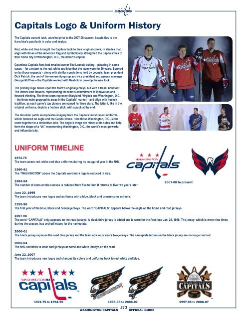
- Page 212 and 213: All-Time Sweater Numbers 50 Eric Fe
- Page 216 and 217: All-Time Draft Selections 1997 Rd.
- Page 218 and 219: All-Time Draft Selections 1978 Rd.
- Page 220 and 221: All-Time Transactions DATE TRANSACT
- Page 222 and 223: All-Time Transactions DATE TRANSACT
- Page 224 and 225: All-Time Transactions DATE TRANSACT
- Page 226 and 227: Game-by-Game Results by Team ANAHEI
- Page 228 and 229: Game-by-Game Results by Team 1/28/8
- Page 230 and 231: Game-by-Game Results by Team 2/27/9
- Page 232 and 233: Game-by-Game Results by Team VANCOU
- Page 234 and 235: Special Teams History POWER PLAY PE
- Page 236 and 237: Capitals Hat Tricks Player Opp. Dat
- Page 238 and 239: Hat Trick History HAT TRICKS FOR AN
- Page 240 and 241: Shutouts Against the Capitals Year
- Page 242 and 243: Overtime History DATE RESULT SCORER
- Page 244 and 245: Shootout History Date Shootout Scor
- Page 246 and 247: Capitals’ Firsts TEAM Category Da
- Page 248 and 249: Capitals NHL Award Winners CAPITALS
- Page 250 and 251: All-Star History Alex Ovechkin CAPI
- Page 252 and 253: Record Book LONGEST LOSING STREAK 1
- Page 254 and 255: Record Book HIGHEST WINNING PERCENT
- Page 256 and 257: Playoff History YEAR-BY-YEAR PLAYOF
- Page 258 and 259: All-Time Playoff Scoring Player GP
- Page 260 and 261: Playoff Overtimes CAPITALS OVERTIME
- Page 262 and 263: Game-by-Game Playoff Results 2008-0
- Page 264 and 265:
Game-by-Game Playoff Results 1992-9
- Page 266 and 267:
Game-by-Game Playoff Results 1982-8
- Page 268 and 269:
Year-by-Year Playoff Statistics 198
- Page 270 and 271:
Playoff Record Book PLAYOFF - TEAM
- Page 272 and 273:
Playoff Record Book FASTEST THREE G
- Page 274 and 275:
Anaheim Ducks At ANAHEIM CAPITALS D
- Page 276 and 277:
Atlanta Thrashers At WASHINGTON CAP
- Page 278 and 279:
Boston Bruins At WASHINGTON CAPITAL
- Page 280 and 281:
Buffalo Sabres At WASHINGTON CAPITA
- Page 282 and 283:
Calgary Flames At CALGARY CAPITALS
- Page 284 and 285:
Carolina Hurricanes At WASHINGTON C
- Page 286 and 287:
Chicago Blackhawks At WASHINGTON CA
- Page 288 and 289:
Colorado Avalanche At WASHINGTON CA
- Page 290 and 291:
Columbus Blue Jackets At WASHINGTON
- Page 292 and 293:
Dallas Stars At DALLAS CAPITALS STA
- Page 294 and 295:
Detroit Red Wings At WASHINGTON CAP
- Page 296 and 297:
Edmonton Oilers At WASHINGTON CAPIT
- Page 298 and 299:
Florida Panthers At WASHINGTON CAPI
- Page 300 and 301:
Los Angeles Kings At WASHINGTON CAP
- Page 302 and 303:
Minnesota Wild At MINNESOTA CAPITAL
- Page 304 and 305:
Montreal Canadiens At WASHINGTON CA
- Page 306 and 307:
Nashville Predators At WASHINGTON C
- Page 308 and 309:
New Jersey Devils At WASHINGTON CAP
- Page 310 and 311:
New York Islanders At WASHINGTON CA
- Page 312 and 313:
New York Rangers At WASHINGTON CAPI
- Page 314 and 315:
Ottawa Senators At WASHINGTON CAPIT
- Page 316 and 317:
Philadelphia Flyers At WASHINGTON C
- Page 318 and 319:
Phoenix Coyotes At PHOENIX CAPITALS
- Page 320 and 321:
Pittsburgh Penguins At WASHINGTON C
- Page 322 and 323:
St. Louis Blues At WASHINGTON CAPIT
- Page 324 and 325:
San Jose Sharks At SAN JOSE CAPITAL
- Page 326 and 327:
Tampa Bay Lightning At WASHINGTON C
- Page 328 and 329:
Toronto Maple Leafs At WASHINGTON C
- Page 330 and 331:
Vancouver Canucks At WASHINGTON CAP
- Page 332 and 333:
Media Information KURT KEHL Vice Pr
- Page 334 and 335:
NHL Directory NHL Directory Gary Be
- Page 336 and 337:
NHL Hockey Operations Order of Sele
- Page 338 and 339:
Television Broadcasters JOE BENINAT
- Page 340 and 341:
Local Media Covering the Capitals N