DISTINGUISHED TYPOGRAPHY - Bloomsbury Auctions
DISTINGUISHED TYPOGRAPHY - Bloomsbury Auctions
DISTINGUISHED TYPOGRAPHY - Bloomsbury Auctions

You also want an ePaper? Increase the reach of your titles
YUMPU automatically turns print PDFs into web optimized ePapers that Google loves.
De Zilverdistel<br />
From its founding in 1910, it took six years and eleven<br />
publications before the Dutch equivalent of the rarified<br />
craft pioneered by William Morris in England, and so<br />
successfully plied by those he inspired, reached maturity<br />
and fully deserved the private press book label. Its three<br />
founders were unfamiliar with printing on a handpress nor<br />
did they aspire to operate one. Hence they entrusted their<br />
poetry to Joh. Enschedé & Zonen, the venerable Haarlem<br />
firm noted for its collection of historic typefaces. It is not<br />
surprising, therefore, that the first four Zilverdistels, printed<br />
on the company’s handpress, featured the fifteenth century<br />
founts of Fleischmann and Hendrik Claesz.<br />
A breath of fresh air arrived in 1913, when two of the founders<br />
lost interest and allowed their colleague, P.N. van Eyck, to<br />
carry on with the knowledgeable participation of a bibliophile<br />
who worked for the postal services’ legal department. Jean-<br />
François van Royen convinced van Eyck to try another<br />
printer for the fifth Zilverdistel, Charles Baudelaire’s Les<br />
Fleurs du Mal, one prepared to invest in S.H. de Roos’ brand<br />
new typeface ‘Médieval Hollandais’. Van Royen showed his<br />
colleague examples of Kelmscott and Doves publications<br />
and that poet’s own next book successfully employed the<br />
newly designed typeface. One month before war broke out<br />
van Royen and his wife travelled to England where they were<br />
entertained by St.John Hornby, Esther & Lucien Pissarro<br />
and T.J.Cobden-Sanderson. The Dutchman gave his hosts<br />
copies of the two latest Zilverdistels in which he had had a<br />
hand, Lanseloet van Denemerken and Verlaine’s Romances<br />
sans Paroles, both of which drew favourable comments.<br />
Van Royen came back full of resolve and commissioned two<br />
dedicated typefaces, the ‘Zilvertype’ from S.H. de Roos, in<br />
principle to be used for modern texts, and the ‘Disteltype’<br />
from Lucien Pissarro, suitable for older texts. All this<br />
cost money so he lectured about the art of the book, took<br />
subscriptions and recruited his friends. A club of fifty became<br />
the mainstay of what was now his press. A financing device<br />
was issuing a limited number of copies on vellum with or<br />
without hand-flourishes, that would command a multiple of<br />
the price of regular copies.<br />
Lot 18<br />
18. la n s e l o e t va n De n e M e r k e n, 48pp., o n e o F 100 C o p i e s<br />
on Batchelor handmade paper, printed in red and black in<br />
type by Peter Schoeffer von Gernsheim and printed by Joh.<br />
Enschedé & Zonen, initial in red by van Royen, original<br />
limp vellum with printer’s device in gilt on upper cover,<br />
spine titled in gilt, uncut, modern cloth slip-case, 8vo, 190<br />
x 130mm., The Hague, De Zilverdistel, 1913.<br />
£250 – £350<br />
* * * An incunable of Dutch theatrical literature going back to<br />
the fourteenth century.<br />
The first use of the Zilverdistel printer’s device designed by<br />
the architect K.P.C. de Bazel.<br />
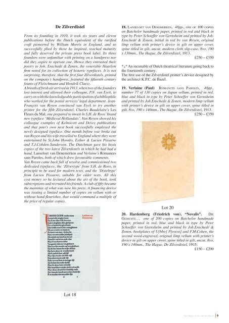
19. Verlaine (Paul) ro M a n C e s s a n s pa r o l e s, 48pp.,<br />
number 77 of 130 copies on Japan vellum, printed in red,<br />
blue and black in type by Peter Schoeffer von Gernsheim<br />
and printed by Joh.Enschedé & Zonen, modern limp vellum<br />
with printer’s device in gilt on upper cover, spine titled in<br />
gilt, 8vo, 190 x 140mm., The Hague, De Zilverdistel, 1913.<br />
£250 – £350<br />
Lot 20<br />
20. Hardenberg (Friedrich von), “Novalis”. Die<br />
ge D i C h t e..., one of 200 copies on Batchelor handmade<br />
paper, printed in red, blue and black in type by Peter<br />
Schoeffer von Gernsheim and printed by Joh.Enschedé &<br />
Zonen, bookplates of U[bbo] P[roost] and F.M.Cohen, the<br />
second wood-engraved, original limp vellum with printer’s<br />
device in gilt on upper cover, spine titled in gilt, uncut, 8vo,<br />
190 x 140mm., The Hague, De Zilverdistel, 1915.<br />
£150 – £200<br />
The library of Jan van der Marck<br />
9