DISTINGUISHED TYPOGRAPHY - Bloomsbury Auctions
DISTINGUISHED TYPOGRAPHY - Bloomsbury Auctions
DISTINGUISHED TYPOGRAPHY - Bloomsbury Auctions

Create successful ePaper yourself
Turn your PDF publications into a flip-book with our unique Google optimized e-Paper software.
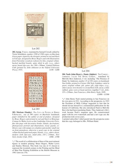
Lot 202<br />
202. Aesop. fa b l e s, translated by Samuel Croxall, edited by<br />
Victor Scholderer, number 1288 of 1500 copies on Barcham<br />
Green paper signed by the designer, printed in red and black<br />
in Fell type, designed by Bruce Rogers and with illustrations<br />
from Florentine woodcuts redrawn by him, original vellumbacked<br />
marbled boards, spine titled in gilt, t.e.g., others<br />
uncut, board slip-case, 4to, 260 x 180mm., Limited Editions<br />
Club [printed by John Johnston at the Oxford University<br />
Press], 1933. £150 – £200<br />
Lot 203<br />
203. Morison (Stanley) fr a lu c a d e pa c i o l i o f bo r G o<br />
s.se p o l c r o, one of 390 copies on Batchelor handmade<br />
paper initialled by the author at end of preface, designed<br />
by Bruce Rogers and printed in red and black in Monotype<br />
Centaur by Walter Lewis at the Cambridge University Press,<br />
fine title-page with decorative border, initials, decorations,<br />
photogravure portrait and illustrations, tissue guards, exlibrary<br />
copy with stamps on colophon and another small one<br />
on front pastedown, otherwise a good copy in the original<br />
vellum-backed patterned-paper boards, t.e.g., others uncut,<br />
modern cloth slip-case, small folio, 310 x 210mm., New<br />
York, Grolier Club, 1933. £500 – £700<br />
* * * The result of a collaboration of three of the most eminent<br />
figures in modern printing: Bruce Rogers, Walter Lewis<br />
and Stanley Morison. This book was one of 31 chosen to<br />
represent the twentieth century in the Printing and the Mind<br />
of Man Fine Printing Exhibition at the British Museum in<br />
1963 (item no.178).<br />
Lot 204<br />
204. Nash (John Henry).- Dante Alighieri. th e co m e d y...<br />
c o m m o N ly c a l l e d th e di V i N e co m e d y, translated by<br />
Melville Best Anderson, 4 vol. including ‘The Florence of<br />
Dante’ by Anderson, number 35 of 250 copies on handmade<br />
Van Gelder, printed in Cloister Old Style Lightface ruled in<br />
green, original vellum, gilt, spines gilt, yapp edges, t.e.g.,<br />
others uncut, w i t h prospectus in marbled cloth, uncut, a little<br />
rubbed, spine worn at head and foot, together 5 vol., folio,<br />
355 x 230mm., San Francisco, John Henry Nash, 1929.<br />
£1000 – £1500<br />
* * * John Henry Nash started printing in San Francisco on<br />
his own press in 1911. According to the prospectus, in 1923<br />
the President of Mills College suggested to him that he<br />
should devote himself to a monumental publication for the<br />
honour of California. She also introduced Nash to Melville<br />
Best who had been translating Dante. Thus Anderson’s life’s<br />
work became Nash’s magnum opus. He commissioned<br />
paper with his own watermark and had a new type cut; the<br />
production took seven years.<br />
A printed subscriber’s label pasted into the prospectus notes<br />
that this copy belonged to Mrs. William Hand.<br />
The library of Jan van der Marck<br />
65