Communicating Clearly with Charts and Graphs - Governor
Communicating Clearly with Charts and Graphs - Governor
Communicating Clearly with Charts and Graphs - Governor

Create successful ePaper yourself
Turn your PDF publications into a flip-book with our unique Google optimized e-Paper software.
<strong>Communicating</strong> <strong>Clearly</strong> <strong>with</strong> <strong>Charts</strong> <strong>and</strong> <strong>Graphs</strong><br />
90<br />
100<br />
80<br />
70<br />
80<br />
60<br />
50<br />
40<br />
30<br />
East<br />
West<br />
North<br />
60<br />
40<br />
North<br />
West<br />
20<br />
20<br />
East<br />
10<br />
0<br />
1st Qtr 2nd Qtr 3rd Qtr 4th Qtr<br />
0<br />
Q1 Q2 Q3 Q4<br />
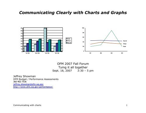
Jeffrey Showman<br />
OFM Budget / Performance Assessments<br />
360-902-7536<br />
jeffrey.showman@ofm.wa.gov<br />
http://www.ofm.wa.gov/performance/<br />
OFM 2007 Fall Forum<br />
Tying it all together<br />
Sept. 18, 2007 3:30 – 5 pm<br />
<strong>Communicating</strong> <strong>with</strong> charts 1
<strong>Communicating</strong> clearly <strong>with</strong> charts <strong>and</strong> graphs – Learning objectives & crib sheet<br />
Learning objectives:<br />
1. Basic communications model – The communications model<br />
can help define what clear communication means for<br />
communicating numbers <strong>with</strong> charts <strong>and</strong> graphs.<br />
Main points:<br />
Sender - Message - Medium - Receiver<br />
Feedback - Environment - Noise<br />
Main user question: “Compared to what?”<br />
2. Focus on users <strong>and</strong> the message by choosing the right type<br />
of graph for the data<br />
3. Minimize noise by eliminating distracting clutter in graphs<br />
• Line graphs = change over time<br />
• Bar charts = differences among<br />
categories<br />
• Pie charts = “parts of the whole”,<br />
percentages<br />
What is noise? Any little thing that distracts<br />
users from focusing on the message.<br />
• 3-D effects<br />
• Legend<br />
• Background color<br />
• Border<br />
• Grid lines<br />
• Tick marks<br />
• Excess zeros, decimal places, words <strong>and</strong><br />
letters<br />
4. Practice creating <strong>and</strong> editing charts Right-Mouse-Button click, <strong>and</strong> pick “Format”<br />
5. Share additional resources <strong>and</strong> answer questions<br />
<strong>Communicating</strong> <strong>with</strong> charts 2
Part I. A. Basic communications model<br />
Communications is a system. Any communication can be analyzed by describing the main parts of the system:<br />
Noise<br />
Sender<br />
Message<br />
Medium<br />
Feedback<br />
• A sender who has something they<br />
want to communicate<br />
• The message itself<br />
• A medium that carries the message<br />
• A receiver – the person to whom<br />
you’re communicating<br />
• Feedback – “Uh-huh”, “OMG!”, “What<br />
do you mean?”<br />
• The environment in which<br />
communication takes place<br />
• Noise – unintended distractions from<br />
the channel or the environment<br />
Technical communication models include<br />
other elements (coder <strong>and</strong> decoder, filters,<br />
etc.)<br />
The goal of communication is that the receiver gets the message that the sender intended.<br />
Applying this to charts <strong>and</strong> graphics:<br />
Noise<br />
Environment<br />
Receiver<br />
• Think of the user (i.e. the receiver) <strong>and</strong> what they want to know<br />
• Choose the right type of chart for the data <strong>and</strong> message<br />
• Reduce noise to improve the odds that the receiver can focus on the message<br />
References:<br />
For a thorough discussion of communication model, http://www.cultsock.ndirect.co.uk/MUHome/cshtml/introductory/sw.html#pnoise<br />
<strong>Communicating</strong> <strong>with</strong> charts 3
Part I. > B. <strong>Communicating</strong> <strong>with</strong> numbers<br />
Numbers tell certain types of stories<br />
• How many things are there?<br />
• How often do things happen?<br />
• What type or degree of change has happened?<br />
• Is change normal or unpredictable?<br />
• Is change likely to continue in the future (i.e. a trend)?<br />
When we use words to tell stories, we organize them in certain ways:<br />
• sentences<br />
• paragraphs<br />
In the same way, to get numbers to tell stories, we have to organize<br />
them in certain ways.<br />
• Tables are the first main tool for organizing numbers<br />
• In a table, we put numbers in rows <strong>and</strong> columns<br />
Every chart starts <strong>with</strong> a table of data, usually in a spreadsheet.<br />
Whether to put data in rows or columns is up to you:<br />
• Brian Willett likes dates in columns, going across the page<br />
• I like dates in rows, going down the page<br />
• We both produce similar graphs.<br />
Example of a data table<br />
Biennium Period Actual Target<br />
2003-05 Q1 59 58<br />
Q2 135 144<br />
Q3 174 210<br />
Q4 180 150<br />
Q5 117 58<br />
Q6 86 144<br />
Q7 188 210<br />
Q8 210 162<br />
2005-07 Q1 122 119<br />
Q2 79 108<br />
Q3 169 162<br />
Q4 157 151<br />
Q5 62 62<br />
Q6 105 121<br />
Q7 160<br />
Q8 197<br />
Source: Exercise 1 - DNR volume of timber sold<br />
<strong>Communicating</strong> <strong>with</strong> charts 4
Part II. Focus on the users <strong>and</strong> the message > A. What makes an effective chart or graph?<br />
A. What makes an effective chart or graph?<br />
Graphic communication has the same goal as written or verbal<br />
communication:<br />
Focus the user on the message, <strong>with</strong> minimal “noise” to<br />
distract them.<br />
A good design is invisible.<br />
Good charts lead to good conversations, clear underst<strong>and</strong>ing, better<br />
decisions.<br />
Effective graphics:<br />
Remember: Your reader is an intelligent,<br />
thoughtful person just like you. Make your<br />
charts easy to read <strong>and</strong> underst<strong>and</strong>, but<br />
don’t “dumb down” the information. (Tufte)<br />
• Are readily understood by the reader<br />
• Are relevant to the world we live in<br />
• Are timely<br />
• Are formatted <strong>with</strong> a sense of balance, proportion, <strong>and</strong> clarity<br />
of design<br />
• Have integrity (data/analysis, cite references, are signed)<br />
• And answer some predictable, fundamental questions, the most<br />
important of which is . . .<br />
“Compared to what?”<br />
References: H<strong>and</strong>out 2, Barbara Felver, “<strong>Communicating</strong> effectively <strong>with</strong> graphics”,<br />
http://www.digitalarchives.wa.gov/governorlocke/improve/quality/tools/bfelver.htm.<br />
<strong>Communicating</strong> <strong>with</strong> charts 5
Part II. Focus on the users <strong>and</strong> the message > B. Types of comparisons<br />
Graphic data acquires meaning when it has context.<br />
Context can come from comparison among . . .<br />
• Categories of things<br />
• Time periods<br />
• Parts of the whole<br />
Other types of comparisons<br />
• Comparisons in space or geography<br />
• How does it work?<br />
<strong>Communicating</strong> <strong>with</strong> charts 6
Part II. Choosing the right chart > Types of comparisons > C. Right chart for the each type of comparison<br />
Each type of comparison has a type of graphic best suited to showing it:<br />
Category comparisons<br />
Bar charts<br />
Column charts<br />
Prior rates<br />
Current rates<br />
$70.01<br />
$68.05<br />
$62.40 $62.11<br />
$60.20<br />
$70.42<br />
$74.87<br />
$75.72<br />
PSE Avista NW Natural Cascade<br />
Change over time<br />
Line charts<br />
(run charts)<br />
$19<br />
$18<br />
$17<br />
$16<br />
$15<br />
$14<br />
$13<br />
Annual aquatic lease revenue ($million)<br />
Trend = +$.77 million/year<br />
$12<br />
$11<br />
$10<br />
1999 2000 2001 2002 2003 2004 2005 2006<br />
Consumer complaints by industry, 2004<br />
Parts of the whole - percentages<br />
Pie charts<br />
Telecom, 74%<br />
Electric, 13%<br />
Solid waste, 6%<br />
Gas, 4%<br />
Water, 2%<br />
Transportation,<br />
1%<br />
How does it work<br />
Flow charts<br />
org charts<br />
diagrams<br />
Telecommunications<br />
Jing Roth<br />
Assistant Director (Acting)<br />
13.65 FTE<br />
Regulatory Services Division<br />
Glenn Blackmon<br />
Director (Acting)<br />
Division Staff<br />
2 FTE<br />
Energy<br />
Solid Waste <strong>and</strong> Water<br />
Roger Braden<br />
Gene Eckhardt<br />
Assistant Director Assistant Director<br />
12.5 FTE<br />
7.5 FTE<br />
Records <strong>and</strong> Licensing<br />
Kathy Hunter<br />
Assistant Director<br />
10.9 FTE<br />
Spatial relations<br />
Maps<br />
Face of customer<br />
Photographs<br />
<strong>Communicating</strong> <strong>with</strong> charts 7
Part II. C. Choosing the right chart > 1. Categories = column or bar charts<br />
Bar or Column charts show differences among categories.<br />
The example on right shows number of customers of different types<br />
of telephone companies. (This is a type of “stacked column” graph.)<br />
For long lists of categories, use horizontal bars because the chart<br />
category labels are easier to read. In Excel, these are called “Bar<br />
charts”. See example below.<br />
Hours charged to telecommunication industry code by different<br />
WUTC sections, fiscal years 2004-2005<br />
Telecommunications<br />
Regulatory Group<br />
Thous<strong>and</strong>s<br />
- 5 10 15 20 25<br />
Washington telephone lines by type of<br />
technology, 2003.<br />
Millions<br />
4<br />
3.5<br />
3<br />
2.5<br />
2<br />
1.5<br />
1<br />
0.5<br />
0<br />
CLEC<br />
0.494<br />
ILEC<br />
3.276<br />
3.567<br />
0.775<br />
Wireline Wireless High Speed<br />
Source: FCC<br />
Consumer Affairs<br />
Administrative Law<br />
Division<br />
Records<br />
Management<br />
Utilities<br />
Administration<br />
Policy Planning <strong>and</strong><br />
Research<br />
Administration<br />
Business Practices<br />
Motor Carrier Safety<br />
FY04<br />
FY05<br />
Notes:<br />
Numbers are millions of subscriber lines.<br />
ILEC = Incumbent local exchange company, or a<br />
traditional l<strong>and</strong>-line telephone company<br />
CLEC = Competitive local exchange company<br />
FCC = Federal Communications Commission.<br />
Chart sources: WUTC Telecommunications<br />
GMAP, Dec. 2005.<br />
Licensing Services<br />
<strong>Communicating</strong> <strong>with</strong> charts 8
Part II. B. Choosing the right chart > 1. Categories = bar charts > More bar <strong>and</strong> column chart examples<br />
Because statistical analysis requires a minimum of seven data<br />
points, some analysts suggest using bar charts instead of line<br />
charts if there are six or fewer data points available.<br />
Percent of client children <strong>with</strong> paternity established per year<br />
(cumulative to Federal Fiscal Year end, Q1 & Q5)<br />
In the example below, the categories are age<br />
groups. Note the detail at the bottom showing the<br />
percentage of each category summing to 100%.<br />
100%<br />
Target, 90%<br />
80%<br />
98% 97% 94.6%<br />
98.1%<br />
60%<br />
40%<br />
20%<br />
0%<br />
Q1 Q2 Q3 Q4 Q5 Q6 Q7 Q8 Q1 Q2 Q3 Q4 Q5 Q6<br />
2003-05 2005-07<br />
The data above are cumulative every quarter, so the most<br />
relevant period is the total in the final quarter. Because the<br />
eye is attracted to dark things, I wanted to draw attention to<br />
these bars are colored dark. It’s difficult to draw attention to a<br />
single point in a line chart, so a bar chart works here.<br />
Source: DSHS ESA charts – PowerPoint<br />
Source: Stephen Few, Perceptual Edge – Design<br />
Examples:<br />
http://www.perceptualedge.com/images/example15-sol-large.jpg<br />
<strong>Communicating</strong> <strong>with</strong> charts 9
Part II. B. Choosing the right chart > 2. Comparison in time = line charts<br />
2. Line charts (or “run charts”) show performance over time<br />
If one of the sets of data is related to time (e.g. quarter, month,<br />
year), then a line chart is probably the right choice.<br />
Annual aquatic lease revenue ($million)<br />
A big advantage of run charts is that<br />
relationships among many data points is<br />
much easier to see <strong>and</strong> underst<strong>and</strong> than<br />
“raw data” in a table.<br />
$19<br />
$18<br />
Trend = +$.77 million/year<br />
This is the data table for the chart to the<br />
left:<br />
$17<br />
$16<br />
$15<br />
$14<br />
$13<br />
$12<br />
$11<br />
$10<br />
1999 2000 2001 2002 2003 2004 2005 2006<br />
Source: DNR Performance Assessment, data from DNR Annual Reports<br />
Year<br />
Aquatic lease<br />
revenue<br />
1999 $11.7<br />
2000 $15.0<br />
2001 $12.6<br />
2002 $14.4<br />
2003 $17.5<br />
2004 $15.8<br />
2005 $16.8<br />
2006 $17.8<br />
It’s possible to get the same information<br />
from the table as from the chart (e.g.,<br />
Which year was highest? Which was<br />
lowest? Is there a general trend?) but it<br />
takes a lot more time <strong>and</strong> effort by the<br />
user.<br />
<strong>Communicating</strong> <strong>with</strong> charts 10
Part II. B. Choosing the right chart > Time change = line charts > More line chart examples<br />
1. Line or run charts - More examples<br />
Line charts are useful for showing things that change in a regular<br />
cycle, outlying or unusual events, etc.<br />
$180<br />
Total Child Support Collections (dollars in millions)<br />
Trend = + $1.5m per Q<br />
Small multiples help comparison (Tufte)<br />
Millions<br />
$7<br />
$6<br />
$5<br />
$4<br />
$3<br />
$2<br />
$1<br />
$0<br />
Parks revenue - Spring<br />
(Apr - June, Q4 & Q8)<br />
Q4 Q8 Q4 Q8 Q4 Q8 Q4 Q8<br />
1999-01 2001-03 2003-05 2005-07<br />
$170<br />
$160<br />
Target<br />
Millions<br />
$10<br />
$8<br />
$6<br />
$4<br />
$2<br />
$0<br />
Parks revenue - Summer<br />
(July - Sept, Q1 & 5)<br />
Q1 Q5 Q1 Q5 Q1 Q5 Q1 Q5<br />
$150<br />
1999-01 2001-03 2003-05 2005-07<br />
$140<br />
Actual collections<br />
Q1 Q2 Q3 Q4 Q5 Q6 Q7 Q8 Q1 Q2 Q3 Q4 Q5 Q6 Q7 Q8<br />
2003-05 2005-07<br />
Note that the dollar scale begins at $140 million. Some variation may<br />
be relatively minor, but still important to see closely. Changing the<br />
scale of the Value Axis (y axis) can highlight differences. Use this<br />
judiciously, though, as it can be perceived as manipulating the data.<br />
Chart sources: Performance Assessments, DSHS ESA (above) <strong>and</strong> State Parks (right)<br />
M illio n s<br />
Millions<br />
$4<br />
$3<br />
$2<br />
$1<br />
$0<br />
$4<br />
$3<br />
$2<br />
$1<br />
$0<br />
Parks revenue - Autumn<br />
(Oct - Dec, Q2 & 6)<br />
Q2 Q6 Q2 Q6 Q2 Q6 Q2 Q6<br />
1999-01 2001-03 2003-05 2005-07<br />
Parks revenue - Winter<br />
(Jan - Mar, Q3 & 7)<br />
Q3 Q7 Q3 Q7 Q3 Q7 Q3 Q7<br />
1999-01 2001-03 2003-05 2005-07<br />
<strong>Communicating</strong> <strong>with</strong> charts 11
Part II. C. Choosing the right chart > 3. Parts of the whole = pie charts<br />
3. Pie charts show percentages of the whole<br />
Use pie charts to show percentages, usually when there are a<br />
few (e.g. seven or less) categories, such as the chart on the<br />
right.<br />
Consumer complaints by industry, 2004<br />
Avoid pie charts if there are many categories, such as the<br />
example below, or if any categories have a value of zero. In<br />
these cases, use a simple table of data, or an exp<strong>and</strong>ed pie<br />
chart, instead.<br />
Expenditures on Telecom Regulation, By Section<br />
July-December 2003<br />
Telecom, 74%<br />
Electric, 13%<br />
Solid waste, 6%<br />
Gas, 4%<br />
Water, 2%<br />
Transportation,<br />
1%<br />
Total Expenditures (6 months) - $2.5 million<br />
Indirect<br />
30%<br />
Telecom Section<br />
26%<br />
Licensing<br />
1%<br />
Other<br />
2%<br />
Consumer Affairs<br />
10%<br />
Hint: Rotate pie chart slices to draw users’<br />
attention to what’s important, or to make it easier<br />
to read by orienting to familiar clock h<strong>and</strong><br />
positions: “3 - 6 – 9 -12”.<br />
Business Practices<br />
2%<br />
Commissioners<br />
2%<br />
Policy<br />
2%<br />
Agency Payments<br />
AG Public Counsel<br />
8%<br />
Records Center Admin Law<br />
2%<br />
3%<br />
4%<br />
Attorney General<br />
8%<br />
Reference: Stephen Few, “Save the pies for dessert”<br />
(Aug. 2007), http://www.perceptualedge.com/articles/08-<br />
21-07.pdf<br />
<strong>Communicating</strong> <strong>with</strong> charts 12
Part III. A. Noise – What is it?<br />
Noise is any unwanted energy or distraction<br />
that degrades the quality of signals <strong>and</strong> data.<br />
Examples of noise:<br />
• Hiss, hum or crackle in a telephone call<br />
• A motorcycle going by a sidewalk café as<br />
you’re about to propose<br />
• Motors, fans, compressors at work<br />
• Non-essential “chart junk” in a graphic.<br />
90<br />
80<br />
70<br />
60<br />
50<br />
40<br />
30<br />
20<br />
East<br />
West<br />
North<br />
Avoiding <strong>and</strong> reducing physical noise is a major<br />
concern of communication scientists.<br />
Avoiding <strong>and</strong> reducing chart noise is a major<br />
concern of communicating <strong>with</strong> graphics.<br />
100<br />
10<br />
0<br />
1st Qtr 2nd Qtr 3rd Qtr 4th Qtr<br />
Noise can be measured by counting all of the<br />
separate things on a chart.<br />
The default PowerPoint chart (above) has over 200<br />
lines, tick marks, edges, surfaces, digits, <strong>and</strong> words<br />
competing for attention.<br />
The edited version (bottom, showing the same data)<br />
has about 22.<br />
“The only question you should ask when looking at a ...<br />
chart is: Does it communicate the data in the clearest<br />
<strong>and</strong> most accurate way possible?” Stephen Few, “Excel’s<br />
new charting engine”<br />
80<br />
60<br />
40<br />
20<br />
0<br />
Q1 Q2 Q3 Q4<br />
For technical discussion of noise in communications, see: http://www.cultsock.ndirect.co.uk/MUHome/cshtml/introductory/sw.html#pnoise<br />
North<br />
West<br />
East<br />
<strong>Communicating</strong> <strong>with</strong> charts 13
Part III. Noise > B. Sources of noise in charts <strong>and</strong> graphs<br />
Noise can come from a variety of things in charts (<strong>and</strong><br />
Excel puts almost all of them into charts by default).<br />
Examples of “noise” that distract from the message in<br />
a chart . . .<br />
Legends or “codes” that force the viewer to<br />
consult a “decoder” for meaning<br />
. . . And how to cure that particular noise problem:<br />
Delete the legend, <strong>and</strong> instead label lines or bars directly:<br />
• Use text boxes (from the drawing toolbar) or<br />
• Label a data point <strong>and</strong> then edit that.<br />
Extra benefit: legend takes up real estate from the data.<br />
Colored or shaded background<br />
Remove colored backgrounds using “Format Plot Area”<br />
Gridlines, borders, tick marks – “Chartjunk”<br />
• Remove gridlines by clicking on them, <strong>and</strong> choosing<br />
“clear”<br />
• Remove borders by clicking on Plot <strong>and</strong>/or Chart area,<br />
<strong>and</strong> choosing Border <strong>and</strong> Patterns – none.<br />
• Remove tick marks, or point them inside, by clicking on<br />
the axis, choosing “Format Axis”, <strong>and</strong> the Patterns tab.<br />
Superfluous words <strong>and</strong> digits (decimal<br />
points, ‘000’s on currency, letters, words)<br />
Click on the axis, choose Format Axis, <strong>and</strong> then Number or<br />
Scale tabs. Minimize the number of digits, letters, words.<br />
“The only question you should ask when looking at a . . . chart is: Does it communicate the data in the clearest <strong>and</strong> most accurate<br />
way possible?” Stephen Few, “Excel’s new charting engine”<br />
<strong>Communicating</strong> <strong>with</strong> charts 14
Part IV. Practical tips > A. How to create a chart in Excel<br />
Highlight the area of the table you want to the graph<br />
• Click on a cell in one corner of the data table,<br />
• hold the button down <strong>and</strong> drag the mouse to the opposite<br />
corner, <strong>and</strong> release the mouse button.<br />
• Include all data you want to be in the graph.<br />
• “X axis” labels can be added later.<br />
Click the "Chart Wizard" icon on the tool bar & just<br />
follow instructions on the chart wizard:<br />
• Choose best type of chart for the data <strong>and</strong> message<br />
• Choose the chart sub-type <strong>with</strong> the minimum noise (note<br />
the "View sample" button)<br />
• Add chart title (optional, can add later through "Chart<br />
Options" menu)<br />
• Choose where to put the chart:<br />
In same worksheet<br />
Advantages:<br />
o Data is right next to the chart, so easy to play <strong>with</strong>;<br />
o Smaller size exports well to a partial page in another document<br />
(Word, Powerpoint)<br />
Disadvantages: Limited room for detail, labels, call-outs<br />
See Exercise 1 – DNR Volume of Timber sold<br />
Chart Wizard icon on the menu<br />
The prompt for choosing chart type <strong>and</strong> subtype<br />
on the Chart Wizard:<br />
On its own worksheet:<br />
Advantages:<br />
o Large size, easy to read <strong>and</strong> work <strong>with</strong>,<br />
o Exports well to a full page in other documents<br />
Disadvantages:<br />
o<br />
o<br />
Data is on a different sheet so is challenging to manipulate;<br />
Exporting to less-than-full page in another document requires<br />
extra h<strong>and</strong>ling (e.g. changing font lock)<br />
<strong>Communicating</strong> <strong>with</strong> charts 15
Part IV. Practical tips: How to clean up an Excel chart > B. Parts of an Excel chart 1<br />
Chart area<br />
Chart title<br />
Percent of vendors <strong>and</strong> employees paid <strong>with</strong>in OFM time<br />
frames<br />
100%<br />
Target - 95%<br />
Value axis<br />
(= y axis)<br />
90%<br />
80%<br />
70%<br />
60%<br />
Pct. of employee<br />
travel paid w ithin 10<br />
days<br />
Pct. of vendors paid<br />
w ithin 30 days<br />
Plot area<br />
50%<br />
Q1 Q2 Q3 Q4 Q5 Q6 Q7 Q8<br />
2005-07<br />
Category axis<br />
( = x axis)<br />
<strong>Communicating</strong> <strong>with</strong> charts 16
Part IV. Practical tips: How to clean up an Excel chart > B. Parts of an Excel chart 2<br />
<strong>Communicating</strong> <strong>with</strong> charts 17
Part IV. Practical tips > C. How to clean up an Excel chart –General approach<br />
1. Put cursor on part of the chart that you want to<br />
edit<br />
• Black boxes appear on the ends or edges of the<br />
selected item<br />
• Lines <strong>and</strong> borders appear mottled<br />
• A description box may also appear (see item 1).<br />
1. Example of a selected “Plot Area” in a chart (note<br />
black squares <strong>and</strong> gray line)<br />
2. Right-Mouse-Button (RMB) click to see menu of<br />
options for that feature (see item 2).<br />
3. Choose the “Format...” menu<br />
4. Edit the item you want<br />
• Menu items often have multiple tabs, each dealing<br />
<strong>with</strong> a different feature (e.g. font, lines, scale)<br />
• Change items by choosing something different than<br />
current settings, usually "none", 'no fill", etc.<br />
5. Click the "Okay" button or press "Enter"<br />
2. Menu of choices after Right-Mouse-Button click on<br />
highlighted Plot Area:<br />
Remember:<br />
<br />
<br />
<br />
It's okay to explore. There’s more here than I can<br />
show, <strong>and</strong> it’s a great way to learn.<br />
For peace of mind save your work early & often.<br />
Use "Edit - Undo" when something goes wrong.<br />
<strong>Communicating</strong> <strong>with</strong> charts 18
Part IV. Practical tips > D. Good chart hygiene - What to clean up every time<br />
B. What to clean up every time:<br />
<br />
Delete legend - Highlight it <strong>and</strong> push “Delete” or<br />
“clear”. Your chart immediately will have additional<br />
“real estate”<br />
Remove gridlines (see item 1)<br />
<br />
<br />
o Click on them, then push “Delete” or clear<br />
Get rid of background color <strong>and</strong> inner border<br />
o Put cursor in Plot Area (see previous slide)<br />
o Right-mouse-button click <strong>and</strong> choose "Format<br />
Plot Area" from the menu<br />
o Choose “Area – None” <strong>and</strong> “Border – No line”<br />
(see item 2)<br />
If exporting to Word or Powerpoint, remove the outer<br />
border in the same way<br />
o Put cursor in Chart Area (not the Plot Area, i.e.<br />
not <strong>with</strong>in the area bounded by the two axes!)<br />
o Choose “Border – none”<br />
1. Selected Gridlines have boxes on ends<br />
2. Menu choice for removing background <strong>and</strong> inner border<br />
from Plot Area<br />
Hints:<br />
<br />
<br />
<br />
In general, start at outside <strong>and</strong> work your way in<br />
Since this happens on every chart, lots of chance to<br />
practice, get good at it.<br />
Can be done in about a minute or so, <strong>and</strong> pays<br />
immediate dividends in improved readability.<br />
<strong>Communicating</strong> <strong>with</strong> charts 19
Part IV. Practical tips > E. Optional things to clean up<br />
Further ways to reduce noise or focus on the message:<br />
Change tick marks - I like them to point inward, toward the data,<br />
not outward like little saw teeth. Some folks eliminate them.<br />
1. Highlight value axis (note black squares):<br />
Unneeded digits on the value (y) axis - Some scales have too<br />
many data points, too many decimals, or too many zeros.<br />
For all these<br />
1. Highlight the Value axis ( = y axis)<br />
2. Right-mouse-button click<br />
3 Choose "Format Axis . . ." menu<br />
To change Tick marks:<br />
Patterns tab<br />
"Major tick mark type" - choose "Inside", or “None”<br />
2. Right-mouse-button click to see menu:<br />
To clean up excess decimals in numbers:<br />
Number tab<br />
Choose "Number" or "Currency"<br />
Set Decimal places = 0<br />
To change the scale:<br />
Scale tab<br />
Change the "Minimum" amount<br />
Change the "Major unit" amount<br />
3. Pick the tab dealing <strong>with</strong> what you want:<br />
To clean up excess zeros in values:<br />
Scale tab<br />
"Display Units" box<br />
Select the one you want (hundreds, thous<strong>and</strong>s, millions, etc)<br />
The axis label will automatically change ("In Millions")<br />
<strong>Communicating</strong> <strong>with</strong> charts 20
Part IV. Practical tips > F. Advanced topics 1 – Using “Data Point” to make a single bar dark<br />
To draw attention to a single bar by coloring it dark:<br />
First color rest of the bars white or light<br />
• Put cursor on any item in the data series <strong>and</strong> click<br />
once – the whole series is highlighted.<br />
• RMB click, choose “Format Data Series”<br />
• Under the Patterns tab, choose the color in Area (see<br />
item 1).<br />
1. Tabs on the “Format Data Series . . .” menu:<br />
2. A highlighted data point in a bar chart:<br />
Then highlight the individual bar (= “data point”)<br />
• Put your cursor on the data point you want to highlight<br />
• Click once to highlight the data series.<br />
• Click a second time <strong>and</strong> hold it– the data point is<br />
highlighted (see item 2)<br />
• RMB click, choose “Format Data Point”<br />
• Change color under Area, <strong>and</strong> click Okay (see item 3).<br />
3. Changing the color of a data point<br />
<strong>Communicating</strong> <strong>with</strong> charts 21
Part IV. Practical tips > F. Advanced topics 2 – Enhance the message in the data lines<br />
Add emphasis to the message by increasing the weight of a data line<br />
Click on the data series<br />
RMB click <strong>and</strong> choose "Format Data Series"<br />
On the first "Patterns" tab,<br />
Under "Line", increase the weight (bottom option)<br />
Provide a visual clue that the target is not actual data by changing it<br />
to a dashed line<br />
Same as above, but under "Line" . . .<br />
click "Style" (top option) <strong>and</strong> choose a type of dashed line<br />
Consider changing the color as well (middle option)<br />
Label the lines directly to replace the deleted legend:<br />
Method 1 - Use text boxes from the "Drawing" toolbar. (Hint – your cursor<br />
needs to be in the Chart Area when creating the text box, or it will disappear<br />
behind the chart)<br />
Method 2 - Label a data point, then edit <strong>and</strong> move it:<br />
• Get to any data point on the line (see previous slide 21)<br />
• Choose "Format Data Point,” then the "Data Labels" tab<br />
• Click one of the choices (Series, Category or Value it doesn’t matter)<br />
• Once the data label is created for the data point, edit it <strong>and</strong> move it<br />
o Click twice on the data label to move it around the chart area<br />
o Click three times on the data label to edit the text<br />
o Click on it once to get the "Format Data Label" to edit font (e.g.<br />
make font color to match the line color), make it bold to be<br />
more readable, etc.<br />
<strong>Communicating</strong> <strong>with</strong> charts 22
Part IV. Practical tips > F. Advanced topics 3 – Adding other data lines<br />
Excel can include a trend line:<br />
• Click on the main chart line (i.e. data series), <strong>and</strong> choose<br />
• “Add Trend line” from the menu choice.<br />
• Can show slope, check R-squared, on one of the tabs<br />
How to get a mixed bar <strong>and</strong> line chart or data on two axes:<br />
• Click pretty much anywhere in the chart <strong>and</strong> RMB click<br />
• Choose “Chart Type” on menu<br />
• Click on the “Custom chart” tab (on the right at top)<br />
• Scroll down <strong>and</strong> look for “Line <strong>and</strong> bar” chart, etc.<br />
How to add additional series of data (e.g. mean or median, etc.)<br />
or define X axis labels<br />
• Add the data in an additional column on the spreadsheet table<br />
• Click anywhere in the chart<br />
• Choose “Source Data”<br />
• Click the “Series” tab<br />
• Click “Add” <strong>and</strong> give it a name<br />
• Click <strong>and</strong> highlight where to get the data<br />
<strong>Communicating</strong> <strong>with</strong> charts 23
Part IV. Practical tips – More hints, ideas, things to think about<br />
1. The eye reads a page like the mark of Zorro –<br />
• People first focus on the upper left corner of the page<br />
• Go across the top to the upper right,<br />
• diagonally back down to lower left, <strong>and</strong><br />
• across bottom to lower right.<br />
These are the four main attention corners, in that priority order. Use<br />
this to prioritize the space for users on charts, e.g.:<br />
• Put legends in upper left corner<br />
• Put technical information at bottom, etc.<br />
2. It’s okay to write a chart title that draws the user’s attention to<br />
the main point.<br />
• E.g. “Energy from renewable energy has increased 32% over<br />
past five years (measured in kilowatt hours)”<br />
3. Some people are color blind. Use colors that don’t cause problems<br />
for these folks (avoid yellows <strong>and</strong> greens.)<br />
4. Think about how your graphic will reproduce in black <strong>and</strong> white.<br />
Not everyone has a color copier or printer. Using shades of gray<br />
ensures copy-ability.<br />
5. Think about ways to make design even less obtrusive:<br />
• Reduce the weight of axis lines<br />
• Change line or font color from black to gray<br />
6. Trust comes from integrity<br />
• State data sources, provide footnotes <strong>and</strong> explanatory text.<br />
• Sign your work.<br />
<strong>Communicating</strong> <strong>with</strong> charts 24
Part V. Resources for improving graphic literacy<br />
Dr. Steve Marshall <strong>and</strong> OFM’s Brian Willett teach “<strong>Communicating</strong> <strong>with</strong> Data” classes through Dept. of Personnel<br />
(DOP).<br />
Edward Tufte, the father of “information design,” has great books, seminars, insights, <strong>and</strong> discussion groups on<br />
his website (http://www.edwardtufte.com/tufte/) including discussion groups (e.g. on project management).<br />
• About Tufte: “The Data Artist”, March, 1997 Salon http://archive.salon.com/march97/tufte2970310.html<br />
• By Tufte: “PowerPoint Is Evil” (Wired , Sept. 03) http://www.wired.com/wired/archive/11.09/ppt2.html<br />
• Influenced by Tufte: “Graphics <strong>and</strong> Web Design based on Tufte” - UW computer class:<br />
http://www.washington.edu/computing/training/560/zz-tufte.html<br />
Stephen Few, <strong>and</strong> his firm Perceptual Edge, have a great web site <strong>with</strong>, for instance:<br />
• a library of publications - http://www.perceptualedge.com/library.php<br />
• “before <strong>and</strong> after” examples of graphics - http://www.perceptualedge.com/examples.php<br />
Barbara Felver, an analyst <strong>with</strong> the DSHS <strong>and</strong> OFM, developed some great tips <strong>and</strong> techniques that I’ve borrowed<br />
(e.g. how to clean up a bar chart, decision maker questions)<br />
http://www.digitalarchives.wa.gov/governorlocke/improve/quality/tools/bfelver.htm.<br />
Start a folder <strong>and</strong> throw ideas into it. Look at examples from publications that use graphic <strong>and</strong> financial data (Wall<br />
St. Journal, New York Times, annual reports by mutual funds, etc.) Washington Department of Transportations’<br />
Gray Notebook (http://www.wsdot.wa.gov/accountability/default.htm) has lots of ideas for graphic communication.<br />
Remember:<br />
Focus on the message<br />
Eliminate noise<br />
<strong>Communicating</strong> <strong>with</strong> charts 25
Jeffrey Showman is a Budget Assistant at the Washington State Office of Financial Management (OFM) doing<br />
performance assessments of state agencies. In 18 years at the Washington Utilities <strong>and</strong> Transportation Commission, he<br />
did a variety of communication jobs:<br />
• Published the agency’s Balanced Scorecard<br />
• Coached managers on presenting performance data graphically for internal GMAP sessions<br />
• Testified to legislative committees, using charts to show performance data<br />
• Helped design web sites <strong>and</strong> information system projects for customer usability, took training on, <strong>and</strong><br />
conducted, usability studies<br />
• Helped write <strong>and</strong> publish a daily electronic newsletter<br />
• Wrote, edited, <strong>and</strong> coordinated production of reports to the legislature<br />
• Conducted workshops <strong>and</strong> gave presentations on a variety of topics to a variety of audiences.<br />
Jeffrey holds a Masters degree in Urban Planning from the University of Washington <strong>and</strong> a Bachelors of Science<br />
degree in Environmental Studies from Huxley College at Western Washington University, where he was also<br />
production manager of the student newspaper <strong>and</strong> a blues disk jockey.<br />
<strong>Communicating</strong> <strong>with</strong> charts 26