

Complete issue 29:1 as one pdf - TUG
Complete issue 29:1 as one pdf - TUG
Complete issue 29:1 as one pdf - TUG

Create successful ePaper yourself
Turn your PDF publications into a flip-book with our unique Google optimized e-Paper software.
Cyklop: A new font family<br />
Janusz Marian Nowacki<br />
ul. Śniadeckich 82 m. 46<br />
86-300 Grudziądz<br />
Poland<br />
janusz (at) jmn dot pl; http://www.jmn.pl<br />
Abstract<br />
Cyklop, pl. Cyclops, (gr. cyclos: round + ops: eye) in Greek mythology, a giant<br />
with <strong>one</strong> round eye in the middle of its forehead. Cyclops were herdsmen and<br />
builders of giant (cyclopean) fortifications. They also worked for Hephaestus at<br />
his forge, where they forged Zeus’ thunderbolts. It is fortunate that they were<br />
only mythical characters.<br />
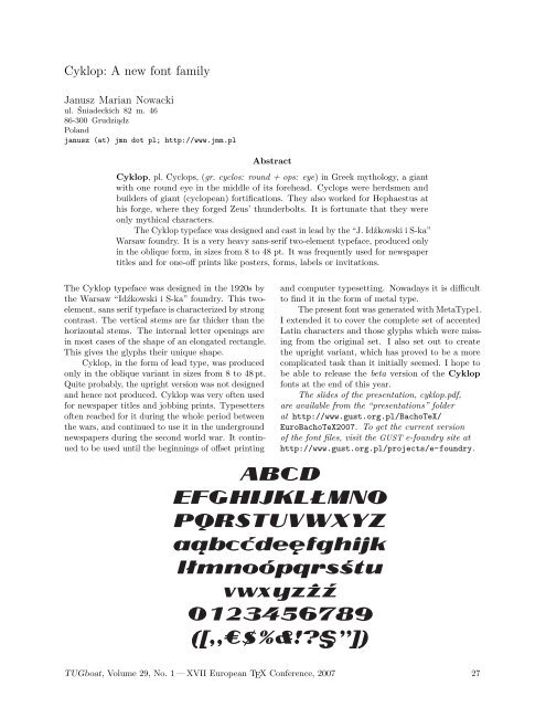
The Cyklop typeface w<strong>as</strong> designed and c<strong>as</strong>t in lead by the “J. Idźkowski i S-ka”<br />
Warsaw foundry. It is a very heavy sans-serif two-element typeface, produced only<br />
in the oblique form, in sizes from 8 to 48 pt. It w<strong>as</strong> frequently used for newspaper<br />
titles and for <strong>one</strong>-off prints like posters, forms, labels or invitations.<br />
The Cyklop typeface w<strong>as</strong> designed in the 1920s by<br />
the Warsaw “Idźkowski i S-ka” foundry. This twoelement,<br />
sans serif typeface is characterized by strong<br />
contr<strong>as</strong>t. The vertical stems are far thicker than the<br />
horizontal stems. The internal letter openings are<br />
in most c<strong>as</strong>es of the shape of an elongated rectangle.<br />
This gives the glyphs their unique shape.<br />
Cyklop, in the form of lead type, w<strong>as</strong> produced<br />
only in the oblique variant in sizes from 8 to 48 pt.<br />
Quite probably, the upright version w<strong>as</strong> not designed<br />
and hence not produced. Cyklop w<strong>as</strong> very often used<br />
for newspaper titles and jobbing prints. Typesetters<br />
often reached for it during the whole period between<br />
the wars, and continued to use it in the underground<br />
newspapers during the second world war. It continued<br />
to be used until the beginnings of offset printing<br />
and computer typesetting. Nowadays it is difficult<br />
to find it in the form of metal type.<br />
The present font w<strong>as</strong> generated with MetaType1.<br />
I extended it to cover the complete set of accented<br />
Latin characters and those glyphs which were missing<br />
from the original set. I also set out to create<br />
the upright variant, which h<strong>as</strong> proved to be a more<br />
complicated t<strong>as</strong>k than it initially seemed. I hope to<br />
be able to rele<strong>as</strong>e the beta version of the Cyklop<br />
fonts at the end of this year.<br />
The slides of the presentation, cyklop.<strong>pdf</strong>,<br />
are available from the “presentations” folder<br />
at http://www.gust.org.pl/BachoTeX/<br />
EuroBachoTeX2007. To get the current version<br />
of the font files, visit the GUST e-foundry site at<br />
http://www.gust.org.pl/projects/e-foundry.<br />
<strong>TUG</strong>boat, Volume <strong>29</strong>, No. 1 — XVII European TEX Conference, 2007 27


