

Complete issue 29:1 as one pdf - TUG
Complete issue 29:1 as one pdf - TUG
Complete issue 29:1 as one pdf - TUG

You also want an ePaper? Increase the reach of your titles
YUMPU automatically turns print PDFs into web optimized ePapers that Google loves.
Those obscure accents . . .<br />
The change from blackletters to old good roman<br />
types came in Bohemia only with a national revival.<br />
Roman types served <strong>as</strong> a symbol of liberation from<br />
the German influence. But the problem with appropriate<br />
accents survives, <strong>as</strong> <strong>one</strong> of the first primers<br />
(spelling-books) clearly shows.<br />
On the other hand, in some c<strong>as</strong>es apostrophe<br />
is used <strong>as</strong> sign of ‘palatization’ in transliteration of<br />
some languages, e.g. Russian.<br />
Virtual fonts. Thanks to our Grand Wizard, virtual<br />
fonts provide an e<strong>as</strong>y method to prepare a font<br />
with the necessary accents, with of course the palatal<br />
hook serving <strong>as</strong> an exception confirming the rule...<br />
Unfortunately most “localized” versions of commercial<br />
fonts distributed not very long ago were prepared<br />
in much the same way: i.e. ľ <strong>as</strong> l with apostrophe<br />
being ‘close enough’. One can see the difference<br />
with the text set in metal type<br />
and <strong>one</strong> of the first electronic versions of B<strong>as</strong>kerville<br />
The name caron seems to be more popular in<br />
typography, while háček is widely used in linguistics.<br />
In Czech, háček means the diminutive form of ‘little<br />
hook’. On the other hand, the etymology of the word<br />
caron is quite unclear (there is an idea that it may<br />
derive from a fusion of the words caret and macron).<br />
In various languages which use this accent, caron is<br />
called ‘softener’ or ‘palatalization mark’, ‘little roof’<br />
or even ‘hat’ (in Finnish).<br />
Today the caron is also used by the Slovaks,<br />
Slovenians, Croats, Bosnians; Serbs and Macedonians<br />
(when romanizing the official Cyrillic); Upper<br />
Lusatian and Lower Lusatian Sorbs, Lithuanians,<br />
Latvians, and Belarusians (formerly in the Latin<br />
alphabet, now only in romanization of the official<br />
Cyrillic).<br />
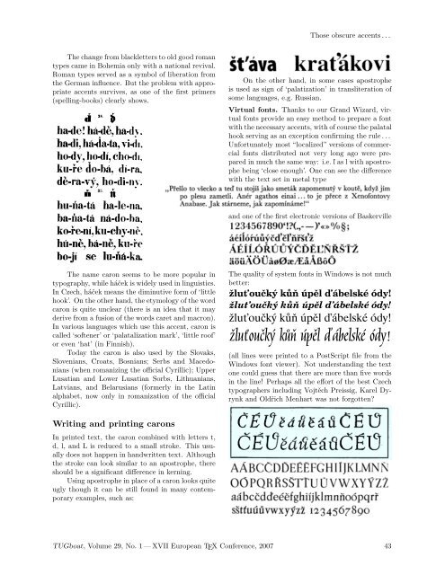
The quality of system fonts in Windows is not much<br />
better:<br />
žluoučký k úpl ábelské ódy! 1234567890<br />
žluoučký k úpl ábelské ódy! 1234567890<br />
žluťoučký kůň úpěl ďábelské ódy!<br />
žluťoučký kůň úpěl ďábelské ódy!<br />
(all lines were printed to a PostScript file from the<br />
Windows font viewer). Not understanding the text<br />
<strong>one</strong> could guess that there are more than five words<br />
in the line! Perhaps all the effort of the best Czech<br />
typographers including Vojtěch Preissig, Karel Dyrynk<br />
and Oldřich Menhart w<strong>as</strong> not forgotten?<br />
Writing and printing carons<br />
In printed text, the caron combined with letters t,<br />
d, l, and L is reduced to a small stroke. This usually<br />
does not happen in handwritten text. Although<br />
the stroke can look similar to an apostrophe, there<br />
should be a significant difference in kerning.<br />
Using apostrophe in place of a caron looks quite<br />
ugly though it can be still found in many contemporary<br />
examples, such <strong>as</strong>:<br />
<strong>TUG</strong>boat, Volume <strong>29</strong>, No. 1 — XVII European TEX Conference, 2007 43


