

Complete issue 29:1 as one pdf - TUG
Complete issue 29:1 as one pdf - TUG
Complete issue 29:1 as one pdf - TUG

You also want an ePaper? Increase the reach of your titles
YUMPU automatically turns print PDFs into web optimized ePapers that Google loves.
Creation of a PostScript Type 1 logo font with MetaType 1<br />
3.2 The first font<br />
After these prerequisites were d<strong>one</strong>, I could start<br />
with my first font. I copied the file tapes.mp (a<br />
sample font that is part of the MetaType 1 distribution)<br />
into myfont.mp, found several settings with<br />
font parameters starting with pf_info_*, changed<br />
them where appropriate (font name, family, creator,<br />
etc.) and kept the rest unchanged.<br />
Then I defined the first two characters according<br />
to the following rule:<br />
Characters consist of closed paths, filled or<br />
unfilled paths, where filled paths always turn<br />
counter clockwise and unfilled paths always<br />
clockwise.<br />
So when designing the letter “a”, I defined an<br />
outer circle that w<strong>as</strong> filled and then an inner circle<br />
to be unfilled and then a rectangular shape <strong>as</strong> vertical<br />
stem. And the letter “t” w<strong>as</strong> just built from a<br />
vertical stem (with a hook at the right bottom) and<br />
a horizontal bar. The definitions for the characters<br />
are shown in listing 1.<br />
Ple<strong>as</strong>e notice in the definition of letter “a”, that<br />
the path for the outer circle is a (counter clockwise)<br />
fullcircle, while the inner circle is a reverse fullcircle,<br />
since the former <strong>one</strong> is filled while the latter <strong>one</strong> is<br />
unfilled. Filling and unfilling of the paths is d<strong>one</strong><br />
by the macros Fill and unFill; these macros warn<br />
you if the turning direction of the path is wrong.<br />
Proofs for the glyphs are produced by compiling<br />
the file myfont.mp with METAPOST. As you can<br />
see, they really do look like an “a” and a “t”:<br />
Although it is possible with pure METAPOST to<br />
find the intersection points of paths to remove overlapping<br />
parts, this tends to be painful. Since Meta-<br />
Type 1 w<strong>as</strong> used to attach cedilla and og<strong>one</strong>k accents<br />
to various characters in the extension of CM to LM,<br />
this painful work of finding the outline of two overlapping<br />
paths w<strong>as</strong> encapsulated into a macro that is<br />
part of MetaType 1, named find_outlines. Let’s<br />
see how this macro is utilized for the letter “a”:<br />
find_outlines(pa,pc)(r);<br />
Fill r1;<br />
It finds the outline of the two overlapping paths pa<br />
and pc, with the result written in the path array<br />
r. The result is an array because the outline of the<br />
paths may consist of more than <strong>one</strong> path, but in our<br />
c<strong>as</strong>e it is just <strong>one</strong> path, accessible <strong>as</strong> r1. The same<br />
is applied for the letter “t” (just the names of the<br />
two paths slightly differ).<br />
When filling the new outlines instead of the<br />
overlapping paths, we now get the following result:<br />
a t<br />
So, obviously finding the outline path for the<br />
“t” worked, but it failed for the “a”. Why? Because<br />
in the c<strong>as</strong>e of the “a”, both paths touch in <strong>one</strong><br />
point without crossing at the right side of the vertical<br />
stem, i. e. they have an intersection point with<br />
the same direction vector. This confuses the macro<br />
that finds the outlines since it doesn’t know which<br />
path to follow — and in this c<strong>as</strong>e it chooses wrong.<br />
So, let’s bear in mind another rule:<br />
Paths must not touch tangentially!<br />
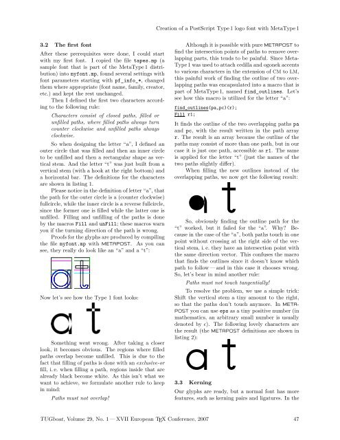
Now let’s see how the Type 1 font looks:<br />
Something went wrong. After taking a closer<br />
look, it becomes obvious. The regions where filled<br />
paths overlap become unfilled. This is due to the<br />
fact that filling of paths is d<strong>one</strong> with an exclusive-or<br />
fill, i. e. when filling a path, regions inside that are<br />
already black become white. As this isn’t what we<br />
want to achieve, we formulate another rule to keep<br />
in mind:<br />
Paths must not overlap!<br />
To resolve the problem, we use a simple trick:<br />
Shift the vertical stem a tiny amount to the right,<br />
so that the paths don’t touch anymore. In META-<br />
POST you can use eps <strong>as</strong> a tiny positive number (in<br />
mathematics, an arbitrary small number is usually<br />
denoted byǫ). The following lovely characters are<br />
the result (the METAPOST definitions are shown in<br />
listing 2):<br />
a t<br />
3.3 Kerning<br />
Our glyphs are ready, but a normal font h<strong>as</strong> more<br />
features, such <strong>as</strong> kerning pairs and ligatures. In the<br />
<strong>TUG</strong>boat, Volume <strong>29</strong>, No. 1 — XVII European TEX Conference, 2007 47


