Munsell - X-Rite
Munsell - X-Rite
Munsell - X-Rite

You also want an ePaper? Increase the reach of your titles
YUMPU automatically turns print PDFs into web optimized ePapers that Google loves.
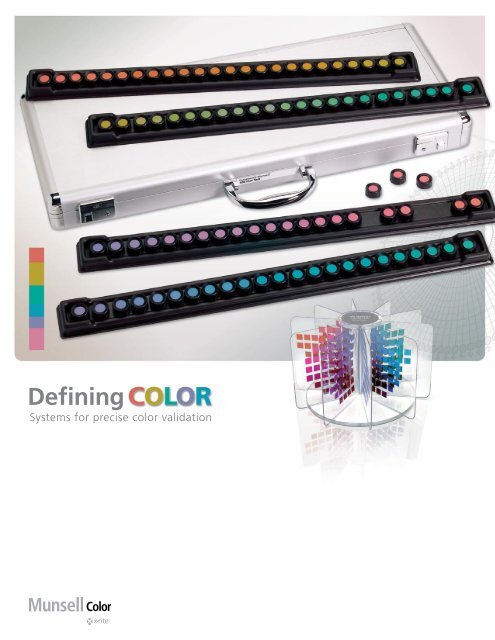
Defining<br />
Systems for precise color validation
The Value of Color<br />
is a difference maker.<br />
has the power to attract. To engage. To embrace.<br />
inspires. Enlightens. Energizes.<br />
Color brings vitality to everything we do. Whether developing a corporate identity,<br />
a brand, a new product, color has the power to create an impression that separates<br />
your image or product from everyone else’s. It is, for many, the defining element of<br />
your product’s personality.<br />
Defining your color and ensuring its accuracy every time it appears is fundamental<br />
to long-term success. X-<strong>Rite</strong> is a global leader in quantitative color measurement<br />
and visual analysis. We pioneer innovative solutions that are scalable from a single<br />
location to a global, multi-facility enterprise. The results are improvements in productivity,<br />
time-to-market, and profitability.<br />
Our <strong>Munsell</strong> Color enhances your ability to standardize color specification, viewing<br />
and measurement — tools that simplify color communication and minimize guesswork<br />
and misunderstanding.<br />
We’re ready to help you make a difference with your color program.
<strong>Munsell</strong>: The Universal<br />
Language of Color<br />
<br />
Everyone perceives color differently. But there are ways to ensure that everyone sees<br />
the color you want them to see. The <strong>Munsell</strong> Color Order System is an accepted<br />
method, worldwide, for precise color specification.<br />
The <strong>Munsell</strong> Color Order System<br />
At the beginning of the 20th century, Professor Albert H. <strong>Munsell</strong> brought clarity<br />
to color communication by establishing an orderly system for accurately identifying<br />
every color that exists. <strong>Munsell</strong> based his system on what he defined as “perceived<br />
equidistance,” the human visual system’s perception of color.<br />
The <strong>Munsell</strong> Color Order System is a three-dimensional model based on the premise<br />
that each color has three qualities or attributes: hue, value and chroma. <strong>Munsell</strong><br />
established numerical scales with visually uniform steps for each of these attributes.<br />
In <strong>Munsell</strong> notation, each color has a logical relationship to all other colors. This<br />
leads to endless creative possibilities in color choices, as well as the ability to<br />
precisely communicate these choices.<br />
Hue<br />
Hue (H) is the actual “color” that follows a<br />
natural order of red (R), yellow (Y), green (G),<br />
blue (B) and purple (P); designated principle<br />
hues. Between each were intermediate hues<br />
yellow-red (YR), green-yellow (GY), bluegreen<br />
(BG), purple-blue (PB) and red-purple<br />
(RP). Arranged in an equally divided circle,<br />
these colors form the <strong>Munsell</strong> Hue Circle.<br />
<strong>Munsell</strong> Hue Circle<br />
Hue<br />
Symbol<br />
Hue<br />
Symbol<br />
Red<br />
R<br />
Blue-Green<br />
BG<br />
Yellow-Red<br />
YR<br />
Blue<br />
B<br />
Yellow<br />
Y<br />
Purple-Blue<br />
PB<br />
Green-Yellow<br />
GY<br />
Purple<br />
P<br />
Green<br />
G<br />
Red-Purple<br />
RP
Value<br />
Value (V) indicates the lightness of a color. The scale of<br />
value ranges from 0 for pure black to 10 for pure white.<br />
Black, white and the grays between them are called<br />
“neutral colors.” They have no hue. Colors that have a<br />
hue are called “chromatic colors.” The value scale<br />
applies to chromatic as well as neutral colors.<br />
Chroma<br />
Chroma (C) is the degree of departure of a color from the neutral color of the same<br />
value. Colors of low chroma are sometimes called “weak,” while those of high<br />
chroma are said to be “highly saturated,” “strong” or “vivid.” The chroma scale<br />
starts at zero, for neutral colors, but there is no arbitrary end to the scale. As new<br />
pigments have become available, <strong>Munsell</strong> color chips of higher chroma have been<br />
made for many hues and values. The chroma scale for normal reflecting materials<br />
extends beyond 20 in some cases. Fluorescent materials may have chromas as high<br />
as 30.<br />
How <strong>Munsell</strong><br />
Color Notation Works<br />
All colors are arranged three-dimensionally according to hue, value and chroma<br />
creating the <strong>Munsell</strong> Color Space. Each color has a specific <strong>Munsell</strong> color notation<br />
from which you can easily visualize the color. Using the <strong>Munsell</strong> nomenclature HV/C,<br />
our vivid red example would have the <strong>Munsell</strong> notation 5R 6/14. 5R is the hue (red),<br />
6 is the value (moderately light), and a 14 chroma indicates a highly chromatic color.<br />
When a finer division is needed for any of the<br />
attributes, decimals are used. For example, 5.3R<br />
6.1/14.4. When the hues of the primary hue<br />
circle are used, the notation is written in the<br />
same way, for example 2B’ 5/4. The notation<br />
for a neutral color is written: NV/. The chroma<br />
of a neutral color is zero, but it is customary to<br />
omit the zero in the notation. The notation N<br />
1/ denotes a black, a very dark neutral, while<br />
N 9/ denotes a white, a very light neutral. This<br />
notation for a middle gray is N 5/.
<strong>Munsell</strong> Color Space<br />
<strong>Munsell</strong> hue, value and chroma can be varied independently so that all<br />
colors can be arranged according to the three attributes in a threedimensional<br />
space. The neutral colors are placed along a vertical line, called<br />
the “neutral axis,” with black at the bottom, white at the top, and all grays<br />
in between. The different hues are displayed at various angles around the<br />
neutral axis. The chroma scale is perpendicular to the axis, increasing<br />
outward. This three-dimensional arrangement of colors is called the<br />
“<strong>Munsell</strong> color space.”<br />
Lightbooths<br />
<br />
<strong>Munsell</strong> Color Solid<br />
All colors lie within a specific region of <strong>Munsell</strong> color space called the<br />
“<strong>Munsell</strong> color solid.” Hue is limited to one turn around the circle. The scale<br />
of value is limited on the lower end by pure black, which is as dark as a<br />
color can be, and on the top by pure white, which is as light as a color can<br />
be. For a given value, there is a limit to the chroma that is possible, even<br />
with theoretically ideal coloring agents. Real coloring agents, with less than<br />
ideal characteristics, impose further limitations on physical representations<br />
of the color solid. The <strong>Munsell</strong> Color Order System itself is applicable to all<br />
possible colors. The highest chroma yellow colors have rather high values,<br />
while the highest chroma blue colors have lower values.<br />
An International Standard<br />
The <strong>Munsell</strong> color order system is recognized<br />
internationally by the following standards:<br />
• American National Standards Institute<br />
— ANSI Z138.2<br />
• Japanese Industrial Standard for Color<br />
— JIS Z872<br />
• German Standard Color System<br />
— DIN 6164<br />
• Several British national standards<br />
X-<strong>Rite</strong>’s Macbeth Lighting solutions<br />
complement the <strong>Munsell</strong> Color Order<br />
System through technology that simulates<br />
standard daylight to more accurately<br />
render color. This technology is further<br />
refined to permit accurate color viewing<br />
under all phases of daylight, including<br />
filtered tungsten halogen daylight, horizon<br />
daylight, blended daylight, and patented<br />
7-phosphor fluorescent daylight. Products<br />
also provide accurate nighttime performance<br />
for second and third shift color<br />
evaluations.<br />
The <strong>Munsell</strong> Color Order System has been widely used in many fields of<br />
color science, most notably as a model of uniformity for colorimetric spaces<br />
and has, itself, been the subject of many scientific studies.
<strong>Munsell</strong> Notation as Basis<br />
for Establishing Reliable<br />
Color Standards<br />
Consistency is essential to every color specification process or program. <strong>Munsell</strong><br />
Color allows you to produce the physical color standard or tool needed to validate<br />
your specific process. With a custom color standard it is possible for you to not only<br />
specify the color you want but to also determine the correct appearance aspects of<br />
that color for the proper reproduction.<br />
<strong>Munsell</strong> will match the physical or numerical standard you provide or work with you<br />
to clarify your color program. Among the options for developing standards are:<br />
QuickColor Standards<br />
For fast, economical color matching, QuickColor<br />
is a proof-free, quick custom color standard for<br />
interim, conceptual or seasonal applications.<br />
These include color standards that have a short<br />
life cycle - such as seasonal products - and preliminary<br />
color standards for new products during<br />
the design process. QuickColor standards are<br />
matched to the desired gloss level (8½” x 11”)<br />
paint-on-paper.
Custom Color Standards<br />
When precise color matching is critical to your success,<br />
present these stable, reproducible color standards<br />
to suppliers and anyone else who needs to match<br />
your colors. Simply submit your sample or provide<br />
numeric data and we’ll match the color and gloss<br />
and provide a proof for your approval. Each Custom<br />
Color Standard comes with a <strong>Munsell</strong> System notation.<br />
Color standards can be produced to match a variety<br />
of color and appearance characteristics including<br />
opaque, translucent, transparent, fluorescent, textured,<br />
pearlescent, and metallic. Custom Color Standards<br />
are matched to the desired gloss level (8½” x 11”) for<br />
paint-on-paper.<br />
<br />
Color Control Panels<br />
For precise color communication, specification, and visual evaluation, this option<br />
provides a physical standard for the communication and specification of color and<br />
appearance to your vendors and raw materials suppliers. They are available in<br />
variations of 3” x 5” formats or custom sizes.<br />
• The single-color control panel represents the master standard or specific<br />
target color. It provides a reference for visual assessment or a target for<br />
color matching with an instrument-based color system.<br />
• The two-step painted panel represents either of a min/max tolerance range<br />
for two colors or an appearance standard for a single color at two gloss<br />
levels. For visual assessment of products with wider tolerances, the threestep<br />
painted panel includes the target color plus two tolerance limits.<br />
Each labeled panel is packaged in a light-proof envelope with the notation and data<br />
needed to ensure accurate color reproduction. Color control panels can be produced<br />
in a variety of painted substrates or textured surfaces. They are also available<br />
in a washable form for applications requiring a more durable, cleanable surface,<br />
such as food applications.
Color Tolerance Sets<br />
Used to improve color quality control among buyers and suppliers, these are ideal for<br />
multi-component products manufactured in different geographic locations. Designed<br />
to reduce time and materials and accelerate time-to-market, the tolerance sets provide<br />
a visual criteria for evaluating finished goods. The Color Tolerance Set shows the<br />
target color plus acceptable limits held in tolerance around the ideal or centroid color.<br />
You determine the tolerance limits and criteria for communicating the tolerances. The<br />
tolerance limits are all defined as being a Light, Dark, Red, Green, Blue or Yellow limit<br />
when compared to the target color. The different types of Color Tolerance Sets are<br />
defined by the number of limits that are incorporated into the Color Tolerance Set.<br />
So a seven-step Color Tolerance Set would have a target color plus a Light limit, Dark<br />
limit, Red limit, Green limit, Blue limit and Yellow limit.
X-<strong>Rite</strong> family of products<br />
<br />
The Color Tolerance Sets are available in<br />
four configurations:<br />
• Three-Step = target + two limits<br />
• Seven-Step = target + six limits<br />
• Nine-Step = target + six limits + two gloss levels<br />
• Ten-Step = target + six limits + three gloss levels<br />
Texture Paint-on-Paper Color Standards<br />
Accurately reproduce your color standards in a surface<br />
texture with an option that produces a texture profile<br />
as well as the color of your specific product. Spatterpainted<br />
standards are available in fine, medium or<br />
coarse textures.<br />
With <strong>Munsell</strong> Color being a part of<br />
X-<strong>Rite</strong>, we have at our disposal the<br />
industry leading color measurement<br />
tools and solutions. This means that<br />
the production of the color standards<br />
are controlled accurately but we are<br />
also capable of communicating the<br />
color in proper numerical format in<br />
addition to the <strong>Munsell</strong> Notation for<br />
the industry that it is used in. The<br />
use of the Macbeth lighting products<br />
means that we can evaluate the color<br />
of the standards accurately and be<br />
assured that they will visually match.
10<br />
ColorChecker Systems<br />
for Ensuring Photorealistic<br />
Color Reproduction<br />
A snow-capped mountain peak. An endless wilderness vista in autumn. A<br />
work of fine art as if the artist’s hand has just touched the canvas. It is every<br />
visual artist’s dream to capture the perfect image and make it come to life.<br />
And yet, the reality of ensuring accurate color reproduction is a significant<br />
challenge.<br />
<strong>Munsell</strong> Color responds to this challenge with a suite of proven solutions that<br />
provide the freedom and the capability to reproduce vivid, natural images as<br />
they are meant to be seen.<br />
ColorChecker<br />
The ColorChecker is a checkerboard array of 24 scientifically prepared colored<br />
squares in a wide range of colors. Many of these squares represent natural<br />
objects of special interest, such as human skin, foliage and blue sky. These<br />
squares are not only the same color as their counterparts, but also reflect light<br />
the same way in all parts of the visible spectrum. Because of this unique<br />
feature, the squares will match the colors of natural objects under any<br />
illumination and with any color reproduction process.<br />
The ColorChecker provides a totally non-subjective standard of comparison to<br />
help determine the true color balance of any color rendition system. It provides<br />
the needed standard for comparing, measuring and analyzing differences in<br />
color reproduction in various processes, thereby avoiding costly mistakes.<br />
Some of its applications include:<br />
• Digital Photography: Check images, output, monitors<br />
• Traditional Photography: Check films, lights, filters and paper<br />
• Graphic Arts: Check any printing or proofing process<br />
• Digital Imaging: Check scanners, monitors and proofing devices<br />
• Cinematography, Television and Video: Check cameras, monitors,<br />
lights and film.
Mini ColorChecker<br />
The Mini ColorChecker, a smaller, pocket-sized version of the<br />
ColorChecker, just 3¼” x 2¼,” for on-the-job convenience<br />
11<br />
Digital ColorChecker SG<br />
The Digital ColorChecker Semi Gloss (SG) is specifically<br />
designed for digital photography. It is used with digital<br />
camera profiling to ensure the consistency of captured<br />
images.<br />
The system is designed to mirror all the colors you can see:<br />
• 140 patches chosen specifically for their location in color space expand the<br />
color gamut and allow you to create profiles that capture the full capabilities<br />
of your digital camera and scanner.<br />
• Includes standard ColorChecker chart colors. Many of these squares represent<br />
natural objects of special interest, such as human skin, foliage and blue sky.<br />
These squares are not only the same color as their counterparts, but also<br />
reflect light the same way in all parts of the visible spectrum.<br />
• More skin-tone reference colors deliver greater accuracy and consistency<br />
over a wide variety of skin tones.<br />
• Gray scale steps provide accurate control of camera balance and<br />
maintain a neutral aspect regardless of light source.<br />
• Sturdy, standardized target size of 8½” x 11” (21.6 x 27.9 cm)<br />
easily fits into a full frame shot.<br />
The Digital ColorChecker SG chart<br />
includes the highest quality color<br />
reference standards available. X-<strong>Rite</strong><br />
and the <strong>Munsell</strong> Color manufacture<br />
products in conformance with the<br />
accreditation practices and procedures<br />
for ISO conformance. All production<br />
instrumentation and equipment is<br />
traceable to NIST.
12<br />
ColorChecker White Balance, Gray Balance, and Gray Scale Products for<br />
Digital Photography<br />
The perceived color of white often changes based on ambient conditions. Outdoors<br />
it is perceived to be cooler, indoors it is perceived to be warmer, and under<br />
fluorescent light it is perceived to be greener. Even in a controlled studio<br />
environment, it is necessary to establishing an accurate custom white balance to<br />
ensure an accurate image from the start of each photo session.<br />
<strong>Munsell</strong> ColorChecker White Balance and Gray Scale products are convenient tools<br />
that give photographers the information needed to adjust the digital camera’s color<br />
sensitivity to exactly match the ambient lighting conditions; to, in effect, change<br />
what that the camera sees.<br />
White Balance products are scientifically engineered to provide a precise uniform<br />
surface that is spectrally neutral (reflects equal amounts of red, blue and green) in<br />
all light conditions. The photographer can now have confidence that the camera’s<br />
raw image is as close to real life as possible.<br />
Gray Scale cards serve as an ideal first reference shot in a series to easily correct<br />
image color under most lighting conditions by balancing on the mid-tone gray<br />
value. For the studio photographer, the ColorChecker Gray Scale permits quick<br />
set-up of the proper studio lighting ratio between main and fill lights for capturing<br />
accurate color without a lot of after-the-fact manipulation. In addition, the<br />
ColorChecker Gray Scale provides reference values that can quickly be checked and<br />
used to adjust colors within most common photo processing software packages.
White Balance, Gray Balance, and Gray Scale<br />
solutions enhance overall photo quality by providing:<br />
13<br />
• A precise, uniform surface that is spectrally neutral<br />
under all lighting conditions<br />
• Assurance that the digital camera’s raw image<br />
accurately portrays real life<br />
• Reference values to check and adjust colors<br />
• The ability to instantly correct color images by setting<br />
the mid-tone gray value<br />
• Quick setup of proper studio lighting ration between<br />
main and fill lights<br />
Lighting audits/certification<br />
ColorChecker White Balance and<br />
Gray Scale Products include:<br />
ColorChecker White Balance<br />
• A full-size version of the white reference square used<br />
in the standard 24-patch ColorChecker<br />
• ColorChecker Mini Gray Balance and Mini White<br />
Balance cards<br />
• Pocket-size (4” x 7”) versions of the 18% gray<br />
reference square and the white reference square<br />
used in the standard 24-patch ColorChecker<br />
ColorChecker Gray Scale<br />
• A full-size version of the white, 18% gray and black<br />
reference square used in the standard 24-patch<br />
ColorChecker<br />
ColorChecker Mini Gray Scale card<br />
• A pocket-size (3¼” x 2¼”) version of the white, 18%<br />
gray and black reference square used in the standard<br />
24-patch ColorChecker<br />
X-<strong>Rite</strong>’s Macbeth Lighting solutions<br />
provide opportunities to optimize viewing<br />
conditions and comply with major<br />
industry standards. X-<strong>Rite</strong> technicians<br />
and technology are employed to conduct<br />
lighting audits and introduce solutions<br />
that ensure consistent, accurate<br />
color viewing. This program extends<br />
to lighting system certification — from<br />
ensuring equipment meets ISO, ANSI<br />
and other standards to recalibrating<br />
equipment and instrumentation.
14<br />
<strong>Munsell</strong> Vision Tests<br />
for Effectively Evaluating<br />
Color Acuity<br />
Getting the color right is as important as getting the right color, and it begins<br />
in-house with the people who communicate your color to your customers.<br />
It is the ability to effectively and consistently see color that allows individuals<br />
to articulate the color information that needs to be communicated to<br />
manufacturing processes, assembly, packaging, promotion — all aspects of<br />
your operation. This means it is equally important to be able to certify that the<br />
individuals responsible for critical color evaluations can successfully discern<br />
and communicate color assessments. <strong>Munsell</strong> Color provides tools for<br />
assessing this capability.<br />
Farnsworth-<strong>Munsell</strong> 100 Hue Test<br />
This easy-to-administer test is a highly effective method for measuring an<br />
individual’s color vision. Used by governments and industry for over 40 years,<br />
the test is used to evaluate and rank color acuity. The test consists of four<br />
trays containing a total of 85 removable color reference caps (incremental hue<br />
variation) spanning the visible spectrum. Color vision aptitude is detected by<br />
the ability of the test subject to place the color caps in order of hue.
Typical applications of this test include:<br />
• Examination of inspectors of color goods, color<br />
graders and color matchers<br />
• Testing for type and degree of color deficiency<br />
• Analysis of color vision of in-house and field staff<br />
• Selection of applicants for vocational training<br />
• Design of color vision tests<br />
• Independent control for measuring the validity of<br />
other color vision tests<br />
15<br />
FM 100 Hue Test Scoring Software<br />
The Farnsworth-<strong>Munsell</strong> Hue Test Scoring Software<br />
expedites and simplifies scoring of the FM 100 Hue Test<br />
and provides a powerful set of analytical and<br />
administrative tools. Results can be saved, displayed in<br />
polar or linear format, and filtered or analyzed according<br />
to a variety of algorithms.<br />
Farnsworth-<strong>Munsell</strong> Dichotomous D-15 Test<br />
An abridged version of the FM 100 Hue Test for<br />
screening color vision defects only. The D-15 Test is<br />
intended for the detection of color vision defects such as<br />
red-green and blue-yellow deficiencies as opposed to<br />
color acuity. The test consists of a reference cap and 15<br />
removable chips of incremental hue variation.<br />
<strong>Munsell</strong> Color Books<br />
<strong>Munsell</strong> Color books are as versatile as<br />
they are inspirational. Individual colors<br />
are available in 8” x 10” sheet format for<br />
use as reference samples and standards.<br />
They are ideal for establishing precise<br />
color standards between multiple sites<br />
and designers. They are a reliable tool<br />
for verifying color consistency between<br />
production runs.
16<br />
<strong>Munsell</strong> Reference Books<br />
Bring Order to Color<br />
Communication<br />
Choosing the right color for your business or product is just the first step. Assuring<br />
that it communicates in a variety of single- and multi-dimensional formats is equally<br />
important. The only way to accomplish this is to have a full range of choices<br />
available.<br />
You have them with <strong>Munsell</strong> Color. <strong>Munsell</strong> wrote the<br />
book on color... many books, in fact. More than just<br />
a collection of colors, <strong>Munsell</strong> Color books are the<br />
physical representation of the points within the <strong>Munsell</strong><br />
Color Order System. They allow the user to specify any<br />
color within the spectrum, even if it does not appear<br />
in the book. And while <strong>Munsell</strong> books are designed to<br />
serve as color guides they can also be used for<br />
establishing communication standards. It is this<br />
flexibility that allows us to supply the color you need to<br />
give your product the look it deserves.<br />
<strong>Munsell</strong> Book of Color<br />
The master atlas of <strong>Munsell</strong> Color, this book contains<br />
over 1,600 removable high-gloss color samples on 40<br />
constant-hue pages. Additional pages of <strong>Munsell</strong> grays,<br />
supplementary accent colors and 37-step neutral value<br />
chart are also included. Individual colors may be<br />
purchased separately in 8½” x 11” full sheets.<br />
Matte Finish Collection<br />
For projects that require colors without surface gloss, the Matte Finish Collection<br />
gives you over 1,300 permanently mounted matte color samples on 40<br />
constant-hue pages. Additional 31-step neutral value chart is also included.<br />
Individual colors may be purchased separately in 8½” x 11” full sheets.
Nearly Neutrals ® Collection<br />
This collection of over 1,100 pastel colors is ideal for projects that<br />
require neutral, subtle colors. The matte color samples are mounted<br />
on 20 constant hue pages plus one Nearly Whites ® constant-value<br />
page. Individual colors may be purchased separately in 8½” x 11”<br />
full sheets.<br />
17<br />
<strong>Munsell</strong> Sheets of Color<br />
All of the colors displayed in any of the <strong>Munsell</strong> Books of Color can<br />
be purchased as an individual 8” x 10” sheet of color. These sheets<br />
are useful tools for developing standards and certified color samples.<br />
Government and Industry Standards<br />
<strong>Munsell</strong> Color has been involved in the production of physical color communication<br />
and specification devices for over 70 years. Over this time we have developed<br />
solutions adopted by numerous government and industrial organizations, such as<br />
ANSI grays and safety standards, and NEMA and electric power industry standards.<br />
Color Coding Charts<br />
A selection developed for color coding of wire and cable insulation and by<br />
Electronic Industries Association (EIA RS359-A) for use with electronics<br />
components. Includes ten 8½” x 11” color charts in a binder: red, orange, brown,<br />
yellow, green, blue, violet (purple), white, gray (slate) and black. Each chart defines<br />
the centroid (ideal) color and the permissible visual tolerances.<br />
Supplemental booklets are also available for the following:<br />
• EIA color coding charts for the telecommunications and<br />
fiber optics industries<br />
• EIA-TIA 598-A Aqua color coding chart<br />
• EIA-TIA 598-B Rose color coding chart
18<br />
Plant Tissue Color Charts<br />
A color guide for botanists, this collection of 17 <strong>Munsell</strong> Color Charts is designed to<br />
provide a means for the exact determination and permanent recording of the color<br />
of plant tissues. In particular, it aims to facilitate the diagnosis of adverse conditions<br />
responsible for the deterioration of plants and to serve as a stepping stone to soil<br />
and plant tissue analyses.<br />
The color plant tissues reflect the influence of light, critical<br />
temperatures, and the chemical composition of the soil,<br />
especially when the soil is deficient in certain major or minor<br />
nutrient elements. Sometimes the color of plant tissue reveals<br />
the genetic origin of plants, effect of toxic substances, or the<br />
action of parasitic organisms. Charts provide scientists,<br />
students, and plant growers with information needed to<br />
respond to problems related to taxonomy, genetics,<br />
physiology, pathology, and plant nutrition.<br />
Soil Color Charts<br />
Developed jointly by <strong>Munsell</strong> Color and the USDA<br />
Soil Conservation Service, these 9 charts are used<br />
to classify soil colors and judge rocks, hydric soils,<br />
archeological samples, and other natural products.<br />
Agronomists, biologists, archeologists, geologists,<br />
zoologists, and other scientists use these charts to<br />
document specimen colors. The charts include color<br />
name diagrams, soil structure diagrams, and masks.<br />
Individual replacement pages are available, as well<br />
as charts for semi-tropical soils, Australian soil, and<br />
Southeast Asia and glauconile soils. New edition<br />
washable charts for soil color classification are<br />
also available.
USDA Food Standards<br />
<strong>Munsell</strong> Color maintains an ongoing program<br />
for development of USDA food color standards.<br />
The current list includes:<br />
19<br />
• Frozen French Fry Standard<br />
• Canned Ripe Olives Standard<br />
• Tomato Grade A & C<br />
• Maple Syrup Standards<br />
• Molasses Standards<br />
• Honey Standards<br />
• Canned Tomato Color Standard<br />
• Frozen Cherries Color Standard<br />
• Pumpkin/Squash Color Standards<br />
Lists are update periodically.<br />
Call 877-888-1720 for more information.<br />
Neutral Value Scales (Gray Scales)<br />
The <strong>Munsell</strong> Neutral Value Scale is a 37-step<br />
gray scale fan deck with values of 0.5/ to 9.5/, in<br />
quarter step intervals. <strong>Munsell</strong> notation and %<br />
reflectance for CIE Illuminant C printed for each<br />
color. Size of each neutral chip 3” x 2” x ¾” and<br />
it is available in glossy or matte finish editions.
20<br />
<strong>Munsell</strong> Educational Tools<br />
for Developing Color<br />
Knowledge and Application<br />
Nuance is an elemental aspect of color. The more one knows about the nuances in<br />
color and how they work, the more one can effectively apply color in any form of<br />
communication. <strong>Munsell</strong> Color provides a selection of resources for learning more<br />
about color and color space. These resources are intelligently illustrated and feature<br />
exercises that give participants a real-world perspective on color and its successful<br />
application.<br />
<strong>Munsell</strong> Color Tree<br />
This attractive, three-dimensional model makes it easy to comprehend the <strong>Munsell</strong><br />
three-dimensional color space. It features 309 printed colors representing the constant<br />
hues, mounted on clear acrylic panels, assembled on a acrylic base. Height 10<br />
1/2” Width 16” , Base Diameter 13.5”.
21<br />
Fundamentals of Color and Appearance Book<br />
This reference guide to basic color theory and practical application is written in<br />
easy to understand terms. It provides an introduction to the basics of color and<br />
appearance, including quantifying color, visual quality control, instrumentation,<br />
instrumental quality control and a comprehensive glossary of common color and<br />
appearance terms. It also serves as a guide to establishing a color quality control<br />
program.<br />
Fundamentals of Color Interactive Student Set<br />
The <strong>Munsell</strong> Student Set is published by Fairchild Books and Visuals and is designed<br />
to teach the <strong>Munsell</strong> System and the concept of three-dimensional color space.<br />
Students build color knowledge by arranging color chips on blank charts. The set<br />
includes 11 charts — one for each of 10 hues, plus 1 hue, value/chroma (H V/C)<br />
chart showing hue circle, value scale, and chroma scale. Also includes The <strong>Munsell</strong><br />
Color System — A Language for Color workbook by Joy Turner Luke.<br />
<strong>Munsell</strong> System Wall Chart<br />
The <strong>Munsell</strong> System at a glance, this poster-sized (25” x 38”) wall chart displays the<br />
<strong>Munsell</strong> System — featuring the 10-step hue circle, 8-step gray scale, and 6-step<br />
red chroma scale — for all trainees and staff to see.
22<br />
Solutions for All of Your<br />
Color Requirements<br />
From color education to establishing color standards to verifying color reproduction<br />
in all forms of product development and communication, X-<strong>Rite</strong> can help you<br />
implement a color management system that assures the highest levels of color<br />
quality and appearance. We provide the technology, the systems and the services<br />
to make every step of the color management process accurate, productive, and<br />
cost efficient.<br />
For more information, call us today at 877-888-1720 or visit xrite.com.
Process Description Key X-<strong>Rite</strong> products and services<br />
23<br />
Design<br />
Master standard<br />
Product concept and colors<br />
Corporate standards for colors<br />
Color standards, lighting,<br />
books of color,<br />
spectrophotometers, software<br />
Color standards<br />
Formulation<br />
Manufacturing of dyestuffs,<br />
textiles, inks, paints, coatings and<br />
plastics<br />
Instrumentation, software,<br />
lighting<br />
Part production<br />
In-process color control<br />
Instrumentation, software,<br />
lighting, testing,<br />
Final QC<br />
Inspection of finished parts<br />
Instrumentation, software,<br />
lighting, testing,<br />
auditing, color standards<br />
Color harmony<br />
Assurance of uniform color when<br />
parts are assembled into final<br />
product<br />
Lighting, color standards (color<br />
tolerance cards)<br />
Corporate QC<br />
Verification of color harmony and<br />
conformance with customer color<br />
specifications<br />
Testing, auditing<br />
Retail<br />
Customer inspection of incoming<br />
goods both at point of delivery<br />
as well as point of display<br />
Lighting, testing, auditing,<br />
consulting color standards<br />
Testing, auditing<br />
Merchandising<br />
Assurance of good color match<br />
between products and<br />
promotional materials (brochures,<br />
catalogs, sell sheets, packaging,<br />
point-of-purchase displays)<br />
Lighting, testing, auditing,<br />
consulting color standards<br />
Spectrophotometers,<br />
densitometers, lighting
24<br />
Refining the science of<br />
To define color through precise color validation systems,<br />
contact <strong>Munsell</strong> Color at 877-888-1720 or visit munsell.com.<br />
X-<strong>Rite</strong> World Headquarters<br />
Grand Rapids, Michigan USA • (800) 248-9748 • +1 616 803 2100<br />
© 2007, X-<strong>Rite</strong>, Incorporated. All rights reserved.<br />
L10-315 (07/18)