Create successful ePaper yourself
Turn your PDF publications into a flip-book with our unique Google optimized e-Paper software.
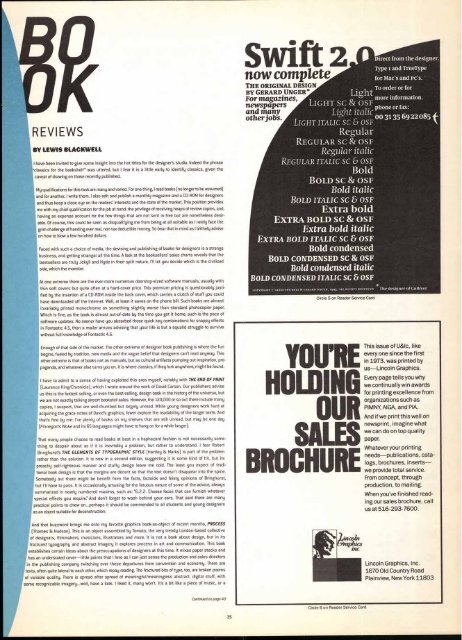
REVIEWS<br />
BY LEWIS BLACKWELL<br />
I have been invited to give some insight into the hot titles for the designer's studio. Indeed the phrase<br />
classics for the bookshelf" was uttered, but I fear it is a little early to identify classics, given the<br />
caveat of drawing on those recently published.<br />
My qualifications for this task are many and varied. For one thing, I read books [no longer to be assumed)<br />
and for another, I write them. I also edit and publish a monthly magazine and a CD-ROM for designers<br />
and thus keep a close eye on the readers' interests and the state of the market. This position provides<br />
me with my chief qualification for the job at hand: the privilege of receiving heaps of review copies, and,<br />
having an expense account for the few things that are not sent in free but are nonetheless desir-<br />
able. Of course, this could be seen as disqualifying me from being at all suitable as I rarely face the<br />
grim challenge of handing over real, non tax deductible money. So bear that in mind as I blithely advise<br />
on how to blow a few hundred dollars.<br />
Faced with such a choice of media, the devising and publishing of books for designers is a strange<br />
business, and getting stranger all the time. A look at the booksellers' sales charts reveals that the<br />
bestsellers are truly Jekyll and Hyde in their split nature. I'll let you decide which is the civilized<br />
side, which the monster.<br />
At one extreme there are the ever-more numerous doorstop-sized software manuals, usually with<br />
thin soft covers but quite often at a hard-cover price. This premium pricing is questionably justi-<br />
fied by the insertion of a CD-ROM inside the back cover, which carries a clutch of stuff you could<br />
have downloaded off the Internet. Well, at least it saves on the phone bill. Such books are almost<br />
invariably printed monochrome on something slightly worse than standard photocopier paper.<br />
Which is fine, as the book is almost out-of-date by the time you get it home, such is the pace of<br />
software updates. No sooner have you absorbed those quick key combinations for snappy effects<br />
in Fontastic 4.5, than a mailer arrives advising that your life is but a squalid struggle to survive<br />
without full knowledge of Fontastic 4.6.<br />
Enough of that side of the market. The other extreme of designer book publishing is where the fun<br />
begins, fueled by tradition, new media and the vague belief that designers can't read anyway. This<br />
other extreme is that of books not as manuals, but as cultural artifacts pumping out inspiration, pro-<br />
paganda, and whatever else turns you on. It is where classics, if they lurk anywhere, might be found.<br />
I have to admit to a sense of having exploited this area myself, notably with THE END OF PRINT<br />
(Laurence King/Chronicle), which I wrote around the work of David Carson. Our publishers advise<br />
us this is the fastest selling, or even the best-selling, design book in the history of the universe, but<br />
we are not exactly talking airport bookstall sales. However, the 120,000 or so out there include many<br />
copies, I suspect, that are well-thumbed but largely unread. While young designers work hard at<br />
acquiring the grace notes of David's graphics, fewer explore the readability of the longer texts. And<br />
that's fine by me: I've plenty of books on my shelves that are still unread, but may be one day<br />
(Finnegan's Wake and its 65 languages might have to hang on for a while longer).<br />
That many people choose to read books at best in a haphazard fashion is not necessarily some-<br />
thing to despair about as if it is inevitably a problem, but rather to understand. I fear Robert<br />
Bringhurst's THE ELEMENTS OF TYPOGRAPHIC STYLE (Hartley & Marks) is part of the problem<br />
rather than the solution. It is now in a second edition, suggesting it is some kind of hit, but its<br />
preachy self-righteous manner and stuffy design leave me cold. The least you expect of tradi-<br />
tional book design is that the margins are decent so that the text doesn't disappear into the spine.<br />
Somebody out there might be benefit from the facts, factoids and feisty opinions of Bringhurst,<br />
but I'll have to pass. It is occasionally amusing for the fatuous nature of some of the advice, always<br />
summarized in neatly numbered maxims, such as: "6.2.2. Choose faces that can furnish whatever<br />
special effects you require." And don't forget to wash behind your ears. That said there are many<br />
practical points to chew on...perhaps it should be commended to all students and young designers<br />
as an object suitable for deconstruction.<br />
And that buzzword brings me onto my favorite graphics book-as-object of recent months, PROCESS<br />
(Thames & Hudson). This is an object assembled by Tomato, the very trendy London-based collective<br />
of designers, filmmakers, musicians, illustrators and more. It is not a book about design, but in its<br />
fractured typography and abstract imagery it explores process in art and communication. This book<br />
establishes certain ideas about the preoccupations of designers at this time. It mixes paper stocks and<br />
has an understated cover—little points that I love as I can just sense the production and sales directors<br />
in the publishing company twitching over these departures from convention and economy. There are<br />
texts, often quite lateral to each other, which repay reading. The fractured bits of type, too, are broken poems<br />
of variable quality. There is spread after spread of meaningful/meaningless abstract digital stuff, with<br />
some recognizable imagery...well, have a look. I liked it, many won't. It's a bit like a piece of music, or a<br />
Continued on page 40<br />
35<br />
now complete<br />
THE ORIGINAL DESIGN<br />
BY GERARD UNGER*<br />
YOU'RE<br />
HOLDING<br />
OUR<br />
SALES<br />
BROCHURE<br />
Direct from the designer.<br />
Type -1 and TrueType<br />
for Mac's and PC's.<br />
Light To order or for<br />
For magazines,<br />
more information,<br />
newspapers LIGHT SC & OSF<br />
phone or fax:<br />
and many<br />
Light ight italic<br />
other jobs.<br />
00 31 35 69 22 085<br />
LIGHT ITALIC SC & OSF<br />
Regular<br />
REGULAR SC & OSF<br />
Regular italic<br />
REGULAR ITALIC SC & OSF<br />
Bold<br />
BOLD SC & OSF<br />
Bold italic<br />
BOLD ITALIC Sc & OSF<br />
Extra bold<br />
EXTRA BOLD SC & OSF<br />
Extra bold italic<br />
EXTRA BOLD ITALIC SC & OSF<br />
Bold condensed<br />
BOLD CONDENSED SC & OSF<br />
Bold condensed italic<br />
BOLD CONDENSED ITALIC SC & OSF<br />
COPYRIGHT C) LINO1YPE-HELL & GERARD UNC.ER, 1995, ALL RIGHTS RESERVED<br />
Circle 5 on Reader Service Card<br />
Circle 6 on Reader Service Card<br />
The designer of Gulliver<br />
This issue of U&Ic, like<br />
every one since the first<br />
in 1973, was printed by<br />
us—Lincoln Graphics.<br />
Every page tells you why<br />
we continually win awards<br />
for printing excellence from<br />
organizations such as<br />
PIMNY, AIGA, and PIA.<br />
And if we print this well on<br />
newsprint, imagine what<br />
we can do on top quality<br />
paper.<br />
Whatever your printing<br />
needs—publications, catalogs,<br />
brochures, inserts—<br />
we provide total service.<br />
From concept, through<br />
production, to mailing.<br />
When you've finished reading<br />
our sales brochure, call<br />
us at 516-293-7600.<br />
Lincoln Graphics, Inc.<br />
1670 Old Country Road<br />
Plainview, New York 11803


