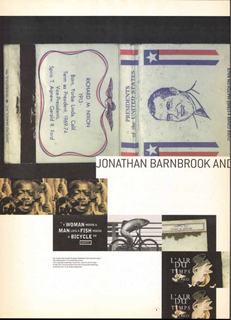
WOMAN NEEDS A MAN LIKE A FISH NEEDS A BICYCLE " Top: Jonathan Barnbr000k/Tony Kaye: Matchbook is their statement about their collaborations in the advertising industry. Left to right: Barnbrook/Kaye: Frames from a spot for Lair du Temps for Opera-RLC, Paris; Barnbrook: Fish ad for Guinness; Barnbrook/Kaye: Frames from the Lair du Temps collaboration. JONATHAN BARNBROOK AN[ Itial3'so,ci 44LE RICCI
HE IDEA OF CREATIVE COLLABORATION IS conundrum. THAT PARTNERS ARE SUPPOSED O BE IN TOTAL AGREEMENT OVER DEEPLY ERSONAL DECISIONS IS SO DIffiCOLT TO ATOM AS TO SEEM ALMOST IMPOSSIBLE. W 00 YOU REALLY SHARE THE ATTRI00 ION Of AN INTUITION THAT LIES AT THE ART Of THE CREATIVE PROCESS? HOW 00 00 EXPLAIN AND DISCUSS AND fORM THE RECISE AND YET UNEXPECTED ELEMENTS *VOLVED IN CREATIVE WORK? -ONY KAYE: W H ALb BY I.EWIS BA ACHWELI 9 With the occasional collaborations of British director Tony Kaye (based in Los Angeles) and designer/ director Jonathan Barnbrook (in London), such prob- lems are brushed aside. Collaboration across the globe has become a practical, routine activity. "Tony tends to just set you off on an area and let you get on with it," explains Barnbrook disarmingly of the partnership that has involved him in providing ani- mated typographic elements for Kaye's commer- cials. "He's very trusting; we both know what's good and what's not:' But while it is easy to agree on what is, say, a good and a bad apple, one would have thought it was a little less clear-cut with some animated type. Not so, it seems. "It's difficult to remember the process," says Barnbrook. "It is usually very quick. We will use the fax a lot. I will create much more than ever sees the light of day. But there is always a mutual respect, a concern with doing the best job:' Kaye is probably the single most powerful influ- ence in bringing animated type into commercials in the '90s, with a series of award-winning spots. He not only brought Barnbrook into contact with film in 1990, but has since pushed him forward as a director on the roster of Tony Kaye Films. This led to Barnbrook directing three of the multi-award- winning BBC Radio Scotland commercials in 1995, which have influenced a rash of animated typo- graphic commercials across Europe. Barnbrook continues to have much to offer to Kaye on the typographic front through his own development as a designer, now with a range of typefaces released besides his work in print. He admits to being drawn to work more fully in film, adding, "I am not sure how much more animated typography we want to see in commercials. There is also the frustration of being asked to work on a six-second end title and then having it cut to two- and-a-half seconds, as has just happened to me. I would like to try more live-action:' Kaye says his work with Barnbrook reflects his fascination with designing in film. "I started off as a designer, a not very good one, before I went into HEADLINE: ITC CONDUIT BOLD BYLINE/B10: ITC FLORINDA TEXT/CAPTIONS: ITC FLORINDA, ITC CONDUIT LIGHT, LIGHT ITALIC advertising. I've since been able to work with a lot of very good designers, but Jon stands out for his innate understanding of film. Once I introduced him to working in the medium, he immediately under- stood what a huge potential there was for him in film:' Like Barnbrook, Kaye describes the collaborative process in remarkably simple terms. He gives Barn- brook the words, an idea, and waits for the results. Typically, Barnbrook would not be able to see the film that might surround the typography while he is creating it. "In many ways, I think we have evolved beyond our earlier collaborative period. Now I am OT working on a feature and Jon is shooting his own things," says Kaye. But the mutual respect remains, the knowledge that each is stimulated by working with the other. Barnbrook knows that at some point he is expected to tackle the typography for Kaye's magnum opus, a personal film on abortion (500 hours-plus of foot- age currently shot). This could be a tough one, but it holds no fears for Barnbrook: "The thing about Tony is that whatever happens in a project, you know he is always working for the best result, that he cares passionately about it:' LEWIS BLACKWELL IS THE EDITOR Of THE LON00148ASEO COMMUNICATION ARTS MAGAZINE CREATIVE REVIEW.
- Page 2 and 3: 0 D ITC On Display. A resource that
- Page 4 and 5: iN VT 4) Message from ITC Collabora
- Page 6 and 7: # COLLABORATE, YOU COLLABOAATE, WE
- Page 10: Imageand Narrative:A Layered Thingi
- Page 13 and 14: d'image,musicand .air? mAhan de sta
- Page 16: Creative,5Hedonism BY ANDREA CODROI
- Page 20 and 21: hor BY JOYCE RUTTER *AVE
- Page 22 and 23: It's about ciel atir an, nvironmen
- Page 24 and 25: Have I Told You Abou Together, we c
- Page 26 and 27: iTO fONTS T M ITC WILD WEST OirLI 4
- Page 28 and 29: ITC Take one old s le roman type, t
- Page 30 and 31: When the Stork CIA closes . cdef cj
- Page 32 and 33: '50 cYfe-W, rvo; 11) PAJ AAil,r
- Page 34 and 35: gleg (Mat Sronto isissfeek.issuctge
- Page 36 and 37: ITC Resellers ITC typefaces, includ
- Page 38 and 39: (Continued from page 37) Helvetica
- Page 40 and 41: lisie is available at the following
- Page 42 and 43: ■■■■■tislellusinessIlirec
- Page 44: 1K—Km" .""""fvew'*ftw 5—DIGIT 9