Content Part "Form" - phpwcms-docu for phpwcms
Content Part "Form" - phpwcms-docu for phpwcms
Content Part "Form" - phpwcms-docu for phpwcms
You also want an ePaper? Increase the reach of your titles
YUMPU automatically turns print PDFs into web optimized ePapers that Google loves.
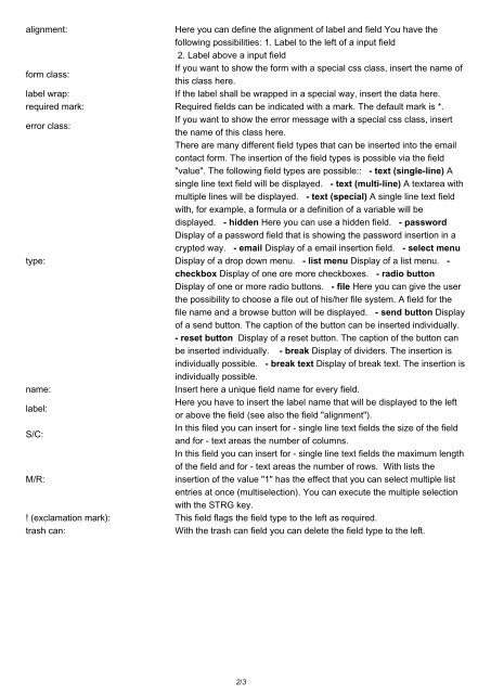
alignment:<br />
Here you can define the alignment of label and field You have the<br />
following possibilities: 1. Label to the left of a input field<br />
2. Label above a input field<br />
If you want to show the <strong>for</strong>m with a special css class, insert the name of<br />
<strong>for</strong>m class:<br />
this class here.<br />
label wrap:<br />
If the label shall be wrapped in a special way, insert the data here.<br />
required mark: Required fields can be indicated with a mark. The default mark is *.<br />
If you want to show the error message with a special css class, insert<br />
error class:<br />
the name of this class here.<br />
There are many different field types that can be inserted into the email<br />
contact <strong>for</strong>m. The insertion of the field types is possible via the field<br />
"value". The following field types are possible:: - text (single-line) A<br />
single line text field will be displayed. - text (multi-line) A textarea with<br />
multiple lines will be displayed. - text (special) A single line text field<br />
with, <strong>for</strong> example, a <strong>for</strong>mula or a definition of a variable will be<br />
displayed. - hidden Here you can use a hidden field. - password<br />
Display of a password field that is showing the password insertion in a<br />
crypted way. - email Display of a email insertion field. - select menu<br />
type:<br />
Display of a drop down menu. - list menu Display of a list menu. -<br />
checkbox Display of one ore more checkboxes. - radio button<br />
Display of one or more radio buttons. - file Here you can give the user<br />
the possibility to choose a file out of his/her file system. A field <strong>for</strong> the<br />
file name and a browse button will be displayed. - send button Display<br />
of a send button. The caption of the button can be inserted individually.<br />
- reset button Display of a reset button. The caption of the button can<br />
be inserted individually. - break Display of dividers. The insertion is<br />
individually possible. - break text Display of break text. The insertion is<br />
individually possible.<br />
name:<br />
Insert here a unique field name <strong>for</strong> every field.<br />
Here you have to insert the label name that will be displayed to the left<br />
label:<br />
or above the field (see also the field "alignment").<br />
In this filed you can insert <strong>for</strong> - single line text fields the size of the field<br />
S/C:<br />
and <strong>for</strong> - text areas the number of columns.<br />
In this field you can insert <strong>for</strong> - single line text fields the maximum length<br />
of the field and <strong>for</strong> - text areas the number of rows. With lists the<br />
M/R:<br />
insertion of the value "1" has the effect that you can select multiple list<br />
entries at once (multiselection). You can execute the multiple selection<br />
with the STRG key.<br />
! (exclamation mark): This field flags the field type to the left as required.<br />
trash can:<br />
With the trash can field you can delete the field type to the left.<br />
2/3


