Evaluating ICC profiles with ColorThink Pro - Professional ...
Evaluating ICC profiles with ColorThink Pro - Professional ...
Evaluating ICC profiles with ColorThink Pro - Professional ...

Create successful ePaper yourself
Turn your PDF publications into a flip-book with our unique Google optimized e-Paper software.
THE GOODS<br />
COLOR MANAGEMENT BY ANDREW RODNEY<br />
<strong>Evaluating</strong> <strong>ICC</strong> <strong>profiles</strong> <strong>with</strong> <strong>ColorThink</strong> <strong>Pro</strong> software<br />
Valid <strong>profiles</strong><br />
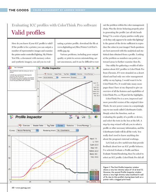
How do you know if your <strong>ICC</strong> profile is valid? uating a printer profile; download the file at<br />
If the profile is for a printer, you can output a www.digitaldog.net/files/Printer%20Test%<br />
number of representative images and examine 20file.jpg.zip.<br />
the prints under controlled lighting. My Printer Various problems, including poor output<br />
Test File, a document <strong>with</strong> memory colors quality or print-to-screen mismatching, are<br />
and synthetic imagery, can aid you in eval-<br />
not uncommon, and it can be difficult to root<br />
out the problem <strong>with</strong>in the color management<br />
chain. Was the device behaving properly prior<br />
to generating the profile (are all ink heads<br />
firing)? Is a series of gray patches really gray<br />
or do they only appear to be under this lighting?<br />
Is the gamut of the device sufficient to reproduce<br />
the colors in your images? Such questions<br />
are best answered <strong>with</strong> the analytical and statistical<br />
data obtained from a profile. Looking<br />
at the problem as numbers can point you<br />
toward areas to further examine then fix.<br />
One utility for gathering a wealth of information<br />
about <strong>ICC</strong> <strong>profiles</strong> is <strong>ColorThink</strong> <strong>Pro</strong><br />
from Chromix. If I were stranded on a desert<br />
island and had only one color management<br />
utility on my laptop, I would want it to be<br />
<strong>ColorThink</strong> <strong>Pro</strong>. It would take many more<br />
pages than I have at my disposal to give an<br />
overview of all the features and capabilities of<br />
<strong>ColorThink</strong> <strong>Pro</strong>, so I’ll just hit the highlights.<br />
<strong>ColorThink</strong> <strong>Pro</strong> is a new, improved and<br />
more powerful version of the original Color-<br />
Think. Its new power comes in a surprisingly<br />
easy-to-use mode called ColorSmarts Guide.<br />
Simply select the function, such as<br />
evaluating the quality of a profile or device,<br />
and select the tests in the box at the left. A<br />
step-by-step wizard will ask you to select a<br />
profile or other necessary information, and the<br />
ColorSmarts Guide will do all the work. You<br />
really don’t need to know anything else<br />
about the program’s internal workings.<br />
Let’s look at a few useful tests that provide<br />
feedback about how an <strong>ICC</strong> profile behaves.<br />
I’ve selected Evaluate a <strong>Pro</strong>file and then<br />
Evaluate Neutral Rendering, then I’m asked to<br />
select an <strong>ICC</strong> profile. <strong>ColorThink</strong> <strong>Pro</strong> did all<br />
Figure 1: The first <strong>Pro</strong>file Inspector window<br />
shows a very low chroma value of 1.0 at level 12.<br />
However, the second <strong>Pro</strong>file Inspector window<br />
shows a very high chroma value (outlined in red)<br />
of 16, due to this profile’s having been built on a<br />
printer <strong>with</strong> a clogged print head.<br />
48 • www.ppmag.com
THE GOODS<br />
the work in producing the results in Figure 1.<br />
You see the red, green and blue curves of the<br />
<strong>ICC</strong> profile I selected (an Epson Stylus Photo<br />
2400 and glossy paper). As I move the cursor<br />
from left to right, I can examine the<br />
neutrality of the curves <strong>with</strong>in the <strong>ICC</strong><br />
profile, from black to white, while keeping a<br />
close eye on the chroma bull’s-eye at the lower<br />
right of the <strong>Pro</strong>file Inspector window. A<br />
chroma value of 0 would indicate a perfect<br />
neutral; 0 chroma indicates no hue. This<br />
profile is pretty good; the worst area has a<br />
1.0 chroma at level 12. Notice in the second<br />
<strong>Pro</strong>file Inspector, a profile of an Epson 2200,<br />
neutrality is so poor you can’t see even a red<br />
dot in the chroma area. At this point in the<br />
curve the value is a whopping 16. Obviously<br />
something’s wrong <strong>with</strong> this profile, and thanks<br />
to <strong>ColorThink</strong> <strong>Pro</strong>, we know why; due to a<br />
clogged print head, there was no dark cyan<br />
ink used when the profile target was built.<br />
Since an output profile provides data<br />
about the device it is based on, this profile<br />
provides useful information about each device.<br />
When I click on Evaluate a Device in the<br />
ColorSmarts Guide, I’m presented six<br />
options. I select Evaluate Device RGB<br />
Calibration. <strong>ColorThink</strong> <strong>Pro</strong>’s online help (in<br />
the far right window) tells me this test will evaluate<br />
the neutralality of a device at the time<br />
the profile was built. I simply select a profile<br />
and click the Next button. <strong>ColorThink</strong> plots the<br />
neutrals in a three-dimensional graph that<br />
can be rotated. In Figure 1 you can see the<br />
results from the same Epson 2400. Spinning<br />
this plot around an axis makes it much easier<br />
to see where the grays fall outside a perfect<br />
neutral; a perfectly straight line of dots run-<br />
Figure 2: The results of this test show how well<br />
the printer behaves <strong>with</strong> respect to neutrals from<br />
black to white. Spinning this three-dimensional<br />
graph makes it easier to see where neutrals shift.<br />
Notice that even in print, the graph of Adobe<br />
RGB is perfectly straight along the vertical axis.<br />
50 • www.ppmag.com
Figure 3: This is the gamut of a printer and an<br />
actual image. Each colored dot represents the<br />
gamut of the color in the image.<br />
ning vertically from black to white. This is<br />
illustrated when I plot an RGB working space<br />
—Adobe RGB (1998)—using the same test.<br />
The balls line up perfectly in the vertical axis.<br />
Each of the 256 values in Adobe RGB (1998)<br />
is neutral, a benefit of all RGB working spaces.<br />
One more useful test: I can compare the<br />
color gamut of any image to the gamut of any<br />
device using ColorSmarts Guide. I simply select<br />
an image and an <strong>ICC</strong> profile. I again selected the<br />
Epson 2400 and a drum-scanned image <strong>with</strong><br />
highly saturated colors. In Figure 3 the gamut<br />
of the printer is in red and the actual colors<br />
from the image are represented as colored dots,<br />
one dot per color. You can see that some yellow,<br />
blue and magenta dots fall outside the gamut<br />
of this printer. I can spin this three-dimensional<br />
graph to see the entire color space. Notice,<br />
too, that the red gamut representing the<br />
Epson printer has a controllable translucency<br />
so I can see where the colors of my image fall.<br />
<strong>ColorThink</strong> <strong>Pro</strong> and <strong>ColorThink</strong> are great<br />
teaching tools because they show us how the<br />
color spaces of devices and images interact. I<br />
can even record a QuickTime movie of a spin<br />
of these gamut plots to share <strong>with</strong> others .<br />
You can download a demo version of<br />
both <strong>ColorThink</strong> and <strong>ColorThink</strong> <strong>Pro</strong> for<br />
Mac OS X and Windows 2000/XP at<br />
www.chromix.com/colorthink. ■<br />
June 2006 • <strong>Pro</strong>fessional Photographer • 51