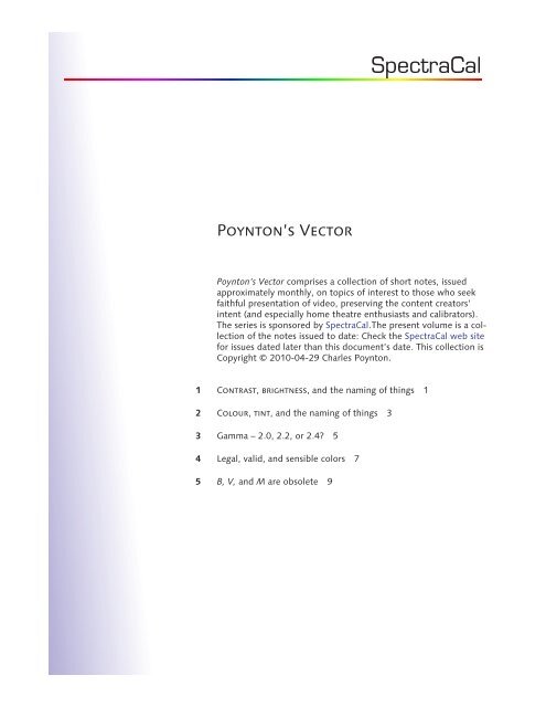
Poynton.s Vector.book - SpectraCal
Poynton.s Vector.book - SpectraCal
Poynton.s Vector.book - SpectraCal

You also want an ePaper? Increase the reach of your titles
YUMPU automatically turns print PDFs into web optimized ePapers that Google loves.
<strong>Poynton</strong>’s <strong>Vector</strong><br />
<strong>Poynton</strong>’s <strong>Vector</strong> comprises a collection of short notes, issued<br />
approximately monthly, on topics of interest to those who seek<br />
faithful presentation of video, preserving the content creators’<br />
intent (and especially home theatre enthusiasts and calibrators).<br />
The series is sponsored by <strong>SpectraCal</strong>.The present volume is a collection<br />
of the notes issued to date: Check the <strong>SpectraCal</strong> web site<br />
for issues dated later than this document’s date. This collection is<br />
Copyright © 2010-04-29 Charles <strong>Poynton</strong>.<br />
1 Contrast, brightness, and the naming of things 1<br />
2 Colour, tint, and the naming of things 3<br />
3 Gamma – 2.0, 2.2, or 2.4? 5<br />
4 Legal, valid, and sensible colors 7<br />
5 B, V, and M are obsolete 9
Charles <strong>Poynton</strong><br />
tel +1 416 535 7187<br />
charles @ poynton.com<br />
www.poynton.com<br />
<strong>Poynton</strong>’s <strong>Vector</strong> 1 Contrast, brightness, and the naming of things<br />
Video professionals face a serious, long-term issue: Consumers don't<br />
know what knob to turn to make their pictures brighter!<br />
Fink, Donald G. (1952), Television<br />
Engineering, Second Edition<br />
(New York: McGraw-Hill)<br />
For more than half a century, the two primary image controls have<br />
been called contrast and brightness. That these controls are<br />
misnamed was observed half a century ago by the preeminent electronics<br />
engineer Donald Fink:<br />
“Unfortunately, in television systems of the present day, ... the separate<br />
manipulation of the receiver brightness and contrast controls<br />
(both of which are misnamed, photometrically speaking) by the<br />
nontechnical viewer may readily undo the best efforts of the system<br />
designers and the operating technicians.”<br />
In the 1950s, contrast (which controlled video gain, as it does now)<br />
was apparently recognized by CE engineers as an important operational<br />
control – the contrast knob was often concentric with volume.<br />
On the other hand, brightness (which introduced an offset or bias)<br />
was apparently recognized as being an unfortunate technical necessity:<br />
On several television sets from that era, the brightness knob was<br />
placed between focus and vertical hold! I don't know if consumers<br />
in 1950 knew the difference between brightness and contrast, but<br />
today the consumer that wants a brighter picture is just as likely –<br />
perhaps even more likely – to crank up brightness as contrast, and<br />
thereby impair contrast ratio. This is the crux of Fink’s complaint.<br />
Fink also complained parenthetically about misnamed controls. It<br />
seems to me that if we retain the brightness control, we should<br />
relabel it as black level, the term that is used on processing equipment<br />
and on many professional displays. However, with the functions<br />
of focus and vertical hold today taken care of by design, and those<br />
two controls abolished, we have to ask whether it is time for brightness<br />
to be abolished.<br />
Consider a digitally encoded signal that is conveyed to the consumer<br />
in digital form – ATSC digital broadcast, DVD, or Blu-ray physical<br />
media. We must assume that black is correctly mastered, because we<br />
cannot distinguish creative intent from faulty production. No black<br />
level impairments are introduced by modern transmission systems,<br />
Charles <strong>Poynton</strong> © 2010-04-29 1
2 Contrast, brightness, AND THE NAMING OF THINGS<br />
and the intrinsic display circuitry doesn't impair black or induce drift.<br />
black level is not required to correct any of these historical issues.<br />
One remaining potential justification for a display black level control<br />
arises from the degradation of black-level luminance caused by<br />
ambient light. The degree of that degradation is determined by the<br />
diffuse faceplate reflectance. Considering the screen as a passive<br />
reflector, luminance is the ambient illuminance (in lux), divided by π,<br />
times the diffuse reflectance factor. Ambient illuminance of 10 lx<br />
reflected from a perfect diffuse surface produces luminance of about<br />
3 nt. Twenty years ago, with a 20% reflective CRT faceplate, ambient<br />
reflectance would have produced 0.6 nt. With 100 nt white – bright at<br />
the time – faceplate reflectance limited contrast ratio to 100/0.6, or<br />
160:1. Diffuse reflectance declined from perhaps 20% two decades<br />
ago to 10% one decade ago (at the pinnacle of CRT display technology);<br />
with the introduction of plasma displays it declined to about<br />
2%, and for today's LCDs the value is about 1%. Today, ambient illuminance<br />
of 10 lx produces black luminance of about 0.03 nt. With<br />
white at 100 nt, diffuse reflectance alone can't reduce contrast below<br />
3,000:1. Delivered contrast ratio is no longer dominated by diffuse<br />
faceplate reflectance.<br />
Apple has apparently concluded that ambient-induced black shift is so<br />
insignificant today that they have abolished the black level control<br />
entirely. Apple avoids the naming problem by labelling the control<br />
with a symbol and no words! However, some confusion remains<br />
because Apple uses the historical brightness icon to label the sole<br />
remaining control.<br />
With an Apple display, it's clear to the consumer what knob to turn to<br />
make the display brighter: There's only one knob! I suggest that we<br />
consider the same idea in the video and HDTV arena, and abolish<br />
brightness (or black level) from consumer displays. For the remaining<br />
control, I've been thinking about a better name than contrast. My<br />
tentative suggestion is white level.<br />
It’s another topic what luminance should be produced for an encoded<br />
zero-unit signal level. Perhaps I’ll tackle that question in a future<br />
column. Meanwhile, I welcome your comments and suggestions!<br />
p.s.<br />
After first publication of this note, my colleague Cam Morrison pointed<br />
out my implicit assumption that faithful image portrayal is the goal.<br />
Cam correctly points out that manufacturers of television receivers do<br />
not usually have that goal: Their goal is typically to succeed in selling<br />
television receivers. Manufacturers have found that consumers respond<br />
to attributes other than faithful portrayal; manufacturers distort tones<br />
and colours according to what they think is most effective in attracting<br />
consumers. Among home theater enthusiasts, an important use of the<br />
black level adjustment is to dial-out the manufacturers’ preference in<br />
order to achieve the content creator’s intent. Apple was able to abolish<br />
the black level adjustment because Apple’s products portray imagery<br />
rather faithfully, with a minimum of signal processing.
Charles <strong>Poynton</strong><br />
tel +1 416 535 7187<br />
charles @ poynton.com<br />
www.poynton.com<br />
<strong>Poynton</strong>’s <strong>Vector</strong> 2 Colour, tint, and the naming of things<br />
In the previous column, I explored the controls called contrast and<br />
brightness. This time, I'd like to explore colour and tint. As before,<br />
I’ll typeset the names of controls in small capitals.<br />
You may find it idiosyncratic, but I’ll<br />
spell colour the way I did as<br />
a child – and in the manner that my<br />
wife and daughters insist – instead<br />
of the way I spelled it when I lived<br />
in California. Hey, we’re all quirky<br />
in one way or another!<br />
Colour and tint controls arose historically from the mechanism of<br />
NTSC encoding. In analog NTSC, poor frequency response characteristics<br />
and differential gain errors often led to reduction of the amplitude<br />
of the modulated chroma signal. Broadcast technicians corrected<br />
those impairments manually by increasing chroma gain. Comparable<br />
facilities were introduced to consumers, labelled as colour.<br />
Iargue that colour is misnamed because the consumer can't be<br />
expected to know whether colour means which colour or how much<br />
colour! Some professional equipment uses the name saturation. That<br />
name is a poor choice in my opinion because saturation refers to many<br />
other phenomena – for example, clipping of overexposed scene<br />
elements in a camera's image sensor. It seems to me that we should<br />
adopt the name chroma, as is used on some receivers: This name<br />
clearly suggests the amount of colour. It is intuitive that setting<br />
chroma to zero yields a greyscale image.<br />
Going back to analog NTSC, differential phase errors often led to shifts<br />
in phase of the modulated subcarrier. Such shifts produced visual hue<br />
errors. In the worst cases the intended hue could only be established<br />
by manually rotating the decoder's subcarrier phase reference. Some<br />
professional decoders still today have phase adjustment; in consumer<br />
equipment the control came to be known as tint.<br />
Wikipedia (2010), Tints and Shades,<br />
).<br />
Iargue that tint is misnamed: To an artist, “to tint” means to add<br />
white, thereby lightening a colour without changing its hue! A quick<br />
check on Wikipedia or Google confirms the popularity of that interpretation.<br />
Phase refers to the underlying technical mechanism, but we<br />
should not burden the consumer with a term dependent upon the<br />
implementation; rather, we should use a perceptual term. The obvious<br />
perceptual name appropriate for this function is hue.<br />
So, although colour and tint are popular among consumer receivers,<br />
chroma and hue are, in my view, far preferable.<br />
Charles <strong>Poynton</strong> © 2010-04-29 3
4 Colour, tint, AND THE NAMING OF THINGS<br />
The blue only feature of professional NTSC displays provided the<br />
video technician with a simple way to disable the red and green<br />
components of the displayed colours. In the colourbar test signal, the<br />
cyan and magenta bars both contain the same amount of the blue<br />
primary, and when displaying blue only they should display identically.<br />
However, modulated subcarrier phase differs between the two;<br />
only if hue is set correctly will the decoded blue component values<br />
match. The white and blue bars both contain the same amount of the<br />
blue primary, but white has no modulated subcarrier. Only if chroma<br />
gain is set correctly will the blue decoded from the blue bar match the<br />
blue decoded from the white bar.<br />
The hue adjustment is meaningful only when decoding composite<br />
video. In a professional broadcast video monitor – “BVM,” the subject<br />
of a future note – the chroma (or saturation) and hue (or phase)<br />
controls are typically disabled when viewing a component input.<br />
Providing a hue control may be useful in program creation, but is<br />
highly unlikely to be useful as an expression of a consumer’s viewing<br />
preference. My recently purchased LCD computer display has only<br />
R’G’B’ digital inputs. There’s no composite NTSC input, and therefore<br />
no modulated chroma signal to correct; however, the display provides<br />
not only a chroma adjustment (there labelled saturation) but also<br />
hue (labelled tint)! Apparently this display’s signal processing chain<br />
takes perfectly good R’G’B’, encodes to Y’C B C R , applies chroma gain<br />
and C B /C R rotation, then matrixes back to R’G’B’! In my view this<br />
“feature” is design engineering gone amok, or perhaps symptomatic of<br />
poorly informed marketing. Hue should simply be made correct by<br />
design. No useful perceptual attribute is addressed by rotating hue,<br />
and in component or digital video, no useful purpose is served by<br />
providing the consumer with a hue control.<br />
<strong>Poynton</strong>’s Fourth Law:<br />
Once a program is mastered, errors<br />
in mastering are indistinguishable<br />
from expressions of creative intent.<br />
Some people may argue that a hue control enables correction of<br />
poorly mastered program material. To them, I assert <strong>Poynton</strong>’s Fourth<br />
Law (in the margin). If you “corrrect” hue, what are you correcting to?<br />
In The Hulk, the protagonist’s face is supposed to be green. Admittedly<br />
a hue control could be used to render Hulk’s face with normal<br />
skin tone, but isn’t that detrimental to creative intent?<br />
There is a minor reason that argues in favor of providing a chroma<br />
control to the consumer. A bright display (more than 100 nt), a bright<br />
ambient, and/or a bright surround may cause a systematic increase in<br />
colourfulness. If the consumer’s viewing situation differs from that at<br />
mastering, maintaining creative intent may require dialing-back some<br />
of the colourfulness increase. This topic will be the subject of a future<br />
piece. I welcome your comments and suggestions!
Charles <strong>Poynton</strong><br />
tel +1 416 535 7187<br />
charles @ poynton.com<br />
www.poynton.com<br />
<strong>Poynton</strong>’s <strong>Vector</strong> 3 Gamma – 2.0, 2.2, or 2.4?<br />
ITU-R BT.709-5 (2002-04), Parameter<br />
values for the HDTV standards<br />
for production and international<br />
programme exchange.<br />
<strong>Poynton</strong>, Charles (2010), Picture<br />
rendering, image state, and BT.709<br />
(unpublished, available at<br />
).<br />
BT.709 refers to an international standard, first adopted in 1990, for<br />
HDTV. The standard defines the colours (chromaticities) of the red,<br />
green, and blue primaries and the white point (CIE D 65 ). These specifications<br />
are well established and widely used. How to accommodate<br />
wide color gamut is a challenge that might require some changes to<br />
BT.709 in the near future, but let's leave that for a later installment.<br />
In addition to specifying chromaticities, BT.709 also purports to<br />
specify nonlinear image coding. I have written extensively elsewhere<br />
about this aspect of BT.709. The short story is that the BT.709 story is<br />
wrong. As written, BT.709 documents camera characteristics, but what<br />
is needed is specification of a reference display. Without a reference<br />
display standard, there is no reliable mechanism to establish creative<br />
intent. We need a new standard that specifies characteristics comparable<br />
to those of a broadcast video monitor (“BVM”). A classic BVM<br />
has a gamma of about 2.4: Input R’G’B’ signals from 0 to 100 units are<br />
scaled by 1 / 100 , raised to the power 2.4, then scaled to the absolute<br />
luminance established for white.<br />
If you are a home theatre calibrator, you might at this point be saying:<br />
“But I align my customers’ displays to gamma of 2.2, not 2.4! Am I<br />
doing it wrong?” Well, perhaps not, but some explanation is in order.<br />
HD programming was historically approved on “BVMs” – B, V, and M<br />
are the first three letters of the part numbers of a series of Sony<br />
displays: A Hollywood studio might routinely master on a Sony<br />
BVM-D32E1WU. Such a reference display would historically produce<br />
white luminance of 100 nt. Twenty years ago, content would have<br />
been approved in an ambient illuminance of perhaps 6 lx with a “dim”<br />
surround of perhaps 10% of reference white. Today, final approval is<br />
done in very dark conditions, with ambient illuminance 1 lx or less,<br />
and surround luminance perhaps just 1% of white luminance.<br />
Colors change appearance depending upon absolute luminance, and<br />
upon their surroundings. A very dark surround at mastering will “suck”<br />
color out of a presentation previously viewed in a light surround.<br />
A colorist will dial-in an increase in colorfulness (for example, by<br />
increasing chroma gain). The intended appearance for an HD master is<br />
obtained through a 2.4-power function, to a display having reference<br />
Charles <strong>Poynton</strong> © 2010-04-29 5
6 GAMMA – 2.0, 2.2, OR 2.4?<br />
white at 100 nt, with 1 lx ambient, and 1% surround – but that<br />
appearance will not be faithfully presented in different conditions!<br />
The key point concerning the consumer's gamma is this: What we<br />
seek to maintain at presentation is the appearance of the colors at<br />
program approval, not necessarily the physical stimuli. If the<br />
consumer's display and viewing conditions differ from those at<br />
mastering, we may need to alter the image data to preserve<br />
appearance.<br />
In a home theater environment, you might set the consumer's display<br />
to 100 nt, matching the approval luminance. However, ambient conditions<br />
in a consumer environment – even a rather dark home theater –<br />
are somewhat lighter than typically used for mastering today. The<br />
lighter conditions cause a modest increase in contrast and colorfulness,<br />
beyond that witnessed at content creation.<br />
If the power function on R’G’B’ – display gamma – is dialed back<br />
a little, that contrast and colorfulness are reduced. At about 300 nt,<br />
with ambient illuminance of 5 or 10 lx, and with a surround of say 5%,<br />
decreasing gamma from 2.4 to 2.2 will visually compensate the effect.<br />
So, if your consumer has such an environment, I recommend gamma<br />
of 2.2. If your customer preferred to display the same imagery at<br />
48 nt, in darkness (zero ambient illuminance), in a 0% surround, then<br />
gamma of 2.6 (as in digital cinema) might be appropriate. In a really,<br />
really bright environment, or with a really bright display (say 400 nt or<br />
500 nt), decreasing gamma to 2.0 might be appropriate.<br />
EBU Tech. 3325 (2008), Methods<br />
for the Measurement of the performance<br />
of Studio Monitors,<br />
Version 1.1 (Sep.).<br />
It is another issue how ten or twenty measurements of the greyscale<br />
curves can be distilled down to a single gamma number. I'm not<br />
enthusiastic about the EBU recommendation for the calculation: EBU<br />
Tech. 3325 (on page 34) calls for subtraction of the base luminance<br />
L min ; subtracting that bias is a mistake in my view. In the EBU document<br />
– and in most home theatre calibration packages – all of the<br />
measurements are effectively normalized by the luminance at reference<br />
white; however, that normalization gives the 100% measurement<br />
undue weight: That particular measurement is very likely to exhibit<br />
some saturation droop. On the other hand, we can’t complain too<br />
much about the EBU technique, because smpte and ITU fail to give<br />
any guidance on computing effective gamma. I'll save the remainder<br />
of this argument for a future piece.<br />
As always, your comments are welcome.
Charles <strong>Poynton</strong><br />
tel +1 416 535 7187<br />
charles @ poynton.com<br />
www.poynton.com<br />
<strong>Poynton</strong>’s <strong>Vector</strong> 4 Legal, valid, and sensible colors<br />
units<br />
V = 64 + 876 ⋅ 100<br />
Eq 1 Mapping from units to<br />
10-bit digital video code<br />
24 .<br />
⎛ 1019 − 64⎞<br />
⎜<br />
123<br />
⎝ 940 − 64<br />
⎟ ≈ .<br />
⎠<br />
Eq 2 Peak luminance fraction of<br />
reference white luminance<br />
Studio HD technicians and home theater calibrators are familiar with<br />
10-bit HD coding: Reference black is placed at interface code 64 and<br />
reference white is placed at 10-bit interface code 940. (The comparable<br />
8-bit codes are 16 and 235.) These communities are less familiar<br />
with the origins of footroom and headroom, and are generally unfamiliar<br />
with proper treatment of codewords that lie in these regions.<br />
I will address these topics in this column.<br />
Codes 64 and 940 are meaningful across a digital video interface;<br />
however, for signal processing it is much more convenient to declare<br />
reference black and white to be zero and unity respectively. Call those<br />
levels 0 units and 100 units if you like. In standard HD, headroom<br />
extends to about 109 units; the corresponding luminance is about<br />
1.23 times reference white. Reference and peak are different! Many<br />
ITU-R, EBU, and SMPTE standards get this wrong, mistakenly using<br />
peak white when reference white is meant. Codes 0–3 and 1020–1023<br />
are prohibited across an HD-SDI interface.<br />
The original digital studio video standard was CCIR Rec. 601, established<br />
in 1984. Analog studio video signals drifted somewhat; to introduce<br />
digital video required accommodation of analog signals having<br />
imperfect reference levels. Footroom and headroom were necessary.<br />
That reason has now vanished. However, several good reasons for<br />
footroom and headroom remain.<br />
When presented with an input signal containing high frequency<br />
content, any practical filter – whether analog or digital, or lowpass,<br />
bandpass, or highpass – necessarily involves some degree of undershoot<br />
and/or overshoot. Premature clipping of undershoots and overshoots<br />
is detrimental to image quality: Clipping should be deferred to<br />
the last possible point in the signal chain. Footroom and headroom<br />
accommodate undershoots and overshoots. Historically, it has been<br />
generally agreed – if not properly documented – that signals shouldn't<br />
dwell in the footroom or headroom region for longer than half a dozen<br />
samples. I'll bring this assumption into question below.<br />
Arelatively recent reason for footroom is to convey the negative<br />
excursions of camera noise. All sensors generate noise, even around<br />
black. When a camera is sensing true optical black (e.g., capped), it is<br />
sensible to set the average signal value to reference black. However,<br />
noise has excursions above and below that level. If the negative-going<br />
excursions are clipped, then the noise is said to be “rectified”: the<br />
average value of the noise then rises above reference black. It is<br />
Charles <strong>Poynton</strong> © 2010-04-29 7
8 LEGAL, VALID, AND SENSIBLE COLORS<br />
Martindale, David and Alan W.<br />
Paeth (1991), “Television Color<br />
Encoding and ‘Hot’ Broadcast<br />
Colors,” in Arvo, James (ed.),<br />
Graphics Gems II: 147–158<br />
(Academic Press, Boston).<br />
important to defer the rectification to the latest possible point in the<br />
signal chain.<br />
A final reason for footroom is that it allows coding of the blackerthan-black<br />
(-2%) PLUGE signal element commonly used to set black<br />
level in studio displays.<br />
A camera engineer typically aligns an HD camera to produce 100<br />
units for a near-perfect white reflector in the scene. However, when<br />
the camera is turned over to the cinematographer, he or she may wish<br />
to convey specular reflections or light sources in the scene, and he or<br />
she may therefore reset exposure to place the white card well below<br />
100 units. Light sources and speculars may lie anywhere above the<br />
cinematographer's white reference, and the speculars and sources<br />
won't let up until they clip! The headroom region ends up carrying<br />
these elements. Typically these elements have momentary excursions,<br />
but they may well be sustained across more than half a dozen samples.<br />
All of the reasons that I have mentioned are arguments against clipping<br />
anything in the footroom and headroom regions! Indeed, to clip<br />
is bound to introduce some degree of visual artifacts. Movie studios<br />
use commercial “QC” outfits to review commercial content prior to<br />
mastering. Many QC outfits are motivated to report “violations.” Most<br />
post houses take the easy way out and clip to “legal” before shipping<br />
content out to the QC houses. The potential visual quality of such<br />
material is compromised, and in the long term, the QC houses should<br />
be educated. Once the QC houses are well informed, the post houses<br />
will stop clipping.<br />
Apart from footroom and headroom in the component digital environment,<br />
in the NTSC days, limiting chroma was important to prevent<br />
atransmitter from exceeding 120% power. That was generally accomplished<br />
through “NTSC legalization,” a process too complicated to be<br />
detailed here. Suffice to say that over-the-air NTSC analog transmission<br />
no longer occurs in the USA. No studio or consumer equipment<br />
operates under the 120% carrier constraint of the now-absent broadcast<br />
transmitters. No NTSC legalization is required – indeed, none is<br />
appropriate – for any signals today, even those in NTSC form!<br />
Unfortunately, in the consumer domain, manufacturers are motivated<br />
to compromise the headroom region for two reasons. First,<br />
consider a display with maximum luminance of 250 nt. By properly<br />
following the gamma curve all the way up to 109 units (historically,<br />
“IRE”), peak luminance is 250 nt, but reference white luminance is<br />
200 nt. If the display follows the gamma curve up to 100 units then<br />
clips, the manufacturer can claim reference white at 250 nt!<br />
Consumers tend to think bigger numbers are better – but the clipped<br />
picture will suffer. A home theatre calibrator, on assessing the greyscale<br />
response, will be savvy to this trick, and will adjust the display to<br />
follow the gamma curve all the way up to peak. Second, a manufacturer<br />
may be motivated to push the curve up in the midscale, then<br />
roll-off the higher regions in an effort to deliver higher average luminance.<br />
The well-equipped calibrator will similarly reverse the trick.<br />
A well-known “standard” for wide-gamut, xvYCC, uses Y’C B C R<br />
codewords outside the R’G’B’ unit cube to convey wide-gamut colors.<br />
To use such a system, gamut legalizers must be disabled. The widegamut<br />
arena will be the subject of a future column.
Charles <strong>Poynton</strong><br />
tel +1 416 535 7187<br />
charles @ poynton.com<br />
www.poynton.com<br />
<strong>Poynton</strong>’s <strong>Vector</strong> 5 B, V, and M are obsolete<br />
Broadcast video monitor: BVM.<br />
Program production culminates with conversion of video data representing<br />
the finished program – think of it as a massive amount of<br />
R’G’B’ image data – to colored light on the surface of a display. To<br />
enable consumers to witness a program as it was intended, the final<br />
production display must be characterized. To achieve faithful presentation<br />
to the consumer, the consumer’s display must approximate the<br />
final production display. B, V, and M are the first three letters of the<br />
part numbers of a family of popular (and expensive) Sony displays<br />
commonly used for production: A Hollywood studio might routinely<br />
approve and master on a Sony BVM-D32E1WU.<br />
Iargue that in the modern age the notation “BVM” is seriously wrong.<br />
At first glance you might think that a part number could hardly matter,<br />
but I contend that the term and the part number exposes serious<br />
philosophical issues that are worth discussing.<br />
First, the B is wrong. “Broadcast” reflects the old scheme where a very<br />
small number of program producers, aggregators, distributors,<br />
networks, and television stations were all part of a highly centralized<br />
distribution system. But YouTube doesn't “broadcast;” the iTunes store<br />
doesn't “broadcast;” Hulu doesn't “broadcast,” Netflix doesn’t “broadcast;”<br />
and when you watch a DVD or a Blu-ray disc, you're not experiencing<br />
“broadcast.” None of the new, innovative, disruptive entrants<br />
in video distribution involve what I would term broadcasting.<br />
Second, the V is wrong. Emergent displays such as RGB-LED backlit<br />
LCD displays offer primaries very close to the DCI P3 RGB primaries of<br />
digital cinema: These displays can be used for certain aspects of digital<br />
cinema creation, processing, and color approval. It's not just “video”<br />
that we're poised to approve.<br />
Third, and most seriously, M is wrong. In BVM, M stands for<br />
“monitor.” If you consult a dictionary, monitor is a passive verb: You<br />
are watching something as it goes by. A related concept is Quality<br />
Control (QC): If you're in a QC department, you examine imagery to<br />
make sure that no unintended impairments have been introduced, but<br />
you do not modify the content. The QC department may raise a red<br />
Charles <strong>Poynton</strong> © 2010-05-26 9
10 B, V, AND M ARE OBSOLETE<br />
flag, but QC is not responsible for, and must not alter, the look of<br />
a show. The most important function of the display at the end of the<br />
content creation chain is approval, and approval is an active verb –<br />
program content is manipulated until its R’G’B’ values create the<br />
intended visual impression. M for monitor is wrong.<br />
So, if not BVM, what? I suggest “studio HD reference display.”<br />
The word “studio” implies professional content creation. You may<br />
create content in your garage, but if you successfully distribute<br />
content at a reasonably wide scale, then that’s your studio.<br />
I use the word “reference” because the display used at the end of the<br />
content creation chain establishes the intended reference for all downstream<br />
displays. If an identical display is present downstream in an<br />
identical environment, then it should present an identical picture. In<br />
the consumers’ premises, we don’t expect the tight tolerances of<br />
a studio display, but we do seek the same aim points.<br />
My term uses HD instead of video because we don't expect any emergent<br />
SD displays. For consumer mastering, there's no need to refer to<br />
cinema because the consumer won't have access to movies encoded<br />
in digital cinema form for some time to come.<br />
I use “display” because that is the generic term for the transducer that<br />
converts electrical video signal to light.<br />
Color appearance is strongly influenced by surround conditions. My<br />
recent proposal for a new standard is entitled “studio HD reference<br />
display and viewing conditions.”<br />
Some of you might have taken the title of this piece to suggest that<br />
BVM CRTs are dead. That conclusion is certainly true: The<br />
BVM-D32E1WU that I mentioned earlier has, in fact, been discontinued<br />
by Sony. I will address that general issue in a future piece.<br />
Your comments are welcome.