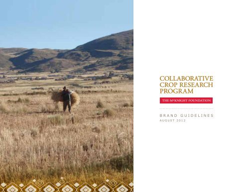
BRAND GUIDELINES - McKnight Foundation
BRAND GUIDELINES - McKnight Foundation
BRAND GUIDELINES - McKnight Foundation

You also want an ePaper? Increase the reach of your titles
YUMPU automatically turns print PDFs into web optimized ePapers that Google loves.
<strong>BRAND</strong> <strong>GUIDELINES</strong><br />
AUGUST 2012
1<br />
While we’re helping smallholder farmers<br />
feed their world, we also need to take<br />
note of how the world sees us.
The Collaborative Crop Research Program (CCRP) is based on the vision of a world<br />
in which all people have access to the nutritious food they need on the terms they can<br />
afford, and where food is sustainably produced in ways that protect local resources<br />
and respect cultural values. In 2012, the CCRP developed these graphic identity<br />
guidelines to help all of our global contributors and collaborators sustain effective<br />
communications with our constituents.<br />
Table of Contents<br />
Vision, Mission and Tag 3<br />
Wordmark 4<br />
Typography 8<br />
Colors 9<br />
Patterns 10<br />
Photography 18<br />
Using the Brand Elements Together 20<br />
Appendix 24<br />
2
Vision, Mission<br />
and Tag<br />
A crucial part of a consistent<br />
brand identity is core language.<br />
The basic elements are a vision,<br />
mission and tag, and together<br />
they form a verbal platform<br />
for all communications. How<br />
are they defined by CCRP?<br />
The CCRP vision describes the<br />
“why” behind our program.<br />
This vision never changes. It’s<br />
our contribution to the world<br />
and remains constant.<br />
Our mission, in contrast,<br />
is time-limited. It relates<br />
the “how” of what we’re<br />
doing now and during the<br />
foreseeable future. A tagline<br />
is the shortest, simplest verbal<br />
expression. Typically it’s a<br />
single sentence or a phrase,<br />
memorable and aspirational.<br />
In 2012, the CCRP developed<br />
this core language, and the<br />
elements are presented here for<br />
inclusion in communications.<br />
Vision<br />
The Collaborative Crop Research Program seeks<br />
to contribute to a world where all have access to<br />
nutritious food that is sustainably produced by<br />
local people.<br />
Mission<br />
We do this through collaborative agro-ecological<br />
systems research and knowledge-sharing that<br />
strengthen the capacities of smallholder farmers,<br />
research institutions and development organizations.<br />
Tag<br />
Helping smallholder farmers feed their world.<br />
3
Wordmark<br />
Wordmark with The <strong>McKnight</strong> <strong>Foundation</strong> Logo<br />
The primary identifying mark<br />
for CCRP is a graphic device<br />
known as a “wordmark”. This<br />
is a distinctive, highly flexible<br />
naming expression drawn from<br />
our typography assets (see page<br />
7). The letter spacing has been<br />
carefully adjusted for visual<br />
clarity, and several options<br />
are available to meet a variety<br />
of communications needs,<br />
as depicted in the examples<br />
shown here.<br />
While three color versions of<br />
The <strong>McKnight</strong> <strong>Foundation</strong><br />
logo are presented in the<br />
following pages, the preferred<br />
logo to be used in most<br />
applications is the red logo. In<br />
select situations where the red<br />
logo is not possible, use of the<br />
black logo is preferred over the<br />
white version.<br />
4
Wordmark. Tag and The <strong>McKnight</strong> <strong>Foundation</strong> Logo<br />
Wordmark<br />
5
Wordmark, Black & White<br />
Wordmark, Reversed<br />
Note: Black & White versions are available for all CCRP wordmark options.<br />
Note: Reversed versions are available for all CCRP wordmark options.<br />
6
Violations<br />
Please be aware that<br />
the examples shown on<br />
pages 3 and 4 present the<br />
complete range of options<br />
for the CCRP wordmark.<br />
The goal is consistent<br />
brand expression across all<br />
communications opportunities,<br />
including but not limited<br />
to printed materials, Web<br />
communications, outdoor<br />
or event signage and even<br />
apparel. Other usages are not<br />
permitted, as illustrated by<br />
examples shown here.<br />
7
Typography<br />
Approved typefaces for the<br />
CCRP are consistent with<br />
those used by The <strong>McKnight</strong><br />
<strong>Foundation</strong>.<br />
Adobe Garamond Pro is the<br />
approved serif typeface for the<br />
wordmark, letterhead address<br />
and other reserved uses,<br />
including publication page<br />
titles. It can also be used for<br />
body copy.<br />
If you don’t have it, substitute<br />
Times New Roman as the<br />
approved serif family for use as<br />
body text in correspondence<br />
and other general print<br />
communications.<br />
Verdana is the approved sans<br />
serif family, but Arial can be<br />
substituted. Regardless of the<br />
project, chosen typefaces must<br />
reflect the straightforward,<br />
accessible approach of<br />
CCRP and <strong>McKnight</strong><br />
communications.<br />
Primary<br />
Adobe Garamond Pro<br />
Aa Bb Cc Dd Ee Ff Gg Hh Ii Gg Kk Ll Mm Nn Oo Pp Qq Rr Ss Tt Uu Vv Ww Xx Yy Zz | 1234567890~!@#$%^&*()<br />
Adobe Garamond Pro Italic<br />
Aa Bb Cc Dd Ee Ff Gg Hh Ii Gg Kk Ll Mm Nn Oo Pp Qq Rr Ss Tt Uu Vv Ww Xx Yy Zz | 1234567890~!@#$%^&*()<br />
Adobe Garamond Pro Semibold<br />
Aa Bb Cc Dd Ee Ff Gg Hh Ii Gg Kk Ll Mm Nn Oo Pp Qq Rr Ss Tt Uu Vv Ww Xx Yy Zz | 1234567890~!@#$%^&*()<br />
Adobe Garamond Pro Bold<br />
Aa Bb Cc Dd Ee Ff Gg Hh Ii Gg Kk Ll Mm Nn Oo Pp Qq Rr Ss Tt Uu Vv Ww Xx Yy Zz | 1234567890~!@#$%^&*()<br />
Primary Alternate<br />
Times New Roman<br />
Aa Bb Cc Dd Ee Ff Gg Hh Ii Gg Kk Ll Mm Nn Oo Pp Qq Rr Ss Tt Uu Vv Ww Xx Yy Zz | 1234567890~!@#$%^&*()<br />
Times New Roman Bold<br />
Aa Bb Cc Dd Ee Ff Gg Hh Ii Gg Kk Ll Mm Nn Oo Pp Qq Rr Ss Tt Uu Vv Ww Xx Yy Zz | 1234567890~!@#$%^&*()<br />
Secondary<br />
Verdana<br />
Aa Bb Cc Dd Ee Ff Gg Hh Ii Gg Kk Ll Mm Nn Oo Pp Qq Rr Ss Tt Uu Vv Ww Xx Yy Zz | 1234567890~!@#$%^&*()<br />
Verdana Italic<br />
Aa Bb Cc Dd Ee Ff Gg Hh Ii Gg Kk Ll Mm Nn Oo Pp Qq Rr Ss Tt Uu Vv Ww Xx Yy Zz | 1234567890~!@#$%^&*()<br />
Verdana Bold<br />
Aa Bb Cc Dd Ee Ff Gg Hh Ii Gg Kk Ll Mm Nn Oo Pp Qq Rr Ss Tt Uu Vv Ww Xx Yy Zz | 1234567890~!@#$%^&*()<br />
Secondary Alternate<br />
Arial<br />
Aa Bb Cc Dd Ee Ff Gg Hh Ii Gg Kk Ll Mm Nn Oo Pp Qq Rr Ss Tt Uu Vv Ww Xx Yy Zz | 1234567890~!@#$%^&*()<br />
Arial Bold<br />
Aa Bb Cc Dd Ee Ff Gg Hh Ii Gg Kk Ll Mm Nn Oo Pp Qq Rr Ss Tt Uu Vv Ww Xx Yy Zz | 1234567890~!@#$%^&*()<br />
8
Colors<br />
Primary/Wordmark<br />
The CCRP color palette<br />
is also based on approved<br />
colors for The <strong>McKnight</strong><br />
<strong>Foundation</strong>. Here, the<br />
primary color (Pantone<br />
146) is reserved for the<br />
wordmark. The other colors<br />
support and complement<br />
the primary color. The full<br />
range conveys optimism<br />
and warmth, and while the<br />
palette doesn’t reflect colors<br />
from any specific country<br />
or culture, it does suggest<br />
an international feeling,<br />
inspired by our international<br />
mission.<br />
Pantone® 146<br />
CMYK<br />
0/43/100/33<br />
RGB<br />
178/116/14<br />
Secondary<br />
HEX<br />
b3740e<br />
Pantone® 404 (<strong>McKnight</strong> Gray)<br />
CMYK<br />
0/8/22/56<br />
RGB<br />
136/126/111<br />
HEX<br />
887f6f<br />
Pantone® 117<br />
CMYK<br />
0/18/100/15<br />
HEX<br />
deb407<br />
Pantone® 152<br />
CMYK<br />
0/51/100/1<br />
HEX<br />
f5911d<br />
RGB<br />
222/180/8<br />
RGB<br />
243/144/29<br />
Pantone® 7491<br />
Pantone® 1805<br />
CMYK<br />
32/0/100/40<br />
HEX<br />
788e1d<br />
CMYK<br />
18/95/100/8<br />
HEX<br />
bf2e1a<br />
RGB<br />
119/142/30<br />
RGB<br />
175/38/38<br />
9
Patterns<br />
Textile Single Color<br />
Geometric patterns are found<br />
worldwide, in all cultures<br />
and eras, from stone art to<br />
textiles. A unique diamond<br />
shape constitutes the basic<br />
building block of the CCRP<br />
visual brand identity. Alone,<br />
it’s a stable yet dynamic<br />
shape. In a pattern, an<br />
energetic quality emerges.<br />
Diamonds of different sizes<br />
and shapes come together<br />
and relate to each other in<br />
different ways, much like<br />
the people and initiatives of<br />
the CCRP. Vibrant colors<br />
from our secondary palette<br />
reinforce this creative energy,<br />
reflecting the collaborative<br />
nature of our work.<br />
10
Patterns:<br />
Textile,<br />
White on Color<br />
The pattern presents well<br />
as a color on a white<br />
background. It also works<br />
well as a white graphic<br />
layer on top of a secondary<br />
color from the CCRP<br />
palette. The white can be at<br />
full strength, 100 percent<br />
opaque. Or it can be more<br />
subdued with the opacity<br />
value set to 30 percent.<br />
White Pattern, 100% Opacity<br />
White Pattern, 30% Opacity<br />
11
Patterns:<br />
Textile, Color<br />
In addition to single color or<br />
white, the textile pattern can<br />
also be represented in multiple<br />
colors drawn from the CCRP<br />
palette. Here, the artwork<br />
comes alive in its fullest,<br />
most vibrant expression. Care<br />
must be taken when using<br />
the multi-color treatment so<br />
it doesn’t compete with other<br />
communications elements. It<br />
could easily draw interest away<br />
from photography or text. In<br />
general, restrict the use of this<br />
graphic to instances where the<br />
background is white and other<br />
elements are minimal (a single<br />
line of type, for instance).<br />
12
Patterns:<br />
Textile Usage<br />
Two additional ways of using<br />
the pattern are creatively<br />
cropped (at the bottom of a<br />
page, as shown to the right)<br />
or in various lengths (long<br />
or short, also indicated at<br />
right). Many different border<br />
treatments can be developed.<br />
Placed horizontally in various lengths on white or light background. In this example, the background uses the brown brand<br />
color applied as a gradient to white with an overall opacity of 30%.<br />
Placed at bottom of page, cropping pattern creatively. Opacity at 30%.<br />
Placed horizontally on color in various lengths.<br />
13
Patterns:<br />
Textile, Swatch<br />
The basic textile artwork lends<br />
itself to extended, running<br />
patterns as shown on the<br />
previous pages, but it can also<br />
form a well-balanced, singular<br />
visual target as indicated here.<br />
This element is referred to as<br />
a “swatch” and offers a way of<br />
anchoring a page in printed<br />
materials or introducing a<br />
complementary texture for<br />
interior Web pages.<br />
14
Patterns:<br />
Diamond<br />
Here the basic shape comes<br />
together as a four-part unit<br />
known as a “diamond.” It<br />
suggests the collaborative<br />
nature of CCRP’s global<br />
initiatives and depicts a<br />
greater solidarity composed<br />
of distinctive individual parts.<br />
Use sparingly and generally<br />
not as the main visual focus. It<br />
works best as a smaller garnish,<br />
perhaps to conclude a column<br />
of text in a written report.<br />
15
Patterns:<br />
Textile Shape<br />
The examples shown here<br />
illustrate three additional<br />
ways of using the basic<br />
diamond shape. It can mask<br />
a photo. It can appear as a<br />
solid color. And it can appear<br />
as a solid color with type<br />
reversed out in white (text<br />
elements will generally be<br />
centered). Visually interesting<br />
combinations can be arranged<br />
using the different options.<br />
mcknight.ccrp.cornell.edu<br />
HELPING SMALLHOLDER FARMERS<br />
FEED THEIR WORLD<br />
16
Patterns: Plot<br />
A final expression of the<br />
basic CCRP pattern is a<br />
background texture known as<br />
the “plot.” It can be expressed<br />
in any of the six CCRP colors<br />
and can be interpreted in<br />
different ways. Does it suggest<br />
an aerial view of farm plots in<br />
a landscape? Does it echo our<br />
collaborative spirit, of various<br />
parts coming together to<br />
form a dynamic whole? Either<br />
interpretation is possible,<br />
along with others. Note that<br />
this document makes use of<br />
the plot in several different<br />
ways. See especially page 6,<br />
where the wordmark is<br />
reversed in white.<br />
17
Photography<br />
Graphics and typography<br />
alone are not enough to<br />
communicate CCRP’s global<br />
work. Photographs are an<br />
important storytelling device too.<br />
Our photos tend to be actual<br />
scenes, not tinted or filtered<br />
for effect. People add instant<br />
depth and interest to any image,<br />
even in large outdoor scenes.<br />
But close-ups are effective, too,<br />
especially when we see food, tools<br />
or unique objects in a cultural<br />
context.<br />
For specific photography options<br />
for CCRP please contact My Lo<br />
at MLo@mcknight.org.<br />
18
Photo Policies:<br />
Releases and<br />
Credits<br />
Because a lot of our<br />
photography includes real<br />
people in actual places (as<br />
opposed to paid actors or<br />
actresses in studios), we need<br />
to pay close attention to<br />
getting proper documentation<br />
from our photo subjects and<br />
sources. Otherwise, we won’t<br />
be able to use the images.<br />
Please refer to the summaries<br />
at right for an overview of our<br />
photo policies. For specific<br />
questions, contact My Lo at<br />
MLo@mcknight.org.<br />
Photo Releases<br />
Photo subject releases – for photos taken by <strong>McKnight</strong> staff or hired photographers;<br />
explicitly permit’s <strong>McKnight</strong>’s public use of a subject’s image or likeness.<br />
Copyright owner agreements – for photos taken by anyone else; states the provider is<br />
granting our public use or has obtained proper permissions from the source.<br />
Photo Credits<br />
When possible and/or upon request from a copyright owner, photo credits in public<br />
materials will cite the photographer or photo source.<br />
Credits should be placed in the bottom corner of the photo (as shown below) or directly<br />
below the photo in a small but readable font. Verdana, an approved CCRP font, is a<br />
good font that is readable at small sizes.<br />
Forms are available in the<br />
appendix of this document<br />
and can also be downloaded<br />
from the <strong>McKnight</strong> Asset<br />
Download website.<br />
Jane Doe, Barb Doe, and John Smith, left to right.<br />
Andes, South America. Photo courtesy Widgets, Inc.<br />
19
HELPING SMALLHOLDER FARMERS<br />
FEED THEIR WORLD<br />
HELPING SMALLHOLDER FARMERS<br />
FEED THEIR WORLD<br />
Using the<br />
Brand Elements<br />
Together<br />
This page showcases<br />
communications that<br />
incorporate various elements<br />
from the CCRP brand<br />
identity system – the<br />
wordmark, typography,<br />
colors, different patterns and<br />
photography.<br />
Note the photos in the upper<br />
right. They demonstrate a<br />
layering effect that can be<br />
achieved by multiplying a<br />
patterned border or the plot<br />
texture over a photo.<br />
COLLABORATIVE<br />
CROP RESEARCH<br />
PROGRAM<br />
MAIN HEADLINE<br />
HEADLINE ONE<br />
Lorem ipsum dolor sit amet, consectetur adipiscing elit. In diam arcu, egestas eu<br />
tempus ut, placerat quis nibh. Sed consequat, felis eget consectetur euismod,<br />
turpis lectus varius nulla, sed lacinia purus enim vitae arcu. Nullam ligula lorem,<br />
scelerisque vitae interdum in, tincidunt eu leo. Integer eget quam sed sem feugiat<br />
tristique nec vel dolor. Etiam vel dui nibh, venenatis lacinia felis. Nullam ac ante<br />
sed purus auctor tristique auctor ut nisi. Nullam imperdiet placerat elit.<br />
Quisque dictum feugiat tortor, eget pellentesque magna porta eu. Duis<br />
ut magna risus. Sed eu turpis sit amet libero lobortis dapibus eu<br />
sit amet magna.<br />
HEADLINE FOUR<br />
Cras at urna leo, sed ornare nunc. Curabitur a ligula vitae purus<br />
bibendum venenatis sit amet quis eros. Etiam ullamcorper eros sed<br />
erat ullamcorper lobortis. Donec in nulla sit amet orci luctus mattis<br />
sed quis elit. Vestibulum tempus volutpat erat at semper. Nullam vitae<br />
MAIN HEADLINE<br />
HEADLINE TWO<br />
Cras at urna leo, sed ornare nunc. Curabitur a ligula vitae purus<br />
bibendum venenatis sit amet quis eros. Etiam ullamcorper eros sed<br />
erat ullamcorper lobortis. Donec in nulla sit amet orci luctus mattis<br />
sed quis elit. Vestibulum tempus volutpat erat at semper. Nullam vitae<br />
eros nec purus blandit aliquet. Vestibulum eu risus felis. Lorem ipsum<br />
dolor sit amet, consectetur adipiscing elit. Vivamus non turpis risus, a<br />
porta neque. Nullam molestie venenatis quam, eget euismod diam<br />
HEADLINE THREE<br />
Morbi non est eget est pellentesque vehicula ut et sapien. Cras laoreet<br />
augue at sapien aliquet eget cursus quam fringilla. Praesent ac adipiscing<br />
libero. Integer euismod pharetra ante, ac accumsan lectus ornare eget.<br />
Vivamus dapibus hendrerit molestie. Vestibulum volutpat turpis eu ante dignissim<br />
bibendum. Mauris porttitor tincidunt libero vel pellentesque. Pellentesque facilisis<br />
laoreet lorem, in pulvinar arcu accumsan non. Quisque ac erat ligula. Fusce venenatis libero auctor ante<br />
aliquet at tempor odio vulputate. Vivamus blandit tristique pellentesque. Pellentesque facilisis laoreet<br />
lorem, in pulvinar arcu accumsan non. Quisque ac erat ligula. Fusce venenatis libero auctor ante aliquet at<br />
COLLABORATIVE<br />
CROP RESEARCH<br />
PROGRAM<br />
mcknight.ccrp.cornell.edu<br />
Diamond shapes broken up and used as graphic treatments:<br />
different sized diamonds in solid colors and masks for photos<br />
MAIN HEADLINE<br />
COLLABORATIVE<br />
CROP RESEARCH<br />
PROGRAM<br />
Yellow color swatch multiplied over photo. White textile pattern<br />
at 30% opacity.<br />
COLLABORATIVE<br />
CROP RESEARCH<br />
PROGRAM<br />
MAIN HEADLINE<br />
HEADLINE ONE<br />
Lorem ipsum dolor sit amet, consectetur adipiscing elit. In diam arcu, egestas eu tempus ut, placerat quis<br />
nibh. Sed consequat, felis eget consectetur euismod, turpis lectus varius nulla, sed lacinia purus enim vitae<br />
arcu. Nullam ligula lorem, scelerisque vitae interdum in, tincidunt eu leo. Integer eget quam sed sem feugiat<br />
tristique nec vel dolor. Etiam vel dui nibh, venenatis lacinia felis. Nullam ac ante sed purus auctor tristique<br />
auctor ut nisi. Nullam imperdiet placerat elit. Quisque dictum feugiat tortor, eget pellentesque magna porta<br />
eu. Duis ut magna risus. Sed eu turpis sit amet libero lobortis dapibus eu sit amet magna.<br />
Brown plot pattern multiplied over photo.<br />
HEADLINE TWO<br />
Cras at urna leo, sed ornare nunc. Curabitur a ligula vitae purus bibendum venenatis sit amet quis eros. Etiam<br />
ullamcorper eros sed erat ullamcorper lobortis. Donec in nulla sit amet orci luctus mattis sed quis elit.<br />
Vestibulum tempus volutpat erat at semper. Nullam vitae eros nec purus blandit aliquet. Vestibulum eu risus<br />
felis. Lorem ipsum dolor sit amet, consectetur adipiscing elit. Vivamus non turpis risus, a porta neque. Nullam<br />
molestie venenatis quam, eget euismod diam vehicula in. Praesent nulla nisl, rhoncus tristique pretium et,<br />
sodales sit amet odio.<br />
HEADLINE THREE<br />
Cras at urna leo, sed ornare nunc. Curabitur a ligula vitae purus bibendum venenatis sit amet quis eros. Etiam<br />
ullamcorper eros sed erat ullamcorper lobortis. Donec in nulla sit amet orci luctus mattis sed quis elit.<br />
Vestibulum tempus volutpat erat at semper. Nullam vitae eros nec purus blandit aliquet. Vestibulum eu risus<br />
felis. Lorem ipsum dolor sit amet, consectetur adipiscing elit. Vivamus non turpis risus, a porta neque. Nullam<br />
molestie venenatis quam, eget euismod diam vehicula in. Praesent nulla nisl, rhoncus tristique pretium et,<br />
sodales sit amet odio.<br />
HEADLINE FOUR<br />
Cras at urna leo, sed ornare nunc. Curabitur a ligula vitae purus bibendum venenatis sit amet quis eros. Etiam<br />
ullamcorper eros sed erat ullamcorper lobortis. Donec in nulla sit amet orci luctus mattis sed quis elit.<br />
Vestibulum tempus volutpat erat at semper. Nullam vitae eros nec purus blandit aliquet. Vestibulum eu risus<br />
felis. Lorem ipsum dolor sit amet, consectetur adipiscing elit. Vivamus non turpis risus, a porta neque. Nullam<br />
molestie venenatis quam, eget euismod diam vehicula in. Praesent nulla nisl, rhoncus tristique pretium et,<br />
sodales sit amet odio.<br />
MAIN HEADLINE<br />
Sub Headline<br />
mcknight.ccrp.cornell.edu<br />
COLLABORATIVE<br />
CROP RESEARCH<br />
PROGRAM<br />
Bottom anchored by cropped yellow textile pattern,<br />
opacity 30%. Small color diamond breaks up bottom copy.<br />
Yellow plot pattern with section of textile pattern.<br />
20
Thank You<br />
Developing a new brand identity<br />
for CCRP has been an exciting<br />
and rewarding experience for our<br />
organization, and we hope you’ve<br />
found these guidelines instructive<br />
and inspiring. Not every instance has<br />
been covered. Not every situation<br />
has been described. These guidelines<br />
represent a starting point as our<br />
story unfolds worldwide. Moving<br />
forward, an important part of our<br />
evolving brand identity will be active<br />
collaboration among the people<br />
and groups telling our story, and we<br />
encourage active sharing of resources<br />
such as photography and digital<br />
assets along with finished pieces. If<br />
you have questions about our graphic<br />
standards or want to pass along<br />
feedback about using the guidelines<br />
in various communications<br />
opportunities, please send a note to<br />
My Lo at MLo@mcknight.org.<br />
21
Appendix<br />
22
710 South Second Street, Suite 400<br />
Minneapolis, MN 55401<br />
612-333-4220<br />
PHOTO SUBJECT RELEASE<br />
I, as the subject of photographs taken on this date, hereby consent and authorize the use of<br />
my image or likeness by The <strong>McKnight</strong> <strong>Foundation</strong> for any purpose including, but not limited<br />
to, promotion, advertising, and public relations without further compensation or consent.<br />
Name (please print): ________________________________________________________<br />
Signature: ________________________________________ Date: __________________<br />
If minor, name of guardian (please print): _______________________________________<br />
If minor, signature of guardian: _______________________ Date: __________________
710 South Second Street, Suite 400<br />
Minneapolis, MN 55401<br />
612-333-4220<br />
COPYRIGHT OWNER AGREEMENT<br />
I, as the Copyright Owner of the photograph(s) noted below, hereby consent and authorize<br />
the use and production of the photograph(s) by The <strong>McKnight</strong> <strong>Foundation</strong>. The<br />
photograph(s) may be used for any purpose.<br />
As Copyright Owner, I further attest that the photograph(s) are original and do not infringe<br />
upon any statutory copyright, common law right, or proprietary right of any individual or<br />
organization. Additionally, I warrant that I have obtained an explicit release for use from all<br />
individuals appearing prominently in the photograph(s).<br />
Copyright Owner (please print): _____________________________________________<br />
Name (please print): ________________________________________________________<br />
Signature: ________________________________________ Date: __________________<br />
Photo Description: __________________________________________________________<br />
Photo credit language to accompany photo: ______________________________________<br />
_________________________________________________________________________