Task Performance Metrics on Liquid Crystal Displays - Computer ...
Task Performance Metrics on Liquid Crystal Displays - Computer ...
Task Performance Metrics on Liquid Crystal Displays - Computer ...

You also want an ePaper? Increase the reach of your titles
YUMPU automatically turns print PDFs into web optimized ePapers that Google loves.
Dave BOCKUS and Jenny GUAY<br />
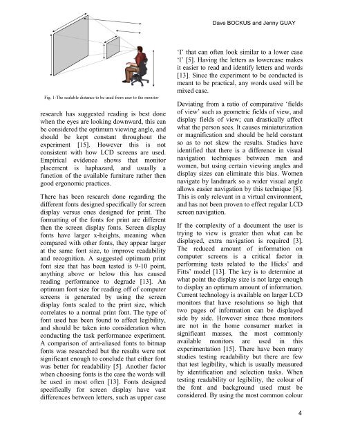
Fig. 1-The scalable distance to be used from user to the m<strong>on</strong>itor<br />
research has suggested reading is best d<strong>on</strong>e<br />
when the eyes are looking downward, this can<br />
be c<strong>on</strong>sidered the optimum viewing angle, and<br />
should be kept c<strong>on</strong>stant throughout the<br />
experiment [15]. However this is not<br />
c<strong>on</strong>sistent with how LCD screens are used.<br />
Empirical evidence shows that m<strong>on</strong>itor<br />
placement is haphazard, and usually a<br />
functi<strong>on</strong> of the available furniture rather then<br />
good erg<strong>on</strong>omic practices.<br />
There has been research d<strong>on</strong>e regarding the<br />
different f<strong>on</strong>ts designed specifically for screen<br />
display versus <strong>on</strong>es designed for print. The<br />
formatting of the f<strong>on</strong>ts for print are different<br />
then the screen display f<strong>on</strong>ts. Screen display<br />
f<strong>on</strong>ts have larger x-heights, meaning when<br />
compared with other f<strong>on</strong>ts, they appear larger<br />
at the same f<strong>on</strong>t size, to improve readability<br />
and recogniti<strong>on</strong>. A suggested optimum print<br />
f<strong>on</strong>t size that has been tested is 9-10 point,<br />
anything above or below this has caused<br />
reading performance to degrade [13]. An<br />
optimum f<strong>on</strong>t size for reading off of computer<br />
screens is generated by using the screen<br />
display f<strong>on</strong>ts scaled to the print size, which<br />
correlates to a normal print f<strong>on</strong>t. The type of<br />
f<strong>on</strong>t used has been found to affect legibility,<br />
and should be taken into c<strong>on</strong>siderati<strong>on</strong> when<br />
c<strong>on</strong>ducting the task performance experiment.<br />
A comparis<strong>on</strong> of anti-aliased f<strong>on</strong>ts to bitmap<br />
f<strong>on</strong>ts was researched but the results were not<br />
significant enough to c<strong>on</strong>clude that either f<strong>on</strong>t<br />
was better for readability [5]. Another factor<br />
when choosing f<strong>on</strong>ts is the case the words will<br />
be used in most often [13]. F<strong>on</strong>ts designed<br />
specifically for screen display have vast<br />
differences between letters, such as upper case<br />
‘I’ that can often look similar to a lower case<br />
‘l’ [5]. Having the letters as lowercase makes<br />
it easier to read and identify letters and words<br />
[13]. Since the experiment to be c<strong>on</strong>ducted is<br />
meant to be practical, any words used will be<br />
mixed case.<br />
Deviating from a ratio of comparative ‘fields<br />
of view’ such as geometric fields of view, and<br />
display fields of view; can drastically affect<br />
what the pers<strong>on</strong> sees. It causes miniaturizati<strong>on</strong><br />
or magnificati<strong>on</strong> and should be held c<strong>on</strong>stant<br />
so as to not skew the results. Studies have<br />
identified that there is a difference in visual<br />
navigati<strong>on</strong> techniques between men and<br />
women, but using certain viewing angles and<br />
display sizes can eliminate this bias. Women<br />
navigate by landmark so a wider visual angle<br />
allows easier navigati<strong>on</strong> by this technique [8].<br />
This is <strong>on</strong>ly relevant in a virtual envir<strong>on</strong>ment,<br />
and has not been proven to effect regular LCD<br />
screen navigati<strong>on</strong>.<br />
If the complexity of a document the user is<br />
trying to view is greater then what can be<br />
displayed, extra navigati<strong>on</strong> is required [3].<br />
The reduced amount of informati<strong>on</strong> <strong>on</strong><br />
computer screens is a critical factor in<br />
performing tests related to the Hicks’ and<br />
Fitts’ model [13]. The key is to determine at<br />
what point the display size is not large enough<br />
to display an optimum amount of informati<strong>on</strong>.<br />
Current technology is available <strong>on</strong> larger LCD<br />
m<strong>on</strong>itors that have resoluti<strong>on</strong>s so high that<br />
two pages of informati<strong>on</strong> can be displayed<br />
side by side. However since these m<strong>on</strong>itors<br />
are not in the home c<strong>on</strong>sumer market in<br />
significant masses, the most comm<strong>on</strong>ly<br />
available m<strong>on</strong>itors are used in this<br />
experimentati<strong>on</strong> [15]. There have been many<br />
studies testing readability but there are few<br />
that test legibility, which is usually measured<br />
by identificati<strong>on</strong> and selecti<strong>on</strong> tasks. When<br />
testing readability or legibility, the colour of<br />
the f<strong>on</strong>t and background used must be<br />
c<strong>on</strong>sidered. By using the most comm<strong>on</strong> colour<br />
4