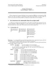
TikZ and pgf
TikZ and pgf
TikZ and pgf

You also want an ePaper? Increase the reach of your titles
YUMPU automatically turns print PDFs into web optimized ePapers that Google loves.
1. How many participants where there?<br />
2. How many participants returned the feedback form?<br />
3. What percentage of the participants returned the feedback form?<br />
4. How many participants checked “very good”?<br />
5. What percentage out of all participants checked “very good”?<br />
6. Did more than a quarter of the participants check “bad” or “very bad”?<br />
7. What percentage of the participants that returned the form checked “very good”?<br />
Sadly, the graphic does not allow us to answer a single one of these questions. The table answers all of<br />
them directly, except for the last one. In essence, the information density of the graphic is very nearly zero.<br />
The table has a much higher information density; despite the fact that it uses quite a lot of white space to<br />
present a few numbers.<br />
Here is the list of things that went wrong with the 3D-bar diagram:<br />
• The whole graphic is dominated by irritating background lines.<br />
• It is not clear what the numbers at the left mean; presumably percentages, but it might also be the<br />
absolute number of participants.<br />
• The labels at the bottom are rotated, making them hard to read.<br />
(In the real presentation that I saw, the text was rendered at a very low resolution with about 10 by<br />
6 pixels per letter with wrong kerning, making the rotated text almost impossible to read.)<br />
• The third dimension adds complexity to the graphic without adding information.<br />
• The three dimensional setup makes it much harder to gauge the height of the bars correctly. Consider<br />
the “bad” bar. It the number this bar st<strong>and</strong>s for more than 20 or less? While the front of the bar is<br />
below the 20 line, the back of the bar (which counts) is above.<br />
• It is impossible to tell which numbers are represented by the bars. Thus, the bars needlessly hide the<br />
information these bars are all about.<br />
• What do the bar heights add up to? Is it 100% or 60%?<br />
• Does the bar for “very bad” represent 0 or 1?<br />
• Why are the bars blue?<br />
You might argue that in the example the exact numbers are not important for the graphic. The important<br />
things is the “message,” which is that there are more “very good” <strong>and</strong> “good” ratings than “bad” <strong>and</strong> “very<br />
bad.” However, to convey this message either use a sentence that says so or use a graphic that conveys this<br />
message more clearly:<br />
none: 20 (40%)<br />
“very good”: 3 (6%)<br />
Ratings given by<br />
50 participants<br />
“very bad”: 0 (0%)<br />
“good”: 9 (18%) “bad”: 8 (16%)<br />
“ok”: 10 (20%)<br />
42