TikZ and pgf
TikZ and pgf
TikZ and pgf

You also want an ePaper? Increase the reach of your titles
YUMPU automatically turns print PDFs into web optimized ePapers that Google loves.
• Do not use 3D pie charts. They are evil.<br />
• Consider using a table instead of a pie chart.<br />
• Due not apply colors r<strong>and</strong>omly; use them to direct the readers’s focus <strong>and</strong> to group things.<br />
• Do not use background patterns, like a crosshatch or diagonal lines, instead of colors. They distract.<br />
Background patterns in information graphics are evil.<br />
4.8 Attention <strong>and</strong> Distraction<br />
Pick up your favorite fiction novel <strong>and</strong> have a look at a typical page. You will notice that the page is very<br />
uniform. Nothing is there to distract the reader while reading; no large headlines, no bold text, no large<br />
white areas. Indeed, even when the author does wish to emphasize something, this is done using italic<br />
letters. Such letters blend nicely with the main text—at a distance you will not be able to tell whether a<br />
page contains italic letters, but you would notice a single bold word immediately. The reason novels are<br />
typeset this way is the following paradigm: Avoid distractions.<br />
Good typography (like good organization) is something you do not notice. The job of typography is to<br />
make reading the text, that is, “absorbing” its information content, as effortless as possible. For a novel,<br />
readers absorb the content by reading the text line-by-line, as if they were listening to someone telling the<br />
story. In this situation anything on the page that distracts the eye from going quickly <strong>and</strong> evenly from line<br />
to line will make the text harder to read.<br />
Now, pick up your favorite weekly magazine or newspaper <strong>and</strong> have a look at a typical page. You will<br />
notice that there is quite a lot “going on” on the page. Fonts are used at different sizes <strong>and</strong> in different<br />
arrangements, the text is organized in narrow columns, typically interleaved with pictures. The reason<br />
magazines are typeset in this way is another paradigm: Steer attention.<br />
Readers will not read a magazine like a novel. Instead of reading a magazine line-by-line, we use headlines<br />
<strong>and</strong> short abstracts to check whether we want to read a certain article or not. The job of typography is to<br />
steer our attention to these abstracts <strong>and</strong> headlines, first. Once we have decided that we want to read an<br />
article, however, we no longer tolerate distractions, which is why the main text of articles is typeset exactly<br />
the same way as a novel.<br />
The two principles “avoid distractions” <strong>and</strong> “steer attention” also apply to graphics. When you design a<br />
graphic, you should eliminate everything that will “distract the eye.” At the same time, you should try to<br />
actively help the reader “through the graphic” by using fonts/colors/line widths to highlight different parts.<br />
Here is a non-exhaustive list of things that can distract readers:<br />
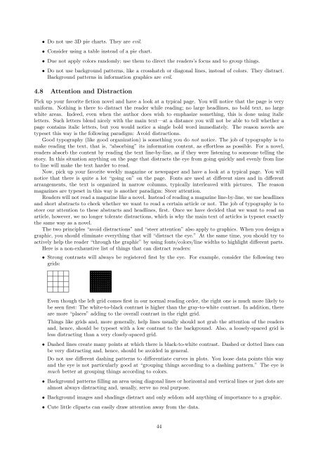
• Strong contrasts will always be registered first by the eye. For example, consider the following two<br />
grids:<br />
Even though the left grid comes first in our normal reading order, the right one is much more likely to<br />
be seen first: The white-to-black contrast is higher than the gray-to-white contrast. In addition, there<br />
are more “places” adding to the overall contrast in the right grid.<br />
Things like grids <strong>and</strong>, more generally, help lines usually should not grab the attention of the readers<br />
<strong>and</strong>, hence, should be typeset with a low contrast to the background. Also, a loosely-spaced grid is<br />
less distracting than a very closely-spaced grid.<br />
• Dashed lines create many points at which there is black-to-white contrast. Dashed or dotted lines can<br />
be very distracting <strong>and</strong>, hence, should be avoided in general.<br />
Do not use different dashing patterns to differentiate curves in plots. You loose data points this way<br />
<strong>and</strong> the eye is not particularly good at “grouping things according to a dashing pattern.” The eye is<br />
much better at grouping things according to colors.<br />
• Background patterns filling an area using diagonal lines or horizontal <strong>and</strong> vertical lines or just dots are<br />
almost always distracting <strong>and</strong>, usually, serve no real purpose.<br />
• Background images <strong>and</strong> shadings distract <strong>and</strong> only seldom add anything of importance to a graphic.<br />
• Cute little cliparts can easily draw attention away from the data.<br />
44