
You also want an ePaper? Increase the reach of your titles
YUMPU automatically turns print PDFs into web optimized ePapers that Google loves.
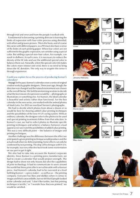
Silver<br />
Matt varnish<br />
through trial and error and from the people I worked with.<br />
Fundamental to becoming a printing director is learning the<br />
limits of expression with four-color process using sheetfed,<br />
web offset and gravure presses. This is the basis, and of course<br />
this varies with different papers, so a PD must also have a sense<br />
of the limits of each printing paper. When four colors are not<br />
sufficient for the graphic expression, we consider using a special<br />
color. But adding a special over four colors, for example, can<br />
result in dullness. In such cases, it is necessary to reduce the<br />
density of the 4C inks and use the additional special color to<br />
balance them out. Naturally, when the special color ink makes<br />
the colors more intense and vivid, there is no need to bring<br />
down the 4C densities. The only way to acquire this sense is<br />
through experience.<br />
Could you explain for us the process of producing <strong>Komori</strong>’s<br />
calendars?<br />
Aoyagi: In the past, <strong>Komori</strong>’s calendars were a series of original<br />
creative works by graphic designers. Three years ago, though, the<br />
direction was changed and the natural environment was chosen<br />
as the overall theme. We held brainstorming sessions to decide<br />
what the best means of expression would be — photographs or<br />
illustrations or something else. For <strong>Komori</strong>, the ideal calendar<br />
is beautiful and artistic rather than functional. For the first<br />
calendar in the new series, we worked with the animal photos<br />
of Mark Laita. For 2013 we used Joel Sartore’s photographs.<br />
We had to decide which photos from about a dozen or so<br />
would be best for showing added value printing techniques<br />
and the possibilities of the new H-UV curing system. With an<br />
ordinary calendar, the designer selects the photos to be used<br />
and special printing treatments follow from that selection. In<br />
<strong>Komori</strong>’s case, we had to select photos to illustrate specific<br />
printing techniques and achieve a balance between visual<br />
appeal as we saw it and the possibilities of added value printing.<br />
This was a very difficult point — the balance of images and<br />
printing techniques.<br />
Another challenge was the difference between the effect we<br />
anticipated a given printing technique would produce and the<br />
actual result when we did test printing. Some effects can only be<br />
confirmed by test printing. The drip-off technique with H-UV,<br />
for example, was very effective but it took some reorientation<br />
on our part to get it right.<br />
We also had to take into account the <strong>Komori</strong> corporate<br />
identity. Since <strong>Komori</strong> is a printing press manufacturer, we<br />
had to create a calendar that would project strength. The<br />
design had to show not only beauty but also the capabilities<br />
of print technology. It had to communicate to users around<br />
the world that these print effects are achievable with a <strong>Komori</strong><br />
press. And <strong>Komori</strong>’s calendar had to be executed at a level<br />
befitting <strong>Komori</strong> — a press maker — as well as us — the printing<br />
company. Everyone has likes and dislikes when it comes to<br />
images and that is unavoidable, but we felt that if people looked<br />
at the calendar and said, “I don’t like turtles, but that printing<br />
technique is terrific,” or “I wonder how that was printed,” we<br />
would be satisfied.<br />
Cover<br />
January–February<br />
March–April<br />
May–June<br />
OP varnish Coater<br />
Red<br />
Matt varnish<br />
OP varnish (pearl x 2)<br />
Matt varnish OP varnish (patterned)<br />
Coater<br />
Green Matt varnish<br />
OP varnish Coater<br />
<strong>Komori</strong> On Press<br />
7