

Vertex Framework Vertex Framework Guide
Vertex Framework Vertex Framework Guide
Vertex Framework Vertex Framework Guide

You also want an ePaper? Increase the reach of your titles
YUMPU automatically turns print PDFs into web optimized ePapers that Google loves.
-webkit-box-sizing: border-box; /* Safari/Chrome, other WebKit */<br />
-moz-box-sizing: border-box; /* Firefox, other Gecko */<br />
box-sizing: border-box; /* Opera/IE 8+ */<br />
This tells it to strictly look at the DIV's width and then everything works fine. IE8 supports it but IE7<br />
does not. So for images in IE7 we’ve just added the following:<br />
<br />
img.ie7, img.boxed, img.boxed_black, img.padded {<br />
max-width:95% !important;<br />
}<br />
<br />
So images with those class names will never get larger than 95%. We’ve added in a class "ie7" that<br />
someone can add if they need it to. So just remember to check your site in IE7 to be sure all images<br />
are showing properly in responsive mode.<br />
4.6 Responsive How To’s<br />
Hide Specific Modules via the Hide Classes<br />
For a complete list of Hide Classes download our Responsive Best Practices document from the<br />
tutorials page:<br />
http://www.shape5.com/joomla_tutorials.html<br />
If you have only a specific module that you would like to hide at certain screen sizes, and not an entire<br />
section of the template, this is the best approach. This is important, a hide class should be used to<br />
hide an entire module position, but rather a specific module published to that position. In other words<br />
if you have two modules published to the same position you can hide one, but not both, or the layout<br />
will be wrong. A hide class is a class that can be applied to any element on the page and hides that<br />
particular element at certain screen sizes. Classes range in 100px increments for large screens and<br />
50px increments for small screens. Use these sparingly if you can. As a recommendation, the primary<br />
target of these classes should focus on tablet and mobile sized screens. Wide screen monitors vary in<br />
size so it's much harder to use these classes correctly for large monitors. Tablet and mobile devices<br />
are much more consistent in size so it is much easier to apply the smaller hide classes.<br />
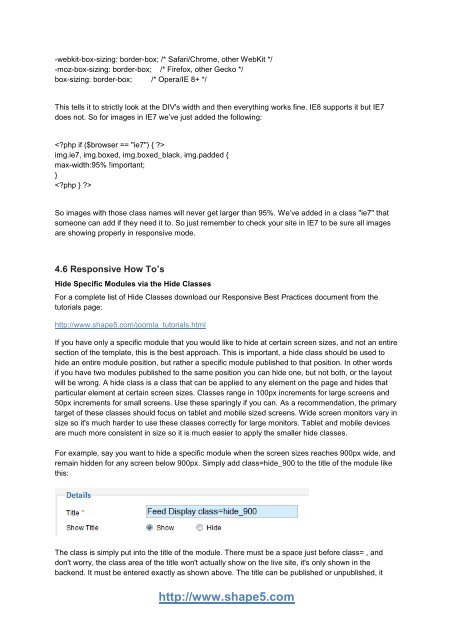
For example, say you want to hide a specific module when the screen sizes reaches 900px wide, and<br />
remain hidden for any screen below 900px. Simply add class=hide_900 to the title of the module like<br />
this:<br />
The class is simply put into the title of the module. There must be a space just before class= , and<br />
don't worry, the class area of the title won't actually show on the live site, it's only shown in the<br />
backend. It must be entered exactly as shown above. The title can be published or unpublished, it<br />
http://www.shape5.com
 Change language