Download Usability Testing Report - Soma Ray
Download Usability Testing Report - Soma Ray
Download Usability Testing Report - Soma Ray

You also want an ePaper? Increase the reach of your titles
YUMPU automatically turns print PDFs into web optimized ePapers that Google loves.
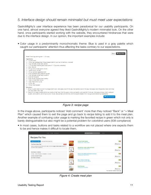
5. Interface design should remain minimalist but must meet user expectations<br />
GastroMighty’s user interface experience has been paradoxical for our usability participants. On<br />
one hand, almost everyone agreed they liked GastroMighty’s modern minimalist look. On the other<br />
hand, once participants started working with the website, they encountered hindrances that were<br />
due to the interface design. In our opinion, the important examples include:<br />
• Color usage in a predominantly monochromatic theme: Blue is used in a gray palette which<br />
caught our participants’ attention thus affecting the tasks contrary to our expectations.<br />
Figure 3: recipe page<br />
In the image above, participants noticed ‘Add comment’ more than they noticed “Back” or “+ Meal<br />
Plan” which caused them to exit the page and go back to recipe listing to add it to the meal plan.<br />
Another example of confusing color usage is marking the favorited recipe in green which not only is<br />
barely distinguishable but also might be a potential problem for colorblind users (508 compliance)<br />
• In most cases, buttons and tasks related to a workflow are not placed where one expects them<br />
to be and hence makes it difficult to locate them.<br />
Figure 4: Create meal plan<br />
<strong>Usability</strong> <strong>Testing</strong> <strong>Report</strong> 11