- Page 3 and 4:
HTML & CSS Design and Build Website
- Page 5 and 6:
Credits For John Wiley & Sons, Inc.
- Page 7:
Contents Introduction Chapter 1: St
- Page 10 and 11:
Firstly, thank you for picking up t
- Page 12 and 13:
Is it hard to Learn? Many books tha
- Page 14 and 15:
How People Access the Web Before we
- Page 16 and 17:
How the Web Works When you visit a
- Page 19 and 20:
1 Structure XX XX XX Understanding
- Page 21 and 22:
STRUCTURE 14
- Page 23 and 24:
STRUCTURE 16
- Page 25 and 26:
STRUCTURE 18
- Page 27 and 28:
HTML Describes the Structure of Pag
- Page 29 and 30:
Tags act like containers. They tell
- Page 31 and 32:
Character left-angle bracket (less
- Page 33 and 34:
HTML5 allows you to use uppercase a
- Page 35 and 36:
Anything written between the tags
- Page 37 and 38:
Article 3 Go to the File menu and s
- Page 39 and 40:
Article 3 Now go to the File menu a
- Page 41 and 42:
altering one template is a lot easi
- Page 43:
STRUCTURE 36
- Page 47 and 48:
2 Text XX XX XX Headings and paragr
- Page 49 and 50:
TEXT 42
- Page 51 and 52:
Paragraphs Article HTML chapter-02/
- Page 53 and 54:
Superscript Article & Subscript HTM
- Page 55 and 56:
Line Breaks Article & Horizontal Ru
- Page 57 and 58:
Semantic Markup There are some text
- Page 59 and 60:
Quotations Article HTML chapter-02/
- Page 61 and 62:
Citations Article & Definitions HTM
- Page 63 and 64:
Changes to Content Article HTML cha
- Page 65:
Example TEXT This is a very simple
- Page 69 and 70:
3 Lists XX XX XX Numbered lists Bul
- Page 71 and 72:
LISTS 64
- Page 73 and 74:
Unordered Article Lists HTML chapte
- Page 75 and 76:
Nested Article Lists HTML chapter-0
- Page 77:
Example LISTS Here you can see a ma
- Page 81 and 82:
4 Links XX XX XX Creating links bet
- Page 83 and 84:
LINKS 76
- Page 85 and 86:
The text between the opening tag a
- Page 87 and 88:
Linking to Other Article Pages on t
- Page 89 and 90:
Parent The examplearts folder is a
- Page 91 and 92:
Relative Link Type example (from di
- Page 93 and 94:
Opening Article Links in a New Wind
- Page 95 and 96:
Linking to a Specific Article Part
- Page 97:
Example LINKS This example is of a
- Page 101 and 102:
5 Images XX XX XX How to add images
- Page 103 and 104:
IMAGES 96
- Page 105 and 106:
Storing Images on Your Site If you
- Page 107 and 108:
Height & Article Width of Images HT
- Page 109 and 110:
Article Result Where you place the
- Page 111 and 112:
Article Result This looks a lot nea
- Page 113 and 114:
Article Result The value of top pla
- Page 115 and 116:
Tools to Edit & Save Images There a
- Page 118 and 119:
DESIGN RESEARCH Image Formats: GIF
- Page 120 and 121:
Image Dimensions The images you use
- Page 122 and 123:
Image Resolution Images created for
- Page 124 and 125:
Animated GIFs Animated GIFs show se
- Page 126 and 127:
Examining Images on the Web Checkin
- Page 128 and 129:
In this example, the logo is a GIF
- Page 131:
Summary IMAGES X X XX XX XX The el
- Page 134 and 135:
There are several types of informat
- Page 136 and 137:
129 TABLES
- Page 138 and 139:
Basic Table Structure The element
- Page 140 and 141:
Spanning ColumnS Sometimes you may
- Page 142 and 143:
Long Tables There are three element
- Page 144 and 145:
Old Code: Width & Spacing There are
- Page 146 and 147:
This example shows a table for cust
- Page 149:
Summary TABLES X X XX XX XX The el
- Page 152 and 153:
Traditionally, the term 'form' has
- Page 154 and 155:
Why Forms? The best known form on t
- Page 156 and 157:
How Forms Work A user fills in a fo
- Page 158 and 159:
Form Structure Form controls live
- Page 160 and 161:
Password Input type="password" Whe
- Page 162 and 163:
Radio Button type="radio" Radio bu
- Page 164 and 165:
Drop Down List Box A drop down lis
- Page 166 and 167:
File Input Box If you want to allo
- Page 168 and 169:
Image Button type="image" If you w
- Page 170 and 171:
Labelling Form Controls When intro
- Page 172 and 173:
HTML5: Form Validation You have pro
- Page 174 and 175:
HTML5: Email & URL Input HTML5 has
- Page 176 and 177:
169 FORMS
- Page 178 and 179:
Example FORMS Forms Your Det
- Page 181:
Summary FORMS XX XX XX XX Whenever
- Page 184 and 185:
At this point, we have covered the
- Page 186 and 187:
The Evolution of HTML Since the web
- Page 188 and 189:
DOCTYPEs Because there have been se
- Page 190 and 191:
ID Attribute Every HTML element can
- Page 192 and 193:
Block Elements Some elements will a
- Page 194 and 195:
Grouping Text & Elements In a Block
- Page 196 and 197:
IFrames An iframe is like a little
- Page 198 and 199:
Information About Your Pages The
- Page 200 and 201:
Escape Characters There are some ch
- Page 202 and 203:
This example starts by using a DOCT
- Page 205:
Summary EXTRA MARKUP X X DOCTYPES t
- Page 208 and 209:
Flash is a very popular technology
- Page 210 and 211:
How Flash Works Since the late 1990
- Page 212 and 213:
Timeline: Flash, VidEo & Audio Web
- Page 214 and 215:
Adding a Flash Movie to Your Web Pa
- Page 216 and 217:
Understanding Video Formats and Pla
- Page 218 and 219:
Preparing a Flash Video for Your Si
- Page 220 and 221:
HTML5: Preparing Video for Your Pag
- Page 222 and 223:
HTML5: Multiple Video Sources To s
- Page 224 and 225:
Adding Audio to Web Pages By far th
- Page 226 and 227:
HTML5: Adding HTML5 Audio to Your P
- Page 228 and 229:
221 FLASH, VIDEO & AUDIO
- Page 231:
Summary FLASH, VIDEO & AUDIO XX XX
- Page 234 and 235:
In this section, we will look at ho
- Page 236 and 237:
Understanding CSS: Thinking Inside
- Page 238 and 239:
CSS Associates Style rules with HTM
- Page 240 and 241: 233 INTRODUCING CSS
- Page 242 and 243: Using External CSS The element ca
- Page 244 and 245: CSS Selectors There are many differ
- Page 246 and 247: How Css Rules Cascade If there are
- Page 248 and 249: Why use External Style Sheets? When
- Page 251: Summary INTRODUCING CSS XX XX XX XX
- Page 254 and 255: Color can really bring your pages t
- Page 256 and 257: Foreground Color color The color pr
- Page 258 and 259: Understanding Color Every color on
- Page 260 and 261: Contrast When picking foreground an
- Page 262 and 263: CSS3: HSL Colors CSS3 introduces an
- Page 264 and 265: 257 COLOR
- Page 266 and 267: Example COLOR Color body { back
- Page 269: Summary COLOR XX XX XX XX XX XX Col
- Page 272 and 273: The properties that allow you to co
- Page 274 and 275: Typeface Terminology Serif Serif fo
- Page 276 and 277: Choosing a Typeface for your Websit
- Page 278 and 279: Techniques That Offer a Wider Choic
- Page 280 and 281: Specifying Typefaces font-family Th
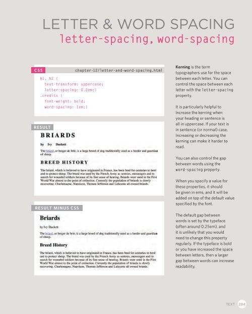
- Page 282 and 283: Type Scales You may have noticed th
- Page 284 and 285: More Font Choice @font-face @font-f
- Page 286 and 287: Bold font-weight The font-weight pr
- Page 288 and 289: UpperCase & LowerCase text-transfor
- Page 292 and 293: Alignment text-align The text-align
- Page 294 and 295: Indenting Text text-indent The text
- Page 296 and 297: First Letter or Line :first-letter,
- Page 298 and 299: Responding to Users :hover, :active
- Page 300 and 301: 293 TEXT
- Page 302 and 303: Example TEXT Text body { paddin
- Page 305: Summary TEXT XX XX XX XX XX There a
- Page 308 and 309: At the beginning of this section on
- Page 310 and 311: Article Box Dimensions width, heigh
- Page 312 and 313: Article Limiting Height min-height,
- Page 314 and 315: Border, Margin & Padding Every box
- Page 316 and 317: Article Border Width border-width T
- Page 318 and 319: Article Border Color border-color Y
- Page 320 and 321: Article Padding padding The padding
- Page 322 and 323: Article Centering Content If you wa
- Page 324 and 325: Article Change Inline/Block display
- Page 326 and 327: Article CSS3: Border Images border-
- Page 328 and 329: Article CSS3: Rounded Corners borde
- Page 330 and 331: 323 BOXES
- Page 332 and 333: Example BOXES Boxes body { font
- Page 335: Summary BOXES XX XX XX XX XX XX XX
- Page 338 and 339: There are several CSS properties th
- Page 340 and 341:
Article Bullet Point Styles list-st
- Page 342 and 343:
Article Positioning the Marker list
- Page 344 and 345:
Article Table Properties You have a
- Page 346 and 347:
Article Border on Empty Cells empty
- Page 348 and 349:
Styling Forms Nobody I know enjoys
- Page 350 and 351:
Article Styling Submit Buttons Here
- Page 352 and 353:
Article Aligning Form Controls: Pro
- Page 354 and 355:
Article Cursor Styles cursor The cu
- Page 356 and 357:
349 LISTS, TABLES AND FORMS
- Page 358 and 359:
Example LISTS, TABLES AND FORMS
- Page 360 and 361:
Example LISTS, TABLES AND FORMS bac
- Page 363:
Summary LISTS, TABLES AND FORMS XX
- Page 366 and 367:
In this chapter we are going to loo
- Page 368 and 369:
Key Concepts in Positioning Element
- Page 370 and 371:
Controlling the Position of Element
- Page 372 and 373:
Article Normal Flow position:static
- Page 374 and 375:
Article Absolute Positioning positi
- Page 376 and 377:
Article Overlapping Elements z-inde
- Page 378 and 379:
Article Using Float to Place Elemen
- Page 380 and 381:
Article Parents of Floated Elements
- Page 382 and 383:
Article Creating Multi-Column Layou
- Page 384 and 385:
Screen Sizes Different visitors to
- Page 386 and 387:
Page Sizes Because screen sizes and
- Page 388 and 389:
Fixed Width Layouts Fixed width lay
- Page 390 and 391:
Article Fixed Width Layout To creat
- Page 392 and 393:
Article Liquid Layout The liquid la
- Page 394 and 395:
Layout Grids Composition in any vis
- Page 396 and 397:
Possible Layouts: 960 Pixel wide 12
- Page 398 and 399:
CSS Frameworks CSS frameworks aim t
- Page 400 and 401:
Article Grid-Based Layout Using 960
- Page 402 and 403:
Article Multiple Style Sheets @impo
- Page 404 and 405:
397 LAYOUT
- Page 406 and 407:
Example LAYOUT
- Page 408 and 409:
Example LAYOUT .more-articles p:las
- Page 411:
Summary LAYOUT X X elements are of
- Page 414 and 415:
Controlling the size and alignment
- Page 416 and 417:
Article Controlling sizes of images
- Page 418 and 419:
Article AligNing images Using CSS I
- Page 420 and 421:
Background Images background-image
- Page 422 and 423:
Background Position background-posi
- Page 424 and 425:
Article Image Rollovers & Sprites U
- Page 426 and 427:
Article CSS3: Gradients background-
- Page 428 and 429:
421 IMAGES
- Page 430 and 431:
Example IMAGES Images body { co
- Page 433:
Summary IMAGES XX XX XX XX XX XX Yo
- Page 436 and 437:
HTML5 is introducing a new set of e
- Page 438 and 439:
Traditional HTML Layouts For a long
- Page 440 and 441:
Headers & Footers The and eleme
- Page 442 and 443:
Articles The element acts as a co
- Page 444 and 445:
Sections The element groups relat
- Page 446 and 447:
Figures You already met the elem
- Page 448 and 449:
Linking Around Block-Level Elements
- Page 450 and 451:
443 HTML5 LAYOUT
- Page 452 and 453:
Example HTML5 LAYOUT HTML5 Layou
- Page 454 and 455:
Example HTML5 LAYOUT margin: 10px 0
- Page 457:
Summary HTML5 LAYOUT XX XX XX XX Th
- Page 460 and 461:
This section discusses a process th
- Page 462 and 463:
Who is the Site For? Every website
- Page 464 and 465:
Why People Visit YOUR Website Now t
- Page 466 and 467:
What Information Your Visitors Need
- Page 468 and 469:
Site Maps Now that you know what ne
- Page 470 and 471:
WireFrames A wireframe is a simple
- Page 472 and 473:
Getting your message across using d
- Page 474 and 475:
Visual hierarchy Most web users do
- Page 476 and 477:
grouping and Similarity When making
- Page 478 and 479:
Designing Navigation Site navigatio
- Page 481:
Summary PROCESS & Design XX XX XX X
- Page 484 and 485:
To wrap up the book we are going to
- Page 486 and 487:
Search Engine Optimization (SEO) SE
- Page 488 and 489:
How to Identify Keywords and Phrase
- Page 490 and 491:
Analytics: Learning about your Visi
- Page 492 and 493:
What Are Your Visitors Looking At?
- Page 494 and 495:
Domain Names & Hosting In order to
- Page 496 and 497:
FTP & Third Party Tools To transfer
- Page 499:
Summary PRACTICAL INFORMATION XX XX
- Page 502 and 503:
# symbol (links) 87, 88 _blank 86
- Page 504 and 505:
E e-commerce 33 editing content 56
- Page 506 and 507:
J JavaScript 208, 212, 218 JPEG 109
- Page 508 and 509:
send to back 369 serif typefaces 26
- Page 510 and 511:
TroubleShooting Here are a few prob
- Page 512 and 513:
HTML Elements 77, 79, 85, 441 53
- Page 514:
CSS Properties background-attachmen