BRAND BOOK STYLE GUIDE

Create successful ePaper yourself
Turn your PDF publications into a flip-book with our unique Google optimized e-Paper software.
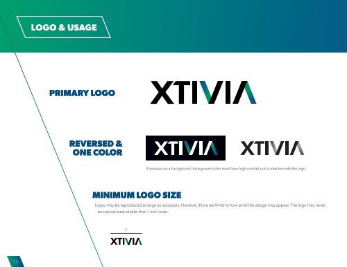
LOGO & USAGE<br />
LOGO STAGING AREA<br />
PRIMARY LOGO<br />
The staging area, also called clear space, is the area around the logo that must always remain clear. It should be thought of as<br />
part of the design. The staging area helps separate the logo from visual clutter and helps the design stand out clearly for easier<br />
recognition. No other printed material should violate this space. This space also determines the minimum distance between<br />
the logo and the closest edge of the surrounding area. The staging area required for our logo at the size shown is indicated<br />
here by a (green) box.<br />
REVERSED &<br />
ONE COLOR<br />
“X” height<br />
Half of the logo “X” height should be the clearspace<br />
MINIMUM LOGO SIZE<br />
If reversed on a background, background color must have high contrast not to interfere with the logo.<br />
Logos may be reproduced as large as necessary. However, there are limits to how small the design may appear. The logo may never<br />
be reproduced smaller than 1 inch wide.<br />
INCORRECT LOGO USAGE<br />
The logo should never be altered or distorted and should never deviate from the established guidelines. Never alter or<br />
distort the shape or color. Using XTIVIA in type body: Whenever XTIVIA is used in emails, sales materials, or any internal<br />
communication, it is always written in all capital letters: XTIVIA. Initial caps (e.g. Xtivia) is NOT permitted in any circumstance.<br />
1''<br />
Example 1 Example 2 Example 3 Example 4 Example 5<br />
26<br />
27