- Page 1 and 2:
Revised 2007MathematicsA Student an
- Page 3 and 4:
Cover photo credits: Left © Royalt
- Page 5 and 6:
ContentsMathematicsIntroduction . .
- Page 7 and 8:
What Are the Helpful Features of Th
- Page 9 and 10:
Texas Assessmentof Knowledge and Sk
- Page 11 and 12:
Objective 1The student will describ
- Page 13 and 14:
Objective 1Do the ordered pairs gra
- Page 15 and 16:
Objective 1How Can You Represent a
- Page 17 and 18:
Objective 1Any equation in the form
- Page 19 and 20:
Objective 1A variety of methods of
- Page 21 and 22:
Objective 1Does the graph below rep
- Page 23 and 24:
Objective 1●Check at least two po
- Page 25 and 26:
Objective 1Find two points that sat
- Page 27 and 28:
Objective 1A physics class is doing
- Page 29 and 30:
Objective 1Which of the following s
- Page 31 and 32:
Objective 1Question 1The basketball
- Page 33 and 34:
Objective 1Question 7Which graph be
- Page 35 and 36:
Objective 1Question 9The table belo
- Page 37 and 38:
Objective 2The student will demonst
- Page 39 and 40:
Objective 2The simplest quadratic f
- Page 41 and 42:
Objective 2Try ItWhat are the domai
- Page 43 and 44:
Objective 2An open circle on agraph
- Page 45 and 46:
Objective 2Try ItA rectangular cour
- Page 47 and 48:
Objective 2Try ItThe graph below de
- Page 50 and 51:
Objective 2A trucking company keeps
- Page 52 and 53:
Objective 2How Do You Use Symbols t
- Page 54 and 55:
Objective 2Verify that each of the
- Page 56 and 57:
Objective 2Students in a math class
- Page 58 and 59:
Objective 2Simplify the expression
- Page 60 and 61:
Objective 2How Do You Solve Algebra
- Page 62 and 63:
Objective 2The length of a rectangl
- Page 64 and 65:
Objective 2Question 12Which functio
- Page 66 and 67:
Objective 2Question 16The table sho
- Page 68 and 69:
Objective 3The student will demonst
- Page 70 and 71:
Objective 3What Is Slope?The slope
- Page 72 and 73:
Objective 3The set of ordered pairs
- Page 74 and 75:
Objective 3What are the slope and y
- Page 76 and 77:
Objective 3What Are the Effects on
- Page 78 and 79:
Change in y-Intercept, bObjective 3
- Page 80 and 81:
Objective 3Try ItIf the slope of th
- Page 82 and 83:
Objective 3Try ItWrite the equation
- Page 84 and 85:
Objective 3Try ItWrite the equation
- Page 86 and 87:
Objective 3Try ItWrite the equation
- Page 88 and 89:
Objective 3Here are two ways to fin
- Page 90 and 91:
Objective 3How Do You Interpret the
- Page 92 and 93:
Objective 3The domestic production
- Page 94 and 95:
Objective 3How Do You Predict the E
- Page 96 and 97:
Objective 3In a science lab Kim fou
- Page 98 and 99:
Objective 3Question 25The graph bel
- Page 100 and 101:
Objective 4The student will formula
- Page 102 and 103:
Objective 4● Solve the inequality
- Page 104 and 105:
Objective 4Try ItSix friends decide
- Page 106 and 107:
Objective 4Try ItA rectangle has a
- Page 108 and 109:
Objective 4Solve this system of equ
- Page 110 and 111:
Objective 4The elimination method i
- Page 112 and 113:
Objective 4Try ItDescribe the solut
- Page 114 and 115:
Objective 4Question 34The Seashell
- Page 116 and 117:
Objective 4Question 40Which is the
- Page 118 and 119:
Objective 5The graph of the quadrat
- Page 120 and 121:
Objective 5What Happens to the Grap
- Page 122 and 123:
Objective 5If the coefficient of x
- Page 124 and 125:
Objective 5What Happens to the Grap
- Page 126 and 127:
Objective 5For what amount should t
- Page 128 and 129:
Objective 5What are the solutions t
- Page 130 and 131:
Objective 5How Can You Solve a Quad
- Page 132 and 133:
Objective 5How Can You Solve a Quad
- Page 134 and 135:
Objective 5Try ItFind the approxima
- Page 136 and 137:
Objective 5●●When raising a ter
- Page 138 and 139:
Objective 5Try ItA rectangular pris
- Page 140 and 141:
Objective 5Question 46A bakery dete
- Page 142 and 143:
Objective 6The student will demonst
- Page 144 and 145:
Objective 6In the diagram below, FR
- Page 146 and 147:
Objective 6Point O is the center of
- Page 148 and 149:
Objective 6Continue to follow this
- Page 150 and 151:
Objective 6Make a table to show the
- Page 152 and 153:
Objective 6Sometimes we can combine
- Page 154 and 155:
Objective 6Find the length of side
- Page 156 and 157:
Objective 6Consuelo is on a boat 3
- Page 158 and 159:
Objective 6How Do You Use Transform
- Page 160 and 161:
Objective 6The graph of ABC is show
- Page 162 and 163:
Objective 6If point P (6, 1) is ref
- Page 164 and 165:
Objective 6Try ItThe graph below sh
- Page 166 and 167:
Objective 6Question 57Look at the s
- Page 168 and 169:
Objective 6Question 63Which set of
- Page 170 and 171:
Objective 7What 3-dimensional figur
- Page 172 and 173:
Objective 7Perspective views of a f
- Page 174 and 175:
Objective 7A coordinate grid is use
- Page 176 and 177:
Objective 7T5yRS432UV1-5 -4 -3 -2 -
- Page 178 and 179:
Objective 7A median of a triangle i
- Page 180 and 181:
Objective 7Parallelogram PTRS is sh
- Page 182 and 183:
Objective 7How Do You Find the Leng
- Page 184 and 185:
The x-coordinates of the endpoints
- Page 186 and 187:
Objective 7You should also be famil
- Page 188 and 189:
Objective 7Question 67Three views o
- Page 190 and 191:
Objective 7Question 71Which equatio
- Page 192 and 193:
Objective 8●Find the area of the
- Page 194 and 195:
Objective 8Try ItHenry is building
- Page 196 and 197:
Objective 8How Do You Find the Leng
- Page 198 and 199: Objective 8Substitute the known val
- Page 200 and 201: Objective 8A πr 2A π(3) 2A 9π
- Page 202 and 203: Objective 8Yolanda’s television s
- Page 204 and 205: Objective 8Try ItWhat is the perime
- Page 206 and 207: Objective 8What is the minimum area
- Page 208 and 209: Objective 8What is the lateral surf
- Page 210 and 211: Objective 8How many cubic centimete
- Page 212 and 213: Objective 8Flask’s volume Volume
- Page 214 and 215: Objective 8DilationsA dilation is a
- Page 216 and 217: Objective 8y13121110A9876DD54321-13
- Page 218 and 219: Objective 8The lengths of the sides
- Page 220 and 221: Objective 8The actual width of the
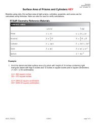
- Page 222 and 223: Objective 8How Is the Surface Area
- Page 224 and 225: Objective 8Question 76D 127 yd 2Que
- Page 226 and 227: Objective 8Question 80Question 79D
- Page 228 and 229: Objective 8Question 85A spherical b
- Page 230 and 231: Objective 9●Write a proportion, a
- Page 232 and 233: edObjective 9What Is Probability?Pr
- Page 234 and 235: Objective 9A jar contains 9 black m
- Page 236 and 237: Objective 9For the second draw, we
- Page 238 and 239: Objective 9A spinner is divided int
- Page 240 and 241: Objective 9Try ItA gardening store
- Page 242 and 243: Objective 9The table shows the atte
- Page 244 and 245: Objective 9Mean:Find the mean of Ry
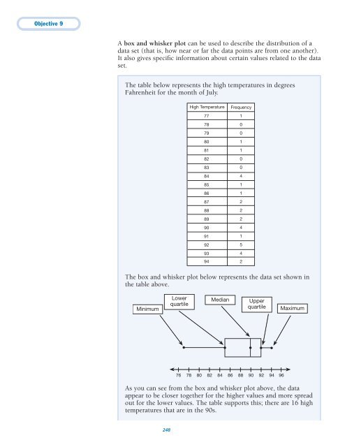
- Page 246 and 247: Objective 9When people go to a doct
- Page 250 and 251: Objective 9The lower quartile can b
- Page 252 and 253: Objective 9The greatest percent inc
- Page 254 and 255: Objective 9Question 91Amelia survey
- Page 256 and 257: Objective 9Question 94The circle gr
- Page 258 and 259: Objective 9Question 97A high school
- Page 260 and 261: Objective 10●Write two equations
- Page 262 and 263: Objective 10Let h represent the num
- Page 264 and 265: Objective 10●The distance around
- Page 266 and 267: Objective 10How Do You Communicate
- Page 268 and 269: Objective 10If the translated funct
- Page 270 and 271: Objective 10How Do You Use Logical
- Page 272 and 273: Objective 10Try ItWrite the equatio
- Page 274 and 275: Objective 10The solution to a probl
- Page 276 and 277: Objective 10Question 102Which equat
- Page 278 and 279: Objective 10Question 105Three trian
- Page 280 and 281: Objective 10Question 107A triangle
- Page 282 and 283: Mathematics Answer KeyDCorrect. Use
- Page 284 and 285: Mathematics Answer KeyThe cost of t
- Page 286 and 287: Mathematics Answer KeySubstitute c
- Page 288 and 289: Mathematics Answer KeyQuestion 39 (
- Page 290 and 291: Mathematics Answer KeySet each fact
- Page 292 and 293: Mathematics Answer KeyQuestion 63 (
- Page 294 and 295: Mathematics Answer KeySubstitute m
- Page 296 and 297: Mathematics Answer KeyThe height of
- Page 298 and 299:
Mathematics Answer Key5quarter is .
- Page 300 and 301:
Mathematics Answer KeyInvestmentof
- Page 302 and 303:
Texas Assessmentof Knowledge and Sk