2010 and 2011 - Census Bureau
2010 and 2011 - Census Bureau
2010 and 2011 - Census Bureau

You also want an ePaper? Increase the reach of your titles
YUMPU automatically turns print PDFs into web optimized ePapers that Google loves.
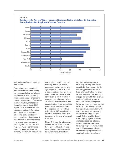
Figure 6.<br />
Productivity Varies Widely Across Regions: Ratio of Actual to Expected<br />
Completions for Regional <strong>Census</strong> Centers<br />
Atlanta<br />
Boston<br />
Charlotte<br />
Chicago<br />
Dallas<br />
Denver<br />
Detroit<br />
Kansas City<br />
Los Angeles<br />
New York<br />
Philadelphia<br />
Seattle<br />
<strong>and</strong> Dallas performed considerably<br />
worse.<br />
Our analysis also examined<br />
how the data collected during<br />
nonresponse follow-up affected<br />
differences in final response<br />
rates across groups of concern.<br />
Figure 7 shows rates of response<br />
through mailout/mailback <strong>and</strong><br />
through enumeration (NRFU)<br />
by the share of minorities in a<br />
tract’s population. Information<br />
about April 1st inhabitants of<br />
a housing unit provided by<br />
people not living there on April<br />
1st—known as proxy response<br />
—is treated as nonresponse<br />
here. Figure 7 shows that mail<br />
response rates strongly negatively<br />
correlate with percent<br />
minority. Tracts with populations<br />
0.0 0.2 0.4 0.6 0.8 1.0 1.2 1.4<br />
Actual/forecast<br />
that are less than 25 percent<br />
minority had about eleven<br />
percentage points higher average<br />
response rates than tracts<br />
with populations that are more<br />
than 75 percent minority. The<br />
correlation is much weaker in<br />
nonresponse follow-up, where<br />
75 percent minority tracts had<br />
approximately three percentage<br />
points lower interview rates.<br />
Nonresponse follow-up thus<br />
reduced the differential undercount<br />
of minorities relative to<br />
the count at the end of the mailback<br />
period.<br />
Figure 8 shows the odds ratios<br />
of selected variables in tractlevel<br />
grouped logistic regressions<br />
of response rates separately<br />
for mailout/mailback<br />
(in blue) <strong>and</strong> nonresponse<br />
follow-up (in red). The results<br />
provide further support for the<br />
story suggested by Figure 7.<br />
Even after controlling for other<br />
factors, minority race/ethnicity<br />
groups have well-below-average<br />
mailout/mailback response<br />
rates, but their nonresponse<br />
follow-up response rates are not<br />
nearly so low. Unemployment<br />
has a positive association with<br />
response rates, but the magnitude<br />
of the effect is very<br />
small. Richer neighborhoods<br />
have slightly higher mailout/<br />
mailback response rates <strong>and</strong><br />
slightly lower nonresponse<br />
follow-up response rates. Areas<br />
with a high concentration of<br />
retirement-aged persons have<br />
very high mailout/mailback<br />
U.S. <strong>Census</strong> <strong>Bureau</strong> Research at the Center for Economic Studies <strong>and</strong> the Research Data Centers: <strong>2010</strong>–<strong>2011</strong> 19