- Page 1 and 2:
Using Zen ComponentsVersion 2012.23
- Page 5 and 6:
5.6 Selections ....................
- Page 7 and 8:
9 Other Zen Components ............
- Page 9:
List of TablesTable 1-1: XML Entiti
- Page 13 and 14:
1Zen TablesA Zen table is data-driv
- Page 15 and 16:
Data Sources1.2 Data SourcesA elem
- Page 17 and 18:
Data SourcesAttributewhereClauseDes
- Page 19 and 20:
Data SourcesAttributeOnExecuteResul
- Page 21 and 22:
Data SourcesPropertyrowCountDescrip
- Page 23 and 24:
Table Columns1.4 Table ColumnsThe
- Page 25 and 26:
Table ColumnsAttributeOnDrawCellDes
- Page 27 and 28:
Conditional Style for Rows or Cells
- Page 29 and 30:
Snapshot ModePredicateNEQSTARTSWITH
- Page 31 and 32:
Column Filters1.8 Column FiltersA Z
- Page 33 and 34:
Column LinksThis example uses the
- Page 35 and 36:
User InteractionsThis example does
- Page 37 and 38:
User InteractionsFor columns that c
- Page 39:
Table Touchups1.12 Table TouchupsAn
- Page 42 and 43:
Zen and SVG2.2 SVG Component Layout
- Page 44 and 45:
Zen and SVGAttributeZen componentat
- Page 46 and 47:
Zen and SVGAttributesnapToGridsvgAu
- Page 48 and 49:
Zen and SVGThe Zen element takes u
- Page 50 and 51:
Zen and SVG• • • • • •
- Page 52 and 53:
Zen and SVGAttributethresholdUpperv
- Page 54 and 55:
Zen and SVG2.4.5 The light bar prov
- Page 56 and 57:
Zen and SVGThe smiley is the famili
- Page 58 and 59:
Zen and SVG2.5 ChartsCharts are SVG
- Page 60 and 61:
Zen and SVGAttributecaptiononclickD
- Page 63 and 64:
3Zen ChartsThis chapter explains ho
- Page 65 and 66:
Types of Chart• High/Low Charts
- Page 67 and 68:
Types of ChartYou can supply up to
- Page 69 and 70:
Types of ChartFigure 3-7: Combo Cha
- Page 71 and 72:
Types of ChartFigure 3-10: Area Cha
- Page 73 and 74:
Types of ChartFigure 3-12: Line Cha
- Page 75 and 76:
Types of ChartA that plots the ite
- Page 77 and 78:
Types of ChartFigure 3-15: Pie Char
- Page 79 and 80:
Types of ChartFigure 3-17: How Zen
- Page 81 and 82:
Providing Data for Zen Page ChartsA
- Page 83 and 84:
Providing Data for Zen Page ChartsP
- Page 85 and 86:
Providing Data for Zen Page Charts1
- Page 87 and 88:
Chart Layout, Style, and BehaviorFi
- Page 89 and 90:
Chart Layout, Style, and BehaviorAt
- Page 91 and 92:
Chart Layout, Style, and BehaviorAt
- Page 93 and 94:
Chart Axes3.3.6 User SelectionsThe
- Page 95 and 96:
Chart AxesFigure 3-21: Same data Pl
- Page 97 and 98:
4Zen FormsForms permit the user to
- Page 99 and 100:
User InteractionsFigure 4-1: Class
- Page 101 and 102:
Defining a FormAttributekeymethodne
- Page 103 and 104:
Providing Values for a FormAttribut
- Page 105 and 106:
Errors and Invalid ValuesExecute th
- Page 107 and 108:
User Login FormsUser ViewpointIn th
- Page 109:
Dynamic Forms2. The second subscrip
- Page 112 and 113:
Zen ControlsTable 5-1: Control Comp
- Page 114 and 115:
Zen ControlsAttributeoriginalValuer
- Page 116 and 117:
Zen Controls• — The user click
- Page 118 and 119:
Zen Controls2. In the %OnAfterCreat
- Page 120 and 121:
Zen ControlsNote:For an example of
- Page 122 and 123:
Zen ControlsAttributedisplayListDes
- Page 124 and 125:
Zen Controls5.6.4 The component di
- Page 126 and 127:
Zen ControlsAttributevalueListDescr
- Page 128 and 129:
Zen Controlscan simply appear when
- Page 130 and 131:
Zen ControlsThe Zen control is not
- Page 132 and 133:
Zen Controls has the following attr
- Page 134 and 135:
Zen Controls• Solutions to proble
- Page 136 and 137:
Zen ControlsAttributescrollIntoView
- Page 138 and 139:
Zen Controls5.7.5.3 Logical and Di
- Page 140 and 141:
Zen ControlsAttributechoiceColumncl
- Page 142 and 143:
Zen ControlsAttributevalueColumnDes
- Page 144 and 145:
Zen ControlsAttributedayListDescrip
- Page 146 and 147:
Zen ControlsAttributeControl compon
- Page 148 and 149:
Zen ControlsAttributedayListDescrip
- Page 150 and 151:
Zen Controls5.9 GridThe control di
- Page 152 and 153:
Zen ControlsFigure 5-1: Data Model
- Page 154 and 155:
Zen ControlsAttributeheighthiddenla
- Page 156 and 157:
Zen ControlsAttributecolumnWidthcon
- Page 158 and 159:
Zen ControlsAttributeshowColumnLabe
- Page 160 and 161:
Zen Controls5.10 HiddenThe Zen con
- Page 162 and 163:
Model View ControllerFigure 6-1: Mo
- Page 164 and 165:
Model View Controller• For refere
- Page 166 and 167:
Model View ControllerAttributeautoR
- Page 168 and 169:
Model View ControllerClient Side Me
- Page 170 and 171:
Model View ControllerWhen you chang
- Page 172 and 173:
Model View ControllerQuit tSC}/// L
- Page 174 and 175:
Model View Controller6.5.4 Step 4:
- Page 176 and 177: Model View ControllerAlso observe t
- Page 178 and 179: Model View ControllerIn the exercis
- Page 180 and 181: Model View Controller3. Add this ,
- Page 182 and 183: Model View Controller• Click OK.T
- Page 184 and 185: Model View Controllerkey:value[CR]k
- Page 186 and 187: Model View ControllerThe data model
- Page 188 and 189: Model View ControllerSince you have
- Page 190 and 191: Model View Controller6.9 Data Model
- Page 192 and 193: Model View ControllerProperty Param
- Page 194 and 195: Model View ControllerMethod%OnStore
- Page 196 and 197: Model View ControllerFigure 6-4: Da
- Page 199 and 200: 7Navigation ComponentsThe “Zen La
- Page 201 and 202: Links7.1 LinksThe following Zen com
- Page 203 and 204: LinksThe corresponding definition
- Page 205 and 206: Menusthe dot (.) in front of the pa
- Page 207 and 208: Menus7.2.1 Each item on a is defin
- Page 209 and 210: TabsAttributeonactivateDescriptionI
- Page 211 and 212: Tabslabel="Color:" name="Color" />T
- Page 213 and 214: Tabs has the following attributes:A
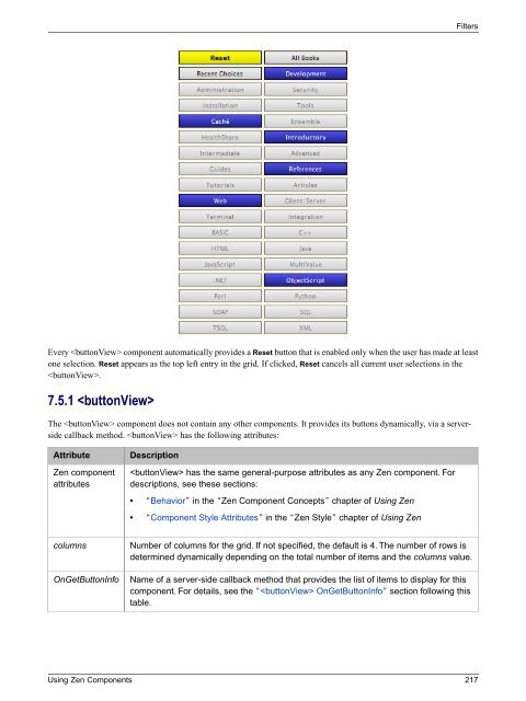
- Page 215 and 216: Trees7.4 TreesThe following Zen com
- Page 217 and 218: TreesThis definition references a n
- Page 219 and 220: Trees7.4.2.1 Using a GlobalThe sim
- Page 221 and 222: Trees• The method returns a %Bool
- Page 223 and 224: Trees#; child nodes are placed unde
- Page 225: TreesAttributeshowLinesonchangeDesc
- Page 229 and 230: Filters• An array passed by refer
- Page 231 and 232: 8Popup Windows and DialogsThis chap
- Page 233 and 234: Modal GroupsNo data entered yet. 5.
- Page 235 and 236: Modal Groups- An optional width val
- Page 237 and 238: Modal Groups3. Finally, you must re
- Page 239 and 240: Modal GroupsClicking OK on the popu
- Page 241 and 242: Popup WindowsTable 8-1: Client Side
- Page 243 and 244: Popup WindowsArgumentpageNamefeatur
- Page 245 and 246: Dialogs8.3.2 Color Selection Dialog
- Page 247: Dialogs• Copy the class %ZEN.Dial
- Page 250 and 251: Other Zen ComponentsThe content may
- Page 252 and 253: Other Zen ComponentsIE is different
- Page 254 and 255: Other Zen ComponentsreadOnly="true"
- Page 256 and 257: Other Zen ComponentsAttributecurrSl
- Page 258 and 259: Other Zen ComponentsOn the output s
- Page 260 and 261: Other Zen Components• pHeaders is
- Page 262 and 263: Other Zen ComponentsAttributeidDesc
- Page 264 and 265: Other Zen ComponentsAttributecaptio
- Page 266 and 267: Other Zen ComponentsAttributeonsele
- Page 268 and 269: Other Zen ComponentsAttributeZen co
- Page 271 and 272: IndexSymbols%OnSubmit, 96%query, 15
- Page 273 and 274: colorPane face, 246colorPane onchan
- Page 275 and 276: dateText separator, 139dateText sho
- Page 277 and 278:
frameAlign, iframe, 241frameBorder,
- Page 279 and 280:
link style, 192link target, 192link
- Page 281 and 282:
onclick, link, 192onclick, menuItem
- Page 283 and 284:
plotStyle, chart, 80plotToEdge, 80p
- Page 285 and 286:
showTime, 135, 139showTime, calenda
- Page 287 and 288:
title, yAxis, 86titleList, 112, 115


 Change language