The Metric U explained - Unipart Logistics
The Metric U explained - Unipart Logistics
The Metric U explained - Unipart Logistics

Create successful ePaper yourself
Turn your PDF publications into a flip-book with our unique Google optimized e-Paper software.
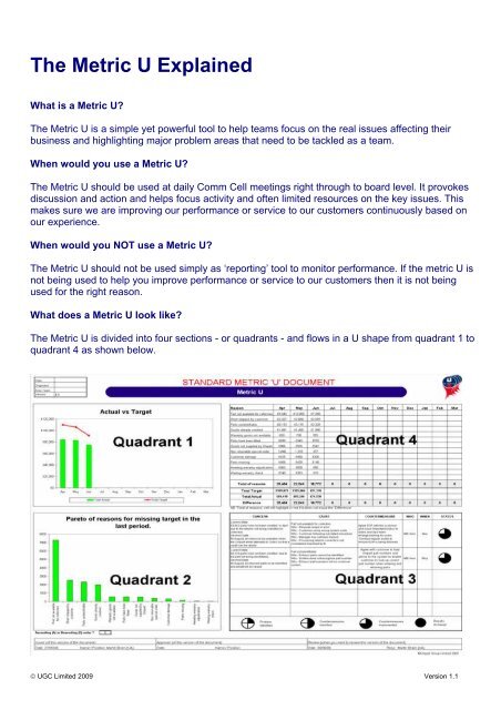
<strong>The</strong> <strong>Metric</strong> U ExplainedWhat is a <strong>Metric</strong> U?<strong>The</strong> <strong>Metric</strong> U is a simple yet powerful tool to help teams focus on the real issues affecting theirbusiness and highlighting major problem areas that need to be tackled as a team.When would you use a <strong>Metric</strong> U?<strong>The</strong> <strong>Metric</strong> U should be used at daily Comm Cell meetings right through to board level. It provokesdiscussion and action and helps focus activity and often limited resources on the key issues. Thismakes sure we are improving our performance or service to our customers continuously based onour experience.When would you NOT use a <strong>Metric</strong> U?<strong>The</strong> <strong>Metric</strong> U should not be used simply as ‘reporting’ tool to monitor performance. If the metric U isnot being used to help you improve performance or service to our customers then it is not beingused for the right reason.What does a <strong>Metric</strong> U look like?<strong>The</strong> <strong>Metric</strong> U is divided into four sections - or quadrants - and flows in a U shape from quadrant 1 toquadrant 4 as shown below.© UGC Limited 2009 Version 1.1
Quadrant 1 shows actual performance against target.Quadrant 2 shows a pareto of the reasons for missing targetQuadrant 3 shows the Concern, Cause and Countermeasures relating to the biggest reasons formissing target.Quadrant 4 tracks the results to monitor the effectiveness of the countermeasures<strong>The</strong> following section describes each quadrant in more detail.1 st QuadrantPerformance Vs Target graph<strong>The</strong> first step is to choose the area of the business that you want to measure, analyse and act upon.For example it could be discrepancies, defects or delivery performance. In most cases you will knowroughly what your current performance levels are and may even know your target level as it mayhave been set by your customer, what you know as best practice, or simply a target you have setyourselves.<strong>The</strong> first quadrant in the <strong>Metric</strong> U is where your normal performance against target graph goes. <strong>The</strong>measurement units are whatever you need them to be - percentages or numbers - and should showyour actual performance and your target.<strong>The</strong> graph shows a red target line and the actual is shown as a green bar for each day, week ormonth dependent on the frequency of data collection.This gives us a top line indicator of our performance. However, it doesn’t tell us where we havefailed or why, simply that we have.© UGC Limited 2009 Version 1.1
ExampleIn the example above, the target line is the value of electronic return requests that the customer hasraised in the month. This is the value that the customer expects <strong>Unipart</strong> to raise a credit for.<strong>The</strong> actual bar is the value that was actually credited to the customer. <strong>The</strong> gap between target andactual is the value of return requests that were rejected by <strong>Unipart</strong> branches.We now need to know why we had rejected returns and where we need to focus - this takes us tothe second quadrant in the bottom left.2 nd QuadrantReasons missing target<strong>The</strong> second quadrant is used to break down the reasons for the ‘gap’ between target and actualperformance so that you can identify what is the largest reason for failure against your performancetarget, or if you are outperforming your target, you can identify how to improve even more. This isdisplayed as a Pareto chart - it is important that you use the same units of measurement thatyou use in the first quadrant, so if the first quadrant is measured in £s, then this needs to bein £s.NB: If percentages are used the second quadrant should always add up to 100 as you are focusingon 100% of the failures or defectsThis chart only shows the last reporting period for your performance target, so that way you caninstantly see what is affecting your latest performance and keep problem solving activity focussedon the biggest issues.© UGC Limited 2009 Version 1.1
ExampleIn the example above, the overall shortfall between electronic return requests and credits raisedwas £25,464 in April so the pareto shows us the breakdown by reason of the £25,464 rejectedreturn requests.By showing it this way we can easily focus our attention on the biggest issues. It is shown as aPareto Chart and MUST be directly related to previous data (quadrant one)In the example above, the biggest reasons for not hitting target in the most recent period, is ‘Partnot available for collection’. <strong>The</strong> next biggest reason is ‘Parts unidentifiable’.Now we have a clear view of what is going wrong and we know if we put our efforts into these twowe should see an overall improvement in rejected returns.From here we move to the third quadrant on the bottom right corner called the 3 C’s. This is wherethe whole team can get involved in the problem solving process.Processing the dataRaw data can be collected in many ways. First you need to specify what are your reasons for failureagainst your performance target, there is no set way to do this as each different target can havemultiple reasons for failure - and the way that you get information around each target is different.Some careful planning and understanding of your targets is needed at this stage, as if you are notmeasuring the right things, you won't be able to solve the problems that affect your performance.It's also important to note that the data you do collect is reliable and accurate, this means thatregardless of who collects the data, we always need to ensure that it is collected in a repeatableand consistent way. It's important to remember that we need good quality data to get a truemeasure of performance which then allows us to implement robust actions that eliminate the rootcauses of problems.3 rd QuadrantConcerns, Causes and Countermeasures - the 3 C's<strong>The</strong> 3 C’s are defined as follows:• Concern - A statement relating to the problem or issue• Cause - A statement of the ROOT cause of the problem established through the useof CPS• Countermeasure - Actions agreed to reduce or eliminate the problem showing who’sresponsible and when they should be completedIt is a capture of the causes and actions agreed to address the top issues showing on the ParetoChart so all can see where the efforts and resources are being focused. It is also a visible sign toManagement that the team are acting on customer related issues to improve their teamsperformance. To help monitor our progress there is a ‘pie chart’ progress monitor shown at thebottom - we simply show one for each action and review progress each day or week.© UGC Limited 2009 Version 1.1
This section of the <strong>Metric</strong> U is not done automatically and should be arrived at using the CPStechniques which can be carried out by the team during a Comm Cell meeting or done as aseparate meeting with a selected group of peopleNote: Actions should remain visible until they are complete.Next stage is to monitor if our actions are successful and this is where we move to the fourth andlast quadrant in the top right corner4 th Quadrant<strong>The</strong> fourth quadrant on the <strong>Metric</strong> U tracks results on a continuous basis and will show us trendsagainst each element of failure over a chosen period of time, say weeks or months.<strong>The</strong> data in this quadrant should directly relate to the first quadrant chart and should have the datafrom the second quadrant Pareto chart - period by period - showing all of the failure reasons and thefigures for them for that particular reporting period.Through focusing on the key issues and taking action we should see a continual improvement in ourperformance. If we don’t then we need to re visit the root cause as that may have changed, or itcould be that the countermeasure that was used has not been effective or has not been anadequate response to the problem.© UGC Limited 2009 Version 1.1
ExampleIn the example above, the value of ‘Parts not available for collection’ and ‘Parts unidentifiable’ havereduced over the 3 month period and the overall value of rejected returns has reduced by nearly£10,000.Next stage - back to quadrant one for a continual cycle. Are we getting closer to the target? Doesthe target need increasing or decreasing so we are constantly improving our performance?© UGC Limited 2009 Version 1.1