- Page 1 and 2:
L ,THEIntelligence and Class Struct
- Page 3 and 4:
THE BELL CURVEIntelligence and Clas
- Page 5 and 6:
There is a most absurd and audaciou
- Page 7 and 8:
viiiContentsContentsix8 Family Matt
- Page 9 and 10:
xii List of Illustrations List of I
- Page 11 and 12:
List of TablesOverlap Across the Ed
- Page 13 and 14:
xxNote to ReaderRegarding those pes
- Page 15 and 16:
AcknowledgmentsThe first thing that
- Page 17 and 18:
2 Introduction Introduction 3Heredi
- Page 19 and 20:
6 Introduction Introduction 7Critic
- Page 21 and 22:
10 Introduction Introduction 1 1The
- Page 23 and 24:
14 Introduction Introduction 15trov
- Page 25 and 26:
1 8 Introduction Introduction 19nit
- Page 27 and 28:
Introduction 23Idiot Savants and Ot
- Page 29 and 30:
26 The Emergence of a Cognitive Eli
- Page 31 and 32:
30 The Emergence ofa Cognitive Elit
- Page 33 and 34:
34 The Emergence of a Cognitive Eli
- Page 35 and 36:
38 The Emergence of a Cognitive Eli
- Page 37 and 38:
42 The Emergence of a Cognitive Eli
- Page 39 and 40:
46 The Emergence of a Cognitive Eli
- Page 41 and 42:
50 The Emergence of a Cognitive Eli
- Page 43 and 44:
54 The Emergence of a Cognitive Eli
- Page 45 and 46:
58 The Emergence of a Cognitive Eli
- Page 47 and 48:
Chapter 3The Economic Pressureto Pa
- Page 49 and 50:
66 The Emergence ofa Cognitive Elit
- Page 51 and 52:
7 0 The Emergence of a Cognitive El
- Page 53 and 54:
74 The Emergence ofa Cognitive Elit
- Page 55 and 56:
78 The Emergence ofa Cognitive Elit
- Page 57 and 58:
82 The Emergence of a Cognitive Eli
- Page 59 and 60:
86 The Emergence of a Cognitive Eli
- Page 61 and 62:
Chapter 4Steeper Ladders, Narrower
- Page 63 and 64:
94 7% Emergence of a Cognitive Elit
- Page 65 and 66:
98 The Emergence of a Cognitive Eli
- Page 67 and 68:
102 The Emergence of a Cognitive El
- Page 69 and 70:
106 The Emergence of a Cognitive El
- Page 71 and 72:
1 10 The Emergence of a Cognitive E
- Page 73 and 74:
1 14 The Emergence of a Cognitive E
- Page 75 and 76:
118 Cognitive Classes and Social Be
- Page 77 and 78:
122 Cognitive Classes and Social Be
- Page 79 and 80:
e begin with poverty because it has
- Page 81 and 82:
130 Cognitive Classes and Social Be
- Page 83 and 84:
134 Cognitive Classes and Social Be
- Page 85 and 86:
138 Cognitive Classes and Social Be
- Page 87 and 88:
142 Cognitive Classes and Social Be
- Page 89 and 90:
146 Cognitive Classes and Social Be
- Page 91 and 92:
150 Cognitive Classes and Social Be
- Page 93 and 94:
154 Cognitive Classes and Social Be
- Page 95 and 96:
158 Cognitive Classes and Social Be
- Page 97 and 98:
162 Cognitive CClses and Social Beh
- Page 99 and 100:
166 Cognitive Chses and Soclal Beha
- Page 101 and 102:
170 Cognitive Classes and Social Be
- Page 103 and 104:
1 74 Cognitive Classes and Social B
- Page 105 and 106:
178 Cognitive Classes and Social Be
- Page 107 and 108:
182 Cognitive Classes and Social Be
- Page 109 and 110:
186 Cognitive Classes and Social Be
- Page 111 and 112:
190 Cognitive Classes and Social Be
- Page 113 and 114:
194 Cognitive Classes and Social Be
- Page 115 and 116:
198 Cognitive Classes and Social Be
- Page 117 and 118:
Chapter 10ParentingEveryone agrees,
- Page 119 and 120:
206 Cognitive Classes and Social Be
- Page 121 and 122:
210 Cognitive Chses and Social Beha
- Page 123 and 124:
2 14 Cognitive Classes and Social B
- Page 125 and 126:
2 18 Cognitive Classes and Social B
- Page 127 and 128:
222 Cognitive Classes and Social Be
- Page 129 and 130:
226 Cognitive Classes and Social Be
- Page 131 and 132:
230 Cognitive Classes and Social Be
- Page 133 and 134:
Chapter 11CrimeAmong the most firml
- Page 135 and 136:
238 Cognitive Chses and Social Beha
- Page 137 and 138:
242 Cognitive Classes and Social Be
- Page 139 and 140:
246 Cognitive Classes and Social Be
- Page 141 and 142:
250 Cognitive Chqses and Social Beh
- Page 143 and 144:
254 Cognitive Classes and Social Be
- Page 145 and 146:
258 Cognitive Classes and Social Be
- Page 147 and 148:
262 Cognitive CClses and Social Beh
- Page 149 and 150:
266 Cognitive Chses and Social Behi
- Page 151 and 152:
270 The National Context Ethnic Dif
- Page 153 and 154:
274 The National Context Ethnic Dif
- Page 155 and 156:
278 The Nationul Contextsample (6,5
- Page 157 and 158:
282 The National Context Ethnic Dif
- Page 159 and 160:
286 The National Context Ethnic Dif
- Page 161 and 162:
290 The National Context(that appar
- Page 163 and 164:
294 The Naticmal Context Ethnic Dif
- Page 165 and 166:
298 The National Context Ethnic Dif
- Page 167 and 168:
302 The National Context Ethnic Dif
- Page 169 and 170:
306 The National Context Ethnic Dif
- Page 171 and 172:
3 10 The National Context Ethnic Di
- Page 173 and 174:
3 1 4 The National Context Ethnic D
- Page 175 and 176:
3 18 The National Context Ethnic ln
- Page 177 and 178:
322 The National Context Ethnic ine
- Page 179 and 180:
3 26 The National Context Ethnic In
- Page 181 and 182:
330 The National Context Ethnic lne
- Page 183 and 184:
334 The National Context Ethnic Ine
- Page 185 and 186:
338 The National Context Ethnic Ine
- Page 187 and 188:
342 The National Context The Demogr
- Page 189 and 190:
346 The National Context The Demogr
- Page 191 and 192:
350 The National Context The Demoqa
- Page 193 and 194:
354 The National Context The Demogr
- Page 195 and 196:
3 58 The National Context The Demog
- Page 197 and 198:
362 The Nanonal Context Tlw Demogra
- Page 199 and 200:
3 66 The National Context The Demog
- Page 201 and 202:
3 70 The National Context Social Be
- Page 203 and 204:
374 The National Context Social Beh
- Page 205 and 206:
378 The National Context Social Beh
- Page 207 and 208:
382 The National Context Social Beh
- Page 209 and 210:
386 The National ContextWe must add
- Page 211 and 212:
390 Living Together Raising Cogniti
- Page 213 and 214:
394 Living Together Raising Cogniti
- Page 215 and 216:
398 Living Together Raising Cogniti
- Page 217 and 218:
402 Living Together Raising Cogniti
- Page 219 and 220:
406 Living to get he^IQ gains attri
- Page 221 and 222:
4 10 Living Together Raising Cognit
- Page 223 and 224:
4 1 4 Living Together Raising Cogni
- Page 225 and 226:
4 18 Living Together The Leveling o
- Page 227 and 228:
42 2 Living Together The Leveling o
- Page 229 and 230:
426 Living Together The Leveling of
- Page 231 and 232:
430 Living Together The Leveling of
- Page 233 and 234:
434 Living Together The Leveling of
- Page 235 and 236:
43 8 Living Together The Leveling o
- Page 237 and 238:
442 Living Together The Leveling of
- Page 239 and 240:
Chapter 19Affirmative Action in Hig
- Page 241 and 242:
450 Living Together Affirmutive Act
- Page 243 and 244:
454 Living Toge tkr Affirmative Act
- Page 245 and 246: 45 8 Living Together Affmtilve Acti
- Page 247 and 248: 462 LivingTogether Affirmative Acti
- Page 249 and 250: Affirmative Action in Higher Educat
- Page 251 and 252: 470 Living Together Affimtive Actio
- Page 253 and 254: 474 Living Together Affirmative Act
- Page 255 and 256: Chapter 20Affirmative Action in the
- Page 257 and 258: 482 Living Together Affirmative Act
- Page 259 and 260: 486 Living Together Affirmative Act
- Page 261 and 262: 490 Living Together Affirmative Act
- Page 263 and 264: 494 Living Together Affirmative Act
- Page 265 and 266: 498 Living Together Affirmative Act
- Page 267 and 268: 502 Living Together Affirmative Act
- Page 269 and 270: 506 Living Together Affirmative Act
- Page 271 and 272: 5 10 Living Together The Way We Are
- Page 273 and 274: 5 14 Living Together The Way We Are
- Page 275 and 276: 5 18 Living Together The Way We Are
- Page 277 and 278: 5 2 2 Living Together The Way We Ar
- Page 279 and 280: 526 Living Togetherwill be an overr
- Page 281 and 282: 530 Living Together A Place for Eve
- Page 283 and 284: 534 Living Together A Place for Eve
- Page 285 and 286: 53 8 Living Together A Place for Ev
- Page 287 and 288: 542 Living Together A Place for Eve
- Page 289 and 290: 546 Living Together A Place for Eve
- Page 291 and 292: 550 Living Together A Place for Eve
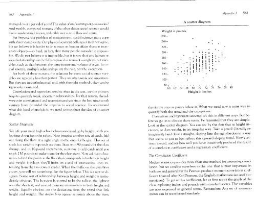
- Page 293 and 294: 554 Appendix 1 Appendix 1 555Tape a
- Page 295: 5 58 Appendix 1 Appendix 1 559Stand
- Page 299 and 300: 566 Appendix 1 Appendix I 567Why ar
- Page 301 and 302: 570 Appendix 2 Appendix 2 5 7 1SCOR
- Page 303 and 304: 5 74 Appendix 2 Appendix 2 575and o
- Page 305 and 306: Appendix 3Technical Issues Regardin
- Page 307 and 308: 582 Appendix 3 Appendix 3 583The na
- Page 309 and 310: 586 Appendix 3rescored the AFQT to
- Page 311 and 312: 590 Appendix 3 Appendix 3 5 9 1inde
- Page 313 and 314: 594 Appendix 4 Appendix 4 595The si
- Page 315 and 316: 598 Appendix 4 Appendix 4 599Basic
- Page 317 and 318: 602 Appendix 4 Appendix 4 603The Hi
- Page 319 and 320: 606 Appendix 4 Appendix 4 607Parame
- Page 321 and 322: 6 10 Appendix 4Parameter EstimatesT
- Page 323 and 324: 6 14 Appendix 4 Appendix 4 6 15Home
- Page 325 and 326: 618 Appendix 4 Appendix 4 619Basic
- Page 327 and 328: 622 Appendix 4CHAPTER 12: CIVILITY
- Page 329 and 330: 626 Appendix 5 Appendix 5 627If for
- Page 331 and 332: 630 Appendix 5 Appendix 5 63 1A pre
- Page 333 and 334: 634 Appendix 5 Appendix 5 63 5that
- Page 335 and 336: 638 Appendix 5 Appendix 5 639the SA
- Page 337 and 338: 642 Appendix 5 Appendix 5 643gap in
- Page 339 and 340: Appendix 6 647Because ~Age, zAFQT,
- Page 341 and 342: Table 3 Expected Probabilities for
- Page 343 and 344: Appendix 7The Evolution of Affirmat
- Page 345 and 346: 658 Appendix 7 Appendix 7 659educat
- Page 347 and 348:
662 Appendix 7 Appendix 7 663furthe
- Page 349 and 350:
666 Notes to pages 15-23 Notes to p
- Page 351 and 352:
670 Notes to pages 46-47 Notes to p
- Page 353 and 354:
674 Notes to pages 66-69 Notes to p
- Page 355 and 356:
678 Notes to page 74 Notes to pages
- Page 357 and 358:
682 Notes to pages 82-85 Notes to p
- Page 359 and 360:
686 Notes to pages 101 -1 08 Notes
- Page 361 and 362:
690 Notes to pages 128-1 29 Notes t
- Page 363 and 364:
694 Notes to pages 145-1477. These
- Page 365 and 366:
698 NotestopagesJ62-165party were g
- Page 367 and 368:
702 Notes to pages 186-195 Notes to
- Page 369 and 370:
706 Notes to pages 2 1 2-2 14 Notes
- Page 371 and 372:
7 10 Notes to pages 237-242 Notes t
- Page 373 and 374:
7 14 Notes to pages 258-260 Notes t
- Page 375 and 376:
7 18 Notes to pages 278-283 Notes t
- Page 377 and 378:
722 Notes to page 294ten points beh
- Page 379 and 380:
726 Notes to pages 303-30494. The c
- Page 381 and 382:
sis, incorporating a broad range of
- Page 383 and 384:
734 Notes to pages 346-34920. Maxwe
- Page 385 and 386:
738 Notes to pages 356-357 Notes to
- Page 387 and 388:
742 Notes to pages 393-395 Notes to
- Page 389 and 390:
746 Notes to pages 405-41 2 Notes t
- Page 391 and 392:
750 Notes to pages 424-426 Notes to
- Page 393 and 394:
754 Notes to pages 437-45 156. Bish
- Page 395 and 396:
758 Notes to pages 466-467 Notes to
- Page 397 and 398:
Notes to pages 493-501 76313. The a
- Page 399 and 400:
766 Notes to pages 527-538 Notes to
- Page 401 and 402:
770 Notes to pages 626-63 1 Notes t
- Page 403 and 404:
BibliographyAhrahamse, A. F., Morri
- Page 405 and 406:
Bibliography 7 79Aelmont, L., Stein
- Page 407 and 408:
782 Bibliography Bibliography 783Br
- Page 409 and 410:
Bibliography 787Collins, J. W. 1992
- Page 411 and 412:
790 Bibliography Bibliography 79 1E
- Page 413 and 414:
794 Bibliography Bibliography 795Go
- Page 415 and 416:
798 BibliographyHogan, D. P., and K
- Page 417 and 418:
802 Bibliography Bibliography 803ab
- Page 419 and 420:
806 Bibliography Bibliography 807Lo
- Page 421 and 422:
8 10 Bibliography Bibliography 81 1
- Page 423 and 424:
8 14 Bibliography Bibliography 81 5
- Page 425 and 426:
8 18 Bibliography Bibliography 8 19
- Page 427 and 428:
822 Bibliography Bibliography 823ri
- Page 429 and 430:
826 Bibliography Bibliography 827St
- Page 431 and 432:
Bibliography 83 1Weitzman, R. A. 19
- Page 433 and 434:
834 IndexBlack and white difference
- Page 435 and 436:
Index 839Fertility, differential, 3
- Page 437 and 438:
Index 843Ogbu, John, 307Osbom, Fred
- Page 439:
"This book is about differences in