National Child Measurement Programme: Detailed Analysis of the ...
National Child Measurement Programme: Detailed Analysis of the ...
National Child Measurement Programme: Detailed Analysis of the ...

Create successful ePaper yourself
Turn your PDF publications into a flip-book with our unique Google optimized e-Paper software.
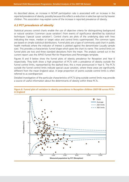
<strong>National</strong> <strong>Child</strong> <strong>Measurement</strong> <strong>Programme</strong>: <strong>Detailed</strong> <strong>Analysis</strong> <strong>of</strong> <strong>the</strong> 2007/08 Dataset 13As described above, an increase in NCMP participation rate is associated with an increase in <strong>the</strong>reported prevalence <strong>of</strong> obesity, possibly because this reflects a reduction in selective opt-out by heavierchildren. This association may explain some <strong>of</strong> <strong>the</strong> increase in reported prevalence <strong>of</strong> obesity.4.2 PCT prevalence <strong>of</strong> obesityStatistical process control charts enable <strong>the</strong> use <strong>of</strong> objective criteria for distinguishing backgroundor natural variation (‘common cause variation’) from events <strong>of</strong> significance identified by statisticaltechniques (‘special cause variation’). Control charts are plots <strong>of</strong> <strong>the</strong> underlying data with linesindicating <strong>the</strong> mean, median or target value and control limits superimposed. The common typesare based on simple statistical distributions. Funnel plots are a type <strong>of</strong> commonly used chart in publichealth methods where <strong>the</strong> indicator <strong>of</strong> interest is plotted against <strong>the</strong> denominator (usually samplesize). This provides a characteristic funnel shape which gives <strong>the</strong> chart its name. The control limits onfunnel plots are two and three standard deviations from <strong>the</strong> mean. The analysis carried out in <strong>the</strong>current report uses <strong>the</strong> APHO Funnel Plot for Proportions and Percentages template.Figures 8 and 9 below show <strong>the</strong> funnel plots <strong>of</strong> obesity prevalence for Reception and Year 6respectively. They both show a high proportion <strong>of</strong> PCTs with a prevalence <strong>of</strong> obesity outside <strong>the</strong>funnel control limits, represented by <strong>the</strong> dashed lines; this is more pronounced in Year 6. The PCTsoutside <strong>the</strong> funnel control limits indicate special cause variation, where <strong>the</strong>se areas are significantlydifferent from <strong>the</strong> mean England value. A large proportion <strong>of</strong> points outside control limits is <strong>of</strong>tenreferred to as overdispersion.<strong>Detailed</strong> investigation <strong>of</strong> <strong>the</strong> particular characteristics <strong>of</strong> PCTs lying outside control limits may providea source <strong>of</strong> useful information about <strong>the</strong> determinants <strong>of</strong> obesity within <strong>the</strong>se PCTs.Figure 8: Funnel plot <strong>of</strong> variation in obesity prevalence in Reception children 2007/08 across PCTsin England16DataAverage2SD limits3SD limits14Prevalence (%)1210860 2,000 4,000 6,000 8,000 10,000 12,000Measured population by PCT (Reception)