Aunt Jemima Maple Syrup Process Book
Documentation of the process and rational of the Aunt Jemima Maple Syrup Re-brand
Documentation of the process and rational of the Aunt Jemima Maple Syrup Re-brand

You also want an ePaper? Increase the reach of your titles
YUMPU automatically turns print PDFs into web optimized ePapers that Google loves.
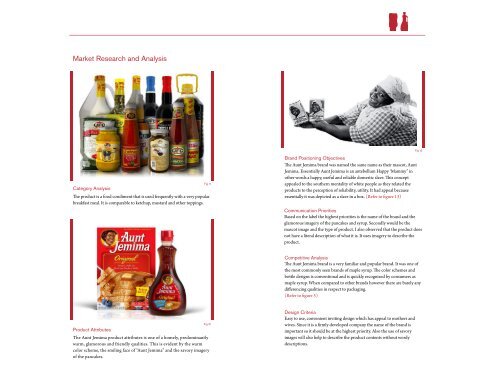
Market Research and Analysis<br />
Fig 13<br />
Category Analysis<br />
The product is a food condiment that is used frequently with a very popular<br />
breakfast meal. It is comparable to ketchup, mustard and other toppings.<br />
Fig 11<br />
Brand Positioning Objectives<br />
The <strong>Aunt</strong> <strong>Jemima</strong> brand was named the same name as their mascot, <strong>Aunt</strong><br />
<strong>Jemima</strong>. Essentially <strong>Aunt</strong> <strong>Jemima</strong> is an antebellum Happy ‘Mammy” in<br />
other words a happy, useful and reliable domestic slave. This concept<br />
appealed to the southern mentality of white people as they related the<br />
products to the perception of reliability, utility. It had appeal because<br />
essentially it was depicted as a slave in a box. (Refer to figure 13)<br />
Communication Priorities<br />
Based on the label the highest priorities is the name of the brand and the<br />
glamorous imagery of the pancakes and syrup. Secondly would be the<br />
mascot image and the type of product. I also observed that the product does<br />
not have a literal description of what it is. It uses imagery to describe the<br />
product.<br />
Competitive Analysis<br />
The <strong>Aunt</strong> <strong>Jemima</strong> brand is a very familiar and popular brand. It was one of<br />
the most commonly seen brands of maple syrup. The color schemes and<br />
bottle designs is conventional and is quickly recognized by consumers as<br />
maple syrup. When compared to other brands however there are barely any<br />
differencing qualities in respect to packaging.<br />
(Refer to figure 5)<br />
Product Attributes<br />
The <strong>Aunt</strong> <strong>Jemima</strong> product attributes is one of a homely, predominantly<br />
warm, glamorous and friendly qualities. This is evident by the warm<br />
color scheme, the smiling face of “<strong>Aunt</strong> <strong>Jemima</strong>” and the savory imagery<br />
of the pancakes.<br />
Fig 12<br />
Design Criteria<br />
Easy to use, convenient inviting design which has appeal to mothers and<br />
wives. Since it is a firmly developed company the name of the brand is<br />
important so it should be at the highest priority. Also the use of savory<br />
images will also help to describe the product contents without wordy<br />
descriptions.