Typography Specimen
Publication Design
Publication Design
You also want an ePaper? Increase the reach of your titles
YUMPU automatically turns print PDFs into web optimized ePapers that Google loves.
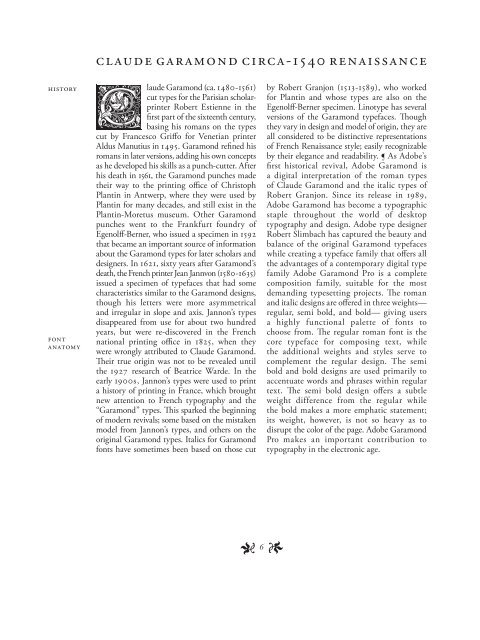
Claude Garamond circa-1540 Renaissance<br />
History<br />
Font<br />
Anatomy<br />
laude Garamond (ca. 1480-1561)<br />
cut types for the Parisian scholarprinter<br />
Robert Estienne in the<br />
first part of the sixteenth century,<br />
basing his romans on the types<br />
cut by Francesco Griffo for Venetian printer<br />
Aldus Manutius in 1495. Garamond refined his<br />
romans in later versions, adding his own concepts<br />
as he developed his skills as a punch-cutter. After<br />
his death in 1561, the Garamond punches made<br />
their way to the printing office of Christoph<br />
Plantin in Antwerp, where they were used by<br />
Plantin for many decades, and still exist in the<br />
Plantin-Moretus museum. Other Garamond<br />
punches went to the Frankfurt foundry of<br />
Egenolff-Berner, who issued a specimen in 1592<br />
that became an important source of information<br />
about the Garamond types for later scholars and<br />
designers. In 1621, sixty years after Garamond’s<br />
death, the French printer Jean Jannvon (1580-1635)<br />
issued a specimen of typefaces that had some<br />
characteristics similar to the Garamond designs,<br />
though his letters were more asymmetrical<br />
and irregular in slope and axis. Jannon’s types<br />
disappeared from use for about two hundred<br />
years, but were re-discovered in the French<br />
national printing office in 1825, when they<br />
were wrongly attributed to Claude Garamond.<br />
Their true origin was not to be revealed until<br />
the 1927 research of Beatrice Warde. In the<br />
early 1900s, Jannon’s types were used to print<br />
a history of printing in France, which brought<br />
new attention to French typography and the<br />
“Garamond” types. This sparked the beginning<br />
of modern revivals; some based on the mistaken<br />
model from Jannon’s types, and others on the<br />
original Garamond types. Italics for Garamond<br />
fonts have sometimes been based on those cut<br />
by Robert Granjon (1513-1589), who worked<br />
for Plantin and whose types are also on the<br />
Egenolff-Berner specimen. Linotype has several<br />
versions of the Garamond typefaces. Though<br />
they vary in design and model of origin, they are<br />
all considered to be distinctive representations<br />
of French Renaissance style; easily recognizable<br />
by their elegance and readability. As Adobe’s<br />
first historical revival, Adobe Garamond is<br />
a digital interpretation of the roman types<br />
of Claude Garamond and the italic types of<br />
Robert Granjon. Since its release in ,<br />
Adobe Garamond has become a typographic<br />
staple throughout the world of desktop<br />
typography and design. Adobe type designer<br />
Robert Slimbach has captured the beauty and<br />
balance of the original Garamond typefaces<br />
while creating a typeface family that offers all<br />
the advantages of a contemporary digital type<br />
family Adobe Garamond Pro is a complete<br />
composition family, suitable for the most<br />
demanding typesetting projects. The roman<br />
and italic designs are offered in three weights—<br />
regular, semi bold, and bold— giving users<br />
a highly functional palette of fonts to<br />
choose from. The regular roman font is the<br />
core typeface for composing text, while<br />
the additional weights and styles serve to<br />
complement the regular design. The semi<br />
bold and bold designs are used primarily to<br />
accentuate words and phrases within regular<br />
text. The semi bold design offers a subtle<br />
weight difference from the regular while<br />
the bold makes a more emphatic statement;<br />
its weight, however, is not so heavy as to<br />
disrupt the color of the page. Adobe Garamond<br />
Pro makes an important contribution to<br />
typography in the electronic age.<br />
1<br />
6 1


