DT e-Paper 24 February 2017

Create successful ePaper yourself
Turn your PDF publications into a flip-book with our unique Google optimized e-Paper software.
Feature<br />
17<br />
FRIDAY, FEBRUARY <strong>24</strong>, <strong>2017</strong><br />
<strong>DT</strong><br />
Anup Dutta: designing a winning pitch deck<br />
• Nahid Farzana<br />
As a startup, you will eventually<br />
need investment and you need<br />
to prepare your investor pitch<br />
deck. Raising money from an<br />
investor for your startup is not an<br />
describing what a pitch deck is.<br />
“Pitch deck is a fundraising tool<br />
and it’s a way to present your<br />
content (problems, industry,<br />
business model, traction, etc,) in a<br />
way that it becomes invest-able.”<br />
Anup said, “Content is the king<br />
• Market size<br />
• Business model<br />
• Value proposition<br />
• Traction<br />
• Team<br />
• Ask<br />
easy job and it will require a great<br />
pitch. How else do you expect to<br />
get the investors’ attention? On<br />
average an investor is listening to<br />
over 30 pitches each day, so how<br />
would you bring your deck to the<br />
limelight?<br />
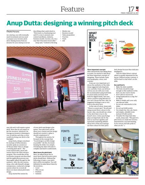
Anup Dutta, design consultant<br />
for startups of GPAccelerator,<br />
recently spoke at a session at<br />
GP House titled “How to design<br />
a winning pitch deck”. The<br />
event started with a short info<br />
session about the GPAccelerator<br />
program. The overall idea of the<br />
accelerator program was described<br />
and the application process was<br />
thoroughly talked through for the<br />
audience. After the info session,<br />
Anup, who calls himself a design<br />
entrepreneur, conducted a design<br />
session where he covered all<br />
there is to know about pitch deck<br />
design.<br />
Anup started the session by<br />
of your pitch and design is the<br />
queen. Your pitch deck will be<br />
about your content and the design<br />
should not overdo it, rather it<br />
should complement it.”<br />
Throughout his session, he<br />
focused on the concept that-<br />
“Good design is as little design<br />
as possible”. By this, he meant<br />
keeping the slides very simple.<br />
Overdoing the slide will make it<br />
complex and hard to understand.<br />
Must-haves for pitch deck<br />
Next, he talked about the 10<br />
must-haves that all investor pitch<br />
decks should have. Without the<br />
following 10 topics, your pitch<br />
deck will be incomplete. You will<br />
definitely be asked about them by<br />
the investors.<br />
• Cover<br />
• Who we are<br />
• Problem<br />
• Solution<br />
Three important concepts<br />
After interactively describing these<br />
10 points, he started to talk about<br />
the three important concepts of<br />
designing. These include: fonts<br />
and typography, colour, and<br />
contrast.<br />
Fonts are very important as it<br />
shows the aesthetics of the slide.<br />
Anup suggested selecting fonts<br />
very carefully. Fonts can tell how<br />
serious you are with your work.<br />
He recommended using Serif fonts<br />
for print media and Sans-Serif<br />
fonts for digital media. One easy<br />
choice could be using Helvetica if<br />
you can’t choose the font. Also, he<br />
suggested sticking to one or two<br />
fonts in the pitch deck.<br />
In the case of colour, Anup said:<br />
“Three is a sweet spot.” He advised<br />
using around three colours in the<br />
layout. Also, one should use colour<br />
in the deck that is true to the<br />
brand’s story. Colour psychology<br />
plays an important role for the<br />
deck as each hue signifies and<br />
represents something definite.<br />
About 60% of the tech startups<br />
use blue colours for their pitch<br />
deck design because blue indicates<br />
intelligence.<br />
Then he talked about contrast<br />
which is equally important for the<br />
layout. Without proper contrast, it<br />
will be hard to read what’s on the<br />
slide.<br />
Dos and Don’ts<br />
• Make the slide readable<br />
• The fonts should be large<br />
enough so that audience in the<br />
back can also read it clearly<br />
• Don’t add too much text<br />
• Using hyphenation is a big ‘No’<br />
for slides<br />
• Make it simple and cover only<br />
one idea per slide<br />
• Do not use watermarks in the<br />
slides<br />
• Do not use bullet points<br />
• Use simple bar, line, pie charts<br />
and simple, relatable icons<br />
instead of bullet points<br />
• Visualise the important data<br />
Lastly, Anup said, “The goal of a<br />
pitch deck is to make the investor<br />
interested for a second meeting.<br />
So be concise and take pride in<br />
what you do.” •<br />
PHOTOS: SD ASIA