


Create successful ePaper yourself
Turn your PDF publications into a flip-book with our unique Google optimized e-Paper software.
THE ADOBE ® PHOTOSHOP ® “HOW-T0” MAGAZINE › › february <strong>2016</strong><br />
Learn how to capture<br />
out-of-this-world images of<br />
planets, galaxies, and nebulae<br />
PHOTOGRAPHY<br />
SECRETS<br />
We go under the hood<br />
to take an in-depth look<br />
at layers in Photoshop<br />
PROVING<br />
GROUND<br />
®<br />
IN-DEPTH<br />
STEP-BY-STEP<br />
TUTORIALS<br />
PHOTOSHOP<br />
DOWN AND<br />
DIRTY TRICKS<br />
NEWS, REVIEWS<br />
AND OTHER<br />
COOL STUFF<br />
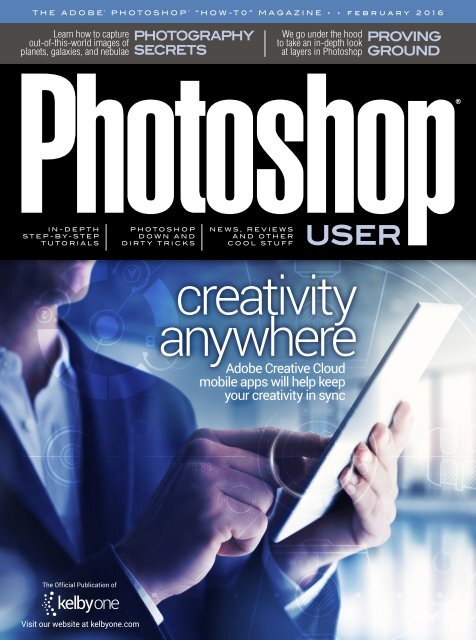
creativity<br />
anywhere<br />
Adobe Creative Cloud<br />
mobile apps will help keep<br />
your creativity in sync<br />
The Official Publication of<br />
The Official Publication of<br />
Visit our website at kelbyone.com
TABLE OF CONTENTS › › FEBRUARY <strong>2016</strong><br />
Layout: Jessica Maldonado<br />
FEATURE<br />
52<br />
Creativity Anywhere<br />
Current technology has given us the power to be creative no matter<br />
where we are. From desktop computers to laptops to tablets to<br />
smartphones, you now have the ability to capture and create in<br />
just about any environment. Bryan O’Neil Hughes, Adobe’s Head<br />
of Outreach & Collaboration, shows us how to unlock all of that<br />
creative potential using the latest and greatest Adobe mobile apps.<br />
He even gives us a sneak peek at a cool app that’s not available yet.<br />
Bryan O’Neil Hughes<br />
Departments<br />
From the Editor 6<br />
Contributing Writers 9<br />
About Photoshop User Magazine 10<br />
KelbyOne Community 12<br />
Exposed: Industry News 18<br />
Columns<br />
50 PHOTOSHOP TIPS<br />
64 DESIGN MAKEOVER<br />
That’s How the Cookie Crumbles<br />
76 PHOTOGRAPHY SECRETS<br />
An Introduction to Astrophotography<br />
131 FROM THE ADVICE DESK<br />
How-To<br />
DOWN & DIRTY TRICKS 20<br />
Commercial Sports Graphic<br />
42 BEGINNERS’ WORKSHOP<br />
Mapping One Image onto Another<br />
The Hateful Eight Poster Effect 30<br />
46 PHOTOSHOP PROVING GROUND<br />
Layers, Part 1: Opacity<br />
DeVine 36<br />
70 LIGHT IT<br />
Portable Lighting: Let’s Go
› › KELBYONE.COM<br />
Lightroom Magazine<br />
LIGHTROOM WORKSHOP 89<br />
Dodging, Burning, and Adjusting Individual Areas of Your Photo<br />
UNDER THE LOUPE 98<br />
Leveraging Slideshows<br />
MAXIMUM WORKFLOW 104<br />
Tethering in Lightroom<br />
LIGHTROOM Q&A 116<br />
LIGHTROOM TIPS & TRICKS 118<br />
Reviews<br />
122 PortraitPro 15 Studio Max Edition<br />
123 X-Rite ColorChecker Passport Video<br />
Macphun’s Aurora HDR Pro<br />
124 Capture One Pro 9<br />
125 Exposure X by Alien Skin Software<br />
Picture Instruments Color Cone<br />
126 StudioMagic I and II<br />
127 Eddycam Fashion Strap<br />
HP Z25n Monitor<br />
128 Akurat Lighting A1 On-Camera Video LED Light<br />
NEC MultiSync EA275UHD<br />
129 Photoshop Book Reviews<br />
Steve Damstra<br />
Colin Falcon Ron Wetherell<br />
DYNAMIC<br />
RANGE<br />
110<br />
Processing Realistic<br />
Starscapes<br />
Sean Arbabi teaches us how to capture starscapes, balancing the<br />
light of the stars with the ambient light in the scene. He then takes<br />
us into Lightroom to show us how to get the most out of those<br />
images, taking them from great shots to amazing shots.<br />
Sean Arbabi<br />
But Wait— There’s More<br />
<br />
KEY CONCEPTS<br />
These icons at the beginning of columns indicate there’s a short video on a tool<br />
or function used in that tutorial at the Key Concepts KelbyOne member webpage<br />
at http://kelbyone.com/keyconcepts.<br />
DOWNLOADABLE CONTENT<br />
Whenever you see this symbol at the end of an article, it means<br />
there are either downloadable practice files or additional content<br />
for KelbyOne members at http://kelbyone.com/magazine.<br />
Dodge & Burn tools<br />
Lasso tool<br />
Layer masks<br />
All lighting diagrams courtesy of Sylights<br />
Pen tool<br />
Smart objects<br />
Quick Selection tool<br />
Click this symbol in the magazine to return to the Table of Contents.
A FEW WORDS FROM › › SCOTT KELBY<br />
From the Editor<br />
staff favorites and<br />
instructor-led curriculums<br />
› › photoshop user › february <strong>2016</strong><br />
006<br />
We have an amazing issue for you here, but before we get to that, I want to take just a sec to tell you about some pretty exciting<br />
things we’re adding to the KelbyOne site for our members.<br />
The current workflow for our members is to log in and search for the topic they’re interested in (retouching, compositing,<br />
lighting, etc.), and they get a bunch of full-length classes and quick-tip videos to choose from. In essence, it works like a search<br />
engine for online classes, right? But when that list of results comes up, which classes should you watch first, which are the best,<br />
which best suit your needs, and so on? In <strong>2016</strong>, we’re working to help you along, and we’ll soon be releasing the first step in<br />
that journey by sharing our own picks for classes that we think will start you off on the right foot.<br />
You’ll see this new Staff Favorites section appear in the left-side navigation on the member site, but this is just a small step leading<br />
to even bigger things that we’re working on (but just right down the road timewise), which are instructor-led curriculums. This<br />
is where our KelbyOne instructors break things down into categories, and give you a list of classes, in the order you should watch<br />
them, to get you where you want to be. For example, if you want to learn sports photography, portrait retouching, or compositing,<br />
instructors who are absolute experts in those fields will give you a complete curriculum of classes, in the proper context and order,<br />
so you can learn the techniques and concepts you need to be a success. We’re going to take things even further than that, but<br />
these are some solid first steps to help guide you through the learning process and make learning even easier.<br />
Beyond all the Photoshop and Lightroom online classes that we have, we also want to make sure that if you buy a new<br />
camera, you can count on us having an online class ready and waiting for you on how to use that camera, so you can get up<br />
to speed really fast. Also, keep an eye on the little “bell” icon at the top of your member dashboard—up there, we share new<br />
classes that have been released recently, along with any new member discounts we’ve negotiated and other stuff we hope will<br />
make your membership more valuable. There will be lots of other great stuff coming in <strong>2016</strong>, but I wanted to share a little of<br />
our roadmap with you here (but again, this is just the beginning).<br />
Okay, onto other fun stuff: Mobile apps are just exploding into the digital imaging space, and Adobe has really hit their stride<br />
in the past year in that area with some really incredible technology (including some stuff I wish we could do on the desktop).<br />
That’s just one of the reasons we’re honored to have Adobe’s own Bryan O’Neil Hughes here in the mag with a feature on<br />
Adobe’s latest mobile apps, along with a look at what’s coming very soon. It’s really incredible what they’re bringing to mobile,<br />
so it’s worth checking out right now (it starts on page 52).<br />
Also in this issue, our good friend Mike Olivella gives a wonderful introduction to astrophotography, including discussing<br />
the equipment and techniques you’ll need to know to make amazing out-of-this-world images. If you’re a Photoshop beginner<br />
(or even a seasoned user), Scott Valentine, with part one of a two-part series on layers in Photoshop, takes us in-depth into how<br />
layers work together, including layer and Fill Opacity, Blend If, Masking, and Clipping Masks. In our Lightroom “mag within a<br />
mag,” Sean McCormack talks about the benefits of tethering, how to set it up in Lightroom, and some equipment that will<br />
make tethering easier (and safer). But that’s just a tiny bit of what’s in this awesome info-packed issue—our first since we’ve<br />
gone all digital (you’ll be seeing some cool new stuff coming to our digital editions as well!).<br />
There’s a lot going on, and it’s going to be a busy year of learning—we’re glad to have you here.<br />
All my best,<br />
Scott Kelby<br />
KelbyOne President & CEO<br />
Editor & Publisher, Photoshop User
The official publication of KelbyOne<br />
FEBRUARY <strong>2016</strong> • Volume 19 • Number 2<br />
EDITORIAL:<br />
Scott Kelby, Editor-in-Chief<br />
Chris Main, Managing Editor<br />
Contributing Writers<br />
Ajna Adams • Sean Arbabi • Steve Baczewski • Corey Barker<br />
Peter Bauer • Pete Collins • RC Concepcion • Michael Corsentino<br />
Seán Duggan • Daniel East • Rod Harlan • Bryan O’Neil Hughes<br />
Jessica Maldonado • Sean McCormack • Mike Olivella • Colin<br />
Smith • Lesa Snider • Rob Sylvan • Scott Valentine • Erik Vlietinck<br />
Jake Widman<br />
GRAPHICS:<br />
Dave Damstra, Production Manager<br />
Jessica Maldonado, Associate Art Director<br />
Margie Rosenstein, Senior Graphic Designer<br />
Angela Naymick, Graphic Designer<br />
MARKETING:<br />
Ajna Adams • Kleber Stephenson<br />
WEB:<br />
Brandon Nourse • Mario Ocon • Yojance Rabelo • Aaron Westgate<br />
PUBLISHING:<br />
Scott Kelby, Publisher<br />
David Moser, Executive Publisher<br />
Kalebra Kelby, Executive V.P.<br />
Jean A. Kendra, Business Manager<br />
ADVERTISING:<br />
Kevin Agren, V.P., Sales 813-433-2370<br />
Jeanne Jilleba, Advertising Coordinator 800-738-8513 ext. 152<br />
Veronica (Ronni) O’Neil, Director of Circulation/Distribution<br />
800-738-8513 ext. 235<br />
HOW TO CONTACT KELBYONE:<br />
U.S. Mail: 118 Douglas Road East • Oldsmar, FL 34677-2922<br />
Voice: 813-433-5000 • Fax: 813-433-5015<br />
Customer Service: info@kelbymediagroup.com<br />
Letters to the Editor: letters@photoshopuser.com<br />
Letters to the Lightroom Editor: lightroom@photoshopuser.com<br />
World Wide Web Including the Photoshop Help Desk,<br />
Photo Gear Desk, and Advice Desk: http://kelbyone.com/my-account/<br />
helpdesk/<br />
COLOPHON:<br />
Photoshop User was produced using Adobe Photoshop CC 2015 and<br />
Adobe InDesign CC 2015. Roboto was used for headlines and subheads.<br />
Frutiger LT Std for text.<br />
This seal indicates that all content provided herein is produced by KelbyOne, LLC<br />
and follows the most stringent standards for educational resources. KelbyOne is<br />
the premier source for instructional books, DVDs, online classes, and live seminars for<br />
creative professionals.<br />
| fuel for creativity<br />
All contents ©COPYRIGHT <strong>2016</strong> KelbyOne, LLC. All rights reserved. Any use of the<br />
contents of this publication without the written permission of the publisher is strictly<br />
prohibited. Photoshop User is an independent journal, not affiliated in any way with<br />
Adobe Systems, Inc. Adobe, the Adobe logo, Acrobat, Illustrator, InDesign, Lightroom,<br />
and Photoshop are registered trademarks or trademarks of Adobe Systems, Inc. in<br />
the United States and/or other countries. All other trademarks mentioned belong to<br />
their respective owners. Some of the views expressed by contributors may not be the<br />
representative views of the publisher. ISSN Pending.
PHOTOSHOP’S MOST WANTED › ›<br />
Contributing<br />
Writers<br />
SEAN ARBABI<br />
has been a widely published commercial photographer the past 25 years. He authored<br />
The Complete Guide to Nature Photography (Crown Publishing) and recently produced a<br />
video series on the Nik Collection (Peachpit). For more info, visit www.seanarbabi.com.<br />
STEVE BACZEWSKI<br />
is a freelance writer, professional photographer, graphic designer, and<br />
con sultant. He also teaches classes in traditional and digital fine arts photo graphy.<br />
His company, Sore Tooth Productions, is based in Albany, California<br />
PETER BAUER<br />
is an Adobe Certified Expert that does computer graphics consulting for a select<br />
group of corporate clients. His latest book is Photoshop CC for Dummies. He was<br />
inducted into the Photoshop Hall of Fame in 2010.<br />
PETE COLLINS<br />
is an education and curriculum developer and website overseer for KelbyOne.<br />
He is one of the Photoshop Guys and co-hosts Photoshop User TV. With a fine arts<br />
background, Pete is well versed in photography, graphic design, and illustration.<br />
RAFAEL “RC” CONCEPCION<br />
is director of content and education for KelbyOne. An Adobe Certified Instructor in<br />
Photoshop, Illustrator, and Lightroom, RC has 10+ years in the I.T. and ecommerce<br />
industries. RC has held training seminars in the U.S., Europe, and Latin America.<br />
MICHAEL CORSENTINO<br />
is an award-winning wedding and portrait photographer, Photoshop and Lightroom<br />
expert, author, columnist for Shutter Magazine and Resource Magazine, and speaker<br />
and international workshop leader. Learn more at www.michaelcorsentino.com.<br />
SEÁN DUGGAN<br />
is the co-author of Photoshop Masking & Compositing, Real World Digital<br />
Photography, and The Creative Digital Darkroom. He leads workshops on digital<br />
photography, Photoshop, and Lightroom (SeanDuggan.com).<br />
DANIEL EAST<br />
is an author, free lance writer, presenter/trainer, and consultant with more than<br />
20 years’ experience in photography, pro-audio, and marketing. Daniel is also founder<br />
and president of The Apple Groups Team support network for user groups.<br />
ROD HARLAN<br />
is an industry veteran with 25 years’ experience as an author, educator,<br />
photo grapher, multimedia artist, and Photoshop addict! He shares content at RodHarlan<br />
.com and is a trainer for Adobe, NAB, FMC, WEVA, and KelbyOne, among others.<br />
BRYAN O’NEIL HUGHES<br />
is Adobe’s Head of Outreach & Collaboration. He spent 15 years on the Photoshop team,<br />
and then drove the expansion to mobile with Photoshop Mix & Fix. A keynote speaker,<br />
author, and 4x MAX Master, Bryan was inducted into the Photoshop Hall of Fame in 2011.<br />
JESSICA MALDONADO<br />
has been art director of books at KelbyOne for more than eight years, has created<br />
video tutorials for LayersMagazine.com and reviews for Photoshop User magazine,<br />
and co-hosted Photoshop User TV in 2013.<br />
SEAN McCORMACK<br />
is the author of Essential Development: 20 Great Techniques for Lightroom 5.<br />
Based in Galway, Ireland, he shoots subjects from musicians, models, and<br />
actors to landscapes and architecture. Learn more at http://lightroom-blog.com.<br />
MIKE OLIVELLA<br />
has been a photographer for Florida State University Athletics, Unconquered Magazine,<br />
and a stringer for two international wire services. His sports photographs are published<br />
worldwide, and he has won numerous awards. For more, visit www.baselineshots.com.<br />
COLIN SMITH<br />
is an award-winning digital artist, photographer, and lecturer who has authored<br />
18 books and has created a series of training videos. Colin is also the founder of<br />
the online resource PhotoshopCAFE.com and president of Software-Cinema.com.<br />
LESA SNIDER<br />
is the author of Photoshop CC: The Missing Manual, Photos for Mac and iOS:<br />
The Missing Manual, several eBooks, and more than 40 video courses. She also<br />
writes a weekly column for Macworld. For more info, visit PhotoLesa.com.<br />
ROB SYLVAN<br />
is the Lightroom Help Desk Specialist for KelbyOne, on staff at the Digital Photo<br />
Workshops, and the author of Lightroom 5: Streamlining Your Digital Photography<br />
Process. You can learn more at www.lightroomers.com.<br />
SCOTT VALENTINE<br />
is an Adobe Community Professional and Photoshop author. His latest book<br />
is The Hidden Power of Adjustment Layers (Adobe Press). Keep up with him<br />
at scoxel.com.<br />
ERIK VLIETINCK<br />
founded IT Enquirer in 1999 (http://it-enquirer.com). A J.D. by education,<br />
Erik has been a freelance technology editor for more than 20 years. He has written<br />
for Macworld, Computer Arts, Windows NT Magazine, and many others.<br />
JAKE WIDMAN<br />
is a writer and editor who lives in San Francisco. He’s been covering the intersection<br />
of computers and graphic design for about 25 years now—since back when it was<br />
called “desktop publishing” and Photoshop was just a piece of scanning software.<br />
› › kelbyone.com<br />
009
› › ABOUT PHOTOSHOP USER<br />
Image: Adobe Stock; Illustration: Corey Barker<br />
Photoshop User<br />
Magazine<br />
Photoshop User magazine is the official publication of<br />
KelbyOne. As a KelbyOne member, you automatically<br />
receive Photoshop User ten times a year. Each issue<br />
features in-depth Photoshop, Lightroom, and photography<br />
tutorials written by the most talented designers,<br />
photographers, and leading authors in the industry.<br />
› › photoshop user › february <strong>2016</strong><br />
About KelbyOne<br />
KELBYONE<br />
is the world’s leading resource for Adobe ® Photoshop ® , Lightroom ® , and<br />
photography training, news, and education. Founded in 1998 as the National<br />
Association of Photoshop Professionals (NAPP), KelbyOne has evolved from<br />
NAPP and KelbyTraining to create a singular hub for creative people to learn, grow,<br />
and inspire. From photographers to graphic designers, beginners to professionals,<br />
KelbyOne is open to everyone.<br />
There’s no faster, easier, and more affordable way to get really good at Photoshop<br />
and photography. You can join for only $19.99 per month or $199 U.S. for a full<br />
year of training. To learn more, visit www.kelbyone.com.<br />
Member Benefits<br />
PHOTOSHOP USER MAGAZINE<br />
Ten issues of the best Photoshop tutorial-based magazine in the industry.<br />
MEMBERS-ONLY WEBSITE<br />
Our extensive website features time- and money-saving content.<br />
ONLINE CLASSES & EDUCATION<br />
Thousands of Photoshop and photography tutorials, full online classes,<br />
and quick-tip videos.<br />
MEMBER DISCOUNTS<br />
Save anywhere from 2–3 times your membership cost by using our many<br />
industry-related discounts.<br />
TECH SUPPORT<br />
Fast, friendly Photoshop, Lightroom, and photo gear help; equipment<br />
advice; and more from certified experts.<br />
MEMBER COMMUNITY<br />
KelbyOne members range from beginners to pros and love to lend each<br />
other a hand. Together, we have built the friendliest, most knowledgeable<br />
Photoshop and photography community on the Web.<br />
NEWS & REVIEWS<br />
Unbiased coverage on the latest equipment, plug-ins, and programs<br />
in the marketplace.<br />
WEEKLY E-NEWSLETTER<br />
The KelbyOne Insider is your weekly connection to everything KelbyOne.<br />
It’s produced exclusively for members to keep you informed of everything<br />
new in the industry and at KelbyOne headquarters.<br />
010<br />
FIND KELBYONE MEMBERSHIP DETAILS AT kelbyone.com or call 800-201-7323 Monday–Friday, 9:00 a.m. to 5:30 p.m. EST.
KelbyOne Community<br />
› › Inspiration, information, and member musings to fuel your creative think tank<br />
BY AJNA ADAMS<br />
The Winners of the KelbyOne<br />
photo & design contest announced<br />
The KelbyOne Photo & Design Contest was our most popular social media photo contest to date, culminating in thousands of<br />
submissions from all over the world. We featured five categories—Landscapes, Babies & Families, Illustration & Design, Pets, and<br />
Wedding & Portrait—and the response was astounding with nearly 4,000 entries!<br />
Congratulations to our hand-selected winners: Colin Falcon, Karlen Mkrtchyan, Carla McMahon, Ron Wetherell, and Jack<br />
Podlas. We’d also like to give a special congrats to our People’s Choice winner, Hanna Salin! Check out the winning images starting<br />
below and on the next three pages.<br />
Each winner received an amazing prize package. Colin Falcon was our grand prize winner, and he received a Canon EOS 7D<br />
Mark II with an EF-S 18–135mm lens, a Canon PIXMA PRO-100 printer, one year of the full Adobe Creative Cloud, a one-year<br />
KelbyOne membership, a $200 B&H Gift Card, an Airport Navigator from Think Tank Photo, and a 4-in-1 Lens from Olloclip.<br />
The other category winners each won a Canon PIXMA PRO-100, a Canon PowerShot G9 X, a one-year KelbyOne membership,<br />
one year of the Adobe Creative Cloud Photography plan, a CityWalker 30 camera bag from Think Tank Photo, a 4-in-1 Lens from<br />
Olloclip, and a $50 B&H Gift Card.<br />
And finally, the People’s Choice winner, Hanna Salin, won a one-year KelbyOne membership, one year of the Adobe Creative<br />
Cloud Photography plan, a Suburban Disguise camera bag from Think Tank Photo, and a 4-in-1 Lens from Olloclip.<br />
KELBYONE PHOTO & DESIGN CONTEST >> LANDSCAPES<br />
GRAND PRIZE WINNER<br />
COLIN FALCON | WWW.PIXVAULT.CO.UK
KELBYONE PHOTO & DESIGN CONTEST >> BABIES & FAMILIES<br />
KARLEN MKRTCHYAN | WWW.SILENTSHUTTERPHOTO.COM<br />
KELBYONE PHOTO & DESIGN CONTEST >> ILLUSTRATION & DESIGN<br />
CARLA MCMAHON | WWW.CARLAMCMAHON.CO.ZA
KELBYONE PHOTO & DESIGN CONTEST >> WEDDING & PORTRAIT<br />
JACEK R PODLAS | HTTP://JACEKPODLAS.WIX.COM/JRP-CREATIVESTUDIO<br />
MEMBER SINCE 2015<br />
KELBYONE PHOTO & DESIGN CONTEST >> PEOPLE’S CHOICE<br />
HANNA SALIN
Social Media Moment:<br />
it’s all about instagram<br />
Right now in the world of social media, Instagram is what’s<br />
hot. If you’re a photographer, you need to be on Instagram.<br />
The great news is that Scott Kelby’s new course on Instagram,<br />
How to Build an Instagram Audience, has just been released on<br />
KelbyOne.com! Follow Scott at Instagram.com/ScottKelby<br />
and be sure to follow us, too, at Instagram.com/KelbyOnePics!<br />
And while you’re at KelbyOne.com don’t forget to check out<br />
all of our new courses, including the ones listed below.<br />
Fresh New Class<br />
released at kelbyone.com<br />
Here’s a roundup of some of our latest classes and tutorials<br />
that you won’t want to miss. Log into your member account<br />
at www.KelbyOne.com or check out these new releases on<br />
our app.<br />
Inspirational Interview with Mark Rodriguez<br />
Join Mia McCormick as she sits down with multi-talented<br />
artist Mark Rodriguez, who recently took the Best in Show<br />
award at Photoshop World. Mark’s background is in graphic<br />
design, and he’s a successful animator and illustrator in his<br />
day job, but his unique and creative images are what have<br />
captured the attention of everyone at KelbyOne!<br />
The Secrets to Capturing the Best. Dog. Photos. Ever. Taken.<br />
Join the fabulous Kaylee Greer, commercial pet photographer<br />
based in Boston, as she shows you how to capture the<br />
best dog photographs you’ve ever taken. In this class, Kaylee<br />
works with four different dogs in different locations, ranging<br />
from the local park to the local animal shelter. You’ll learn<br />
her tips and tricks for engaging with her subjects to bring out<br />
their unique personalities for portraits that owners will love<br />
for a lifetime!<br />
Master FX: Real Movie Poster Effects in Adobe Photoshop<br />
Ready to learn the techniques used to build a Hollywood movie<br />
poster? Join Corey Barker as he leads you step-by-step starting<br />
with a simple studio shot and building it into a full design.<br />
KELBYONE PHOTO & DESIGN CONTEST >> PETS<br />
RON WETHERELL | WWW.FACEBOOK.COM/WETHERELLRON<br />
PHOTO FOR AD IN TALLY-HO MAGAZINE
KelbyOne Community<br />
Who's Who<br />
in the kelbyone community<br />
Antonio Martez is an award-winning fashion, beauty, and<br />
lifestyle photographer represented by the international illustration<br />
and photography artist agency, Illozoo & Pictozoo.<br />
Antonio has graced the pages of Jamaque, Alchemist, INDIE,<br />
and a host of other international lifestyle and fashion magazines<br />
and fashion houses. Antonio Martez Photography is<br />
based out of his White Space Studio home in the Chelsea<br />
area, the Art Deco epicenter of New York City.<br />
Speaking of Photoshop World, is there a particular<br />
instructor to whom you would like to give a special<br />
shout out?<br />
Terry White: this man is an Adobe guru! He is truly one of the<br />
most amazing people I have ever had the chance of meeting<br />
and conversing with. He has truly became a great friend and<br />
mentor since our meeting at Photoshop World 2015.<br />
Why train with KelbyOne?<br />
I feel that training with KelbyOne will assist me in becoming<br />
the best artist and creative I can be in an ever-changing<br />
market and industry.<br />
Are you working on any cool projects right now?<br />
I’m currently working on several commercial campaigns<br />
ranging from Petit Pois, a Miami-based ready-to-wear<br />
apparel company, to an editorial cover and feature story with<br />
Venue Magazine. I really look forward to the continuation on<br />
my ongoing project, “BLIND BEAUTY,” which is my take on<br />
the world of beauty and how blind we have become to true<br />
natural beauty.<br />
› › photoshop user › february <strong>2016</strong><br />
016<br />
You’re pretty new to the KelbyOne community. How<br />
did you learn about KelbyOne and what has your<br />
involvement been?<br />
I’m six months into the KelbyOne community. I learned of<br />
KelbyOne through the various videos I watched on YouTube<br />
of Scott Kelby and his many guests on the Grid.<br />
You went to your first-ever Photoshop World last year.<br />
What was your major takeaway from the event?<br />
Yes, the 2015 Photoshop World conference was the first<br />
one I attended. I was completely blown away by how accessible<br />
that many of the presenters were to assist with questions<br />
or just for a general conversation.<br />
Antonio Martez<br />
What is your greatest source of inspiration in both life<br />
and at KelbyOne?<br />
My greatest source of inspiration comes from what I call<br />
“Zest of Life.” The Zest of Life for me comes from doing<br />
what I feel is my passion and purpose on a daily basis.<br />
My greatest inspiration that I get from KelbyOne is that<br />
I can see myself being on the same platforms that many<br />
of those who I watch via YouTube are on. Being a part<br />
of KelbyOne and having direct access to those whom<br />
I watched over the years has truly made me appreciate the<br />
KelbyOne community even more. ■<br />
Antonio Martez
ARTIST SPOTLIGHT › › STEVE DAMSTRA<br />
MEMBER SINCE 2010 | HTTP://WWW.FACEBOOK.COM/STEVE.DAMSTRA.9?FREF=TS<br />
ARTIST SPOTLIGHT › › STEVE DAMSTRA<br />
MEMBER SINCE 2010 | HTTP://WWW.FACEBOOK.COM/STEVE.DAMSTRA.9?FREF=TS
Exp sed: Industry News<br />
› › The latest news about photography gear, software, and services<br />
BY CHRIS MAIN<br />
Canon Announces<br />
the EOS-1D X Mark II<br />
On <strong>February</strong> 1, Canon revealed the Mark II version of its flagship EOS-1D X camera.<br />
With a new 20.2 megapixel 35mm Full Frame Canon CMOS sensor and Dual<br />
DIGIC 6+ Image Processors, this new camera will be in high demand by everyone<br />
from sports photographers to wildlife shooters. The EOS-1D X Mark II has a long<br />
list of new features, many of which are firsts for EOS cameras.<br />
Continuous shooting speeds are now up to 14 frames per second (fps) with<br />
Auto Exposure (AE) and predictive Autofocus (AF) for viewfinder shooting, and<br />
up to 16 fps in Live View mode. With the Dual DIGIC 6+ Image Processors, you<br />
can capture up to 170 consecutive RAW images at 14 fps.<br />
The EOS-1D X Mark II can shoot 4K video at 60p and Full HD video at 120p with<br />
Dual Pixel CMOS AF. At 120p, videographers can produce high-quality slow motion video,<br />
and with 4K Frame Grab, photographers can create 8.8-megapixel still JPEGs from 4K video right in the camera.<br />
The camera also has a new, built-in Digital Lens Optimizer to help correct aberrations (which is kind of like having the Lens<br />
Corrections panel from Lightroom inside your camera). It also has an improved 61-point High-Density Reticular AF II system with<br />
expanded coverage. All 61 points are selectable by the user, and each point supports AF at maximum apertures up to f/8, which<br />
means precise focus even when using super-telephoto lenses with an extender—a huge benefit to wildlife photographers. It has<br />
two card slots: one that supports CF memory cards up to UDMA 7, and another that supports CFast, which is especially useful<br />
when recording 4K video.<br />
A first for the Canon EOS-1D series, the Mark II also features a 360,000-pixel RGB+IR metering sensor with enhanced precision<br />
and performance compared to its predecessor. It can also detect and compensate for flickering light sources such as sodium vapor<br />
lamps that are often used in gymnasiums.<br />
Other features include built-in GPS, an improved grip, and an enhanced AF sensitivity that works in much darker shooting conditions.<br />
The Canon EOS-1D X Mark II is scheduled to ship in April for an MSRP of $5,999 for the body only. A Premium Kit will list for<br />
$6,299 and will include a 64-GB CFast memory card and card reader. For more information, visit usa.canon.com/EOS1DXMarkII.<br />
› › photoshop user › february <strong>2016</strong><br />
018<br />
The Odin II Trigger<br />
by Phottix is now available<br />
According to Phottix, the new Odin II Transmitter will give photographers more control than<br />
they’ve ever experienced before. With each of the five groups having its own access button,<br />
it’s easy to pick a light, make changes with the large control dial, lock in the settings,<br />
and then shoot. A large, illuminated LCD panel shows all settings at a glance, and if you<br />
switch off a group, it disappears from the screen for a streamlined viewing experience.<br />
You can pick from 32 channels; the first four channels offer three groups and<br />
are compatible with the original Odin receivers. Channels 5 through 32 use the<br />
new functionality of the Odin II receiver, including user-set digital ID for secure<br />
triggering. High Speed Sync with TTL flashes and OverDrive Sync with manual,<br />
wire-connected, studio-type flashes, enable flash photography at up to 1/8000.<br />
A built-in AF assist light helps with autofocus in low lighting. Other features include<br />
TTL power control +/– 3EV; manual power control 1/1 to 1/128; second curtain sync<br />
(Nikon, Sony only); flash zoom control; modeling light control with Indra500/360;<br />
2.4 GHz, with a range of 332' (100m); and firmware upgradable.<br />
The Odin II for Canon will be available in various countries throughout <strong>February</strong> and March. The Odin II for Nikon will be available a<br />
few weeks later. The Odin for Sony will be introduced in late spring. For more information, visit www.phottix.com.
› › exposed: industry news<br />
New High-Performance<br />
64" fine art photographic printer from Epson<br />
Epson recently introduced the 64" SureColor P20000 printer, the successor to its Epson Stylus Pro 11880. The SureColor<br />
P20000 features an all-new, high-performance 10-channel PrecisionCore MicroTFP print head that delivers output up to 2.8x<br />
faster than previous Epson models for production-level printing without sacrificing quality. This new 2.64" print head can<br />
print at extremely high resolutions up to 2400x1200 dpi and supports variable size ink droplets as small as 3.5 picoliters for<br />
excellent print quality.<br />
Combined with the new Epson UltraChrome PRO nine-color pigment ink system, the SureColor P20000 provides exceptional<br />
color and black density. Epson UltraChrome PRO is the first pigment ink set to feature four levels of gray ink technology,<br />
including Gray, Light Gray, Dark Gray, and Black pigments to provide seamless transitions with less visible noise<br />
and reduced bronzing for better grayscale output. In addition, the SureColor P20000 uses improved Resin Encapsulation<br />
Technology for output with superior gloss uniformity, and exceptional overall contrast ratio and clarity. A new Yellow pigment<br />
formulation provides up to twice the overall print permanence and longevity when compared with previous-generation<br />
ink sets.<br />
The Epson SureColor P20000 will be available in March for $11,995 (MSRP). For additional information, visit www.proimaging<br />
.epson.com.<br />
Nikon Introduces<br />
two new flagship cameras<br />
At CES <strong>2016</strong>, Nikon announced a new flagship FX-format DSLR and a new flagship<br />
DX-format DSLR. (Yes, that’s two new flagship cameras.) On the FX side,<br />
the new Nikon D5 features a Nikon-developed 20.8-megapixel CMOS sensor<br />
and an all-new AF system with Nikon’s first dedicated AF processor:<br />
the Multi-CAM 20K AF sensor module. This system offers superior AF performance<br />
with 153 AF points, including 99 cross-type sensors and dedicated<br />
AF processor. The D5 is capable of capturing 12 frames per second<br />
(fps) with full AE and AF, or 14 fps with the mirror locked. The EXPEED 5<br />
engine dramatically enhances camera performance, delivering low noise<br />
and high-speed image processing, including the power needed for<br />
4K UHD video at 30p. The native ISO ranges from 100 to 102,400 but<br />
is expandable from 50 (Lo-1) to 3,280,000 (Hi-5), offering near-night<br />
vision capability. Other features include a new 3.2" 2359K dot XGA LCD<br />
with touchscreen functionality and a built-in 1000 Base-T 400MBps Ethernet connection for image<br />
transfer, with speeds up to 1.5x faster than the D4S. The D5 will be available in March <strong>2016</strong> (body only) for $6,499.95 (MSRP)<br />
in two different versions: dual XQD card slots or dual CF card slots.<br />
On the DX side, the new Nikon D500 features a new 20.9-megapixel DX-format CMOS sensor capable of excellent lowlight<br />
performance, with an ISO range of 100–51,200, expandable to 50–1,640,000 equivalent. It can capture 10 frames per<br />
second (fps) with full AF and AE with a buffer that allows for up to 79 shots. Fitted with the same AF system as the Nikon<br />
D5, it includes the Multi-CAM 20K AF sensor module and 180K RGB metering system. It also has the ability to capture 4K<br />
UHD video at up to 30p, as well as Full HD video at a variety of frame rates. The D500 will be available in March <strong>2016</strong> (body<br />
only) for $1,999.95 (MSRP) and in a kit configuration that includes an AF-S DX NIKKOR 16–80mm f/3.5–5.6 G ED VR lens for<br />
$3,069.65 (MSRP).<br />
Nikon announced several other new products at CES as well, including the Nikon KeyMission 360 (the first in their series<br />
of action cameras), the SB-5000 Speedlight, the WT-6A Wireless Transmitter, and the WT-7A Wireless Transmitter. For more<br />
information on the two new flagship cameras, as well as the other new products, visit www.nikonusa.com. ■<br />
› › kelbyone.com<br />
019
HOW TO › ›<br />
& Down<br />
Dirty<br />
Tricks<br />
commercial sports graphic<br />
BY COREY BARKER<br />
So the last thing I wanted to do was sign up for another social media<br />
site, but I jumped into Pinterest because it’s a great resource for<br />
finding inspiration and ideas. This one came from a very cool sports<br />
ad that I saw, and I thought it would be a cool technique for a high<br />
school sports photo or something similar. Once you see how it’s<br />
done, you can decide what to do with it. Have fun!
› ›DOWN AND DIRTY TRICKS<br />
Step One: Start by opening the image of the main subject<br />
that you want to use, or if you’re a KelbyOne member, you can<br />
download the files with which we’re working. This subject is on<br />
a white background, which will make her a bit easier to extract.<br />
[KelbyOne members may download the files used in this tutorial<br />
at http://kelbyone.com/magazine. All files are for personal<br />
use only.]<br />
Step Two: We don’t need the volleyball in this image, so grab<br />
the Lasso tool (L) in the Toolbox and draw a loose selection<br />
around the ball. Press D then X to set your Foreground color<br />
to white. Then, press Option-Delete (PC: Alt-Backspace) to fill<br />
that selected area with white. Press Command-D (PC: Ctrl-D)<br />
to deselect.<br />
Step One<br />
©Adobe Stock/.shock<br />
Step Three: Because our subject is on a solid white background,<br />
let’s use my trusty channel method to extract her. Open<br />
the Channels panel (Window>Channels) and click on the Green<br />
channel, as this one is where the subject is darkest. Right-click on<br />
the channel, choose Duplicate Channel from the pop-up menu,<br />
and click OK.<br />
Step Two<br />
Step Three<br />
Step Four: With the duplicate channel<br />
active, click the little box to the<br />
left of its thumbnail in the Channels<br />
panel to make it visible. Click the<br />
Eye icon next to the original Green<br />
channel to hide it. Press Shift-Delete<br />
(PC: Shift-Backspace) to open the Fill<br />
dialog. Choose Black from the Contents<br />
drop-down menu and change<br />
the Mode to Overlay. Click OK. This<br />
will make the gray areas darker while<br />
leaving the background white. Do<br />
this a second time to make them<br />
even darker.<br />
Step Four<br />
› › kelbyone.com<br />
021
DOWN AND DIRTY TRICKS › ›<br />
Step Five: We want the subject to be solid black, but too many<br />
Overlay fills will roughen the edges. So instead, select the Brush<br />
tool (B) in the Toolbox and choose a round soft-edged brush.<br />
Press X until the Foreground color is black, and change the Mode<br />
setting in the Options Bar to Overlay. Now paint in the light areas<br />
to force them to black. Some areas may need several strokes<br />
to make them completely black. Again, this won’t change the<br />
white background even if you paint into those areas. If there are<br />
any areas that won’t go to solid black, change the Brush Mode<br />
back to Normal, decrease the size of your brush using the Left<br />
Bracket key, and paint over those areas. You’ll have to be careful,<br />
though, because in Normal mode, you can now paint on the<br />
white background.<br />
Step Six: Once the subject is solid black, press Command-I<br />
(PC: Ctrl-I) to invert the image, making the subject white and<br />
the background black. You can continue to adjust the channel<br />
if needed. Now hold down the Option (PC: Alt) key as you go<br />
under the Image menu and choose Duplicate. The Option (PC:<br />
Alt) key will create the duplicate file directly, bypassing the Duplicate<br />
Image dialog where you can rename the duplicated file.<br />
Step Five<br />
Step Seven: In the duplicate file, go to Image>Adjustments>HDR<br />
Toning. If you’re using the practice file, then drop the Saturation<br />
to –100 before adjusting the other settings to those shown here.<br />
Click OK.<br />
Step Eight: In the Channels panel, hold down the Command (PC:<br />
Ctrl) key and click on the Green copy channel thumbnail to load<br />
the shape of the subject as a selection. With the selection active,<br />
press Command-J (PC: Ctrl-J) to copy the subject to a new layer.<br />
Step Six<br />
Step Nine: Back in the original subject file, click on the RGB<br />
channel at the top of the Channels panel to make it active and<br />
hide the Green copy channel. In the duplicate file, switch to the<br />
Move tool (V), hold the Shift key, and click-and-drag the HDR<br />
layer back to the original subject image. Holding down the Shift<br />
key as you drag will center and align it with the original subject<br />
layer. In the Layers panel, change the layer blend mode to Over-<br />
Step Seven<br />
› › photoshop user › february <strong>2016</strong><br />
022<br />
Step Eight
› ›DOWN AND DIRTY TRICKS<br />
lay and drop the layer Opacity to around 85%. Press Command-E<br />
(PC: Ctrl-E) to merge the HDR layer into the Background layer.<br />
Step Ten: Use the Green copy channel in this document to make<br />
a selection of the subject again, and then copy it to a new layer.<br />
We’ve hidden the Background layer here so you can see the<br />
extracted subject.<br />
Step Eleven: Create a new document (File>New) for the final<br />
design measuring 600x800 pixels. Go back to the subject image,<br />
and using the Move tool, drag the extracted image to the new<br />
document. Press Command-T (PC: Ctrl-T) to enter Free Transform,<br />
hold the Shift key, and drag a corner handle to scale<br />
the subject in the composition as you see here. Click-and-drag<br />
inside the bounding box to reposition the subject. Press Enter<br />
when done.<br />
Step Ten<br />
Step Twelve: Here<br />
we have a texture that<br />
we’ll add to the background.<br />
You can use<br />
this texture that’s part<br />
of the exercise download,<br />
or you can use a texture of your own. I like this one because<br />
it has a framing element inside. To keep good detail in the texture<br />
while removing the color, set the Toolbox colors to their defaults<br />
by pressing D. Then, go to Image>Adjustments>Gradient Map,<br />
and click OK.<br />
Step Eleven<br />
©PhotoArtTextures.com<br />
Step Thirteen<br />
Step Thirteen: Using the Move tool and holding the Shift key,<br />
drag this image into the new document and then use Free Transform<br />
to scale the image to fit in the composition. Also, make<br />
sure the texture layer is positioned below the subject layer in the<br />
Layers panel.<br />
› › kelbyone.com<br />
023
DOWN AND DIRTY TRICKS › ›<br />
Step Fourteen: Drop the<br />
Opacity of the texture layer to<br />
85% and then click the Add<br />
Layer Mask icon (circle in a<br />
square) at the bottom of the<br />
Layers panel. Choose the Gradient<br />
tool (G) in the Toolbox, click<br />
on the gradient preview strip<br />
in the Options Bar, choose the<br />
Foreground to Transparent preset<br />
in the Gradient Editor, and<br />
click OK. Also in the Options<br />
Bar, click on the Radial Gradient<br />
icon. Make sure the Foreground<br />
color is set to black by pressing<br />
D then X. Now draw a couple of gradients in the document to<br />
add them to the layer mask, which will hide parts of the texture<br />
so it doesn’t draw attention away from the subject.<br />
Step Fourteen<br />
› › photoshop user › february <strong>2016</strong><br />
Step Fifteen: Now we’re<br />
ready to add some text. Select<br />
the Type tool (T), click on the<br />
Foreground color swatch near<br />
the bottom of the Toolbox,<br />
choose a red color in the Color<br />
Picker, and click OK. Click on<br />
the canvas to set a new text<br />
layer. I couldn’t make out what<br />
the original poster said, so I’m<br />
going to type “SPIKE” in a font<br />
called BN Machine, but almost<br />
any thick, bold font will do. Go<br />
to Edit>Transform and choose<br />
Rotate 90° Counter Clockwise.<br />
Then, press Command-T (PC:<br />
Ctrl-T) to enter Free Transform<br />
and scale the text to fit almost<br />
the full height of the image area. Drag the text near the left<br />
edge of the image and press Enter to commit the transformation.<br />
Drag the text layer to the top of the layer stack in the<br />
Layers panel.<br />
Step Sixteen: We want to add a cracked texture to the text<br />
so that it looks like shattering glass. An image of broken glass<br />
should do the trick (this texture is also available in the exercise<br />
download).<br />
Step Fifteen<br />
©Adobe Stock/alexkar08<br />
024<br />
Step Sixteen
› ›DOWN AND DIRTY TRICKS<br />
Step Seventeen: Once<br />
again, remove the color<br />
using the Gradient Map<br />
trick we used in Step<br />
Twelve, and then use<br />
Levels (Command-L [PC:<br />
Ctrl-L]) to boost the dark<br />
contrast until most of the<br />
background behind the<br />
cracks is black. In this<br />
example, we dragged the shadows slider to 168. Click OK to<br />
close Levels.<br />
Step Seventeen<br />
Step Eighteen: Using the<br />
Move tool and holding the<br />
Shift key, drag this texture<br />
into the main image and position<br />
this layer just above the<br />
text layer in the Layers panel.<br />
Go to Edit>Transform>Rotate<br />
90° Counter Clockwise. Press<br />
Option-Command-G (PC: Alt-<br />
Ctrl-G) to clip the texture inside<br />
the text.<br />
Step Eighteen<br />
Step Nineteen: In the Layers<br />
panel, set the broken glass<br />
layer to Screen. Add a layer<br />
mask, and then use the Gradient<br />
tool like we did in Step<br />
Fourteen to hide a couple of<br />
areas of the glass texture to<br />
vary the look.<br />
› › kelbyone.com<br />
Step Nineteen<br />
025
DOWN AND DIRTY TRICKS › ›<br />
Step Twenty: With the text layer active, click on the Add a Layer<br />
Style icon (ƒx) at the bottom of the Layers panel, and choose Gradient<br />
Overlay. Use the settings shown here to add a light effect<br />
to the text. Be sure to click on the Gradient preview thumbnail,<br />
choose the Foreground to Background preset, click OK to close<br />
the Gradient Editor, and then check on the Reverse box. Clickand-drag<br />
inside the document to position the center of the Gradient<br />
Overlay where the subject’s arm meets the origin of the<br />
cracks in the glass texture on the letter E. Click OK.<br />
Step Twenty-One: We want to make the lettering look like<br />
there are shards of glass breaking off, so we’ll need to make a<br />
custom brush to create the glass shard particle effect. Create a<br />
new document (File>New) that’s 500x500 pixels with a white<br />
background. Grab the Lasso tool (L) in the Toolbox and draw a<br />
selection that looks like a glass shard similar to the one we have<br />
here. Press D to set your Foreground color to black, and then<br />
press Option-Delete (PC: Alt-Backspace) to fill the selection with<br />
black. Then, go to Edit>Define Brush Preset. Name the brush<br />
when prompted and click OK.<br />
Step Twenty<br />
Step Twenty-One<br />
Step Twenty-Two: Switch back to your working document,<br />
and select the Brush tool (B). The new brush you just created<br />
should be selected, but if it’s not, go to the Brush Presets panel<br />
(Window>Brush Presets) and select it from the bottom of the list.<br />
Open the Brush panel (Window>Brush) and click on Brush Tip<br />
Shape. Set the Spacing to around 229%.<br />
Step Twenty-Two<br />
Step Twenty-Three: Next, activate Shape Dynamics. Set both<br />
the Size Jitter and Angle Jitter to 100%. Also, check on Flip X Jitter<br />
and Flip Y Jitter. Then, activate Scattering and check on Both<br />
Axes. Lastly, push the Scatter amount to around 382%.<br />
› › photoshop user › february <strong>2016</strong><br />
026<br />
Step Twenty-Four: If you’re using the practice files, you’ll want<br />
to set the size of the brush to around 50 px in the Options Bar<br />
(use a larger brush for higher resolution files). Add a Layer mask<br />
to the text layer, and make sure<br />
the Foreground color is set to<br />
black. Starting at the arm of<br />
the subject, paint around that<br />
area so it looks like pieces of<br />
broken glass are missing from<br />
the lettering. Here’s a view of<br />
the mask. You can Option-click<br />
(PC: Alt-click) on the layer mask<br />
thumbnail in the Layers panel<br />
to see it in the main window.<br />
Option-click (PC: Alt-click) again<br />
to bring back the image.<br />
Step Twenty-Three<br />
Step Twenty-Four
› ›DOWN AND DIRTY TRICKS<br />
Step Twenty-Five: Click the top layer in the Layers panel to<br />
make it active, and then click the Create a New Layer icon at<br />
the bottom of the panel to create a new layer at the top of the<br />
layer stack. With the same brush still selected, Option-click (PC:<br />
Alt-click) on the red of the text to sample that color. Then, paint<br />
shards of glass around the broken areas of the text. This will create<br />
the effect of fragments breaking off.<br />
Step Twenty-Six: One last thing:<br />
We want to bring most of her arm<br />
in front of the text, so Commandclick<br />
(PC: Ctrl-click) the layer thumbnail<br />
of the main subject layer to load<br />
her shape once again as a selection.<br />
Once you have the selection, click<br />
on the mask thumbnail on the text<br />
layer to make it active again. Select a<br />
round, hard-edged Brush and paint<br />
away the text in front of the arm.<br />
Step Twenty-Five<br />
As a finishing touch, drop in a player’s name using the Type<br />
tool. Apart from any adjustments that you might want to make,<br />
you’re pretty much done. ■<br />
Final<br />
› › kelbyone.com<br />
027
HOW TO › ›<br />
& Down<br />
Dirty<br />
Tricks<br />
the hateful eight poster effect<br />
BY COREY BARKER<br />
Being a big Quentin Tarantino fan, I just had to have a go at his latest<br />
movie The Hateful Eight. There were a lot of poster designs done for<br />
this movie, and this exercise examines one of the coolest posters.<br />
Once you have the technique down, it will be easy to repurpose it for<br />
your own designs, plus it’s a lot of fun.
› ›DOWN AND DIRTY TRICKS<br />
Step One: For this design, we need a background image of a<br />
snowy wilderness scene. Here, we have a nice shot from Adobe<br />
Stock that will work, but we need to make some changes first.<br />
[KelbyOne members may download the files used in this tutorial<br />
at http://kelbyone.com/magazine. All files are for personal<br />
use only. If you’re looking for downloads for a past issue, just<br />
hover your cursor over the circles below “View Previous Issues”<br />
to see the month and year of the various issues.]<br />
Step Two: Remove the color from the scene by pressing Shift-<br />
Command-U (PC: Shift-Ctrl-U). Open Levels by pressing Command-L<br />
(PC: Ctrl-L), grab the midtone slider below the histogram,<br />
and push it to the left to around the 3.5 mark. This will greatly<br />
lessen the contrast of the image. Then, go to Output Levels just<br />
below and push the shadow slider to around the 39 mark. Click<br />
OK when done.<br />
Step One<br />
©Adobe Stock/Leonid Tit<br />
Step Three: Select the Gradient tool (G) in the Toolbox. In the<br />
Options Bar, click on the preview strip, choose the Foreground<br />
to Transparent preset, and click OK to close the Gradient Editor.<br />
Also in the Options Bar, make sure the Linear Gradient icon is<br />
selected, and set the Mode to Overlay. Press D then X to set<br />
white as the Foreground color. Now drag gradients from each<br />
of the four sides about a quarter of the way into the image to<br />
create a white fade all the way around the image. Do this directly<br />
to the Background layer.<br />
Step Two<br />
Step Four: Now create a new document (File>New) that’s<br />
1000x700 pixels. Using the Move tool (V) and holding the Shift<br />
key, click-and-drag the wilderness scene into this new document<br />
(the Shift key will center it in the document). Press Command-T<br />
(PC: Ctrl-T) to enter Free Transform, hold Shift-Option (PC: Shift-<br />
Alt) and drag a corner point to scale the scene to fit in the new<br />
image window (Shift will constrain the proportions, and Option<br />
[PC: Alt] will transform it from the center). Press Enter to commit<br />
the transformation.<br />
Step Four<br />
Step Five: Now open the main subject image, which is also part<br />
of the exercise download. This is a gunfighter image shot on a<br />
neutral background. We need, of course, to extract him from<br />
the background, but first we’re going to do some HDR Toning<br />
effects. Go to the Image menu, hold down the Option (PC: Alt)<br />
key, and choose Duplicate. The Option (PC: Alt) key will bypass<br />
the Duplicate Image dialog.<br />
Step Five<br />
©Adobe Stock/ysbrandcosijn<br />
Step Six: In this duplicate image, go to Image>Adjustments>HDR<br />
Toning. Set the Saturation setting at the bottom to –55%. Then,<br />
up in the Tone and Detail section, set the Detail way up to around<br />
140%. Drop the Exposure to about –0.50. Lastly, go to the Edge<br />
Glow section and set the Radius to 67 px and the Strength to<br />
about 1.08. Leave Smooth Edges unchecked and click OK.<br />
Step Six<br />
› › kelbyone.com<br />
031
DOWN AND DIRTY TRICKS › ›<br />
Step Seven: Back in the original<br />
image of the subject, grab<br />
the Quick Selection tool (W) in<br />
the Toolbox. Use the Bracket<br />
keys on your keyboard to<br />
change the brush size, then start<br />
painting over the subject to create<br />
a selection. Continue painting<br />
until the entire subject is<br />
selected, minus the background.<br />
If you happen to select some of<br />
the background, just hold the<br />
Option (PC: Alt) key and paint<br />
back over that area to remove<br />
it from the selection. Be sure to<br />
remove the small background<br />
areas between his arms and<br />
body from the selection.<br />
Step Eight<br />
Step Eight: Click on the<br />
Refine Edge button in the<br />
Options Bar to open the Refine<br />
Edge options. Since there are<br />
no soft edges, just set the<br />
Edge Detection Radius slider<br />
to around 1.5 px. Then, set the<br />
Output To drop-down menu<br />
at the bottom to New Layer.<br />
Click OK when done.<br />
Step Nine: Go back to the HDR Toned version and use the<br />
Move tool to drag it to the original. Hold down the Shift key<br />
so that it lands centered and aligned with the original. Also,<br />
make sure it’s positioned above the extracted subject in the Layers<br />
panel. Press Option-Command-G (PC: Alt-Ctrl-G) to clip the<br />
HDR layer into the extracted layer. Also, change the layer blend<br />
mode to Color Dodge and the Opacity to 55%.<br />
Step Nine<br />
› › photoshop user › february <strong>2016</strong><br />
Step Ten: When done, press Command-E (PC: Ctrl-E) to merge<br />
the two layers into a single layer. Then, use the Move tool to<br />
drag the subject into the wilderness scene, and use Free Transform<br />
to scale him to fit in the composition, as you see here. Press<br />
Enter when done.<br />
Step Eleven: Click the Create a New Layer icon at the bottom<br />
of the Layers panel. Set the blend mode to Overlay and<br />
drop the layer Opacity to 75%. Also, clip this layer to the layer<br />
below, as we did in Step Nine, by pressing Option-Command-G<br />
(PC: Alt-Ctrl-G).<br />
032<br />
Step Ten
› ›DOWN AND DIRTY TRICKS<br />
Step Twelve: Now we’re<br />
going to use the same<br />
white gradient that we<br />
used earlier in Step Three<br />
except select the Radial<br />
Gradient icon and change<br />
the tool Mode in the<br />
Options Bar back to Normal.<br />
Add some gradients<br />
around the edge of the<br />
subject to create an edge<br />
light effect to help him<br />
blend into the scene better.<br />
Step Thirteen: Now we’re ready to add the brushstroke effect<br />
similar to the original poster. Here we have a group of strokes,<br />
also from Adobe Stock. These are also part of the exercise download.<br />
The color isn’t right, but that’s not important because<br />
we can change that. We just need the shape of the strokes, so<br />
remove the color by pressing Shift-Command-U (PC: Shift-Ctrl-U).<br />
Step Twelve<br />
Step Thirteen<br />
©Adobe Stock/Roman Samokhin<br />
Step Fourteen: Press Shift-<br />
Delete (PC: Shift-Back space)<br />
to open the Fill dialog. Set<br />
the Contents drop-down<br />
menu to Black and the Mode<br />
to Overlay. Click OK. This will<br />
force the dark gray to black and leave the background white.<br />
Step Fourteen<br />
Step Fifteen: Open the<br />
Channels panel (Window><br />
Channels) and hold down<br />
the Command (PC: Ctrl)<br />
key as you click on the RGB<br />
channel thumbnail to load<br />
the white area as a selection.<br />
We need the brushstrokes<br />
selected, so go to<br />
Select>Inverse, which will flip the selection to the main objects.<br />
Step Sixteen: Back in the Layers panel, create a new blank layer,<br />
click the Foreground color swatch near the bottom of the Toolbox,<br />
select a deep-red color like the one shown here, and click<br />
OK. Press Option-Delete (PC: Alt-Backspace) to fill the selection<br />
with red.<br />
› › kelbyone.com<br />
Step Sixteen<br />
033
DOWN AND DIRTY TRICKS › ›<br />
Step Seventeen: Using<br />
the Lasso tool (L), make a<br />
loose selection around the<br />
top two horizontal strokes.<br />
Then, copy-and-paste these<br />
selected strokes into the<br />
main layout image. Once<br />
there, press Command-T<br />
(PC: Ctrl-T) to activate Free Transform. Hold the Shift key and<br />
click-and-drag outside the bounding box to rotate the object<br />
90°. Still holding the Shift key, drag a corner point to resize the<br />
strokes, and then click-and-drag inside the bounding box to<br />
reposition them on the left side of the subject as shown. Press<br />
Enter when done, then drag this layer below the subject layer in<br />
the Layers panel.<br />
Step Seventeen<br />
Step Eighteen: Switch to<br />
the Move tool, hold down<br />
the Option (PC: Alt) key, and<br />
then click-and-drag a duplicate<br />
of the strokes to the right<br />
side of the subject. Go to<br />
Edit>Transform>Rotate 180° to<br />
rotate this duplicate layer so it<br />
looks different than the original.<br />
Press Command-E (PC: Ctrl-E) to<br />
merge this duplicate layer with<br />
the original brushstroke layer<br />
below. Change the layer blend<br />
mode to Multiply to make the<br />
strokes blend with the wilderness<br />
background.<br />
Step Eighteen<br />
› › photoshop user › february <strong>2016</strong><br />
034<br />
Step Nineteen: Add a new<br />
blank layer at the top of the<br />
layer stack and grab the Gradient<br />
tool again. This time change<br />
it back to a Linear Gradient and<br />
press D then X to set the Foreground<br />
color to white. Drag a<br />
gradient from the bottom edge<br />
of the image to above his belt to<br />
add a white fade.<br />
Step Twenty: Add another<br />
blank layer at the top of the<br />
layer stack and press Shift-Delete (PC: Shift-Backspace) to<br />
open the Fill dialog. Select 50% Gray from the Contents dropdown<br />
menu, set the Mode to normal, and click OK. Go to<br />
Filter>Noise>Add Noise. Set the Amount to 400%, the Distribution<br />
to Gaussian, and check on Monochromatic. Click OK.<br />
Step Nineteen<br />
Step Twenty
› ›DOWN AND DIRTY TRICKS<br />
Step Twenty-One: Now, go under the Filter menu again and<br />
select Blur>Gaussian Blur. Set the Radius to 3 Pixels and click OK.<br />
Step Twenty-Two: Press Command-L (PC: Ctrl-L) to open the<br />
Levels dialog. Push the shadow and highlight sliders way in<br />
toward the middle as shown here to get an instant snow effect.<br />
Feel free to tweak these settings to increase or decrease the<br />
amount of snow. Click OK when done.<br />
Step Twenty-Three: Change<br />
the layer blend mode to Screen,<br />
and there you have it! ■<br />
Step Twenty-One<br />
Step Twenty-Two<br />
› › kelbyone.com<br />
Final<br />
035
HOW TO › ›<br />
& Down<br />
Dirty<br />
Tricks<br />
devine<br />
BY PETE COLLINS<br />
You may have seen various images that have vines or branches wrapped<br />
around products from companies selling anything from fertilizer to beer.<br />
It’s a great way to frame the product and draw the eye around the composition<br />
to where you want the viewer to look. The technique used to<br />
accomplish this look is really easy to apply and has the added benefit of<br />
introducing some folks to the power of Puppet Warp.
› ›DOWN AND DIRTY TRICKS<br />
Step One: First, gather your main elements. For this, we’ll be<br />
using a generic bottle and a wooden log from Adobe Stock.<br />
When you’re looking for an image to use for the vines, you may<br />
want to choose a log with nice bark texture; this will add character<br />
to the vines and emphasize their curves. Try different images<br />
to see what kind of results you get and experiment to see if you<br />
like the vines fat or skinny.<br />
[KelbyOne members may download the files used in this<br />
tutorial at http://kelbyone.com/magazine. All files are for personal<br />
use only.]<br />
Step Two: You’ll need to remove the log from the white background.<br />
The Quick Selection tool (W) can make this quite easy,<br />
and depending on how precise you want to be, you can go the<br />
extra step and use Refine Edge to make sure everything is perfect.<br />
Step Three: Once you have the selection made with the marching<br />
ants dancing around the edge of the log, press Command-J<br />
(PC: Ctrl-J) three times to copy the selection onto three new<br />
layers. In the Layers panel, click the Eye icons next to the Background<br />
layer and the two lower copied layers so that you’re only<br />
working with the top log layer. We’ll use the other layers later.<br />
› › kelbyone.com<br />
©Adobe Stock/Vankad<br />
©Adobe Stock/salita2010<br />
Step One<br />
Step Two<br />
Step Three<br />
037
DOWN AND DIRTY TRICKS › ›<br />
Step Four: To transform the log into our first section of vine, go<br />
to Edit>Puppet Warp. You’ll see the log with a bunch of triangular<br />
segments, and anywhere you click on the log will drop a<br />
pin. The pins act as holding points/control points for warping the<br />
object. If you just put down one pin and then try to move things,<br />
the object will more than likely just spin around that pin. You<br />
need at least two pins so that you can keep part of the object<br />
in place while warping the other pin. It may take a bit of playing<br />
around to get used to it, but once you get the hang of it, it’s a<br />
wonderful tool.<br />
The key to Puppet Warp is to try to use as few pins as you<br />
can because each pin works in conjunction with the others and<br />
you don’t want to add any funky edges or bends. If you mess<br />
up, you can undo or click on any stubborn pins and press Delete<br />
(PC: Backspace) to remove them and try again.<br />
Step Four<br />
Step Five: For the log to be turned into a vine, you’ll need to<br />
stretch it and give it an S shape so it will wrap around both edges<br />
of the bottle (or whatever product you’re using). That way, when<br />
you mask out the top and bottom of the vine, it will look as<br />
if those sections are going behind the top and bottom of the<br />
bottle. The more severe the curves, the more pins you’ll need<br />
to strategically place along the log to help control the look. You<br />
could make the whole vine by adding just a few pins and severely<br />
stretching the log, but breaking it into sections will make shaping<br />
it easier, and leave more bark detail. The more severe the<br />
warping the more likely those parts of the object will start to look<br />
funny. Press Enter to commit the Puppet Warp.<br />
Step Six: Once you have the first section of vine shaped how<br />
you want it, use the Move tool (V) to drag it over to your bottle<br />
image, and position it in front of the bottle. Line it up, resize,<br />
and rotate it by using Free Transform (Command-T [PC: Ctrl-T]),<br />
making sure that the ends of the vine are completely overlapping<br />
the bottle. You also want to ensure that there’s space between<br />
the bottle and the curves of the vine that are closest to the bottle.<br />
Press Enter to commit the transformation.<br />
Step Five<br />
› › photoshop user › february <strong>2016</strong><br />
Step Seven: Now we need to use a layer mask to hide the ends<br />
of the vine behind the bottle. Click the Add Layer Mask icon at<br />
the bottom of the Layers panel (it looks like a rectangle with a<br />
hole in the middle). Switch to the Brush tool (B), and press D<br />
then X to set the Foreground color to black. In the Options Bar,<br />
click on the brush preview thumbnail, set the Hardness to 100%,<br />
and then paint over the ends of the vine where they overlap the<br />
bottle. If you mess up and mask too much of the vine, press X to<br />
switch to white, and paint back any areas that were hidden by<br />
black. When you’re done, the edges of the vine and the bottle<br />
038<br />
should be crisp.<br />
Step Six<br />
Step Seven
› ›DOWN AND DIRTY TRICKS<br />
Step Eight: Go back to your log file, hide the S shaped log layer,<br />
click on one of the copied layers below it, and click where its Eye<br />
icon used to be to make it visible again. Repeat the Puppet Warp<br />
process for this log, but this time you only need to bend it slightly<br />
since it’s going behind the bottom of the bottle and then out of<br />
the frame. After practicing on the S shape, this should be a snap.<br />
Step Nine: Now you could create a third section of vine for the<br />
top section by warping the third layer so that you have three<br />
Step Eight<br />
unique vines, but a shortcut is to use the same vine you created<br />
in the previous step for the top and the bottom. Bring them over<br />
to your bottle image and use Free Transform to reshape, resize,<br />
and rotate them, as necessary. Once they’re in place, mask them<br />
so they appear to be coming from behind the bottle.<br />
Step Ten: To give more life to the vines, you may want to add a<br />
little greenery. This could be a patch of moss, flowers, or in this<br />
example, some little sprigs of a plant. Place one section so that it<br />
looks like it’s coming out of the vine and then make a copy and<br />
move it to another location. Transform the copy so that the two<br />
sprigs don’t look identical, and use layer masks to hide any parts<br />
that should be behind the bottle or vine.<br />
Step Nine<br />
Step Eleven: Once those pieces are in place, what’s really going<br />
to help sell the composite is to make sure you have proper shadowing.<br />
You’ll want to add shadowing where the bottle and the<br />
vine interact, along with dodging and burning any vine areas<br />
that may be too dark or light, respectively, for the environment.<br />
This is the art of compositing, a skill that has to be learned and<br />
practiced. If you want to get better at compositing, you’ll need to<br />
learn where to put shadows and highlights, and then the Dodge<br />
and Burn tools (O) will become your friends. Don’t forget to add<br />
shadows where the vine would be behind the bottle, especially<br />
at the top of the neck. Notice that we also darkened the bottom<br />
of the bottle to give the appearance that you can vaguely see the<br />
©Adobe Stock/jcsmilly<br />
› › kelbyone.com<br />
vine through the liquid.<br />
Step Ten<br />
Step Eleven<br />
039
DOWN AND DIRTY TRICKS › ›<br />
Step Twelve: The bottle needs to be dressed with an appropriate<br />
label. Design your own or use a stock label, then place it<br />
between the bottle layer and the main vine layer in the Layers<br />
panel. A great tip to help the label look like it’s part of the bottle<br />
is to lower its Opacity in the Layers panel to between 95 and<br />
97%. Just that little tweak will let some of the bottle’s coloring<br />
and contrast come through ever so slightly. Also, don’t forget to<br />
add a shadow where the vine crosses the label.<br />
› › photoshop user › february <strong>2016</strong><br />
Step Thirteen: Find and place a suitable background image that<br />
fits with your product. If you’re using the download files, click<br />
on the lock icon next to the Background layer to convert it to a<br />
regular layer, and drag your new background image to the bottom<br />
of the layers stack. Next, select the bottle using the Quick<br />
Selection tool, make sure its layer is active in the Layers panel,<br />
and click the Add Layer mask icon to mask out the white behind<br />
the bottle, revealing your new background image below. Resize<br />
and position the new background image as needed.<br />
Step Fourteen: Depending on the scene, you could have the<br />
bottle sitting on the ground, but oftentimes you’ll want to place<br />
it on a base in front of the scene. If that’s the case, a quick solution<br />
is to grab a grungy piece of wood and transform it with Free<br />
Transform. Just Right-click inside the transform box and select<br />
the Perspective option. Now when you drag a corner handle, it<br />
will transform the object in perspective. After you transform the<br />
base, remember to add the shadows of the bottle and vine on<br />
top of the wood so that they look like they’re all together in the<br />
same scene.<br />
And there you have it, a great way to highlight a product that’s<br />
simple to do and has great impact. Understanding and practicing<br />
with the Puppet Warp feature will allow you to bend just about<br />
any object to your will. ■<br />
Step Twelve<br />
Label: ©Adobe Stock/DavidArts<br />
Step Thirteen<br />
Wood Base: ©Adobe Stock/picsfive Background Image: ©Adobe Stock/GIS<br />
040<br />
Step Fourteen
HOW TO › ›<br />
Beginners' Workshop<br />
mapping one image onto another<br />
LESA SNIDER<br />
One of the slickest Photoshop tricks ever is to wrap one image around the contours of another. It’s great for<br />
creating conceptual imagery for ads or artistic purposes. To perform this feat, we’ll create a displacement<br />
map—a grayscale image that Photoshop uses to warp and bend one image to the curvature of another.<br />
Read on!<br />
Step One: Open the image you want to map another image<br />
onto and then choose Window>Channels. To make the best<br />
displacement map, use the channel with the highest contrast.<br />
Click each channel to view it or, if you’re in RGB mode (and<br />
you probably are), you can cycle through different channels by<br />
pressing Command-3, -4, and -5 (PC: Ctrl-3, -4, and -5); stop<br />
when you land on the one you want to use. With the highest<br />
contrast channel active (Blue here), choose Duplicate Channel<br />
from the Channels flyout menu (circled).<br />
[KelbyOne members may download the files used in this<br />
tutorial at http://kelbyone.com/magazine. All files are for personal<br />
use only.]<br />
©Adobe Stock/beautyblowflow<br />
Step One<br />
Step Two: In the dialog that opens, choose New from the<br />
Document drop-down menu (circled). In the Name field, enter<br />
“Map” and click OK. When you do, Photoshop opens a new<br />
document containing the channel you picked in Step One.<br />
Step Three: In the Map document, choose Filter>Blur>Gaussian<br />
Blur. In the resulting dialog, enter a value of 1–4 pixels (try<br />
1 for low-resolution images and 4 for high-resolution images)<br />
and click OK. The goal is to blur the image so the map is<br />
slightly smooth.<br />
Step Two<br />
› › photoshop user › february <strong>2016</strong><br />
042<br />
Step Four: Choose File>Save As and, at the bottom of the<br />
dialog, make sure the Format drop-down menu (PC: Type) is<br />
set to Photoshop and that the Alpha Channels checkbox is<br />
turned on. Click Save. Close the Map document by choosing<br />
File>Close.<br />
Step Four
› › BEGINNERS' WORKSHOP<br />
Step Five: When you cycled through the different channels<br />
back in Step One, Photoshop temporarily turned off the composite<br />
channel (the one that shows your image in full color).<br />
So in the original document (the one you opened in Step One),<br />
turn all the channels back on by clicking the composite channel<br />
at the top of the Channels panel (circled) or by pressing Command-2<br />
(PC: Ctrl-2).<br />
Step Six: Create a selection of the guy’s back. In this example,<br />
we’ll select the white background and then invert the selection<br />
to select his back. Press-and-hold the fourth icon from the top<br />
of the Toolbox (circled), and from the resulting menu, click<br />
the Magic Wand tool. In the Options Bar, set the Tolerance to<br />
around 20. Mouse over to the image and click once within the<br />
white background. Choose Select>Similar to have Photoshop<br />
select more pixels that match the one you clicked. Shift-click<br />
bits of the background that aren’t yet selected (a plus sign<br />
appears beneath your cursor). Don’t worry about the guy’s<br />
hair or towel; we’ll deal with those spots later. Now invert the<br />
selection by choosing Select>Inverse.<br />
Step Five<br />
Step Six<br />
Step Seven: In the Options Bar, click the Refine Edge button.<br />
In the dialog that opens, set the Smooth and Feather sliders<br />
to 1 pixel (or higher if you’re working with a high-resolution<br />
image) and then set the rest to 0. From the Output To dropdown<br />
menu, choose Selection, and click OK.<br />
Step Seven<br />
Step Eight: Save the selection by choosing Select>Save Selection.<br />
In the resulting dialog, enter “back” in the Name field<br />
(circled) and click OK. Now choose Select>Deselect to dismiss<br />
the marching ants.<br />
Step Eight<br />
Step Nine: Choose File>Place Embedded and in the dialog that<br />
opens, navigate to the motherboard image and click Place. To<br />
resize the image, Shift-drag any corner handle and then press<br />
Enter. In the Layers panel, use the drop-down menu above<br />
the layer locks (circled) to change the blend mode to Multiply<br />
(when using your own imagery, experiment with other blend<br />
modes to see which one works best). Next, lower the Opacity<br />
setting (also circled) to approximately 50%.<br />
©Adobe Stock/Svetoslav Radkov<br />
› › kelbyone.com<br />
Step Nine<br />
043
BEGINNERS' WORKSHOP › ›<br />
Step Ten: With the motherboard layer active, choose<br />
Filter>Distort>Displace. In the resulting dialog, leave the factory<br />
settings as is and click OK. If you’re not sure whether the<br />
default settings have been changed in the Displace dialog,<br />
press-and-hold the Option (PC: Alt) key to change the Cancel<br />
button into a Reset button; click it and you’re back to the<br />
defaults. In the next dialog that opens, navigate to the Map<br />
document you saved in Step Four and click Open. If you watch<br />
your document closely when you click Open, you’ll see the<br />
motherboard shift to the contours of the back.<br />
Step Eleven: Choose Select>Load Selection and, from the<br />
resulting dialog’s Channel drop-down menu, choose the selection<br />
you saved earlier (back, in this example) and click OK.<br />
Step Ten<br />
Step Twelve: With the motherboard layer active, click the<br />
circle-within-a-square icon at the bottom of the Layers panel<br />
(circled) to add a layer mask. Photoshop hides the motherboard<br />
from everywhere except the selected area.<br />
Step Twelve<br />
› › photoshop user › february <strong>2016</strong><br />
Step Thirteen: While the mask is active, you can hide the<br />
motherboard from additional areas (the hair and towel). Press<br />
B to activate the Brush tool (circled) and press the D key on<br />
your keyboard to reset the color chips at the bottom of the<br />
Toolbox (also circled) to the default values of black and white.<br />
Press the X key to flip-flop them so black is on top. Mouse over<br />
to the image and then brush across the hair and towel. If you<br />
hide too much of the motherboard, press the X key to flip-flop<br />
the color chips so white is on top and then brush back across<br />
that area. (When you’re working with layer masks, using black<br />
con-ceals and white reveals.)<br />
Here’s the final result, complete with the Layers panel.<br />
As you can see, the end result is well suited for an ad for back<br />
pain due to excessive computing. Until next time, may the<br />
creative force be with you all! ■<br />
Step Thirteen<br />
044<br />
Final Image
#KelbyOneBooks<br />
ALL OF THE HOW<br />
NONE OF THE WHY<br />
Best-selling author Scott Kelby shows you the power of<br />
Photoshop Elements 14 and how to make it work for you!<br />
Need to know the best ways to organize, correct, edit, sharpen, and retouch your photos<br />
in Photoshop Elements? Plus slick workarounds for common image problems, and<br />
the most requested special effects techniques? This book was designed just for you.<br />
Order your copy today<br />
at kelbyone.com/books
HOW TO › ›<br />
Photoshop Proving Ground<br />
SCOTT VALENTINE<br />
layers, part 1: opacity<br />
So you know about layers, right? They’re the building blocks of pretty much everything you can do in Photoshop,<br />
from organization to detail work. It’s a pretty basic idea, and it’s probably one of the first things you learned<br />
about in the world’s most popular digital image-editing application. Rather than try and hash over things you<br />
already know, I’d like to present some ways of thinking about layers that should help your understanding of<br />
what layers can really do for you.<br />
Just so we’re all on the same page, you can think of layers<br />
as containers that stack on top of each other. Each container<br />
(layer) holds information that’s split into two general parts:<br />
content and instructions. Content is stuff you can actually<br />
see in the layer—pieces of your image. Instructions do something<br />
with content to change it, usually by looking at content<br />
from lower layers.<br />
The classic way of<br />
looking at layers is<br />
like a stack of transparencies<br />
or glass;<br />
as you look down<br />
on the stack, you<br />
see the composite<br />
of all the individual<br />
contributions. This<br />
painting is made up<br />
of several layers that<br />
combine to give you<br />
what you see on<br />
Photoshop’s canvas.<br />
©Adobe Stock/msdnv<br />
That’s fine to describe content, but instructions are a<br />
bit more challenging. Instructions in this case are mathematical<br />
functions, which take in information, do some<br />
math to it, and return a result. The math that a function<br />
performs is directed and manipulated by variables. If this<br />
sounds complicated or boring, just hang in there; it’ll make<br />
sense soon!<br />
Let’s put all of this in terms with which we’re familiar.<br />
Functions in Photoshop are things such as adjustment layers,<br />
transparency, and blending modes. Variables is another word<br />
for content, so any image you have on a layer affects how<br />
the function behaves, usually by getting combined with the<br />
content from lower layers.<br />
The simplest example would be two layers. The bottom<br />
layer could be a photograph, and the top layer might be<br />
some text. On the top text layer, the function says, “Anywhere<br />
that’s not covered up by text, show the content from<br />
below; otherwise, show the text.” The variables are the photograph<br />
and the text. When you combine them, the result is<br />
exactly what you’d expect: text over a photo.<br />
› › photoshop user › february <strong>2016</strong><br />
046
› › PHOTOSHOP PROVING GROUND<br />
While this looks like a trivial example, it’s the basis for<br />
understanding more complex techniques. Here are two key<br />
elements to think about:<br />
1. Photoshop moves information up. Whatever is at the<br />
bottom is processed first, then the output is moved up<br />
as input to the next layer.<br />
2. Each layer represents a composite of everything below<br />
it. This is pretty important because it says functions<br />
don’t combine across layers.<br />
white area (100% Opacity) is content that gradually fades<br />
to transparent (0% Opacity) where you can see the checkerboard<br />
pattern. The pixels themselves carry transparency<br />
information. Even if a pixel has 0% Opacity, it’s still content<br />
on the layer.<br />
The second point can be confusing, so think about it this<br />
way: Each layer behaves as if it’s the top layer in the stack,<br />
so if you turn off every layer above it, what you see on the<br />
canvas is what Photoshop uses as input from that layer to the<br />
layer immediately above it. There are no leftovers, only variables<br />
that weren’t affected due to transparency. Put another<br />
way, 100% transparency on a layer is a unique set of instructions<br />
that say, “Do nothing.”<br />
What do we get from these two somewhat academic<br />
observations? Mostly this: order matters. That is, if you<br />
change the order of layers, it’s likely that your results will<br />
change. The output of any given layer is the input to the next<br />
layer up, so changing the order of the layer stack will change<br />
the total output.<br />
The other idea we get is that of a virtual image. As I mentioned,<br />
the image you see on Photoshop’s canvas is the result<br />
of performing functions on variables—content and instructions<br />
being combined. The image doesn’t exist until you<br />
render it in some way. Even when you save and reload the<br />
PSD or TIFF file, the canvas is the representation of all those<br />
layers, not a single image by itself, so that means you can<br />
change the output by changing something on any of the layers.<br />
When you flatten the layers or print it, then it becomes a<br />
real image. This is less important to understand, but I felt the<br />
need to include it for completeness—and because I’m a geek.<br />
Alpha Instructions<br />
Now that we have these fundamental ideas out of the way,<br />
let’s describe some features of content and instructions. I<br />
want to define “content” as actual pixels on a layer. In the<br />
example above, the text content is only the letters you can<br />
see. All the areas where you can see the photograph are not<br />
considered content on the text layer. Why should you care?<br />
Because layer styles such as Drop Shadows, Bevel & Emboss,<br />
and Stroke all depend on that definition. They apply to the<br />
edges of the content on the layer.<br />
Content can have opacity. Content Opacity, or how<br />
much of the current content you can see through, is a feature<br />
of each individual pixel. Check out this gradient. The<br />
There is a twist, however. Opacity is a special type of<br />
instruction channel called “alpha.” Photoshop applies this<br />
instruction in different ways depending on the content and<br />
any other instructions that are being used. (Note: Alpha is<br />
actually a channel, but would take more space than I have to<br />
explain properly. Calling alpha a type of instruction is a necessary<br />
simplification.)<br />
For now, you can think of alpha as a step in the stack of<br />
instructions that gets shuffled around in different situations.<br />
The practical use for this is that you can get different transparency<br />
effects by choosing different alpha tools.<br />
Now that we’re clear (get it?), let’s look at other alpha<br />
instructions:<br />
Layer Opacity: Layer Opacity applies to all content and layer<br />
styles. As you drag the Opacity slider toward zero, everything<br />
on that layer becomes more transparent, including<br />
layer styles.<br />
Fill Opacity: A special version of Opacity is called Fill, which<br />
does the same thing as Opacity, but it’s calculated only on<br />
the content itself; it ignores layer styles. That means you can<br />
apply a Drop Shadow to some layer content, then reduce<br />
the Fill to zero and be left with only the Drop Shadow. The<br />
content vanishes. If you did that with Opacity, both the content<br />
and the Drop Shadow would vanish. Fill also applies to<br />
Background: ©Adobe Stock/picsfive<br />
› › kelbyone.com<br />
047
PHOTOSHOP PROVING GROUND › ›<br />
content that already has lower Opacity, but Fill can’t add back<br />
Opacity to content.<br />
Blend If: The third kind of layer alpha, found in the Advanced<br />
Blending section of the Layer Style dialog, is called Blend If. This<br />
alpha is only applied to specific kinds of content based on the<br />
brightness value (either gray or individual color channels). Like<br />
Fill, it only considers actual content; layer styles are ignored.<br />
Blend If also has a trick up its sleeve. It uses a comparison<br />
function (the “if” part). Blend If can use the current layer information<br />
(content and instructions combined), or it can use the<br />
output from a lower layer. In plain language, it says to “blend<br />
this layer’s content with whatever is below if some criteria are<br />
met.” The criteria are the brightness values of either layer.<br />
When using Blend If for This Layer, layer styles aren’t<br />
affected—it behaves like a selective Fill Opacity. But when<br />
using Underlying Layer, layer styles are affected.<br />
Mask: There are two more features to talk about that concern<br />
layers and transparency: clipping and masks. Remember<br />
above when I said alpha instructions are actually channels?<br />
Well, here’s where that information starts to make sense.<br />
A mask is really an alpha channel attached to a specific layer<br />
(or group of layers). An alpha channel is a grayscale image<br />
that’s applied to another image and provides instructions<br />
about what’s transparent and what’s not. In the case of<br />
masks, Photo shop treats white as opaque, and black as transparent.<br />
This is mostly independent of other alpha instructions,<br />
and gets added on top of everything else. That means you<br />
still have access to Content Opacity, Layer Opacity, Fill, and<br />
Blend If, and then the layer mask gets added after all of that.<br />
Clipping: Clipping refers to using the content of one layer<br />
as a mask for another. A clipped layer has content and is<br />
above a target layer with content. The clipped layer’s content<br />
only shows up where the target layer content exists. Let’s go<br />
back to our first example and switch the order of the text<br />
and image layers. The text is now obscured. But if we clip<br />
(Option-Command-G [PC: Alt-Ctrl-G]) the image layer to the<br />
text (target) layer, the image content now fills the text.<br />
Next issue, we’ll tackle blending modes and adjustment layers<br />
in terms of how they behave in a stack. It’s gonna get geeky<br />
in here! ■<br />
› › photoshop user › february <strong>2016</strong><br />
048
DEPARTMENT › ›<br />
Photoshop Tips<br />
boost your productivity and creativity<br />
COLIN SMITH<br />
› › photoshop user › february <strong>2016</strong><br />
050<br />
I have a grab bag full of tips for you this issue. I decided,<br />
rather than have a theme, I’d do it shotgun style and provide<br />
a variety of tips, so there’s something for everyone. Yup, even<br />
you. I hope you enjoy these and they serve you well.<br />
Colored Layer<br />
There are lots of times when you may need a plain colored<br />
layer in Photoshop, for example, to unify the color in compositing.<br />
When making a colored layer in Photoshop, don’t just<br />
create a new layer and fill it with a color; instead, it’s better to<br />
use a Solid Color adjustment layer, Layer>New Fill Layer>Solid<br />
Color. For starters, it will keep the file size smaller. Also, it’s<br />
easy to change the color: Just double-click its layer thumbnail<br />
in the Layers panel and choose a new color from the Color<br />
Picker. The adjustment layer isn’t only faster, but it’s more<br />
flexible. One other thing is if you increase the size of your<br />
document, the adjustment layer will continue to fill the page.<br />
Copy Multiple Layers Across Documents<br />
Since last year’s update to Photoshop CC, you can now dragand-drop<br />
multiple layers and adjustment layers between<br />
documents in tabbed view. Select the layers you want to<br />
copy in the Layers panel and drag them up to the tab of<br />
the document to which you want to copy them. When the<br />
window opens, release the mouse button, and you’ve completed<br />
the move—no U-Haul required.<br />
Lock Brush Settings<br />
I use a Wacom tablet<br />
all the time and I love<br />
it. One thing I don’t<br />
love is when pressure<br />
sensitivity is turned on<br />
for brush size when<br />
I don’t need it. You can<br />
turn it off, but as soon<br />
as you choose another<br />
brush preset that, by<br />
default, has pressure<br />
sensitivity turned on for<br />
size, it comes back on<br />
because brush presets override local settings. You can override<br />
this override, though—how meta! Go to the Shape<br />
Dynamics section in the Brush panel (Window>Brush) and<br />
turn off Pen Pressure in the Control drop-down menu for<br />
Size Jitter. To apply this setting to all brushes, click the little<br />
padlock next to Shape Dynamics and it will be locked, even<br />
if you change brushes.<br />
Change Brush Opacity<br />
To set the opacity of a brush, press a number key on your<br />
keyboard. They’re in 10% increments, so just press the 1 key<br />
for 10%, the 5 key for 50%, etc. For 100%, press the 0 key.<br />
If you quickly type in two digits, such as 2 and then 5, you can<br />
dial in an exact opacity.<br />
Force that Type Tool<br />
If you work with a lot of text in Photoshop, one thing you<br />
might find frustrating is adding new text to a text-heavy<br />
page. When you click with your Type tool, instead of creating<br />
new text, it selects existing text. Annoying! If you’re<br />
clever, you lock the underlying text layers so they won’t be<br />
selected. If you’re super-clever, you’re reading this column<br />
and about to discover a faster fix: Hold down the Shift key<br />
while clicking with the Type tool and a new text layer will be<br />
created—every time!<br />
Sharpen the Photo, not the Noise<br />
Have you ever sharpened a photo just to find that all you’ve<br />
done is drawn attention to the noise? Here’s the thing:<br />
Digital noise is usually more apparent in the shadows.<br />
Before you go off and create some elaborate workflow<br />
with Blend If, let’s just use the tool Adobe has provided<br />
us: Smart Sharpen. Go to Filter>Sharpen>Smart Sharpen,<br />
expand the Shadows/Highlights section, and fade the<br />
shadows. Voilà! Done.<br />
Cleaner Selections with Color Range<br />
Color Range (Select>Color Range) is a great tool for making<br />
selections; you just click on a color and adjust the Fuzziness<br />
to clean up the selection. The only thing is that sometimes<br />
it leaves little unselected spots on the shadows or highlights
› › PHOTOSHOP TIPS<br />
because this tool also looks at luminosity, not just color, to<br />
make a selection. You can select more colors or increase<br />
the Fuzziness when using Color Range, but this contaminates<br />
the edges of the selection. Here’s what I do: Make<br />
the selection with Color Range, and then apply Quick Mask<br />
(the Q key on your keyboard). Go to the Channels panel<br />
(Window>Channels) and look for the Quick Mask channel.<br />
Click on it and open Levels (Command-L [PC: Ctrl-L]).<br />
Drag the black and white triangles until the spots disappear,<br />
and click OK to close the Levels dialog. When you’re done,<br />
press Q again to get out of Quick Mask, and you now have<br />
a cleaner selection.<br />
Dragging Shadows<br />
Drop Shadows are awesome and fun. You can easily apply<br />
one by choosing the layer style at the bottom of the Layers<br />
panel (the ƒx icon). Don’t waste your time using the Distance<br />
and Angle controls, though. With the layer style open, you<br />
can click-and-drag the shadow right in the document window<br />
to put it exactly where you want. Try it: It’s quite fun<br />
dragging the interactive shadows on your image.<br />
Reset Your Filter<br />
When you’re in a dialog, it’s easy to get carried away with the<br />
settings; in fact, sometimes you get so carried away that you<br />
create a huge mess and can’t get out of it without exiting and<br />
going back in again—system abort! There’s a better way. If<br />
you hold down the Option (PC: Alt) key, the Cancel button<br />
will turn into a Reset button. Click Reset for a mulligan and<br />
try again.<br />
Stealing Presets from Lightroom<br />
Did you know that you can grab your presets from Lightroom<br />
and change them into Adobe Camera Raw presets<br />
in Photoshop? Start by applying the preset to an image<br />
in Lightroom and open it as a smart object in Photoshop<br />
(Photo>Edit In>Open as Smart Object in Photoshop). Now,<br />
in Photoshop, double-click the smart object thumbnail in the<br />
Layers panel to launch Camera Raw. Go to the Presets tab,<br />
click on the Create New Preset icon at the bottom, name<br />
the preset, and click OK. That’s all you have to do. Done!<br />
The cool thing is that it doesn’t matter which image you use<br />
for the preset to hitch a ride, because you aren’t using the<br />
image for any other purpose. ■<br />
› › kelbyone.com<br />
ALL IMAGES BY COLIN SMITH<br />
051
Bryan O’Neil Hughes<br />
› › photoshop user › february <strong>2016</strong><br />
052<br />
DECORATIVE BACKGROUND IMAGES © ADOBE STOCK
EVERY APP SHOWN HERE IS FREE. Nearly all are available on<br />
both iOS and Android, and in the case of the former, they run<br />
on both the iPhone and iPad. Each app requires an Adobe ID.<br />
If you’re using a free membership, this enables access to your<br />
files and projects across devices (you can sign into any mobile<br />
device or Web browser to access your work). If you’re an existing<br />
Creative Cloud member using our desktop software, you’ll<br />
find a deep level of integration between mobile and desktop<br />
platforms and all of the files between them.<br />
Adobe Capture CC<br />
Let’s start on the phone with an app that stands<br />
nicely on its own, but is pure magic for existing<br />
desktop CC users: Adobe Capture CC. We know<br />
that the iPhone is the most-used camera in the<br />
world and a pretty amazing one at that, but<br />
what if it could see more than just photos and<br />
videos? Capture does just that, extracting harmonious<br />
color combinations, vector shapes, powerful<br />
brush tips, and color “looks” from the world<br />
around us. There’s a lot to Capture, so let’s just<br />
look at one function.<br />
The Shapes section of Capture is one of the<br />
most magical and intuitive, but there are a couple<br />
of tricks. Here’s how it works:<br />
STEP ONE: Upon login, go to the Shapes section of the app and<br />
select or create a library for your creations to live in.<br />
› › kelbyone.com<br />
053
Step Two Step Four Step Five<br />
STEP TWO: While the default is a live camera, remember that<br />
you can access any imagery from your camera roll, Creative<br />
Cloud account, and more by simply tapping the thumbnail in<br />
the lower right.<br />
the content is patiently waiting in your Libraries panel.) Suddenly<br />
everything—menus, fonts, signs, logos, or textures—looks a lot<br />
more interesting. My favorite use of this app is converting my<br />
son’s napkin sketches into scalable, archival media.<br />
STEP THREE: The trick to creating a great vector is tapping the<br />
main image window to preview the effect, then using the slider<br />
to adjust the intensity—be careful of shadows and overlapping<br />
content.<br />
› › photoshop user › february <strong>2016</strong><br />
STEP FOUR: At the Refine screen, zoom in to remove (or add)<br />
any pieces of your vector.<br />
STEP FIVE: Shape then magically resolves a smooth, infinitely<br />
scalable, vector shape from your live camera or pre-existing<br />
photo. These vectors can be exported and shared, so that they<br />
can be used in any of the other Adobe mobile apps, or put to<br />
great use on the desktop. (When you launch Photoshop CC, etc.,<br />
Colors, shapes, and brushes auto-populate<br />
the Libraries panel in CC Desktop apps.<br />
054
iPhone vs. the iPad<br />
In moving from the iPhone to the iPad, I should explain<br />
why I use each. The iPhone is with me always. While limited<br />
in size, it’s the most convenient platform in terms<br />
of its camera and connection (social). I can (and often<br />
do) write long emails and edit photos on it. For editing,<br />
given the choice, a larger screen would afford me more<br />
pixels and precision. The truth is, prior to the iPad Pro,<br />
I was using the iPhone for almost all of my mobile editing.<br />
But with more pixels than my Retina MacBook Pro and a<br />
stylus (Apple Pencil) that “just works,” I’m shooting on<br />
the phone and editing on the iPad Pro. Nearly everything<br />
I’m about to show you can be done on either your iPhone<br />
or iPad (no matter what size).<br />
Creative Cloud App<br />
The iPad also makes a fantastic portfolio, so<br />
before we delve into editing, let’s talk briefly<br />
about access. The Creative Cloud app allows you<br />
to access any of the files you’ve created on the<br />
desktop, your phone, or your tablet. This is a fantastic<br />
way to share finished work with a client or<br />
to reference desktop files on the road. The app<br />
gives you much more than access, though; with<br />
a long-press on a thumbnail, you can rename,<br />
move, delete, and share files—any of these<br />
changes will be reflected anywhere you find the<br />
files (mobile, Web, and desktop).<br />
Beyond this powerful, standalone app, Creative<br />
Cloud content can be opened in all of the Adobe<br />
Mobile apps.<br />
› › kelbyone.com<br />
Note the varied file types, which are all accessible anywhere<br />
055
Lightroom Mobile<br />
Lightroom Mobile has evolved from a companion<br />
application to Lightroom on the desktop to<br />
a potent standalone, mobile image editor. Let’s<br />
look at both workflows and what they mean to<br />
anyone working with photos.<br />
If you’re an existing Lightroom desktop user,<br />
Lightroom Mobile gives you access to any of your<br />
synced desktop files by using a proxy-based system<br />
(smaller files that pass the changes between platforms)<br />
that allows you to edit, nondestructively,<br />
anywhere, anytime. Not only can you rank and<br />
sort on the fly, but you have access to an incredible<br />
amount of Lightroom editing power, right there<br />
in the palm of your hand—even features such as<br />
Dehaze. Whether you’re star-ranking, cropping,<br />
or deep in image editing, all changes are synced<br />
between devices and up to date, and everything<br />
is natively nondestructive so that cropped B&W<br />
you made for Instagram is always an uncropped<br />
color image under the hood.<br />
Okay, let’s say that you’re shooting more<br />
mobile than anywhere else, and you’re new to<br />
Lightroom. Here are a few tricks to get you producing<br />
gorgeous images, quickly!<br />
› › photoshop user › february <strong>2016</strong><br />
056<br />
Familiar controls, such as Highlights, Shadows, Clarity, and Dehaze,<br />
mean that powerful editing can be done on your phone or tablet.
The Enable Offline Editing option copies files locally.<br />
Enable Auto Add will put any mobile captures in a<br />
Lightroom Mobile collection.<br />
iPhone 6S capture meets Lightroom Mobile—basic tonal adjustments,<br />
a slight vignette, and Dehaze.<br />
STEP ONE: Launch Lightroom Mobile and add selected photos<br />
from your camera roll. These will come in as full-resolution files,<br />
automatically sorted by date and time.<br />
STEP TWO: After you’ve added your files to a collection, you’ll<br />
see three dots to the right of the collection. Pressing those dots<br />
will reveal some powerful controls, such as Enabling Offline Editing,<br />
which is a must for travelers. This is an opt-in because photos<br />
take up a large amount of space, but I cannot recommend<br />
this enough for those of you who fly or are often disconnected.<br />
STEP THREE: While there’s incredible depth to the app, it’s<br />
designed to be consistent and friendly with the desktop. For those<br />
of you new to Lightroom, I suggest starting with one of the many<br />
presets and then delving into Adjust. In addition to the default<br />
Basic tonal adjustments, touching the far left icon in Adjust<br />
will reveal more powerful controls for Curves, Vignette, B&W,<br />
Dehaze, and more.<br />
STEP FOUR: One last tip: If you’ve applied settings that you like,<br />
don’t go through all of the steps again with the next (similar)<br />
image(s). Scroll to the far right of Adjust and apply previous. You<br />
can also long-press on an edited image to copy settings, select<br />
another image, long-press, and then paste settings!<br />
› › kelbyone.com<br />
057
Photoshop Fix<br />
MIKE HILL<br />
The idea with Fix was to bring Photoshop’s<br />
retouching to everyone, everywhere.<br />
That was a lofty ambition, but<br />
I think the team went above and<br />
beyond in their delivery. Not only can<br />
Fix do a number of things that desktop<br />
users love, but it can also do a<br />
number of things that are unique to it.<br />
This is probably the most feature-rich<br />
1.0 app that we’ve ever turned out,<br />
so I thought I’d take you through a<br />
quick portrait retouching. I found the<br />
model of imperfection: me.<br />
A nice photo by my good friend Mike Hill, but man, I need help.<br />
STEP ONE: When it comes to any brush-based<br />
operation, Fix becomes more precise the closer<br />
you zoom in—a great example of more pixels<br />
equaling more precision. With overlays turned<br />
on, you can see that I’ve quickly removed a<br />
number of blemishes. Note that this tool is a<br />
hybrid, which can also act as the Patch or Clone<br />
Stamp tool.<br />
› › photoshop user › february <strong>2016</strong><br />
058<br />
STEP TWO: Skin smoothing is unique to Fix<br />
and works extremely well. My tip is to reduce<br />
the Opacity to 50% or less. Fix knows the difference<br />
between skin and detailed areas like hair,<br />
so even if I scrub hastily, the result is applied<br />
only to the skin. While slightly cartoonish when<br />
zoomed in close, I trust that I can still smooth<br />
a bit more aggressively.<br />
STEP THREE: You’ll notice that Light is the<br />
equivalent of Dodge and Burn, but this is a<br />
great example of how bringing Photoshop<br />
power to touch means not only an entirely new<br />
interface, but a friendlier and more familiar<br />
language—no scary, dated terms here. I don’t<br />
need to adjust local tones, but I do want to<br />
work on my teeth. For that I’ll use Color set to<br />
Step One<br />
Step Two
Desaturate. Again, adjust the brush dynamics<br />
as they work for you; I like small, soft brushes<br />
set to low Opacity. You can always brush<br />
over again to build up the effect, not unlike a<br />
toothbrush in this case. Notice how close I’ve<br />
zoomed to get the teeth, but not the gums. If I<br />
did misstep, I have a Restore brush and several<br />
levels of Undo to lean on.<br />
STEP FOUR: You can use Color for digital<br />
make up, changing the tones in a sunset, the<br />
color of hair, or in this case, my eyes. My tip<br />
here is to select a very diluted version of<br />
the color you like and set Opacity at 50% or<br />
less. With one eye colored, you can see the<br />
difference before and after. The Color Picker<br />
shows how the selected color can be a bit<br />
misleading—remember Undo and Restore are<br />
your friends.<br />
Step Three<br />
STEP FIVE: Clearly, I could spend a lot more<br />
time on my tired, old, face, but the last thing<br />
I’ll do is apply a vignette. Note that these can<br />
be applied off-center and you can control the<br />
shape and even color of the overlay.<br />
STEP SIX: Here’s the finished product shown<br />
with some of the options I now have. Sending<br />
to Photoshop will translate the image into<br />
individual layers, masks, and adjustment layers,<br />
and a full-resolution PSD file will await you in<br />
Photoshop CC.<br />
Step Four<br />
Liquify is one feature that’s much more<br />
fun to try than describe! Take a picture of<br />
yourself or a friend, bring it into Fix’s Liquify,<br />
and click on Face. Points are auto-magically<br />
placed on eyes, nose, chin, jaw, etc. I’ll<br />
warn you now, this is addictive! All operations<br />
in Fix are layers under the hood. That’s<br />
what allows you to revisit and edit each at<br />
any point, except for Liquify, which flattens<br />
your image. For that reason, I recommend<br />
Liquifying first.<br />
Step Six<br />
› › kelbyone.com<br />
059
Photoshop Mix<br />
Similar to Fix, the idea with Mix was to<br />
bring Photoshop’s powerful selection<br />
and compositing tools to everyone in<br />
a friendly way. Mix and Fix both take<br />
full advantage of the GPU and that’s<br />
at the heart of what now allows Mix<br />
to edit multiple layers and enjoy the<br />
magic of blend modes. Let me show<br />
you my favorite use of Mix: creating a<br />
multiple-exposure effect.<br />
STEP ONE: I began by isolating this image of<br />
my wife in Mix’s Cut Out. Selections are made<br />
much like Quick Select in Photoshop: You select<br />
the area that you want and then toggle to subtract<br />
and select the area that you don’t. With an<br />
image like this, I zoomed in and worked around<br />
the edges I wanted to isolate. This gave me<br />
more precision. While working an image like<br />
this is time-consuming, the process can yield<br />
very impressive results.<br />
Step One<br />
STEP TWO: Next, I press the + icon to add the<br />
image I want to blend. This technique enjoys<br />
imagery that’s out of place, so I used a rotated<br />
image of trains. Rotation and transform are simple<br />
pinch-and-twist gestures. The trick now is to<br />
drag the thumbnail of my wife onto the thumbnail<br />
of the trains and choose Copy Mask on<br />
Layer. Having done that, we now see the trains<br />
trimmed in the shape of my wife in this image.<br />
Step Two<br />
› › photoshop user › february <strong>2016</strong><br />
060<br />
STEP THREE: Here we see the effect with a<br />
Soft light blend and Opacity lowered to 82%.<br />
STEP FOUR: My last step was to add a third<br />
image with the + icon and use a Multiply blend<br />
(see next page).<br />
Like Fix, Mix files sent to Photoshop will honor<br />
all masks, layers, and blend modes. Tonal adjustments<br />
will even come in as Adobe Camera Raw<br />
smart objects! You may have noticed that there’s a<br />
common design language with Mix and Fix. They<br />
also share a project-based system that lets you<br />
begin on one device and continue on another<br />
simply by signing in. Both apps are natively<br />
Step Three
Step Four<br />
nondestructive, feature multiple undos, and are deeply integrated with Apple<br />
Pencil. Finally, all of these apps feature tutorials and guided edits within the app.<br />
Adobe Post<br />
Post is a very recent release and is quickly rivaling Capture as my<br />
favorite iPhone app. (As of this writing, Post is only available for<br />
the iPhone.) Post allows you to create very quick, beautiful, social<br />
graphics (text on images).<br />
STEP ONE: Choose a photo from your local Camera Roll, Lightroom, or Creative<br />
Cloud. Double-click to add text. Now, click Design to toggle through presets.<br />
And here’s where it becomes fun: You can now select the text and customize it.<br />
STEP TWO: You can toggle Palette and multi-click on each color combination,<br />
but be warned, this will change the color of the text (which you probably just<br />
changed). For this reason, I move to the Photo control and adjust its color, skipping<br />
over the middle Palette control. Once finished, click on the watermark<br />
(#AdobePost), and you’ll be prompted with the option of removing the mark by<br />
sharing with a friend.<br />
› › kelbyone.com<br />
061
Adobe PaintCan<br />
This app is a Labs effort, meaning it hasn’t officially been released.<br />
You wouldn’t know it to use it, though; PaintCan works great on both<br />
the iPad and iPhone. Personally, I prefer it on the phone, as the UI is<br />
more simplified, and I enjoy working with mobile captures to dramatically<br />
change their look. My first tip for success here is: Choose a solid<br />
photo to start with, as the composition needs to work for it to become a<br />
good painting. Next, I suggest first running it through Lightroom Mobile<br />
to amplify the Clarity (midtone contrast) and Vibrance. From here, the<br />
steps are simple:<br />
STEP ONE: Work the tools left to right,<br />
zooming in for detail as you go. I often finish<br />
with a broad brush around the edges.<br />
I rarely use the last two brushes.<br />
STEP TWO: The final output has a white<br />
border with an app credit; both can be<br />
turned off in the settings control, found<br />
in the upper left-hand corner of the app.<br />
› › photoshop user › february <strong>2016</strong><br />
062
Astropad<br />
I’m a big believer in rethinking things for<br />
touch, and delivering apps in a native,<br />
approachable, task-based fashion. While<br />
some people ask for Photoshop CC running<br />
on an iPad Pro, I think they’d quickly find<br />
that driving around a thousand menu commands<br />
via touch would be maddening.<br />
There is, however, a use case that makes<br />
perfect sense, and (for me) it took a stylus<br />
to take this idea from being good to great.<br />
The combination of the iPad Pro’s 5.6-million<br />
pixel screen and a pressure-sensitive<br />
Apple Pencil, both talking to a tethered<br />
Photoshop CC, well, that’s pretty awesome.<br />
If you’ve ever used a Cintiq, this is<br />
similar: The iPad becomes an input device.<br />
Astropad is so Photoshop-centric that it<br />
comes wired with common PS controls.<br />
Designed and built by former Apple<br />
engineers, the app is very nicely done. My<br />
only recommendation is to tether via USB,<br />
rather than Wi-Fi. I find the latter to be<br />
spotty and have more latency, which likely<br />
has more to do with the connection than<br />
the app. For anyone doing serious illustration<br />
or retouching in Photoshop, Astropad<br />
is definitely worth a closer look.<br />
Astropad being used on the iPad with FiftyThree Pencil<br />
So that’s a brief introduction to just some of what Adobe is doing with<br />
mobile. We’ve built a number of other truly awesome apps: Comp for layout<br />
(imagine thousands of gorgeous fonts on a touch device), Photoshop<br />
Sketch and Illustrator Draw for raster and vector illustration, and much<br />
more. You can learn more, and link to the free downloads by following<br />
this link: www.adobe.com/creativecloud/catalog/mobile.html.<br />
These apps are by no means static; we’re constantly updating features<br />
and expanding platforms. I can promise you that all of this will<br />
continue to get more and more interesting. The feedback from our<br />
users has always been key to providing useful technology, so whether<br />
you’re looking to learn more or just share your thoughts on how we<br />
can do better, please feel free to reach out to me.<br />
Thanks for reading. I can’t wait to see what you do away from<br />
your desks! ■<br />
COURTESY OF ASTROPAD<br />
BRYAN O’NEIL HUGHES (bhughes@adobe.com) is Adobe’s Head of Outreach & Collaboration,<br />
closely working with product teams, partners, influencers, and press. Bryan spent 15 years on<br />
the Photoshop team, a decade as Product Manager (CS3–CC), and then drove the expansion<br />
to mobile with Photoshop Mix and Fix. Bryan is a regular keynote speaker, author, and 4X MAX<br />
Master—his videos have enjoyed more than 12 million views. He lives with his wife and two<br />
boys in the Santa Cruz Mountains where he’s slowly restoring an old truck. Bryan was inducted<br />
into the Photoshop Hall of Fame in 2011. Check out his work on Instagram at bhughes222 and<br />
Behance at Behance.net/bryanoneilhughes.<br />
ALL IMAGES BY BRYAN O’NEIL HUGHES, EXCEPT WHERE NOTED<br />
› › kelbyone.com<br />
063
COLUMN › ›<br />
DesignMakeover<br />
JAKE WIDMAN<br />
CLIENT<br />
Appalachia Cookie Company<br />
http://appcookieco.com<br />
before<br />
“‘We talked about not just bringing<br />
the brand to a more current state but<br />
also to a point where he could really<br />
expand and build on the brand style<br />
and brand system.’”—Bateman<br />
that’s how the cookie crumbles<br />
David Holloman opened his Appalachia Cookie Company (http://<br />
appcookieco.com) in the mountain town of Boone, North Carolina,<br />
in late 2013. The company started with baking cookies and<br />
delivering them to students at Appalachian State University, Holloman’s<br />
alma mater. Over its first year, the company saw dramatic<br />
growth, fueled in part by celebrity chef Paula Deen deeming<br />
the product one of the 10 best cookies in the country.<br />
By the beginning of 2015, though, Appalachia Cookie Company<br />
was also outgrowing their original logo and image. The company<br />
launched with a logo “born out of necessity,” says Holloman.<br />
“We were on a deadline to get something for the marketing<br />
materials.” They wanted something that said both “cookies” and<br />
“mountains,” and they came up with a drawing of cookies with<br />
bites taken out of them to leave jagged peaks. “It captured what<br />
we wanted,” says Holloman. “It looked good for the first year.”<br />
But it didn’t suit an ambitious, growing company. Holloman<br />
wound up chatting about his brand with Charles Bateman, who<br />
at the time was working for a marketing and advertising company<br />
called High Country 365. High Country was doing printbased<br />
marketing work for Holloman, and when the two men met<br />
one night at a bar’s trivia contest, they started talking about the<br />
company’s website and, soon, about the future of the brand.<br />
“We talked about not just bringing the brand to a more current<br />
state but also to a point where he could really expand and<br />
build on the brand style and brand system,” recalls Bateman. The<br />
discussions gradually moved from just rebuilding the website to<br />
ways to update the brand into something that could work across<br />
different print media, digital media, and retail applications.<br />
› › photoshop user › february <strong>2016</strong><br />
makeover submissions<br />
We’re looking for product packaging or labels, print advertisements, websites, and magazine covers that are currently in the marketplace for future “design<br />
makeovers.” So if you or someone you know has a design that you’d like us to consider making over, or if you’re a designer and you’d like to be considered for a<br />
future “Design Makeover,” send us an email at letters@photoshopuser.com. (Note: This is purely a design exercise and the designers do not work directly with<br />
the client, create functioning websites, etc.)<br />
We’ll also be covering real-world makeovers in this column, so let us know if you recently had a branding makeover or if you did a branding makeover for a<br />
client that you’d like us to consider.<br />
064
› › DESIGN MAKEOVER<br />
CLIENT<br />
Appalachia Cookie Company<br />
http://appcookieco.com<br />
the problem<br />
When Holloman and Bateman first started talking about a brand<br />
refresh, Bateman hadn’t actually tasted any of the cookies. “I knew<br />
that the product was out there,” he recalls, “but I’d never sampled<br />
it. I think Dave’s done a great job in building a name, and he also<br />
does a good job of marketing to the right demographic. I have<br />
three children in the school system, and they’re all very aware of<br />
the Appalachia Cookie Company.”<br />
But Bateman felt that the logo the company had launched with<br />
was “a little too cartoony.” “We didn’t feel that it evoked enough<br />
of a brand that was going to appeal to a long-term consumer,” he<br />
says. He thought the company could build a brand and a business<br />
that could not just stand on its own but be taken national—not<br />
just the business model, but the brand itself.<br />
To that end, he thought it would be possible to reinvent the<br />
cookie as a lifestyle choice rather than just a product. “I wasn’t<br />
involved in the naming of it,” Bateman continues, “but I think<br />
that intrinsically there’s some power to the word Appalachia<br />
as opposed to Appalachian. Appalachian is more of a proper<br />
name for the mountain range, whereas Appalachia evokes more<br />
of the community spirit.” As a region, Appalachia is cohesive<br />
despite spreading over a large area and multiple states, Bateman<br />
believes, and it’s known for its entrepreneurial endeavors—like<br />
the cookie company.<br />
Bateman also wanted to come up with an identity that would<br />
be Southern without being too distinctly Southern. “The recent<br />
trend in graphic design has brought in a lot of retro styling themes<br />
and some elements that might be more easily recognized as<br />
Southern,” he says. “But we wanted something that was going<br />
to be bold without being overly bold, and be Southern without<br />
being overly Southern, and be very distinctive without being weird<br />
or too one-of-a-kind. We tried to find a balance.”<br />
about the client<br />
APPALACHIA COOKIE COMPANY<br />
Appalachia Cookie Company describes itself on its website as “a late-night delivery service located in Boone, NC.” The company specializes in offering cookies and<br />
brownies baked to order and delivered while still hot, in particular to hungry students at Appalachian State University. The website also promises, “We know that<br />
you can’t very well have cookies without milk, that’s why we also offer cold milk delivery as well as hot chocolate and freshly roasted, high-quality, fair trade, organic<br />
coffee.... We are proud to use high-quality ingredients and, when possible, locally sourced ingredients. Listen, we understand that sometimes you just want something<br />
sweet and don’t want to leave the house. Now, you don’t have to.”<br />
The company also does catering and has a mail-order service for nationwide delivery. Its stated commitment is “not only to bake and deliver a high-quality product<br />
to our customers but also to better the community in which we operate. A healthy community means a healthy business.”<br />
› › kelbyone.com<br />
065
DESIGN MAKEOVER › ›<br />
DESIGNERS<br />
Charles Bateman / Logan Hall<br />
www.charlesbateman.me / http://loganhalldesign.com<br />
the process<br />
To carry out the redesign, Bateman enlisted the help of graphic<br />
designer Logan Hall. Hall knew Bateman from doing an internship<br />
at High Country 365 while he was in school, and even after the<br />
internship, the company continued to give Hall design work.<br />
For the Appalachia Cookie Company logo, “I gave Logan a lot<br />
of creative freedom,” says Bateman. “I would manage some of the<br />
strategic direction and give feedback on how we would work with<br />
a specific idea, but I gave him a lot of leeway with where we could<br />
build the brand, what color palettes we should use, and how we<br />
could start to apply the system to different applications.”<br />
Hall thought there were some good aspects to the existing<br />
logo, “but we wanted a more refined approach than that,” he<br />
says, “something that hinted at the ideals of Appalachian living<br />
and a high-end gourmet food brand without specifically referencing<br />
the mountain imagery. We were also going for kind of a<br />
hip, modern look because the demographic is primarily collegeage<br />
kids.” Hall’s initial approaches retained some kind of cookie<br />
image, but he wanted to pair it with type that had a script-like or<br />
handmade feeling.<br />
Holloman turned out to be an “exacting client,” in Bateman’s<br />
words. “He wanted to see iterations, he wanted to understand<br />
how the system could work.”<br />
So Bateman and Hall collaborated on putting together “mood<br />
boards” to communicate different approaches to the logo. “We<br />
sent over probably about 10 or so preliminary ideas to let Dave<br />
decide what direction he thought was working best,” recalls Hall.<br />
Holloman would respond with “I like it” or “Keep working on it,”<br />
and the designers would move on to the next round. Eventually<br />
they came to focus on a logo that was primarily a wordmark, without<br />
a lot of additional graphics.<br />
› › photoshop user › february <strong>2016</strong><br />
066
› › DESIGN MAKEOVER<br />
DESIGNERS<br />
Charles Bateman / Logan Hall<br />
www.charlesbateman.me / http://loganhalldesign.com<br />
the result<br />
The design team presented a lot of different typeface options,<br />
recalls Bateman, including scripts, sans serifs, and slab serifs. But<br />
they finally settled on one they felt had a rustic (but not too rustic)<br />
feeling. “For Appalachia, it’s kind of based on stacking logs,” says<br />
Hall. The design starts with the font Aventura—the one designed<br />
by Jimmy Kalman. (There are multiple fonts with that name.) “And<br />
then there’s a slab serif for Cookie Company,” Hall continues. That<br />
part uses the font Serific from Fontsite.<br />
The new logo is slowly being rolled out across the product line.<br />
“People really like it,” says Holloman. “We’re still in the process of<br />
making the switch.”<br />
“The first thing I saw the new logo on was a printed circular<br />
that Dave sent out at the beginning of the new college semester,”<br />
says Bateman. “And I’ve seen it on a table tent and a tablecloth.<br />
The website was recently finished, near the end of last year.” The<br />
website still shows a box with the old logo at the National Shipping<br />
link, but that should change soon.<br />
Bateman also found the project personally satisfying. “I like<br />
working with brands that have a vision for the future,” he says.<br />
“And if anyone has that, it’s Dave Holloman. This redesign was an<br />
example of being able to start from a small, ‘Hey, we might want<br />
to update our website’ and evolve it to, ‘Hey, we’re going to overhaul<br />
your entire brand system and bring you forward to your next<br />
growth phase.’”<br />
about the designers<br />
CHARLES BATEMAN / LOGAN HALL<br />
Charles Bateman has more than 14 years of sales, marketing, and management experience in the marketing, advertising, and financial industries. As the director<br />
of operations for Main Street Marketing, he managed all of the firm’s print, Web, and event promotion projects. He also oversaw the building of the firm’s online<br />
media outlet, High Country 365, including its website and mobile apps. Charles is currently the principal of Bateman Consulting (www.charlesbateman.me).<br />
Logan Hall (http://loganhalldesign.com) is a freelance graphic designer based in Boone, North Carolina. He has a BFA in graphic design from Appalachian<br />
State University and specializes in branding, identity development, illustration, and motion graphics. Music is also a huge part of his life—he plays guitar, bass, and<br />
mandolin and has played in bands since he was 16. ■<br />
› › kelbyone.com<br />
067
LIGHT IT<br />
PORTABLE LIGHTING:<br />
LET’S GO<br />
IN JUST A FEW SHORT YEARS, THE POWER, WORKFLOW, AND CAPA-<br />
BILITIES OF MOBILE PHOTOGRAPHY HAVE EXPERIENCED NOTHING<br />
SHORT OF A MAJOR GROWTH SPURT, GOING FROM PROMISE TO<br />
REALITY. FROM STANDALONE MOBILE APPS TO THOSE THAT SYNC<br />
WITH THEIR DESKTOP COUNTERPARTS, MOBILE PHOTOGRAPHY<br />
HAS COME OF AGE.<br />
By Michael<br />
Corsentino
› › LIGHT IT<br />
I<br />
ncreased bandwidth, less expensive memory, powerful<br />
processors, a host of mature software titles,<br />
competitive data rates, and robust cloud-storage<br />
solutions have all helped usher in a mobile photography landscape<br />
that now includes file formats such as TIFF and PSD, once<br />
the sole province of the desktop. The march forward is ongoing<br />
and promises to continue unabated—great news for the photographer<br />
on the go!<br />
Lighting manufacturers have done a great job keeping pace<br />
with the never-ending quest for increased portability, bringing<br />
exciting, first-of-their-kind, lightweight, battery-operated, TTLcap<br />
able, and wireless radio-enabled strobe and handheld flash<br />
products to market. These, along with a plethora of high-quality<br />
portable lighting modifiers designed specifically for photographers<br />
on the go, represent a revolution in location lighting and<br />
its possibilities. Whether you’re shooting with handheld flash or<br />
small strobe, there are exciting developments and new products<br />
in each arena.<br />
The gear landscape is vast, so in this article I’ll focus only<br />
on the tools and techniques with which I have personal experience.<br />
I’ll explain how and why I use these tools and share my<br />
two favorite, no-fail location lighting patterns. Hopefully, you’ll<br />
gain some insight into the exciting world of portable lighting.<br />
I’ll be talking specifically about off-camera flash, otherwise<br />
known as OCF. It’s how I work 99.9% of the time and it’s<br />
what I recommend to anyone serious about lighting work. If<br />
you’re not already using OCF, start now! This topic alone could<br />
fill an entire book, but suffice it to say that getting your flash<br />
off your camera will dramatically improve your results with<br />
artificial light. Don’t be afraid, just jump in!<br />
exposure modes, flexible groups, and super-simple interface.<br />
(If you’re interested in learning how to unleash the power of this<br />
exciting system, be sure to check out my forthcoming class on<br />
KelbyOne. Yep, a shameless plug!)<br />
I’ll cover a few of my favorite Speedlite modifiers below,<br />
but first here are my favorite ways to work with the 600EX-RT.<br />
As I mentioned above, OCF is the way to go. Once off camera,<br />
I vertically orient and manually zoom the flash head to<br />
200mm. I do this when I’m working with bare flash. This<br />
does two things: It creates a beam of light that more closely<br />
matches the vertical shape of the human body, and it creates<br />
a tighter pool of light with a natural, in-camera fall-off. (That<br />
means less vignettes needed in post!) If you’re working with a<br />
light modifier, you’ll want to let the shape of the modifier dictate<br />
orientation, and zoom your flash head to a value that provides<br />
enough coverage for that modifier. The 600EX-RT also<br />
provides a lot of flexibility with respect to exposure modes. I’ll<br />
discuss when it’s best to use manual, TTL, or High-Speed Sync<br />
(HSS) below.<br />
If you’re a Nikon shooter or you’re using an older Canon<br />
flash and you’re interested in wireless radio-based communication<br />
between your off-camera flash(es) and your<br />
camera, look no further than the PocketWizard FlexTT5<br />
system (http://www.pocketwizard.com). These rock-solid<br />
radio triggers are reliable and provide both manual and<br />
TTL capabilities.<br />
HANDHELD FLASH<br />
Let’s start with handheld flash. There are a ton of great options out<br />
there but my personal hands-down favorite is the Canon 600EX-RT<br />
and ST-E3-RT Speedlite system (http://www.usa.canon.com).<br />
This first-of-its-kind radio-enabled wireless flash-and-controller<br />
combo is itself a revolution in handheld flash technology and<br />
usability via its built-in radio, powerful features, mix-and-match<br />
Canon’s 600EX-RT Speedlite has built-in radio-enabled wireless communication,<br />
an easy-to-understand streamlined interface, mix-andmatch<br />
exposure modes, groups, high-speed sync, and much more.<br />
This cross-lit image perfectly illustrates the benefits of<br />
radio-enabled communication between flashes and triggers.<br />
Because radio signals are unconstrained by line-of-sight<br />
requirements, I’m able to easily hide and trigger an<br />
accent light placed behind the wall, camera right. This is<br />
something not possible with optically based systems.<br />
Michael Corsentino<br />
› › kelbyone.com<br />
071
LIGHT IT › ›<br />
SMALL STROBE<br />
Handheld flash units are great, but when you need more<br />
power, nothing beats small strobes. The last few years have<br />
seen amazing developments in this category. Profoto’s B1 an B2<br />
(http://profoto.com/us/home) and Elinchrom’s Ranger Quadra<br />
and new ELB 400 battery packs (http://www.elinchromus.com)<br />
deliver between 5 and 10 times as much power as a Speedlite;<br />
sport powerful, lightweight lithium batteries; and provide flash<br />
counts reaching into the hundreds at full power, and thousands<br />
at lower power. Add to this powerful and easy-to-navigate digital<br />
interfaces, wireless radio controllers, and highly portable<br />
form factors, and you have a winning combo.<br />
There are some important differences between each system<br />
that are worth noting. Profoto’s B1 and B2 are TTL-capable<br />
while Elinchrom’s Quadra and ELB are not. I’ll cover exposure<br />
modes below, but this honestly isn’t a deal breaker because<br />
I find myself using Manual the majority of the time. The Quadra<br />
and ELB offer 400-Watt seconds of output over the Profoto’s<br />
B2 at 250-Watt seconds. Profoto’s B1 is a powerful contender<br />
at 500-Watt seconds and it’s a tool on which I often rely; however,<br />
it’s the heaviest and largest of the group. Each tool offers<br />
different capabilities and trade-offs; it’s up to you to make the<br />
call about which one fits your needs.<br />
EXPOSURE MODES<br />
The three exposure modes I use most often are Manual, TTL,<br />
and HSS, in that order. For some reason, Manual exposure mode<br />
strikes fear into the hearts of burly men. I don’t get it; it couldn’t<br />
be simpler. Do you want more light or less light? That’s Manual<br />
in a nutshell. Dial it up or dial it down—it’s that simple. Manual<br />
is best when distances between your subject and flash are<br />
constant. TTL, on the other hand, is perfect when the distances<br />
between your subject and flash are in flux.<br />
There’s a misconception in some circles that the use of<br />
TTL forfeits the user’s creative control; this couldn’t be further<br />
from the truth. Through distance and other calculations, TTL<br />
does the heavy lifting for you, providing an exposure that’s a<br />
solid starting point. After that it’s up to you to make the exposure<br />
your own using a mixture of ISO, shutter speed, aperture,<br />
and flash exposure compensation (FEC).<br />
Keep these simple guidelines in mind in ambient light and<br />
flash scenarios: Shutter speed controls the amount of ambient<br />
light contributed to the exposure; and aperture and FEC control<br />
the amount of flash contributed to the exposure. Aperture<br />
is nuanced as it governs both ambient light and flash, so you’ll<br />
want to lean more heavily on FEC to fine-tune your flash output<br />
when using TTL.<br />
HIGH-SPEED SYNC<br />
When it comes to creating dramatic portraits with moody skies<br />
and ominous clouds, HSS makes it easy. This is because HSS allows<br />
the use of shutter speeds beyond your camera’s top flash sync<br />
speed or X Sync rating, typically around 1/160–1/200. With HSS,<br />
you can use shutter speeds all the way up to 1/8000. This makes<br />
the use of flash and wide apertures in mixed-light situations easy.<br />
Remember, shutter speed controls the amount of ambient light in<br />
an exposure. The ability to dramatically reduce the ambient light<br />
allows you to underexpose the background, sky, etc., and use<br />
your flash to expose your foreground subject properly.<br />
It’s important to think about flash and ambient light as<br />
two independent light sources, each controlled separately.<br />
I typically underexpose the ambient by around 1–2 stops for<br />
› › photoshop user › february <strong>2016</strong><br />
072<br />
Profoto’s B1 delivers an impressive<br />
500-Watt seconds of power and hundreds<br />
of pops at full power. This compact battery-operated<br />
mono head offers a digital<br />
interface, wireless control, and Manual,<br />
TTL, and HSS exposure modes.<br />
Profoto’s B2 packs a lot into a small package.<br />
This 250-Watt seconds battery pack<br />
and head system offers Manual, TTL, HSS<br />
exposure modes; wireless control; a digital<br />
interface; and a line of OCF light modifiers.<br />
Elinchrom’s new ELB 400 portable battery pack<br />
and head system delivers 400-Watt seconds of<br />
power, a digital interface, wireless control, and<br />
numerous flash modes not found elsewhere,<br />
such as stroboscopic, delay, and others. With<br />
two heads available, one for action and one for<br />
slower work, and Manual and HSS exposure<br />
modes, there’s something for everyone.
› › LIGHT IT<br />
this kind of look. Creating dramatic portraits is easy using<br />
this method. (I cover this in detail in my class on KelbyOne.<br />
Another plug!)<br />
given the right conditions, you can use the sun as the accent<br />
light. Both can be used with bare flash or modifiers, or a combination<br />
of both bare and modified flash. So no excuses; get out<br />
there and try these lighting patterns. You’ll be glad you did!<br />
Cross light: This pattern is simply two lights (or one light and<br />
the sun) facing each other along the same axis with the subject<br />
sandwiched between them. This arrangement provides a<br />
key light with directional light and an accent that adds dimension.<br />
Rotate this pattern around your subject, placing the key<br />
light on the right or left, with the accent light always on the<br />
opposite side.<br />
Michael Corsentino<br />
Underexposing the ambient light by one or two stops and<br />
using flash to properly expose your foreground subject is a<br />
great way to create dramatic portraits.<br />
LIGHTING PATTERNS<br />
Here are my two favorite, no-fail, mobile lighting patterns: cross<br />
light and wedge light. They’re both two-light patterns; however,<br />
Here’s an example of cross lighting. I’m using two Canon<br />
600EX-RT Speedlites. The accent light has a 1/2 cut of CTO<br />
(color temperature orange) gel on it to mimic the setting<br />
afternoon sun and warm up the model’s hair.<br />
Michael Corsentino<br />
Cross lighting doesn’t always have to be created with<br />
two flashes. Here I’m using one Profoto B1 as my key light<br />
and on the opposite side I’m using the sun as my accent<br />
light to create a highlight on my model’s hair.<br />
Michael Corsentino<br />
› › kelbyone.com<br />
073
LIGHT IT › ›<br />
Wedge light: This pattern is created by<br />
placing two lights in a pie slice or wedge<br />
shape relative to your subject. These lights<br />
can then be rotated around your subject to<br />
introduce more or less shadows.<br />
Michael Corsentino<br />
In this image, I’m using two bare Speedlites, each manually zoomed to<br />
200mm and vertically orientated in a wedge lighting pattern to create a<br />
key light on the model’s face and an accent light on her hair.<br />
MUST-HAVE GEAR<br />
Handheld flash meter: Don’t even get me started! The reasons<br />
why you need a handheld flash meter could fill an entire article;<br />
but trust me, despite what you may have heard, this is an<br />
indispensable tool. My meter of choice is the Sekonic L-758DR<br />
(http://www.sekonic.com).<br />
Light poles: When light stands aren’t allowed or you’re on<br />
the go, check out Lastolite’s Non-Rotating Extending Handles<br />
(http://www.lastolite.com). I use them constantly. They<br />
extend from 29–91" and have a 5/8 stud at the end.<br />
Portable light modifiers: My go-to favorite light modifier is<br />
Elinchrom’s 27.5" Rotalux Softbox Deep Octa. It’s highly portable,<br />
extremely versatile, and delivers a beautiful quality of light. Other<br />
favorites include Lastolite’s Ezybox and Strobo line, Expo Imaging’s<br />
Rogue system (http://www.expoimaging.com), and Chimera’s<br />
Octa 30" Collapsible Beauty Dish (http://chimeralighting.com)<br />
—it’s killer! You can’t beat a beauty dish when it comes to creating<br />
soft light with just the right amount of contrast; however,<br />
beauty dishes have traditionally been anything but portable. This<br />
30" collapsible version changes all that and does double duty as<br />
an octabank when needed. If you’re just starting out and want<br />
› › photoshop user › february <strong>2016</strong><br />
074<br />
More often than not, one light will do the trick. Here I’m using<br />
one Profoto B1 modified with an Elinchrom 27.5” Rotalux Softbox<br />
Deep Octa. I love this highly portable modifier for its beautiful<br />
quality of light and the variety of ways it can used.<br />
Michael Corsentino
› › LIGHT IT<br />
one catchall modifier, make it a convertible umbrella such as the<br />
Lastolite 8-in-1 Umbrella.<br />
One quick tip with modifiers: Most softboxes and octabanks<br />
have a central hot spot. This is where the light is the strongest<br />
and arguably the least pleasing. Working with the light at the<br />
edges of these modifiers, you’ll get a much more pleasing result.<br />
This is called “feathering,” and I recommend it.<br />
Reflectors and diffusers: These are easily the least expensive but<br />
most useful pieces of gear you’re likely to get your hands on.<br />
Pick up a 30" Lastolite TriFlip 8-in-1 Reflector Kit and a 30"<br />
Silver/White Lastolite TriGrip Reflector. With these you’ll be able<br />
to diffuse sunlight, soften and broaden flash, and bounce light<br />
wherever you need it.<br />
MOBILE TETHERING<br />
Everything looks great on your camera’s small LCD screen; it’s<br />
only later when viewed on a larger monitor that unseen mistakes<br />
become painfully visible. For this reason, I’m a huge proponent of<br />
shooting tethered in the field and studio. Great wireless and wired<br />
solutions such as CamRanger (http://camranger.com) and Manfrotto’s<br />
Digital Director (http://www.manfrotto.com) allow<br />
you to easily use your iPad as a large field monitor for real-time<br />
proofing and camera control. [For more on shooting tethered to<br />
Lightroom, see “Maximum Workflow,” p. 104.—Ed.]<br />
DO A LOT WITH A LITTLE<br />
I’ve covered a lot of gear, but keep in mind you don’t need a<br />
king’s ransom’s worth of equipment to get started with mobile<br />
lighting; quite the contrary, you can accomplish a ton with one<br />
light and one modifier. In fact, I recommend starting this way.<br />
Working with one light keeps things simple and allows you to<br />
really get to know each piece of equipment and what it’s capable<br />
of before you add the next. Build your lighting kit slowly and<br />
deliberately, picking up new pieces only as needed. When you<br />
do, make it your business to explore all the ways to use your new<br />
acquisition. This way you’ll be able to squeeze every last bit of<br />
utility out of each of your tools. ■<br />
Combining bare and modified flash is a great way to<br />
vary the quality of light used in an image. Here I’m using a<br />
Canon 600EX-RT modified with a Chimera Octa 30”<br />
Collapsible Beauty Dish for a soft yet contrasty key light<br />
and another 600EX-RT, bare and zoomed to 200mm, to<br />
eliver a punchy accent light on my model’s hair.<br />
Michael Corsentino<br />
› › kelbyone.com<br />
075
PHOTOGRAPHY SECRETS › ›<br />
AN INTRODUCTION TO<br />
BY MIGUEL A. OLIVELLA, JR.<br />
› › photoshop user › february <strong>2016</strong><br />
ASTROPHOTOGRAPHY IS MY PHOTOGRAPHIC<br />
ESCAPE. AS A PROFESSIONAL SPORTS PHOTO-<br />
GRAPHER, I’M PAID TO RUN AROUND AND<br />
FREEZE ATHLETES IN MOMENTS IN TIME. FOR<br />
THE PAST THREE YEARS, MY RELAXATION HAS<br />
BEEN ASTROPHOTOGRAPHY; THE YANG TO MY<br />
YIN AS I SPEND HOURS IN MY OBSERVATORY<br />
DURING NEW MOON WEEKENDS IMAGING<br />
CELESTIAL TARGETS.<br />
Inside my dome observatory during an imaging run<br />
076
‹ ‹ PHOTOGRAPHY SECRETS<br />
GETTING STARTED IN ASTROPHOTOGRAPHY<br />
Left: My first astro image, a full moon shot in 1980 through a telescope with a 35mm film camera.<br />
Right: A full lunar eclipse shot in 2010 with a DSLR through a 400mm lens and a teleconverter.<br />
Astrophotography doesn’t have to be complicated or expensive. Most of us can drive an hour to get away from city-light pollution and<br />
take photos of bright objects, such as the moon, simply by placing a cell phone camera on the eyepiece of a telescope.<br />
DSLR image of the Andromeda Galaxy<br />
Naturally, the quality of the image won’t be comparable to what’s possible with more sophisticated gear, but there’s a lot of astrophotography<br />
that can be accomplished with everyday photography equipment. Beyond that, the sky is literally the limit, depending<br />
on your interest and budget.<br />
KEEPING IT CHEAP AND SIMPLE<br />
Star Trails<br />
Photographing star trails is one way to engage in astrophotography with basic photography gear. All you need is a camera body<br />
capable of long exposures (Bulb mode); a wide-angle lens; a tripod; and a moonless, clear night at a location free from as much light<br />
pollution as possible.<br />
› › kelbyone.com<br />
077
PHOTOGRAPHY SECRETS › ›<br />
An intervalometer is well worth the investment, but not essential. This device will automate the imaging process by allowing you to<br />
program shutter speeds, number of exposures, and exposure intervals. Once the imaging sequence begins, it does the rest. All that’s<br />
left for you to do is replace the camera’s battery if and when needed.<br />
For circular star trails, locate Polaris (the North Star) and compose the image with Polaris in the frame. All other stars will appear to<br />
revolve in a circle around Polaris.<br />
Eiffel Tower star trails composite<br />
I created my Eiffel Tower composite using a Nikon D600, a 15mm Sigma f/2.8 fisheye, a Phottix TR-90 Intervalometer, and a tripod.<br />
The star trails consist of twenty-four 15-minute exposures at ISO 1600, f/2.8, and then layered together. The Eiffel Tower image was<br />
shot at f/2.8, ISO 1600, and 1/40.<br />
› › photoshop user › february <strong>2016</strong><br />
078<br />
Meteor Showers<br />
The technique used to shoot star trails can also be used for capturing images of meteor showers. Because of the sporadic appearance of<br />
meteors, numerous exposures are necessary to capture enough light streaks in the sky. To create a meteor shower in one image, shoot as<br />
many images as you can, select the ones with light streaks, and then layer them together while masking out everything but the light streaks.<br />
My Perseid meteor shower composite (see next page) was created with a Nikon D800E and a NIKKOR 17–35mm f/2.8 lens piggybacked<br />
atop my Celestron NexStar 8SE computerized telescope to minimize blurry stars. Absent a motorized piggyback telescope,<br />
keep exposures to a maximum of 30 seconds. I used ISO 1600 at f/2.8 with my intervalometer set to 60-second exposures every<br />
3 minutes for 6 hours on two successive nights. I added a few longer exposures of the sky to capture the Milky Way. The foreground<br />
image was shot during the day and then converted in Photoshop to simulate night, adding a faux-light painting effect.<br />
The Milky Way Galaxy<br />
The Milky Way is another astrophotography image that can be captured with basic photography gear. At a clear, dark site on a moonless<br />
night, locate the Milky Way in the night sky. A quick search on the Web should help you find it. The best views in the Northern<br />
Hemisphere are from <strong>February</strong> through September.
‹ ‹ PHOTOGRAPHY SECRETS<br />
Perseid meteor shower composite<br />
The Milky Way<br />
Using a tripod-mounted camera, start with ISO 3200 at f/2.8 with a 25-second exposure. Next, shoot several over- and underexposed<br />
images that bracket this exposure. Images shot with a shutter speed in excess of 30 seconds will show some blurring in<br />
the stars, but no worries.<br />
Finally, in Photoshop, layer your images one on top of the other. Mask out the poorly exposed portions from each image. Do<br />
the same for any blurry stars from the slow shutter speed images. Then, merge your layers and make final processing adjustments.<br />
› › kelbyone.com<br />
079
PHOTOGRAPHY SECRETS › ›<br />
TAKING IT TO THE NEXT LEVEL<br />
Solar System Imaging: The Moon<br />
Imaging the solar system is a natural progression from wide-angle sky images, and an easy way to delve deeper into astrophotography.<br />
The Moon: Nikon D300, NIKKOR 400mm f/2.8 lens with 1.4x teleconverter, ISO 200 @ f/16 and 1/125.<br />
Background: Nikon D3S, NIKKOR 17–35mm f/2.8 lens, ISO 3200 @ f/2.8 and 25 seconds.<br />
Because the targets are bright, exposure times are short enough to prevent blurry star images. A tripod as a base will suffice<br />
and a full-frame DSLR will yield better images than cropped sensor bodies. Added cost will come into play if you lack a long focal<br />
length lens.<br />
After setting up, find the moon in your viewfinder. Shutter speeds will typically be 1/250 for a full moon, 1/60 for a quarter moon,<br />
and 1/15 for a slivered crescent moon at ISO 400 and f/16. Once you have the moon composed in the viewfinder, shoot quickly<br />
because the moon won’t stay in your frame for long.<br />
› › photoshop user › february <strong>2016</strong><br />
080<br />
Solar System Imaging: Planets<br />
Going from moon to planetary photography requires a step up in equipment. To avoid blurry, faint images of planets, you’ll need a<br />
telescope that has a focal length of 2000mm or more to achieve the necessary magnification for these targets.<br />
An investment of $500 or so in a used 8"<br />
Schmidt Cassegrain telescope (SCT) will give<br />
you the necessary focal length. Celestron and<br />
Meade have been making SCT telescopes for<br />
years and they’re plentiful on the used market.<br />
You’ll also need a T-mount attachment<br />
for your camera to connect a DSLR camera<br />
body to the back of the telescope. Finally, a<br />
Barlow lens is a must. Barlow lenses increase<br />
magnification without affecting f-stop value.<br />
They come in various magnification factors<br />
from 2–5x, and while you can scrimp on<br />
these lenses, the only ones I’d recommend are<br />
TeleVue Powermates. These are optimized for<br />
photography and are well worth the price tag<br />
of approximately $200 for a new one, less for<br />
used ones.<br />
The imaging process is the same as the one<br />
described for shooting the moon, with one<br />
exception: because of the slower shutter speeds,<br />
use a remote shutter release or the camera’s selftimer<br />
feature to trigger the shutter. You should<br />
also lock your mirror in the up position. This<br />
will minimize camera vibration, which produces<br />
blurry images.<br />
Jupiter: Nikon D3S, Celestron NexStar 8SE telescope, and TeleVue 4x Powermate.<br />
Ninety images @ ISO 800, f10, and 1/10th to 1/30th.
‹ ‹ PHOTOGRAPHY SECRETS<br />
DEEP SPACE: THE FINAL FRONTIER<br />
For deep-sky targets, such as nebulae and galaxies,<br />
a motorized mount is a must. There are<br />
two types: Altitude-Azimuth mounts (Alt-Az) and<br />
German Equatorial mounts (GEM). The GEM is<br />
the best choice for astrophotography. Once the<br />
mount is polar-aligned, lengthy exposures can<br />
be taken without any target movement. Expect<br />
to pay $500–$1,500 for a quality GEM that can<br />
handle a DSLR with long lenses and/or many telescopes.<br />
To ensure smooth operation while imaging,<br />
the mount’s rated weight capacity must be<br />
twice the weight of the equipment you intend to<br />
use, so purchase wisely.<br />
Saturn: Nikon D3S, Celestron NexStar 8SE telescope, and TeleVue 5x Powermate.<br />
Ninety images @ ISO 800, f/10, and 1/2.5 to 1/6.<br />
Star field: 17–35mm lens @ f/2.8, ISO 3200, f/2.8, and 25 seconds.<br />
My imaging telescopes. Left: Celestron NexStar 8" SCT with Alt-Az go-to mount; Center: Takahashi TSA-102 4" refractor with Celestron<br />
CGEM equatorial mount; Right: Astro-Tech 12" Ritchey-Chrétien truss tube telescope with Takahashi EM-400 equatorial mount.<br />
Learning To Walk<br />
Deciding how to shoot deep-sky targets will determine<br />
equipment selection that will, in turn, dictate<br />
the size, quality, and detail of the targets being<br />
imaged. Wide-field images can be captured with a<br />
DSLR, a modestly priced 80mm (3") refractor telescope,<br />
and a Celestron Advanced VX GEM mount<br />
(30-lb load capacity). Not counting the camera,<br />
your investment would run approximately $1,500–<br />
$2,000 by the time you add desirable accessories<br />
such as dew heaters and an autoguider.<br />
This photo (right) is an example of what’s possible<br />
with this setup, including the accessories. I<br />
shot a total of 160 images at various shutter speeds<br />
ranging from 10–45 seconds at ISO 1600, and 10<br />
images with 1–3 minute exposures to layer in a sky<br />
Wide-field image of the nebulae in the Orion constellation.<br />
Orion’s Belt is the diagonal line formed by the three blue stars<br />
on the left, ending with the blue star in the center nebula.<br />
› › kelbyone.com<br />
081
PHOTOGRAPHY SECRETS › ›<br />
saturated with stars at the end of the Photoshop process. Before wrapping up, I shot ten “flats” at each shutter speed, twelve “darks”<br />
at each shutter speed, and ten “bias” frames for the pre-Photoshop processing in software that “stacks” the images together.<br />
“Flats” are images taken by covering the end of the lens with a white T-shirt and shining a flashlight on it. They’re used by the<br />
stacking software to correct any difference in brightness in the main images. “Darks” are images taken by covering the end of the<br />
lens with the lens cap. Half of the darks are taken at the beginning and the other half at the end. Darks correct the dark signal<br />
flaws in image sensors. “Bias” frames are images taken with the fastest possible shutter speed the camera can shoot and the lens<br />
cap on. They contain only the noise generated by the camera’s electronics on the sensor. This noise is subtracted from the data in<br />
the darks to identify the true sensor noise. These extra images are time-consuming but they’ll allow you to create the best possible<br />
final image.<br />
Learning To Run<br />
Adding more sophisticated equipment, such as a bigger telescope and mount, will yield larger, more detailed images of your targets.<br />
For comparison, here are images of the nebulae in Orion taken through a 4" Takahashi refractor on a Celestron CGEM mount. The<br />
equipment investment is now in the $3,500 (used) to $5,000 range (new). The targets are much larger in the frame with more detail.<br />
Horsehead and Flame Nebulae in Orion<br />
› › photoshop user › february <strong>2016</strong><br />
082<br />
Running Man and Great Orion Nebulae
‹ ‹ PHOTOGRAPHY SECRETS<br />
Sprinting<br />
For comparison, below are examples of the Horsehead Nebula and the Great Orion Nebula through my 12" Astro-Tech Ritchey-Chrétien<br />
truss tube telescope, Takahashi EM-400 mount, and a QSI 683 mono CCD camera with a full complement of filters.<br />
Horsehead and Flame Nebulae with a 12" Ritchey-Chrétien telescope<br />
› › kelbyone.com<br />
Great Orion Nebula with a 12" Ritchey-Chrétien telescope<br />
083
PHOTOGRAPHY SECRETS › ›<br />
The telescope has a 2,432mm focal length at f/8—a bit shorter and faster with the flattener—and 12" light-gathering capability. The<br />
CCD camera has a full-frame 8.3MP sensor and a built-in cooling mechanism that will cool the sensor down to –40° Celsius to minimize<br />
noise. Finally, the Takahashi mount slews and tracks like a fine-tuned sports car. Here are more examples of what this rig can do.<br />
Cone Nebula (left), Christmas Tree Nebula (to the right of the Cone), and Fox Fur Nebula (upper center)<br />
Eagle Nebula<br />
Sombrero Galaxy<br />
› › photoshop user › february <strong>2016</strong><br />
084<br />
Sculptor Galaxy<br />
Trifid Nebula
‹ ‹ PHOTOGRAPHY SECRETS<br />
Tadpole Nebula<br />
› › kelbyone.com<br />
Whirlpool Galaxy<br />
085
PHOTOGRAPHY SECRETS › ›<br />
Elephant Trunk Nebula<br />
Lagoon Nebula<br />
Moon<br />
Veil Nebula<br />
› › photoshop user › february <strong>2016</strong><br />
086<br />
Astrophotography with friends: My 10' dome observatory (center) between a friend’s roll-off roof<br />
observatory (left) and another friend’s pod (right) at the Chiefland Astronomy Village in Florida.<br />
If you’ve been looking for a way to expand your photographic horizons and if you enjoy capturing images of spectacular objects,<br />
astrophotography may be a new interest for you. You can do it alone or add a wonderful social element to the activity by doing it with<br />
friends. Either way, the images that are possible are beautiful and limited only by your interest. ■<br />
Miguel (Mike) Antonio Olivella, Jr. is a professional photographer based in Tallahassee, Florida. Mike has been a featured photographer for Florida<br />
State University Athletics (for more than ten years), Unconquered Magazine, and a stringer for two international wire services. His sports photographs<br />
are routinely published worldwide. Mike’s wildlife, travel, landscape, and astro images have garnered numerous awards and have been exhibited in<br />
various solo and joint gallery exhibitions. You can see more of Mike’s work at www.baselineshots.com, on Google+ (Mike Olivella), or on Facebook<br />
(Miguel Antonio Olivella).<br />
ALL IMAGES BY MIQUEL A. OLIVELLA, JR.
Scott Kelby<br />
Rob Sylvan<br />
Sean McCormack<br />
89 98 104 110 116 118<br />
Sean Arbabi<br />
Scott Kelby<br />
Scott Kelby<br />
Tips<br />
&<br />
Tricks<br />
BY SEÁN DUGGAN<br />
Questions & Answers<br />
BY SCOTT KELBY<br />
Dynamic Range<br />
processing realistic starscapes<br />
BY SEAN ARBABI<br />
Maximum Workflow<br />
tethering in lightroom<br />
BY SEAN Mc CORMACK<br />
Under the Loupe<br />
leveraging slideshows<br />
BY ROB SYLVAN<br />
Lightroom Workshop<br />
dodging, burning, and adjusting<br />
individual areas of your photo<br />
BY SCOTT KELBY<br />
lightroom magazine › contents › ›
dodging, burning, and<br />
adjusting individual areas<br />
Lightroom<br />
of your photo<br />
Workshop<br />
BY<br />
SCOTT KELBY<br />
Everything you do in the Basic panel affects the entire<br />
image. If you drag the Temp slider, it changes the white<br />
balance for the entire image (it’s a “global adjustment”).<br />
But what if you want to adjust one particular area<br />
of your image (a “local” adjustment)? Then you’d use<br />
the Adjustment Brush, which lets you paint changes<br />
just where you want them, so you can do things<br />
Excerpted from The Adobe Photoshop<br />
Lightroom CC Book for Digital Photographers<br />
like dodging and burning (lightening and darkening<br />
different parts of your photo).
› › lightroom magazine › ›<br />
step one: Here’s the original<br />
image—one of the amazing ceilings at<br />
St. Peter’s Basilica in Vatican City, Italy. It<br />
needs a lot of work. The bright sunlight<br />
coming into the dome fooled the camera’s<br />
metering system (and, apparently,<br />
the guy holding it, as well. Ahem…)<br />
and underexposed most of the image<br />
by quite a bit. That’s the key—there<br />
are parts that are too bright, and areas<br />
I wish were brighter. This is where<br />
the Adjustment Brush, which lets you<br />
selectively dodge (make certain areas<br />
brighter) and burn (make certain areas<br />
darker), totally rocks. It was born for this<br />
stuff, but I don’t use it until I at least<br />
get my basic exposure right, so let’s do<br />
that first. In the Develop module’s Basic<br />
panel, let’s tweak the sliders to get us at<br />
least in the ballpark.<br />
› › photoshop user › february <strong>2016</strong><br />
step two: Since it’s way underexposed,<br />
let’s start by dragging the<br />
Exposure slider to the right to help the<br />
overall brightness. The light coming in<br />
from the top of the dome and the windows<br />
is pretty bright, so let’s lower the<br />
highlights in those areas by dragging<br />
the Highlights slider to the left quite a<br />
bit. Finally, I’d like to see more detail in<br />
the shadow areas, so let’s open up the<br />
Shadows a nice bit, too (as shown here).<br />
Okay, it already looks a lot better, but<br />
the areas right around the dome are still<br />
pretty dark, and the gold ceiling area on<br />
the left is too bright. The ceiling area at<br />
the top center is too bright, too, and so<br />
are the columns on either side of it. As<br />
is often the case, there are some areas<br />
that need to be brighter and some that<br />
need to be darker.<br />
090
› › lightroom magazine › ›<br />
step three: The Adjustment Brush<br />
is found in the toolbox right above the<br />
Basic panel (it’s the tool on the far right,<br />
shown circled here), or just press the<br />
letter K on your keyboard. When you<br />
choose it, an options panel pops down<br />
(seen here) and you’ll see that you can<br />
paint using nearly all the same controls<br />
you have in the Basic panel, except<br />
that Vibrance isn’t there. (Rats!) But, at<br />
least we have other cool stuff, like noise<br />
reduction and moiré removal, so it kinda<br />
makes up for not having Vibrance. Kinda.<br />
With the Adjustment Brush, you choose<br />
which adjustment you want to paint<br />
with by dragging one or more of those<br />
sliders, and then you just start painting<br />
that adjustment right on your photo.<br />
tip: changing brush sizes<br />
To change your brush size, press the<br />
Left Bracket key to make it smaller or<br />
the Right Bracket key to make it bigger.<br />
step four: Since you don’t actually<br />
see the effect until you start painting<br />
on your photo, how do you know<br />
how far to move the sliders? Well, this<br />
is going to sound weird, but you don’t.<br />
You literally just make a blind guess at<br />
how much you think you might want of<br />
a particular adjustment, and then you<br />
paint over the area you want to adjust.<br />
Then, once you can see the adjustment,<br />
you go back to that slider and tweak the<br />
amount until it looks right. The good<br />
part is you get to make your final decision<br />
after you’ve painted over the area,<br />
so you can get it right on the money.<br />
For example, here I (1) got the brush,<br />
(2) dragged the Exposure slider to the<br />
right a bunch, (3) painted over the dark<br />
area on the right side of the dome to<br />
brighten it, and then (4) went back to<br />
the Exposure slider and lowered the<br />
amount until it looked right to me.<br />
› › kelbyone.com<br />
091
› › lightroom magazine › ›<br />
step five: Once you stop painting,<br />
you’ll see that a little white circle<br />
with a black dot in the center appears<br />
on your image right at the spot where<br />
you started painting. (If you don’t see<br />
the black dot, look down in the toolbar<br />
under your image and make sure Auto,<br />
Always, or Selected appears after Show<br />
Edit Pins. If you don’t see the toolbar,<br />
press T.) That’s called an Edit Pin (shown<br />
circled here in red), and it represents the<br />
change you just made to the right side<br />
of the dome. As long as you see a black<br />
dot in the center, it means that adjustment<br />
is “active,” and if you start painting<br />
again right now it just adds to what<br />
you’ve already painted. So, let’s continue<br />
painting around the rest of the dark<br />
areas surrounding the dome (as shown<br />
here, where that area is much brighter<br />
now). By the way, that little Edit Pin automatically<br />
hides as you paint.<br />
› › photoshop user › february <strong>2016</strong><br />
092<br />
step six: When you’re done brightening<br />
around the dome, and you now<br />
want to adjust a different area (for<br />
example, let’s say you want to darken<br />
[burn] the gold ceiling on the left center<br />
of the image, so it’s not too bright),<br />
you can’t just drag the Exposure slider<br />
over to the left and start painting. That’s<br />
because your Edit Pin for the dome is<br />
still active. Moving the Exposure slider<br />
will make the area you painted around<br />
the dome darker. You have to tell Lightroom<br />
to “Leave what I did around the<br />
dome alone. Now, I want to paint a totally<br />
separate adjustment, somewhere<br />
else in the photo, with different settings.”<br />
You do that by clicking the New<br />
button at the top of the Adjustment<br />
Brush panel. Now, you can lower the Exposure<br />
amount and start painting over<br />
that bright middle-left ceiling area without<br />
disturbing your original brightening<br />
of the area around the dome. Each time<br />
you want to paint with a different set of<br />
adjustments (so that area is controlled<br />
separately from the last area you painted),<br />
click the New button.
› › lightroom magazine › ›<br />
step seven: Okay, after you click<br />
the New button, go ahead and lower<br />
the Exposure amount and the Highlights<br />
amount, and start painting over<br />
that middle-left gold ceiling area, so<br />
it’s not so bright. I figured we’d take<br />
down the highlights at the same time<br />
since there’s a bright light fixture right<br />
in the center of that ceiling area. When<br />
you’re done painting, move your cursor<br />
out of the way (drag it over the panels<br />
on the right side), and now you’ll see<br />
two Edit Pins: (1) which is now just solid<br />
gray—there’s no black dot in the center<br />
because it’s not the active pin—and represents<br />
the area brightened around the<br />
dome, and (2) which represents the area<br />
you just darkened (the gold ceiling on<br />
the middle left). It has a black dot in the<br />
center of the pin because it’s still active,<br />
meaning if you move any sliders now, it<br />
will affect that gold ceiling area.<br />
➋<br />
➊<br />
tip: deleting edit pins<br />
To delete an Edit Pin, click on it then<br />
press the Delete (PC: Backspace) key.<br />
step eight: If you want to go back<br />
and work on the area around the dome,<br />
all you have to do is click on that gray<br />
pin. It becomes the active area, and all<br />
the sliders automatically update to the<br />
last settings you used on that pin, so<br />
you can continue right where you left<br />
off. It’s not unusual for me to have five<br />
or six Edit Pins in a photo (occasionally<br />
more) because I needed to adjust five or<br />
six different areas. Now, what do you<br />
do if you make a mistake or paint over<br />
something that doesn’t look good? For<br />
example, look at the light fixture in the<br />
center of the gold ceiling area on the<br />
left. It looks gray, which looks weird<br />
(light isn’t usually gray). To remove the<br />
adjustment over just that light, pressand-hold<br />
the Option (PC: Alt) key,<br />
which switches you to the Erase brush.<br />
Now, just paint over the light fixture<br />
and it erases the adjustment in only that<br />
area, and the light looks normal again.<br />
Above: Darkening the gold ceiling also darkened<br />
the light fixture, making it look gray<br />
Above: Erasing the effect just over the light<br />
fixture brings back the original natural look<br />
› › kelbyone.com<br />
093
› › lightroom magazine › ›<br />
step nine: Before we wrap up erasing,<br />
two quick things: (1) as with the<br />
brush, you have complete control over<br />
how your Erase brush works in the<br />
very bottom section of the Adjustment<br />
Brush panel. Click on the word Erase (as<br />
shown here) and it displays the settings<br />
for the Erase brush. You can choose the<br />
Size, Feather (how soft the edges are),<br />
Flow (whether it paints a solid stroke at<br />
100% opacity or whether you want it to<br />
build up as you paint), and you can turn<br />
on/off Auto Mask (we’ll talk about that<br />
next). (2) You have two regular brushes<br />
to choose from, as well, called “A”<br />
and “B,” and you can choose their settings.<br />
I usually make my “A” brush have<br />
a soft edge and my “B” brush have a<br />
hard edge (I lower the Feather amount<br />
to 0), so if I run into a situation where<br />
I’m painting along a wall or other area<br />
where a soft edge looks weird, I can<br />
toggle over to my “B” brush using the<br />
Backslash (/) key on my keyboard.<br />
› › photoshop user › february <strong>2016</strong><br />
094<br />
step ten: I’m going to switch to a<br />
new image for just a moment to talk<br />
about Auto Mask (you turn this on/off<br />
near the bottom of the panel). When it’s<br />
on, it kind of senses where the edges of<br />
things are and keeps you from accidentally<br />
painting where you don’t want to.<br />
Take a look at the image on top, here.<br />
I want to darken the background, but<br />
when I paint on it near the guard’s arm,<br />
it also paints over his arm. However, look<br />
at the image at the bottom. When I turn<br />
Auto Mask on, it senses the edge and<br />
lets me paint over the background next<br />
to his arm without spilling over onto it<br />
(pretty amazing!). The trick is knowing<br />
how it works: You see that little + (plus<br />
sign) in the center of the brush? That<br />
determines what gets painted, and any<br />
area that + travels over gets painted.<br />
So, as long as that + doesn’t go over his<br />
arm, it won’t paint over it, even if the<br />
outer rim of the brush extends way over<br />
onto his arm (as shown here). As long as<br />
you keep that off the arm, it leaves that<br />
area alone.
› › lightroom magazine › ›<br />
step eleven: Before we get back<br />
to working on our church ceiling,<br />
I wanted to mention one more thing<br />
about Auto Mask. When it’s turned on,<br />
the brush runs a bit slower, because it’s<br />
doing “math” as you paint (determining<br />
where the edges are). So, if I’m painting<br />
over a big sky or wall or other area<br />
that doesn’t need the brush doing fancy<br />
math, I turn it off so things go faster.<br />
Okay, back to our church. I think that, at<br />
this point, you’ve got the idea: In a lot of<br />
images, there are some areas you want<br />
brighter and some you want darker, and<br />
this brush not only lets you do that, but<br />
you can add any of the other sliders, as<br />
well. This is awesome because you can<br />
brighten an area and make it sharper,<br />
or darken an area and make the color<br />
more saturated, too (great for skies).<br />
Let’s go ahead and darken and brighten<br />
a few more areas here (like darkening<br />
the dome at the top center. Then, I’d<br />
brighten the area along the bottom of<br />
the image, darken the two columns up<br />
top on the sides, and even lower the<br />
Highlights in the dome itself to bring<br />
back some detail there. You can see I’ve<br />
got nine Edit Pins now).<br />
tip: how do you know if<br />
you’ve missed a spot?<br />
Press the letter O on your keyboard<br />
to show a red mask over the area you<br />
painted on the active pin (to see it temporarily,<br />
move your cursor over the<br />
pin). If you missed an area, paint over<br />
it; if you spilled over onto something<br />
you didn’t want to, press-and-hold the<br />
Option (PC: Alt) key and paint it away.<br />
step twelve: Okay, now, how<br />
about a finishing move that I usually<br />
use in landscape photos to add an extra<br />
“kiss of light” to highlight areas in<br />
the image? Click the New button, make<br />
your brush pretty large, increase the<br />
Exposure to about 1.00, and then click<br />
once over highlight areas as though<br />
little beams of light are hitting them.<br />
Here’s a before/after.<br />
› › kelbyone.com<br />
095
› › lightroom magazine › ›<br />
step thirteen: By the way, dodging<br />
and burning isn’t just for cathedrals<br />
and it isn’t just for travel and landscape<br />
photos. I routinely use it for portrait<br />
work, and here’s a typical example:<br />
when you’re lighting an outdoor portrait<br />
and the flash not only lights your<br />
subject, but spills over onto the ground<br />
and lights that, as well (as seen here,<br />
which looks lame because our goal is<br />
to light the subject’s face the brightest,<br />
and then have fall-off so the light gets<br />
darker and darker as it moves down<br />
your subject until it fades away. In short,<br />
it shouldn’t make it to the ground).<br />
Above: You can see the light from the flash spilling onto the ground.<br />
step fourteen: When this happens,<br />
here’s a quick fix: get the Adjustment<br />
Brush, lower the Exposure<br />
amount, and paint over the ground until<br />
you don’t see the flash spilling onto it,<br />
which gives you a much more professional<br />
look.<br />
› › photoshop user › february <strong>2016</strong><br />
096<br />
tip: moving your<br />
adjustment<br />
In Lightroom CC, you can now drag a<br />
pin to move it to a new location once<br />
you’ve copied-and-pasted the Adjustment<br />
Brush edit onto other photos, like<br />
similar ones from the same shoot. If you<br />
didn’t use a tripod, chances are either<br />
you or your subject moved a tiny bit<br />
from shot to shot. Now you can drag<br />
the adjustment a tiny bit, too! To return<br />
to the way clicking-and-dragging on a<br />
pin used to work (when you dragged<br />
over the pin, it moved all the adjustment<br />
sliders in tandem instead), just<br />
press-and-hold the Option (PC: Alt) key,<br />
then click directly on the pin and drag<br />
left or right. ■<br />
Above: Here’s the photo after lowering the Exposure amount and painting over the ground.<br />
When it gets close to her boots, turn on Auto Mask, so it doesn’t darken them (unless you<br />
want that). If you did darken them, I would hit the New button, then don’t lower the<br />
Exposure quite as much, and then paint over just her boots separately.<br />
ALL IMAGES BY SCOTT KELBY
Under<br />
the<br />
Loupe<br />
leveraging slideshows<br />
BY ROB SYLVAN<br />
A slideshow can be a simple yet powerful means to display a<br />
collection of photos in a variety of ways. Lightroom CC/6 introduced<br />
some welcome new tools to the Slideshow module that<br />
really improve the final product.
› › lightroom magazine › ›<br />
A well-done slideshow has the power to emotionally engage<br />
your audience beyond what’s possible by viewing static still<br />
photos alone. While Lightroom’s Slideshow module is by no<br />
means the most full-featured product for creating a slideshow,<br />
the fact that it’s integrated into the Lightroom workflow does<br />
give it a major advantage over competing products. With the<br />
introduction of Lightroom CC/6 we gained the ability to add<br />
multiple music tracks, a way to sync slideshow transitions to<br />
the beats in the music, a method to preview the slideshow at<br />
different aspect ratios, an automated pan-and-zoom effect to<br />
liven up the display of still photos, and a number of smaller<br />
tweaks to improve the experience.<br />
My family recently said a sad farewell to our beloved dog of<br />
(almost) 16 years. Sixteen years that spanned a significant part<br />
of my marriage and the entirety of my 14-year-old son’s life to<br />
date. As you can guess, our dog’s life was well documented,<br />
and these photos told not only his story, but the story of our<br />
growing family from our first home to our first move, to our<br />
son’s arrival, to his growth as a young man, and every trip,<br />
snowstorm, naptime, and playtime along the way. I gathered<br />
up a collection of these photos and decided to create a slideshow<br />
to share with family and friends who knew and loved<br />
him, and in so doing gained a new appreciation for this part<br />
of Lightroom. If you’ve written off the Slideshow module or<br />
simply not used it at all, you might want to give it another<br />
chance. Here are some tips to help you get the most out of<br />
the experience.<br />
start with a collection<br />
While not required, it can make the start of the process a<br />
lot simpler. I created a collection for this project and then<br />
set it as the Target Collection by Right-clicking the collection<br />
and choosing that option from the contextual menu.<br />
From there, you can go through your Library and add photos<br />
(and videos) to the collection by selecting them and<br />
pressing the B key (shortcut to add to Target Collection).<br />
I set the sort order of this collection to Capture Time, which<br />
made sense for this project, but you can change the sort<br />
order via the View>Sort menu (or use the Sort menu in the<br />
Library Toolbar). You can even drag-and-drop photos while<br />
in Grid view or the Filmstrip to create a custom sort. This<br />
can always be changed later, if needed. From there, click<br />
the Slideshow button in the Module picker to start creating<br />
the slideshow.<br />
› › kelbyone.com<br />
099
› › lightroom magazine › ›<br />
templates are starting points<br />
The Template Browser (below) contains a number of basic<br />
Slideshow templates that can serve as a way to jump-start<br />
your project. There’s probably not one that is perfect for your<br />
needs, but all are entirely customizable, so choose one that<br />
looks the closest, and start tweaking. Before you start to<br />
modify the layout, you might consider the answers to a few<br />
questions, such as: Do you want to display text along with<br />
your photos? Do you want to include an identity plate? What<br />
do you want for a background? Will there be an intro and/<br />
or ending screen in addition to the photos? Do you have the<br />
music tracks in a supported format? The answers to these<br />
questions will determine the choices you make in the panels<br />
on the right side of the Slideshow module.<br />
be aware of your content<br />
You may have started a collection, as I did, with the intention of<br />
including all photos in the collection in the Slideshow; however,<br />
there are plenty of other scenarios where maybe you’ll start by<br />
selecting an existing collection of photos, and you only intend<br />
to use a subset of those photos in the actual slideshow. There’s<br />
an easily overlooked Use option in the Toolbar that, by default,<br />
will be set to All Filmstrip Photos. Click that Use drop-down<br />
menu or go to Play>Content, and choose from All, Selected, or<br />
Flagged Photos based on what best fits your project.<br />
create a saved slideshow<br />
Before you go too far in your customization choices, it’s a good<br />
idea to click the Create Saved Slideshow button in the upperright<br />
side of the interface. This creates a special type of collection<br />
that will remember not only all of the photos included in<br />
the slideshow, but all of your customization tweaks as well.<br />
This will open the Create Slideshow dialog where you can give<br />
› › photoshop user › february <strong>2016</strong><br />
100
› › lightroom magazine › ›<br />
this creation a meaningful name, choose where it’s located,<br />
and configure additional options. These output module creations<br />
have unique icons displayed in the Collections panel<br />
that can be double-clicked to jump right to the module where<br />
they were created for ease of access.<br />
adding overlays<br />
I rarely get questions through the Help Desk (now Advice Desk<br />
on KelbyOne) about how the layout controls work in Slideshow,<br />
as they’re very what-you-see-is-what-you-get intuitive;<br />
however, there are a few things I think that are worth clarifying.<br />
The first is that in the Overlays panel you’ll find one of<br />
the very few (and very small) differences between the Mac<br />
and Windows versions of Lightroom. You’ll only find the drop<br />
shadow controls for overlays on a Mac. I don’t know why, but<br />
I do hear from Windows users wondering where those controls<br />
have gone, so I just want you to know that they don’t exist.<br />
When it comes to overlays, you can add an Identity Plate,<br />
a watermark, rating stars, and text overlays. The one type of<br />
overlay that constantly confuses people is the text overlay, so<br />
let’s take a closer look at how this works. The text overlay is<br />
driven by text templates that can pull text from each photo’s<br />
metadata or can contain custom text. The key is to select<br />
(or create) the right template for your needs. Here’s how:<br />
step one: Click the ABC button in the Toolbar to access<br />
the text templates.<br />
step two: Click the drop-down menu that appears to<br />
select from a selection of pre-loaded templates, or choose<br />
Edit to open the Text Template editor. Let’s choose Edit to see<br />
how templates work.<br />
› › kelbyone.com<br />
101
› › lightroom magazine › ›<br />
step three: The Text Template Editor is very similar to<br />
the Filename Template Editor in that it uses tokens to pull<br />
different types of data from the photo’s metadata, or custom<br />
text, or you can type right into the template itself. Click<br />
the Preset drop-down menu to look at how the preinstalled<br />
templates were made. Clear the template window and create<br />
your own template using any combination of tokens that<br />
suits your needs. Once you’ve included the desired tokens,<br />
click the Preset drop-down menu and choose Save Current<br />
Settings as New Preset, and give the template a meaningful<br />
name. For this project I’ll use a template that pulls the caption<br />
from the photo’s metadata.<br />
Note: Use the Caption or Title preset if you want to display<br />
unique text for each photo in your slideshow, then enter a<br />
caption or title via the Metadata panel in the Library module.<br />
step four: Position the text overlay by clicking-and-dragging<br />
it to where you want it to display. A sticky anchor point<br />
will appear to lock onto various corners and midpoints on<br />
the photo or background, which determines where the text<br />
overlay will display as the slideshow progresses. I chose a midpoint<br />
on the background to keep it consistent. Resize the text<br />
overlay using the resize handles on the overlay itself. If no text<br />
appears on your slide, make sure you’ve entered the text in<br />
the photo’s metadata. The font color, opacity, and face can<br />
be configured in the Overlays panel.<br />
Deleting any overlay is as simple as selecting it and pressing<br />
the Delete key.<br />
› › photoshop user › february <strong>2016</strong><br />
102
› › lightroom magazine › ›<br />
add music<br />
Music is key to creating an emotional connection with your<br />
audience. We now have the ability to add up to 10 tracks,<br />
though one or two will probably suffice for most projects. The<br />
first step is to make sure you have the music in one of the supported<br />
file formats (.mp3, .m4a, or .m4b), and the rights to<br />
include said music based on where you’re going to display the<br />
slideshow. There are a number of affordable outlets for licensing<br />
music files such as Triple Scoop Music and Song Freedom<br />
(to name a couple), but do your research before sharing your<br />
slideshow with the public.<br />
Click the switch on the new Music panel to enable audio to<br />
be included. Once enabled, click the plus sign (+) in the panel<br />
to navigate to the music files and select them. The Music<br />
panel will display the duration of each track as well as the total<br />
for all tracks. You can re-order the tracks within the panel by<br />
dragging and dropping them into the desired order. Select a<br />
track and click the minus sign (–) to remove it from the project.<br />
control playback<br />
The Playback panel got the most attention in this latest version.<br />
Some of the sliders were given more intuitive names,<br />
which is great. The most notable new features are the ability<br />
to Sync Slides to Music and the Pan and Zoom function. You<br />
can check Sync Slides to Music if you want the slide transitions<br />
to be based on the beats in the music instead of a set<br />
time interval. Note: When checked, any included video files<br />
will only display the poster frame in order to keep in time with<br />
the transitions, so not a good option if you want video clips<br />
to play.<br />
The Fit to Music function (see above right) has been<br />
improved, and does a better job of actually fitting the slideshow<br />
to the music duration. Set the Crossfades time first, then click<br />
the Fit to Music button to set the Slide Length. If your slideshow<br />
does include video, you’ll want to experiment with the Audio<br />
Balance slider to find the right mix of audio from the video clip<br />
and your music soundtrack.<br />
The new Pan and Zoom function, more commonly known<br />
as the Ken Burns effect, can add a little (or a lot of) motion to<br />
your stills as the slides transition through. This setting requires<br />
experimentation to decide if it’s right for your slideshow, but<br />
my experience says less is more as you cannot set it per slide.<br />
You can use the Draft or Standard setting on the new Quality<br />
drop-down menu at the bottom of the panel as you’re<br />
experimenting with settings to speed up playback.<br />
When the slideshow is ready, you can play it from inside<br />
Lightroom with music or you can output it as a video, <strong>PDF</strong>,<br />
or a series of JPG slides. Video is the only export option that<br />
includes the music. I find exporting as a video gives me more<br />
playback options even if I’m going to run the slideshow from<br />
the same computer. It’s nice to have choices. ■<br />
ALL IMAGES BY ROB SYLVAN<br />
› › kelbyone.com<br />
103
Maximum<br />
Workflow<br />
BY<br />
tethering in lightroom<br />
SEAN Mc CORMACK<br />
“Maximum Workflow” continues to look at hardware<br />
and software to help your workflow in Lightroom,<br />
and in this issue, we’re going to discuss<br />
tethering, which is the process of connecting your<br />
camera to a computer in order to view images as<br />
they’re shot. It can be cumbersome to set up, so<br />
it’s not as frequently used as it could be, but we’re<br />
here to show you how to get it up and running in<br />
Lightroom, and some items that make it easier.
› › lightroom magazine › ›<br />
The name “tether” conjures up images of ropes and lines<br />
with a water skier. It’s not too far from the truth with<br />
Lightroom tether. You take a compatible camera, connect<br />
a suitable wire between it and the computer, and turn on<br />
tethering. As you shoot, each photo will be imported into<br />
Lightroom and appear onscreen.<br />
why tether?<br />
Why would you even want to tether? An image may look<br />
great on the back of your camera, but tethering allows you<br />
to see the full-resolution RAW file on a large screen, so it’s<br />
easier to see focus issues, motion blur, or composition errors<br />
that could ruin the shot.<br />
If you look at behind-the-scenes shots or videos of any<br />
medium to large production shoot, you’ll see someone manning<br />
a laptop or computer, checking the files coming in, and<br />
providing feedback. You’ll often see the client standing at<br />
the computer too, so there’s no guessing if they’re happy<br />
with the results. Just because you see tethering used in larger<br />
shoots, though, shouldn’t stop you from using it for smaller<br />
productions. Here’s how to get tethering.<br />
Another great, must-have gadget from Tether Tools is<br />
the JerkStopper. The JerkStopper attaches to the camera’s<br />
strap holder and to the TetherPro cable, allowing you to<br />
create slack on the cable between the JerkStopper and the<br />
camera’s USB connector. This means that if someone trips<br />
on the cable, it will pull the camera rather than break the<br />
USB connection.<br />
practical tether<br />
First, get a suitable cable for your camera. For a full list<br />
of compatible cameras, go to http://helpx.adobe.com/<br />
lightroom/kb/tethered-camera-support.html. Additionally,<br />
third parties offer software for Pentax, Samsung, Olympus,<br />
and Fuji (X-T1 only). By way of example, I’m tethering with a<br />
Canon EOS 5D Mark III, which has a USB Mini-B socket, so a<br />
USB to USB Mini-B cable is required.<br />
While you can get long, basic USB cables from just about<br />
anywhere, I highly recommend a TetherPro cable from<br />
Tether Tools for the following reasons. First, you’ll avoid<br />
a trip hazard—because of its color. Many years ago while<br />
using a standard black cable on location, I managed to<br />
catch the cable and send a 5D Mark II flying to the ground.<br />
I saved the camera with my foot, but the USB cable broke<br />
the USB connection inside the camera during the fall. The<br />
bright orange of a TetherPro cable acts as a visual reminder<br />
on set that you’re connected, helping you to avoid tripping<br />
on the cable. Second, TetherPro cables are thicker than normal<br />
USB cables, making them hardier with a better signal.<br />
And third, they’re available in long lengths, which you generally<br />
need for tethering.<br />
› › kelbyone.com<br />
105
› › lightroom magazine › ›<br />
Looking for an all-in-one solution? Tether Tools make<br />
table mounts to go on lighting stands or tripods. This means<br />
you can mount your computer right beside your camera on<br />
your tripod for immediate feedback. It’s more than usable<br />
on location as well.<br />
step one: Go to File>Tethered Capture, and click Start<br />
Tethered Capture.<br />
lightroom tether<br />
You can start Lightroom tethering with or without a camera<br />
attached. While most cameras will tether without a memory<br />
card, some (like my 5D Mark III) need a card in the camera. If<br />
in doubt, use a card, and it can also act as a backup, which is<br />
always a good idea. If you have images on the card already,<br />
start Lightroom tether before attaching the camera to prevent<br />
Lightroom from opening the Import dialog.<br />
› › photoshop user › february <strong>2016</strong><br />
106
› › lightroom magazine › ›<br />
step two: This opens the Tethered Capture Settings dialog.<br />
Each tethered shoot is referred to as a “Session.” Give<br />
the session a name. You can opt to turn on Segment Photos<br />
by Shots, which will open an additional dialog after closing<br />
the current dialog where you can name the shots.<br />
this extends the dialog to include a list of available collections.<br />
As this is a fresh catalog in this example, only the Quick Collection<br />
is available.<br />
step five: To make a new collection, click the Create Collection<br />
button. Give the collection a suitable name, and click<br />
Create. This new collection will be added to the list as the<br />
chosen collection. It also appears in the Collections panel.<br />
You can opt to put it inside a collection set, but you’ll need<br />
to have the collection set created in advance (one of Lightroom’s<br />
foibles). You can also make this new collection the<br />
Target Collection.<br />
step three: Naming allows you to choose from the standard<br />
filename templates, as well as allowing you to edit your<br />
own naming templates. You can have the Session Name used<br />
as part of the file naming, though you should use a uniform<br />
naming system on all your files.<br />
step four: Destination allows you to select a location for<br />
the files on any connected drive. Click the Choose button to<br />
change it. Next is Add to Collection, a newer feature. Clicking<br />
step six: Finally, you can add a Metadata preset containing<br />
information relevant to the shoot, such as copyright information,<br />
etc., as well as apply generic tags that suit all the<br />
images using Keywords in the Information section. Click OK<br />
to start tethering.<br />
› › kelbyone.com<br />
107
› › lightroom magazine › ›<br />
› › photoshop user › february <strong>2016</strong><br />
step seven: If you selected to Segment Photos by<br />
Shots, then you’ll see the Initial Shot Name dialog. Type a<br />
name to begin.<br />
The tether modal dialog will appear. Let’s look at its parts:<br />
1. This shows the currently connected camera, or No Camera<br />
Detected if it can’t find one.<br />
2. This displays the current camera settings. You can only<br />
view them; you can’t change them in Lightroom. They<br />
can, however, be changed on camera.<br />
3. Here you can change the Develop Settings by choosing<br />
a preset. Alternatively, you can edit the first image that<br />
comes in and then choose Same as Previous to copy<br />
these settings to each consecutive image that comes<br />
into Lightroom.<br />
4. The Close dialog button will quit tethering.<br />
5. This is the Session Name from the Tethered Capture<br />
Settings. If you had Segment Photos by Shots selected,<br />
this name would also appear here.<br />
6. Click the Shutter button to take a shot remotely.<br />
7. The Settings button opens the Tethered Capture Settings<br />
dialog.<br />
Now you’re ready to begin. (It takes far less time to get going<br />
than it did to read this far.) Start shooting. As you shoot, you’ll<br />
see “Transferring Files from Camera” appear in the Module<br />
Picker at the top left of Lightroom.<br />
108
› › lightroom magazine › ›<br />
If you’re in Loupe view, each image will display, replacing the previous one. A good tip is to press F to turn on Full Screen view,<br />
especially for clients. The image fills the screen and hides Lightroom completely. Press F again to return to normal viewing.<br />
Here’s a quick look at the Grid from a recent shoot where I was using tether so students from a makeup class could see photos<br />
of their models.<br />
troubleshooting<br />
Tether in Lightroom is great, but sometimes it can just stop for no reason. Once upon a time, the camera going to sleep<br />
would break tether and only restarting Lightroom and reconnecting the camera would work. If it stops for you, here are<br />
a few things to try. If a step doesn’t work, try the next one! One of those steps will usually get tethering going again.<br />
1. First, turn the camera off and on again.<br />
2. Next, disconnect and reconnect the camera.<br />
3. Restart tethering.<br />
4. Restart Lightroom, start tether, then connect the camera.<br />
5. Finally, if all else fails, restart your computer, restart Lightroom, start tether, then connect the camera again.<br />
Tethering is a really useful tool and a great timesaver for knowing you have the shot. Tools such as those from Tether Tools also<br />
make the process far easier. ■<br />
› › kelbyone.com<br />
ALL IMAGES BY SEAN McCORMACK<br />
109
ADOBE PHOTOSHOP Lightroom Magazine › ›<br />
Dynamic Range<br />
processing realistic starscapes<br />
SEAN ARBABI<br />
It never gets old staring up at the night sky. The mind wanders, the imagination runs wild, and the shifting stellar<br />
canopy that never seems to change feels like an old friend joining you through life’s journey. Constellations were<br />
the first calendar tracking of the seasons, as well as a latitude indicator for travelers navigating north and south<br />
on our planet. For every outdoor photographer comes a challenge to capture this often awe-inspiring event that<br />
occurs with every turn of our globe.<br />
The continued advancement of image<br />
sensors has taken nighttime photography<br />
to a whole new level, diminishing digital<br />
noise and upping light sensitivity, while<br />
vastly improving the dynamic range: the<br />
stops of light a digital image sensor can<br />
cover, from the brightest highlights to<br />
the deepest shadows. These innovations<br />
have given stargazing image-makers extra<br />
latitude to create some wild scenes of the<br />
dark expanse.<br />
› › photoshop user › february <strong>2016</strong><br />
110<br />
This issue, “Dynamic Range” focuses on<br />
creating stunning nightscapes with the<br />
goal of realism for the final image file. This<br />
not only comes from your experience of<br />
how these scenes appear through a pair<br />
of human eyes, but also how contrast,<br />
exposure, light, and detail manifest during<br />
these hours of darkness. We’ll discuss<br />
how knowledge of the night sky can give<br />
you a solid starting point, some of the<br />
challenges you may face documenting a<br />
extremely low-lit scene, and how to process<br />
your image file to maximize the detail<br />
and tones captured.<br />
Step One: Before you become a photographic<br />
night owl, planning your outing<br />
can give you a good head start. Travel<br />
to an area far away from any major city,<br />
often referred to as a green zone. Artificial<br />
city light can flood skies, casting an<br />
orange glow of light pollution, diminishing<br />
the visibility of starlight and Milky Way<br />
detail. A moonless night is another option<br />
to consider for better star detail, as seen in<br />
this 13-second exposure of Yosemite Falls.<br />
Step One
› › Lightroom Magazine ADOBE PHOTOSHOP<br />
If you prefer to add detail and color, moonlight can illuminate<br />
your landscapes; however, as a light source, it can<br />
also potentially obstruct stars. Clear skies are another option,<br />
although some clouds can add a dynamic touch depending<br />
on the scene. Finally, understanding where the Milky Way<br />
is located and which way the stars move depending on the<br />
direction you face—north, east, south, or west—can also<br />
assist your nocturnal compositions. From Dark Skies to The<br />
Photographer’s Ephemeris, there are sites and apps to assist<br />
with all of these decisions, helping you determine optimal<br />
shoot dates and locations.<br />
Step Two: Documenting scenes of nature can be tough, but<br />
fumbling around in the dark to catch a night scene in all its<br />
glory is yet another challenge. Make sure to include a headlamp<br />
for hands-free camera operating, and an extra flashlight<br />
as a backup or to paint the landscape with a touch of artificial<br />
light for additional detail. Also essential are a remote shutter<br />
release and tripod, a sturdy easy-to-use model to keep your<br />
camera locked in position for long exposures.<br />
Creating a pleasing composition is another hurdle to<br />
overcome, so previsualizing your final scene can give you an<br />
idea of what lens you choose, direction to face, and what<br />
you may or may not wish to include in the shot. Reviewing<br />
your scenes on your LCD screen after the capture can help<br />
you straighten horizons or force you to recompose to include<br />
important elements.<br />
Focusing is yet another issue to tackle since the accuracy<br />
of the infinity mark on most lenses is off just enough to blur<br />
stars, and autofocus fails in such low-light levels. Let your eyes<br />
adjust to the darkness for a few minutes, enable manual focus,<br />
use the infinity mark on your lens as a starting point, then look<br />
through your viewfinder to fine-tune focus. The LCD can then<br />
come into play to determine how accurate you are with sharpness<br />
by reviewing the image and zooming into specific star clusters.<br />
Live View may also help here, digitally zooming into a few<br />
stars for tack sharpness through manual focus, avoiding any<br />
bokeh effect. A tripod, remote, and LCD preview for sharpness<br />
were all used for this image of Half Dome on a moonless night,<br />
captured with a 70mm lens, f/2.8 for 8 seconds using ISO 6400.<br />
Step Three: When operating in extreme low-light situations<br />
such as star-filled skies, meters begin to fail; therefore, critical<br />
exposure settings and camera functions must be considered<br />
to capture the detail needed for postprocessing. Shooting in<br />
RAW should be a given because of the amount of detail and<br />
latitude the format offers. Using a solid DSLR or mirrorless<br />
camera system with manual controls is another good tool to<br />
have. The better your image sensor is with ISO, the less noise<br />
and more detail captured.<br />
Exposure charts combined with past trial-and-error experience<br />
can give you the proper settings needed since some<br />
shutter speeds may take as little as 8 seconds, or run for hours<br />
in bulb mode. A larger aperture setting, low f-stop number, is<br />
preferred since the amount of light is so low; exposures can<br />
lengthen greatly if you attempt to capture more depth-offield<br />
through a smaller aperture.<br />
ISO, the measurement of your image sensor’s sensitivity to<br />
light, for the most part should be set above 1000 but below<br />
6400 since noise build-up can create a nightmare with star<br />
detail. Higher ISOs also keep stars from becoming trails, due<br />
to the rotation of the earth, by ensuring shorter exposures.<br />
› › kelbyone.com<br />
Step Two<br />
111
ADOBE PHOTOSHOP Lightroom Magazine › ›<br />
One general guideline to avoid star blur is known as “the<br />
500 rule.” Simply divide 500 by the focal length of your lens,<br />
and that equals the longest exposure, in seconds, you can use<br />
before the stars start to trail in your shot. For example, using<br />
a 20mm lens on a full-frame camera, divide 500 by 20, giving<br />
you 25 seconds, the longest time you can expose before the<br />
stars appear to move.<br />
If you plan to capture star trails through a long exposure,<br />
a lower ISO gives you much less noise, and the light absorbed<br />
by the lengthy time exposure can capture the detail needed.<br />
Wide-angle lenses work best to cover larger portions of the<br />
sky, but any lens can be used; just recognize that the longer<br />
the lens, the more opportunity for camera shake, as well as<br />
a smaller aperture that’s tougher to see through, requiring<br />
careful focus and a higher ISO setting. Faster lenses, ones<br />
with larger maximum apertures, are also a benefit since the<br />
wider openings make it easier to see through the viewfinder,<br />
allow more light to hit your sensor, and give you the option<br />
to use lower ISOs for less noise.<br />
To balance artificial light with ambient starlight, the artificial<br />
light you provide, or that’s provided through another<br />
source, must match closely to the extremely dim ambient<br />
light level of the stars. Go outside that limited range and your<br />
exposure is lost due to the difference between an extremely<br />
bright artificial light and low-level starlight combined, hence<br />
an unrealistic final scene or a ton of post work to recover<br />
the image. Waiting for the campfire to lower to a flicker was<br />
the key to this image, while artificial light from a headlamp<br />
was used to add a touch of detail to the glacial erratic sitting<br />
below a star-filled sky. The RAW file was exposed at f/4 for<br />
15 seconds using ISO 1600 with an 18mm lens.<br />
Step Three<br />
› › photoshop user › february <strong>2016</strong><br />
Step Four: Once you have a solid RAW<br />
file to work with, various postprocessing<br />
techniques in Lightroom CC can<br />
help you stretch the capabilities of<br />
your image sensor, pulling out extra<br />
detail while correcting other imperfections.<br />
Using presets to fix night scenes<br />
may not be the best option, as every<br />
situation and exposure requires specific<br />
recovery and adjustments. Take<br />
this Yosemite image of a tent below<br />
the Milky Way. The balance of the tent<br />
glow and the nighttime sky are a bit<br />
high in contrast, but not enough to<br />
lose detail in either area. Initial adjustments<br />
are done in the Lens Correc-<br />
Step Four<br />
112
› › Lightroom Magazine ADOBE PHOTOSHOP<br />
tions panel of the Develop module: turn on Enable Profile<br />
Corrections to correct for lens vignetting or distortion, and<br />
Remove Chromatic Aberration, which is often seen in the<br />
stars in the corners of the composition.<br />
[KelbyOne members may download the file used in this<br />
tutorial at http://kelbyone.com/magazine. All files are for personal<br />
use only.]<br />
Step Five: Next, use the sliders in the Basic panel of the<br />
Develop module to recover highlights and open shadow<br />
detail. For this specific image, an extra step is taken by creating<br />
a Mask Overlay using the Adjustment Brush (K) to<br />
recover highlight detail and correct white balance in the<br />
tent, while not affecting the pinpoints of light in the sky. In<br />
this example, I’ve turned on Show Selected Mask Overlay so<br />
you can see where I’ve painted with the Adjustment Brush.<br />
The letter O will turn the overlay on and off.<br />
Step Six: The second Mask Overlay using the Adjustment<br />
Brush (K) covers the upper part of the scene to color-correct<br />
the sky. Click the word “New” at the top of the Adjustment<br />
Brush panel to add a new pin to your image. That way you<br />
won’t affect the Adjustment Brush settings that you just<br />
applied to the tent. If your image only contains a silhouetted<br />
landscape with the stars above, this step isn’t necessary. A<br />
Fluorescent white balance is often a good place to start, neutralizing<br />
greenish skies while offering a cooler sky tone. You<br />
can also adjust the white balance manually in the sky using<br />
the Temp and Tint sliders in the Basic panel. Skies are rarely<br />
green (not including the northern lights) and, if you’re a good<br />
distance from any metropolitan area, shouldn’t appear as any<br />
other hue besides a deep blue, falling off to a slight orange<br />
near the horizon. It’s how we see most night skies, outside<br />
of a stark black tone. Therefore, balancing your sky to match<br />
this tone helps assist the lifelike aspect for the final scene.<br />
Step Five<br />
› › kelbyone.com<br />
Step Six<br />
113
ADOBE PHOTOSHOP Lightroom Magazine › ›<br />
Step Seven: To maintain realism, there should<br />
be a balance between what we can see with<br />
the naked eye and what an image sensor can<br />
record; however, at night when the sensor can<br />
retain so much more detail, collecting the light<br />
over a longer exposure, some artistic license can<br />
be taken to enhance certain areas. The goal is<br />
to bring out important detail while maintaining<br />
a strong sense of a nighttime feel through dark<br />
tones, solid contrast, and a proper exposure.<br />
Adding contrast to the night sky brings out the<br />
detail in the disk-shaped glowing band of the<br />
Milky Way. You can either use the Lights slider<br />
in the Tone Curve panel of the Develop module,<br />
or make adjustments by adding another<br />
Mask Overlay with the Adjustment Brush using<br />
the Exposure, Contrast, Highlights, and Whites<br />
sliders in the Adjustment Brush panel.<br />
Step Seven<br />
Step Eight: In any night scene, you should<br />
maintain a deep black area, what we use<br />
to call D-max in film and print processing.<br />
The Histogram can be a good tool to check<br />
this. Just recognize that you’ll have quite a<br />
bit of clipping, loss of detail in the shadow<br />
areas, and this is okay. We’re working with<br />
a night scene and if you attempt to show all<br />
detail in all areas, this can result in a bizarre<br />
unrealistic-looking starscape. Knowing when<br />
and where to enhance and brighten detail is<br />
a critical step toward this realistic approach.<br />
› › photoshop user › february <strong>2016</strong><br />
Step Nine: Once you’ve made all your major<br />
adjustments, use Lightroom CC’s new-andimproved<br />
Noise Reduction sliders in the Detail<br />
panel of the Develop module. Reducing digital<br />
noise created from higher ISOs removes the<br />
gritty look of the final scene, but use these sliders<br />
cautiously so you don’t remove many of<br />
the stars in the sky. Zoom in to 1:1 or 2:1 in<br />
the Navigator panel at the top left, adjust the<br />
sliders, then turn the Detail settings on and off<br />
with the toggle switch at the top left of the<br />
panel to compare the before and after.<br />
Step Nine: Before removing noise<br />
Step Nine: After removing noise<br />
114
› › Lightroom Magazine ADOBE PHOTOSHOP<br />
Step Ten: Once your image has the look and feel you desire,<br />
move into Photoshop (Command-E [PC: Ctrl-E]) to make any<br />
final touch-ups and save a PSD or TIFF version of the final master<br />
file. Be subtle in your approach and remember, photography,<br />
as an art, can be creative and subjective, but when the aim<br />
is for a natural feel, nonfiction is better than fantasy. ■<br />
› › kelbyone.com<br />
Final<br />
ALL IMAGES BY SEAN ARBABI<br />
115
ADOBE PHOTOSHOP Lightroom Magazine › ›<br />
&<br />
Questions Answers<br />
SCOTT KELBY<br />
› › photoshop user › february <strong>2016</strong><br />
116<br />
When I’m painting over large areas<br />
with the Adjustment Brush, sometimes<br />
the brush really lags. Is there any way<br />
to speed this up?<br />
Here’s one thing that can make a big speed difference: Turn<br />
off the Auto Mask checkbox in the Adjustment Brush (K)<br />
panel. When you’re painting over a large area with Auto<br />
Mask turned on, it’s trying to detect the edges of things, so<br />
it’s doing all this behindthe-scenes<br />
math, and<br />
that slows the brush<br />
down (and gives you<br />
little gaps sometimes as<br />
well). So turn it off when<br />
you’re well away from<br />
areas you don’t want to paint over, and this will really speed<br />
things up a lot. What I do is keep Auto Mask off nearly all<br />
the time, and only turn it on when my brush gets near the<br />
edge of an area I don’t want to accidentally paint over. Give<br />
that a try—I think you’ll see an immediate speed boost.<br />
In the Print module, in the Print Job<br />
panel, how come when I drag the<br />
Brightness or Contrast slider, I don’t<br />
see anything change?<br />
It’s because it’s not<br />
actually changing the<br />
brightness or contrast<br />
of the image file itself<br />
—it just applies those<br />
adjustments to the<br />
version of the image it<br />
sends to the printer, so<br />
that’s where you see<br />
the brightness or contrast<br />
changes appear. It<br />
takes a test print or two<br />
to find out the right<br />
amount of Brightness<br />
and Contrast to match<br />
what you see onscreen<br />
to what comes out of<br />
your printer.<br />
A lot of times when I shoot products<br />
on a white background, the white areas<br />
have a bluish tint to them. What’s an<br />
easy way to get rid of this?<br />
As long as the rest<br />
of the image doesn’t<br />
have a lot of blue in<br />
it, you can try this<br />
technique I use when<br />
I run into this situation:<br />
Go to the HSL<br />
panel, click on the<br />
Saturation tab, and<br />
click on the Targeted<br />
Adjustment Tool (TAT) in the top-left corner of the panel.<br />
Then, click-and-drag downward on the white background to<br />
remove the bluish tint. It will automatically select the right sliders<br />
to reduce that blue tint.<br />
What is a Target Collection and why would<br />
I use it?<br />
Lightroom has a Quick Collection that lets you add any image<br />
to it by clicking on the image and pressing the letter B. Some<br />
folks use this as a temporary collection while sorting images,<br />
but if you’d prefer that a different collection be used when<br />
you press the letter B, you can set any collection to be your<br />
Target Collection (instead of the Quick Collection). Just Rightclick<br />
on the collection that you want to use in the Collections<br />
panel and select Set as Target Collection. Once you do that,<br />
clicking on an image and pressing B will send your image to<br />
the collection you targeted, instead of to the Quick Collection.
› › Lightroom Magazine ADOBE PHOTOSHOP<br />
Here’s how I use a Target Collection: When I’m doing a<br />
studio shoot, I create a new collection, set it as my target collection,<br />
and sync that collection to Lightroom Mobile on my<br />
iPad. Then, I hand my iPad to the art director or client on the<br />
set, and when I take an image during the shoot that I want the<br />
client to see, I press the letter B, and the image goes into that<br />
collection and over to the client on the iPad. That way, they<br />
only see the images I want them to see, and not ones where<br />
my subject didn’t have a great expression, or where I messed<br />
up the composition, or when the flash didn’t fire, etc.<br />
If I’ve used the Adjustment Brush on<br />
an image, and I’ve applied a number of<br />
different sliders (for example, Contrast,<br />
Highlights, Whites, Blacks, and Clarity),<br />
and later decide that the entire adjustment<br />
was a bit too strong, is there a way I can<br />
reduce all those sliders by the same<br />
percentage amount, or do I have to drag<br />
them one by one?<br />
Actually, there’s a way you can move them all in tandem<br />
so it’s more like turning down the intensity of your entire adjustment.<br />
If you look near the top-right corner of the Adjustment<br />
Brush panel, you’ll see a little black disclosure triangle (boring<br />
official name) that’s aiming down, which indicates it’s already<br />
displaying (or disclosing) all those sliders. Click on that disclosure<br />
triangle, and it tucks all those sliders away, but it reveals<br />
something new: an Amount slider that lets you adjust the<br />
overall amount of all the sliders at the same time. Dragging<br />
it to the left will proportionally reduce all of the applied settings<br />
at once.<br />
I keep hearing about new features<br />
being added to Lightroom Mobile<br />
(like Split Toning and Tone Curve),<br />
but I can’t seem to find them. Where<br />
are they hiding?<br />
In Lightroom Mobile, tap on the Adjust icon, then tap once on<br />
the little lens opening icon on the far left of the screen, and a<br />
pop-up menu of Develop module features will appear. That’s<br />
where you’ll find Split Toning, Tone Curve, and more.<br />
Sometimes the area that the Spot Removal<br />
tool (Q) picks to sample is way off, and<br />
the results look terrible. I know I can drag<br />
the sample circle to a new location and it<br />
will sample from there instead, but is there<br />
a better way to do this, or is it just one of<br />
those things you have to do manually?<br />
There’s a way to have Lightroom automatically pick a different<br />
sample spot for you—just press the Forward Slash key on your<br />
keyboard and it picks a new spot. You can press it multiple<br />
times until you see a result that looks better than the original<br />
one it chose.<br />
Is there a way to pick which image appears<br />
as the one that’s visible in an image stack?<br />
Absolutely. Start by clicking the two lines next to the image<br />
thumbnail in Grid view (G) to expand the stack so you<br />
can see all the images under that one thumbnail. Now,<br />
move your cursor over the image you’d like to have as the<br />
cover thumbnail for the stack and its number in the stack<br />
appears up in the top-left corner; for example, if you have<br />
16 images in your stack, and you moved your cursor over<br />
the ninth image in the stack, you’d see a white box appear<br />
that says “9 of 16.” Click once directly on that number and<br />
that image now becomes the thumbnail for the stack when<br />
it’s collapsed. ■<br />
› › kelbyone.com<br />
117
ADOBE PHOTOSHOP Lightroom Magazine › ›<br />
& TipsTricks<br />
SEÁN DUGGAN<br />
One of the cool things about Lightroom and Photoshop is<br />
that, since they’re both Adobe products, they “play well<br />
together.” Because of this, it’s easy to take a file from Lightroom<br />
into Photoshop for additional editing. In this month’s<br />
column, we’ll take a closer look at the details of the back and<br />
forth between Lightroom and Photoshop.<br />
why make the trip to photoshop?<br />
Lightroom is a very capable program in terms of applying<br />
“global” adjustments that affect the overall image, as well as<br />
targeted “local” modifications that affect only specific parts of<br />
a photo. These changes are nondestructive and can be modified<br />
or undone at any time, which is one of the great things about<br />
working in Lightroom. In my own workflow, a trip to Photoshop<br />
might be triggered because I need a much more precise<br />
and specific local edit than I can create with Lightroom’s local<br />
adjustment tools, or perhaps I need to apply more intricate and<br />
complex retouching, or I might want to use the photo as part<br />
of a multi-image composite. For some people who are new<br />
to Lightroom, but already well acquainted with Photoshop, a<br />
trip into that program may occur simply because they’re more<br />
familiar with Photoshop. My approach is to do as much as<br />
I can to the file in Lightroom and then bring it into Photoshop<br />
for those adjustments or modifications that I just can’t do in<br />
Lightroom, such as the precise layer mask seen here.<br />
into Photoshop, the title tab for the file may still show the file<br />
extension as the RAW file from where it originated, but at this<br />
point it’s no longer a RAW file.<br />
The file will appear in Photoshop in the resolution, bit depth,<br />
and color space you’ve specified in the External Editing Preferences<br />
(Lightroom [PC: Edit]>Preferences). When you save the<br />
file in Photoshop (using the normal File>Save menu command,<br />
or the Command-S [PC: Ctrl-S] shortcut), it will be saved in the<br />
file format specified in this dialog, and placed back into the<br />
same folder as the original RAW file. (There’s also an option<br />
in the External Editing Preferences to stack this edited file with<br />
the original.)<br />
› › photoshop user › february <strong>2016</strong><br />
118<br />
to photoshop and back with raw files<br />
When you open a RAW file from Lightroom to Photoshop<br />
using the Photo>Edit In>Edit in Adobe Photoshop command<br />
(Command-E [PC: Ctrl-E]), Lightroom will apply any adjustments<br />
you’ve added in the Develop module and process the<br />
RAW file into Photoshop. Note that when the file is opened<br />
alternate paths into photoshop<br />
Depending on what you want to do with your file, there are a<br />
few other choices available in the Photo>Edit In menu.<br />
Open as Smart Object in Photoshop will do just that,<br />
extending all the nondestructive flexibility of smart objects (far<br />
too numerous to list here) to the file when it arrives in Photoshop.<br />
If it’s a RAW file, you’ll be able to re-edit any Lightroom<br />
Develop adjustments by double-clicking the smart object layer<br />
thumbnail and opening the embedded RAW file into Adobe<br />
Camera Raw.<br />
Open as Layers in Photoshop is one of my favorite commands<br />
and is for opening multiple files as layers into one<br />
document. This is ideal for when you want to create a multiimage<br />
composite and have Lightroom and Photoshop do the<br />
basic layer setup for you.
› › Lightroom Magazine ADOBE PHOTOSHOP<br />
There are also options for Merge to Panorama in Photoshop<br />
and Merge to HDR Pro in Photoshop. Lightroom CC also offers<br />
its own commands for panoramas and HDR that don’t require<br />
Photoshop, and you can find those under Photo>Photo Merge.<br />
the further edits fork in the road<br />
Once you’ve taken a file from Lightroom to Photoshop and<br />
back, you’re faced with a fork-in-the-road situation. Will further<br />
editing only be done in Photoshop, or will it be a combination<br />
of both newer Lightroom edits and additional Photoshop<br />
edits? The main thing to understand is that there are<br />
some limitations to how the Photoshop edits (especially layers)<br />
and any new Lightroom edits can work together.<br />
reopening a psd, tiff, or jpeg file<br />
into photoshop<br />
When you choose to open a non-RAW file (i.e., a TIFF, PSD,<br />
or JPEG) into Photoshop using the Command-E (PC: Ctrl-E)<br />
shortcut, a dialog appears that asks you what you want to edit,<br />
and it presents you with three possible options. These options<br />
include an explanation, but some new users are still perplexed<br />
by the choices, so let’s take a look at these and deconstruct<br />
exactly what happens.<br />
• Edit a Copy with Lightroom Adjustments: As advertised, this<br />
will create a new file and apply any Lightroom adjustments.<br />
So, if you’ve already brought a file into Photoshop, added<br />
layers, saved it back to Lightroom, and now you’ve applied<br />
some more Lightroom adjustments, here’s what you’ll get:<br />
A file in Photoshop where your previous layers have been<br />
flattened, but the new Lightroom adjustments have been<br />
applied. The loss of my Photoshop layers is what makes this<br />
option a non-starter for me most of the time, but it might<br />
be useful if you’re opening a JPEG from your smart phone<br />
and want to apply any Lightroom adjustments and do further<br />
work in Photoshop.<br />
• Edit a Copy: This creates a copy of the original file, but Lightroom<br />
adjustments will not be visible in Photoshop. If it’s a<br />
layered PSD file, then your layers will be preserved and editable.<br />
If you choose to save the metadata to the file (Command-S<br />
[PC: Ctrl-S]) before bringing the file into Photoshop,<br />
you can make new edits in Photoshop and when you save<br />
and close the file, the version that comes back into Lightroom<br />
will still have the Develop module adjustments that<br />
weren’t visible in Photoshop.<br />
• Edit Original: The term “original” here is quite problematic.<br />
Most people think it refers to the original file that the camera<br />
created, but this isn’t necessarily the case, especially with a<br />
RAW file. It refers to the original file that was created during<br />
the first trip into Photoshop, or to an original JPEG (possibly a<br />
camera original, but possibly not), TIFF, or PSD file. All layers<br />
will be preserved and, as long as metadata is saved to the file<br />
before making the trip into Photoshop, any Lightroom edits<br />
will be reapplied once the file arrives back in Lightroom.<br />
the curse of the multiplying files<br />
Since each of the first two options in this dialog create a copy<br />
of the file, using them too many times with the same file is a<br />
sure way to end up with lots of files that all look very similar,<br />
and it can be easy to lose track of just which file is which.<br />
Because the default behavior for Lightroom is to append<br />
“-Edit” onto the original filename, if you see files that are<br />
named something like “Img_2384-Edit-Edit-Edit-Edit-Edit-<br />
Edit-Edit.tiff,” then you know that you’ve probably invoked<br />
that command many times on the same original file.<br />
changing the way externally edited<br />
files are named<br />
In the aforementioned External Editing Preferences, the last<br />
option in the dialog lets you modify how the filenames are<br />
appended for files that are edited in external applications. For<br />
instance, I use the naming convention of “-M” to indicate a<br />
“master file,” which is how I think of the layered files I create<br />
from a RAW original.<br />
creating alternate edit in<br />
photoshop presets<br />
In the center section of the External Editing Preferences is where<br />
you can specify an external editor in addition to Photoshop. This<br />
is also the place where you set up some plug-ins. I’ve used this<br />
section to set up an alternate Photoshop editing preset that<br />
I use for JPEG files from my iPhone. My default edit in the Photoshop<br />
configuration opens the images as 16-bit ProPhoto<br />
RGB files, which isn’t really appropriate for 8-bit JPEGs from<br />
a camera phone. So I’ve created a special preset for those files<br />
that, when used, will open them as 8-bit Adobe RGB files. Once<br />
you’ve chosen your application and file settings in the Additional<br />
External Editor section, select Save Current Settings as<br />
New Preset from the Preset drop-down menu, name it in the<br />
New Preset dialog that appears, and click Create. This preset<br />
will now appear in the Photo>Edit In menu. ■<br />
ALL IMAGES BY SÉAN DUGGAN<br />
› › kelbyone.com<br />
119
Product Reviews<br />
PortraitPro 15<br />
Studio Max Edition<br />
Make Portrait Retouching Easy and Even Fun!<br />
Review by Jessica Maldonado<br />
› › photoshop user › february <strong>2016</strong><br />
122<br />
An experienced Photoshop user can take hours of meticulous attention<br />
to professionally retouch a portrait from start to finish. But how<br />
often do we have the luxury of giving our full attention to every<br />
image—especially for a large project or if we’re on a tight deadline?<br />
I reviewed and recommended PortraitPro back in ver sion 12,<br />
and now I have the pleasure of working with the PortraitPro 15<br />
Studio Max edition. It’s just as good as before, but with several<br />
new features that are just plain fun to use. (In fact, I found it hard<br />
to stop playing with it long enough to write this review!)<br />
PortraitPro instantly detects the faces in each image opened,<br />
and it’s an easy process to make any tweaks: Just drag around the<br />
outlines to match the face in your image. Out-of-the-box “after”<br />
results are pretty good, so you potentially have a retouched image<br />
ready to go in less than one minute. My lingering issue with the<br />
automatic results is that they include Face Sculpt. While a few portraits<br />
will require adjustment, and some clients may even request<br />
one (a smaller nose, perhaps), it irks me that it’s part of the default—<br />
even for children! But, it’s one click to remove, and easy to save a<br />
custom preset that doesn’t include Face Sculpt (especially handy for<br />
batch work). And, speaking of batch adjustments, they’re impressively<br />
fast, although they occasionally return some funkiness, so<br />
I’d recommend taking a peek at each image in your batch before<br />
closing out of PortraitPro, then you can tweak the face-detection<br />
outlines, where necessary, to avoid these aberrations.<br />
At the top of the control panel on the interface is a list of Presets,<br />
including a few that add makeup (new this version). No preset<br />
is perfect, but these make for good starting points. Everything<br />
is easily fine-tuned with sliders in each section, so it can’t hurt to<br />
flick through the presets rather than start from scratch. Again,<br />
with a couple of clicks, you can save your favorite results as custom<br />
presets.<br />
The Skin Smoothing Controls give great results, with separate<br />
sliders for the left and right under-eye areas, around the mouth,<br />
etc. There’s a long menu of skin texture fills, so skin will still look<br />
like skin, not just blurred or noisy. For larger blemishes that the<br />
controls can’t fix, there’s the Touch Up Brush (cousin to Photoshop’s<br />
Healing brush) for targeted zapping. Below that are the<br />
Skin Lighting Controls, where you can move the light source,<br />
adjust shadows, even add Left or Right Kick lights. If you go crazy<br />
in this section, you can create artifacts outside the face area, but<br />
you can resolve that by backing off on the adjustments. Down in<br />
the Skin Coloring Controls, there’s a new menu of skin settings,<br />
ranging from Illuminating Dew to Icy Frosting to help you get an<br />
Before<br />
After with Makeup<br />
even wider range of looks. All the skin sections let you view and<br />
edit the skin area easily (think Quick Mask or Refine Edge).<br />
Additional sections include Eye Controls and Mouth & Nose<br />
Controls, which give you sliders for each eye, the top and bottom<br />
lip, and teeth. You can brighten, sharpen, whiten, adjust eye and<br />
lip color, and even add contact lenses (I found this handy in a stock<br />
image where the iris texture was lost to noise).<br />
New to this version are Makeup Controls. Although these may<br />
not always be necessary, they’re totally fun to use, and they might<br />
come in handy if a photo shoot lacks a makeup artist or the model’s<br />
makeup has worn away. (As with every section/slider, however,<br />
too much can look fake.) I especially like the mascara and<br />
false eyelashes, which remind me of brushes that Corey Barker<br />
created for Scott Kelby’s book, Professional Portrait Retouching<br />
Techniques for Photographers Using Photoshop. I’d love to see<br />
PortraitPro partner with a cosmetics company for real-world color<br />
palettes, but for now it’s great to be able to sample color from<br />
your photo or choose from the spectrum.<br />
This is powerful retouching software at a very reasonable price.<br />
The Studio and Studio Max editions can be used alone or as a<br />
Photoshop or Lightroom plug-in, handle RAW files directly, and<br />
support different color spaces. PortraitPro 15 Studio Max edition<br />
takes what can be a tedious, repetitive task, and gives good<br />
results quickly, so you can move on to other work—if you can tear<br />
yourself away from playing with it! ■<br />
Company: Anthropics Technology Ltd. Price: $239.90<br />
Web: www.portraitprofessional.com<br />
Rating: ◆◆◆◆◆<br />
Hot: Myriad features make retouching fast and enjoyable<br />
Not: Hair-coloring features and presets could be improved
› › GET THE SCOOP ON THE LATEST GEAR<br />
X-Rite ColorChecker Passport Video<br />
Four Reference Color Targets in a Clamshell<br />
Review by Erik Vlietinck<br />
In December, X-Rite released its ColorChecker Video range of<br />
products, including the ColorChecker Passport Video, which uses<br />
a clamshell design with four targets rolled into one. It integrates<br />
with Color Finale, a professional color grading plug-in for Final Cut<br />
Pro X by Denver Riddle.<br />
The ColorChecker Passport Video has a white balance target,<br />
a 40 IRE midtone gray patch, a color target, and a focus target.<br />
The color target has six chips specifically designed to align with the<br />
color axis on a vectorscope.<br />
The workflow is simple. Before you start your actual take or<br />
shot, you place the ColorChecker for a couple of seconds somewhere<br />
in the frame facing the camera, making sure the reflective<br />
black patch doesn’t reflect into the lens.<br />
When everything’s been done correctly, you can shoot your<br />
clip as usual. In postproduction you can now correct colors using<br />
the card as a reference tool. The card makes the correction process<br />
a lot easier because you’re dealing with primary colors.<br />
The whole process becomes really efficient when it’s integrated<br />
with your video editor, such as with the Color Finale plugin<br />
for Final Cut Pro X. In color grading apps, such as Adobe’s<br />
SpeedGrade, you miss out on this user-friendly integration. Even<br />
then, it’s easier to get colors right using the target and the software’s<br />
vectorscope.<br />
For DaVinci Resolve (Blackmagic Design), a Color Match feature<br />
will soon integrate with the ColorChecker, while other apps will<br />
integrate the ColorChecker in their correction workflow as well.<br />
The white balance and 40 IRE patches allow you to improve<br />
the color preview on your camera’s display so your histograms are<br />
more reliable. The focus target helps with edge focusing; however,<br />
users of cheaper lenses will benefit less with this target than<br />
others because of moiré problems.<br />
The company also offers a large ColorChecker Video for studio<br />
work. ■<br />
Company: X-Rite, Inc. Price: $149<br />
Web: http://xritephoto.com/video-targets Rating: ◆◆◆◆◆<br />
Hot: Form factor; lightweight; 4-in-1<br />
Not:<br />
Macphun’s Aurora HDR Pro<br />
Advanced Color Control and Color Toning<br />
Review by Steve Baczewski<br />
Early HDR software gave photographers a process to combine<br />
bracketed exposures of a scene and maximize the dynamic range<br />
otherwise too wide to be captured by a single exposure. Sadly,<br />
the results were often garish, lacking subtlety, and left a vacuum<br />
for a more photorealistic look.<br />
A collaborative effort between Macphun and HDR maven<br />
Trey Ratcliff, Aurora HDR Pro has arguably the most powerful<br />
comprehensive toolset on the market, providing users with a creative<br />
license to roam from the otherworldly to photorealistic. This<br />
Mac-only Pro version works as a standalone and as a plug-in for<br />
Photoshop, Lightroom, Aperture, and Elements.<br />
Much of the Aurora interface will look familiar. The slider<br />
names are appropriately descriptive; however, some sliders have<br />
levels of complexity with fine distinctions, so I’d suggest users<br />
might benefit by reading the manual and watching website video<br />
tutorials, including an hour-long video with Trey Ratcliff.<br />
Aurora Pro supports all the popular proprietary RAW formats,<br />
and you can drag-and-drop files on Aurora’s splash screen or<br />
export them from your image editor. Initial processing includes<br />
options for ghost reduction, alignment, and chromatic aberration.<br />
Five 42-megapixel Sony RAW files took two minutes to<br />
process. There are 38 wide-ranging presets for use as a point<br />
of departure, but Aurora’s power is in its vast toolset. Edits can<br />
be done globally or selectively. Key features include luminosity<br />
masks, advanced tone mapping, a sophisticated layers section,<br />
blend modes, masking, brushes, and image detail enhancement.<br />
A histogram tracks your every move.<br />
Although I found using the split screen before-and-after mode<br />
very practical, I hope the next version of this software will include<br />
a history feature or an option to save snapshots for versions worth<br />
further exploration. While you can dial it way up stylistically, Aurora<br />
HDR Pro is great with creating a balanced, natural HDR look. If you<br />
create HDR images, Aurora Pro is well worth looking into. ■<br />
Company: Macphun Software Price: $99<br />
Web: www.macphun.com<br />
Rating: ◆◆◆◆<br />
Hot: Multiple export options including social media<br />
Not: No history or snapshot feature<br />
› › kelbyone.com<br />
123
REVIEWS › ›<br />
Capture One Pro 9<br />
The Best Keeps Getting Better!<br />
Review by Michael Corsentino<br />
› › photoshop user › february <strong>2016</strong><br />
124<br />
Capture One Pro 9, Phase One’s new full-version update<br />
to their flagship RAW conversion and image-editing<br />
software, continues its history as an imaging tool<br />
worthy of love, something users have come to expect.<br />
I use this software every day and am a big fan of<br />
its elegant design, powerful toolset, and best-in-class<br />
RAW conversions.<br />
This is mature software, so the majority of enhancements,<br />
additions, and updates in any new version aren’t earth shattering,<br />
reinvent-the-wheel revelations, but rather those that build<br />
steadily upon and improve Capture One Pro’s already solid foundation.<br />
This isn’t to say that there aren’t a slew of exciting new<br />
tools and compelling reasons to upgrade to version 9, because<br />
there are. Here’s a look at some of what’s new and improved.<br />
Keywords: Two new tools have been added to Capture One<br />
Pro 9: the Keyword tool, which enables the addition/removal<br />
of keywords to individual or multiple images; and the Keyword<br />
Library tool, which can be used to create and manage multiple<br />
keyword lists or import them from other sources.<br />
Improved Contrast Engine: The Exposure Contrast slider can<br />
now add contrast, while at the same time preserving hue, saturation,<br />
and lightness values. Curves has a new Luma mode that<br />
constrains contrast changes to Luminance only, also preserving<br />
hue and saturation values. Making contrast (and its impact on<br />
color) independent goes a long way toward better, more accurate<br />
color fidelity.<br />
Local Adjustments and Masking: Masking Brush Settings now<br />
include Flow and Airbrush sliders, both welcome additions. Flow<br />
and Airbrush controls are especially useful when it comes to<br />
creating complex masks and dodging and burning. Straight Line<br />
Masking lets you create a mask outline by first clicking to define<br />
the desired square, rectangle, or similar straight-line shape, and<br />
then filling it to complete the masked area.<br />
Updated Color Editor Interface: The Color Editor is now a tool<br />
palette that can be undocked from others and resized, when<br />
needed, for improved visual feedback when selecting color<br />
ranges. With the Create Masked Layer from Selection option,<br />
you can now use color range selections to create Local Adjustments<br />
Masks. This very powerful feature makes all the tools in<br />
the Local Adjustments toolset available for use with masked<br />
color range selections.<br />
Rescaling Engine: Capture One Pro 9’s Rescaling Engine for<br />
reducing or enlarging images from their original dimensions has<br />
been completely overhauled, allowing users to preserve the quality<br />
and sharpness of their images regardless of output size.<br />
Tethered Shooting Battery Power Status Indicator: A batterypower<br />
status icon has been added to Capture One Pro’s Tethered<br />
Shooting toolbar, thus helping to prevent unwanted interruptions<br />
from loss of power.<br />
Import DNG Catalogs: For those considering, or now in transition<br />
from Lightroom to Capture One Pro, there’s good news!<br />
Lightroom catalogs containing DNG file-format images can now<br />
be imported easily into Capture One Pro.<br />
If you haven’t dipped your toe into the Capture One Pro 9 pool<br />
yet, now might just be the perfect time to download the free<br />
30-day trial. Just sayin’. ■<br />
Company: Phase One<br />
Price: $299 (Upgrade: $99); $15/month<br />
single-user subscription<br />
Web: www.phaseone.com Rating: ◆◆◆◆◆<br />
Hot: Keyword tools; revised contrast engine; color editor masks<br />
Not:
› › GET THE SCOOP ON THE LATEST GEAR<br />
Exposure X by Alien Skin Software<br />
Film Emulation and Effects Plug-in<br />
Review by Daniel M. Eastr<br />
It’s always a huge plus when a developer strives to improve upon<br />
one of their flagship products, and it’s especially true when they’re<br />
listening to their end users along with their own research and<br />
development. As they always do, Alien Skin Software steps up<br />
their game with a major update to their popular Exposure plug-in/<br />
standalone software with version X.<br />
There’s a lot to love, but let’s focus on what’s new and<br />
improved. My personal favorite is seamless access to photo files:<br />
Exposure X lets you preview, view, select, and organize your<br />
images, saving a lot of time. You can work at will with a folder<br />
of images from within the launched software. While there’s no<br />
specific button to apply your effect(s), a simple export shortcut<br />
does the trick (for Mac users, it’s Command-E).<br />
Another great feature is that you can make edits in other software<br />
and immediately see those results in your previews—and the<br />
previews are really fast. The one stumbling block (and it’s not a big<br />
one) is that the preview window doesn’t seem to use the same<br />
color profile as the image once you’re back in Photoshop (or your<br />
preferred editing software); but it’s just a preview.<br />
The controls are more accurate, have more abilities, and effects<br />
can be stacked in a nondestructive layer, so blending effects with<br />
the original offers countless options for your final output’s look.<br />
Even after years of working with all of the previous versions, Exposure<br />
X is so much fun to use that I want to go back to some older<br />
images just to see what they might look like with these new filters,<br />
effects, and controls.<br />
Exposure X is all of the things that made every preceding version<br />
a photographer’s favorite, but it adds even more options,<br />
control, and speed, thus providing the potential for more timeless<br />
images in the creative photography market. ■<br />
Company: Alien Skin Software, LLC Price: $149 (Upgrade: $99)<br />
Web: www.alienskin.com<br />
Rating: ◆◆◆◆◆<br />
Hot: Faster; new features; file management<br />
Not:<br />
Picture Instruments Color Cone<br />
Color Correcting in the HCL Color Scheme<br />
Review by Erik Vlietinck<br />
Color Cone is a new app that enables you to correct colors and<br />
create color lookup tables (LUTs). The app is based on a terrific<br />
concept, but its design could be better.<br />
Color Cone consists of one window with four segments. The<br />
preview window shows your image and the adjustments made<br />
to it, while the other three segments deal with the adjustments<br />
themselves. Color Cone renders colors in the HCL scheme using<br />
eyedropper samples on the interface.<br />
The eye catcher is the dual cone in the center of the right<br />
panel; however, the cone cannot be rotated or otherwise<br />
manipulated. You can manipulate the samples, but that quickly<br />
becomes unwieldy when there are a lot of them.<br />
Although the app has a clumsy design, the workflow is simple:<br />
You use the eyedropper to select a color you want to adjust<br />
in your image, fine-tune the selection, and a mask shows your<br />
selection. Lastly, you adjust the color using the Target controls.<br />
When you’re done, you can either save the adjustments as a preset,<br />
or as a 3D LUT in any of half-a-dozen LUT file formats for use<br />
in other apps such as Photoshop.<br />
Unfortunately, the process is only straightforward if correcting<br />
images with easily discernible colors. For example: When<br />
colors bleed through to the background, you’ll need so many<br />
samples to get it right that it makes selecting them incredibly<br />
hard. It’s especially difficult when they’re close together, as you<br />
have to “scroll” through all of them to find the one you need.<br />
That’s inefficient because there are no layers or even a list to pick<br />
from directly.<br />
In addition, the app doesn’t support RAW images, which in<br />
my opinion doesn’t make sense. Color Cone is really a brilliant<br />
idea that in practice leaves much to be desired. ■<br />
Company: Picture Instruments, UG Price: $189<br />
Web: www.pictureinstruments.com<br />
Rating: ◆◆◆<br />
Hot: Concept; HCL scheme; 3D LUT export feature<br />
Not: Interface; no RAW support; no numeric feedback on sliders<br />
› ›<br />
125
REVIEWS › ›<br />
StudioMagic I and II<br />
One-Click Compositing Suite for Photoshop<br />
Review by Rod Harlan<br />
› › photoshop user › february <strong>2016</strong><br />
126<br />
StudioMagic I & II is a full-fledged, robust, compositing suite built<br />
into Photoshop panels. For novice Photoshop users, StudioMagic<br />
will allow them to push the limits of their creativity beyond the<br />
level of their Photoshop skills. For advanced users and working<br />
professionals, it will save time and money by greatly accelerating<br />
their visual effects workflow.<br />
The StudioMagic Designer Set caught my attention as much<br />
for what it’s not than for what it is. It’s not a collection of actions<br />
or a big pile of filters to further clutter up your Photoshop panels.<br />
It is a very clever group of lengthy Photoshop scripts tied to<br />
one-click buttons on grouped Photoshop panels, which all work<br />
together to make dramatic images as quickly and easily as possible.<br />
Basically, StudioMagic harnesses the power of Photoshop<br />
under its hood, and reduces many of its most complicated tasks<br />
to a few simple mouse clicks, so that anyone can create the look<br />
of Photoshop masters in a fraction of the time.<br />
It starts with StudioMagic I Pro-Panel that includes CutOut,<br />
ShadowCaster, and LightBrush, the foundational tools needed<br />
to ready your subjects for compositing.<br />
CutOut takes the guesswork out of Photoshop’s Refine Edge<br />
command by using industry-tested professional defaults, simple<br />
sliders, and checkboxes. CutOut can cut out and replace skies<br />
or remove subjects from backgrounds in seconds, even with<br />
detailed edges or flying hair.<br />
ShadowCaster is the logical extension of CutOut. It easily<br />
creates an accurate shadow so your subject is believable and<br />
anchored in its new scene. Change a shadow’s direction, opacity,<br />
and softness to match scene lighting, or create shadows<br />
based on time of day, and then copy the same shadow settings<br />
to multiple subjects in the same scene.<br />
LightBrush takes flat-looking images and adds focus and<br />
drama by painting with light (which is really just a layer mask).<br />
If you make a mistake, just click a key, and paint back the light<br />
you removed.<br />
StudioMagic II includes the following five major compositing<br />
toolsets for enhancing your images or working with StudioMagic<br />
virtual sets:<br />
Enviro turns a summer landscape into a snowy blizzard, creates<br />
a drenching rainstorm, or fills a field with thick morning<br />
fog. You can even change daytime to sunset! The Enviro toolset<br />
includes: Season Shifter, Let it Snow, Rain Maker, Fogged In,<br />
and Sunset.<br />
LightingEffex creates that magical moment when light breaks<br />
through the clouds or a sudden beam streams through a window.<br />
The LightingEffex toolset includes: Color Match, LightRays,<br />
LightBeams, LightBursts, and Edge Light.<br />
Reflections is one of the most powerful scripts. In just a matter<br />
of seconds, it creates slick mirrored effects and controllable<br />
water ripples that usually take much longer to produce. The<br />
Reflections toolset includes: Water Reflect and Mirror Image.<br />
Compositor places a selection of commonly used photographic<br />
enhancements at your fingertips so you can add them<br />
to an image with a click of the mouse. The Compositor toolset<br />
includes: Cloud Creator, Moon Clock, Over the Rainbow, Starry<br />
Night, Lightning Strikes, and Birds & Flocks.<br />
HyperZap is a module inspired by contemporary sports images,<br />
magazine covers, and movie posters. It’s the closest thing that this<br />
package has to a filter set, but it delivers an image style that’s both<br />
contemporary and commercial. The HyperZap toolset includes:<br />
Grunge Boost and Color Pop Effects.<br />
All in all, the StudioMagic I & II Designer Set, bundled with<br />
12 Virtual Studio Sets, is a good deal at $249, both for Photoshop<br />
novices who want to produce better work than their current<br />
skillset, and for advanced users who want to save hours<br />
producing these same effects from scratch. And if you use the<br />
special Photoshop User magazine promo code “PUser-<strong>2016</strong>,”<br />
you can save 20% through March 30! And if you’re a KelbyOne<br />
member, be sure to visit the Discounts section at KelbyOne.com<br />
for even more savings on LayerCake products. ■<br />
Company: LayerCake Inc.<br />
Price: $249 Designer Set<br />
Web: www.layercakeelements.com<br />
Rating: ◆◆◆◆◆<br />
Hot: Simple buttons/sliders work fast; excellent results<br />
Not:
› › GET THE SCOOP ON THE LATEST GEAR<br />
Eddycam Fashion Strap<br />
When a Camera Strap Isn’t Just a Camera Strap<br />
Review by Michael Corsentino<br />
There are those who would argue that a car is just a car. As long<br />
as it gets you from point A to point B, what’s the difference?<br />
While this is basically true, there’s a clear difference between a<br />
Porsche and a minivan, not just in price but also capability. The<br />
same can be said of camera straps; but considering that they’re all<br />
that stands between your much-loved camera and Newton’s law<br />
of gravity, having a strap that’s up to the task is critical. If you can<br />
also find one that’s sexy, even better!<br />
German-based Eddycam is the Porsche of camera straps, producing<br />
handcrafted elk skin camera straps in a variety of colors<br />
and styles. Their marketing materials say their straps were developed<br />
with the individualist in mind, coming with small scratches<br />
and imperfections inherent in the rugged frontier environment<br />
where they’re sourced.<br />
Eddycam prides itself on using high-quality components, craftsmanship,<br />
and paying attention to detail, such as quintuple-stitched<br />
webbing and special 4700-N tensile-strength thread; non-breakable<br />
stainless-steel adjustment clips; and sturdy polypro pylene<br />
connecting elements. Made from elk skins up to 2.4 mm thick,<br />
Eddycam straps provide stability, elasticity, and comfort using the<br />
proprietary treatment process at Eddycam’s Finnish tannery.<br />
I’ve been using my Eddycam strap for several weeks now with<br />
my Fuji X-T1, and I can tell you firsthand that these straps live up to<br />
their hype. They’re well built, very comfortable, and great looking<br />
too. Keep in mind the strap I tested, as well as a large part of the<br />
Eddycam line, is best suited for lighter cameras, such as mirrorless,<br />
rather than larger DSLR bodies.<br />
With more than 100 versions in 8 colors and 17 different color<br />
combinations, each available in three widths, lengths, and configurations,<br />
Eddycam Fashion straps have a lot to offer. ■<br />
Company: Eddycam Price: From $135<br />
Web: www.digitalback.com<br />
Rating: ◆◆◆◆<br />
Hot: Five-year warranty; beautiful design; high-quality components<br />
Not: Best suited for lighter cameras<br />
HP Z25n Monitor<br />
Narrow Bezel, 25" IPS Display<br />
Review by Daniel M. East<br />
As the displays for design and photo professionals improve their<br />
technologies and overall quality, one might imagine that a new,<br />
slim-profile, energy-efficient model from HP would be just what<br />
the doctor ordered for your latest upgrade. Unfortunately, in a<br />
market that now boasts 4K displays from brands such as Dell and<br />
Acer for around the same price, the HP Z25n has a bit of catching<br />
up to do.<br />
On the plus side, the screen has a 2560x1440 resolution with<br />
a 16:9 aspect ratio that is clear from all angles of viewing, but it<br />
stops short of the 3840x2160 4K resolution that’s quickly becoming<br />
the standard—for now. While the screen quality is good—<br />
the images are very sharp, clean, and clear—there is variation in<br />
the appearance edge-to-edge. Contrast and saturation are neutral<br />
but they’re not consistent. With a 1000:1 static contrast ratio,<br />
there is less “true black” where one might want it. The deepest<br />
black tones seem slightly artificial relative to the very good white<br />
balance. The picture-in-picture capability is nice in theory but, in<br />
this size, a second display might offer better options.<br />
The Z25n has a full complement of ports for HDMI, DVI-D,<br />
DisplayPort 1.2, mini-DisplayPort 1.2, and four USB 3.0 connec-<br />
tions in its roughly 16 lb. structure. It also has a very stable feel<br />
to its pivot positions for both horizontal and vertical viewing. In<br />
spite of its nice design, the Z25n is pricey compared to similar<br />
products from its competitors, and it lacks the control over color<br />
that is so critical to this industry. Overall, this is a good monitor<br />
that simply needs to step ahead of the competition instead of<br />
running behind. ■<br />
Company: HP Price: $429<br />
Web: www8.hp.com<br />
Rating: ◆◆◆<br />
Hot: Sharp image; lots of connectivity options; slim design<br />
Not: Lacks color control; contrast varies edge-to-edge<br />
› › kelbyone.com<br />
127
REVIEWS › ›<br />
Akurat Lighting A1<br />
On-Camera Video LED Light<br />
Highest Color Rendering Index with V-WHITE<br />
Violet Chip Technology<br />
Review by Erik Vlietinck<br />
With dual color balance using two sets of diodes and the ability to<br />
mix color temperatures in various combinations, the A1 manages<br />
to achieve the highest CRI values in the industry with an Ra of 98<br />
and an R9 of 97. The A1 throws about 1100 lux on your subject.<br />
The A1 is small enough to fit comfortably on top of a video camera,<br />
be it a professional ENG camera or a Sony A7. Made out of aluminum,<br />
it weighs next to nothing. Optional barndoors use strong<br />
magnets for mounting and include a separate diffusion glass.<br />
The A1 can be powered by any type of battery used in the video<br />
industry. I chose to have the Sony NP-F adapter fitted. Equipped<br />
with an NP-F970 battery, the light has about 4–6 hours runtime.<br />
You can also power the A1 with an optional power adapter, or by<br />
using your own 6–14 Volt DC adapter.<br />
I tested the A1’s luminous output and its color accuracy with<br />
a spectrophotometer. The A1’s claims are no exaggeration, with<br />
only slight differences between what’s on the control knob and<br />
the measured temperature, even when using the mixed color output<br />
settings.<br />
The barndoors and diffuser option are meant to control the<br />
light. Using magnets on the front bezel, they’re extremely easy<br />
to attach and detach from the unit. The diffuser glass sits loosely<br />
between the unit and the barndoors and does double duty as a<br />
protection for the LEDs. You don’t lose f-stops when using it.<br />
The A1 comes with a jointed mounting system that gives you<br />
more accurate targeting of the light. It lets you aim the A1 only in<br />
the horizontal and vertical plane. This system is also made of metal<br />
and can be replaced if desired. ■<br />
Company: Akurat Lighting, Sp. z o.o. Price: $449.95 (Barndoors: $79.95)<br />
Web: www.akuratlighting.com Rating: ◆◆◆◆◆<br />
Hot: CRI values; luminous output; size; quality of build<br />
Not:<br />
NEC MultiSync EA275UHD<br />
27" 4K LCD Desktop Monitor<br />
Review by Daniel M. East<br />
› › photoshop user › february <strong>2016</strong><br />
128<br />
As the design and digital imaging industries continue to move<br />
into 4K as the standard for displays, the product choices are<br />
becoming more competitive. As one of the leaders in this migration,<br />
NEC delivers an excellent option for those who want to balance<br />
form and function with a price-point that won’t break the<br />
bank: Enter the MultiSync EA275UHD 4K monitor.<br />
While your best view with this display is head-on, the nearly<br />
180° of clear viewing is impressive. In fact, it’s one of the first<br />
things you may notice before calibration. Like its larger sibling,<br />
the PA322UHD, the EA275UHD has touch controls and a clarity<br />
that cannot be ignored. This is an excellent display with natural,<br />
neutral contrast, plus excellent light and “human” sensors to<br />
accommodate nearly any ambient lighting situation.<br />
The EA275UHD has an ECO mode that saves more than 50%<br />
of power consumption on an already lower power drain monitor.<br />
Further, it’s Energy Star, TCO, and RoHS environmentally compliant.<br />
The closest competitor to the EA275UHD is the Dell 27 Ultra<br />
HD, which is $100 less, but its image quality isn’t as balanced, nor<br />
does it have the viewing angles or vertical viewing capabilities of<br />
the NEC. The sound quality of the internal speakers is the only<br />
stumbling point for this display (as it is for so many manufacturers).<br />
The “barky” 500Hz–2Khz sound is barely listenable and<br />
harsh to the ears so, in this case, the real purpose of this monitor<br />
is sight over sound.<br />
When it’s time for an upgrade to a new monitor that provides<br />
more features than its competitors’ at a midline price, the NEC<br />
27" EA275UHD is worth your consideration. While it may not be<br />
as inexpensive as some of their competitors’ models, the overall<br />
image quality, features, and functions of this monitor make it an<br />
excellent choice and a standout in this category. ■<br />
Company: NEC Display Solutions Price: $799<br />
Web: www.necdisplay.com<br />
Rating: ◆◆◆◆<br />
Hot: Image quality; text clarity; viewing angles; fast startup<br />
Not: Speaker quality
› › BOOK REVIEWS PETER BAUER<br />
Photoshop Masking & Compositing,<br />
Second Edition<br />
By Katrin Eismann, Seán Duggan, and James Porto<br />
Achieving Your Potential As a Photographer:<br />
A Photographer’s Creative Companion and Workbook<br />
By Harold Davis<br />
While there’s no doubt that this book is worth sixty bucks,<br />
there’s no need to pay that much. You can purchase the paperback<br />
directly from www.peachpit.com for $47.99 or from<br />
www.barnesandnoble.com for $44.99. Peachpit.com also offers<br />
digital versions in the formats EPUB, MOBI, and <strong>PDF</strong> (reviewed<br />
here) for $38.39. The Barnes & Noble Nook version runs $30.49.<br />
Okay, now let’s talk about the five-star rating: If you do anything<br />
more than red-eye correction and color balance to an image,<br />
buy this book. You’ll learn to make selections that isolate part<br />
of an image that needs a specific adjustment, how to combine<br />
multiple images into a single piece of art, and do those things<br />
that separate common photography from great compositions.<br />
With red-eye correction, you’re isolating one part of the image<br />
(or two) for adjustment. Imagine being able to do that to anything<br />
or any part of an image!<br />
This book is also less expensive at www.barnesandnoble.com<br />
and www.amazon.com, and is also available as an eBook on<br />
Amazon and the Apple iBooks Store (but at the list price). Much<br />
of the book is designed around the workbook. The author displays<br />
many of his own photos, often with information about<br />
how he took the photo and what decisions he made in the<br />
process. Other images are for illustrative purposes. This book<br />
is intended for photographers who want to spend disciplined<br />
time and effort in order to improve their work. The introduction<br />
explains the author’s intent. Some of the chapters provide<br />
very specific information about a technique or process, while<br />
others (such as the “Artisanal Print Making” chapter) offer only<br />
some generalities. Likewise, some of the exercises in the workbook<br />
have very specific instructions and goals; others (like the<br />
exercise on printing) aren’t related to the chapter content.<br />
Publisher: New Riders Pages: 487<br />
Website: www.peachpit.com<br />
Price: $59.99<br />
Rating: ◆◆◆◆◆<br />
Publisher: Focal Press Pages: 257 (including 48 page workbook)<br />
Website: www.focalpress.com<br />
Price: $34.95<br />
Rating: ◆◆◆◆◆<br />
› › kelbyone.com<br />
129
Photoshop<br />
<strong>February</strong> <strong>2016</strong><br />
I N D E X O F A D V E R T I S E R S<br />
For advertising information, please contact Kevin Agren, V.P. Sales, at 813-433-2370.<br />
email: kagren@kelbymediagroup.com<br />
4 Over, Inc ........................................IBC<br />
www.4over.com<br />
[ K ]<br />
Photoshop World Conference & Expo .........68–69<br />
www.photoshopworld.com<br />
[ B ]<br />
Best of The Digital Photography Book Series, The .....97<br />
www.kel.by/bestofdp<br />
[ E ]<br />
Elinchrom .........................................11<br />
www.elinchromus.com<br />
[ H ]<br />
KelbyOne....................................8, 28–29<br />
http://kelbyone.com<br />
KelbyOne Live . . . . . . . . . . . . . . . . . . . . . . . . . . . . . . 120–121<br />
http://kelbyone.com/live<br />
[ M ]<br />
Miller’s Professional Imaging .................. IFC–3<br />
www.millerslab.com/affiliate<br />
[ P ]<br />
Phottix* ...........................................41<br />
http://phottixus.com<br />
[ T ]<br />
Tamron .............................................7<br />
www.tamron-usa.com<br />
[ Z ]<br />
Headshot: The Secrets to Creating Amazing<br />
Headshot Portraits, The.............................49<br />
http://kel.by/hurleyheadshot<br />
Photoshop Elements 14 Book for<br />
Digital Photographers, The* ........................45<br />
http://kelbyone.com/books<br />
Zoo Printing ..................................... 130<br />
www.zooprinting.com<br />
*Advertiser offers discount to KelbyOne members. Visit http://kelbyone.com/discount for more information.<br />
While every attempt has been made to make this listing as complete as possible, its accuracy cannot be guaranteed.
COLUMN › ›<br />
From The Advice Desk<br />
› › Answers to Photoshop and gear-related questions<br />
BY PETER BAUER<br />
I’m a little confused about the difference between the Image>Adjustments commands and using<br />
adjustment layers. And now we have Camera Raw and a Camera Raw Filter inside Photoshop.<br />
What’s the difference?—Kathleen<br />
To: Kathleen<br />
From: KelbyOne Advice Desk<br />
The key is flexibility, the possibility of going back to a layered<br />
PSD or TIFF file and making changes to the changes<br />
you already made. If you use an Image>Adjustments<br />
command, the pixels are changed forever. If you use<br />
an adjustment layer, you can re-open the adjustment’s<br />
dialog and apply different settings.<br />
This might happen if you change your mind about<br />
how the image should look, or it may be because you<br />
want to create a custom copy of a particular image<br />
because this print will be hung in an area with unusual<br />
lighting. If, for example, you have a client who will be<br />
hanging your print under fluorescent lighting and you<br />
want it to look as good as it does under daylight, you<br />
may need to add a Hue/Saturation adjustment layer<br />
(or make changes to an existing adjustment layer),<br />
play around with the settings, and create small sample<br />
prints until you get exactly what you want. If the print<br />
will be hanging in a very brightly lit room, you may<br />
need to work with a Curves adjustment layer to get the<br />
exact look you want.<br />
Remember, one of your most important advertising<br />
tools is the people seeing your work. If it doesn’t look<br />
good because of the lighting in the room, you may<br />
be missing a sale (or several). I like to see where my<br />
prints will hang (or at least a photo of the area) and a<br />
paint chip of the wall color so I can judge the lighting<br />
before making a print for that specific spot. I also like<br />
to know the distance from which people will first see<br />
the image so that I can sharpen appropriately. Unfortunately,<br />
the various sharpening filters aren’t available as<br />
adjustment layers, so each print is a separate file. When<br />
working with adjustment layers, you have a couple of<br />
options so that you don’t end up with several copies of<br />
the same file.<br />
You can, for example, add a single Hue/Saturation<br />
adjustment layer and use the Note tool (nested in the<br />
Toolbox with the Eyedropper tool [I]) to keep track of<br />
what settings you used for each print. Alternatively,<br />
use a series of Hue/Saturation adjustment layers,<br />
each appropriately named, and have only one of the<br />
adjustment layers visible at the time you make that<br />
specific print.<br />
The Camera Raw Filter in Photoshop is simply a filter<br />
that offers you most of the capabilities of the Camera<br />
Raw plug-in. But, it’s a filter and the changes it makes<br />
to an image are permanent—if you re-open the filter,<br />
all the sliders are set back to their defaults. And keep<br />
in mind that using the Camera Raw Filter in Photoshop<br />
doesn’t convert your image into a RAW file.<br />
The Camera Raw plug-in, which is used with RAW<br />
image files, is used prior to opening the image into Photoshop.<br />
You do have the option of opening images from<br />
Camera Raw into Photoshop as smart objects rather<br />
than as image files. Doing so enables you to go back to<br />
the Camera Raw plug-in to make changes by doubleclicking<br />
the smart object layer thumbnail in Photo shop’s<br />
Layers panel. Filters applied to a smart object are applied<br />
as smart filters so, much like an adjustment layer, you<br />
can double-click the filter in the Layers panel to re-open<br />
it and make changes. Flexibility!<br />
The KelbyOne Member<br />
ADVICE DESK<br />
Are you taking advantage of the Advice Desk at the KelbyOne member website? This is the place where you can get all of your<br />
Photoshop and Lightroom questions answered by our Advice Desk experts. Not only that, you can get photo and computer gear<br />
help and advice, as well. What are you waiting for? Visit the Advice Desk section under My Account on the KelbyOne member<br />
site today! ■<br />
› › www.photoshopuser.com<br />
131
Photoshop User magazine is the official<br />
publication of KelbyOne.<br />
Each issue features in-depth Photoshop<br />
tutorials written by the most talented<br />
designers, photographers, and leading<br />
authors in the industry.<br />
As a KelbyOne member, you<br />
automatically receive Photoshop User<br />
delivered digitally ten times a year.<br />
FIND KELBYONE MEMBERSHIP<br />
DETAILS AT<br />
www.kelbyone.com