The Beat - Spring 2018
Drummond's Spring 2018 Edition of The Beat.
Drummond's Spring 2018 Edition of The Beat.
Create successful ePaper yourself
Turn your PDF publications into a flip-book with our unique Google optimized e-Paper software.
16 <strong>Spring</strong> <strong>2018</strong> PANTONE COY<br />
C-71 M-73 Y-7 K-8<br />
R-95 G-75 B-139<br />
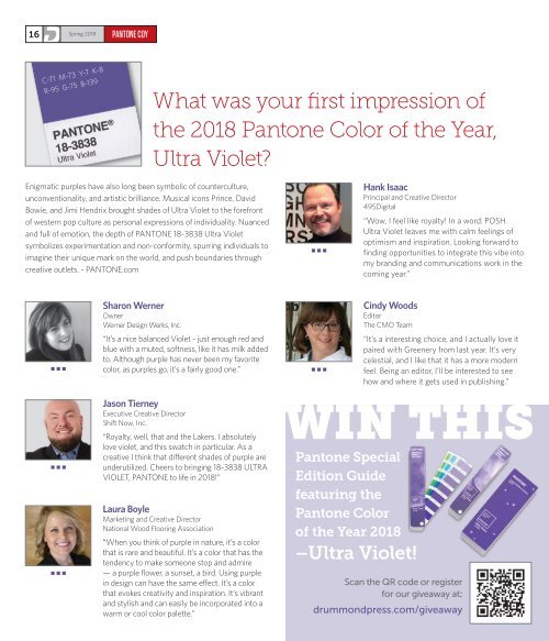
What was your first impression of<br />
the <strong>2018</strong> Pantone Color of the Year,<br />
Ultra Violet?<br />
Enigmatic purples have also long been symbolic of counterculture,<br />
unconventionality, and artistic brilliance. Musical icons Prince, David<br />
Bowie, and Jimi Hendrix brought shades of Ultra Violet to the forefront<br />
of western pop culture as personal expressions of individuality. Nuanced<br />
and full of emotion, the depth of PANTONE 18-3838 Ultra Violet<br />
symbolizes experimentation and non-conformity, spurring individuals to<br />
imagine their unique mark on the world, and push boundaries through<br />
creative outlets. - PANTONE.com<br />
•••<br />
Hank Isaac<br />
Principal and Creative Director<br />
495Digital<br />
“Wow, I feel like royalty! In a word: POSH.<br />
Ultra Violet leaves me with calm feelings of<br />
optimism and inspiration. Looking forward to<br />
finding opportunities to integrate this vibe into<br />
my branding and communications work in the<br />
coming year.”<br />
Sharon Werner<br />
Owner<br />
Werner Design Werks, Inc.<br />
“It’s a nice balanced Violet - just enough red and<br />
blue with a muted, softness, like it has milk added<br />
to. Although purple has never been my favorite<br />
color, as purples go, it’s a fairly good one.”<br />
Cindy Woods<br />
Editor<br />
<strong>The</strong> CMO Team<br />
•••<br />
•••<br />
“It’s a interesting choice, and I actually love it<br />
paired with Greenery from last year. It’s very<br />
celestial, and I like that it has a more modern<br />
feel. Being an editor, I’ll be interested to see<br />
how and where it gets used in publishing.”<br />
•••<br />
•••<br />
Jason Tierney<br />
Executive Creative Director<br />
Shift Now, Inc.<br />
“Royalty, well, that and the Lakers. I absolutely<br />
love violet, and this swatch in particular. As a<br />
creative I think that different shades of purple are<br />
underutilized. Cheers to bringing 18-3838 ULTRA<br />
VIOLET, PANTONE to life in <strong>2018</strong>!”<br />
Laura Boyle<br />
Marketing and Creative Director<br />
National Wood Flooring Association<br />
“When you think of purple in nature, it’s a color<br />
that is rare and beautiful. It’s a color that has the<br />
tendency to make someone stop and admire<br />
— a purple flower, a sunset, a bird. Using purple<br />
in design can have the same effect. It’s a color<br />
that evokes creativity and inspiration. It’s vibrant<br />
and stylish and can easily be incorporated into a<br />
warm or cool color palette.”<br />
WIN THIS<br />
Pantone Special<br />
Edition Guide<br />
featuring the<br />
Pantone Color<br />
of the Year <strong>2018</strong><br />
–Ultra Violet!<br />
Scan the QR code or register<br />
for our giveaway at:<br />
drummondpress.com/giveaway


