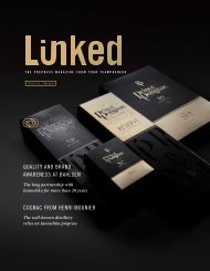
Janoschka magazine Linked_V6_2021

You also want an ePaper? Increase the reach of your titles
YUMPU automatically turns print PDFs into web optimized ePapers that Google loves.
The Prepress Magazine
issue #6 / a u g u s t 2021
GOLD
The light of the gods
packaging
Looks are everything
Grounds for celebration
Mysterious and dark:
The culture that became a cult
Olfactory Marketing
Swathed in a nice scent
e d i t o r i a l
issue #6 ©
l i n k e d
5
Dear Reader,
The world has changed dramatically since we proudly
launched our LINKED magazine five years ago. Alongside
many other things, the pandemic has taught us to
completely rethink customer relations. Social distancing
rules and contact restrictions were previously alien
concepts. Digital communication demands a lot from us
and, at the same time, the personal touch always seems
to fall short. Precisely because this situation is ubiquitous
and currently dominates our lives, we can lose sight of
everything else all too easily.
With this in mind, we wanted this sixth edition of LINKED
to sharpen our awareness of the things that enrich our
lives – both large and small. We have cast the net very
wide: LINKED#6 describes the long journey a little bean
makes and how it undergoes sophisticated processing
before we are able to enjoy one of the many varieties of
hot, aromatic coffee.
This edition highlights the wide range of formats and materials
that perfectly meet the diverse demands packaging
needs to fulfil – and it illustrates how some of these types
of packaging help make brands instantly recognisable.
LINKED also includes a report on gold, describing the endless
fascination this element exerts on us and how even
the tiniest amount of it can add a touch of elegance.
You will discover how all these topics tie in with our multifaceted
world of printing and brands. As ever, we want
LINKED to be a source of information and entertainment –
all from Janoschka and Linked2Brands.
On that note, I wish you an enjoyable read.
Yours,
Alexander Janoschka
c h i e f e x e c u t i v e o f f i c e r
6 c o n t e n t s
issue #6 © l i n k e d
7
contents issue #6
6
68
16
58
44
24
32
insights
knowledge & competence
network & people
notes
6 Gold
The light of the gods
32 Swathed in a nice scent
Olfactory marketing
48 How about a coffee with…
The discovery of slowness
68 Japris
Moving patterns for moving brands
16 Packaging looks are everything
The packaging maketh the brand
face to face
24 Grounds for celebration
Mysterious and dark:
The culture that became a cult
44 Can-do cans!
High-quality design with
precision full-circle printing
54 Limited editions
Trendy packaging for trendy sorts
to tell the truth
58 Do you know…
Which came first: the match or the lighter?
66 Judging the book by its cover?
Packaging reflects cultural developments
70 Linked2Brands goes global
Consistent brand presentation for
international consumer goods markets
72 Walk the talk
Green Deal sustainability
8 i n s i g h t s
issue #6 © l i n k e d 9
The light
of the gods
Lustrous and rare, heavy, alluring, beautiful and magical.
Gold inspires almost all of us to dream: of fairy-tale treasures,
of glittering jewellery, of unbelievable riches.
Gold epitomises luxury – it is exquisite and exclusive and
lends everything a special appeal.
The Incas referred to gold as the “tears of the sun“. The Pharaohs
used it as a burial object. The Spanish Conquistadors crossed
the Atlantic to find the legendary “El Dorado” with its untold
golden treasures for their king. To this day, our fascination with
this precious metal runs literally like a “golden thread” through the
history of humanity. The roofs and façades of temples, mosques
and churches gleam with gold; a golden sheen endows statues
with dignity, status and sanctity. The royal chambers and the state
rooms at Versailles, Schönbrunn and other baroque and rococo
palaces would be unimaginable without their gold lustre. There is
gold wherever you look, but how can that be? Since human beings
first discovered gold thousands of years ago, only 190,000 tonnes
of it have been found across the planet. How can that be enough
to create the many golden things that surround us? Not to mention
the fact that pure gold is very expensive.
10 i n s i g h t s
issue #6 ©
l i n k e d
11
Gold leaf –
it is gossamer thin
yet has tremendous appeal
All that glitters is not gold – or is it? Gilding, the ancient
technique of applying an extremely thin layer of gold
to make any material look valuable and precious, is
thought to have been invented in India over 5,000
years ago. But how do you turn a heavy metal into
this form? What properties does gold need to have to
meld with objects in such a way that they appear to be
solid gold? Above all, it needs to be thin – extremely
thin and flexible. Gold is the most malleable and ductile
of all the metals. This means that its form can be changed
dramatically without breaking.
Numerous steps are required to create what is known as
gold leaf from a gold bar. It is the craft of “gold-beaters“,
who hammer the most precious of the eight “precious”
metals into extremely thin, translucent square sheets
with a thickness of just 0.0001 millimetres (about 1,000
times thinner than a sheet of newspaper). Despite many
technological advances, the manufacture of gold leaf
has not changed over the millennia. Each step requires
delicate work, and skilled craftsmanship is still the key.
And, it also takes some very unusual tools.
The Golden Rock, one of the most sacred
Buddhist sites in Myanmar and according to
legend balanced on just a strand of the
Buddha’s hair. Pilgrims paste gold leaf onto it.
The Victory Column, Berlin
Braving the elements:
surfaces covered in gold leaf retain
their lustre for up to 25 years.
12 i n s i g h t s
issue #6 © l i n k e d 13
It all begins with fire
Before the actual beating begins, about one kilogram
of gold is melted at over 1,100°C. At this
stage, other metals like silver, copper or platinum
can be added to create gold colour variations. The
liquid metal is cast into a small bar that is two to five
millimetres thick (approximately 2–5 mm).
Once it has cooled down, the goldbeater passes
this bar through rollers. This process is repeated
numerous times until a ribbon that is approximately
100 m long emerges. The goldbeater sets the rollers
closer together each time he feeds the gold
through. This makes the metal continuously thinner
and shinier. Interestingly, this process, which is
known as “strain hardening“, makes the soft metal
up to 20 per cent stronger. Once the gold finally
reaches the thickness of newspaper (approximately
0.06 — 0.07 mm), the goldbeater cuts it into small
squares. He then stacks them, separating each layer
with a piece of special paper (Montgolfier paper)
to form a package made up of approximately 600 to
700 sheets, which is called a cutch. Finally, he binds
the package with strips of goatskin.
Gold is a chemical element with the symbol Au (aurum in Latin).
Gold is the 79 th element in the Periodic Table.
It is the only metal that does not corrode.
Gold has a density of 19.3 g/cm³.
This means it is considerably heavier than the proverbially “heavy” lead (11.3 g/cm³).
It is malleable and strong. Normally, gold is hardened
by being alloyed with other metals.
Beating strengthens it while retaining its purity.
Au 79
Latin: aurum
melting point: 1,064.18°C
boiling point: 2,970°C
14 i n s i g h t s
issue #6 ©
l i n k e d
15
This is where the actual work begins that earned the goldbeater
his job title: using a spring hammer he beats this stack of paper
and gold. He constantly rotates and moves the package under the
hammerhead until the sheets of gold leaf have spread to about four
times their size and have only a hundredth of the previous thickness
(approximately 0.006–0.007 mm).
Goldbeating – transforms a single ounce of gold
(approximately the size of a sugar cube)
into a sheet measuring about 28 square metres
“Carte des mines d’or” – an ancient treasure map
The oldest known “treasure map” originates from ancient Egypt and
dates back to the reign of Ramses IV – around 1,150 BC. The papyrus
fragments of the map are currently kept at the Egyptian Museum in
Turin and are known as “Carte des mines d’or“. The map shows the
location of gold deposits in the hills, the distance between the quarry
and the mine, and the living quarters for the mineworkers. So where
exactly is this mine? Well, the map is no different to the treasure maps
you will have heard about in stories: its features are somewhat “vague”
and are likely to send you on a wild goose chase.
Next, the gold leaves are removed one
by one from the layers of paper and quartered.
By now, the gold leaf is so thin that
you can only touch it with delicate, long
ebony pincers. The wood will not harm
the gold leaf as it is soft and not prone to
static charging. The goldbeater then sorts
each of the cut gold leaf quarters into a
stack again, which is called the shoder.
Traditionally, vellum made from ox intestines
was used for the dividing layers at
this stage, not paper. Known as goldbeater’s
skins, these membranes are in
fact more valuable than the gold leaf that
they hold during beating because of their
strength and resilience.
To stop the gold leaf sticking to the skins,
the goldbeater uses a hare’s foot to powder
each layer with the finest gypsum,
called brime.
The goldbeater then checks the quality of
the gold leaf in the assembled stack before
the next round of beating: the gold
has now become so thin that you can
shine a light through it to spot any imperfections
or flaws. Then, it goes back under
the hammer until it reaches a thickness of
approximately 0.001 mm.
Cast bar
2.0–5.0 mm
Rolling
0.06–0.07 mm
Beating
0.006–0.007 mm
…
0.001 mm
…
0.0001 mm
The oceans hold the greatest gold reserves.
Ocean waters contain forty times more gold than humans have found
and put into circulation to date (roughly 6.8 million tonnes in total).
A stack of
7,055 leaves
is no thicker than a
ten euro cent coin.
16 i n s i g h t s
issue #6 ©
l i n k e d
17
Gentle
hammering
In the final stage of beating, the gold leaf is pounded again
by hand to one hundredth of its previous thickness – i.e.
from 0.001 to 0.0001 millimetres. This calls for the highest
level of craftsmanship as manual beating is the only way
to produce the sought-after soft gold leaf with an even
thickness. Interestingly, this process is no slower than
mechanical hammering and is considerably more precise.
Goldbeaters use a selection of short-handled hammers
weighing between three and twelve kilograms. Experience,
pure instinct, a sense for atmospheric conditions
(above all, humidity) and a feel for the “mood of the gold”
define this last stage of beating. To warm up the gold, an
experienced goldbeater will begin with approximately seventy
strikes per minute. During the whole process, which
can go on for hours, he will rotate and turn over the shoder
again and again. Impressively, he gets a steady rhythm
going while varying the speed from heavy and slow to
lighter and faster.
Sheer physical strength is not as important here as perfect
control. The gold packet in its goatskin sleeve compresses
slightly and makes the hammer rebound. It produces a
sound much like a boxer thumping a heavy punch bag.
Striking the shoder at an angle to take advantage of this
rebound is a fundamental skill in the art of goldbeating that
calls for coordination between the hammer and gravity.
The goldbeater decides when this process is complete
depending on what the gold leaf will be applied
to – glass, wood, stone, leather, porcelain, paper or
frescos. Maybe it will even be used on human skin or
on culinary creations, like risotti, cakes or chocolates
or even as flakes of gold in liqueurs.
A glint of luxury
All that glitters is not gold – but it certainly is an eye-catcher when used on
the packaging of consumer goods. Confectionery, cigarettes, chocolate or coffee
– high-quality consumer goods have an air of luxury when they shimmer with
gold, stylishly standing out from the crowd to great effect.
Finally, the finished gold leaves are normally cut into
squares and laid between layers of tissue paper in a
booklet called a “libretto“. The gold leaf is so fine it
is literally “untouchable” by human hand. It is so fine
that it becomes creased as soon as it hits the paper,
but also so fine that it can be smoothed out again
simply by blowing on it very gently. This fineness allows
it to cling to any shape as if it were part of it.
Refining with hot film in relief printing is the most frequently used method for
packaging. The stamping foil that is common to this day was invented in 1932
by gold leaf producer Konrad Kurz. He vapour-deposited real gold onto foil
strips under a vacuum.
In embossed foil printing, the raised parts of the paper or substrate come into
contact with the hot foil. The latter carries a release layer that is applied
by means of heat and pressure. The layer you see on the finished product is
transferred from the stamping foil during processing. In addition to the foil,
an embossing stamp is required to press the selected parts or motifs into their
raised or sunken shapes.
18 i n s i g h t s
issue #6 ©
l i n k e d
19
Packaging Looks
Are Everything
or: The packaging
maketh the brand
The moment when customers first touch or lay their eyes on packaging is crucial.
Brands have to go all out to make that moment count. After all, 75 per cent of consumers don’t decide
which product to buy until they’re actually in the shop.
Blessed is the packaging with instant appeal, for no matter whether we’re shopping at a supermarket
or a delicatessen, we face the same quandaries over and over again.
Which deodorant, which crisps and which of the countless coffee varieties should we buy?
Fresh coffee is simply a good start to the day – no matter whether it’s a quick espresso made using a
capsule or a coffee celebration of hand-ground beans. These days, being able to grab an aromatic,
perfectly roasted coffee ground to our taste in the comfort of our own home is something we take for granted.
Things were very different in the mid-nineteenth century. In those days green beans were sold loose
from the sack and customers roasted them themselves in an oven or on the stove –
often with less than satisfactory results as the beans easily got burnt.
Sweetening the package
As industrialisation advanced, the inventive
spirit of the era produced a wide range of solutions
across the world. The Arbuckle brothers
in the United States, for example, started selling
ready roasted beans instead of green beans
in 1868. They filled them into one-pound paper
bags and dispatched them from New York to
the American West. To ensure the beans kept
their aroma, each bean was glazed with a patented
egg and sugar coating. The egg also
helped the coffee beans to settle while the
sugar ensured that the popular beverage came
ready-sweetened.
Rivals initially laughed, but the Arbuckle brothers’
strategy soon proved right. Not long afterwards,
they started shipping ready ground
coffee. The accompanying unprecedented advertising
campaign made “Arbuckles’” so well
known that it became a generic name for coffee,
just as Levi’s is for jeans.
20 i n s i g h t s
issue #6 ©
l i n k e d
21
Flat-bottomed bags
and folding cartons
While the Arbuckle brothers were conquering North America
with their packaged coffee beans, Margaret E. Knight invented
a machine that made flat-bottomed paper bags. These were
an initial step towards individual packaging: they allowed products
to be packaged and shipped on a large scale in small units
intended for private households.
In 1879, Robert Gair, a
Scottish-born American
inventor, followed with an
innovation that perhaps
marked the birth of modern, industrially produced
packaging: a machine-made folding carton. It soon
proved to be highly versatile and helped Gair establish
a business empire. Its advantages were many:
it provided ideal protection for packaged goods;
it could be stacked and easily transported; and all
six sides of the box could be printed with advertisements
– a key factor in its remarkable success.
We should remember that up until the mid-nineteenth
century, grocers sold “raw goods“. Tea, coffee
and other exotic and luxury goods came in simple
wooden chests, barrels, sacks and other containers.
Shopkeepers did sometimes sell “house blends“,
guaranteeing the quality of their products with their
name and giving customers detailed advice as a per-
sonal touch. Around this time, these goods started
to attract customers from further afield and therefore
needed to keep longer. Manufacturers began to print
their names – and the associated promise of quality –
on their packaging. The “market” was no longer ruled
by the traders. Manufacturers seized control, printing
advertisements on packaging, placing promotions in
magazines or posting advertising on large billboards –
all perfectly coordinated.
The demand for folding cartons sky-rocketed. They
were perfect for detergents, sugar and cocoa.
Colgate used them to package its soaps and toothpastes
and Ponds its beauty creams.
Robert Gair spent the rest of his life improving and
optimising “his” folding carton. At the same time,
he always focused on the lithographic process used
to print advertisements on the cartons. By 1927, the
year of his death, the world of packaging, consumption
and advertising had been revolutionised.
By pioneering and streamlining the large-scale manufacture and
lithography of inexpensive cardboard packaging, Gair provided
companies advertising space with which they could shape the public
image of their products.
22 i n s i g h t s
issue #6 ©
l i n k e d
23
Crackers and biscuits
One of the first brands to become widely available
nationwide was “Uneeda Biscuits” made by Nabisco
and packaged in – you’ve guessed it – folding cartons.
These crackers were promoted with perhaps
the first ever multi-million dollar marketing campaign.
The slogan “Lest you forget, we say it yet, Uneeda
Biscuits” was everywhere. In Europe, meanwhile,
Bahlsen pioneered production technology and branding,
with its butter biscuits coming off the continent’s
first conveyor belt system in small packages.
Classic brands thus date back to the early twentieth
century. Initially these brands were mainly everyday
items such as food, beverages and tobacco, washing
and cleaning products and personal hygiene and
pharmaceutical items – everything that we would call
fast-moving consumer goods (FMCG) today.
Visibility sells –
supermarket shelves
and cellophane bags
Most goods were still supplied without packaging
until the mid-twentieth century. However, in 1916
at the Piggly Wiggly Store in Memphis, Tennessee,
people first encountered a completely new concept
that boosted the demand for packaging once again:
the self-service shop. Ensuring products were visible,
recognisable and thus increasingly identifiable
as a brand was suddenly a must. For the first time,
customers served themselves and then took the
goods to the cashier.
Following the hardship of the war years, Europeans
were now eager to indulge their pent-up need
to consume. By the sixties at the latest, a new era
had dawned: certain long-established brand products
now enjoyed nationwide and international success
and were joined by new ones. Packaging became the
key to being recognised on the market.
Bahlsen biscuits were intended to be high-quality, nonperishable
and affordable. The combination of a
successful recipe and efficient packaging that simultaneously
conveyed the brand message was clearly the key.
The fine taste of the first butter biscuits revolutionised
German baking culture. Hermann Bahlsen protected the
high-quality, tasty contents with the first dust- and moistureproof
cardboard packaging.
In Germany, Bonn-based confectioner Hans Riegel
had already been making sweets under the name
“Haribo” since 1920. His Tanzbären (dancing bears)
made from wine gum did not sell that well at first.
Their breakthrough came after they were renamed
“Goldbären” (Goldbears) and, above all, packaged in
cellophane bags, making the colourful bears visible
and thus irresistible to anyone with a sweet tooth.
Since the sixties, Goldbears have been a mainstay
of the German confectionery sector. The French love
their “Ours d’Or“, the Spanish their “Ositos de Oro”
and the Poles their “Złote Misie“. The cellophane bag
looked modern and contemporary, expressing the
spirit of Germany’s economic miracle era.
24 i n s i g h t s
issue #6 ©
l i n k e d
25
Multiple forms
for multiple functions
Another well-known tube is the one containing
Pringles crisps that was patented in 1970. Not
only is it highly original, it is also highly functional
because the crisps are safely stacked inside the
sturdy cardboard tube and do not get crushed.
The plastic lid can also be closed again, keeping
the crisps fresh longer.
Smarties are another colourful sweet treat. They were
invented by British confectioner Henry Isaac Rowntree
and were first produced in 1937. They, too, conquered
the western European markets (and sweet teeth)
during the sixties. Smarties have always stood out due
to their unusual packaging: a cardboard tube printed all
over with coloured chocolate drops.
SEE ARTICLE ON PAGE – SEE ARTICLE ON PAGE –
p.66
Smarties is a brand with cult status whose recognition
value is inextricably linked to its packaging. Nevertheless,
Nestlé took a daring step in 2021, switching the international
packaging concept for Smarties to paper. The iconic
Smarties tube has been replaced by a hexagonal shape.
Until now, only 10 per cent of Smarties products were
packaged in recyclable paper. The campaign, which goes by
the name “Smart Initiative“, aims to save over 191 tonnes
of plastic each year in the production of tubes, bags and
cartons in Germany alone. According to Nestlé, this will
make it one of the most important sustainable packaging
initiatives in the confectionery field. The company claims
that the new Smarties paper packaging originates from
sustainable forests, is made from coated paper, paper labels
or cardboard, and can be recycled after use.
Customers
buy packaging
Special editions of Nutella jars cannot only be
resealed, but also repurposed. Italian confectioner
Michele Ferrero launched the new hazelnut
and cocoa spread in 1964. The following year,
he filled Nutella into a new style of jar with an
unmistakable, iconic design. Over the decades,
this packaging was enhanced in numerous ways.
Some jar shapes, which can be re-used as drinking
glasses, have gained cult status – especially
those emblazoned with Asterix and Obelix or the
Flintstones. Another advertising ploy is to allow
customers to order personalised labels for their
jars. In Italy, Ferrero sold the regular jars printed
with single letters and thus made them collectors’
items.
All of this shows that packaging is a marketing
instrument. As “signature packaging“, it is a
communication medium, opens a dialogue with
consumers, in some cases inviting interaction.
But no matter how playful or how high-quality
packaging is – function comes first, particularly
in the food and personal hygiene industries. In
addition, consumers are increasingly concerned
about the material and its reusability and recyclability.
These days packaging has to be “green”
and sustainable to sell.
We can see two contrary trends, above all in the
food sector: while convenience products continue
to reflect the fast pace of our lives and require
more sophisticated packaging solutions, many
people feel a need to slow down. This is tied to
a demand for products that have undergone as
little processing and use as little packaging as
possible (or even no packaging at all). Above all,
very young (20-something) consumers who find
green and sustainability issues important are increasingly
influencing the markets.
Manufacturers will have to respond to this
changing demand. Today, the main requirement
in terms of packaging is: as little as possible.
History has shown us that if you want to be selling
a product tomorrow, you need to package it
well today – a principle that is truer now than it
ever was.
26
f a c e t o f a c e
issue #6 ©
l i n k e d
27
“Ethiopian coffee traditionally has
a heavy, earthy taste. Here, it is the
custom to serve coffee with a little sprig
of rue. When I stir the coffee with this
herb, it acquires a bright aroma with
fruity notes of bramble and raspberry.”
Daniel Tesfaye leans back against the
Grounds for
Celebration
colourful hangings covering the wall
of the little street café in Addis Ababa,
a look of satisfaction on his face. The
smell of the coffee just roasted on a
little brazier fills the narrow room. A
wooden mortar to grind the coffee in
and a traditional clay pot called a jebena
– that’s all this corner café needs
to prepare coffee.
The “black gold” is served in small,
Mysterious and Dark:
The Culture That Became a Cult
Thirteen months sunshine a year –
perfect conditions to produce perfect coffee.
But hang on a moment... thirteen months?
What might sound like a marketing ploy is
measurable reality in Ethiopia.
In the birthplace of coffee, not only do the
clocks run differently, life also follows a
completely different calendar.
The year begins on 11 September, and the
last month of the year is only a few days long.
That’s how Ethiopians get thirteen months
of sunshine – much to the benefit of the
country’s world-famous export.
“coffee has to be as hot
as hell, black as the
devil, pure as an angel,
sweet as love.”
With between 800 and 1,000 different
aromas, coffee is a taste
explosion and far more complex
than wine. Coffee testers, or cuppers
as they’re called, distinguish
between earthy, mild and strong;
between sweet, nutty, chocolatey
and fruity aromas; and between
coffees that taste of honey, flowers,
pepper, bread or caramel. It
takes a great deal of experience
to be able to identify the fine and
complex nuances and to describe
and evaluate the coffee.
In Ethiopia, flavours range from
the idiosyncratic, mysterious and
ambiguous taste of Harrar beans
to the elegant, bright aromas that
envelop the Sidamo and Limu coffees
pervaded by floral notes.
But the quintessential Ethiopian
coffees come from Yirgacheffe.
With their shimmering, extravagant,
spicy, lemony aromas, these
full-bodied, eclectic and balanced
coffees are simply unmistakeable,
the expert reveals.
demi-cups typical of Ethiopia. Here, in
the capital of this East African country,
a culture is emerging based on a coffee
tradition dating back thousands of
years that can certainly rival any of the
world’s hippest coffee centres. Daniel
Tesfaye is part of this culture. As a professional
coffee taster, he samples up
to 500 cups of coffee a day, evaluating
and grading the quality, the taste and
the aroma.
Charles-Maurice de Talleyrand
(18th century)
28
f a c e t o f a c e
issue #6 ©
l i n k e d
29
Coffee is grown in around eighty, mainly
less developed countries on or close to
the equator. After oil, coffee is the world’s
most important traded commodity and,
after water, its most frequently consumed
beverage. Half of the world’s population
drinks at least one cup of coffee a day.
The planet has roughly 15 billion coffee
trees to cover this demand, and about 100
million people earn their living directly or
indirectly from growing coffee. Around 70
per cent of them are small farmers who
produce their coffee by hand and using a
few simple machines. The pairs of hands
each coffee bean passes through before
it reaches the cup are varied and many –
each just as important as the one before.
Coffee trees grow on slopes, so harvesting
coffee cherries is hard physical work
and requires an attentive and keen eye.
There are two main types of coffee: Arabica
(coffea arabica) or mountain coffee that
grows at an altitude of between 600 and
A world of coffee –
coffee for the world
2 4 °degrees latitude north
coffee belt
2 4 °degrees latitude south
Tropic of Cancer
Tropic of capricorn
Only regions with year-round stable, mild, frost-free climates provide the ideal
conditions for growing coffee and producing top-quality aromatic beans.
Coffee is a classic example of what used to be called “colonial goods” in grocery stores.
While coffee is produced mainly in less developed countries near the equator,
three-quarters of it is drunk in industrialised countries.
2,200 metres; and Robusta (coffea canephora),
which also grows lower down and
is known as lowland coffee.
The coffee cherries are hand-picked and
only the dark-red, ripe berries are harvested.
They grow alongside those that
are still green and those that are only just
blossoming. Once they have been picked,
they need to be processed immediately. A
simple machine is used to extract the two
beans from the cherry. After washing off
any fruit flesh still clinging to the beans,
the farmer then leaves them in a trough to
ferment for at least a day. This method is
known as wet processing. The beans are
then spread out in the sun to dry.
Another method is dry processing. In this
case, the ripe coffee cherries are left intact.
To ensure that they dry evenly, they
are spread out on drying terraces and
turned regularly. Only then does the farmer
crack them open. Whichever method is
used, a kilogramme of cherries produces
only 200 grams of raw beans.
Cherry-picking
with a difference:
What we call “beans”
are actually the seeds
of the coffee cherries.
Many hands –
many eyes
Many coffee farmers are organised in
cooperatives to which they sell their
raw beans. From there, the beans
are taken to the hulling machine that
removes the fine parchment skin.
After that, mechanical shakers sort
the beans according to size. In a final
quality control process, diseased or
discoloured beans – i.e. anything that
might spoil the flavour – are picked
out laboriously by hand. In most coffee-growing
countries, women do
this work, and for many of them it is
the only means of earning an income.
The effort, diligence and care that
goes into producing the world’s coffee
is extraordinary at every step.
Every plantation or cooperative is
rightly proud of its product. This pride
is often reflected in the individual
label printed on the traditional burlap
or jute sacks in which the coffee
makes its long journey to its final destination.
In some places, the sacks
with their colourful labels are just as
much cult items as their contents.
Only after drinking the customary third cup of
coffee does Tesfaye leave the little street café.
There will be many more cups to come. At his
place of work he prepares everything for
today’s round of tasting (or cupping). Cupping
is a universal standardised method for
evaluating and grading coffee.
You might compare it to wine-tasting. For this
ritual, Tesfaye, the coffee sommelier, prepares
a dozen bowls of different types of raw coffee
from Ethiopia’s famous growing areas.
These shimmering silvery green beans don’t
have any flavour yet. Therefore, Tesfaye roasts
four cups’ worth of samples of each variety.
He then places them ready for the four obligatory
infusions. Today’s guests are the owners
of small private roasting outfits from Oslo,
Berlin and Melbourne. After the coffee experts
have assessed the appearance of the green raw
coffees and their appearance after roasting,
they will sniff – and slurp – their way through
countless aromas. Slurping is the only way to
obtain the full taste experience from the coffee.
30 f a c e t o f a c e
issue #6 ©
l i n k e d
31
Coffee sacks
Jute sacks – the pride of every
plantation and cooperative
Releasing the flavours
– the art of roasting
For more than two hundred years, jute sacks have been the material
of choice for packaging raw coffee. Printed with logos, dates
of origin and the names of types of coffee, they testify to the hard
work and pride of the coffee farmers in the respective region.
Jute is a natural and hence environmentally friendly product.
But it also has a number of other advantages:
- The loosely woven sacks allow air to circulate, keeping the coffee
beans fresh while they travel – often for weeks at a time.
- The rough surface is easy to grip, making loading easier and
stopping the piles of sacks slipping during transport at sea.
- They are the official measure for raw coffee: between 50 kg and
70 kg depending on the country of origin.
SEE ARTICLE ON PAGE – SEE ARTICLE ON PAGE –
p.66
For reasons of cost, the current trend is towards plastic sacks:
huge polypropylene super sacks hold around a ton of raw coffee.
Like wine, it’s the terroir that determines the
taste of coffee: in other words, climate, growing
region, altitude, soil quality and weather. But
it takes fire to unlock all the aromas from these
very ordinary looking beans that make coffee the
world’s most popular psychoactive drug. Roasting
– which even scientists describe as an art
– not only brings out the flavour, but transforms
the entire product: in this complex process the
beans change their colour and grow to twice
their size while at the same time losing weight.
They become porous and brittle, and thus suitable
for grinding. The general rule of thumb is, the
darker the roasting, the more intense the taste.
The high temperatures decrease the acid content,
and the sugar in the coffee beans starts to
caramelise, yielding a bitter-sweet flavour. The
resulting aroma is the one we know from typical
Italian espresso: strong and black.
This is the perfect coffee to combine with milk,
whether as a cappuccino, latte macchiato, café
cortado or flat white.
Light roastings have been all the rage for a few
years now. This is part of the so-called Third
Coffee Wave, which has not only revived the
hand filter and the Karlsbad coffee pot, but also
coffee served as cold drip, AeroPress or cold
brew. For these methods of preparation the variety
of tastes and individual flavours plays a key
role. Only high-quality raw coffee can reveal the
secret of light roasts: the subtle acids in the coffee
beans are preserved and the more nuanced
natural aromas of the coffee come to the fore.
The coffee acquires a more aromatic, floral and
fruity flavour with notes of jasmine, bilberries or
raisins. To release these aromas from the coffee
beans, the roaster needs a lot of experience,
an all-round knowledge of the raw product and a
highly attuned feel for the business of roasting.
32
f a c e t o f a c e
issue #6 ©
l i n k e d
33
“Unlike other natural fruits, such
as vanilla or bananas, there is no
specific coffee taste molecule,” Tesfaye
explains. “Instead, it is the work of
countless diligent hands, the quality
and special goodness of the raw
product and the country of origin that
give the coffee the richness that we experience
with every cup,” he continues,
summing up the long history of coffee
in a nutshell.
A matter of taste
Zeitgeist is King when it comes to preparation
Who needs a coffee molecule?
Coffee is so much more than that.
Coffee is magic...
Pour
over
Arabic
mocca
Espresso
makers
A simple way to indulge the senses: the Ethiopian coffee ceremony
Formally known as filter
coffee. As well as getting the
amount of coffee, the fineness
of the grind and the water
temperature exactly right,
a special pouring technique
is needed to allow the coffee
flavour to fully develop.
The oldest way of making
coffee uses special little jugs
made of copper or brass
with long handles (ibrik).
The classic design of the
little octagonal aluminium
pots originated with Alfonso
Bialetti in 1933.
First wave:
coffee for
everyone
Second wave:
coffee
to go
Third wave:
back to
the beans
Drinking coffee first became an established
household habit between the
1930s and 1960s.
Whereas previously coffee had been an
exclusive commodity, specially weighed
for customers in small shops and
then freshly ground, it now became a
cheaply produced industrial good that
could be bought in supermarkets ready
ground and vacuum packed.
Starting in the 1980s, high-quality
Arabicas and espresso beverages found
their way onto the mass market as “coffee
to go“. Cappuccino, latte macchiato etc.
required a lot of milk. The trend of
enhancing coffee with artificial aromas
and syrup came from the United States.
This wave was accompanied by the advent
of fully automatic coffee machines as
well as machines that used capsules
or pads for a quick cup of coffee at home
or in the office.
Here, the emphasis was on the special
qualities of coffee as well as on fair trade.
“The third wave appreciates each coffee
for what it truly is and takes whatever
steps are necessary to highlight the
amazing, unique character in every
coffee”, Nicholas Cho, Wrecking Ball
Coffee Roasters, San Francisco.
Single-origin coffees, quality criteria such
as growing region and year, plantation,
roaster and method of preparation have
an important role to play alongside
social aspects such as fair production
and trade.
Portafilter
machines
Attempts to make coffee
with machines that generate
steam go back to the nineteenth
century. This method
allows a typical Italian
espresso, with its dark oily
quality and markedly creamy
consistency, to be made in
just 25 seconds.
Aero-
Press
Water is poured onto coffee
powder and, after it has been
stirred by hand, it is pressed
down with a plunger directly
into a cup.
Cold
drip
Ice-cold water drips slowly
into a vessel containing
freshly ground coffee. After
several hours this produces
a coffee concentrate, which
can either be drunk neat
or diluted with water for a
longer drink.
34 k n o w l e d g e & c o m p e t e n c e
issue #6 ©
l i n k e d
35
Just a hint of vanilla or orange
and we already feel relaxed.
Catching a whiff
Swathed
in a Nice
Scent
Scent is the fastest of
all means of communication.
The intense smell of an espresso can
evoke memories of the sun and sea breeze
of last year’s Italian holiday.
The aromas wafting from a bakery will
stimulate our appetites at any time of day,
and the smell of incense can awaken
something inside us, too.
Seventy per cent of our emotions are triggered through our sense of smell:
whether we feel comfortable in our surroundings, whether we feel like doing
something or not, or whether we feel the urge to be creative. Germans even
express their dislike of a person in the phrase “ jemanden nicht riechen
können” – literally not being able to stand the smell of a person.
Scents affect us on so many levels that they can be used as a universal
communication tool, as a medium to convey characteristics,
to arouse feelings and to differentiate. Scents have a longer lasting effect
than any other medium. Scent marketing exploits precisely this property:
the deliberate use of scent can help sell a product better,
boost customer loyalty and increase the brand value.
A product’s “corporate scent” broadens corporate communication
in key ways and forges an identity – a corporate identity (CI), in other words.
Scents make products and brands unforgettable.
36 k n o w l e d g e & c o m p e t e n c e
issue #6 © l i n k e d 37
Car manufacturers
pick up the scent
Scents have played a role in the motor industry for
a while now. Daimler Benz patented a scent for vehicle
interiors not long after the Second World War.
However, the fact that the company never enforced
the patent shows above all that it was decades
ahead of its time. It was not until the 1980s that
scents suddenly became important in the automotive
sector. Initially, car manufacturers went to
great lengths to neutralise smells in vehicle interiors
where possible – mainly to eliminate the often unpleasant
plastic odours emitted by the interior trim.
A lot has happened since then. Scent options now
seem to know no boundaries.
Do you want your car to smell new for as long as
possible? Should the interior emit the luxurious
smell of leather and wood? Today, car buyers can in
many cases use a scent system to decide for themselves
how their car should smell and how intensely.
Peugeot was one of the first manufacturers to
use this idea. Now many other carmakers also fit
cartridges in the air vent ducts to release scent into
the vehicle interior.
Other industries have followed. In recent years, almost
all self-respecting brands have addressed the
questions of scents and how their products smell.
The new fragrance, exclusively for
the EQS: no.6 MOOD Linen.
In the Social and Technological Research
department at Mercedes-Benz, futurologist
Sabine Engelhardt analyses the zeitgeist
and long-term social trends.
The research results then flow into strategies,
products – and fragrances.
38 k n o w l e d g e & c o m p e t e n c e
issue #6 © l i n k e d 39
A Nobel Prize for the most
fleeting of all senses
You could say the developments in this field have been quite astounding.
For a long time, the sense of smell was left in the shadows, treated
as a “lesser sense” together with the sense of taste – both by researchers
and, ultimately, also in the public perception.
The nose was considered to be the most
mysterious of all sensory organs. It was
not until molecular biologists started to
take an interest in smell that this sense
was awoken from its deep slumber. The
turning point came in 1991 with the discovery
of odorant receptors by Linda Buck
and Richard Axel. In 2004, the two scientists
were awarded a Nobel Prize for their
research into the human sense of olfaction.
Since then we have known that our nose
absorbs tiny scent molecules that stimulate
millions of olfactory nerve cells. The
scent is converted into an electrical signal
and the brain reacts immediately. In other
words, the brain evaluates, deciphers and
memorises the scent. The limbic system
is of central importance in this process. It
controls our emotional life, and it is also
where our memories of scents are stored.
The signal received by the limbic system
causes the brain to secrete hormones,
which – put simply – generate feelings and emotions. This
means that a smell alone is capable of making us feel tired
or vitalised, lowering our blood pressure or speeding up our
heartbeat.
Furthermore, several studies have shown that smells have
a greater impact on our memory than images – the memories
they evoke are more vivid and emotional. In comparison
with verbal stimuli, smells also seem to be ahead by a nose
as they activate the limbic system more strongly.
Back in 1995, an experiment in Las Vegas revealed something
quite astounding: the takings of a casino rose 45 per
cent after a pleasant scent was diffused through its rooms.
A study conducted at Hasselt University in Belgium found
that the smell of chocolate wafting through a bookshop led
to increased sales of romantic novels, although sales of
thrillers fell, keeping the overall turnover the same as before.
Much of this field, like the effect of different scents
on people and how brands can make use of this, still needs
further research.
40 k n o w l e d g e & c o m p e t e n c e
issue #6 © l i n k e d 41
Hotel Daniel (in Vienna and Graz) has its very
own brand of shower gel, making a stay there an
memorable experience.
However, one thing is certain: there is no
escape from scents. Olfactory marketing
has long since become an important playing
field for the specialists. Room scents
are now relevant in almost all industries and
are being used in a variety of settings – in
kitchen showrooms, in hotels, at swimming
pools, in care homes, on trains, in offices,
in shops, at opticians, at electronics retailers
and at petrol stations. In most cases,
aroma diffusers carefully dose the respective
scent. Dosing the scent is in fact the
greatest challenge, as it should never be
too complex or intense. Too much scent
will overwhelm customers: the brain will
attempt to decipher the components – it
is distracted and the person no longer concentrates
on what they actually came for.
Research has shown that a subtle use of
scent can have a positive effect on purchaser
behaviour. Nevertheless, in our globalised
world, we need to remember that
there are cultural differences: Germans
associate “cleanliness” more with lemongrass,
the French with flowery scents
and Spaniards with chlorine. You may notice
this if you pass through the airports of
Berlin, Paris and Madrid.
42 k n o w l e d g e & c o m p e t e n c e
issue #6 © l i n k e d 43
Scent follows function
An airport was actually among the pioneers of
room scents. In Frankfurt am Main, fragrances
composed of peppermint, rosemary and lemongrass
to promote wellbeing have been flowing
from the air-conditioning system in the departure
lounges for a while now. Of course, the scent experience
does not necessarily end once you are
called to your gate. Singapore Airlines, for example,
developed its own corporate scent – “Stefan
Floridian Waters” – back in the late 1990s. Their
flight attendants wear this delicate fragrance, it is
infused into wet wipes and towels and diffused
through the whole cabin.
A scent used in a room should ideally reflect the
function of that room as well as fitting the architectural
concept and interior design. What do we want
to do in the room? Focus on work or relax?
While an intense scent may be suitable for an
ornate baroque room, minimalistic interiors call
for something more discreet. Experts agree that
smells are only pleasant if they have a subtle and
subliminal effect on us.
Brands are increasingly creating their own scents
rather than using familiar ones as a basis. This allows
the inherent scents of a product to be used
along with an “add-on” scent. Whichever scent is
chosen, it should create a positive experience for
customers and anchor it firmly in their memories.
Scent marketing experts thus utilise the principles
of how smells trigger memories in our brains and
associate certain emotions with certain scents.
The sense of smell – although the most fleeting –
is the most elementary of all human senses. That
is what makes scents so powerful. An opportunity
not to be missed for any brand. Therefore, we can
expect scents to play an even greater role in marketing
over the coming years.
44 k n o w l e d g e & c o m p e t e n c e
issue #6 © l i n k e d 45
... more than a thousand words
According to an American study*, imbuing packaging
with scent significantly improves people’s
ability to recall brand attributes. Two groups of
test participants were shown advertising claims
listing a total of thirteen different product characteristics:
one group was given just images
and text while the other group was additionally
exposed to a fragrance.
Two weeks later, the test persons from the
scent group could remember five out of
the thirteen characteristics. The group without
the scent, however, only managed to recall
between one and two on average. So there
are certainly some good reasons for getting
the message across via the nose.
Scented coatings use microencapsulated aromatic
substances or scented oils. The essential
oils enclosed in the plastic capsules are applied
directly in a transparent overprint varnish. Scented
coatings are suitable for use with all common
printing techniques, like flexo, gravure, screen,
sheet-fed or web offset printing.
They can be applied across the whole surface
or at specific points. The scented coating can
be water- or oil-based, contain solvents or be
UV-based, depending on the printing technique
and procedure being used. It can be processed
in printing or coating units. When consumers
touch a surface that has been scented using
this technique, the friction causes the capsules
to break open and release the scent.
* Krishna, A., Lwin, M., Morrin, M., Product Scent and Memory. Journal of Consumer Research, Vol. 37, June 2010.
Tree – Sundance Film Festival 2016
“Tree” is a virtual reality experience with “sensible” enhancements.
It transforms you into a full-sized tree in a majestic rain forest.
Your arms become the branches and your body the trunk as
you experience the tree growing from a seedling into its fullest form.
Finally, you witness its fate at first hand.
A team of passionate artists, producers and programmers have
created a truly immersive VR storytelling tool.
A very subtle and impressive dimension of smells is added to stimulate
the senses and fully immerse the audience in their new identity.
The scents range from the fragrance of the soil where the seedling
takes root, all the way to the smell of burning wood.
treeofficial.com
46
k n o w l e d g e & c o m p e t e n c e
issue #6 ©
l i n k e d
47
Beauty is the name of the game here – inside and outside.
The products instantly promise you a radiant complexion,
fresh scent and – while they’re about it – eternal
youth. Beauty products are about the essentials in life:
our bodies and our physical appeal. Their exterior has to
communicate this promise at a glance, so it’s all down to
the packaging: if it puts on a perfect show at the point of
sale, creams, soaps and deodorants will find their way
into the bathrooms – and lives – of consumers.
Can-do cans!
High-quality design
with precision
full-circle printing
How does the brand design find its way onto the aluminium spray can?
Cans containing deodorant or shaving foam greet you every morning in the bathroom.
But in fact a great deal of technical expertise goes into making these everyday items –
even just branding and printing the cans is a highly skilled job.
The brand “guards” at Linked2Brands shed light on
the complex world of spray can printing.
Colours, graphic elements and nifty details on packaging
are used to communicate a brand image. At the same
time, packaging makes promises about the effectiveness
of its contents. The containers, whether high-quality jars,
soft-touch tubes, bottles or tins, also need to guarantee
that the product is packed hygienically, is easy to dispense
and can be used in small quantities.
Airy solution
This is no easy task for marketeer, production
agencies and manufacturers –
particularly when high-tech packaging
formats are involved, like said aluminium
spray cans.
For a start, they have to meet the highest
hygiene requirements, ensuring there is
no direct contact between the packaging
and germ-laden surfaces when you apply
the contents. The outstanding barrier
properties of aluminium keep out light, air
and other gases as well as moisture, corrosion,
germs and bacteria, and thus protect
the contents of the can against any
form of contamination.
Bella figura – an eye-catching figure
Deodorant spray cans are characterised by appealing,
fresh, aesthetic colours and imagery. Shapes that sit
nicely in your hand underline the premium look. The
cans therefore often do not simply have a cylindrical form
– they have waves or are curved or necked. Curves have
a direct impact on the printed images: they shorten or
lengthen lines, make straight lines curved or similar.
This is a job for the repro specialists who ensure that the
writing and images on the spray can do not look distorted.
When they process the print, they compensate the
effect of the specific can shape on the image design until it
looks right again.
They distribute the product on your skin
sparingly, precisely and, above all, in
small doses. Thanks to the premium appearance
of their material, its luxurious
feel and an impressive variety of shapes,
products can be differentiated at the point
of sale. That’s why they’re the packaging
of choice for sensitive care products and
cosmetics. It will come as no surprise
then that the cosmetics industry accounts
for around 85 per cent of the aluminium
aerosol cans produced across the
world. Deodorants and perfumes are the
clear leaders within this sector as they fill
every second can produced.
48 k n o w l e d g e & c o m p e t e n c e
issue #6 © l i n k e d
49
Inspired design
Tailor-made for its specific purpose, the aluminium
can awaits its likewise tailor-made brand label. Printing
is done directly on the can. Firstly, it needs to meet
the premium requirements of the beauty sector – to
exude maximum appeal at the point of sale and inspire
a purchase. Secondly, the material and shape
of the aerosol can also set high requirements for the
design, adaptation and printing technology. This is a
job for experts.
“When we print aluminium spray cans, we work
within a highly defined area. Unlike drinks cans, for
example, which are emptied in a single usage and are
therefore purely throw-away products, personal care
products are with us for a much longer time. They are
more of a luxury product and consumer experience
and expectation call for high quality in all respects,“
says Wouter Dalebout, Linked2Brands onsite account
manager at Unilever Rotterdam, summing up the situation.
“To achieve the desired look and feel of this material,
at Linked2Brands we mediate between the idea
and its realisation and thus bring two worlds together:
design and print.“
The print goes onto the shaped aluminium aerosol
can. Unlike working with flat material, there is no way
to detect the starting point for a printing process on
the round shape. Therefore, the whole image is printed
in a single pass.
SEE ARTICLE ON PAGE – SEE ARTICLE ON PAGE –
p.66
High pressure – a lightweight
that packs a punck
In addition to the product-specific payload, spray
cans contain what is known as a propellant.
The propellant generates the pressure required to
dispense the product evenly from the can.
The liquid is only atomised into thousands of
droplets once you press the spray button. When
filled into the can, the propellant is compressed to
such an extent that it liquefies. The pressure inside
most cans lies between 3 and 5 bar – higher
than car tyres.
The different factors that make up the basic
principle can all be adapted flexibly and thus
very specifically to the application: from the
required droplet size and the fineness of the
dispenser to the right propellant and a suitable
can material, special shape or printing.
Spray can or aerosol can – since 1927
The spray can gets its special properties from a
unique technology: aerosol.
An aerosol is a heterogeneous mixture of solid or liquid
particles suspended in a gas.
Greek: aer (ἀήρ) = air | Latin: solutio = solution
The spray can produces an aerosol at the push of a button –
tailored to the respective application so that the
consumer has precisely the product he or she requires at that moment
with the right particle size and the precise degree of fineness.
Dry offset
– pinpoint accuracy
This makes dry offset printing the method of choice.
In this technique, all process colours are applied precisely
and directly to the final product in a single pass.
Since intermediate steps are not required, dry offset
is, although limiting, yet the best fitting decoration
technology for these shapes. Dry offset accurately
places an intricate puzzle of multiple coloured print
images seamlessly side by side. This method creates
impressive images through perfect interplay between
design and implementation.
Guaranteeing this is one of Linked2Brands’ areas of
expertise. The company supports brand owners from
the outset when it comes to producing their packaging.
One can generally say that getting the pre-press specialists
on board as soon as possible will keep costs
down and achieve the desired high-quality results.
Questions come up even in the draft phase: can the
expectations for the desired design or image be met
and are they precise and consistent? What kind of
design works best with the printing technique used?
“All analyses follow an in-depth consultation process
to set the right priorities for the customer’s different
interests,” says Stefan Hilß, Managing Director of
Linked2Brands. “The design, the needs of the brand
and the production process have to be coordinated in
an intelligent way. If, for example, a packaging design
has a large number of details, we will know exactly
where to simplify it so both the premium look and the
brand are retained when one particular manufacturing
method is used.“
Javier Pérez Martínez, Artwork Production Manager,
Unilver, also describes the collaboration as a winwin
situation. “Consulting, repro and support from
Linked2Brands have essentially helped define the
impressive appearance of our deodorant products and
ensured trouble-free processing. That is extremely
valuable because, in addition to high quality, fast and
reliable implementation of our ideas is decisive for us.”
The beauty and cosmetics industry is one of the few
sectors to possess such great potential to win over
loyal and enthusiastic customers. What counts is to
stand out from the crowd with quality and packaging
that convincingly says: “You are beautiful and attractive.
Buy me and you will stay that way.”
50
n e t w o r k & p e o p l e
issue #6 ©
l i n k e d
51
How
about a
coffee
with ...
The Discovery
or:
of Slowness
At coffeehouses, espresso bars and Arab street cafés. . .
all over the world, a cup of coffee is a great opportunity
to meet people, chat and get to know one another.
We were keen to find out more, so we asked staff from
Janoschka and Linked2Brands: Who would you most
like to meet for coffee?
Ana Mahiques
Administration, Janoschka EspaÑa
“Undoubtedly, I’d drink coffee with my grandfather. When he was alive, I didn’t care about his
stories. Abel, the fifth son of a midwife, grew up in an idyllic, remote hamlet in the mountains.
He lived and worked as a miller in his father’s flour mill, next to a waterfall and he married there
too. Although money was scarce, they were self-sufficient, kept farm animals and cultivated their
own fields, besides hunting and fishing. He never went to school and yet he learned to read and
write and devoured technical books about mill engines.
There were so many stories: how he was positioned at the front during the war because he was
an excellent marksman, how he won each egg-eating contest, how he played the mandolin at balls,
mingling with young and old, making friends everywhere, carving the mill stone underwater,
doing household tasks, making his family laugh every day, …
From what the stories tell, he must have been a real ’good-for-all’ kind man.”
52 n e t w o r k & p e o p l e
issue #6 © l i n k e d 53
Renata Ziegler
Office Manager,
Janoschka Polska
Kerem Erol
Key Account Manager,
Linked2Brands Turkey
“I’d like to have a cup of coffee with Keanu
Reeves. He is a popular actor who is famous
for the movies Speed, the Matrix trilogy and
the John Wick series. This extraordinary man,
despite his enormous popularity, is modest
and shares his wealth with those in need.
Keanu is mentally strong. He has endured
many difficult moments in his private life.
Despite living among celebrities, he remains
‘the boy next door’. While having a cup of
coffee with him, I would like to take a bass
guitar lesson from him.“
“Honestly, these days I would love to have a coffee
with anyone! It doesn’t matter who it is, as long
as it’s in person. I’ve been working from home
since March 2020 and I miss social life. And as I
have the free choice, I would love to have a coffee
with Douglas Adams. He is an English sciencefiction
author who gained fame with the series
‘The Hitchhiker’s Guide to the Galaxy’. In 2001
he passed away at the age of 49, leaving an unfinished
novel. I love his unique sense of humour
and the totally crazy alternative universe he
describes. The most important thing about him:
millions of people have read his books and every
single fan is secretly convinced that he or she is
the only one who understands him. Well, I’m one
of those fans and why wouldn’t I discuss “Life, the
Universe and Everything” with him.”
54 n e t w o r k & p e o p l e
issue #6 © l i n k e d 55
Priyanka Birari
Client Service,
Linked2Brands India
“Actually, there are many people I would like to have a coffee with...
from our plant manager to my two-and-a-half-year-old kiddo. But here
I’d like to suggest our famous and bold politician, Minister of Road
Transport and Highways, Mr Nitin Gadkari. He talks about renewable
energy management in India, which each and every one of us needs.
Using the resource solar energy, which is abundant in India, will be a
big step towards India becoming a self-reliant country.
He has played a crucial role in the development of
infrastructure as well as small- and medium-scale industries.
People can really see his work on the ground. It is so inspiring
how he is micromanaging such a vast area of development.
Having a cup of coffee with him would be
a learning experience for me.”
“I’d love to have a coffee with my beloved
grandma. She is a strong, independent,
affectionate, albeit stubborn lady. For me
she is a very special person. She loves to tell
stories about the past. She likes to remember
my grandpa and the time when she was young
and independent. She can tell you a story
about any subject you care to mention. She
doesn’t regret a single decision and considers
them all valuable for her life. All of her stories
carry the message that life is precious and
that one should enjoy and treasure even the
smallest experiences. Even if she sometimes
repeats her stories, you can tell from her eyes
that she is relishing the past and feeling wistful
at the same time.
Sandra
Schäfer
Junior Head of Social Media & PR,
Linked2Brands Germany
What fascinates me the most about her is
that, despite some tough times in her life, she
never gives up and always keeps her goals in
mind. The story of her life and the grace with
which she manages to find something positive
in every setback and to integrate this into
her life’s story makes her a role model for me.
Precisely for this reason I would never miss
a single opportunity to have coffee with my
grandma, and there’s always something sweet
to go with it.”
56 n e t w o r k & p e o p l e
issue #6 ©
l i n k e d
57
Limited Editions
trendy packaging for
trendy sorts
Linked2Brands ensures
brand consistency through
seamless processes
Limited editions, seasonal varieties, expanded product lines – customers
like to ring the changes. To ensure they don’t satisfy their thirst for
novelty elsewhere, astute brand manufacturers will do well to retain
customer loyalty with original and creative ideas. What is more, this form
of product differentiation gives companies an opportunity to test the
waters. Product variations are therefore a useful tool in many respects,
but only if they are presented to the customers in the right way.
First and foremost, packaging is the key to getting
a product noticed and arousing curiosity. It needs
to feel good, promise quality and match the brand.
A lot of time, design acumen and meticulous artwork
go into every detail of the brand identity:
the logo, the colours, the graphic elements, the
typography and the proportions. Taken together,
these ensure that customers immediately associate
a product with a certain brand. If small runs of
a brand product, like limited editions and seasonal
varieties, are to have the desired effect, i.e. contribute
to brand awareness, it is important to put
the same effort into them. “Even straying slightly
from the norm can backfire and will not pay off in
the long run,” says Markus Fautz, Site Manager at
Linked2Brands Germany. “If you want packaging
to instantly show customers that the brand keeps
its promises, even in special campaigns like limited
editions, it needs to have the familiar look and feel
at the point of sale – no matter whether it’s on a
shop shelf or sold through eCommerce.“
If all these aspects – from design and artwork to
production – slot together smoothly, brand owners
can be sure that all the elements and information
that make up the brand are visible on the packaging
according to the brand book or the style guide.
Know-how and a sure instinct are the name of the
game here, as is a meticulous approach throughout
the design-to-print-process.
Brands make promises about their whole product
range and the packaging design needs to back them
up. This is precisely where the brand guardians
at Linked2Brands come in. They ensure that the
design, layout and colour result in aconsistent brand
image – globally via all channels. And that is precisely
what brought K-fee to Linked2Brands.
k-fee.com
Design details accentuate the flavour
and the summery feel of the limited edition.
58 n e t w o r k & p e o p l e
issue #6 ©
l i n k e d
59
Different approaches in
print data preparation.
In an exclusive, patented system of machines and
capsules, K-fee offers a wide variety of beverages
of the kind served in cafés: from espresso and teas
to milk drinks. K-fee was planning for the first time
to sell limited editions to expand the product range
by limited editions for its home brand Espresto with
four “in” flavours and was looking for just the right
packaging design.
To find it, K-fee took a more liberal approach to the
style guide, which allowed the designers greater
freedom to develop a slightly unusual variation.
The packaging was to have a clear emphasis on
emotion as well as limited availability. K-fee initially
planned a run of 3,000 units for this limited edition.
While the packaging for the standard products
was to be manufactured using offset printing and
high-quality finishing, such as silver foil, embossing
and UV lacquer, the packaging for the new varieties
would be produced for the first time using
digital printing, to be able to sell small quantities.
Linked2Brands knows that myriad design details
are crucial if you want to ensure a consistent brand
appearance. And so for that exact reason, the production
agency acts as a one-stop shop using clear
communication and close consultation to organise
the interaction of everyone involved. Thanks to
this closely attuned method of working, processes
flow flexibly into one another and produce compelling
results. For customers, this shortens the time
to market and saves money.
“The first edition has already sold out completely,”
Krüger reports. “The feedback from customers
was very good so we have already produced another
run. We are currently considering whether
to add some of these flavours to our core range.”
The collaboration is entering the next round for the
brand-specialists at Linked2Brands with translation
services for other language variants of their
products. Furthermore (we can safely share this
with you), following the resounding success, customers
can look forward to more limited editions
from K-fee.
Linked2Brands has over twenty-five years of experience
and sound knowledge in the area of brand presentation.
From the very beginning of a project, the specialists keep
an eye on the implementation of the design in the different
printing processes. From the design through to the
proofs, with all the different design revisions, artwork
and repro that come in between, they check all relevant
parameters to ensure the brand identity is reproduced
reliably and coherently with a specific printing method.
So, when it came to the limited edition, Linked2Brands
Creative Director, Björn Siebrecht, had to take into
account one key factor: recreating the high-quality appearance
of the packaging with digital printing.
This is no easy task as the digital process needs to simulate
refinements so that the design, layout and colour
that customers are familiar with from the core products
look the same. The final results depend on a wide
range of factors and more than a little experience. What
advantages or limitations does the printing technique
bring with it? How can effects be reproduced in the best
possible way?
“One big reason why our limited edition is spot on is
because one and the same person is responsible for all
production steps at Linked2Brands. As a result, even the
smallest pieces of information flow seamlessly and nothing
gets lost on the way. The results meet our quality
standards in terms both of design and realisation,” says
a pleased Jana Krüger, Product Manager at K-fee.
From design and design adaptation to photography, artwork, colour separation,
all the way to repro, print- and colour management and enhanced services:
with its broad portfolio of services and products, all-round project management and
flexibly structured teams, Linked2Brands ensures consistent brand experiences.
linked.global
60
t o t e l l t h e t r u t h
issue #6 ©
l i n k e d
61
Do you know ...
which came first:
the match
or the lighter?
Night-time in the prairie. A lonesome cowboy casually strikes a match against the
heel of his boot and holds the flame to his cigarette until a glowing red dot
appears. This classic Western scene could never have happened without a chance
discovery by an English pharmacist.
To find out why, we’ll head to Stockton-on-Tees, England. The year is 1826. John Walker,
renowned throughout the town for his extravagant clothing and excellent education,
spent a lot of time conducting chemical experiments. This particular November evening
he was busy mixing antimony-sulphide (a sulphur compound) and potassium chlorate with
gum arabic and starch. We don’t know for sure what he was trying to achieve.
What we do know is that some of the thick paste remained stuck to the little wooden stick
he was using to stir it. Perhaps absent-mindedly, perhaps irritated, he tried to scrape off
the residue along a rough surface. Suddenly, it burst into flame.
He soon saw a practical use for his discovery. He had little wooden sticks
manufactured in the local poorhouse and dipped one end into his
chemical kindling mixture. He sold them in his pharmacy together with
a little piece of sandpaper and called them “friction lights“.
No risk – no light?
Wooden sticks soaked in sulphur were already
used more than a thousand years
ago in ancient China to light fires in fireplaces
and hearths. Not long after that they
came to Europe. However, to get these to
ignite, you needed a spark plus a smouldering
“tinder fungus“. Later, a type of match
was invented with a white phosphorus
and potassium chloride head that would
only ignite when it was dipped into sulfuric
acid. To call this method “playing with fire”
wouldn’t be an exaggeration, since you had
to carry a little bottle of this dangerous liquid
around with you.
Walker’s “friction lights” are based on a different
principle. To ignite the mixture on the
head of the stick, frictional heat was sufficient.
Unfortunately, he neglected to register
a patent for his invention and his matches
were in any case technically flawed. For
one thing, they ignited very easily and were
therefore dangerous; for another, the unevenly
flickering flame gave off a vile smell
of sulphur.
That was why the Londoner Samuel Jones
gave the name “Lucifer” to the product
for which he registered a patent in 1828,
having plagiarised Walker’s discovery.
John Walker’s idea fired imaginations all
over the world. Everywhere chemists
started playing around with different mixtures.
Some of them experimented with –
extremely poisonous – white phosphorus.
Later this was replaced by red phosphorus.
Eventually, around twenty years after
the first “friction light” had seen the light
of day, the ignition and friction substances
were separated, and the handy “safety
matches” that we know today were born.
Walker’s strike-anywhere matches have
not entirely disappeared, though. To this
day, one can light these “cowboy matches”
on any rough surface. They still have
the igniting component in their heads.
62 t o t e l l t h e t r u t h
issue #6 ©
l i n k e d
63
We didn’t start the fire
– or did we?
So was it really these little wooden sticks with
their chemical-coated heads and a friction surface
that transformed the previously laborious
business of lighting a fire into a “free-handed”
experiment that turned the task into child’s
play? Hardly. But exactly when did these handier
and simpler utensils replace the lengthy
process of drilling, striking or ploughing to
make a fire? And what did they look like?
However, with the invention of the wheel lock
in the late fifteenth century, things began to
change in the traditional fire-making culture.
Originally developed for rifles, a drawstring (or
a spring) would set a little iron wheel in motion
that then applied pressure to a piece of pyrite
(iron sulphide). If the sparks it generated came
into contact with gunpowder, it would explode;
if they landed on tinder, it would ignite.
For 40,000 years, fire-striking was the usual
method. Until well into the nineteenth century,
a fire-steel, flints (firestones) and tinder were
the valuable utensils one needed to light a fire.
Around one hundred years later, the key idea
for developing a flintlock lighter emerged –
once again from the gunmakers’ workshops.
A cock holding a flint struck against steel: the
result was sparks… tinder… fire.
Leonardo da Vinci – drawing and
description of a matchlock for a scoppietto
(Codex Madrid)
Flint locks as lighters
64 t o t e l l t h e t r u t h
issue #6 ©
l i n k e d
65
So the foundations were laid. In the eighteenth and nineteenth centuries,
chemical (“Turin candle“) and electro-chemical lighters emerged;
flames were produced by pneumatics, galvanism and oxyhydrogen
mixtures. None of these designs was very practical, however.
They were more like ignition machines, with the added disadvantage that
they tended to explode from time to time.
Complex constructions, sophisticated mechanisms,
extravagant materials – much ado about a little flame.
66 t o t e l l t h e t r u t h
issue #6 ©
l i n k e d
67
A burning interest
in the pocket-size lighter
Once this idea really caught on, it culminated
in Carl Auer von Welsbach’s development
of ferrocerium in 1903. This excellent
ignition substance is still used in
practically every lighter even today. Parallel
to ferrocerium, the friction wheel ignition
method appeared – a perfect match.
The rest of the story can be told in a few
words: the 1960s saw the invention of
refillable tanks – small and handy fuel
containers. After that came the refillable
lighter, followed by the disposable
lighter.
So which came first: the match or the lighter? We can’t
say for certain. The significance of fire for humanity is
so obvious that we don’t need to spell it out. But the
fire-making utensils are certainly interesting, both as
technical curiosities and as attractive objects. And so, of
course, are the enterprising people who were prepared
to risk anything to enable us to literally light fires at the
drop of a hat, safely and effortlessly.
Do you know...
why a sailor dies, if one lights
a cigarette with a candle?
In the old days, sailors used to sell matches
on land during the winter or when
they received no pay on the ship.
If people used a candle rather than
a match to light a cigarette,
they deprived a sailor of his earnings
and robbed him of his livelihood.
68 t o t e l l t h e t r u t h
issue #6 © l i n k e d 69
Judging A book
by its cover?
Functional and defining – in addition to protecting its contents, packaging plays
a major role in making brand products stand out from others and instantly
recognisable. The progress in the different product presentations also shows
how our everyday lives have changed. Packaging reflects cultural developments
and success stories in brand management.
Dr. Scheffield’s fills
“Crème Angelique
Dentifrice” into tubes.
Julius Maggi creates his
seasoning sauce and
designs the famous longnecked
bottle.
A classic triangle – the
Toblerone shape and
recipe defined it from the
very beginning.
More than any other
design, this bottle
encapsulates the idea of
modernity and design as
a whole.
Inseparable: the yeasty
spread and its bulbous
dark glass jar.
1 st century A.D.
Egyptians make the first glass bottles
1938
Block-bottom bag
packaging
1810
The first cans for
preserving food
Coca-Cola’s contoured or
Mae West bottle is an
internationally registered
trademark.
The unmistakable
blue tin with the white logo
– Nivea.
Patented by Odol:
the bottle with the
angled neck.
Terry’s chocolate orange:
you can tell its
flavour at a glance.
Ritter Sport designs a
chocolate bar that fits in
your breast pocket.
Ancient times
Ceramic amphorae for
liquids and dry goods
1828
Samuel Jones patents
the safety match
1970
The first drinks packaging
made from an aseptic
paperboard laminate
1927
Invention of
the spray or
aerosol can
1969
Handy, standalone
drinks pouch
with straw
1841
Tubes patented – first used for
ready-mixed artist’s paint
1989
The first can with
“stay-on tabs”
1950
Dispenser box
for tissues
1963
The first “easy-open
ring pull” for aluminium
drinks cans.
1940
Columbia Records puts records
in covers with designs for the
first time
1986
Coffee capsules –
Nestlé positions coffee
in the luxury segment
19XX
Would Asian food have
made its mark without
this iconic folding box?
Kikkoman Soy Sauce – the
iconic bottle designed by
Kenji Ekuan is part of the
MoMa collection.
A container that gets
everything right: it keeps
the sweets fresh and its flip
lid stops you getting your
fingers sticky.
Kölln Flocken rolled oats in
block-bottom bags
featuring the traditional
light and dark blue design.
Twist&drink: soft plastic
bottles that are just as
colourful as their contents
– with a characteristic top.
Cans and soup:
two things that belong
together (and did so long
before Andy Warhol).
No prizes for guessing
what is inside:
Jif lemon juice
Kinder Surprise:
a chocolate egg concealing
a toy inside a plastic shell.
A simple solution to get that
Ketchup on your plate: on
its head and squeezable –
the Heinz bottle.
Mini Babybel –its distinctive,
red wax coating
makes the delightful snack
ready-to-eat anytime and
anywhere.
The unmistakable
cult jar for unmistakable
content: Nutella
Ben & Jerry’s ice cream
pints are just vvas unique as
the flavours inside them –
their modern, fun
designs use expressive
graphics in
unconventional ways.
1993
Aroma-seal valves
keep the contents
fresh for longer
1991
First PET
reusable bottle
1900
R. Gair invents
the first folding box
Just add water – a
meal in its own pot:
Maggi’s
“5-minute terrine”.
Stored separately but eaten
together: the yoghurt with
the corner from Müller.
Manner adds a red tear
strip to the traditional
double-aluminium foil
packaging for its wafers.
Signal advancement:
toothpaste earns
its stripes.
Glistening soap bubbles,
everywhere and at all times.
Pustefix makes it possible:
soap solution in a handy
tube with the blow
ring integrated in the lid.
Pringles tube:
no more
broken crisps...
70 n o t e s
issue #6 © l i n k e d
71
A new generation
of finishing solutions for packaging
1
t e c h n o l o g y : p r i s m a t i c e f f e c t c y l i n d e r : j a p r i s
Special design features on packaging, like UV coatings, gold foil and embossing, catch the eye and arouse
interest among consumers at the point of sale. When it comes to competing for the consumer’s attention,
the winning messages are those that stand out from the crowd. Janoschka, the innovative partner for brand
owners and converters, knows just what a challenge this is. They have therefore come up with a
new generation of packaging finishing solution: J A P R I S (Janoschka Prismatic Effect Cylinder).
Moving Patterns for
Moving Brands
JAPRIS uses a special data preparation
process to engrave images on a
gravure cylinder that gives the substrate
a dynamic, three-dimensional
look. This new technique uses light
reflection and different levels of
brightness to create animated patterns
and metallic effects. JAPRIS
can also add special security marks
to provide effective protection against
product counterfeiting. The JAPRIS
gravure cylinder fits in all standard
printing presses and applies these refinements
during the normal printing
process. A method that is as simple
as it is effective.
JAPRIS adds attention-grabbing features
to packaging. One of these is a
pattern that changes as you tilt, rotate
or turn the packaging. This creates
a new kind of visual experience in
which consumers play an active role
and spend longer with the product
and thus with the brand. A clear advantage
at the POS.
Whether applied in specific positions
or across a larger area, these new
finishing touches can be used for a
wide range of applications. Firstly, the
JAPRIS special effects can be combined
with all commonly used refinements.
They can therefore add the
final touches to embossed designs,
UV structures and other decorative
elements. Secondly, JAPRIS is compatible
with all kinds of plastic film
and cardboard as well as laminated
cardboard.
Lutz Braune, Chief Sales Officer at
Janoschka Holding, was impressed
by the innovative power of his team,
who wasted no time in bringing this
novelty to market. The first examples
are already on the shelves in the
form of striking cigarette boxes: “We
develop our JAPRIS designs in close
cooperation with the brand owners.
Our barrel proof service, that is: our
in-house development service that
works directly at the printing unit,
has proven to be invaluable in this
respect. Our experts can implement
any changes requested by the brand
owner fast and flexibly. That gets the
products onto the shelves quickly –
and out to the consumers.“
The JAPRIS trick of making objects
appear to move on the packaging
already has customers fascinated.
So whether it’s the food or non-food
sector we’re talking about, FMCG
packaging featuring these special
effects is clearly heading for a brilliant
career in moving pictures.
janoschka.com/japris
72 n o t e s
issue #6 ©
l i n k e d
73
2
n e t w o r k : l i n k e d 2 b r a n d s
Just two years after the founding of Linked2Brands,
four more branches of the production agency have
started working. Our network continues to spread
across the globe as new offices in India, Russia,
Mexico and Turkey join our sites in Brazil (on which
we reported in Linked#5) and Germany. At each
location, a team of prepress specialists ensures
consistent implementation and presentation of
brands at the point of sale for local clients.
So what do these countries have in common? They
all have growing middle classes and therefore a
constantly rising demand for consumer and luxury
goods. Their increasingly well-heeled consumers
want to spend money and they prefer major brand
labels. After all, for this class of customer, consumption
means much more than just fulfilling specific
needs. The symbolic status of a product and
the prestige it confers play an equally important
role in purchase decisions. Consumers expect quality
and they look for it above all in brand products.
Therefore, the markets in Russia, India, Mexico
and Turkey are an important jumping-off point for
many brand owners when it comes to reaching new
consumers.
Brazil
Sao Paulo
Germany
KIPPENHEIM
Germany
MUNICH
India
MUMBAI
Mexcio
MEXICO CITY
Russia
MOSCOW
Turkey
IZMIR
Linked2Brands
goes global
Consistent brand presentation for
international consumer goods markets
Here the onus is certainly on packaging, no
matter whether the items are imports or
domestic products. It makes the premium
character visible on the outside and essentially
communicates the image. Therefore,
doing business with consumer goods
hinges on careful and consistent brand presentation.
This is precisely what the Linked-
2Brands subsidiaries have specialised in:
they guarantee accurate reproduction of all
elements that make up a brand, such as logos,
colours, special typography, imagery etc.
From each of the now six locations, the
Linked2Brands teams take brand owners
through the whole prepress value creation
chain. They use their expertise in design adaptation,
layout, photography, artwork, print
management and colour management along
with advanced brand enhancement services.
Other significant advantages for brand owners
include the teams’ knowledge of the local
markets and their ability to provide consultation
services in the local language for all kinds
of packaging projects whether for food or
non-food products.
74 n o t e s
issue #6 © l i n k e d
75
3
s u s t a i n a b i l i t y : h o l y g r a i l 2 . 0
Invisible but highly effective
Walk the Talk:
Green Deal
sustainability
– transparency in plastic recycling
Linked2Brands is supporting the HolyGrail 2.0 project as an enhancing partner
Environmental and climate protection are the most pressing global challenges of our age.
Saving resources is the order of the day. The European Commission has responded to
these issues with its Green Deal, setting standards for sustainable growth and paving the
way for a circular economy with a plan of action.
Digital watermarks are codes the size of postage stamps
(imperceptible to the human eye) that are placed on the
surface of consumer goods packaging. They can hold a
large amount of information and attributes, such as manufacturer,
type of plastics used, composition of multilayered
items, use for food or non-food etc. The watermark
information can be used along the whole value
creation chain – from the manufacture to the reuse of the
packaging. It makes the entire lifecycle of packaging transparent.
When packaging with a digital watermark arrives
at a waste-sorting plant, a high-resolution camera on the
sorting line can decode the information. The packaging is
then sorted into the correct stream based on the transferred
attributes.
Being a strategic partner for enhancement services in
the area of digital barcode solutions, Linked2Brands can
utilise its expertise and experience in graphic packaging
production to the full. The production agency is applying
its know-how to actively support the (semi)-industrial
HolyGrail 2.0 trials in 2021-2022.
“We are contributing our collective specialist knowledge
of data preparation as well as our experience along the
whole packaging value creation chain to the HolyGrail 2.0
project. Responsibility for sustainability and resources has
always been decisive in our work. Our role as an enhancing
partner reflects this,” says Stefan Hilss, Managing
Director Linked2Brands. “Establishing closed cycles is a
very complex task that we can only solve if all stakeholders
actively work together.“
HolyGrail 2.0 with its system of digital watermarks for
sorting has created new options. The technology previously
available fell short of the mark. To test the
watermark technology’s ability to achieve accurate sorting,
an industrial pilot facility is required as are scenarios to
evaluate the system from an economic point of view.
HolyGrail 2.0 brings together innovation, sustainability and
digital technology to achieve the Green Deal objective of
a clean, circular and carbon-neutral economy. More than
130 companies and organisations from the packaging industry
encompassing the whole value creation chain have
signed up to the initiative.
Reusable or recyclable
All plastic packaging in the EU should be reusable or
recyclable at low expense by 2030. The plan is for this
new, sustainable plastic economy to work exclusively
as a circular system. With the Digital Watermarks Initiative
"HolyGrail 2.0", the European Brands Association
AIM (Association des Industries de Marque) drives a
project with the aim of making packaging more easily
sortable. Aware of their responsibility regarding
sustainable packaging, Linked2Brands has joined the
quest for the Holy Grail and is contributing its expertise
and know-how in the role of an enhancing partner.
The HolyGrail 2.0 initiative is making use of the broad
expertise of its various partners to look into digital
watermarks as a possible solution. They want to find
out whether this innovation could contribute to greater
sorting efficiency and hence higher quality recycling
for packaging in the EU. This technology should then
set the circular economy in motion.
After all, an efficient circular economy for packaging
essentially relies on optimum sorting of consumer
waste: the more homogeneous the packaging, the
easier it is to recycle. Therefore, the crucial thing is
to be able to identify the packaging material precisely,
and digital watermarks are currently considered to be
the most promising technology for this.
European Green Deal:
The European Commission launched its “Green Deal” – an extensive programme
for better climate and environmental protection in the EU –
in December 2019. The declared aim is to make the EU the world’s first
carbon-neutral bloc by 2050. This will be achieved by reducing harmful
emissions significantly and further promoting the circular economy in Europe.
At the same time, economic growth is to be decoupled from resource use.
www.aim.be/priorities/digital-watermarks
76
i m p r i n t
THE NEXT EDITION OF LINKED WILL APPEAR IN 2022.
WE ARE DELIGHTED THAT YOU HAVE READ OUR MAGAZINE.
PLEASE LET US KNOW WHAT YOU THINK ABOUT IT SO
THAT WE CAN DO WHAT WE DO EVEN BETTER.
PLEASE GIVE US YOUR OPINION:
linked@janoschka.com
LINKED is Janoschka ’s customer
magazine and appears annually.
Owned & published by:
Janoschka Holding GmbH
Mattweg 1
77971 Kippenheim
Germany
© 2021 Janoschka Holding GmbH
All rights reserved. Reprint or electronic
distribution, including in extracts,
is subject to the publisher’s approval.
Editor-in-Chief (with responsibility
according to German press law) & text:
Corina Prutti, das komm.büro, Munich
www.komm-buero.de
Ideas & Conceptual Design:
Sabine Joachims, Janoschka Holding
Corina Prutti, das komm.büro
Art Direction, Layout & Graphic Design:
Patrick Brandecker
Print & Binding:
Gotteswinter & Aumaier GmbH, Munich
www.gotteswinter.de
The information contained within this magazine has
been prepared with the utmost diligence and verified
for accuracy. However, Janoschka does not assume
any liability for inaccurate or incomplete information.
Any liability claim against the organisation due to
inaccurate or incomplete information is excluded.
Image & content copyright:
Alamy: p. 4, 5, 6, 9, 20, 27, 28, 29, 30, 41, 60, 64, 65 /
Arbuckle Coffee Roasters: p. 16, 17 / Bahlsen:
p. 20 / Manuel Bergamin (photographer) and Mario
Berta Battiloro company: p. 11 / Patrick Brandecker:
13, 47, 66 / Frank Burkhard Fotografie: p. 36 / Andrea
Cacopardi Photography: p. 12 / Createam Promotion:
p. 15 / Hotel Daniel Vienna: p. 38 / Marc De Tollenaere:
p. 15 / Deutsches Museum München: p. 59,
62, 63 / Keith Dotson Photography: p. 20 / European
Brands Association: p. 73 / Ferrero Deutschland:
p. 22 / Getty Images: p. 24, 28, 29, 31, 32, 39, 48 /
Haribo: p. 21 / iStock p. 5, 6,8, 13, 25, 26, 27, 28, 29,
31, 33, 37, 40, 42, 49ff, 54, 58, 64, 72 / Janoschka/
Linked2Brands archive: p. 3, 5, 49, 50, 51, 52, 53,
57, 68 / K-fee System GmbH: p. 55 / Mercedes-Benz
AG: 4, 34, 35 / Nabisco: p. 20 / Division of Medicine
and Science, National Museum of American History,
Smithsonian Institution: p. 19 / Nestlé: p. 22, 23 /
New Reality Company: p. 42 / Piggly Wiggly: p. 21 /
Preston Park Museum & Grounds: p. 59 / Volker Putz,
Lighter Collection: p. 60, 63, 64 / Stadt Schwabach:
p.14 / Unilever: p. 45, 47 / Blattgoldschlägerei Alois
Wamprechtsamer GmbH, Wien: p. 4, 10, 13, 14 /
Wikipedia: p. 8, 18, 25 / Woodyform: p. 28 / Zsinta: p. 20
If you would like to be added
to our distribution list,
please email us: linked@janoschka.com
Please inform us of any change of address or if you
no longer wish to receive Linked.
issue #6 / a u g u s t 2021