Janoschka magazine Linked_V8_2023
The customer magazine by Janoschka and Linked2Brands.
The customer magazine by Janoschka and Linked2Brands.

Create successful ePaper yourself
Turn your PDF publications into a flip-book with our unique Google optimized e-Paper software.
e d i t o r i a l<br />
issue #8 ©<br />
l i n k e d<br />
3<br />
DEAR READER,<br />
Every year we are delighted at the positive reaction<br />
to our LINKED <strong>magazine</strong>. Each edition shows that<br />
we are successfully achieving what we stand for:<br />
namely, being in close contact with you – our<br />
customers and partners. This sense of connectedness,<br />
working together on a day to day basis, always<br />
gives rise to the best solutions across the board.<br />
And with each edition of LINKED we like to highlight<br />
some of the things that enrich our lives.<br />
THE COOLEST FISH AROUND<br />
How the humble sardine becomes<br />
a work of art<br />
MESSAGE ON A BOTTLE<br />
The fine art of keeping things brief<br />
MORE THAN JUST A PRETTY FACE<br />
The eye-catching art of dial creation<br />
THE PAPER BOTTLE REVOLUTION<br />
An industry in transition<br />
The theme of LINKED#8 is small things with a big<br />
impact: whether they are tiny structures on<br />
embossed surfaces, wine labels that use the smallest<br />
of spaces to awaken our desires, or watch faces as<br />
masterpieces of miniature craftsmanship.<br />
Our features cover a spectrum ranging from traditional<br />
print products to fields where our industry is<br />
experiencing far-reaching digital transformation.<br />
After all, the developments of recent years have<br />
turned markets upside down to the extent that they<br />
will never be the same again.<br />
Everything is in a state of flux. But we don’t just go<br />
with the flow. We strive instead to always stay ahead<br />
of the times.<br />
LINKED is a snapshot of our multifaceted world of<br />
print and brands. We – <strong>Janoschka</strong> and <strong>Linked</strong>2Brands<br />
– once again wish you an enjoyable read.<br />
Yours,<br />
Alexander <strong>Janoschka</strong><br />
chief e xecutive officer
4 c o n t e n t s<br />
issue #8 © l i n k e d<br />
5<br />
contents issue #8<br />
64<br />
6<br />
32<br />
72<br />
80<br />
20<br />
42<br />
insights<br />
knowledge & competence<br />
network & people<br />
notes<br />
6 The Coolest Fish Around<br />
How the humble sardine becomes<br />
a work of art<br />
20 Message on a Bottle<br />
The fine art of keeping things brief<br />
28 Visual Assets for the Global Point of Sale<br />
Perfect artwork to create content with a wow effect<br />
face to face<br />
42 The Paper Bottle Revolution<br />
An industry in transition<br />
54 From a Round Biscuit to<br />
Seductive Pin-Up<br />
Product photography and styling go<br />
hand in hand for a perfect look<br />
58 On the Joys and Tribulations<br />
of Packaging<br />
What product manufacturers should look out for<br />
64 Embossed Surfaces<br />
Small shapes – big jobs<br />
to tell the truth<br />
72 Do you know…<br />
How sugar cubes got into shape?<br />
84 <strong>Janoschka</strong> Polska<br />
Even closer to the customer<br />
86 A Groundbreaking Copper<br />
Recycling Process<br />
<strong>Janoschka</strong> develops new standard<br />
for unique purity<br />
88 <strong>Janoschka</strong> and <strong>Linked</strong>2Brands Mexico<br />
Close to the customers with the<br />
latest infrastructure<br />
32 More than Just a Pretty Face<br />
The eye-catching art of dial creation<br />
80 Gravure Cylinders<br />
Of cells, screens and tonal values
6 i n s i g h t s<br />
issue #8 © l i n k e d 7<br />
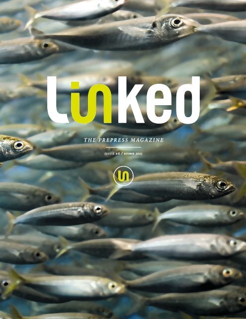
THE COOLEST FISH AROUND<br />
OR: A SIMPLE LUXURY<br />
IN SPECTACULAR PACKAGING<br />
How the humble sardine becomes a work of art<br />
No one can say exactly when the plain old sardine in oil escaped from the darkest corner of our<br />
pantries and broke into the cosmopolitan restaurant scene; or when sardine tins started<br />
trending on TikTok and found a place in select concept stores alongside niche perfumes. The fact is,<br />
somewhere along the way from the old canning factory via typically bare student<br />
fridges to the gourmet shops, restaurants and hippest bars, sardines have undergone a make-over –<br />
inside and out. Lovingly lined up by hand, the silvery fish bask in golden olive oil,<br />
their tins featuring designs by renowned artists, meriting the status of collector’s items.
8 i n s i g h t s<br />
issue #8 ©<br />
l i n k e d<br />
9<br />
Haute cuisine – nouvelle cuisine?<br />
Even gourmet restaurants serve<br />
their “star sardines” in the tin.<br />
FROM EMERGENCY RATIONS<br />
TO GOURMET PRODUCTS<br />
Whether it’s the outlandish “Sardinen.bar” in avantgarde<br />
Berlin, the (now closed) trendy Manhattan restaurant<br />
“Prune” owned by New York chef and bestselling<br />
author Gabrielle Hamilton or the most exclusive fish<br />
restaurant in sedate St. Moritz, Switzerland – they all<br />
bear witness to the long distance the sardine has<br />
travelled – not just geographically, but in terms of quality<br />
as well. The sardine has won a place in the hearts of top<br />
restauranteurs (on some menus, you can choose from<br />
up to fifty different varieties) and advanced to become a<br />
coveted object for food scouts and gourmets.<br />
The story was heading in a very different direction for<br />
quite a while though. Sardine tins with their sad grey<br />
contents floating in colourless oil had an extremely bad<br />
reputation in more ways than one. For years, the sardine<br />
was considered to be poor person’s food. An emergency<br />
ration of them was to be found in every self-respecting<br />
interrailer or hiker’s rucksack, not to mention the 1970s<br />
communes, where hoarding Portuguese sardines in oil<br />
in packs of ten was regarded as a gesture of political<br />
solidarity with the Carnation Revolution. And of course,<br />
to this day, packed like sardines in a tin is still the idiom<br />
that springs to mind when sun lovers crowd onto Mediterranean<br />
beaches or commuters squeeze themselves<br />
into public transport.<br />
So “beautiful” is not exactly the adjective one typically<br />
associates with sardine tins. Yet nowadays no other can<br />
expresses as much love for art and design as the sardine<br />
tin with its typical shape does. You could even dare<br />
to claim that, if Andy Warhol were to honour a food tin<br />
today, he would no longer choose Campbell’s Soup, but<br />
would instead be won over by the charm and originality<br />
of contemporary sardine cans.
10<br />
i n s i g h t s<br />
issue #8 ©<br />
l i n k e d<br />
11<br />
A CAN-DO CAN<br />
Manufacturers seem to be engaged in constant<br />
competition to see who can create the most<br />
beautiful tins for their sardines. Cost what it may,<br />
they commission painters, artists and comic illustrators<br />
(particularly in France where comics or bandes<br />
dessinées rule) to adorn their sardine tins, each in<br />
their own unique style, often using outlandish motifs.<br />
Unsurprisingly, harbour scenes, trawlers, fishermen<br />
in yellow oilskins and fishing nets are all very<br />
popular, with the Mouettes d’Arvor cans sporting a<br />
cubist version à la Picasso. Others show black and<br />
white photo montages of the rugged Atlantic coast<br />
(La Compagnie Bretonne), while a woman wearing<br />
a headscarf, known as “La Douarneniste”, seems<br />
to have jumped straight out of a Vermeer painting.<br />
Gonidec likewise goes for the traditional look, with<br />
impressionist landscapes featuring strong colours.<br />
Food trend luxury tins<br />
Who covets these beautiful tins more – gourmets or collectors?<br />
Why not just buy two? Then you can eat one now and keep the other<br />
(just don’t forget to turn the tin over regularly!).
12 i n s i g h t s<br />
issue #8 © l i n k e d<br />
13<br />
One of the cans from producer<br />
Quiberonnaise shows<br />
“Joker Breizh”, drawn by the<br />
award-winning cartoonist Frank<br />
Margerin (Lucien). Quiberonnaise<br />
also chose this genre for<br />
a limited edition of collectors’<br />
cans to mark its centenary in<br />
2021: three caricaturists and illustrators<br />
who are also famous<br />
and celebrated outside France<br />
came up with a triptych using<br />
a standardised style and the<br />
same horizontal line.<br />
La Quiberonnaise unites Denis Lelièvre (dit Pic),<br />
Gilbert Shelton and Frank Margerin, three of the most famous<br />
comic illustrators, on its anniversary sardine tin. Incidentally:<br />
the motorbike motif also pays homage to a major Italian<br />
brand that celebrated its centenary in the same year.
14 i n s i g h t s<br />
issue #8 ©<br />
l i n k e d<br />
15<br />
Cutting a fine figure<br />
Thinking outside the box and a delicate touch is<br />
what it takes to get the perspective right,<br />
and for the mermaid and fish to stay in shape.<br />
From 2D to 3D<br />
or: How to keep curves curvy<br />
La Perle des Dieux can even afford their own in-house illustrators, Delphine<br />
Cossais and Coralie Joulin, who created two stylistically contrasting<br />
brand ambassadors in “Mademoiselle Perle” and “Mademoiselle Lulu”.<br />
Each year, they endow the La Perle des Dieux products with elegance and<br />
refinement, each time showing a different maritime ambience.<br />
When it comes to ensuring that imaginative designs<br />
and artwork are displayed to full effect on sardine tins<br />
with their typical rounded edges, ridges and curves,<br />
both extensive repro know-how and many years of<br />
experience in the production of printing tools are<br />
invaluable. This is the only way of successfully transferring<br />
a design to the final packaging without any<br />
features becoming distorted. As you can imagine,<br />
this is no easy task.<br />
The first step is to print the design flat onto the tinplate<br />
or aluminium used to make the sardine tin. Only then is<br />
the material pressed into the required form. “Corners,<br />
recesses, edges, i.e. all three-dimensional and functional<br />
elements that produce the final shape of the tin, can<br />
potentially shift and distort the two-dimensional printed<br />
image,” explains Rainer Geiger, Director Strategic<br />
Business Unit Converters at <strong>Janoschka</strong> Deutschland.<br />
“We have to take these potential deformations into<br />
account when we engrave the printing tools. Therefore<br />
we deliberately distort the flat printed image so that it<br />
returns to its perfect form when the metal is shaped<br />
into a sardine tin.” It takes high precision work and a lot<br />
of experience to get it just right.<br />
In addition, the printing tool engraver makes sure<br />
that a good printed image with sharp, clearly defined<br />
edges is created on the poorly absorbing surface of the<br />
metal substrate. Specialist knowledge is indispensable<br />
throughout the process to ensure that the curves retain<br />
the right shape in the right places, that the lettering is<br />
legible and that colour gradients turn out how the artists<br />
and designers intended.
16<br />
i n s i g h t s<br />
issue #8 ©<br />
l i n k e d<br />
17<br />
It all began with champagne bottles<br />
In the early days, sardine packaging was anything but mundane. When Nicolas Appert,<br />
a master confectioner from the French department of Champagne, discovered in 1790 that<br />
food could be kept almost forever if heated to 100°C in a hermetically sealed container,<br />
he used champagne bottles with widened necks for his experiments.* However, glass soon<br />
proved to be too fragile and the elegant vessel was replaced with a can made from tinplate.<br />
British merchant Peter Durand patented this idea in 1810 – and the food can was invented.<br />
* To this day, the English term for preserving food in this way is "to bottle".<br />
THE CONTENTS<br />
ARE AS GLITZY AS<br />
THE PACKAGING<br />
Although even supermarkets are increasingly<br />
stocking more colourful tins with nice<br />
designs, the product in question here is a<br />
speciality from a small producer known as<br />
“sardines millésimées” or vintage sardines.<br />
Gourmets consider them to be the “Pauillac”<br />
and “Margaux” of the fish world, the grand<br />
crus of the seas. The September catch is<br />
considered to be the best, so only these are<br />
canned as vintage sardines. September is<br />
the time of year when sardines are well fed<br />
and hold the ideal combination of various<br />
omega-3 fatty acids.<br />
As soon as they are hauled on board, the fish<br />
are handpicked and descaled. Instead of being<br />
shock-frosted, as is common practice with<br />
preserved fish, the “sardines millésimées”<br />
are freshly cooked and then carefully placed<br />
loosely in cans by hand. After all, there needs<br />
to be enough space between the shiny individual<br />
little silver fish for the essential ingredient:<br />
a high-quality, extra-virgin olive oil. The<br />
sardines will only mature perfectly if the oil,<br />
seasoned with a touch of sea salt, can flow<br />
freely around them. Then the lid is sealed –<br />
often for several years.
18 i n s i g h t s<br />
issue #8 © l i n k e d 19<br />
Just like a fine wine, vintage sardines get<br />
better with time. The longer a sardine<br />
rests undisturbed in the can, the more intensively<br />
the oil combines with its flesh<br />
making it tender and flaky – until it takes<br />
on an almost creamy consistency. The<br />
fish melt on your tongue, releasing a full,<br />
intense flavour and, as the years pass, the<br />
aromas become ever subtler. Together<br />
with a few simple ingredients and careful<br />
processing, it is above all time that turns<br />
sardines into a delicacy.<br />
Since the contents and the packaging are<br />
both a treat to behold, many restaurants<br />
now serve sardines together with the<br />
can – and not just as a snack or apéritif.<br />
Arranged on a board with fresh toast and<br />
salad, sardines have now become a real<br />
cause for celebration in many places,<br />
proving once more: food is best when it’s<br />
simple but makes the person eating it feel<br />
like nobility. That’s the beauty of tinned<br />
sardines.<br />
Did you know<br />
… that there are special clubs for sardine tin collectors? And that these people are known as<br />
“puxisardinophiles” and “clupédiophiles”? Puxisardinophiles – collectors of sardine tins<br />
Clupédiophiles – sardine lovers (“clupeidae”: Latin for the family of fish to which sardines belong)<br />
Incidentally, it was none other than Oscar Wilde’s son, Vyvyan Holland,<br />
who – apparently no less eccentric than his father –<br />
established the first high-class sardine club outside France in 1935. Known as the<br />
“Dining Society in London”, it had its own sardine cellar and hosted tastings.<br />
Didn’t there used to be...?<br />
Yes, a small key to open the tins. This clever but simple kitchen gadget<br />
fitted onto a metal tab on the lid so you could roll it open. Originally,<br />
you kept one in the drawer and used it over and over again, but sardine<br />
tin keys were later included with every tin once convenience became<br />
king. Today, most sardine tins have a ring-pull. Real connoisseurs will<br />
have their own stylish sardine can opener though.
20 i n s i g h t s<br />
issue #8 ©<br />
l i n k e d<br />
21<br />
MESSAGE<br />
ON A BOTTLE<br />
THE FINE<br />
ART<br />
OF KEEPING<br />
THINGS BRIEF<br />
Wine labels are small, but they do an important job. They need to be eye-catching<br />
and they need to communicate quality, identity and an entire lifestyle – all in a highly competitive<br />
market. Either the wine is displayed in a limited area or else consumers find themselves<br />
facing endless aisles stacked with identically shaped bottles. Here, too, as at any point of sale,<br />
the purchase decision is made in seconds. So if a bottle of wine is to grab the customer’s attention,<br />
the label designer needs to come up with something unusual.<br />
They say you shouldn’t judge a book by its cover.<br />
That’s fair enough when it’s books you’re looking<br />
at. But when it comes to wine, the bottle label<br />
is pretty much the be all and end all. You have a<br />
space measuring just ten by fifteen centimetres<br />
to tell a convincing story. Each element needs to<br />
strike a chord. But how? With a name that resonates?<br />
With coats of arms and seals? With amusing<br />
drawings, colourful graphics?<br />
Should there be simply a gold-embossed line<br />
representing the horizon at the respective vineyard<br />
location? Or is real art required? There are<br />
many possibilities. And yet the impression that<br />
customers get when surveying the wine shelves<br />
is that they’ve seen it all before. Or have they?<br />
You might think so until you see people kneeling<br />
in front of the shelf holding their smartphone up<br />
to wine bottles and listening.
22 i n s i g h t s<br />
issue #8 ©<br />
l i n k e d<br />
23<br />
19 CRIMES<br />
What they are listening to is the story of a crime<br />
committed in the nineteenth century told from the<br />
point of view of the offender who was deported<br />
to Australia as a punishment. Had the convict set<br />
fire to the brushwood? Cut up or burned clothes?<br />
Secretly got married? Indulged in bigamy? Or simply<br />
impersonated an Egyptian? In Great Britain and<br />
Ireland, a total of nineteen different offences could<br />
get you put on a ship for Downunder. In most cases,<br />
it was a one-way trip.<br />
The Australian wine label Treasury Wine Estates<br />
has recalled this dark chapter in Australian history<br />
with a series of wines. And their labels literally<br />
speak to you even before you have done justice to<br />
the contents. The labels bear the image of a convict<br />
from that era and bring the person to life using augmented<br />
reality. If you download the free app and<br />
hold your smartphone to the different labels, you<br />
will hear stories about prisoners who had to do time<br />
in the British penal colony.<br />
One of the stories is that of<br />
Jane Castings from Leicester,<br />
England, whose photo adorns<br />
the Chardonnay bottle. A mother<br />
of four children, she was<br />
convicted for receiving stolen<br />
goods in 1846. She had accepted<br />
items like “cheese and<br />
bacon, knowing them to be<br />
stolen.” She had also trained a<br />
group of teenagers to do the job<br />
and paid them to steal goods.<br />
Jane had to leave her husband<br />
and children behind and was<br />
transported on board the Sea<br />
Queen to Van Diemen’s Land<br />
(Tasmania) where she spent<br />
seven years.<br />
John Boyle O’Reilly, Michael<br />
Harrington, James Wilson and<br />
Cornelius Dwyer Kane also get<br />
to tell their stories. Theirs are all<br />
true accounts backed up with<br />
photographs – a rarity on wine<br />
labels – showing the patina of a<br />
past era. The 19 Crimes labels<br />
cleverly combine history with a<br />
pinch of fiction and good marketing.<br />
It’s a complete concept<br />
that targets social drinkers with<br />
cuvées made from grapes like<br />
Cabernet Sauvignon, Shiraz and<br />
Pinot Noir. The idea has certainly<br />
paid off: Treasury Wine Estates<br />
has seen sales rise 60 per cent.<br />
To strike the iron while it’s hot, the label has lined up<br />
the law-breakers of times gone by, who have since<br />
become folk heroes, alongside icons from modern<br />
pop culture. Rap, sex, grass and trouble at airports<br />
are, of course, not among the 19 Crimes; nor are<br />
participation in benefit events or having a passion<br />
for wine. Nevertheless, the American rapper Snoop<br />
Dogg features on one of the wines and tells his own<br />
story on the “Snoop Cali Red” label.<br />
This very clever advertising strategy went viral on<br />
YouTube and soon captivated whole communities of<br />
wine lovers. An excellent example of how new technology<br />
can be used to market traditional products and<br />
add something novel to wine shelves in the process,<br />
causing nothing short of a sensation.<br />
Meet the darker side<br />
Alongside Snoop Dogg, the luminous<br />
skeleton of the Halloween limited<br />
edition is a further “highlight”.<br />
Consumers are in direct contact with the brand via augmented<br />
reality or “near field communication” – interaction that enhances<br />
the customer experience and promotes brand loyalty.
24 i n s i g h t s<br />
issue #8 ©<br />
l i n k e d<br />
25<br />
BLOSSOMING SUSTAINABILITY<br />
The labels on the aptly named Italian organic wine<br />
brand “The Flower Pot” ensure that the life cycle of<br />
the wine does not end once the bottle is empty. Made<br />
from environmentally friendly seed paper, it is the<br />
world’s first and only wine label from which flowers<br />
actually grow. All you need to do is to peel the label<br />
off the bottle, place it in a flower pot or flower bed<br />
and water it … Soon, according to the developers, you<br />
will behold a colourful potpourri of flowers. It not only<br />
looks great, but creates “a few flowers more” of habitat<br />
for bees and other insects.<br />
EACH WINE MUST BE SERVED<br />
AT THE RIGHT TEMPERATURE<br />
Labels concealing a very different kind of “add-on”<br />
are affixed to a white wine from the Lake Constance<br />
region in Germany. Dew forms pearls on the champagne-coloured<br />
bottle. The label is minimalist, exhibiting<br />
a simple elegance with plain lettering set against<br />
green water colours. But when chilled, the shape of<br />
Lake Constance gradually appears in a watery blue<br />
hue as if the fog were lifting. Once the whole lake<br />
has emerged, you know the wine has reached its<br />
correct drinking temperature: 8 degrees Celsius. This<br />
cuvée comes with a thermal label that changes with<br />
the temperature to create this special effect.<br />
The vibrant labels are part of an extensive sustainable<br />
marketing strategy pursued by the private winery<br />
Franz Wilhelm Langguth Erbe. It begins with the<br />
origins of the Flower Pot wines in southern Italy. All<br />
three, Pinot Grigio, Rosato and Primitivo, are produced<br />
using fully certified organic viticulture that protects the<br />
soil as well as the fauna and flora. The whole packaging<br />
concept is geared to sustainability. The Flower Pot<br />
wines not only have a “blooming label”, they are also<br />
sold in significantly lighter bottles made from recycled<br />
glass and weigh just 360 grams. Since lighter bottles<br />
are easier to transport, this cuts CO2 emissions. The<br />
company’s use of green electricity during production<br />
and its support for the bee conservation initiative “Projekt<br />
2028” launched by HektarNektar round off the<br />
sustainable wine concept.<br />
The name and the exuberantly coloured label with its<br />
varied life sprouting from the “Flower Pot” lettering<br />
and buzzing with bees communicate everything that<br />
is special about this marketing idea and are an eyecatcher<br />
on any wine shelf.<br />
The online wine dealer Hawesko uses the same principle.<br />
For its young and exclusive own brand “Fleur de Fruit”, the<br />
company has transferred the successful concept of special<br />
editions to wine. Differentiation is the name of the game,<br />
after all, and that works best as part of an overall marketing<br />
strategy using innovative packaging solutions. In the case<br />
of “Fleur de Fruit” wines, one rosé and one white, labels<br />
that react to temperature reflect the sophistication of the<br />
two Atlantic wines: their freshness and light aromas fully<br />
unfold once the wine reaches the perfect, cool drinking<br />
temperature. And when is it that? Once the flowers on the<br />
label bloom in full colour.<br />
Wine label design can combine innovation, art and marketing<br />
to superb effect. If the producer is open to new and<br />
original ideas, labels can become marketing strategy instruments:<br />
they tell stories, communicate the taste and personality<br />
of the wine with the power of suggestion, and form<br />
an inner connection between the wine and the consumer<br />
that goes far beyond their visual elements. In that way, they<br />
stand out from the sea of wines and awaken desires.
26 i n s i g h t s<br />
issue #8 ©<br />
l i n k e d<br />
27<br />
1967 César 1970 Marc Chagall 1974 Robert Motherwell<br />
LABEL ART<br />
Château Mouton Rothschild, one of the world’s most<br />
famous vineyards, has subscribed to the power of art<br />
for decades. The artist who designs the label each<br />
year is rewarded in kind with a case of wine from that<br />
vintage. The illustrious group of artists who have<br />
immortalised themselves on the bottles for the vineyard<br />
in Bordeaux range from Marc Chagall and Joan Miró<br />
to Jeff Koons and Keith Haring and even Pablo Picasso<br />
and Andy Warhol.<br />
This tradition dates back to 1945 when Baron Philippe<br />
de Rothschild wanted to celebrate the victory over<br />
Nazi Germany on his wine bottles. He commissioned<br />
the artist Philippe Julian. The only specification was<br />
to incorporate a “V” for “victoire” (victory) on the<br />
label. Since then, designs by artists have become a<br />
standard feature. The commissioned artists, mainly<br />
men but also a few women including France’s Niki de<br />
Saint Phalle, have had a free hand, but many have<br />
taken wine and the vineyard’s coat of arms featuring<br />
two rams as reference points.<br />
1966 Pierre Alechinsky<br />
1965 Dorothea Tanning<br />
1975 Andy Warhol<br />
1988 Keith Haring
28 i n s i g h t s<br />
issue #8 ©<br />
l i n k e d<br />
29<br />
LINKED2BRANDS<br />
PERFECT ARTWORK TO CREATE<br />
CONTENT WITH A WOW EFFECT<br />
Consumer decision-making is slowly but surely shifting into the digital world. Products now need<br />
to look good in multiple formats: in online shops, in 360° views, as animations or as<br />
GIFs on Instagram and the like. This has radically redefined product presentation.<br />
Brand manufacturers are facing the enormous challenges of providing creative visual content<br />
extremely rapidly and, above all, consistently for all digital channels.<br />
Traditional methods are simply no longer up to scratch because they are neither fast enough<br />
nor do they meet today’s quality standards.<br />
Automatically generated digital content is increasingly seen as the solution.<br />
Patented technology is used to process photos or CAD files. It generates virtual versions of products<br />
in the form of stills or moving images. You can then choose from countless variations in real time to<br />
create visual content for any purpose, for example, e-commerce touchpoints, social media etc.<br />
Ten different images of a deodorant spray produced<br />
instantly for ten different countries, …<br />
a 360° animation of a bag of snacks – against<br />
different backgrounds… beer labels announcing<br />
or commenting on the latest World Cup news<br />
– for Facebook, Instagram and Twitter… Digital<br />
transformation means brand manufacturers<br />
have to ensure their products are displayed perfectly<br />
on a variety of digital platforms while still<br />
maintaining consistent analogue presentation.<br />
Companies usually put a lot of effort into cultivating<br />
their brands and invest a great deal<br />
of money in brand communication. There are<br />
many different aspects to brand presentation:<br />
colours and materials may vary, and then there<br />
are the specific variants or seasonal items to<br />
consider. All of this calls for meticulous visual<br />
design. Successful communication must meet<br />
the requirements of each specific consumer<br />
context and must be absolutely consistent<br />
across all channels, otherwise it may damage<br />
the brand’s image.
30 i n s i g h t s<br />
issue #8 ©<br />
l i n k e d<br />
31<br />
Even back in the “analogue” days this was a task for<br />
highly experienced specialists. Each detail of the design<br />
is decisive: do the proportions, layout and text blocks<br />
fit the packaging? How do the lettering, graphics and<br />
images look? And last, but not least: what about the<br />
colours and the logo? Do all these elements together<br />
reflect the brand’s personality? Does the overall look<br />
live up to the premium claim of a brand?<br />
When translated into the digital world for a global point<br />
of sale, the tasks and challenges increase exponentially:<br />
budgets are tight, timeframes tighter still, and<br />
ubiquitous visibility is paramount. Is the brand logo still<br />
easy to recognise when a drinks can moves in the animated<br />
3D view? If it isn’t, then a serious rule has been<br />
broken whose effect is all the more harmful given that<br />
the brand is being displayed all over the world via social<br />
media. Anyone who sees their favourite beer, shower<br />
gel or biscuit on their tablet or smartphone should be<br />
able to tell from the picture whether it keeps the brand<br />
promise. This is where brand guardians with knowhow<br />
come in.<br />
The <strong>Linked</strong>2Brands production agency uses its brand<br />
mindset and production expertise to mediate between<br />
brands and consumers. Our specialists know that time<br />
is of the essence when it comes to producing visual<br />
content. For swift implementation, they rely on Grip,<br />
an online tool that automates visual content production<br />
for physical goods. Instead of all the images having to<br />
be created by hand, this system draws on a library of<br />
data, thus meeting the growing demand for visual content<br />
that covers all marketing channels and customer<br />
contact points.<br />
Digital transformation<br />
E-commerce is the new normal. Accelerated by the pandemic, digitalisation,<br />
e-commerce and other processes now define trade. Retail turnover,<br />
including digital services (like eBooks and music streaming), rose above<br />
the 100 billion Euro mark for the first time in 2021.<br />
Here the greatest drivers of growth (with an increase in turnover of<br />
36.4 per cent) were fast-moving consumer goods (FMCG), i.e. food,<br />
health and beauty products, pet food and similar. And while this idea may<br />
seem strange at first: space is also short on the online shelves of this world.<br />
Brands that use this very reduced platform better and earlier for their<br />
product presentation – in particular on mobile devices – therefore have<br />
3D-<br />
Models<br />
INPUT IS KEY<br />
clear advantages. For the industry, fitting visual depictions or hero images<br />
are now not just desirable add-ons but “must haves.”<br />
Packaging<br />
artwork<br />
Digital twins<br />
Automatically<br />
generated<br />
visual content<br />
grip.tools<br />
Background templates<br />
eCommerce | Social | Campaigns | Videos | Interactive 3D | 360°<br />
“Top-class artwork is essential if the visual content<br />
thus generated for all possible touchpoints is to meet<br />
our own and our customers’ standards,” Stefan Hilss,<br />
Managing Director of <strong>Linked</strong>2Brands, emphasises.<br />
“Virtual versions of the product can only be created if<br />
our input is top quality. Only then will our customers<br />
benefit from the shorter production and lead times that<br />
speed up market launch and allow more output at the<br />
same cost.”<br />
On the one hand, Hilss and his team know how important<br />
the specific and exact preparation of data is. All<br />
elements like logos, images and text need to be scaled<br />
and positioned correctly so that they live up to the care<br />
and attention that goes into the design of products,<br />
packaging and labels. After all, that is what makes a<br />
product stand out, arouse curiosity and feel right. In<br />
the process, Grip takes the creation of e-commerce<br />
images to a new level, accelerates production (so that<br />
it takes minutes rather than days) and maintains rigorous<br />
consistency: a coding, a form, an aesthetic DNA<br />
– across the world.<br />
On the other hand, <strong>Linked</strong>2Brands takes charge of<br />
endowing brand products with emotional appeal for<br />
social media. In their role as brand guardians, they<br />
exploit the full potential of existing content and use<br />
suitable artwork to prepare it for new applications,<br />
such as films, stills, animations or mood pictures.<br />
Hilss is aware that exploding consumer demand for<br />
visual content at all digital contact points cannot be satisfied<br />
with an analogue, i.e. traditional, linear production<br />
model: “No matter how hard we work to improve<br />
the KPIs year for year … if we seriously want to meet<br />
expectations at different digital touchpoints, we need<br />
a radically new system.”<br />
According to the chief brand guardian, it will take not<br />
evolution, but a revolution to make all presentations fit<br />
a brand, generating an unmistakable experience. In this<br />
way, brands will not only stay up to date, but move<br />
ahead of their time.
T<br />
32<br />
f a c e t o f a c e<br />
H<br />
A<br />
issue #8 ©<br />
l i n k e d<br />
33<br />
M O R E<br />
T H A N<br />
Producing watch dials is a highly complex process.<br />
Up to 100 steps go into creating these small surfaces, making them nothing<br />
short of masterpieces. Each time you check your watch, you are looking at its face.<br />
It will appeal to you only if it is beautiful, harmonious and yet easy to read.<br />
E<br />
P<br />
N<br />
The manufacture of watch dials has sometimes<br />
been described as alchemy or even “black magic”.<br />
And there is definitely something magical about<br />
giving a face to a watch, this tiny mechanism with<br />
a beating heart. The design of the minute details<br />
is not regulated by any standards, nor is there a<br />
specific formula to set boundaries.<br />
The sky’s the limit, in other words. Whether entrylevel<br />
brands, haute horlogerie, independent labels<br />
or names belonging to major luxury groups: more<br />
than ever, watchmakers are using a wealth of creativity.<br />
To get their timekeeper to stand out from the<br />
rest with a custom-designed dial, they experiment<br />
with strong colours, unusual textures, innovative<br />
layouts and unconventional materials.<br />
E<br />
R<br />
T<br />
THE EYE-CATCHING<br />
ART OF DIAL CREATION<br />
J U S<br />
J<br />
E<br />
T<br />
T<br />
Y<br />
O<br />
M<br />
T<br />
F<br />
A<br />
A<br />
T<br />
C<br />
E<br />
T<br />
A<br />
F<br />
S<br />
U<br />
C<br />
PASSION IS PRICELESS<br />
You might be forgiven for thinking that no other<br />
part of the watch is as straightforward as the face:<br />
numbers and hands – that’s all you need to tell the<br />
time after all. Take a second, closer look and you’ll<br />
realise that digits or indices may in fact all be individual<br />
parts, just like any other element (for example,<br />
the frame of the date window). Not only can<br />
the cost of these dozens of single components<br />
reach a four- or five-figure sum, but each one has<br />
to be attached to the watch face separately. Fitted<br />
with minute little feet, they are secured in equally<br />
microscopic holes. Some of these tiny features<br />
will have already been processed by hand – by<br />
experts using diamond tools – and polished to a<br />
brilliant shine. Precision work is essential to create<br />
a watch that is something out of the ordinary.<br />
A
34 f a c e t o f a c e<br />
issue #8 © l i n k e d 35<br />
Thh e divisions on a watch dial allow us to measure time precisely down to fractions of a second. Th h e indices, windows and sub-dials allow us to keep an eye on the time, day, date, month and year as well as follow the phases of the moon.<br />
METICULOUS CARE<br />
Watch dial manufacture is not<br />
just an area of watchmaking; it is<br />
a separate trade with its very own<br />
vocabulary and traditions. Nevertheless,<br />
even in Switzerland, the<br />
motherland of watches, there are<br />
only a handful of companies left<br />
that still have both the necessary<br />
creativity and the extraordinarily<br />
skilled artisans required to tackle<br />
the most demanding – and sometimes<br />
extremely cost-intensive<br />
– challenges faced by watchmakers.<br />
Watch dial makers work with<br />
an unbelievable range of materials<br />
from semi-precious stones,<br />
ceramics and various enamels,<br />
to mother of pearl, wood, lacquers<br />
and even meteorites. Furthermore,<br />
they need to master<br />
numerous artisanal and artistic<br />
techniques: guillochéing, engraving,<br />
enamelling, polishing, turning<br />
and even toolmaking. These specialists<br />
will have the upper hand<br />
if, in addition to passion, they hold<br />
a wealth of well-kept professional<br />
secrets. This is how expressive<br />
miniature masterpieces emerge<br />
from a combination of astonishing<br />
materials, incomparable knowhow<br />
and the latest techniques,<br />
paired with attention to detail and<br />
precision.<br />
Each watch dial model is unique and<br />
defined by its style, functions and<br />
components, like date display, totalisators<br />
(sub-dials), moon phase indicators<br />
– and the way these are positioned.<br />
Once the design has been finalised,<br />
the dial-maker starts with a blank: a<br />
thin metal disc made from brass, nickel,<br />
gold, silver, titanium or similar. After<br />
a few preparations, which include<br />
punching out the display windows and<br />
the hole in the centre for the hands,<br />
they attach small feet to the back of<br />
the metal disc. These appendages<br />
eventually anchor the watch face to<br />
the movement. Initially, though, their<br />
job is to ensure accurate positioning<br />
of the dial during the subsequent assembly<br />
stages. The blanks are then<br />
cleaned and polished before setting<br />
out on a journey into a world of diverse<br />
and highly specialised craftsmanship.<br />
Along the way, some will be adorned<br />
with decorative finishes (like the famous<br />
sunbrushing); others may stop<br />
off at the electroplating department<br />
for metal-plated enhancements; while<br />
others still will receive their final colour<br />
in the paint shop.<br />
Let’s take a closer look at a few special<br />
surface refinements. Some have<br />
been used for centuries, while others<br />
are state-of-the-art. Meticulous craftsmanship<br />
is involved as well as the<br />
latest advanced precision tools. Both<br />
serve to produce watch dials with a<br />
perfect balance of beauty and clear<br />
readability.
36 f a c e t o f a c e<br />
issue #8 ©<br />
l i n k e d<br />
37<br />
GUILLOCHÉ<br />
MICROPAINTING<br />
The century-old technique of hand guillochéing<br />
is a decorative engraving process using a<br />
special engine turning machine or rose engine.<br />
The guillocheur controls the rotation of the<br />
machine with one hand, while guiding the engraving<br />
tool with extreme precision via a magnifying<br />
glass with the other. He or she cuts intricate<br />
lines into the metal surface of the blank,<br />
creating repetitive geometric patterns in an<br />
almost endless variety of highly complex and<br />
fascinating decoration – a kaleidoscopic array<br />
of crisscrossing lines and waves. The most<br />
popular designs used on watch dials are: clous<br />
de Paris (hobnail), vieux panier (basket weave),<br />
grain d’orge (barley corn) and soleil (solar). The<br />
one feature that they all have in common is that<br />
they play with light, lending each watch face its<br />
unique character.<br />
The perfect base for micro-painting is mother of pearl.<br />
Some of the details are so fine that the painters<br />
use brushes with a single bristle.<br />
All micro-painted pieces are handmade and unique.<br />
MARQUETRY TECHNIQUE<br />
Mentioned for the first time in the 16th century, guillochéing initially<br />
found use in jewellery making (the most famous and probably<br />
most expensive examples are Fabergé eggs).<br />
Marqueteurs decorate watch dials with a wide range of different woods<br />
in a multitude of colours. They cut the pieces to shape following their inspiration<br />
and the selected or set motifs, join them together and glue them on.<br />
It was not until the end of the 19th century that watchmakers<br />
discovered this art. A high-precision technique, it has been passed down<br />
from master to master and is used on parts of the watch movement,<br />
casings, bracelets, winding rotors and, of course, watch dials.
38 f a c e t o f a c e<br />
issue #8 ©<br />
l i n k e d<br />
39<br />
The sheer number of processing stages<br />
makes this all very time-consuming, and<br />
requires dedication to and extraordinary<br />
expertise in this most delicate and rare<br />
watch dial art. Each trip to the kiln harbours<br />
risks. To obtain precisely the right hue, the<br />
enameller has to know exactly how the<br />
respective colour pigment will turn out<br />
upon firing. And of course, several days,<br />
or even weeks, of work could be ruined<br />
by tiny dust particles or a sudden draught<br />
of air. Only perfect mastery of each manufacturing<br />
step, not to mention an intimate<br />
knowledge of the kiln, will yield an even,<br />
clear and smooth enamel layer, creating a<br />
flawlessly flat watch dial boasting colours<br />
of the deepest intensity and shimmering<br />
transparency.<br />
ENAMEL<br />
The real alchemists among watch dial makers<br />
are the enamellers, for they are the masters of<br />
colour and fire. The whole magic of the enamel<br />
is formed in the kiln, where the glass-like material<br />
based on quartz sand melts onto the metal.<br />
Temperatures of over 800° Celsius create art<br />
objects with an everlasting shine and a luminance<br />
that never fades.<br />
However, the way to that point is long and beset<br />
with countless incalculable factors: first, the<br />
enameller grinds coloured glass or enamel pigments<br />
into a fine powder and cleans it several<br />
times before mixing it with water or oil. This<br />
step alone may take several hours. The greatest<br />
care and patience is called for to obtain the<br />
purest hues and the subtlest nuances. After<br />
that, the artist can start applying the enamel to<br />
the prepared metal surface with the finest of<br />
brushes before it is put in the kiln. Depending<br />
on the complexity of the design, dozens of firing<br />
processes might be required. Firing renders the<br />
enamel paste solid and extremely hard.<br />
Enamelling is an ancient<br />
technique hat dates<br />
back to Byzantine times.<br />
Three variants are distinguished:<br />
CLOISONNÉ /<br />
cell<br />
Fine flat wire, normally made from<br />
gold, is bent into shape using a template.<br />
The enameller fills the cells<br />
(French: cloisons) formed by the wire<br />
with different coloured enamel masses.<br />
The wire strips separate the individual<br />
colour fields and prevent the colours<br />
running into each other.<br />
CHAMPLEVÉ /<br />
raised field<br />
This technique first of all involves<br />
engraving recesses into the metal plate.<br />
The enamel artist then fills these cells<br />
using colours to create the desired hues.<br />
PAILLONNÉ /<br />
translucent layering<br />
This enamelling discipline uses tiny<br />
motifs made from leaf gold and silver<br />
(paillons). The enameller embeds these<br />
extremely fine, precisely cut tinsel-like<br />
pieces (just 0.0001 mm thick) between<br />
two layers of translucent enamel.
40<br />
f a c e t o f a c e<br />
issue #8 ©<br />
l i n k e d<br />
41<br />
Watch dial-makers mostly use round pads,<br />
hence the name: ballon.<br />
PAD PRINTING<br />
All techniques used to create<br />
watch dials have one thing<br />
in common: high quality and<br />
know-how are of paramount<br />
importance for each individual<br />
part and for all the materials and<br />
every manufacturing step.<br />
In addition to highly specialised<br />
and high-performance equipment,<br />
it is the skilled hands of<br />
artisans who lend the blanks a<br />
unique identity on their journey<br />
through the different crafts.<br />
The end result is the finished<br />
watch dial, which translates the<br />
concealed tiny world of wheels,<br />
levers, pins and springs into<br />
readable time and endows the<br />
many hundred individual parts<br />
of a watch with a meaning.<br />
In the final step, indices, markings, the brand<br />
logo are added to many watch dials by means<br />
of pad printing. This lithographic technique,<br />
also known as tampography, is characterised<br />
in particular by its fineness and precision.<br />
Minute figures and symbols can be added even<br />
to curved surfaces, bent parts and recesses to<br />
yield an extremely sharp printed image.<br />
As with all forms of gravure printing, the elements<br />
to be printed – for example, numbers,<br />
letters, logos and images – are first engraved<br />
on a steel cliché. These recesses are then<br />
filled with paint or lacquer. A silicone pad, a<br />
balloon-shaped, soft cylinder, picks up the<br />
paint and prints it directly onto the watch dial.<br />
The printer repeats this process with different<br />
image plates and pads until all lettering<br />
and colours have been applied. Alongside a<br />
dust-free atmosphere, a printing expert with<br />
a steady hand, a feel for consistent pressure<br />
and keen, experienced eyes is essential for<br />
perfect results.<br />
ulysse-nardin.com
42 k n o w l e d g e & c o m p e t e n c e<br />
issue #8 ©<br />
l i n k e d<br />
43<br />
THE PAPER<br />
BOTTLE<br />
REVOLUTION<br />
AN INDUSTRY<br />
IN TRANSITION<br />
NOW MORE THAN EVER, IT’S WORTH<br />
TAKING A CLOSE LOOK AT THE<br />
SHELVES IN SUPERMARKETS AND<br />
DRUGSTORES, BECAUSE MORE<br />
AND MORE PRODUCTS – RANGING<br />
FROM HIGH-QUALITY BODY LOTION<br />
AND WASHING POWDER TO OLIVE<br />
OIL, WINE AND BEER – ARE BEING<br />
PRESENTED IN NEW, PREVIOUSLY<br />
UNIMAGINABLE PACKAGING.<br />
THE GAME CHANGER IN QUESTION IS<br />
PAPER BOTTLES.
44<br />
k n o w l e d g e & c o m p e t e n c e<br />
issue #8 ©<br />
l i n k e d<br />
45<br />
Recycle, reusable or compostable<br />
– Kraft is striving to achieve<br />
net-zero greenhouse gas emissions by 2050.<br />
Paper bottles should help.<br />
Only a few years ago if you wanted to<br />
do something for the environment and<br />
assuage your conscience, you would reach<br />
for reusable glass bottles and jars. Shoppers<br />
did this instinctively after Tetra Paks<br />
became a no-no, because no-one could<br />
decide whether they belonged in the waste<br />
paper or the plastics bin, or somewhere<br />
else altogether? And single-use plastic bottles<br />
and containers were in any case already<br />
beyond the pale.<br />
The taboo status acquired by the latter is most<br />
certainly down to pictures of beaches littered<br />
with plastic waste and of seabirds tangled up in<br />
plastic having suffered torturous deaths. Lately,<br />
traces of microplastics have even turned up in<br />
the remotest mountain regions.<br />
Clear view: Henry John Heinz<br />
was the first food<br />
manufacturer to sell his<br />
products in glass containers.<br />
A simple solution<br />
to get the ketchup<br />
on your plate:<br />
on its head<br />
and squeezable .
46 k n o w l e d g e & c o m p e t e n c e<br />
issue #8 © l i n k e d 47<br />
The main problem was that many types of packaging<br />
are extremely difficult to recycle and hence<br />
leave a comparatively large carbon footprint.<br />
Even the reusable milk bottles and yoghurt jars –<br />
once the sacred cow of sustainability – have long<br />
since lost their squeaky clean image because they<br />
too have inherent disadvantages. First of all, they<br />
are relatively heavy and therefore fairly energyintensive<br />
to transport full to the shops and empty<br />
back to the washing plant. In fact this makes their<br />
carbon footprint so large that the bottles and jars<br />
need to run through this cycle umpteen times<br />
before the sustainability balance sheet is finally<br />
back in the black.<br />
For several years, researchers have therefore been<br />
seeking a material that will maximise recyclability<br />
and environmental compatibility in the long run<br />
and yet meets the strict requirements of the food<br />
industry. At present, the most promising candidate<br />
is paper. Surprisingly, it is spearheading a sector<br />
where glass was traditionally considered to be the<br />
only option if product quality was to be maintained:<br />
the wine industry.<br />
The Italian winery Cantina Goccia sells<br />
its wines in paper bottles made from<br />
94 per cent recycled cardboard and lined<br />
with a food-safe pouch.
48 k n o w l e d g e & c o m p e t e n c e<br />
issue #8 © l i n k e d 49<br />
Carbon footprint<br />
reduced to 1 / 6<br />
of the reference value<br />
Just 1 / 5 of the weight of<br />
an equivalent glass bottle<br />
7 7 % less plastic compared<br />
with plastic bottles<br />
UK company Frugalpac launched the “frugal<br />
bottle”, its pioneering lightweight container,<br />
back in 2020. This bottle is made from 94<br />
per cent recycled cardboard and is lined<br />
with a lightweight food-grade plastic pouch.<br />
Weighing only a fifth of the equivalent glass<br />
bottle, its carbon footprint is cut down to<br />
one sixth of the reference value.<br />
The frugal bottle, so the designers promise,<br />
is guaranteed to keep the contents fresh for<br />
at least twelve months. It can be filled with<br />
high-quality wines that are drunk young –<br />
considered to be the key segment in the<br />
wine market – without any concerns. To recycle<br />
it, you simply open up the cardboard<br />
sleeve and remove the thin plastic pouch.<br />
Both components can be disposed of separately<br />
and processed for re-use.<br />
Initially supplied to one Italian wine producer,<br />
the product has since caught the attention<br />
of potential clients across the world.<br />
A British supermarket chain began stocking<br />
wine in paper bottles in early <strong>2023</strong>.<br />
The major interest has not come about<br />
merely by chance, as major wine producers<br />
are setting ambitious goals. For example,<br />
the Spanish company Torres is looking<br />
to reduce the greenhouse gases originating<br />
from its wine production by 50 percent<br />
up to 2030 and by 80 percent up to 2045.<br />
The first step towards this goal is to tackle<br />
the packaging weight.<br />
frugalpac.com
50<br />
k n o w l e d g e & c o m p e t e n c e<br />
issue #8 ©<br />
l i n k e d<br />
51<br />
o n e s t e p a t a t i m e<br />
A thin layer of recyclable PET is still<br />
needed in the initial development phase,<br />
but even today paper bottles use 70 per cent<br />
less plastic than conventional packaging.<br />
p o l y e t h y l e n f u r a n o a t<br />
You might be forgiven for wondering what’s new<br />
about this. Bag-in-box wines have been available<br />
for years and the 5- or 10-litre cartons have long<br />
since been accepted on the market. However,<br />
the sheer size of these wine boxes means they<br />
are more likely to be bought for larger gatherings.<br />
Thanks to frugal bottles, you can now also open<br />
a nice wine for a cosy evening with your partner,<br />
while admiring a fresh, individual bottle design<br />
thought up by the vineyard.<br />
Moreover, the last real obstacle seems to have<br />
been overcome, too. Until recently, the new type<br />
of bottle was only suitable for semi-automated<br />
filling and that hit processing efficiency. Now, the<br />
bottling plant has gone fully automatic.<br />
From Greek olive oil to Japanese sake, products<br />
that were previously only conceivable in glass<br />
bottles will soon appear in your supermarket in<br />
resource-saving paper containers, like the frugal<br />
bottle. A similar approach is being taken in Denmark<br />
and goes one step further. Since 2010, the<br />
industry has been committed to the “Green Fibre<br />
Bottle” project. The fruit of their labour is Paboco,<br />
a completely bio-based paper bottle. Although<br />
it does still need to be lined with a thin layer of<br />
high-density polyethylene (HDPE) to function as a<br />
“traditional” bottle, this lining can at least be<br />
removed easily and separated when the waste<br />
paper is prepared for recycling. This solution does<br />
not work so well with carbonated drinks, however,<br />
which normally require a slightly thicker PET<br />
barrier. Coatings made from bio-based polymer<br />
(polyethylene furan-2,5-dicarboxylate/ PEF)<br />
contents currently look promising. They have<br />
similar characteristics to PET and form a highly<br />
effective barrier between the outer sleeve and<br />
the (carbonated) beverage. Initial consumer tests<br />
conducted by Carlsberg have shown that the new<br />
bottles come up to scratch.<br />
And in fact they exceed expectations, because<br />
they can hold the carbon dioxide of the beer better<br />
than normal PET and safeguard the flavour as<br />
well. The developers have also managed to further<br />
increase the strength of this paper bottle. This<br />
means they can now turn their attention to the<br />
next medium-term goal: replacing the final plastic<br />
components. The bottles should have a fibrebased<br />
lid and closure, too.
52 k n o w l e d g e & c o m p e t e n c e<br />
issue #8 © l i n k e d 53<br />
So, following the meteoric rise of plastic,<br />
its catastrophic impact has gradually dawned<br />
on us. Perhaps we have also simply underestimated<br />
paper for many years. Today, we<br />
are witnessing a renewed fascination with<br />
cellulose, the main component of plant cells<br />
and thus of paper. Modern processing methods<br />
now allow paper packaging to be many<br />
times more sturdy than plastic packaging with a<br />
comparable weight.<br />
One further detail makes this innovation especially<br />
interesting. Unlike previous solutions, the<br />
new paper bottles and containers are produced<br />
virtually directly from a thin sheet of natural fibres<br />
and do not require folding, gluing or the like. Nor<br />
do they require an additional (paper) label as you<br />
can print directly onto the paper bottle itself.<br />
The whole 360-degree surface of the bottle<br />
can be used for effective promotional designs,<br />
and can even be embossed. Furthermore, if the<br />
appropriate print colour quality is used, they are<br />
also harmless to the environment.<br />
It may take a while yet before all the details of<br />
the paper bottle have been clarified, but one<br />
thing is already certain: apart from simply avoiding<br />
packaging altogether, paper bottles are one<br />
of the best solutions to our biggest waste problem.<br />
Perhaps the best of all.<br />
paboco.com<br />
The outer layer of recycled paper provides<br />
stability. The thin liner made from PET<br />
(the most commonly recycled plastic across<br />
the world) ensures that the product is kept safe<br />
and hygienic.
54 k n o w l e d g e & c o m p e t e n c e<br />
issue #8 ©<br />
l i n k e d<br />
55<br />
FROM A ROUND<br />
BISCUIT TO A<br />
SEDUCTIVE PIN-UP<br />
PRODUCT PHOTOGRAPHY<br />
AND STYLING GO HAND IN HAND<br />
FOR A PERFECT LOOK<br />
Macarons come in raspberry pink, lemon yellow and pistachio green, their crunchy<br />
outside concealing a fruity or creamy soft centre that melts in your mouth.<br />
They began their come-back starring in Sofia Coppola’s film Marie Antoinette, and<br />
they cut a fine figure in the <strong>Linked</strong>2Brands photo studio too.<br />
A flawless figure and an immaculate appearance – every model needs<br />
to look perfect in front of the camera. And product photography is no<br />
different. To make food look enticing on packaging or in advertising<br />
brochures, food stylists use clever tricks to whet our appetites.<br />
We visited the <strong>Linked</strong>2Brands experts in their photo studio and met their<br />
colourful, curvaceous models.<br />
A QUESTION<br />
OF PERSPECTIVE<br />
Perfect product photos are created by stylists who also know about photography or<br />
who are experts in both fields. How does the manufacturer envisage the product?<br />
What colours and lighting do they want? What message should the image ultimately<br />
convey? Depending on the client’s wishes, the stylists position the product, set up<br />
the lighting and select the shutter speed to obtain the right effect.
56<br />
k n o w l e d g e & c o m p e t e n c e<br />
issue #8 ©<br />
l i n k e d<br />
57<br />
“COLOUR<br />
MANAGEMENT”<br />
Are the colours right? Whether during the<br />
early stages of the design or later on, colour<br />
is the name of the game in packaging design.<br />
Studies have shown that three out of<br />
four consumers regularly claim that colours<br />
essentially influence their purchase decision.<br />
Nevertheless, colours are no longer just a visual<br />
effect. Today, they are defined, measurable<br />
values. According to research conducted<br />
by Loyola University Maryland, exact reproduction<br />
of the colour palette increases the<br />
recognisability of a brand by 80 per cent.<br />
In the limelight<br />
Ideas and creativity are needed to show what the product can do. Alongside their<br />
pastel colours, macarons are known primarily for their airy lightness. To capture<br />
their weightlessness in the photo, the food stylist places the individual biscuits<br />
on transparent stands. The graphic designer then arranges the macarons to fit the<br />
desired picture composition and make them float. Additional design features<br />
enhance the effect to show them at their best.<br />
STANDARD<br />
PACKAGING<br />
FOR A<br />
SINGLE<br />
PROMISE<br />
linked.global<br />
Packaging needs to live up to what the<br />
brand promises. Many factors are involved<br />
in ensuring that the design, layout<br />
and colour always produce a consistent<br />
brand image – the printing substrate<br />
being just one. <strong>Linked</strong>2Brands starts by<br />
using its know-how and expertise to<br />
create an appealing image of the product.<br />
The second task is then to ensure<br />
that the image slots seamlessly into<br />
the overall design so that the brand is<br />
reflected in every package and at every<br />
point of sale.
58 n e t w o r k & p e o p l e<br />
issue #8 ©<br />
l i n k e d<br />
59<br />
ON THE JOYS<br />
AND TRIBULATIONS<br />
OF PACKAGING<br />
WHAT PRODUCT<br />
MANUFACTURERS<br />
SHOULD LOOK OUT FOR<br />
SELIN OZEL<br />
HUMAN RESOURCES,<br />
JANOSCHKA DEUTSCHLAND<br />
It’s more or less sustainable, its tearability is decidedly iffy, sometimes<br />
yielding nasty surprises. We’re talking about packaging.<br />
And seeing as <strong>Janoschka</strong> staff deal with this topic on a daily basis<br />
– both at work and as consumers – we thought we’d ask them a few<br />
questions, such as: What makes your favourite packaging stand out<br />
from the rest? What types of packaging annoy you?<br />
Are there materials or features that make packaging special for you?<br />
In a nutshell: What you always wanted to let brand owners know<br />
about packaging. Now’s your chance to tell us.<br />
“Gender – isn’t that the topic<br />
on everyone’s lips? It doesn't<br />
seem to have reached the<br />
packaging market yet, though.<br />
In a continuously changing<br />
and developing world, I believe<br />
packaging should be genderless<br />
too. Shades of pink and red<br />
are still attributed to women<br />
whereas men get shades of blue<br />
and anthracite. This is accompanied<br />
by divisive narratives,<br />
such as: women appear in detergent<br />
advertisements whereas<br />
computer games often feature<br />
male figures.<br />
In addition to all commercial<br />
activities, packaging is the<br />
material that most effectively<br />
subconsciously influences our<br />
perception when we choose a<br />
product. Why do aftershaves<br />
usually have a black or navy<br />
label? Why do chocolate makers<br />
use separate packaging designs<br />
for boys and girls? To me,<br />
these are all little things that<br />
encode inequality and have<br />
a big impact on everybody’s<br />
minds. Children are still growing<br />
up with this. It is a system<br />
that needs to be deconstructed.<br />
There are already signs it is<br />
collapsing and the packaging<br />
market needs to take this on<br />
board.”
60 n e t w o r k & p e o p l e<br />
issue #8 © l i n k e d 61<br />
ELIYA<br />
AZHIR<br />
BUSINESS DEVELOPMENT EMEA,<br />
JANOSCHKA HOLDING<br />
“For the sake of a better world:<br />
never ever forget sustainability!<br />
In today’s competitive market,<br />
product packaging is no less<br />
important than the product<br />
itself! In fact, most purchases<br />
are made according to the<br />
product’s appearance. Good<br />
packaging represents the product<br />
inside and makes it unique<br />
in the eyes of consumers. But<br />
what is good packaging?<br />
Beautiful and attractive design<br />
is one thing; but in my opinion,<br />
practical aspects also need to<br />
be considered with special<br />
packaging, to make the buyer<br />
prefer it to other brands. You<br />
might have felt the need for this<br />
when you struggled with the<br />
“easy-to-open” promise of some<br />
packages, which in fact resist<br />
being opened even with claws<br />
and teeth.<br />
Or when you open a packet<br />
of beans, say. You pour them<br />
into a jar, and? … What are<br />
you going to do with the beans<br />
left in the packet? How do you<br />
store them if the packaging<br />
designer didn’t think that far?<br />
Maybe they won’t even last if<br />
the protective packaging can’t<br />
be reclosed. And this can be a<br />
potential reason why customers<br />
won’t buy this brand’s products<br />
anymore.<br />
These are only two examples<br />
of how the packaging industry<br />
can help people to live a better<br />
life on a better planet.”<br />
HAMDI<br />
AKTASOGLU<br />
HR & ADMINISTRATION SPECIALIST,<br />
JANOSCHKA IZMIR<br />
“My feedback is aimed at Nesquik and it is:<br />
You got everything right!<br />
As a child – quite honestly – it was not really<br />
about the drinking chocolate, but about the<br />
little cars that were hidden somewhere in the<br />
cocoa powder. They were colourful and there<br />
was everything a little boy could want: cranes<br />
and fire engines, tipper trucks and lorries.<br />
Thinking back to this consumer experience,<br />
a few collaborations sprang to mind that would<br />
make packaging a “must-have” for any child.<br />
Lego City is one example. Some of the City<br />
parts would be perfect for Kinder Surprise<br />
eggs. Perhaps even an exclusive “Lego-Kinder<br />
City” that is only available in Surprise eggs.<br />
I personally would find a Beyblade stadium<br />
even better. That would take a slightly larger<br />
Surprise egg :)<br />
… and then, of course: all kinds of Beyblades<br />
as collector’s items.”
62 n e t w o r k & p e o p l e<br />
issue #8 © l i n k e d 63<br />
EUNICE TAN<br />
GLOBAL ERP LEAD,<br />
JANOSCHKA MALAYSIA<br />
“As a child, I have a cherished memory of stumbling<br />
across Nestlé ice cream with extraordinary packaging.<br />
One sunny summer’s day, while strolling through a<br />
neighbourhood grocery store, my eyes were captivated<br />
by a vibrant display: an assortment of Nestlé ice creams<br />
nestling inside stunning packaging.<br />
The packaging itself: what a delightful sight, adorned<br />
with enticing images of luscious scoops, tempting toppings,<br />
and a backdrop of joyful scenery. Colours and<br />
illustrations evoking a sense of anticipation and pure<br />
delight. I couldn’t resist!<br />
I unwrapped the packaging which revealed the frozen<br />
treat. The ice cream tasted just as exquisite as it looked.<br />
Creamy and full of flavour, it melted on my tongue,<br />
offering a blissful respite from the summer heat.<br />
That day, both the captivating packaging and the<br />
delicious ice cream transformed my indulgence into a<br />
magical experience. It enhanced the joy of savouring<br />
each spoonful and left an everlasting impression.<br />
Even now, as I reminisce about that childhood memory,<br />
I am reminded of the power of remarkable packaging<br />
to elevate ordinary moments into extraordinary ones.”<br />
FABIAN<br />
BÜHLER<br />
TEAM LEADER IT,<br />
JANOSCHKA DEUTSCHLAND<br />
“Being a single who does not spend much time at home,<br />
I have a clear preference for packaging with added value.<br />
The packaging for salami sticks is my favourite. It has two<br />
impressive features: a notch allowing you to open it easily<br />
and a resealable function. A note to that effect is printed on<br />
the packaging itself. Therefore, nobody needs to search for<br />
another way to get at the contents other than the intended<br />
one, which works excellently. I like to eat these salamis<br />
along with other cold meats and cheeses – also sold in<br />
resealable packaging. For me, when it comes to resealable<br />
packaging, the sustainability aspect is important alongside<br />
the practical side: the contents stay fresh longer so I don’t<br />
have to throw away any food.<br />
One sustainable product that has failed to convince me<br />
though is the cartons for liquids – in particular when they<br />
go soft. On some of them, the whole plastic closure falls into<br />
the glass together with the contents or you get little pieces of<br />
paper in the juice… Soggy paper straws are just the pits.”
64 n e t w o r k & p e o p l e<br />
issue #8 ©<br />
l i n k e d<br />
65<br />
SMALL SHAPES<br />
BIG JOBS<br />
–<br />
EMBOSSED<br />
SURFACES<br />
Embossing adds a third dimension to a wide range of materials.<br />
Surfaces refined in this way provide a haptic experience, not just a visual one,<br />
and embossing often enhances their functionality as well.<br />
With their extensive know-how, experience and technical skills, the embossing<br />
experts at <strong>Janoschka</strong> make full use of the enormous potential of this<br />
technology, while at the same time meeting the market requirements for high-grade<br />
surfaces, design and quality.<br />
What does the spectacular One World Trade-<br />
Center in New York have in common with lift<br />
panels, supermarket check-outs, suitcases,<br />
game boards and the lids on yoghurt pots<br />
and coffee capsules? The answer’s quite<br />
simple: their embossed surfaces, of course.<br />
Daniela Heidt (Sales Manager Embossing) and<br />
Matthias Heidt (Team Leader Embossing),<br />
both from <strong>Janoschka</strong> Deutschland, know how<br />
to enhance such a wide range of materials<br />
and applications with haptic features, looks<br />
and functions. We talked to them about their<br />
work and found out a lot about specific and<br />
complex tasks as well as about enthusiasm<br />
and passion.
66 n e t w o r k & p e o p l e<br />
issue #8 ©<br />
l i n k e d<br />
67<br />
An outstanding team at home and at work.<br />
Daniela Heidt (Sales Manager Embossing)<br />
and Matthias Heidt (Team Leader Embossing),<br />
both: <strong>Janoschka</strong> Deutschland<br />
SO YOU BRING TOGETHER MANY YEARS OF<br />
EXPERIENCE, TECHNICAL KNOW-HOW<br />
AND EXTENSIVE SPECIALIST KNOWLEDGE?<br />
Matthias Heidt: That's right.<br />
The world of embossing is<br />
huge. You have to imagine<br />
that you can emboss almost<br />
any material. You’ll be familiar<br />
with various types of embossed<br />
paper and cardboard,<br />
like packaging, wallpaper and<br />
paper place mats on restaurant<br />
tables. Cellulose is embossed<br />
to make kitchen roll and toilet<br />
paper. Embossed plastics are<br />
used in car interiors and strapping<br />
band. However, you can<br />
also emboss glass, sheet steel<br />
and composite materials for<br />
façades on spectacular buildings.<br />
Which embossing tool is<br />
used depends on the material.<br />
The technique we use to add<br />
the image to the tool, i.e. either<br />
direct laser, CNC cutting or<br />
etching, depends on the motif:<br />
micro-embossing and intricate<br />
structures are normally produced<br />
using lasers.<br />
YOU BOTH SPECIALIZE IN<br />
EMBOSSING TOOLS. HOW WOULD<br />
YOU DESCRIBE YOUR WORK?<br />
Each task in the embossing process<br />
is complex, owing to the<br />
combination and interaction of<br />
the various aspects: the material,<br />
the different design elements<br />
in the various embossing techniques,<br />
the finest lines and lettering<br />
or designs covering large surfaces –<br />
all of which play a role in achieving<br />
the desired results.<br />
Daniela Heidt: In a nutshell, we<br />
translate customer wishes into<br />
the latest technology, always<br />
thinking outside the box. After<br />
all, we don’t manufacture the<br />
embossed product that the customer<br />
shows us, but instead do<br />
the research to work out which<br />
properties and images an embossing<br />
tool requires to achieve<br />
exactly this result on the desired<br />
material. Reproducing customer<br />
specifications down to the finest<br />
detail calls for a lot of creativity,<br />
experience and a high level of<br />
precision.<br />
Matthias Heidt: Our job is to<br />
produce perfect embossing tools<br />
that go on to yield perfect embossing<br />
results. In the first step,<br />
good and close contact with the<br />
customer and direct communication<br />
are indispensable for the<br />
whole process. This allows us<br />
to gather extensive and precise<br />
information about the desired<br />
product and all its properties.<br />
We then sit down to figure out<br />
how to prepare the data that our<br />
colleagues in production will use<br />
to put images on the embossing<br />
tool, so that in the final step – i.e.<br />
when the tool has done its job –<br />
the finished product is exactly<br />
what the customer wants.<br />
Daniela Heidt: And then there<br />
are all the different reasons<br />
why you might emboss surfaces:<br />
to make them look elegant, to<br />
catch your eye and to feel good<br />
in your hands – just for starters.<br />
The diverse and essential<br />
functions fulfilled by embossed<br />
surfaces are less obvious, but<br />
no less intriguing: on sheet steel<br />
in lifts or on sliding surfaces at<br />
supermarket check-outs, the aim<br />
is to prevent soiling or to make<br />
the surface more slippery or<br />
easier to clean. Embossing<br />
makes labels more elastic and<br />
creates decorative patterns on<br />
tissue products like kitchen roll<br />
and toilet paper, thus strengthening<br />
it and holding the individual<br />
layers together.
68 n e t w o r k & p e o p l e<br />
issue #8 ©<br />
l i n k e d<br />
69<br />
WE HAVE ALL SEEN WORM<br />
AND LINEN PATTERNS ON YOGHURT<br />
POT LIDS. WHAT ARE THEY FOR?<br />
<strong>Janoschka</strong> Know-how<br />
Direct laser engraving into hardened steel<br />
One outstanding and significant in-house development from<br />
<strong>Janoschka</strong>’s embossing experts is direct laser engraving into deephardened<br />
steel. This ensures an exact fit for patrices and matrices,<br />
high-resolution engravings and extremely durable cylinders. Customers<br />
also receive their embossing tools much faster since the imaged<br />
cylinder no longer needs to be hardened. The downstream hardening<br />
process was not only time-consuming, but also problematic as the soft<br />
steel cylinders were sometimes damaged during the hardening process<br />
itself and also during transport.<br />
<strong>Janoschka</strong> can rely on an experienced team who have employed<br />
state-of-the-art direct laser technology for this in-house development.<br />
A laser beam measuring approx. 10 µm (0.01 mm) in diameter<br />
ablates material from the embossing cylinder according to the prepared<br />
engraving data. Thanks to very precise control of the laser intensity<br />
and engraving depths up to 1,100 μm, highly detailed motifs can be<br />
created using almost any three-dimensional structure and on a range<br />
of materials like copper, zinc, steel and aluminium.<br />
Daniela Heidt: Yes, you will<br />
have done. That kind of threedimensional<br />
shaping across the<br />
whole surface makes yoghurt<br />
lids stronger, for example. It<br />
allows several pots to be stacked<br />
on top of each other in<br />
supermarket refrigerators. In<br />
addition, the structure makes<br />
the material itself more durable<br />
and therefore also helps the<br />
contents last longer. Without<br />
this surface structure the lids<br />
would either have to be thicker<br />
or backed with another (composite)<br />
material to achieve a<br />
similar loading capacity and<br />
robustness. So this technique<br />
meets sustainability requirements<br />
on several levels, too.<br />
Matthias Heidt: This form of<br />
embossing also has important<br />
functions during the production<br />
process itself: the reliefs<br />
act as spacers to a certain extent<br />
so that the aluminium foil<br />
lids rest loosely on top of each<br />
other. This in turn allows the<br />
filling machine to separate the<br />
individual lids more easily<br />
when it seals them onto the<br />
pots. Without the embossed<br />
structure, the very smooth<br />
pieces of metal foil would lie<br />
so compactly that the machine<br />
would not be able to separate<br />
and apply them so easily. This<br />
would cause production holdups<br />
and increase costs.
70 n e t w o r k & p e o p l e<br />
issue #8 ©<br />
l i n k e d<br />
71<br />
Among other things, surface structures allow<br />
the capsules to sit properly when inserted<br />
into the machine and then be evenly perforated<br />
for perfectly brewed coffee.<br />
“Sometimes on a Sunday an idea springs<br />
to mind while we’re having breakfast<br />
on the terrace. Then, we end up pushing<br />
our croissants aside, opening the<br />
laptop and working out together whether<br />
this spontaneous idea could help<br />
solve our latest embossing issue …<br />
or could perhaps even be the solution?!”<br />
Matthias Heidt: Yes, and as<br />
unremarkable as it looks, their<br />
development is truly an “outstanding”<br />
project for us – and<br />
THESE LITTLE PATTERNS<br />
FULFIL BIG TASKS THEN...<br />
a success story. We spent a long<br />
time doing intensive research…<br />
Daniela Heidt: … with many,<br />
many hours of trial runs,<br />
countless experiments, feedback<br />
loops and tears …<br />
Matthias Heidt: … until we<br />
made the major advancement<br />
of switching from manual<br />
to laser engraving to produce<br />
the rollers for these precise<br />
and detailed structures. When<br />
we began developing it about<br />
six years ago, our customers<br />
were convinced that high quality<br />
could only be achieved<br />
with hand-engraved (Molette<br />
engraved) rollers. Other techniques,<br />
like direct laser engraving,<br />
were still in their<br />
infancy. In the initial phase,<br />
the patrices and matrices did<br />
not fit together 100 per cent<br />
when laser-engraved tools<br />
were used, or the roughness of<br />
the surfaces produced was not<br />
right. The whole manual engraving<br />
process, though, was<br />
extremely time-consuming: it<br />
can take weeks or sometimes<br />
even months depending on the<br />
roller size. If something goes<br />
wrong during production, you<br />
have to start the whole process<br />
all over again. The costs are<br />
accordingly high. We managed<br />
to obtain comparable quality<br />
by using direct laser engraving.<br />
We are very proud of that.<br />
Daniela Heidt: Above all,<br />
because we’ve since optimised<br />
it for the highest quality packaging.<br />
Coffee capsule manufacturers<br />
use this technique,<br />
for example. The finest grading<br />
and lines are important<br />
when embossing the lids for<br />
these capsules; the shine has to<br />
be perfect, the writing easy to<br />
read. Only then does the whole<br />
design communicate the exclusivity<br />
that consumers of this<br />
luxury product expect.<br />
WHAT IS THE KEY TO SUCCESS WITH<br />
THIS KIND OF DEVELOPMENT?<br />
Matthias Heidt: Alongside ongoing<br />
contact with the client, it<br />
is, above all, our enthusiastic,<br />
well attuned team of experts<br />
who make such intensive new<br />
developments at all possible<br />
with their interdisciplinary<br />
specialist knowledge and<br />
technical know-how. Each<br />
individual puts forward their<br />
ideas, opens new perspectives.<br />
We function like a watch mechanism.<br />
Such projects can only<br />
be pushed forward and lead to<br />
success if we work together.<br />
Daniela Heidt: Enthusiasm<br />
and passion are other important<br />
ingredients, in addition<br />
to meticulous work, precision<br />
and team spirit – whether on<br />
the customer side or within our<br />
team. We do not stop until the<br />
customer is completely happy<br />
with the aesthetics and function<br />
of the surface; only then<br />
are we happy too.
72 t o t e l l t h e t r u t h<br />
issue #8 © l i n k e d 73<br />
DO YOU KNOW ...<br />
OW SUGAR<br />
UBES<br />
OT THEIR<br />
HAPE?<br />
When you think of<br />
SUGAR CUBES it’s often your grandma’s<br />
or your elderly neighbour’s collection of<br />
them that springs to mind. Remember the<br />
little oblong packets containing two<br />
cubes that were displayed either on the<br />
kitchen shelf or in a large glass jar on the<br />
window sill? Perhaps you even had an<br />
unusual pack of sugar cubes in your room<br />
as a child as a holiday souvenir.
74<br />
t o t e l l t h e t r u t h<br />
issue #8 ©<br />
l i n k e d<br />
75<br />
A 150-YEAR-OLD<br />
SUCCESS STORY<br />
The writing in a foreign language seemed<br />
exotic. And then there were the ones from<br />
closer to home with picture series: couples<br />
in traditional local costume, views of small<br />
towns, or signs of the zodiac. Perhaps less<br />
exciting were those simply advertising the<br />
name of a café, restaurant or hotel. But<br />
whether they had collectable pictures or<br />
advertising on the wrapping, sugar cubes<br />
were a standard feature beside every cup<br />
of coffee or tea, alongside the spoon.<br />
So where have they gone? Slowly but<br />
surely, without anyone really noticing, the<br />
double packets of sugar cubes in their<br />
pretty wrapping became a rarity – no<br />
longer accompanying the hot beverage<br />
ordered in a restaurant, ice-cream parlour<br />
or teashop. Just as espresso, cappuccino<br />
and latte macchiato have replaced good<br />
old filter coffee, so sachets of sugar have<br />
usurped the place of the angular, prettily<br />
wrapped lumps on the saucer.<br />
How on earth did this come about? Invented<br />
in 1842, sugar cubes were an unadulterated<br />
success story for the next 150 years – right<br />
up until the 1990s when sugar manufacturers<br />
saw their sales fall dramatically. Before the<br />
invention of sugar cubes you could only buy<br />
sugar in so-called sugar cones (or sugar loafs).<br />
These bore little resemblance to today’s packaged<br />
sugar. They were rock-hard blocks, some<br />
of them the size of a small child, carefully<br />
stored in the larders of middle-class housewives.<br />
It took a hammer and chisel to break<br />
off small pieces, which were then served in<br />
little tins with coffee or tea. There’s a story<br />
that Juliane Rad, wife of the director of a sugar<br />
factory in what is now in the Czech Republic,<br />
injured her finger while engaged in this arduous<br />
task. This prompted her to come up with<br />
the not so far-fetched idea of producing sugar<br />
in smaller portions, which she then presented<br />
to her husband, Jacob Christoph Rad. He, in<br />
turn, invented a machine that compressed<br />
ground, still moist sugar into small rectangular<br />
moulds. Once the sugar had dried, out came<br />
the world’s first-ever sugar cube. Rad recognised<br />
the potential of his invention and in 1843<br />
had it patented. Local consumers loved the<br />
new “tea sugar” and “Viennese cubed sugar”.<br />
Rad sold his patent to sugar factories all over<br />
Europe. What happened after that is a classic<br />
example of European cooperation.<br />
The Rads might well have been the<br />
Pierre and Marie Curie of beverage<br />
sweeteners, but it actually took<br />
decades before the sugar cube became<br />
widespread in Europe.<br />
By the 1800s, stores sold sugar already broken up<br />
into random-size pieces. But these chunks could<br />
be inconvenient at teatime.
76 t o t e l l t h e t r u t h issue #8 © l i n k e d 77<br />
Production has continuously improved since Jacob Christoph Rad was<br />
granted an “imperial privilege” for his method of producing sugar cubes.<br />
For all the technical innovations and inventions<br />
designed to produce ever better<br />
sugar cubes, ultimately it was the food<br />
wholesaler Karl Hellmann who one hundred<br />
years ago made sugar cubes into<br />
what we have come to know and love<br />
today. The trick was to buy ready-made<br />
slabs of sugar directly from the sugar<br />
factory and saw them into cubes. Well,<br />
yes, but Hellmann’s real innovation was<br />
actually to divide the sugar cubes into sets<br />
of two and wrap them in little packets like<br />
those your grandma loved to hoard. The<br />
really pioneering aspect of this, though,<br />
and the one that struck a chord with consumers<br />
of the time, was that by virtue<br />
of their wrapping, sugar cubes were no<br />
longer just sweeteners, but with their<br />
collectable pictures and names of cafes<br />
suddenly vehicles for advertising. With<br />
the addition of the banner, a simple<br />
consumer product acquired a second<br />
function. It communicated messages<br />
that went far beyond the sugar itself:<br />
memories of visits to restaurants whose<br />
names would otherwise have been forgotten,<br />
of holidays, special moments,<br />
conversations.<br />
The humble sugar cube thus became a pioneer of<br />
modern marketing strategies. Who could have imagined<br />
it? The catering industry of the Golden Twenties<br />
was ecstatic. From the coffee house manager<br />
in a summer resort to the owner of a variety theatre<br />
in the city, the modern sugar cube with the advertising<br />
space on the banner was a must have. Hellmann<br />
built a whole business empire on this sales<br />
idea. Hellma GmbH still exists today and is not only<br />
"Europe’s largest producer and supplier of portionsized<br />
packaging", as its website claims, but also the<br />
only remaining company in Germany producing packets<br />
of double sugar cubes.<br />
One Viennese newspaper claimed in 1843 that<br />
the new kind of sugar in cube form<br />
would “mainly appeal to thrifty ladies”. Did that<br />
also apply to the women who packaged it?
78 t o t e l l t h e t r u t h<br />
issue #8 ©<br />
l i n k e d<br />
79<br />
What happened? Why did Hellmann’s<br />
rectangular packets of sugar go out of<br />
fashion?<br />
Sugar cubes date from a time when life<br />
was still simple, at least as far as sugar<br />
consumption was concerned. Until the<br />
1970s hardly anyone was aware of how<br />
unhealthy eating a lot of sugar was. On<br />
the contrary, sugar stood for prosperity<br />
and pleasure. Not only that: around<br />
1900 sugar was still the main source of<br />
calories for many poor people. A piece of<br />
bread dunked in very sweet coffee was<br />
regarded as a meal among the working<br />
classes. Known as “coffee soup” it was<br />
both a stimulant and a source of energy.<br />
Sugar filled the hunger gap of workers<br />
in the industrial age. Back then, sugar<br />
was supposed to satiate your appetite<br />
rather than making you fat. So who cared<br />
whether sugar came in chunks?<br />
That’s why café owners and consumers alike<br />
now prefer their sugar to be portioned completely<br />
differently, thus nipping any remote association<br />
with pudginess in the bud. The sales hit<br />
these days is “sugar sticks”: long, extremely thin<br />
sachets with an “ergonomic grip”, as Hellma’s<br />
website terms it. Who would have thought sugar<br />
would come to be associated with svelte?<br />
But the sachet-style packaging has another advantage,<br />
too. Whereas consumers were once<br />
happy to comply with the cubed norm and to<br />
classify themselves as a one, two, three or fourlump<br />
man or woman, nowadays the amount<br />
of sugar allowed to trickle into a cup is a highly<br />
individual affair. There is no set dose: any sugar<br />
left in the sachet is simply thrown away, allowing<br />
the consumer to break completely free of those<br />
pesky normed portions.<br />
The same applies to coffee, by the way. Whereas<br />
until the 1980s everyone drank the same filter<br />
coffee, the range of coffees available today is<br />
nothing short of overwhelming. Not to mention<br />
the milk: oat milk, almond milk, or the now almost<br />
passé foamed cow’s milk. Normed sugar<br />
cubes would be completely out of place here.<br />
Now it’s up to consumers to decide whether to<br />
let the sugar trickle directly into the mini-crater<br />
in the middle of the foamed milk or to distribute<br />
it evenly over the surface and spoon the sweet<br />
foam into their mouths. Another option of course,<br />
given that milk is naturally sweet, is to dispense<br />
with sugar altogether and simply have a healthier<br />
drink. That would be the death blow – and not<br />
only for sugar cubes. However, given that filter<br />
coffee is currently making a comeback, in a kind<br />
of “back-to-the-roots” trend, it’s just possible,<br />
and perhaps even fitting, that sugar cubes will<br />
experience a renaissance as well.<br />
Even though they may have fallen out of fashion, sugar cubes still seem to be a fixed unit:<br />
they are sometimes used to indicate the sugar content on food packaging.<br />
Nowadays, everyone worries about being overweight, and since<br />
at least the 1980s sugar has been regarded as the culprit for the<br />
extra pounds. As our bodies start to become oblong rather than<br />
round, it’s our high sugar consumption that is held to blame, so<br />
we’d rather not be reminded of that by sugar cubes. It’s almost<br />
as if the shape of the sugar had anticipated the expansion of our<br />
waistlines resulting from its excessive consumption.
80<br />
t o t e l l t h e t r u t h<br />
issue #8 ©<br />
l i n k e d<br />
81<br />
GRAVURE<br />
CYLINDERS<br />
OF CELLS, SCREENS AND<br />
TONAL VALUES<br />
Gravure cylinders are printing tools onto which the printing image<br />
is engraved in the form of cells using a range of techniques.<br />
The cells hold the ink while the areas of the cylinder that are not<br />
engraved are wiped clean of ink by a doctor blade.<br />
2<br />
1<br />
1 Steel base<br />
2 Copper plating<br />
3 Chrome layer:<br />
improves the mechanical<br />
durability of the<br />
gravure cylinder<br />
3<br />
ELECTROMECHANICAL ENGRAVING<br />
A copper-plated cylinder base with a specially treated surface forms the<br />
basis for electromechanical engraving. Electromechanically engraved<br />
cylinders are used to produce large and always repeatable print runs.<br />
The copper layer is engraved with a diamond stylus. A digital repro file<br />
is converted into electrical pulses to control the diamond stylus.<br />
Diamond stylus<br />
IMAGING SPEED<br />
8000 CELLS/ SEC.<br />
5%<br />
5% 50% 100%<br />
LIGHTS<br />
Impression roller<br />
4 Cells = image areas<br />
5 Cell walls / non image areas<br />
Copper layer<br />
50%<br />
MID TONES<br />
Substrate<br />
Doctor blade<br />
Printing cylinder<br />
5 4<br />
Electromechanically engraved cells can have<br />
different sizes and depths.<br />
The deeper the engraving, the larger the cells<br />
and the darker the tonal value.<br />
100%<br />
FULL TONES<br />
Ink trough
82 t o t e l l t h e t r u t h<br />
issue #8 © l i n k e d 83<br />
Dot screen<br />
ONE BEAM PER CELL<br />
Masterscreen technology<br />
SEVEN BEAMS PER CELL<br />
During printing of the different colours,<br />
different screen angles prevent the moiré effect.<br />
DIRECT LASER<br />
IMAGING<br />
Cylinders for direct laser imaging have a copper or zinc coating.<br />
In the direct laser system, image data is transferred via a<br />
laser beam directly onto the copper or zinc layer.<br />
Up to 70,000 cells can be laser-engraved per second.<br />
LASER ETCHING<br />
This technique also begins with a copper-plated cylinder. A coating of etching resist is applied<br />
to the cylinder to a thickness between 4 and 10 μm (depending on the etching depth).<br />
The resist protects the cylinder surface during the subsequent etching process.<br />
The desired motif is transferred to the coated cylinder by the laser ablating the paint coating<br />
in the image area. After the laser process, the cylinder is etched with ferric chloride.<br />
This only affects the areas where the resist was removed. It deepens and widens these<br />
areas to form cells. The paint coating is then removed from the whole cylinder before it is<br />
finally chrome-plated.<br />
Human hair<br />
ø~100µm<br />
Laser<br />
ENGRAVING SPEED<br />
70,000 CELLS/ SEC.<br />
Laser Etching<br />
1 2<br />
IRON(III)-CHLORIDE<br />
(Fe C l 3<br />
)<br />
Copper layer<br />
4-10 µm<br />
Etching resist<br />
Copper layer<br />
Masterscreen<br />
ø~35 µm<br />
Direct laser<br />
ø~10µm<br />
The cell geometry is completely variable. Lasered cylinders transfer<br />
the colour better, above all on difficult substrates like aluminium<br />
foil and uncoated paper, and guarantee excellent printing quality.<br />
The cell geometry can only be varied in size during etching.<br />
Cell geometric shape: square<br />
Imaging only on coating layer.<br />
Screening range: normally from 70 to 120 screens<br />
Wide range of screen types, e.g. cushion, hexagon or special.<br />
3<br />
CHROME LAYER<br />
(Cr )<br />
Exposition laser<br />
ø~2µm
84 n o t e s<br />
issue #8 © l i n k e d 85<br />
1<br />
j a n o s c h k a p o l s k a : n e w l o c a t i o n i n ł u b n a<br />
JANOSCHKA POLSKA<br />
Even closer to the customer<br />
A new location with more space for top-quality production<br />
Mariusz Wojciechowski,<br />
Plant Manager <strong>Janoschka</strong> Polska<br />
This year <strong>Janoschka</strong> Polska<br />
moved into new buildings in<br />
Łubna, which were officially<br />
inaugurated in July. With a production<br />
facility covering 1,400<br />
square metres, the new location<br />
is around 30 per cent larger than<br />
the old one and provides extra<br />
capacity to expand the portfolio.<br />
Up till now <strong>Janoschka</strong> has used<br />
its Polish site primarily to produce<br />
gravure tools for flexible<br />
packaging. The new premises<br />
will allow it to also manufacture<br />
printing cylinders for the tobacco<br />
segment. Printing tool production<br />
relies on rapid, high-quality<br />
implementation to be successful,<br />
which is why it’s important<br />
to be close to customers.<br />
They, in turn, benefit in more<br />
ways than one from the new<br />
facilities according to Mariusz<br />
Wojciechowski, Plant Manager<br />
<strong>Janoschka</strong> Polska. “The much<br />
larger premises have space for<br />
additional equipment, so we<br />
were able to up our production<br />
by a third straight away. Further<br />
technical modernization in all<br />
spheres as well as automation<br />
in the graphic environment have<br />
allowed us to meet the highest<br />
requirements in terms of optimum<br />
workflow and <strong>Janoschka</strong><br />
quality,” adds Wojciechowski.<br />
before predicting that in the<br />
long term nothing will stand in<br />
the way of a further 40 per cent<br />
increase.<br />
<strong>Janoschka</strong> Polska was the second<br />
branch of <strong>Janoschka</strong> to be<br />
established outside Germany.<br />
They have been supplying the<br />
local and regional market with<br />
a prepress portfolio of reproductions<br />
and electromechanically<br />
engraved gravure cylinders<br />
since 1997. The Polish<br />
factory boasts the Mondi Group,<br />
Amcor Group and Amcor Special<br />
Carton as well as many local companies<br />
among its customers.<br />
Location<br />
ŁUBNA<br />
PL<br />
Production area<br />
1.400 m 2<br />
Expansion<br />
+ 30 %<br />
Since<br />
1997
86 n o t e s<br />
issue #8 ©<br />
l i n k e d<br />
87<br />
2 s u s t a i n a b i l i t y : c o p p e r r e c y c l i n g<br />
29<br />
C u<br />
63,546<br />
A GROUNDBREAKING<br />
COPPER RECYCLING<br />
PROCESS<br />
<strong>Janoschka</strong> develops new standard<br />
for unique purity<br />
When it comes to printing packaging, catalogues<br />
and <strong>magazine</strong>s in large batches, gravure cylinders<br />
are unbeatable. They produce precise and reliably<br />
consistent printing results – economically, efficiently<br />
and at high speed. A key component of a gravure<br />
cylinder is the thin layer of copper that is applied to<br />
the cylinder base with a thickness in the µ range.<br />
It has the perfect properties for engraving the cylinder<br />
during the electromechanical imaging process.<br />
A final layer of chrome ensures a long life. Once<br />
the print job is complete, gravure cylinders can be<br />
reused over and over again.<br />
99.98 %<br />
pure copper<br />
Copper is a durable material that has the highest<br />
rate of recycling across the world. Copper<br />
recycling has a long tradition and works over<br />
and over again without any noticeable loss<br />
in quality or properties. Nothing new about<br />
that. The <strong>Janoschka</strong> process, however, is<br />
unique because of the purity standards it<br />
delivers and the small nugget form.<br />
The old copper layer and thus the print design is<br />
removed so that a fresh layer of copper can then be<br />
added for a new engraving.<br />
This method of recycling has inspired <strong>Janoschka</strong><br />
to become a pioneer in terms of sustainability and<br />
go one step further. In an extensive research project,<br />
<strong>Janoschka</strong> Izmir collaborated with a university<br />
department for material technology to develop a<br />
unique recycling process for extracting 99.98 per<br />
cent pure copper.<br />
7t<br />
per month<br />
Six to eight tonnes of copper are now being<br />
recycled at <strong>Janoschka</strong> Izmir each month.<br />
Investments in two other recycling centres<br />
within <strong>Janoschka</strong> Group are currently being<br />
planned.<br />
As a world leader, <strong>Janoschka</strong> has committed<br />
itself to constant innovation and sustainability.<br />
Setting an example in the sector, we<br />
translate words into deeds, thus reducing<br />
the environmental impact of our activities.<br />
Our own copper recycling alone yields annual<br />
carbon savings of over 235 tonnes.
88<br />
n o t e s<br />
issue #8 ©<br />
l i n k e d<br />
89<br />
3<br />
j a n o s c h k a m é x i c o<br />
JANOSCHKA MÉXICO<br />
Close to the customers with the latest infrastructure<br />
<strong>Janoschka</strong> México is investing in a new production facility<br />
in the immediate vicinity of its main customers SIG combibloc<br />
and Emsur. The site is twice as large, offers hightech<br />
infrastructure and has capacity for around 30 per cent<br />
more output. “The new location sees us put our strategy<br />
of always being close to customers into action. In addition,<br />
we’re offering the highest quality standards by further<br />
automating important production and coordination steps,”<br />
says Roberto Brandi, Managing Director <strong>Janoschka</strong> México,<br />
summing up the advantages.<br />
Production Output<br />
+ 30 %<br />
<strong>Janoschka</strong> México is investing in the latest technology for<br />
the new site. The priority is to shorten lead times and allow<br />
customers to speed up their market launches. This is<br />
being achieved with state-of-the-art engraving technologies<br />
and the latest add-ons, such as HQH and X-Treme<br />
engraving, along with an innovative copper process.<br />
Furthermore, investments are flowing into the further<br />
automation of repro and into print colour management.<br />
This will continuously enhance the quality of the graphic<br />
services and proofing processes as well as optimising the<br />
workflow.<br />
<strong>Janoschka</strong> México has been serving local and regional<br />
markets since 2011 with its extensive pre-press portfolio.<br />
In 2021, <strong>Linked</strong>2Brands México also started providing premedia<br />
services. As a production agency, <strong>Linked</strong>2Brands<br />
specialises in preprint along the whole value creation<br />
chain and ensures trouble-free implementation of designs<br />
on actual packaging.<br />
The proximity both to customers and to the airport reduces<br />
the carbon footprint significantly – another plus point<br />
for the new location.<br />
Roberto Brandi,<br />
Managing Director <strong>Janoschka</strong> México
90<br />
i m p r i n t<br />
THE NEXT EDITION OF LINKED WILL APPEAR IN 2024.<br />
WE ARE DELIGHTED THAT YOU HAVE READ OUR MAGAZINE.<br />
PLEASE LET US KNOW WHAT YOU THINK ABOUT IT SO<br />
THAT WE CAN DO WHAT WE DO EVEN BETTER.<br />
PLEASE GIVE US YOUR OPINION:<br />
linked@janoschka.com<br />
LINKED is <strong>Janoschka</strong>’s customer<br />
<strong>magazine</strong> and appears annually.<br />
Owned & published by:<br />
<strong>Janoschka</strong> Holding GmbH<br />
Mattweg 1<br />
77971 Kippenheim<br />
Germany<br />
www.janoschka.com<br />
© <strong>2023</strong> <strong>Janoschka</strong> Holding GmbH<br />
All rights reserved. Reprint or electronic<br />
distribution, including in extracts,<br />
is subject to the publisher’s approval.<br />
Editor-in-Chief (with responsibility<br />
according to German press law) & Text:<br />
Corina Prutti, das komm.büro<br />
www.komm-buero.de<br />
Ideas & Conceptual Design:<br />
Sabine Joachims, <strong>Janoschka</strong> Holding<br />
Corina Prutti, das komm.büro<br />
Art Direction, Layout & Graphic Design:<br />
Patrick Brandecker<br />
Print & Binding:<br />
Gotteswinter und FIBO Druckund<br />
Verlags GmbH, Munich<br />
www.gfdruck.de<br />
The information contained within this <strong>magazine</strong> has<br />
been prepared with the utmost diligence and verified<br />
for accuracy. However, <strong>Janoschka</strong> does not assume<br />
any liability for inaccurate or incomplete information.<br />
Any liability claim against the organisation due to<br />
inaccurate or incomplete information is excluded.<br />
Image & content copyright:<br />
19 Crimes, Alamy, Baron Philippe de Rothschild S.A.,<br />
Brooklyn Museum, Cantina Goccia, Charles & Marie,<br />
Conservas de Portugal - Museu digital da Indústria<br />
Conserveira, Conserverie Gonidec, F.W. Langguth<br />
Erben, Frugalpac, genuss7.de, Goethe Institut, Horniman<br />
Museum and Gardens, INDG, iStock, <strong>Janoschka</strong>,<br />
José Gourmet, La Compagnie Bretonne, La Perle des<br />
Dieux, La Quiberonnaise, <strong>Linked</strong>2Brands, Outokumpu<br />
Nirosta, Paper Bottle Company, Patrick Brandecker,<br />
Pfeifer & Langen, Quintessential Brands Group,<br />
Sardinen Bar Berlin, Sardines Pirates, send-a-fish.de,<br />
Shutterstock, The Kraft Heinz Company, Ulysee<br />
Nardin, Wikipedia, Winzerverein Hagnau, Zuckermühle<br />
Rupperswil<br />
IF YOU WOULD LIKE TO BE ADDED<br />
TO OUR DISTRIBUTION LIST,<br />
please email us: linked@janoschka.com<br />
Please inform us of any change of address or if you<br />
no longer wish to receive LINKED.