Janoschka magazine_Linked_V2_2017

Create successful ePaper yourself
Turn your PDF publications into a flip-book with our unique Google optimized e-Paper software.
t h e p r e p r e s s m a g a z i n e f r o m y o u r t e a m p r e n e u r<br />
issue #2 / m ay <strong>2017</strong><br />
Completely In Line<br />
Curves and corners<br />
Much Ado about Smoke<br />
Glitz and glamour for an old girl<br />
where walls speak volumes<br />
A roll to set the stage
e d i t o r i a l<br />
issue #2 © l i n k e d<br />
Dear Reader,<br />
We were delighted with all the interest shown in the first<br />
issue of our customer <strong>magazine</strong> LINKED, and would like<br />
to say thank you for all your feedback. In this issue, we<br />
once again present you with a variety of topics from our<br />
impressive, and just as colourful, industry.<br />
For over 40 years, <strong>Janoschka</strong>, with its broad spectrum of<br />
products and services, has been part of the printing and<br />
packaging industry. With our customers and partners, we<br />
are continually developing these products and services<br />
further. Together, we create brands and markets.<br />
LINKED expresses our enthusiasm for this and is a reflection<br />
of this diversity. In the second issue, we talk about the<br />
chequered history of wallpaper and its glittering comeback.<br />
You can travel to India with LINKED this time and be<br />
shown convenience food in a different light. We look at<br />
colours, examine their meanings and messages and provide<br />
you with information about the latest technologies –<br />
in and from <strong>Janoschka</strong>.<br />
LINKED is a multifaceted combination of information and<br />
entertainment.<br />
So, on that note: happy reading!<br />
Yours,<br />
Alexander <strong>Janoschka</strong><br />
c h i e f e x e c u t i v e o f f i c e r
2 c o n t e n t<br />
index issue #2<br />
10<br />
16<br />
22<br />
4<br />
insights<br />
4 Where walls speak volumes<br />
A roll to set the stage<br />
10 Much ado about smoke<br />
Glitz and glamour for an old girl<br />
face to face<br />
16 Cross-cultural cook off<br />
Instant soup versus lunch box:<br />
even convenience food has cultural roots<br />
knowledge & competence<br />
22 Like herding cats?<br />
Vegan trends and favourite fodder<br />
How pet food is becoming more like human food<br />
26 Whirlwind in rotogravure printing<br />
New role allocation with Dynacyl<br />
28 Surfaces - anything but superficial<br />
A look with a feeling for furniture surfaces
issue #2 ©<br />
l i n k e d<br />
3<br />
36<br />
30<br />
28<br />
40<br />
network & people<br />
30 Without words – the language of colours<br />
Stop at red but cross at green<br />
36 “The launching of a ship…”<br />
A day checking the proofs of premium,<br />
elaborate cigarette packets<br />
40 Completely in line<br />
Curves and corners<br />
to tell the truth<br />
44 Do you know why …<br />
Swabian monks have it all wrapped up?<br />
How the “Maultasche” got its dough<br />
notes<br />
46 Jaholo – packaging with the wow effect<br />
The magic of apparent visibility<br />
48 Second production site in Vietnam<br />
<strong>Janoschka</strong> strengthens its presence in Ho Chi Minh City<br />
49 Clear communication with the Cellaxy C500<br />
The decision to purchase – a prima facie case
4<br />
i n s i g h t s<br />
where walls<br />
speak volumes<br />
A roll to set the stage<br />
Anyone who would like to make their walls eye-catching today has a seemingly<br />
endless selection of wallpapers to choose from. Paper wall coverings<br />
originated as a cheap alternative to wickedly expensive tapestries. But, as time<br />
has gone by, they have become luxury items themselves.<br />
Quilted velvet or just paper after all?<br />
“Collection Pleats” from the House of Élitis, France<br />
elitis.fr
issue #2 ©<br />
l i n k e d<br />
5<br />
In 1803, King Ludwig I. of Bavaria did not exactly<br />
move into student digs, in the everyday sense<br />
of the word. At that time, he was still the crown<br />
prince and had gone to study in Landshut. His<br />
accommodation was the previously modernised,<br />
so-called “Birkenfeld Rooms” of the Wittelsbach<br />
family’s town residence, which was a<br />
Renaissance palace. Empire furniture and, above<br />
all, classical French wallpapers made the suite of<br />
rooms the “dernier cri”.<br />
Some of the wallpapers came from the renowned<br />
wallpaper manufacturer, Jean Baptiste Révellion<br />
in Saint-Antoine, near Paris. Révellion was one<br />
of the first craftsmen to be celebrated as an artist.<br />
He took his inspiration from the grotesque<br />
motifs in Raphael’s studios, from frescoed ceilings<br />
and ancient paintings. Exuberant flowers in<br />
streamlined vases adorned his designs, graceful<br />
swans and birds seemed to fly out of a central<br />
medallion motif and swoop up to the ceiling.<br />
He introduced vibrant colours – deep shades of<br />
red, ochre, azure blue and strong green tones.<br />
His workshop developed and produced the most<br />
elegant and beautiful “paper tapestries” for<br />
the French aristocracy and received the title of<br />
“Manufacture Royale” in 1783.<br />
The French wallpapers of this time were, despite<br />
machine production and printing, lucrative<br />
luxury articles. Their manufacture required a high<br />
level of craftsmanship and skill. Their design attained<br />
unimagined artistry. Perfected techniques<br />
afforded a stylistic idiom with many variations.<br />
It stretched from mythological tales, through<br />
hunt settings and on to deceptively realistic reproductions<br />
of architectural elements, such as<br />
columns and capitals, or illusionary, iridescent<br />
silk draperies gathered with golden braids. Finely<br />
elaborated “paysages” opened up the salons<br />
onto seemingly Arcadian vistas, while a crowded<br />
collection of blue chinoiserie appeared between<br />
tendrils that crept from floor to ceiling – and still,<br />
it was all just paper.<br />
The supremacy of France in the design and production<br />
of wallpapers reached its zenith in the<br />
19th century. Over 140 manufacturers employed<br />
around 33,000 workers. Christophe-Philippe<br />
Oberkampf developed the first printing machine<br />
for repeating segments of pattern (rapport) for<br />
his calico fabric. Almost at the same time, in<br />
1799 in fact, his fellow countryman, Nicolas-<br />
Louis Robert, obtained a patent for a method<br />
to manufacture continuous rolls of paper on a<br />
Fourdrinier machine. The way was paved for the<br />
industrial production of printed wall paper rolls<br />
and Révellion understood how to tread this path<br />
with all his skill.<br />
Inspiration for the reception room of the “Birkenfeld Apartments” were draped<br />
wall coverings in sumptuous silk fabrics of intense, vivid colour: these wallpapers<br />
were the result of block printing in seven colours on a blue background.<br />
The sheets of paper would then be pasted together into lengths.
6<br />
i n s i g h t s<br />
On a Roll<br />
In the Middle Ages, tapestries and textile wall coverings,<br />
often in expensive wool or silk, provided insulation<br />
and decoration while showing the prosperity of<br />
the house. Making tapestries was not only extremely<br />
cost-intensive, but also time-intensive too. It was during<br />
the Renaissance that the first paper wall decorations<br />
appeared. Using wooden shapes for printing<br />
and generally coloured by hand, patterned sheets, socalled<br />
“domino papers”, quickly decorated walls and<br />
ceilings or were used to line cupboards and drawers.<br />
Initially, these papers also served as a cheap replacement<br />
for wall textiles, leather fittings or panelling.<br />
The revolutionary development of the printing process<br />
was soon able to serve the increasing demand<br />
of the rich for this alternative to wall decorations: the<br />
use of several wooden blocks enabled the printing of<br />
multicoloured, more complex designs as well as larger<br />
areas with a repeat pattern, too. With the technical<br />
achievements of paper manufacture and printing techniques<br />
in the 18th century and their further developments<br />
in the 19th, wallpaper manufacture blossomed<br />
far beyond the expectations of its pioneers. If the first<br />
designs were valued because of their skilful imitation<br />
of sought-after textiles and other expensive wall<br />
coverings, the later designs incorporated the opportunities<br />
of specific manufacturing methods.<br />
The first wallpapers to be completely machine-printed<br />
came from Lancashire, England, around 1840. Steamdriven<br />
wallpaper machines used paste-based paints to<br />
bring the pattern onto the paper. Many of them could<br />
print up to 18 colours at the same time and already<br />
produced 2,000 rolls per day. The next step in the industrial<br />
surge of wallpaper brought a significant advantage:<br />
rotation printing enabled manufacture “on the<br />
production line”.<br />
Paper was relatively<br />
expensive until the advent<br />
of steam-driven papermaking<br />
processes in the<br />
19th century. Increasing<br />
mechanisation led to<br />
automated lines like this<br />
one, where continuous<br />
production was possible.<br />
France, circa 1880.<br />
As cheap products, wallpapers were accessible to<br />
an ever-widening public. This often resulted in their<br />
design being neglected and increasingly simplified,<br />
almost shoddy. It was for this reason that William<br />
Morris and his “Arts and Crafts Movement” turned<br />
down industrial designs and looked for a return to<br />
the qualities of a particular craftsman’s own art. They<br />
found their own stylistic idiom, even for wallpapers,<br />
and revolutionised the designs with their typical flat,<br />
stylised, naturalistic patterns in deep, but at the same<br />
time, muted colours.<br />
"Whatever you have in your rooms,<br />
think first of the walls, for they<br />
are that which makes your house<br />
and home." William Morris<br />
One of the most beautiful and successful wallpapers was<br />
“Eldorado” from 1848. A total of 1,554 printing blocks<br />
were required to transfer this dreamlike landscape onto paper:<br />
lush gardens with roses, peonies, clematis, pines, palms<br />
and much more. The inspiration and its implementation<br />
were based on botanical studies in the greenhouses belonging<br />
to the wallpaper manufacturer, Zuber.
issue #2 © l i n k e d 7<br />
Modern Objectivity<br />
At the beginning of the 20th century, wallpaper had arrived in<br />
almost every household. It influenced the atmosphere and style<br />
of a room and, quite often, the choice of the other furnishings.<br />
Advances in technology made it possible for wallpapers to be<br />
made of more durable paper and long-lasting colours, while making<br />
hanging and stripping also easier. The aesthetics of classical<br />
modernism, especially the influences of the Bauhaus in Weimar,<br />
were pioneering.<br />
The Bauhaus was dedicated to industrial progress in building and<br />
living, in line with the “New Objectivity”. After some initial hesitation,<br />
wallpapers quickly established themselves as a suitable<br />
and inexpensive wall covering. The first Bauhaus wallpaper pattern<br />
book in 1930 presented 14 patterns on a total of 145 sheets.<br />
The wallpapers showed blurred, diagonal hatching, vertical and<br />
horizontal strokes as well as the most delicate grids and lattice<br />
work. In four years, over six million rolls were sold, with the licensing<br />
revenue from them becoming the most lucrative source<br />
of income for the Bauhaus.<br />
Hermann Fischer,<br />
Bauhaus wallpaper, circa 1932<br />
Pattern book<br />
for Bauhaus wallpaper<br />
from the company, Rasch,<br />
Bramsche near Osnabrück:<br />
Bauhaus, 1930<br />
The German company, Rasch, played a leading role in the<br />
development of these effects and textured wallpapers<br />
and still holds the rights to the brand name “Bauhaus<br />
Wallpapers” today. During the course of this, woodchip<br />
for interior design was discovered, having originally been<br />
developed for window displays and as a base paper for<br />
surface printing.<br />
tapeten.museum-kassel.de<br />
On the one hand, the new style met the need for modern,<br />
stark and functional design, but on the other hand,<br />
due to the Bauhaus, the results were to be exemplary<br />
objects for the society of the future, instead of luxury<br />
goods. However, woodchip shared the same destiny as<br />
many avant-garde trends and it was only with a delay that<br />
it came centre stage in society. As an alternative concept<br />
to the domesticity of the 50s and 60s and the questionable<br />
styles of the 70s, such as photo wallpaper with<br />
motifs of sunsets on palm beaches or psychedelic wall<br />
fantasies in orange and brown, young interior designers<br />
remembered the austerity of woodchip papers and made<br />
them respectable for almost every room.
8 i n s i g h t s<br />
Never too late for new walls<br />
Printed wallpapers are currently experiencing a meteoric<br />
comeback in interior design. New materials let<br />
not only bath and shower rooms be wallpapered, but<br />
also external walls and facades. The latest developments<br />
in printing technology have been calling a new<br />
generation of designers and artists to action. They<br />
present unexpected patterns and materials or create<br />
gigantic, large-scale wall decorations, reminiscent of<br />
murals. With the trompe-l’oeil technique, they show<br />
complete libraries or open shelves with artistically<br />
arranged objects. Many wallpapers pay tribute to their<br />
origins with a likeness to velvety velour, fluffy carpeting<br />
or studded leather coverings. Individually-designed<br />
surface areas, with the different characteristics of their<br />
direct surroundings, show just how far holistic and<br />
creative designs can go.<br />
Modern trompe-l’œil:<br />
“Cabinet of Curious” from Rebel Walls<br />
Shortly before his death, Oscar Wilde is claimed to<br />
have said in a hotel on the Left Bank in Paris:<br />
“Either the wallpaper goes, or I do!”<br />
Just like the attempt to prevent the disappearance<br />
of the art and aphorisms of Oscar Wilde, so is and<br />
remains wallpaper the vivacious embodiment of<br />
changing fashion trends and an eloquent testimony of<br />
individual taste. It is room art made of paper.<br />
Details of an embossing tool,<br />
Sächsische Walzengravur/ SWG<br />
swg-online.de/embossing
issue #2 ©<br />
l i n k e d<br />
9<br />
Clearly defined rolls<br />
Wallpaper manufacture has always required expertise, care and creativity.<br />
Nothing has changed in that respect, even with automated printing technology.<br />
Gravure, letterpress and flexo, as well as rotary silkscreen printing, are<br />
mainly used for wallpaper.<br />
The carrier paper or fleece is laminated with PVC. Embossing cylinders give<br />
the surface texture and emphasise the pattern. Materials such as lacquer,<br />
metallic paints and glass beads give wallpapers glamour and sophistication.<br />
Working closely with the designer, the engraver prepares the separations of<br />
the individual printing inks. These are engraved onto the printing cylinder and<br />
placed perfectly on top of each other. Each colour requires its own printing<br />
tool. As printing is rotative, the repeat of the pattern depends on the<br />
circumference of the printing cylinders. When it comes to hanging the wallpaper<br />
later, the match of the wallpaper can be either free or offset or,<br />
depending on the composition of the pattern, have a repeat that requires<br />
close attention.<br />
as-creation.de
10 i n s i g h t s<br />
Glitz and Glamour for an old Girl<br />
Gold and silver, inks and lacquers, embossing and debossing – there is room for refinements even on<br />
the smallest area. From time immemorial, the barely 8.5 by 5.5 centimetres of a standard<br />
packet of cigarettes have been used perfectly to attract the attention of the buyer, to inspire their<br />
imagination and to promise them unforgettable pleasure. Packets of cigarettes transport the brand<br />
image and are, with that, the key factor in the purchasing decision.
issue #2 © l i n k e d 11<br />
“We sell a lifestyle – the motorbike comes free!”<br />
With this aphorism, Harley Davidson sums up its<br />
own brand history in a nutshell. A principle that applies<br />
to every carefully well-kept brand – and especially<br />
to cigarettes, too. They differ from their competitors<br />
more strongly than most other products<br />
due to their image. Even more: the image is part<br />
of the product, the core business of the marketing.<br />
However, for ten years now, most types of advertising<br />
for tobacco have been banned in the EU. So<br />
what does a marketing department do when it may<br />
no longer advertise? When spots on TV and the<br />
Internet as well as advertisements in print media<br />
are not allowed? Without advertising, they no<br />
longer have the material, out of which they created<br />
their advertising world before. Without advertising,<br />
every cigarette is just the same.
12<br />
i n s i g h t s<br />
a clear statement –<br />
always there<br />
In order to safeguard their market share, tobacco<br />
concerns rely more than ever on the packaging as<br />
the most important component of their marketing<br />
strategy. This means that cigarette packets take<br />
on crucial communication tasks alongside their<br />
packaging function: tobacco manufacturers convey<br />
their essential brand message on the packet.<br />
Colour symbolism and design have a great role to<br />
play. The little box takes on a big task: it expresses<br />
desires and links these to the brand.<br />
Furthermore, the smoker uses them to speak –<br />
without words: whoever smokes, carries a packet<br />
of cigarettes around with them the whole day,<br />
holds it in their hands many times and promotes<br />
the brand constantly. The box is almost a part of<br />
the smoker’s outfit and reflects their personality.<br />
As it flies with a casual flick of the wrist onto the<br />
table of a bar or a club, it emits a visible “statement”<br />
for everyone to see – unmistakably personal<br />
and familiar.<br />
miniature works of<br />
advertising art<br />
The tobacco companies employ the cleverest<br />
designers to fulfil the need for image of as many<br />
and as varied people of different cultures as possible.<br />
The result is appealing designs with a wide<br />
spectrum of motifs: from golden bats to butterflies,<br />
ladies in golf outfits or with rakish feather<br />
hats, from sailors to Flamenco dancers. Indeed,<br />
even skeletons have been seen on cigarette<br />
packets – long before warning labels became<br />
compulsory.<br />
Striking motifs on the smallest of areas require<br />
the designers to be creative. Their application<br />
makes exceptionally high demands on the<br />
printing as on the finishing. They are a driving<br />
force behind innovative developments in the<br />
technology.<br />
Lacquers are currently fashionable and are gaining<br />
increasing importance. Across the partial or<br />
whole surface, they bring subtle contrasts onto<br />
the packaging. Textured lacquers, together with<br />
matt areas and metallic paints, create the impression<br />
and feel of a racing car’s interior, while<br />
others achieve the appearance of elegant snakeskin<br />
leather.<br />
This cigarette packet is a statement of elegance:<br />
as elegant as a lady’s handbag – snakeskin in discreet colours.
issue #2 © l i n k e d 13<br />
James Dean, Yves Montand and John Lennon – yes, even James Bond: they are anchored in our<br />
collective memory with a cigarette in the corner of their mouths. However, they are not just simply<br />
“smokers”: they are closely linked to particular brands.
14 i n s i g h t s<br />
A short history of the cigarette<br />
After their modest beginnings in the late 18th century,<br />
cigarettes enjoyed ever greater popularity very quickly –<br />
worldwide. In the Crimean War, in the 1850s, influenced<br />
by their Turkish allies, the English and French took up<br />
smoking tobacco. The Spanish also did their part: for the<br />
first time, tobacco was not rolled in leaves, but in paper.<br />
Soon, smoking was widespread. Doctors even went as far<br />
as recommending smoking as a therapy for improving<br />
eyesight or calming nerves.<br />
In the 20th century, a change was seen in the way tobacco was consumed<br />
in society: modern life became visibly faster. This meant that the cigar –<br />
which, up till then, had been the first choice of most smokers – could not<br />
keep pace. The cigarette became the symbol of an accelerated consumption<br />
and the new trend. Cigarette smokers were considered urbane, chic<br />
and somewhat reckless.<br />
Smoking cigarettes became a badge of freedom. Women, who were<br />
demanding their rights, demonstrated this most clearly, by taking the<br />
liberty to smoke, for a start. Freedom tasted like Lucky Strike and smelt<br />
of the Gitanes and Gauloises from Saint-Germain-des-Prés.<br />
In the 70s and 80s of the last century, nearly everyone smoked – anytime<br />
and anywhere: television detectives, elegant spies, demonstrating<br />
students, even cartoon characters. To take advantage of the growing<br />
market, new brands were always emerging around the world – each one<br />
with a packet design, just as distinctive as attractive.
issue #2 © l i n k e d 15<br />
Embossing and debossing, along with<br />
hot-foil stamping, emphasise the high<br />
standard of finishing. Extensive knowhow<br />
is required, for the more elements<br />
are embossed, the more the paper<br />
warps. A task which, in view of the size<br />
of the packaging, involves a certain complexity.<br />
And apart from that, filigree lines<br />
and lettering necessitate special laser<br />
technologies, which make these subtle<br />
effects possible.<br />
In the meantime, approximately 100 new developments<br />
have come out of the company’s tobacco<br />
business sector. Because of <strong>Janoschka</strong>’s global<br />
focus, their prepress experts guarantee innovative<br />
developments as well as consistent results,<br />
regardless of their location.<br />
Without consistency, the painstakingly established<br />
brand image is endangered and the lifestyle<br />
that is associated with a certain cigarette loses its<br />
power to bond. And at the end of the day, that<br />
is what it is all about: with a cigarette, smokers<br />
are, first and foremost, buying themselves an image,<br />
which they think suits them best. And so,<br />
the good old packet of cigarettes is today possibly<br />
just as glamourous as an evening dress from<br />
Gaultier: the design and production complexity<br />
being absolutely comparable.
16 f a c e t o f a c e
issue #2 ©<br />
l i n k e d<br />
17<br />
instant soup versus lunch box<br />
Even convenience food has cultural roots<br />
Convenience food is gaining ground and satisfies the need for quick and simple-to-prepare meals –<br />
not least in the workplace, where time is, literally, money. The packaging design plays an<br />
important role for these effortless meals. Different cultures have completely different ways of seeing<br />
just what convenience food is. A peek into a German and an Indian office shows this.<br />
12:30<br />
CET<br />
12:30<br />
IST<br />
Lunchtime<br />
in Frankfurt<br />
Monika Homburger needs things to go quickly today: she<br />
is presenting her ideas for a new sales strategy to her<br />
colleagues and bosses this afternoon. The concept is<br />
ready, but her presentation still needs a little fine tuning,<br />
so there is not much time for a lunch break. Her hunger<br />
pangs come all the same.<br />
Monika Homburger reaches into her desk drawer and<br />
brings out three ready meals: “Spoilt for choice!<br />
Gourmet goulash soup, tomato sauce all’arrabiata or<br />
something more exotic: a pot of Tom Kha Gai noodles.”<br />
Because she is under a lot of time pressure today,<br />
she takes the Thai noodles. “I just need to heat up some<br />
water, fill up the pot and wait three minutes.<br />
Thank goodness for the food industry,” she says with a<br />
grin and disappears in the direction of the office<br />
kitchen. Eating is something of an aside today, just<br />
taking place at the computer.<br />
Lunchtime<br />
in Mumbai<br />
Sanket Goradia is in just as much of a rush: his boss is<br />
flying to see a customer in the south of India today,<br />
but before that, he still needs a draft contract, and quick.<br />
Even so, Sanket Goradia would never entertain the<br />
idea of skipping his lunch break. “I want to chat with<br />
my colleagues too, for we are a team, after all. At a<br />
push, then even 20 minutes are enough. The food is<br />
already conveniently prepared on the table.”<br />
Beside him on the table stands the Indian version of<br />
a lunch box, a tiffin: four watertight round tins,<br />
stacked on top of each other to create a round, at least<br />
30-centimetre-high metal container, which closes<br />
with a handle. Perfectly suited for holding and transporting<br />
a complete Indian meal. Today, Sanket Goradia<br />
finds a little bowl with flatbread, one with fried rice and<br />
two each with a vegetable curry. The dishes were<br />
prepared by his wife.
18 f a c e t o f a c e<br />
Team effort:<br />
5,000 Dabbawallas<br />
working together<br />
However, Sanket Goradia does not actually lug the<br />
tiffin himself from his home to the office, a good 20<br />
kilometres away. This task is undertaken by a delivery<br />
service, which only exists in this form in India: the cooperatives<br />
of dabbawallas – literally translated as “can<br />
carriers”. In the morning, a dabbawalla cycles past the<br />
house of Sanket Goradia’s family and collects the tiffin.<br />
By 12.30 at the latest, the stacked meal is sitting on<br />
Sanket Goradia’s desk – and that is despite the chaotic<br />
traffic in the metropole of Mumbai with its population<br />
of 12 million.<br />
This is not a direct collection and delivery service by<br />
one and the same dabbawalla, but an ingenious logistical<br />
network: every day, around 5,000 dabbawallas<br />
transport approximately 200,000 tiffins criss-cross<br />
through one of the most populous cities in India. In the<br />
process, each tiffin passes through the hands of four<br />
people, on average.<br />
Both scientists and the managements of large concerns<br />
have already looked into the system, for it achieves<br />
amazing results, of which logistics titans such as<br />
Amazon or DHL can only dream: the error rate is just<br />
one in a million. And customers just pay a few cents for<br />
each delivery. Even more astonishing: the dabbawalla<br />
system manages without any cars or mopeds at all –<br />
and has already been working for more than 125 years.<br />
Dabbawallas are a part of the urban landscape of Mumbai and other Indian metropoles.<br />
They can be recognised by their “topi”, the typical head covering.
issue #2 © l i n k e d 19<br />
200,000 meals<br />
on the table<br />
at 12:30<br />
At about nine in the morning, the first dabbawalla collects the<br />
tiffins from up to 30 different households and brings them to<br />
the nearest railway station by bike. There, a group of dabbawallas<br />
loads the containers onto the right trains – and we<br />
are talking about normal passenger trains, which seldom<br />
stop for longer than 30 seconds. Every hand movement has<br />
to be precise to get the hundreds of tiffins in their wooden<br />
crates onto the trains quickly enough. A third group of dabbawallas<br />
travels with the trains and passes out the meals at<br />
the stations when they arrive. A fourth dabbawalla is waiting<br />
there for the tiffins that are intended for him and takes his<br />
bike to deliver them. By 12.30 at the latest, 200,000 tiffins<br />
are standing on the dining tables for which they are intended.<br />
And so it is for Sanket Goradia in the central business district<br />
of Mumbai. Thanks to an insulated covering, his wife’s dishes<br />
are still warm when he opens the tiffin in the communal<br />
area of his office – just like five other colleagues at the table.<br />
“You simply can’t beat my wife’s home cooking,” he says,<br />
obviously pleased, and bites into his first piece of roti with<br />
vegetable curry. He gives credit to the dabbawallas: “Admittedly,<br />
you do get used to the service. But when I think about<br />
how often I arrive too late for an appointment because of the<br />
traffic chaos in Mumbai! It really is a mystery to me, how the<br />
dabbawallas manage to deliver on time every day.” However,<br />
with the delivery of the food, the work of the dabbawallas is<br />
not yet done: they collect the empty tiffins again in the afternoon<br />
and transport them back to the families.<br />
Around 200,000 tiffins are transported by the dabbawallas in the megacity<br />
of Mumbai everyday – with no cars at all. Longer distances are travelled<br />
by train, while short ones are covered by bike.<br />
And all this effort just because many Indians prefer to<br />
eat dishes prepared at home rather than food prepared<br />
by strangers in a restaurant or canteen? In principle,<br />
yes. But it is not just a matter of taste, even although<br />
homemade cooking tastes better. This is where specifically<br />
Indian perceptions of the purity of their food play<br />
a major role: have the religious food and preparation<br />
requirements been observed? Whose hands prepared<br />
the dishes? Were they made “energetically” unclean by<br />
someone with an impure status? There are also reservations<br />
with regard to the hygiene of street food vendors<br />
and conventional delivery services. Given all these uncertainties,<br />
when in doubt, then food cooked by your<br />
own family is the option about which you can have the<br />
least concerns and, at the same time, the tastiest.<br />
Pureness: the special<br />
aspect of<br />
home cooking<br />
So, in this cultural humus, a very special model of convenience<br />
food for everyday working life has emerged.<br />
That is why it is also not surprising that, despite the food<br />
industry’s temptation of convenience foods, the dabbawalla<br />
system has proven itself to be very resilient:<br />
with the increasing prosperity of the middle class, the<br />
demand for the tiffin delivery service is even growing.<br />
It seems that the food industry still has not been able<br />
to instil into many Indians the required trust in the quality<br />
and the method of preparation of their convenience<br />
products. Creativity is called for, in order to take into<br />
account not only preferences in taste but also cultural<br />
characteristics.
20<br />
f a c e t o f a c e<br />
It´s in the bag<br />
Since 1889, Knorr has been producing the now legendary<br />
“Erbswurst” – literally “pea sausage” as the dehydrated<br />
soup originally came in a sausage casing. The individual portions<br />
of instant soup are rolled together. Keeping for months,<br />
when mixed with water and boiled up, they produce a creamy<br />
pea soup – nutritious and ready-to-eat in no time at all. It has<br />
accompanied expedition teams to the North Pole and generations<br />
of Alpine climbers, hikers and campers. It can be<br />
considered a pioneer of “convenience thinking”.<br />
A product is “convenient” if it is practical and fit-for-purpose.<br />
The manufacturer prepares the product and takes cooking<br />
completely or partly away from the consumer. In general,<br />
five steps of convenience can be identified, describing the<br />
different stages of preparation: from just cutting or chopping<br />
the food, through the preparing, cooking and warming, right<br />
up to ready-to-serve meals.<br />
As traditional in taste as in design:<br />
the “Erbswurst” bears the old brand logo.<br />
knorr.de<br />
Today, Knorr products are simply part of day-to-day cooking<br />
for millions of consumers – whether as a valuable aide<br />
such as the “Fix” products and salad dressings or as soups,<br />
sauces or quick ready-meals. Exotic specialities, bouillons<br />
and classical Italian dishes belong to the variety of products<br />
in the same way as hearty, traditional fare.<br />
The diverse ingredients and preparation stages of convenience<br />
foods make high functional demands on the different<br />
types of packaging. These have to keep the food products<br />
fresh and appetising for months, while some have to be<br />
heat-resistant, so that the snack can be prepared in its own<br />
pot, for example. The widest variety of vastly specialised<br />
materials are used for this, placing a high demand on the<br />
prepress expertise of <strong>Janoschka</strong>.
issue #2 ©<br />
l i n k e d<br />
21<br />
“It is our task to ensure that the brand identity of<br />
Knorr can be reliably printed on various materials:<br />
sachets, tins, cardboard boxes and the plastic cups of<br />
the current Asia Snack line – all the products should<br />
bear the unmistakable appearance of Knorr products”,<br />
explains Caroline Eiberg, Key Account Manager<br />
for Unilever at <strong>Janoschka</strong>.<br />
“The great challenge facing us is to print these very<br />
different substrates not only with different inks, but<br />
also at various printers and with different printing<br />
processes. We always have to achieve the same<br />
result: the Knorr logo and the design’s appearance<br />
must always look the same no matter where.”<br />
<strong>Janoschka</strong> is responsible for the prepress printing<br />
process of Knorr packaging at a total of 120 different<br />
converters at different locations. With its expertise,<br />
the company lends its support to the assured recipe<br />
for success of the Knorr brand which includes the<br />
high-quality and functional packaging as well as the<br />
typical and unmistakable taste.<br />
“the Knorr logo and the design’s<br />
appearance must always look<br />
the same no matter where.”<br />
Caroline Eiberg, who is both the Unilever Key Account Manager<br />
at <strong>Janoschka</strong> and the mother of children who love alphabet soup.
22 k n o w l e d g e & c o m p e t e n c e<br />
Like Herding<br />
Cats?<br />
How pet food is becoming more like human food<br />
Vegan<br />
Trends<br />
and<br />
Favourite<br />
Fodder
issue #2 © l i n k e d 23<br />
Pumpkin and rosehip refine the salmon, potatoes and wild herbs jazz up the duck, while rice, mango<br />
and lemon grass turn tuna into a culinary delight. Sounds like “Haute Cuisine” – it probably is, too.<br />
Only a very few of us will ever find out whether the consumers of these dishes feel the same way, as these<br />
are the current range of ready meals for our four-legged friends. And it is not just rare and exotic<br />
ingredients, such as fruit, herbs and berries that are becoming increasingly popular in pet food: their<br />
origin of source is arousing interest too. Experts have observed that ever more pet owners are demanding<br />
the same standards of quality in the food for their pets as in their own.<br />
In the past year, the global sales of pet food<br />
have amounted to over 75 billion US dollars,<br />
which is approximately 4.8 per cent more<br />
than in the previous year. Dog food alone,<br />
with 45 billion US dollars, makes up more<br />
than half of this. The growth in this segment<br />
amounts to 5.2 per cent. The most recent<br />
international study by Euromonitor predicts<br />
further market growth for the next five years,<br />
particularly in the Asia-Pacific region. An<br />
increasing number of pet owners here are<br />
choosing industrially manufactured pet food.<br />
blog.euromonitor.com<br />
The buying behaviour observed in the pet food market allows<br />
as many conclusions to be drawn about the person buying it as<br />
about the animal eating it – if not more. Pet owners search for<br />
the perfect food; whereas manufacturers look to defend their<br />
market share in this fast-growing segment, placing their focus<br />
on brand loyalty. This is why the appearance and packaging of<br />
pet food are increasing in importance.<br />
But just what is this packaging like? One that promises not only<br />
perfect food, but also health and well-being for the beloved, little<br />
four-legged friend.
24<br />
k n o w l e d g e & c o m p e t e n c e<br />
puristic design<br />
for premium quality<br />
Instead of depicting dogs and cats as energetic with<br />
eye-catching, realistic photo shots or funny and cute<br />
in cartoon drawings as in the past, the trend is clearly<br />
moving towards monochrome, and, in the premium<br />
segment in particular, even black packaging. This corresponds<br />
with the developments in the food market. At<br />
the moment, the supermarket shelves are dominated<br />
by packaging that communicates in a very clear, direct<br />
and tidy way – when it comes to the presentation and<br />
declaration of the ingredients in particular. In keeping<br />
with this, the premium category of pet food adopts<br />
catchwords that are associated with health and wellbeing:<br />
these provide information about the ingredients<br />
– whether they are “organic” or “sustainable”, for example<br />
– or also about their preparation, such as “made<br />
by hand” or “air-dried”. With regard to the sources of<br />
protein, whether it be meat, fish or soya, details about<br />
animal welfare or the freshness of the catch are important<br />
aspects that can be found on the packaging.<br />
It is to be expected that, in the medium term, even detailed<br />
lists which show everything that is not included,<br />
such as “gluten-free”, “no additives” and “reducedcalorie”,<br />
will no longer satisfy the consumer.<br />
The demand for more transparency, which has been<br />
becoming louder in the food industry over the past<br />
few years, has, in the meantime, also reached the pet<br />
food manufacturers. “Clean labels” guarantee, here<br />
just as there, that the product only contains nutritious<br />
ingredients, without any additional and superfluous<br />
extras, such as artificial flavourings and colourings. The<br />
packaging design places the focus increasingly on conveying<br />
the relevant information simply and at a glance:<br />
symbols and icons make it easy for consumers to understand<br />
whether a food is suitable for their pet.<br />
The trend towards simple food has also reached the<br />
pet food market. In particular, the need to deal with or<br />
prevent allergies calls for foodstuffs with hardly any or<br />
hardly processed ingredients: a requirement that can<br />
only be satisfied with certified ingredients. Today, however,<br />
a lot of food packaging already provides the source<br />
of the ingredients: Angus beef as well as French wild<br />
boar can be found in dog food or Scottish salmon in cat<br />
nibbles.
issue #2 © l i n k e d 25<br />
lots of variations:<br />
special packaging<br />
for food specialities<br />
Snacks, such as lollies, crackers and other treats are<br />
the sales boosters in the pet food departments. They<br />
complement the original limited choice of wet or dry<br />
food. Special types of food are continually enlarging<br />
the segment: different food is available both for puppies<br />
and kittens and for elderly four-legged friends.<br />
While discerning food specialities take into consideration<br />
the health of the animal, the special features of<br />
others ensure healthy teeth, a shiny coat or supple<br />
joints. Extras inspired by the finest cuisine, such as a<br />
variety of superfood toppings - chia seeds, algae and<br />
berries - are completely in line with current trends.<br />
Innovative packaging also takes this development<br />
into account. It offers a multitude of variations, from<br />
the individually packaged single meals, easy-to-open<br />
and resealable bags, to portable “to go” containers.<br />
Boxes for dog treats look like chocolate boxes, while<br />
the shape and design of both dog biscuits and their<br />
packaging are evocative of those for our biscuits.<br />
Using the most varied of materials, packaging manufacturers<br />
deal with the consistency of every conceivable<br />
food, without ever losing sight of user convenience.<br />
This often presents them with considerable<br />
challenges. A highly competitive market calls for the<br />
brand identity to be presented consistently whether on<br />
huge 15 kg bags or on small individual portions, and<br />
regardless of whether the packaging is made of a synthetic<br />
material, paper or foil.<br />
Above all however, comprehensive repro know-how<br />
and experience are of invaluable importance for thermoforming.<br />
<strong>Janoschka</strong>´s expertise helps its clients with<br />
the challenging process of reproducing the design<br />
faithfully on the packaging.<br />
“First, the design is printed on the flat material of the<br />
thermoform mould and only then is it formed into the<br />
desired shape,” explains Rainer Geiger, Managing<br />
Director of <strong>Janoschka</strong> Deutschland. “Corners, depressions,<br />
rims – all these three-dimensional shaping elements<br />
shift and distort the two-dimensional printed<br />
image. Step by step and in close consultation with our<br />
clients, we work together with the printing company to<br />
achieve the perfect result. Success is precision work.”<br />
With the indispensable know-how of <strong>Janoschka</strong>´s<br />
experts, lines are straight, writing is legible, colour<br />
gradations are just as stipulated by the artwork – and<br />
cats and dogs keep their shape.<br />
As owners value the nutrition of their four-legged<br />
friends just, or almost, as highly as their own, the differences<br />
between food for pets and food for humans<br />
are becoming smaller and smaller. A good packaging<br />
design and maximum functionality have made an impact<br />
on the image at food retailers and this has established<br />
itself as the standard for pet food shelves – we<br />
are looking forward to the next instalment of this<br />
story.<br />
Aluminium foil is often used for high-quality wet food<br />
due to its extraordinary barrier protection functions. In<br />
the premium segment, individually packaged, portionsized<br />
containers in an elegant design emphasise the<br />
quality. These aluminium containers are manufactured<br />
using thermoforming. The engraver has to ensure<br />
that a good printing result with clear contour definition<br />
is achieved on the low-absorption surface of this<br />
substrate.<br />
terracanis.com/en
26 k n o w l e d g e & c o m p e t e n c e<br />
whirlwind<br />
in rotogravure printing<br />
New role allocation with Dynacyl<br />
<strong>Janoschka</strong> has developed a new, innovative rotogravure cylinder. With a circumference that can be<br />
varied from 300 to 600 millimetres, Dynacyls have model measurements. Their nine to a maximum<br />
of 25 kilogrammes make them a true featherweight in this sector. With the Dynacyl, <strong>Janoschka</strong> has<br />
revolutionised rotogravure and promoted its long-term competitiveness.<br />
Approximately 60 per cent of all flexible packaging<br />
worldwide is manufactured using rotogravure printing.<br />
It is the process of choice for large print runs. Rotogravure<br />
achieves excellent results on the most diverse<br />
substrates. The digitalisation of some processes means<br />
that time-saving as well as fine colour gradations and a<br />
better smoothing of the text edges have now become<br />
standard. Precise and reliable print colour management<br />
enables the faithful reproduction of the original material<br />
and colour on the proof – the expert know-how of the<br />
engraver and an in-depth consultation beforehand, preclude<br />
unpleasant surprises.<br />
With this tried and tested, highest-quality printing process,<br />
Dynacyl now makes even short runs efficient and<br />
profitable. For the first time in the printing industry, the<br />
new cylinder concept offers a standard product made<br />
from innovative material. Premanufactured and available<br />
immediately, it can be customised as specified for the<br />
application in just a few steps.<br />
With approximately one tenth of the weight of traditional<br />
steel cylinders, Dynacyl makes life easier in many ways.<br />
This reduction in weight is noticeable in the logistics<br />
and, above all, in the handling in the printing press.<br />
Nevertheless, Dynacyl offers a variable circumference<br />
that can be adapted exactly to the desired format.<br />
The flexibility that had been lacking in this technology so<br />
far, has found its way into rotogravure printing, thanks<br />
to Dynacyl. Heavy materials, protracted manufacturing<br />
processes, expensive machines as well as cumbersome<br />
and cost-intensive logistics were disadvantages all associated<br />
with rotogravure printing.
issue #2 © l i n k e d<br />
27<br />
Renewable<br />
Saves time and material: the image layer of the Dynacyl cylinder can<br />
be removed and the surface re-engraved several times.<br />
<strong>Janoschka</strong> developed the innovative Dynacyl in partnership<br />
with the machinery manufacturer, Windmüller<br />
& Hölscher. In order to avoid the difficulties of having<br />
many different types of cylinders, particular attention<br />
was paid to standardisation. Small and light, Dynacyl<br />
not only reduces the production, storage and transport<br />
costs, but also introduces new invoicing and business<br />
models. Large runs still remain on the other machines.<br />
Meanwhile, the new, lightweight image carrier expands<br />
the productivity to include short runs that can be produced<br />
on these cylinders efficiently and profitably, without<br />
blocking capacity elsewhere.<br />
At the same time, this new technology maintains the<br />
high print quality we have come to expect from rotogravure,<br />
with the same colour systems for the whole run<br />
achieved on different materials.<br />
For a long time now, <strong>Janoschka</strong> has been setting new<br />
quality standards for rotogravure cylinders worldwide.<br />
Dynacyl makes rotogravure printing attractive to new<br />
areas of application, opening up new opportunities to<br />
brand owners and printers, while creating flexibility and<br />
brand consistency. This enables <strong>Janoschka</strong> to meet its<br />
aspiration to offer clients and partners that little bit of<br />
extra added value, repeatedly.<br />
The new printing machine, DYNASTAR<br />
from Windmöller & Hölscher, is an<br />
innovative concept of a narrow web press –<br />
extremely user-friendly with very short<br />
set-up and changeover times.<br />
wuh.com
28<br />
k n o w l e d g e & c o m p e t e n c e<br />
Surfaces<br />
anything<br />
but superficial<br />
A look with a feeling for furniture surfaces<br />
Interior design is all about the surfaces. Doors, furniture, walls:<br />
effects and textures give life to them. The surface determines<br />
whether a product meets the current living trend; its look and<br />
feel determine its success.<br />
There is scarcely anything that defines our lives<br />
more than our surroundings. If they suit our lifestyle<br />
and our personality, then they are inspiring,<br />
create places of refuge and a comfortable home.<br />
The topic of living is experiencing a renaissance<br />
at the moment.<br />
The Scandinavian “hygge” trend remains unabated.<br />
Instagram, Pinterest and lifestyle <strong>magazine</strong>s<br />
are making sure of that. Roughly translated into<br />
English with “cosy”, the Danish word “hygge” is<br />
the name given to the need to withdraw from a<br />
world which has become unmanageable through<br />
globalisation and digitalisation, by spinning ever<br />
faster. It is about “slow living”, about a philosophy<br />
of well-being.<br />
What would be better suited for this living trend<br />
than wood? A natural, timeless, raw material,<br />
wood offers countless design possibilities. It<br />
fulfils the desire for uniqueness, for individuality<br />
and authenticity and appears alive, just like the<br />
current living trend. Clear lines and pastel colours<br />
give wood a new nonchalance.<br />
Wood and lacquer – a perfect alliance<br />
As a real alternative to various layerings, <strong>Janoschka</strong> is helping<br />
lacquer make a comeback in the wood and furniture industry.<br />
The company’s strategic business unit for décor<br />
is developing innovative surfaces for furniture fronts and<br />
doors. Textured paint creates a novel tactile effect, which<br />
is unique in the furniture industry to date. Laser-engraved<br />
rubber rollers, with cells up to 1,000μm deep, apply the<br />
lacquer convexly onto the prepared and primed substrates.<br />
The exquisite special-effect lacquer gives the wooden surfaces<br />
a particular, multi-layered character. This is the way<br />
optical structures are made tactile.
issue #2 © l i n k e d 29<br />
Lacquer outstandingly applied: with each tone,<br />
the relief is built up on the surface of the furniture.<br />
Working closely with furniture and interior designers,<br />
<strong>Janoschka</strong> produces designs for tactile surfaces that are technically<br />
prepared at their in-house repro. Because of its flexibility,<br />
this new printing technique can adopt new living trends.<br />
Thanks to its in-depth grasp of aesthetic, as well as technological,<br />
aspirations, <strong>Janoschka</strong> achieves a high potential for<br />
creating value in the wood and furniture industry with this<br />
new technique, while, at the same time, fulfilling the market’s<br />
demands for design, quality and high performance “smart”<br />
surfaces.
20<br />
63<br />
30<br />
n e t w o r k & p e o p l e<br />
Authority<br />
Art / Creativity<br />
Anger<br />
Wisdom<br />
Warmth<br />
Virtue<br />
Balance<br />
Bad Luck<br />
1<br />
2<br />
84<br />
Unhappiness<br />
Beauty<br />
83<br />
3<br />
82<br />
Trust<br />
4<br />
Truce<br />
Celebration<br />
81<br />
Calm<br />
5<br />
6<br />
7<br />
8<br />
9<br />
10<br />
11<br />
12<br />
13<br />
14<br />
15<br />
COLOURS<br />
A B C D E F G H I J<br />
IN<br />
CULTURE<br />
80<br />
79<br />
Trouble<br />
Success<br />
Children<br />
78<br />
77<br />
Style<br />
76<br />
Strength<br />
Compassion<br />
Cold<br />
75<br />
74<br />
Self-cultivation<br />
Courage<br />
73<br />
Royalty<br />
Cowardice<br />
72<br />
Respect<br />
Cruelty<br />
71<br />
Repels evil<br />
Danger<br />
70<br />
Religion<br />
Reliable<br />
Death<br />
69<br />
16<br />
Rational<br />
Decadence<br />
68<br />
17<br />
Radicalism<br />
67<br />
Deceit<br />
18<br />
66<br />
Purity<br />
Desire<br />
19<br />
65<br />
Personal power<br />
Earthy<br />
64<br />
Power<br />
Energy<br />
21<br />
Penance<br />
Erotic<br />
22<br />
62 Peace<br />
Eternity<br />
23<br />
61 Passion<br />
Evil<br />
24<br />
60 Nature<br />
25<br />
59<br />
Excitement<br />
Mystery<br />
Family<br />
26<br />
58<br />
27<br />
Mourning<br />
57<br />
Femininity<br />
28<br />
Money<br />
56<br />
Fertility<br />
29<br />
55<br />
Modesty<br />
Flamboyance<br />
30<br />
54<br />
Marriage<br />
Freedom<br />
31<br />
53<br />
Luxury<br />
Friendly<br />
32<br />
52<br />
33<br />
Loyalty<br />
Fun<br />
51<br />
Love<br />
God<br />
34<br />
50<br />
Life<br />
Gods<br />
35<br />
49<br />
Good luck<br />
36<br />
37<br />
38<br />
39 Healing<br />
40 Healthy<br />
41 Heat<br />
42 Heaven<br />
43 Holiness<br />
44 Illness<br />
45 Insight<br />
46 Intelligence<br />
47 Intuition<br />
48 Jealousy<br />
Joy<br />
Learning<br />
Gratitude<br />
Growth<br />
Happiness<br />
A Western America C Hindu<br />
E Chinese G Eastern European I<br />
B Japanese<br />
D Native American F Asian<br />
H Muslim<br />
J<br />
African<br />
South American<br />
source: informationisbeautiful.net
issue #2 © l i n k e d 31<br />
Without Words<br />
the Language<br />
of Colours<br />
Stop at red<br />
cross at green<br />
Meanings are attached to colours, just as they are to words. Colours also have the power to<br />
convey moods. They are the most effective way to establish brands and companies firmly<br />
in the heads of consumers, creating a viable and sustainable brand image. This is what<br />
makes colour selection one of the most significant communication tools for global marketing<br />
and absolutely crucial for commercial success. Choosing them wisely is, therefore, of<br />
inestimable importance for logos and figurative brands, corporate design, packaging and<br />
the product itself, but it is also essential to take cultural aspects into consideration.<br />
The effect of colours can be mesmerising. Whether<br />
we are aware of it or not. Expressive and efficacious,<br />
it is impossible to imagine communication<br />
without them. Throughout the world, traffic lights<br />
and stop signs send clear signals. In many cases<br />
though, the context is important for the message<br />
of the colour: a gathering of people dressed in<br />
black may just as easily be mistaken for a group<br />
of mourners, a graduation ceremony, an exhibition<br />
opening or a punk rock concert.<br />
How long has a pink bow symbolised the birth of<br />
a girl and blue that of a boy? Why is custard not<br />
blue? How did the change from red to green to the<br />
background of the yellow M of McDonalds come<br />
about?<br />
The perception of colours is a cultural thing. The<br />
preference for certain colours is determined by the<br />
meaning that is given to them in a particular culture.<br />
In order to use colours successfully, so that<br />
the messages are correctly understood, it is vital to<br />
scrutinise the cultures of the target markets in this<br />
area. At the same time, neither fashions nor trends<br />
should be disregarded.
32<br />
n e t w o r k & p e o p l e<br />
you do not always see red<br />
when you marry<br />
In China, red and black symbolise joy and personal<br />
happiness. They are the preferred colours for wedding<br />
cards. In the USA and Europe, it is quite different:<br />
here, traditionally, you marry in white. However, in<br />
many Asian countries, white is the colour of mourning<br />
and it is not the tradition to appear in white at<br />
weddings. In India, people would even be afraid that<br />
wearing pure white to this occasion would result in<br />
untimely widowhood and misfortune.<br />
In English, Italian, French and German, someone can<br />
be said to be “green” with envy. Not a nice feeling.<br />
This colour only has a positive meaning in the Middle<br />
East and in all Muslim countries. Green is sacred<br />
here. Then again, for Hindus, orange (saffron) is the<br />
holy colour, the Dutch express their reverence for<br />
their royal family in it and in contrast to both of them,<br />
in the USA, it is associated with “cheap”. In each<br />
of these countries, an orange logo would obviously<br />
have a completely different association.<br />
In addition to the traditional connotations of colours,<br />
there are also those levels of meaning, which international<br />
marketing and brand communications bring<br />
with them. Green is the colour of the environmental<br />
parties and their political activities worldwide. Coca-<br />
Cola is red, Puma likewise – both brands go hand<br />
in hand with energy and dynamism. Apple presents<br />
itself in white and black: purist, ingenious, perfect.
issue #2 © l i n k e d 33<br />
pretty in pink –<br />
Football strips and Barbie dolls<br />
A tribute to the days of<br />
its foundation: a Juventus Turin<br />
player in the pink jersey.<br />
In many countries, it is the custom to announce the<br />
birth of a baby with bow on the front door of the<br />
house. Today’s rule: pink for a girl, blue for a boy. In<br />
the past centuries, and even up to the 1940s, it was<br />
the exact opposite. Blue, as the colour of the Virgin<br />
Mary, was seen as particularly delicate and graceful.<br />
It was reserved for little girls. Pink on the other hand<br />
was, at least in Western society, the colour for little<br />
boys. In the Rococo period, pink was even considered<br />
the latest thing in men’s fashion for a while. An<br />
equally very masculine use of colour: when Juventus<br />
Turin was founded in 1897, its first football strips<br />
were pink. The extent to which colour perception<br />
has changed since then could be read in the vilifying<br />
newspaper headlines when the club commemorated<br />
this with its away kit for the 2015 season.<br />
Nowadays, it is seen almost as natural that everything<br />
that is pink should send little girls into a state of<br />
ecstasy. Whether with the market launch of Barbie<br />
in 1959 and since then, the consistent branding in<br />
typical pink have contributed to this, or the phenomenon<br />
just skilfully used it for its own purposes, one<br />
thing is certain: Barbie, with her pink accessories, is<br />
the world-famous role model for every pink fairy and<br />
princess.<br />
Marketing strategies that<br />
hit the right tone<br />
A large-scale international study at the turn of the millennium<br />
provided insights into cross-cultural similarities,<br />
as well as differences, in colour perception.<br />
There was a special focus on the question of which<br />
specific meaning consumers associated with individual<br />
colours and, above all, colour combinations.<br />
Only when this is known, can companies select the<br />
colours which transpose their strategy onto a crosscultural<br />
market in the most appropriate way. If there<br />
are different colour perceptions between the cultures,<br />
then an obvious step would be to adjust the branding,<br />
packaging and products accordingly. A good example<br />
of just such a strategy is McDonald’s: the company<br />
adjusts both its websites and colour selection to suit<br />
different countries.<br />
That the colour pink literally makes hearts beat faster,<br />
is called into question by medical research. It attests,<br />
rather, to its relaxing effect. This was made use of by<br />
some prisons. In a study of inmates in cells painted<br />
pink, a long-term calming influence on anger, rage<br />
and hostile behaviour could be observed.<br />
PANTONE ®<br />
C 219<br />
All over the world, Barbie’s pink logo is the same.<br />
Pantone 219c ensures that, no matter the substrate,<br />
the Barbie pink does not change.
34<br />
n e t w o r k & p e o p l e<br />
print colour management<br />
Once the colours have been decided upon, for a coherent<br />
brand identity, it is imperative that these are consistently<br />
repeated in line with the standards of the corporate design:<br />
regardless of what it is printed on, the colour systems<br />
or the finishing processes, and, above all, irrespective of<br />
where in the world it is printed.<br />
With its Print Colour Management, <strong>Janoschka</strong> defines all<br />
the parameters relevant to this process.<br />
Its experts simulate the specifications and take into consideration<br />
up to 70 variables and the way these interact: for<br />
example, printing inks (manufacturer, solvent, pigment,<br />
suitability for further processing), printing tool (raster<br />
screen, angle, linearisation, process, cutting etc.), printing<br />
press (final proof reading, speed etc.) or substrate (topography,<br />
ink trapping properties, further processing etc.). Only<br />
then can colour-guaranteed proofs be produced. A reliable<br />
process for print colour management is fingerprinting.<br />
Fingerprinting is a very reliable print<br />
colour management process for achieving<br />
consistent results from different printing<br />
processes and printing companies. A<br />
fingerprint is the “snapshot” of distinctive<br />
printing conditions in a specific printing<br />
works, for example.<br />
To produce a fingerprint, a special test<br />
forme is required, on which the appropriate<br />
reference images, test charts and monitoring<br />
controls can be found. Using the<br />
individual standard parameters, the motifs<br />
on this test forme are transferred onto the<br />
various printing tools of the relevant printing<br />
processes.
issue #2 © l i n k e d 35<br />
The Original Neapolitan Wafers from<br />
Manner were invented by the company’s<br />
founder, Josef Manner I, in 1898.<br />
The format and basic recipe have remained<br />
unchanged to this day.<br />
pantone®<br />
striking the right tone<br />
Probably the best-known reference for colours among graphic<br />
designers, designers, publishing houses, printing companies<br />
and in the paint industry, it can distinguish 1,114 nuances.<br />
For over 50 years, the Pantone colour fan has ensured that<br />
printed colours look the same everywhere in the world.<br />
In 1963, Lawrence Herbert used 14 basic colours to develop<br />
a total of 500 variations. He had this printed as a sample<br />
together with a mixture code, so that it is possible to reproduce<br />
every single one exactly.<br />
pantone.com
36 n e t w o r k & p e o p l e<br />
The “barrel proof” process is teamwork: clients, the creative team,<br />
printing experts – together they decide if<br />
the actual execution corresponds with the wishes and expectations.
issue #2 © l i n k e d 37<br />
“The launching<br />
of a ship...”<br />
A day checking the proofs of premium,<br />
elaborate cigarette packets<br />
Proof printing is an important step in the process. Before printing a complete run, the experts<br />
at <strong>Janoschka</strong> scrutinise the print image on the proof press. Cigarette packets are<br />
intricately designed, printed products, with many elements and very different criteria that have<br />
to be taken into consideration to achieve the perfect result.<br />
We spoke to Sergio Isabel, Operations Manager Tobacco, <strong>Janoschka</strong> Deutschland about<br />
a special type of proof print: the “barrel proof”.<br />
The “barrel-sized” impression cylinder<br />
gives the process its name.
38<br />
n e t w o r k & p e o p l e<br />
The substrate is mounted<br />
onto the “barrel-sized”<br />
impression cylinder.<br />
Various cylinders apply inks<br />
one after the other to achieve<br />
the desired image.<br />
linked:<br />
Mr. Isabel, what is a “barrel proof” exactly?<br />
Sergio Isabel,<br />
Operations Manager Tobacco<br />
at <strong>Janoschka</strong> Deutschland<br />
Sergio Isabel:<br />
At <strong>Janoschka</strong>, the production of a<br />
barrel proof has the character of the<br />
launching of a ship. It is an exciting<br />
day: for the first time, we get to<br />
hold a proof in our hands and see the<br />
first “real” version that we have been<br />
working on for quite some time.<br />
This is why our client and every one<br />
of the experts involved in the project<br />
come together in a workshop: the creative<br />
agency, the client´s marketing and<br />
technical support are there, as well as<br />
the ink supplier and the printer.<br />
Printing and embossing experts from<br />
our side are also present. Up until<br />
then, we have only ever seen our<br />
ideas and concepts as drafts, graphic<br />
files, colour proofs or dummies.<br />
Now we can see whether the paper,<br />
colour and refinements actually look<br />
the way we had imagined them and<br />
if we have achieved the desired effect<br />
with the engraving technology.<br />
From the in-house “ink kitchen”:<br />
the actual inks and substrates are used for<br />
the barrel proof.
issue #2 © l i n k e d 39<br />
linked:<br />
It is a complex process that has to take many<br />
aspects into account and that requires a lot of<br />
expertise. For which projects does <strong>Janoschka</strong> use<br />
barrel proofs?<br />
Sergio Isabel:<br />
Always for complex printing projects. For example,<br />
when particular tactility or refinements for lively<br />
surfaces with metallic and other effects come into<br />
play, then we work with barrel proofs.<br />
For barrel proofs, we use the actual printing cylinders<br />
that have been engraved by us, as well as the<br />
real inks. Then, for the first time, a sheet comes<br />
out of the machine that looks like the one that will<br />
eventually go into production. Before printing a<br />
complete run, we check the printed image directly<br />
on the print proof. Each expert is then able to see<br />
directly how the individual components, such as<br />
paper, colour and the image carrier interact and<br />
what needs to be modified.<br />
Finest embossing:<br />
every detail makes a big impression –<br />
not only under the printer’s loupe.<br />
linked:<br />
What can you find out by doing this and why?<br />
Sergio Isabel:<br />
On the one hand, the barrel proof shows us<br />
whether the drafts and ideas are actually<br />
feasible. And on the other, it is used for colour<br />
matching, as well as the checking of all the<br />
refinements. In addition, we inspect all the<br />
printing formes from the technical content side<br />
– so that all the elements have the right colour<br />
and are in the right place. We also frequently<br />
offer additional graphical options to the desired<br />
one, to give our clients a choice.<br />
Everyone brings their expertise –<br />
for a perfect result.<br />
With the findings we gain, we keep optimising<br />
the interaction of all the parameters in the<br />
printing process until we achieve the desired<br />
result and everyone concerned is happy.<br />
Finally, we accurately keep to this result during<br />
the production run. There are never “too<br />
many cooks” when it comes to the barrel proof<br />
and this guarantees success and a perfect<br />
printing result.
40<br />
n e t w o r k & p e o p l e<br />
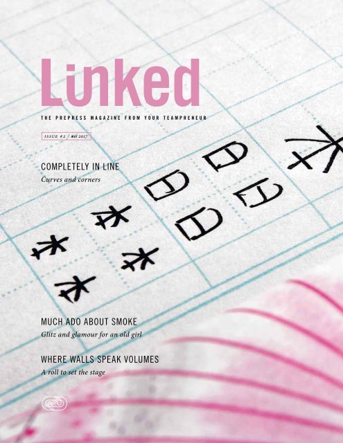
Completely In Line<br />
Curves and corners<br />
Handwriting is as individual as the<br />
writers themselves. This has been<br />
known since 1622. At that time,<br />
an Italian doctor and philosopher,<br />
Camillo Baldi, looked into how a<br />
person’s handwriting can reveal<br />
their personality. In addition to this,<br />
handwriting is influenced by national<br />
characteristics. This holds true<br />
not only for the different characters<br />
of the alphabet, such as in Japanese,<br />
Hebrew or Cyrillic script, but even<br />
Roman script is written differently<br />
by children in Austria or France<br />
than in Germany or in America.<br />
However, there is one thing that<br />
remains the same all over the world:<br />
generations of primary school pupils<br />
practise lines and lines of curves,<br />
arches and ticks until handwriting<br />
becomes routine. Apart from writing<br />
instruments, more than anything,<br />
paper with lines is indispensable –<br />
and these lines follow their own rules<br />
worldwide.
issue #2 © l i n k e d<br />
41<br />
The pages have four lines per row and a learning<br />
house at the beginning and end of each row.<br />
This helps first graders, in Germany, to assimilate<br />
the ascenders, mid lengths and descenders of letters.<br />
swg-online.de/lineaturen<br />
france<br />
The most popular and widely used format for lines in<br />
France is the “grands carreaux” (large squares) or “réglure<br />
Seyès”. It originated from the paper trader, Jean-Alexandre<br />
Seyès, who developed this system of lines in 1892,<br />
and even had its design registered at a court in Pontoise.<br />
With its large number of horizontal and vertical reference<br />
points, the “réglure Seyès” simplified the teachers’ work<br />
enormously. That is to say that they could now give clear<br />
guidance as to the lengths of the ascenders and descenders,<br />
the size of the letters as well as the right positioning<br />
of the accents, without moving from their own desk. With<br />
the introduction of compulsory schooling in 1882, the<br />
classes had increased up to 50 pupils. It was, therefore, no<br />
longer possible for teachers to check individually how their<br />
pupils were learning to write nor to make adjustments by<br />
guiding their pupils’ hands.<br />
This distinctive arrangement of lines is still used in France<br />
and in North Africa by all grades today. It is only supplemented<br />
by small squares for mathematical subjects. In the<br />
1980s the “grands carreaux” made advances in Germany,<br />
becoming a trendy product with students and yuppies.<br />
germany<br />
Unlike France, German pupils have a total of 34 sets of<br />
lines available to them – not counting the ones for the first<br />
writing and maths exercises. The reason may be that primary<br />
school pupils in Germany learn the 26 letters of the<br />
Roman alphabet in four different writing styles. In the East<br />
German states, the style of writing that is still often taught<br />
is the one that was introduced by the GDR in 1968. In the<br />
West however, many primary schools start with block lettering,<br />
progressing then to cursive script in the second and<br />
third grade. Depending on the teacher’s personal preference,<br />
this is either the Lateinische Ausgangsschrift (LA)<br />
style of writing or the simplified version, Vereinfachte Ausgangsschrift<br />
(VA).<br />
There are exercise books available in all sorts of variations<br />
to make learning and practising easier: there is the extralarge<br />
or seven-line system, exercise books with a colourcontrasted<br />
background, a pronounced middle field or<br />
dotted lines in the middle, ones for left-handed and righthanded<br />
people, punched on both sides, with a margin on<br />
the left or the right or on both sides. The shopping lists at<br />
the beginning of a school year are elaborate and tricky –<br />
regardless of the colour and quality of the cover, which can<br />
also be specified by the teacher.
42<br />
n e t w o r k & p e o p l e<br />
japan<br />
It is quite different in Japan. As is typical for this country,<br />
complexity is met with purism. A single line pattern is sufficient<br />
for Japanese children to master the great challenge<br />
of their written language. This is basically made up of four<br />
different systems: the two syllabic scripts of Hiragana and<br />
Katakana, with 46 characters each, the Chinese characters,<br />
Kanji, and from the Latin letters, Romaji.<br />
Kanji mostly express whole words and are correspondingly<br />
complex. They have their origin in Chinese characters, of<br />
which there are between 50,000 and 80,000. The Japanese<br />
adopted around 15,000 of them. To read a simple<br />
newspaper article in Japan requires knowing over 2,000<br />
kanji. In daily life, the characters of these four systems are<br />
all mixed in together, so that Japanese texts make particularly<br />
high demands of the pupils<br />
Such a large number of characters can only be mastered<br />
with constant practice and repetition. Japanese line layout<br />
is a simple but clever tool for this. Squares with sides<br />
of two centimetres are divided into four equal squares by<br />
two lines that cross at the centre. This cross gives those<br />
who are learning an orientation for the correct proportion<br />
of the character and for the positioning of the individual<br />
elements. This can be repeated column by column. At the<br />
next exercise level, the characters can each be written,<br />
substantially smaller, four times in the box.<br />
With pen and paper for more<br />
expression and self-confidence<br />
The skill of handwriting is, meanwhile, regarded almost as<br />
a traditional cultural technology and teaching how to write<br />
is regularly questioned: the digital being swipes, clicks and<br />
types. However, it seems that not only personality can be<br />
inferred from handwriting: studies have shown that people<br />
who have developed a handwriting style, also possess<br />
many abilities and potential; they have better powers of<br />
concentration, can remember and understand texts better,<br />
achieve better academic results and experience an<br />
increase in their self-confidence as well as in their ability<br />
to express themselves creatively. It only remains to hope<br />
that many generations of pupils still learn to write with<br />
classical school exercise books – on whatever manner of<br />
lined page.<br />
Few guide lines – great effect:<br />
all the strokes have their exact<br />
position and proportion.
issue #2 © l i n k e d 43<br />
KANJI<br />
ROMAJI<br />
HIRAGANA<br />
KATAKANA
44 t o t e l l t h e t r u t h<br />
Swabian monks have<br />
it all wrapped up<br />
How the “Maultasche” got its dough<br />
Legend has it that resourceful Cistercian monks from Maulbronn,<br />
Germany thought up this recipe in the 15th century,<br />
and not just because the filling was tastier and they were<br />
easier to prepare this way. The fact is that the inhabitants<br />
of the Swabian monastery were more interested in hiding<br />
the forbidden meat filling from divine eyes during Lent. By<br />
doing this, they believed that their enjoyment of meat dishes,<br />
and therefore the transgressive breaking of their fast,<br />
would go unnoticed.<br />
And today? The cheating monks would not stand a chance.<br />
There is now complete transparency: all the ingredients<br />
are clearly labelled on food packaging. Nutrition tables, information<br />
about the origins of the ingredients and the like,<br />
even tell us today which substances are not to be found in<br />
our food: no fat in gummy bears, no gluten in bread and no<br />
lactose in milk.<br />
Modern, informative packaging gives us important information.<br />
Just imagine the supermarket shelves full of completely<br />
blank food packaging: modern Maultaschen, so to<br />
speak. We can only guess what our monks would have<br />
thought about this. And whether they would have gone as<br />
far in their deception as to label Swabian Maultaschen with<br />
“Suitable for Vegetarians”.
issue #2 © l i n k e d 45<br />
The same principle applies to both Swabian Maultaschen and ravioli:<br />
the pasta dough keeps the filling fresh and aromatic – and protects it from prying eyes.
46<br />
n o t e s<br />
1<br />
s o l u t i o n s j a h o l o<br />
Packaging with<br />
the Wow Effect<br />
The magic of apparent visibility<br />
Together with Amcor, <strong>Janoschka</strong> has developed Jaholo, an innovative finishing technology.<br />
Jaholo produces unique, prismatic motion effects and puts animated patterns<br />
and sequences three-dimensionally centre stage. Jaholo creates a spatially-dynamic<br />
photographic image. Unlike tactile lacquer, which gives a sense of feeling to the optical,<br />
Jaholo teases the eye with a perfect illusion: seemingly real, three-dimensional objects<br />
appear to float in mid-air.<br />
Janoscka creates this holographic effect by using<br />
the combination of state-of-the-art, micro-embossing<br />
cylinders, specially adapted gravure<br />
cylinders, as well as a UV lacquer that was<br />
produced just for this. A customised workflow<br />
for the manufacture of printing and embossing<br />
tools, as well as an ingenious system for repro<br />
preparation and processing, are the basis of<br />
these innovative refinements for the packaging<br />
industry.<br />
Jaholo enhances packaging with unexpected<br />
eye-catchers. The process introduces consumers<br />
to new visual experiences and actively<br />
involves them: by tilting, rotating and turning,<br />
the consumer can delve into the effect. Jaholo<br />
can be applied both just to parts or to complete<br />
large areas. This new refinement offers a broad<br />
spectrum of application opportunities: on the<br />
one hand, it can be used on any background<br />
colour and can be combined with all prevalent<br />
refinements. On the other, it can be applied to<br />
SBS, FBB, laminated cardboard and other substrates.<br />
Jaholo is introducing unexpected perspectives<br />
to innovative packaging. But one thing<br />
is for sure: while the movement of the objects is<br />
illusory, the client´s enthusiasm is real.
issue #2 © l i n k e d<br />
47<br />
Jaholo<br />
Micro Emboss<br />
UV Varnish<br />
Paperboard<br />
Jaholo turns packaging into eye-catchers and motivates the<br />
consumer to look deeply into the illusion.<br />
There are no limits set for the design:<br />
Jaholo makes shapes float.<br />
amcor.com
48<br />
n o t e s<br />
2<br />
n e t w o r k e x p a n s i o n i n a s i a<br />
second production site in vietnam<br />
<strong>Janoschka</strong> strengthens its presence in Ho Chi Minh City<br />
The opening of the second production site in<br />
Ho Chi Minh City sees <strong>Janoschka</strong> extending its<br />
business operations in Asia considerably, with<br />
the joint venture, APE Vietnam. The company<br />
operates other sites in Malaysia and Singapore<br />
and in doing so has already advanced its strategic<br />
focus onto the Far East. This expansion in<br />
Vietnam emphasises the increasing importance<br />
of the Asian market for the consumer goods<br />
industry and the rising demand for high-quality<br />
packaging.<br />
Experts expect that, by the year 2030 at the latest,<br />
Asia will be the predominant production site<br />
and key sales market worldwide. The increase<br />
in the packaging market there is estimated to<br />
be approximately six per cent and in the year<br />
2018 should make up 40 per cent of the global<br />
packaging business.<br />
<strong>Janoschka</strong>, with its 24 subsidiaries in 14 countries,<br />
has a comprehensive global network. The<br />
prepress provider has had an active presence<br />
in Vietnam since 2010. Together with the established<br />
subsidiary in Malaysia and a service<br />
office in Singapore, the site in Ho Chi Minh<br />
City serves the whole packaging market of the<br />
booming economic community ASEAN (Association<br />
of South-East Asian Nations).<br />
“With our additional site in Ho Chi Minh City,<br />
we are taking into account the positive development<br />
in the region. We intend to focus even<br />
more strongly in the future on the Asian economic<br />
zone and its growing purchasing power,”<br />
explains Rudi Weis-Schiff, <strong>Janoschka</strong>´s Director<br />
Business Development. “With international<br />
standards, we have aligned our new production<br />
site in Vietnam to our prepress expertise:<br />
a global, complete value chain, which interlinks<br />
all our dynamic manufacturing processes across<br />
different process stages and local sites.”<br />
A team of 230 employees work in Ho Chi Minh<br />
City. They offer the complete production process<br />
for the packaging sector: beginning with<br />
graphic services, such as artwork and repro.<br />
Using modern technology, as the Think laser for<br />
example, they achieve an annual production capacity<br />
of 40,000 rotogravure cylinders, 30,000<br />
steel bases, in addition to artwork and colour<br />
separations for different market segments including<br />
food and non-food, as well as tobacco<br />
products.
issue #2 © l i n k e d 49<br />
3<br />
t e c h n o l o g y i n v e s t m e n t<br />
clear communication with the cellaxy c500<br />
The decision to purchase – a prima facie case<br />
Most people live in towns and cities and, therefore, in a shaped reality. Points of sale<br />
are everywhere. Packaging communicates with consumers. Its messages act as a<br />
significant incentive for buying decisions. Increasingly elaborate, they appeal to the<br />
buyers with their brand promises. The clear trend in the case of consumer products:<br />
the design itself implies every advantage and embodies the brand promise both tacitly,<br />
but, at the same time, with a recognisable overtness.<br />
The quality of the execution must<br />
be excellent: precisely defined<br />
contours and high print density are<br />
essential for designs, whether on<br />
flexible packaging, on cigarette<br />
packets or on packaging for the<br />
cosmetic and pharmaceutical industry.<br />
Fine lines and a wealth of<br />
detail make high demands on the<br />
embossing cylinder.<br />
In order to guarantee the highest<br />
print quality for its clients’ products,<br />
<strong>Janoschka</strong> invests in the<br />
newest technologies: these include<br />
the latest generation of the<br />
Cellaxy direct laser from Hell Gravure<br />
Systems. The Cellaxy C500 is<br />
the universal high-performance<br />
laser tool for the direct engraving<br />
of rotogravure and embossing cylinders.<br />
2D print or 3D embossing<br />
formes, engraved by the Cellaxy,<br />
give a convincing performance all<br />
along the line: it reproduces text<br />
in high definition with a resolution<br />
of 2540dpi and images in a 90l/cm<br />
screen with soft vignettes. The Cellaxy<br />
provides fully automated multipass<br />
engraving with an engraving<br />
depth of up to 800 µm.<br />
The machine, installed at the Kippenheim<br />
production site at the end<br />
of 2016, is the fifth Cellaxy direct<br />
laser in the <strong>Janoschka</strong> network.<br />
It complements the company´s<br />
state-of-the-art technology park,<br />
which uses all the relevant laser<br />
techniques on the market: besides<br />
the Cellaxy from Hell, the Laserstar<br />
from Daetwyler, Digilas from<br />
Schepers, Think from Think Lab and<br />
DV Laser from Acigraf are also available<br />
for the manufacture of printing<br />
and embossing tools.
50 i m p r i n t<br />
The next edition of <strong>Linked</strong> will appear in the spring of 2018.<br />
WE ARE DELIGHTED THAT YOU HAVE BEEN WITH US.<br />
Please let us know what you thought about our <strong>magazine</strong><br />
so that we can do what we do EVEN better.<br />
Please give us your opinion:<br />
linked@janoschka.com<br />
LINKED is <strong>Janoschka</strong> Holding’s customer<br />
<strong>magazine</strong> and appears annually.<br />
Owned and published by:<br />
<strong>Janoschka</strong> Holding GmbH<br />
Mattweg 1<br />
77971 Kippenheim<br />
Germany<br />
© <strong>2017</strong> <strong>Janoschka</strong> Holding GmbH<br />
All rights reserved. Reprint or electronic<br />
distribution, including in extracts, is subject<br />
to the publisher’s approval.<br />
Editor-in-Chief<br />
(with responsibility according to German press law)<br />
Corina Prutti, das komm.büro, Munich<br />
www.komm-buero.de<br />
Ideas and Conceptual Design:<br />
Sabine Joachims, <strong>Janoschka</strong> Holding<br />
das komm.büro, Munich<br />
Art Direction / Layout:<br />
Patrick Brandecker<br />
www.patrick-brandecker.de<br />
Print and Binding:<br />
Druckerei Vogl, Zorneding<br />
www.druckerei-vogl.de<br />
The information contained within this <strong>magazine</strong> has<br />
been prepared with the utmost diligence and verified<br />
for accuracy. However, <strong>Janoschka</strong> does not assume<br />
any liability for inaccurate or incomplete information.<br />
Any liability claim against the organisation due to<br />
inaccurate or incomplete information is excluded.<br />
Image and Content Copyright:<br />
p. 23, 24: Affinity Petcare S.A / p. 2, 3, 9: A. S. Création<br />
Tapeten AG / p. 7: Bauhaus-Archiv e.V. / p. 5: Bayerische<br />
Schlösserverwaltung / cover and graphics:<br />
p. 26, 27, 34, 35, 38, 41, 42, 44: Patrick Brandecker /<br />
p. 4, Élitis / p. 20, 45: Fotolia / p. 2, 3, 13, 14, 16,<br />
17, 18, 19, 29, 32, 33, 40, Getty Images / p. 30:<br />
informationisbeautiful.net / p. 2, 3, 10, 11, 13, 14,17,<br />
22, 24, 28, 33, 43 iStock / p. 1, 3, 12, 15, 21, 34, 35,<br />
36, 37, 38, 39, 46, 47, 48, 49: <strong>Janoschka</strong> archive /<br />
p. 20, 21: Knorr / p. 6: Museumslandschaft Hessen<br />
Kassel, Deutsches Tapetenmuseum / p. 8: Sächsische<br />
Walzengravur/ SWG / p. 6: Science Photo Library Ltd /<br />
p. 8: Tapeten-Agentur / p. 24, 25: Terra Canis GmbH /<br />
p. 28: Windmöller & Hölscher KG<br />
If you would like to be added<br />
to our distribution list<br />
please email us: linked@janoschka.com<br />
Please inform us of any change of address or if you<br />
no longer wish to receive <strong>Linked</strong>.
i s s u e #2 / may <strong>2017</strong>