Janoschka magazine_Linked_V2_2017

Create successful ePaper yourself
Turn your PDF publications into a flip-book with our unique Google optimized e-Paper software.
issue #2 © l i n k e d 33<br />
pretty in pink –<br />
Football strips and Barbie dolls<br />
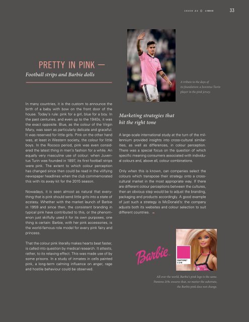
A tribute to the days of<br />
its foundation: a Juventus Turin<br />
player in the pink jersey.<br />
In many countries, it is the custom to announce the<br />
birth of a baby with bow on the front door of the<br />
house. Today’s rule: pink for a girl, blue for a boy. In<br />
the past centuries, and even up to the 1940s, it was<br />
the exact opposite. Blue, as the colour of the Virgin<br />
Mary, was seen as particularly delicate and graceful.<br />
It was reserved for little girls. Pink on the other hand<br />
was, at least in Western society, the colour for little<br />
boys. In the Rococo period, pink was even considered<br />
the latest thing in men’s fashion for a while. An<br />
equally very masculine use of colour: when Juventus<br />
Turin was founded in 1897, its first football strips<br />
were pink. The extent to which colour perception<br />
has changed since then could be read in the vilifying<br />
newspaper headlines when the club commemorated<br />
this with its away kit for the 2015 season.<br />
Nowadays, it is seen almost as natural that everything<br />
that is pink should send little girls into a state of<br />
ecstasy. Whether with the market launch of Barbie<br />
in 1959 and since then, the consistent branding in<br />
typical pink have contributed to this, or the phenomenon<br />
just skilfully used it for its own purposes, one<br />
thing is certain: Barbie, with her pink accessories, is<br />
the world-famous role model for every pink fairy and<br />
princess.<br />
Marketing strategies that<br />
hit the right tone<br />
A large-scale international study at the turn of the millennium<br />
provided insights into cross-cultural similarities,<br />
as well as differences, in colour perception.<br />
There was a special focus on the question of which<br />
specific meaning consumers associated with individual<br />
colours and, above all, colour combinations.<br />
Only when this is known, can companies select the<br />
colours which transpose their strategy onto a crosscultural<br />
market in the most appropriate way. If there<br />
are different colour perceptions between the cultures,<br />
then an obvious step would be to adjust the branding,<br />
packaging and products accordingly. A good example<br />
of just such a strategy is McDonald’s: the company<br />
adjusts both its websites and colour selection to suit<br />
different countries.<br />
That the colour pink literally makes hearts beat faster,<br />
is called into question by medical research. It attests,<br />
rather, to its relaxing effect. This was made use of by<br />
some prisons. In a study of inmates in cells painted<br />
pink, a long-term calming influence on anger, rage<br />
and hostile behaviour could be observed.<br />
PANTONE ®<br />
C 219<br />
All over the world, Barbie’s pink logo is the same.<br />
Pantone 219c ensures that, no matter the substrate,<br />
the Barbie pink does not change.