03 Magazine: February 08, 2023

You also want an ePaper? Increase the reach of your titles
YUMPU automatically turns print PDFs into web optimized ePapers that Google loves.
44 <strong>Magazine</strong> | Interiors<br />
“Mother Nature is the ultimate colour<br />
expert, so start to notice the colour values<br />
of the outside world in your everyday life<br />
– consider it free colour training!"<br />
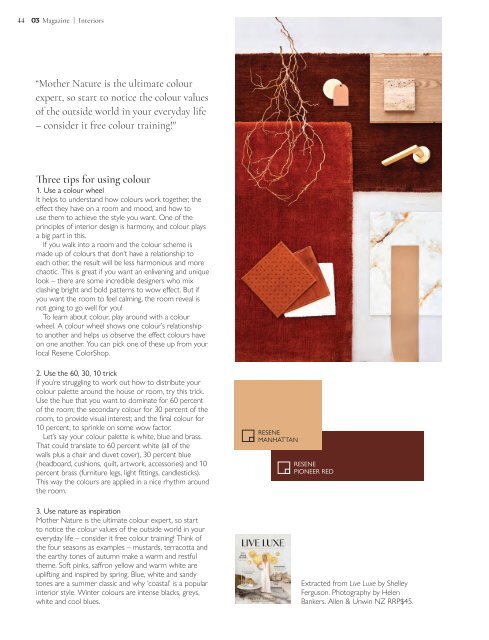
Three tips for using colour<br />
1. Use a colour wheel<br />
It helps to understand how colours work together, the<br />
effect they have on a room and mood, and how to<br />
use them to achieve the style you want. One of the<br />
principles of interior design is harmony, and colour plays<br />
a big part in this.<br />
If you walk into a room and the colour scheme is<br />
made up of colours that don’t have a relationship to<br />
each other, the result will be less harmonious and more<br />
chaotic. This is great if you want an enlivening and unique<br />
look – there are some incredible designers who mix<br />
clashing bright and bold patterns to wow effect. But if<br />
you want the room to feel calming, the room reveal is<br />
not going to go well for you!<br />
To learn about colour, play around with a colour<br />
wheel. A colour wheel shows one colour’s relationship<br />
to another and helps us observe the effect colours have<br />
on one another. You can pick one of these up from your<br />
local Resene ColorShop.<br />
2. Use the 60, 30, 10 trick<br />
If you’re struggling to work out how to distribute your<br />
colour palette around the house or room, try this trick.<br />
Use the hue that you want to dominate for 60 percent<br />
of the room; the secondary colour for 30 percent of the<br />
room, to provide visual interest; and the final colour for<br />
10 percent, to sprinkle on some wow factor.<br />
Let’s say your colour palette is white, blue and brass.<br />
That could translate to 60 percent white (all of the<br />
walls plus a chair and duvet cover), 30 percent blue<br />
(headboard, cushions, quilt, artwork, accessories) and 10<br />
percent brass (furniture legs, light fittings, candlesticks).<br />
This way the colours are applied in a nice rhythm around<br />
the room.<br />
RESENE<br />
MANHATTAN<br />
RESENE<br />
PIONEER RED<br />
3. Use nature as inspiration<br />
Mother Nature is the ultimate colour expert, so start<br />
to notice the colour values of the outside world in your<br />
everyday life – consider it free colour training! Think of<br />
the four seasons as examples – mustards, terracotta and<br />
the earthy tones of autumn make a warm and restful<br />
theme. Soft pinks, saffron yellow and warm white are<br />
uplifting and inspired by spring. Blue, white and sandy<br />
tones are a summer classic and why ‘coastal’ is a popular<br />
interior style. Winter colours are intense blacks, greys,<br />
white and cool blues.<br />
Extracted from Live Luxe by Shelley<br />
Ferguson. Photography by Helen<br />
Bankers. Allen & Unwin NZ RRP$45.