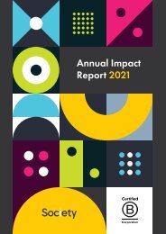
Society's Brand Guidelines

Create successful ePaper yourself
Turn your PDF publications into a flip-book with our unique Google optimized e-Paper software.
Society<br />
<strong>Brand</strong> <strong>Guidelines</strong> | 1.0
01 | Society | <strong>Brand</strong> <strong>Guidelines</strong><br />
What’s<br />
Included<br />
Intro<br />
<strong>Brand</strong> Standards Start Here 02<br />
<strong>Brand</strong> Logo<br />
Primary Logo 04<br />
Primary Logo: Minimum Sizing 05<br />
Primary Logo: Clear Space 06<br />
Primary Logo: Colour Variations 07<br />
Common Errors 08<br />
<strong>Brand</strong> Colours<br />
Primary Palette 10<br />
Secondary Palette 11<br />
Common Errors 12<br />
Typography<br />
Primary Typeface 14<br />
Secondary Typeface 15<br />
Hierarchy and Weight 16<br />
Top Typography Tips 17<br />
Common Errors 18<br />
Visual Identity Style<br />
Graphics 20<br />
<strong>Brand</strong> Photography 21<br />
People Photography 22<br />
Thank You 23<br />
Contacts and Approvals 24
02 | Society | <strong>Brand</strong> <strong>Guidelines</strong><br />
<strong>Brand</strong> Standards Start Here<br />
Welcome to our <strong>Brand</strong> <strong>Guidelines</strong><br />
This is our brand DNA. An essential ‘how to’ create and<br />
communicate with consistency and confidence.<br />
Our brand values and ethos are strong. And the way we<br />
work, create and collaborate should reflect that. We want<br />
to be seen. Be heard. And be instantly recognisable.<br />
Within these pages, you can learn or refresh your<br />
knowledge of the brand. Read it cover to cover or dip<br />
in and out as you reference visual and tonal cues.<br />
Every element mentioned is crucial to the alignment<br />
and impact we create. And everyone’s welcome –<br />
from designers and vendors to front-of-house. If you’re<br />
part of our team, you’re part of our house rules.<br />
From our founding story to our promising future, every<br />
innovation and collaboration will take us forward.<br />
And we’re excited for you to join us on the journey.<br />
Instead, use them to empower you and align your work<br />
with our signature style. No matter how abstract or daring<br />
it might be. There’s a time for conservative and a time for<br />
controversy. We’re a bit of both. It’s all about balance.<br />
The Only Constant is Change<br />
This is a working, living, evolving document. Refer back<br />
to it often to discover the next chapter. While we’re<br />
established, we’re still evolving. And through each new<br />
era, we aim to remain current and future ready.<br />
A Final Note on Permissions<br />
Please double check you have authorisation to use our<br />
brand materials, including resources, graphics and visual<br />
elements. If you’re unsure, just get in touch with those<br />
listed on the contacts and approvals page in this<br />
document and they’ll point you in the right direction.<br />
All good? Let’s go.<br />
In a Sea of Italics Be Bold<br />
We hate the word ‘rules’. But there are certain guidelines<br />
that we must stick to in order to remain consistent,<br />
together. Stick within these parameters, but never<br />
let them limit your creativity.
03 | Society | <strong>Brand</strong> <strong>Guidelines</strong><br />
<strong>Brand</strong><br />
Logo<br />
Our Symbolic Anchor<br />
of <strong>Brand</strong> Identity<br />
Our logo is our No. 1 brand<br />
ambassador. Always iconic,<br />
never overlooked. It’s how we<br />
stand out in a saturated market.<br />
And it’s a promise of enduring<br />
quality, consistency and reliability.<br />
With that in mind, it’s vital that<br />
our logo is always presented<br />
accurately in every execution.<br />
To do that, please read on.
04 | Society | <strong>Brand</strong> <strong>Guidelines</strong><br />
Primary Logo<br />
Our primary logo has timeless, dynamic simplicity<br />
and instantly identifies our brand. Use this logo as<br />
an authenticity stamp. We only put our name to<br />
the absolute best. Wherever it appears, it’s a solid<br />
reassurance of the creativity, collaboration and<br />
innovation behind the scenes.<br />
Remember!<br />
This logo is a carefully crafted piece of locked artwork.<br />
It should never be altered in any way.
05 | Society | <strong>Brand</strong> <strong>Guidelines</strong><br />
Primary Logo<br />
Minimum Sizing<br />
5mm or 25px<br />
This version is not intended for extremely small sizes. The minimum<br />
height is 5mm for print applications and 25px for digital applications.<br />
Clarity is key. To ensure our logo is legible and<br />
recognisable, it’s important to maintain optimal<br />
and minimal logo sizing.<br />
Remember!<br />
Never reproduce our logo smaller than the minimum<br />
size listed on this page.<br />
Use your natural eye first and these guidelines<br />
second. If legibility is an issue, opt for the biggest size<br />
(within reason). In some cases, it may be acceptable<br />
to use the minimum size. But always sense-check.<br />
If something doesn’t look right, it probably isn’t.
06 | Society | <strong>Brand</strong> <strong>Guidelines</strong><br />
Primary Logo<br />
Clear Space<br />
Cut the clutter. Clear space, white space or negative<br />
space is the area that surrounds the logo, free from<br />
any other graphical element.<br />
Remember!<br />
At a minimum, there should be clear space equal to<br />
the height of the [S] on all four sides of the logo mark.<br />
We use this to give our logo presence, help it stand out<br />
from the other elements on the page and ensure legibility,<br />
even at small sizes. If you’re unsure, go for more.<br />
Maximizing clear space always supports and never<br />
distracts from logo definition.
07 | Society | <strong>Brand</strong> <strong>Guidelines</strong><br />
Primary Logo<br />
Colour Variations<br />
To be used over light backgrounds<br />
To be used over dark backgrounds<br />
To be used over light backgrounds<br />
To be used over dark backgrounds<br />
Life is vibrant. Our brand celebrates that. Each brand<br />
logo lockup has several colour variations, for use<br />
on different background types, tones and colours.<br />
Remember!<br />
Always take care to ensure logo legibility on the final<br />
media or materials used.<br />
There’s a whole spectrum of potential. But when<br />
in doubt, use the most legible version of the logo<br />
for the available background.
08 | Society | <strong>Brand</strong> <strong>Guidelines</strong><br />
Common Errors<br />
Lost in Translation<br />
Do not stretch, squash, skew, or distort<br />
the logo in any way.<br />
Do not edit the logo colour, use an off-brand<br />
colour, or reduce the logo opacity.<br />
Do not add graphic effects to the logo,<br />
including drop shadows.<br />
Proposal by:<br />
Thank you.<br />
Do not place the logo on a high contrast<br />
pattern or busy photograph.<br />
Do not change the layout or relationship<br />
between logo elements.<br />
Do not encroach on the required clear<br />
space surrounding the logo.<br />
Our logo is a very carefully considered asset that<br />
should be used in adherence with the guidelines<br />
set out in the document.<br />
This goes for the placement of the logo onto<br />
photographs, textures and patterns too.<br />
Sense check and ensure that both close-up<br />
and from a distance, the logo is legible and clear.
09 | Society | <strong>Brand</strong> <strong>Guidelines</strong><br />
<strong>Brand</strong><br />
Colours Colour<br />
Theory 101<br />
Colour theory is an integral part<br />
of branding and design. The colours<br />
we chose to represent our brand are<br />
symbolic of who we are, what we<br />
stand for and how we relate to<br />
people internally and externally.<br />
They set us apart and help us to<br />
evoke emotion and character.<br />
With that in mind, it’s vital that our<br />
colours are reproduced with precision<br />
and consideration.<br />
The following section covers our<br />
colour guidelines in more detail.
10 | Society | <strong>Brand</strong> <strong>Guidelines</strong><br />
Primary Palette<br />
Dark Grey<br />
PMS (Coated): 425<br />
PMS (Uncoated): 433<br />
CMYK: 0 0 0 80<br />
RGB: 88 89 91<br />
HEX: #58595b<br />
Yellow<br />
PMS (Coated): 116<br />
PMS (Uncoated): 108<br />
CMYK: 0 14 100 0<br />
RGB: 255 205 0<br />
HEX: #FECB00<br />
White<br />
RGB: 255 255 255<br />
HEX: #ffffff<br />
Our primary colour palette forms the visual foundation<br />
of our brand and helps people to recognise us. Aside from<br />
specific recommendations within this guide, these colours<br />
should always be in play, across all touchpoints.<br />
Using the Pantone Matching System is highly recommended<br />
to ensure colour consistency and impact. If Pantone<br />
colour matching is not available or out of budget,<br />
please take great care to match the specific colour<br />
references above with precision.
11 | Society | <strong>Brand</strong> <strong>Guidelines</strong><br />
Secondary Palette<br />
100%<br />
80%<br />
60%<br />
40%<br />
20%<br />
Charcoal: PMS (C) 419 / PMS (U) 5463 / CMYK 75, 65, 60, 79 / RGB 32 34 33 / HEX #202221<br />
100%<br />
80%<br />
60%<br />
40%<br />
20%<br />
Mid Grey: PMS (C) 422 / PMS (U) 422 / CMYK 0 0 0 40 / RGB 166 168 171 / HEX #a6a8a<br />
100%<br />
80%<br />
60%<br />
40%<br />
20%<br />
Light Grey: PMS (C) 420 / PMS (U) Cool Grey 1 / CMYK 0 0 0 10 / RGB 229 230 231 / HEX #e5e6e<br />
100%<br />
80%<br />
60%<br />
40%<br />
20%<br />
Petrol: PMS (C) 7476 / PMS (U) 323 / CMYK 89, 25, 38, 54 / RGB 12 83 88 / HEX #0c535<br />
100%<br />
80%<br />
60%<br />
40%<br />
20%<br />
Teal: PMS (C) 3533 / PMS (U) 3245 / CMYK 51, 0, 23, 0 / RGB 105 219 200 / HEX #69dbc<br />
100%<br />
80%<br />
60%<br />
40%<br />
20%<br />
Light Blue: PMS (C) 7457 / PMS (U) 7457 / CMYK 25, 0, 0, 0 / RGB 188 229 238 / HEX #bce5e<br />
Our secondary palette has been chosen to highlight or<br />
complement our primary colours. These are to be used<br />
sparingly in situations that require a broader spectrum<br />
of colours, for example, on our website or sales and<br />
marketing collateral.<br />
If necessary, use a 20% tint step system, keeping legibility<br />
in mind. Any tint below 60% used as a background will<br />
require dark text.
12 | Society | <strong>Brand</strong> <strong>Guidelines</strong><br />
Common Errors<br />
Don’t Colour Outside the <strong>Guidelines</strong><br />
Don’t<br />
Don’t<br />
Don’t<br />
Don’t use any colours other than those<br />
specified in the brand palette.<br />
Don’t use transparent text.<br />
Don’t use colours along side each other<br />
that have insufficient contrast.<br />
Don’t<br />
Don’t<br />
Don’t<br />
Don’t use colours together that clash.<br />
Don’t use yellow (or other light colours)<br />
for type on a light background,<br />
especially at smaller sizes.<br />
Don’t combine too many colours at once.<br />
Our colour schemes have been developed to create<br />
impact, not confusion. Everyone should always be able<br />
to read what we write and see what we make. But with<br />
so much choice available, it’s easy to get side-tracked.<br />
With that in mind, always make sure that you ask yourself<br />
these questions before deciding on an execution. Is it on<br />
brand? Is there enough contrast between the colours for<br />
it to be legible? Are the dominant colours of the piece<br />
from the primary palette?
13 | Society | <strong>Brand</strong> <strong>Guidelines</strong><br />
Typography<br />
Just Our Type<br />
We follow fonts to the letter. Our font<br />
family is aligned with our overarching<br />
brand identity. That’s because<br />
typography can be just as impactful<br />
as graphical elements.<br />
Font consistency delivers distinctive<br />
visual impact. The way we<br />
communicate with letters, numbers<br />
and symbols are all part of the<br />
bigger brand picture. We believe<br />
typography should strike a balance<br />
between legibility and interest.<br />
The following section will cover<br />
approved typefaces, the way we<br />
use typography to communicate<br />
clearly and some helpful usage tips.
14 | Society | <strong>Brand</strong> <strong>Guidelines</strong><br />
Primary Typeface<br />
Our Go-To Font<br />
The typeface we choose for all brand executions:<br />
Gilroy<br />
Gilroy was designed by Radomir<br />
Tinkov, Gilroy is a modern sans serif<br />
with a geometric touch. It comes<br />
in 20 weights, 10 uprights and its<br />
matching italics, and includes<br />
a wide array of glyphs, weights,<br />
and special features. We love it.<br />
Our primary typeface should be<br />
used most often – particularly for<br />
most heading styles, body copy,<br />
standfirsts, and captions.<br />
Fallback typeface (free Google font):<br />
Albert Sans<br />
Albert Sans is for use when the<br />
primary typeface is not available,<br />
for example in PowerPoint<br />
presentations or in Word documents.
15 | Society | <strong>Brand</strong> <strong>Guidelines</strong><br />
Secondary Typeface<br />
Our Supporting Font<br />
The typeface we choose for all brand executions:<br />
Nantes<br />
Nantes is a serif typeface designed<br />
by Luzi Gantenbein. It was released<br />
through Luzi Type in 2016. The design<br />
features distinctive teardrop terminals<br />
on the lowercase a and c. The family<br />
is available in three weights with<br />
matching italics.<br />
Our secondary typeface should<br />
be reserved for impactful headings<br />
at a high-level, and any other<br />
supporting elements such as<br />
key statistics, large numbers and<br />
pull-out quotes.<br />
Fallback typeface (free Google font):<br />
Baskervville<br />
Baskervville is for use when the<br />
secondary typeface is not available,<br />
for example in PowerPoint<br />
presentations or in Word documents.
16 | Society | <strong>Brand</strong> <strong>Guidelines</strong><br />
Hierarchy and Weight<br />
Primary<br />
Secondary<br />
Gilroy/Light:<br />
abcdefghijklmnopqrstuvwxyz<br />
Nantes/Book:<br />
abcdefghijklmnopqrstuvwxyz<br />
Available weights:<br />
Thin + Italic<br />
Ultra light + Italic<br />
Light + Italic<br />
Regular + Italic<br />
Medium + Italic<br />
Semibold + Italic<br />
Bold + Italic<br />
Extra bold + Italic<br />
Black + Italic<br />
Heavy + Italic<br />
Available weights:<br />
Light + Italic<br />
Book + Italic<br />
Regular + Italic<br />
Semibold + Italic<br />
Bold + Italic<br />
You can’t whisper and shout at the same time. There’s a<br />
time and a place for every kind of type. And we’re here to<br />
help guide you with them.<br />
Using a contrast of heavy and lighter weights to<br />
communicate boldness and subtleties is key. This is<br />
known as the hierarchy of information. Sometimes it<br />
helps to read a title or piece of text aloud, to really<br />
bring it to life and give it a test of character.
17 | Society | <strong>Brand</strong> <strong>Guidelines</strong><br />
Top Typography Tips<br />
01<br />
Stay Left-Aligned Rag Right<br />
Legibility and clarity are vitally important to great<br />
typographic layouts. In English, we read from<br />
left to right, so we should align our type accordingly.<br />
02<br />
Skip Weights and Double the Size<br />
Contrast is the name of the game when it comes<br />
to great design. When in doubt, skip a weight when<br />
pairing two weights, and double the size between<br />
two text elements.<br />
03<br />
Align X-Heights or Baselines<br />
Whenever you place text next to each other,<br />
either align the baselines (the line that the bottom<br />
of a lowercase x sits on) or align the x-heights<br />
(the top of a lowercase x).<br />
04<br />
Watch the Rag<br />
When setting paragraphs, keep an eye on the right<br />
(ragged) edge. If the rag unintentionally creates<br />
a recognisable shape, consider tweaking the<br />
language or resizing the text area. Also, try to<br />
prevent single-word lines (orphans) where possible.<br />
05<br />
Give Things Space if Needed<br />
Negative space, clear space or white space around<br />
elements is extremely important. That being said,<br />
if informational elements belong together, move them<br />
closer together. Use grouping wisely, just try not to<br />
cram too many things into one space.<br />
06<br />
Keep Line Length Reasonable<br />
It is easy for the reader to get lost in long lines of<br />
text and short ones are easily ignored. It’s best<br />
to keep lines between 45 and 70 characters long,<br />
depending on the size of the font. This will ensure<br />
legibility as the font sizes increase or decrease.
18 | Society | <strong>Brand</strong> <strong>Guidelines</strong><br />
Common Errors<br />
A Checklist for Type Perfection<br />
w r ong<br />
wrong<br />
Keep tracking, kerning, and leading<br />
reasonable and legible. Do not stray<br />
far from the examples in this guide.<br />
Try to avoid using centered or completely<br />
justified alignment for multi-line text.<br />
Do not use unauthorised fonts or<br />
typefaces. The only exception is stylised<br />
merchandise or illustrations on a case-bycase<br />
basis.<br />
wrong<br />
wrong<br />
wrong<br />
Do not use a stroke or outline on<br />
typography. Also avoid using a drop<br />
shadow on typography at all costs.<br />
Do not use typography on any angle<br />
other than 0° or 90°. Our typography<br />
should always read up if 90°.<br />
Do not stretch, squish, or otherwise<br />
mangle typography. Use the appropriate<br />
weight instead.
19 | Society | <strong>Brand</strong> <strong>Guidelines</strong><br />
Visual<br />
Identity<br />
See the Bigger Picture<br />
Powerful branding is simple and<br />
dynamic, aligning finer elements<br />
with the theme of the overall design.<br />
While brand consistency relies<br />
heavily on logo usage, colour and<br />
typography, there are other key<br />
visual elements and compositions<br />
that play a key role in the overall<br />
brand identity.<br />
In this section we’ll be covering<br />
approved visual elements for<br />
our brand.
20 | Society | <strong>Brand</strong> <strong>Guidelines</strong><br />
Graphics<br />
Graphic A: Dominoes Graphic B: Ripple Graphic C: Reaction<br />
Society activate a chain reaction of positive impact<br />
in the world.<br />
Our core three graphics act as a metaphor to illustrate<br />
this dynamic. They use concentric circles that radiate<br />
outwards from a central dot, that represents the<br />
candidate as a catalyst - initiating change within their<br />
environment, in their own way.<br />
Remember!<br />
These graphics are carefully crafted pieces of<br />
supplied artwork. Their forms should never be altered<br />
in any way, however they may be recoloured to suit<br />
their backgrounds, as long as the dot remains<br />
yellow (or white if reversed out of yellow).
LONDON • NEW YORK • AUCKLAND<br />
The Fulwood<br />
4 Fulwood Place<br />
London WC1V 6HG<br />
United Kingdom<br />
+44 (0)207 935 4052<br />
hello@society-search.com<br />
society-search.com<br />
Society Limited Registered in England and Wales, No. 6917936<br />
STRICTLY PRIVATE AND CONFIDENTIAL<br />
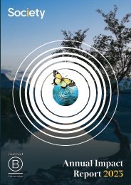
21 | Society | <strong>Brand</strong> <strong>Guidelines</strong><br />
Image Style<br />
<strong>Brand</strong> Photography<br />
Anonymous University<br />
Appointment of a University Secretary<br />
Candidate Review Document<br />
December 2022<br />
Anonymous University<br />
Appointment of a University Secretary<br />
Candidate Review Document<br />
December 2022<br />
Catalysts:<br />
Example cover 1 Example cover 2<br />
Impacts:<br />
<strong>Brand</strong> photography is a high-level image style that can<br />
be used in corporate communications, for example when<br />
talking about the company’s offer.<br />
Our conceptual image style replicates the visual idea<br />
seen within our core three graphics. Yet again the<br />
central dot becomes the catalyst, and the background<br />
represents the positive impact with the world.<br />
All catalysts should be used with a core graphic,<br />
and either with or without a background image,<br />
as seen above.<br />
The images have been colour balanced to reflect<br />
the brand colour palette, and natural instances<br />
of yellow have been included where possible.
22 | Society | <strong>Brand</strong> <strong>Guidelines</strong><br />
Image Style<br />
People Photography<br />
Team Photography<br />
Candidate Photography<br />
We have two kinds of people photography - team and candidate photography.<br />
Team photography should be shot against a white wall,<br />
so that it can be cut-out and used over a coloured<br />
background. Always crop them similarly (head & shoulders),<br />
to help standardise their appearance. The border width on<br />
these circles shown here are 2pt, but balance the chosen<br />
width accordingly with the application being designed.<br />
Candidate photography will be supplied to us, but try<br />
to obtain colour images and place them in a circle to<br />
represent catalysts. Always crop them similarly (head<br />
& shoulders), to help standardise their appearance.<br />
The border width on these circles shown here are 2pt,<br />
but balance the chosen width accordingly with the<br />
application being designed.
23 | Society | <strong>Brand</strong> <strong>Guidelines</strong><br />
Thank You<br />
Knowledge is power. But what’s even more powerful<br />
is when we’re all on the same page. Thank you for<br />
taking the time to read our guidelines. We hope you<br />
now feel confident and up-to-speed with our brand ethos,<br />
principals and processes.<br />
Please remember that these guidelines were created<br />
to ensure maximum brand impact and recognition.<br />
They are never intended to limit creativity.
24 | Society | <strong>Brand</strong> <strong>Guidelines</strong><br />
Contacts and Approvals<br />
Our Creator-Friendly Support<br />
Team is Just a Click Away<br />
Whatever guidance or support you need,<br />
we can help you join the dots. Though we’re<br />
in different departments, we’re all connected.<br />
For troubleshooting big or small, especially<br />
when working on brand execution, please get<br />
in touch with one of the contacts listed below.<br />
Christiane Baehr<br />
Chief Operating Officer<br />
christiane.baehr@society-search.com<br />
+44 (0)203 653 0472<br />
Sarika Gohil<br />
Executive Assistant and Head of Engagement<br />
sarika.gohil@society-search.com<br />
+44 (0)203 653 0469
<strong>Brand</strong> guidelines created by<br />
Naked Ideas (nakedideas.com)<br />
Version: 1.0<br />
Last updated: March 2023