Create successful ePaper yourself
Turn your PDF publications into a flip-book with our unique Google optimized e-Paper software.
descriptions of the beast attributes sometimes refer to texts from classical Greece to<br />
validate their authenticity. For each chapter Ponce de León has provided commentary,<br />
which is usually many times longer than the Physiologus text itself. In this commentary<br />
Ponce de León notes references to Biblical texts, early church writers, and Classical<br />
Greek works. He also comments on the text itself, and on the translation from Greek<br />
to Latin.<br />
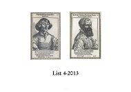
All of the Physiologus illustrations are<br />
copperplate engravings drawn by Pieter<br />
van der Borcht, who did many such<br />
illustrations for Plantin’s print shop. It<br />
is unclear if van der Borcht also did the<br />
engraving or etching; his early drawings<br />
were usually engraved by specialists<br />
(Jean Wiericx and Antoine van Leest,<br />
among others), but by 1588 he was doing<br />
some of his own engraving and etching,<br />
signing at least one of his works “Petrus<br />
van der Borcht invenit et fecit” (cf. A.J.J.<br />
Delen, Histoire de la Gravure dans les<br />
Anciens Pays-Bas et dans les Provinces<br />
Belges. Deuxième Partie: Le XVIe Siècle, les<br />
Graveurs-Illustrateurs, Paris, 1969, pp. 88-<br />
91). Although van der Borcht sometimes<br />
signed his drawings with his initials<br />
(PB), no such signature has been found<br />
in the Physiologus illustrations. Delen (p.<br />
91) says of van der Borcht’s illustrations<br />
for the book: “Les 26 planches de Sancti<br />
Epiphanii ad Physiologum, paru chez<br />
Plantin en 1588, montrent une autre<br />
face du talent de Van der Borcht. Dans<br />
de petites compositions carrées, il met en scène des animaux divers, chaque fois<br />
devant un fond de paysage, pittoresque et amusant. D’une pointe fine et légère, il<br />
gratta ici sur le cuivre des tableautins spirituels qui comptent parmi ses illustrations<br />
les plus captivantes.” Delen and Voet also suggest that van der Borcht might have<br />
copied the illustrations from the 1587 edition woodcuts, and a comparison of the two<br />
sets of images supports this idea to some extent. However, while many of van der<br />
Borcht’s illustrations are similar to the woodcuts, and some have almost identical<br />
compositions, it is clear that van der Borcht did not merely copy what he saw. Even<br />
where the pose of the animals is identical, the van der Borcht illustrations are much<br />
more lifelike and detailed. The backgrounds in the woodcuts are for the most part<br />
simplistic, while in the copperplate engravings they are fully realized landscapes.<br />
Van der Borcht also had a much better grasp of perspective than the woodcut artist.<br />
Copperplate engravings allow for a much higher level of detail than the woodcuts<br />
used for the original 1587 edition, and van der Borcht took full advantage of this. The<br />
lines and the cross hatching used for shading are sharp, and the ink has not filled in<br />
large black areas, as happened with the woodcuts. This ability to engrave fine lines<br />
allowed van der Borcht to produce printed illustrations with great detail, and with<br />
variable shading that gives the impression of grays rather than just black and white. In<br />
the animal illustrations the animal is the center of attention, placed directly in front of<br />
the viewer. However, unlike most bestiary illustrations in medieval manuscripts, each<br />
animal is depicted in front of a complex background. The background usually recedes<br />
into the distance, giving a sense of depth. These images are reminiscent of landscapes