Download the Eckerd College Branding Guidelines
Download the Eckerd College Branding Guidelines
Download the Eckerd College Branding Guidelines
You also want an ePaper? Increase the reach of your titles
YUMPU automatically turns print PDFs into web optimized ePapers that Google loves.
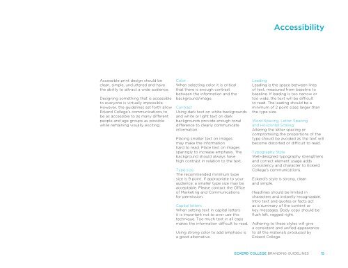
Accessible print design should be<br />
clean, simple, uncluttered and have<br />
<strong>the</strong> ability to attract a wide audience.<br />
Designing something that is accessible<br />
to everyone is virtually impossible.<br />
However, <strong>the</strong> guidelines set forth allow<br />
<strong>Eckerd</strong> <strong>College</strong>’s communications to<br />
be as accessible to as many different<br />
people and age groups as possible<br />
while remaining visually exciting.<br />
Color<br />
When selecting color it is critical<br />
that <strong>the</strong>re is enough contrast<br />
between <strong>the</strong> information and <strong>the</strong><br />
background/image.<br />
Contrast<br />
Using dark text on white backgrounds<br />
and white or light text on dark<br />
backgrounds provide enough tonal<br />
difference to clearly communicate<br />
information.<br />
Placing smaller text on images<br />
may make <strong>the</strong> information<br />
hard to read. Place text on images<br />
sparingly to increase emphasis. The<br />
background should always have<br />
high contrast in relation to <strong>the</strong> text.<br />
Type size<br />
The recommended minimum type<br />
size is 9 point. If appropriate to your<br />
audience, a smaller type size may be<br />
acceptable. Please contact <strong>the</strong> Office<br />
of Marketing and Communications<br />
for permission.<br />
Capital letters<br />
When setting text in capital letters<br />
it is important not to over use this<br />
technique. Too much text in all caps<br />
makes <strong>the</strong> information difficult to read.<br />
Using strong color to add emphasis is<br />
a good alternative.<br />
Accessibility<br />
Leading<br />
Leading is <strong>the</strong> space between lines<br />
of text, measured from baseline to<br />
baseline. If leading is too narrow or<br />
too wide, <strong>the</strong> text will be difficult<br />
to read. The leading should be a<br />
minimum of 2 point sizes larger than<br />
<strong>the</strong> type size.<br />
Word Spacing, Letter Spacing<br />
and Horizontal Scaling<br />
Altering <strong>the</strong> letter spacing or<br />
compromising <strong>the</strong> proportions of <strong>the</strong><br />
type should be avoided as <strong>the</strong> text will<br />
become distorted or difficult to read.<br />
Typography Style<br />
Well-designed typography streng<strong>the</strong>ns<br />
and correct element usage adds<br />
consistency and character to <strong>Eckerd</strong><br />
<strong>College</strong>’s communications.<br />
<strong>Eckerd</strong>’s style is strong, clean<br />
and simple.<br />
Headlines should be limited in<br />
characters and instantly recognizable.<br />
Intro text and quotes or facts act<br />
as a summary of <strong>the</strong> content or<br />
key messages. Body copy should be<br />
flush left, ragged right.<br />
Adhering to <strong>the</strong>se styles will give<br />
a consistent and unified appearance<br />
to all <strong>the</strong> materials produced by<br />
<strong>Eckerd</strong> <strong>College</strong>.<br />
ECKERD COLLEGE BRANDING GUIDELINES 15


