Download the Eckerd College Branding Guidelines
Download the Eckerd College Branding Guidelines
Download the Eckerd College Branding Guidelines

Create successful ePaper yourself
Turn your PDF publications into a flip-book with our unique Google optimized e-Paper software.
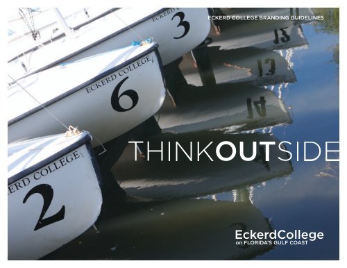
ECKERD COLLEGE BRANDING GUIDELINES
Contents<br />
Introduction ................................................................................................................. p2<br />
Contact .......................................................................................................................... p3<br />
Who to contact with design and writing questions, and <strong>the</strong> approval process.<br />
The <strong>Eckerd</strong> <strong>College</strong> Signature ............................................................................p4<br />
Identifying <strong>Eckerd</strong> <strong>College</strong>’s existing branding elements.<br />
THINKOUTSIDE ..........................................................................................................p8<br />
Identifying <strong>the</strong> THINKOUTSIDE campaign branding elements.<br />
Accessibility ................................................................................................................p15<br />
Explanations of how core elements are effectively used.<br />
Image Style .................................................................................................................p16<br />
Resource for using, acquiring and printing images.<br />
Applications ................................................................................................................p17<br />
Visual reference of core branding elements successfully applied to various projects.<br />
Paper & Printing ..................................................................................................... p26<br />
Identifying which paper to use, assistance with vendor selection and print production.<br />
<strong>Guidelines</strong> and recommendation for in-house desktop projects.<br />
ECKERD COLLEGE BRANDING GUIDELINES 1
Dear <strong>Eckerd</strong> <strong>College</strong> community,<br />
Introduction<br />
In a visually based society overrun with logos and slogans available via<br />
countless technological platforms, it’s more important than ever that<br />
organizations seeking recognition by consumers find a look and a message—<br />
and stick with <strong>the</strong>m. Establishing, <strong>the</strong>n preserving, visual integrity is a key<br />
element in creating a consistent image.<br />
At <strong>Eckerd</strong>, our “look” is informed by <strong>the</strong> <strong>College</strong> mantra, THINKOUTSIDE.<br />
Applicable campus-wide, <strong>the</strong> visual elements not only speak to our emphasis<br />
on critical thinking and our beautiful Florida environment, but also apply to<br />
our focus on learning not only inside <strong>the</strong> classroom, but also outside <strong>the</strong><br />
classroom in residence halls, eateries, student lounges, our campus beach and<br />
athletic fields, and through internships and o<strong>the</strong>r forms of experiential learning.<br />
In short, THINKOUTSIDE embodies <strong>the</strong> combination of location, curriculum and<br />
experiential learning that makes <strong>Eckerd</strong> unique.<br />
The following pages provide guidelines about <strong>Eckerd</strong>’s visual identity and<br />
should serve as an early point of reference in planning for <strong>College</strong> materials.<br />
All THINKOUTSIDE visual elements should be used only in consultation with<br />
<strong>the</strong> Office of Marketing and Communications, members of which are happy to<br />
work with <strong>College</strong> departments and designers.<br />
Toge<strong>the</strong>r we can achieve and maintain visual integrity and align our messages<br />
and visuals with <strong>the</strong> transformational experiences of our students, parents,<br />
alumni, faculty and staff.<br />
Valerie Gliem<br />
Executive Director, Marketing and Communications<br />
ECKERD COLLEGE BRANDING GUIDELINES 2
The Office of Marketing and Communications is available to provide guidance<br />
to <strong>College</strong> departments for print, web and multi-media services. We are <strong>the</strong><br />
campus resource for ensuring design and writing awareness and consistency.<br />
Please contact <strong>the</strong> Office of Marketing and Communications<br />
with any questions or needs.<br />
Valerie Gliem<br />
Executive Director, Marketing and Communications<br />
727-864-8408 / gliemvm@eckerd.edu<br />
Casey Paquet<br />
Director, Marketing, Communications and Web Services<br />
727-864-7987 / paquetcd@eckerd.edu<br />
Alizza Punzalan-Randle<br />
Director, Community and Media Relations<br />
727-864-7978 / punzalat@eckerd.edu<br />
Dawn Ellenburg ’86<br />
Creative Director<br />
727-864-8874 / ellenbdr@eckerd.edu<br />
Contact<br />
ECKERD COLLEGE BRANDING GUIDELINES 3
The <strong>Eckerd</strong> <strong>College</strong> Signature is a<br />
combination of <strong>the</strong> shell icon and <strong>the</strong><br />
“<strong>Eckerd</strong> <strong>College</strong>” logotype. The shell<br />
icon represents <strong>the</strong> Pacific Trumpet<br />
Triton, a rare gastropod found in <strong>the</strong><br />
Pacific Ocean.<br />
As one of three elements within <strong>the</strong><br />
<strong>Eckerd</strong> <strong>College</strong> brand (see page 9),<br />
<strong>the</strong> <strong>Eckerd</strong> <strong>College</strong> Signature and<br />
its consistent use will promote<br />
and contribute in distinguishing<br />
<strong>Eckerd</strong> <strong>College</strong>.<br />
The Signature must appear in every<br />
piece of material that is created for<br />
<strong>the</strong> promotion of <strong>Eckerd</strong> <strong>College</strong> in<br />
any fashion. Including but not limited<br />
to internal and external materials.<br />
> The Signature should be produced<br />
exactly as shown and should never<br />
be altered in any way without<br />
permission from <strong>the</strong> Office of<br />
Marketing and Communications.<br />
The <strong>Eckerd</strong> <strong>College</strong> Signature<br />
These elements are in a locked configuration and are not<br />
to be adjusted at any time without expressed permission<br />
of <strong>the</strong> Office of Marketing and Communications.<br />
ECKERD COLLEGE BRANDING GUIDELINES 4
Print Dimensions<br />
The application should not be used<br />
in sizes that proportionally exceed<br />
<strong>the</strong> parameters outlined here as<br />
<strong>the</strong> quality of <strong>the</strong> Signature will not<br />
reproduce properly.<br />
See below right for smallest<br />
application for print use.<br />
Equal<br />
X<br />
The <strong>Eckerd</strong> <strong>College</strong> Signature<br />
> For exceptions and questions,<br />
Equal<br />
or to obtain high quality electronic<br />
files, please contact <strong>the</strong> Office of<br />
1/2 X OFFICE OF THE REGISTRAR<br />
Marketing and Communications. Signature and Unit Name. The unit name should always appear in Bembo all caps<br />
with special attention paid between <strong>the</strong> letter R and o<strong>the</strong>r characters.<br />
2 5 / 32 ”<br />
7 /16 ”<br />
Exclusion zone = X around entire Signature<br />
Smallest usage. Whenever measuring <strong>the</strong> shell,<br />
one should measure from <strong>the</strong> left most point to<br />
<strong>the</strong> right most point as shown above.<br />
ECKERD COLLEGE BRANDING GUIDELINES 5
Color Control<br />
The combination of PMS 5483C<br />
and black OR PMS 7474U and black<br />
creates a distinct style which is both<br />
simple to use and powerful through<br />
its simplicity. The colors specified<br />
are not to be transposed nor are any<br />
o<strong>the</strong>r colors to be used. See page 7<br />
(Improper Uses) for more detail.<br />
The “<strong>Eckerd</strong> <strong>College</strong>” logotype has<br />
been custom kerned. Do not attempt<br />
to typeset. It appears 100% black.<br />
> Please contact <strong>the</strong> Office of<br />
Marketing and Communications<br />
for color approval not outlined<br />
in this document.<br />
Uncoated Stock Application<br />
When using <strong>the</strong> <strong>Eckerd</strong> <strong>College</strong><br />
Signature on uncoated stock, <strong>the</strong><br />
BLACK PMS7474U<br />
recommended color combination for<br />
2-color printing is PMS 7474U + black.<br />
On stationary materials <strong>the</strong> shell is<br />
always to be 100% solid PMS 7474U.<br />
Do not specify any percentages.<br />
Coated Stock Application<br />
When using <strong>the</strong> <strong>Eckerd</strong> <strong>College</strong><br />
Signature on coated stock, <strong>the</strong><br />
recommended color combination for<br />
2-color printing is PMS 5483C + black.<br />
4 Color Applications<br />
Coated Stock Application<br />
When printing <strong>the</strong> <strong>Eckerd</strong> <strong>College</strong><br />
Signature in 4-color process or digital<br />
printing process, <strong>the</strong> recommended<br />
color combination is a 4-color build of<br />
PMS 5483C (62% cyan, 0% magenta,<br />
21% yellow, 31% black).<br />
uncoated color palette coated color palette<br />
BLACK PMS5483C<br />
The <strong>Eckerd</strong> <strong>College</strong> Signature<br />
Signature Use with<br />
Backgrounds or Colors<br />
When <strong>the</strong> <strong>Eckerd</strong> <strong>College</strong> Signature is<br />
reproduced on a background color or<br />
image, it should be treated as follows.<br />
Dark Backgrounds<br />
Dark backgrounds are defined as<br />
colors or images that read darker<br />
than 40% black in tone. The preferred<br />
<strong>Eckerd</strong> <strong>College</strong> Signature that should<br />
be applied is <strong>the</strong> reversed white or<br />
knocked out logo.<br />
Light Backgrounds<br />
Light backgrounds are defined as<br />
colors or images that read lighter<br />
than 40% black in tone. The preferred<br />
<strong>Eckerd</strong> <strong>College</strong> Signature that should<br />
be applied is <strong>the</strong> appropriate two<br />
color PMS + black version. If using <strong>the</strong><br />
two color logo isn’t possible due to<br />
print constraints, using a 100% PMS<br />
or 100% black logo is preferred.<br />
White Background<br />
The Signature should be printed in <strong>the</strong><br />
appropriate two color PMS + black<br />
version on a white background. If using<br />
<strong>the</strong> two color logo isn’t possible due to<br />
print constraints, using a 100% PMS or<br />
100% black logo is preferred.<br />
Preferred two color application<br />
Preferred one color application<br />
Preferred one color application<br />
>40% shade<br />
Preferred dark background application<br />
Improper Uses<br />
Unacceptable variations or alterations.<br />
To preserve <strong>the</strong> visibility and integrity<br />
of <strong>the</strong> <strong>Eckerd</strong> <strong>College</strong> Signature, it<br />
is important to consistently apply<br />
<strong>the</strong> logo.<br />
The Signature is fundamental to <strong>the</strong><br />
overall look of <strong>Eckerd</strong> <strong>College</strong> and<br />
should never be compromised. Being<br />
aware of improper usage shown here<br />
protects <strong>the</strong> integrity of <strong>the</strong> Signature.<br />
> Always reproduce <strong>the</strong> logo from<br />
original electronic files provided<br />
by <strong>the</strong> Office of Marketing and<br />
Communications. If you have<br />
questions regarding usage, please<br />
contact <strong>the</strong> Office of Marketing<br />
and Communications.<br />
The <strong>Eckerd</strong> <strong>College</strong> Signature<br />
Do not reposition <strong>the</strong> Signature. Do not alter <strong>the</strong> colors.<br />
Do not outline <strong>the</strong> Signature. Do not fill <strong>the</strong> Signature with<br />
a photo element or pattern.<br />
Do not scan or use a Signature that hasn’t been<br />
provided by <strong>the</strong> Office of Communications.<br />
Do not use special effects, outlines, glows.<br />
Contact <strong>the</strong> office of communications for approval.<br />
Do not change or distort <strong>the</strong> proportions<br />
of <strong>the</strong> Signature in any fashion.<br />
<strong>Eckerd</strong> <strong>College</strong><br />
Do not alter <strong>the</strong> type.<br />
No font substitutions are permitted.<br />
Do not apply <strong>the</strong> Signature to a background<br />
that distracts from clarity and legibility.<br />
Do not place <strong>the</strong> Signature<br />
inside a box, frame or shape.<br />
ECKERD COLLEGE BRANDING GUIDELINES 7
The THINKOUTSIDE Campaign<br />
consists of four key graphic elements.<br />
The THINKOUTSIDE wordmark, <strong>the</strong><br />
<strong>Eckerd</strong> <strong>College</strong> wordmark, <strong>the</strong> Web<br />
Dialogue element and <strong>the</strong> Recycled<br />
element. Consistent use of <strong>the</strong>se<br />
elements assist an audience in<br />
immediately identifying <strong>Eckerd</strong> <strong>College</strong>’s<br />
message and establish recognition.<br />
THINKOUTSIDE Wordmark<br />
The THINKOUTSIDE wordmark is <strong>the</strong><br />
primary element in <strong>the</strong> THINKOUTSIDE<br />
campaign. This element should be<br />
featured prominently in all external<br />
pieces used in promoting <strong>Eckerd</strong> <strong>College</strong>.<br />
For usage guidelines see pages 9-10.<br />
<strong>Eckerd</strong> <strong>College</strong> Wordmark<br />
The <strong>Eckerd</strong> <strong>College</strong> wordmark is<br />
also a critical element in establishing<br />
recognition. This element is important<br />
as it easily identifies <strong>Eckerd</strong> <strong>College</strong><br />
and it’s location. This element should<br />
also be featured prominently in all<br />
external pieces used with <strong>the</strong><br />
THINKOUTSIDE wordmark. The<br />
wordmark is not to be used in lieu<br />
of <strong>the</strong> <strong>Eckerd</strong> <strong>College</strong> Signature, which<br />
is required to appear on all pieces.<br />
For usage guidelines see pages 9-10.<br />
Web Dialogue Element<br />
The Web Dialogue element is a<br />
secondary graphic used in assisting<br />
an audience in finding a web address<br />
for more information. Consistent use<br />
of this element allows <strong>the</strong> viewer to<br />
quickly identify a web address when<br />
needed. This element should remain<br />
in PMS 632 and PMS 153, unless<br />
<strong>the</strong> reversed version is applicable<br />
(see pages 22-23).<br />
Recycled Element<br />
See Paper & Printing page 26 for<br />
appropriate usage.<br />
> These elements should be<br />
produced exactly as shown and<br />
should never be altered in any<br />
way without permission from<br />
<strong>the</strong> Office of Marketing and<br />
Communications.<br />
Please contact Dawn Ellenburg<br />
in <strong>the</strong> Office of Marketing and<br />
Communications, 727-864-8874<br />
to receive <strong>the</strong>se elements in an<br />
appropriate format.<br />
THINKOUTSIDE Core Elements<br />
THINKOUTSIDE wordmark.<br />
<strong>Eckerd</strong> <strong>College</strong> wordmark.<br />
LEARn moRE www.sampleaddress.com<br />
Web dialogue element.<br />
LEARn moRE www.sampleaddress.com<br />
One color web dialogue element.<br />
LEARn moRE www.sampleaddress.com<br />
Alternate web dialogue element.<br />
LEARn moRE www.sampleaddress.com<br />
Reversed web dialogue element.<br />
Recycled element.<br />
ECKERD COLLEGE BRANDING GUIDELINES 8
Print Dimensions<br />
The application should not be used<br />
in sizes that proportionally exceed<br />
<strong>the</strong> parameters outlined here as<br />
<strong>the</strong> quality of <strong>the</strong> elements will not<br />
reproduce properly.<br />
When using <strong>the</strong> reversed version<br />
of <strong>the</strong> THINKOUTSIDE wordmark,<br />
<strong>the</strong> “T” character or <strong>the</strong> “E” character<br />
should bleed off of ei<strong>the</strong>r <strong>the</strong> right or<br />
left side of <strong>the</strong> image it is featured in.<br />
See page 20 for examples.<br />
For maximum emphasis, allow tonal<br />
differences within <strong>the</strong> image and<br />
<strong>Eckerd</strong> <strong>College</strong> wordmark to dictate<br />
<strong>the</strong> placement of <strong>the</strong> wordmark<br />
(right or left side of image).<br />
> For exceptions and questions,<br />
or to obtain high quality electronic<br />
files, please contact <strong>the</strong> Office of<br />
Marketing and Communications.<br />
THINKOUTSIDE Core Elements<br />
O Exclusion<br />
zone = height of O character<br />
surrounding entire wordmark<br />
Smallest usage. Since this wordmark is <strong>the</strong> title of <strong>the</strong> campaign, it is possible that this element<br />
could be used within body copy. Pay special attention to legibility when reducing this wordmark.<br />
CExclusion zone = height of C character<br />
surrounding entire wordmark<br />
Smallest usage. To preserve legibility this wordmark should not be produced smaller<br />
than 2" unless permission is granted by <strong>the</strong> Office of Marketing and Communications.<br />
ECKERD COLLEGE BRANDING GUIDELINES 9
Color Control<br />
Signature Use with<br />
Backgrounds or Colors<br />
When <strong>the</strong> THINKOUTSIDE or <strong>Eckerd</strong><br />
<strong>College</strong> wordmark is reproduced on a<br />
background color or image, it should<br />
be treated as follows.<br />
Dark Backgrounds<br />
Dark backgrounds are defined as<br />
colors or images that read darker<br />
than 40% black in tone. The preferred<br />
element that should be applied is <strong>the</strong><br />
reversed white or knocked out logo.<br />
PMS632<br />
Light and White Backgrounds<br />
Light backgrounds are defined as<br />
colors or images that read lighter<br />
than 40% black in tone. The preferred<br />
THINKOUTSIDE wordmark that should<br />
be applied is <strong>the</strong> one color PMS 632. If<br />
using <strong>the</strong> one color logo isn’t possible<br />
due to print constraints, using <strong>the</strong><br />
100% black logo is acceptable.<br />
The preferred <strong>Eckerd</strong> <strong>College</strong> wordmark<br />
that should be applied to a light<br />
background is <strong>the</strong> two color PMS 632<br />
and 100% black version. If using <strong>the</strong><br />
two color logo isn’t possible due to<br />
print constraints, using <strong>the</strong> 100% black<br />
logo is acceptable.<br />
PMS124 PMS153 PMS7496 PMS390 PMS418<br />
*For 4 color<br />
process please<br />
use <strong>the</strong> cmyk<br />
build for<br />
PMS 418<br />
listed below.<br />
Cyan 33%<br />
Magenta 23%<br />
Yellow 34%<br />
Black 68%<br />
THINKOUTSIDE Core Elements<br />
Preferred two color application<br />
Preferred one color application<br />
Alternate one color application<br />
Preferred one color application<br />
Alternate one color application<br />
Preferred dark background (>40% shade) application<br />
Preferred light background (40% shade) application<br />
Preferred light background<br />
(
Improper Uses<br />
Unacceptable variations or alterations.<br />
To preserve <strong>the</strong> visibility and integrity<br />
of <strong>the</strong> THINKOUTSIDE campaign, it<br />
is important to consistently apply<br />
<strong>the</strong> elements.<br />
Being aware of improper usage shown<br />
here protects <strong>the</strong> integrity of <strong>the</strong><br />
THINKOUTSIDE logos.<br />
> Always reproduce <strong>the</strong> logo from<br />
original electronic files provided<br />
by <strong>the</strong> Office of Marketing and<br />
Communications. If you have<br />
questions regarding usage, please<br />
contact <strong>the</strong> Office of Marketing<br />
and Communications.<br />
THINKOUTSIDE Core Elements<br />
THINKOUTSIDE<br />
Do not recreate or modify <strong>the</strong> wordmark.<br />
THINKOUTSIDE<br />
Do not use multiple colors in <strong>the</strong> wordmark as it should remain PMS632, 100% black or reversed in white.<br />
Do not change or distort <strong>the</strong> proportions<br />
of <strong>the</strong> wordmark in any fashion.<br />
Do not fill <strong>the</strong> wordmark with<br />
a photo element or pattern.<br />
Do not outline <strong>the</strong> wordmark.<br />
<strong>Eckerd</strong><strong>College</strong><br />
on FLORIDA’s GULF COAST<br />
Do not alter <strong>the</strong> type.<br />
No font substitutions are permitted.<br />
Do not alter <strong>the</strong> colors.<br />
ECKERD COLLEGE BRANDING GUIDELINES 11
Typography<br />
The THINKOUTSIDE wordmark is<br />
adapted from <strong>the</strong> typeface Gotham<br />
Light and Gotham Medium. Always<br />
use <strong>the</strong> approved graphic for <strong>the</strong><br />
THINKOUTSIDE wordmark, do not<br />
recreate <strong>the</strong> logotype using <strong>the</strong><br />
Gotham family or any similar typeface.<br />
Typography Styles<br />
When using <strong>the</strong> THINKOUTSIDE<br />
typefaces in print, it is important to<br />
implement design styles. Utilizing<br />
<strong>the</strong>se styles will give a consistent feel<br />
to all materials produced by <strong>Eckerd</strong><br />
and helps establish brand familiarity.<br />
Headlines, Subheads and Body Copy<br />
Gotham Medium is appropriate for<br />
heads, subheads and emphasizing<br />
items in body copy. Goudy is<br />
appropriate body text. Clarendon<br />
bold is appropriate for emphasizing<br />
smaller items such as sidebars or<br />
numbers within <strong>the</strong> text.<br />
Paragraphs<br />
Paragraphs should be set flush left<br />
without indenting <strong>the</strong> first line.<br />
Avoid hyphenation if possible.<br />
THINKOUTSIDE Core Elements / Typography<br />
Gotham Light<br />
Gotham Book<br />
Gotham Medium<br />
Goudy<br />
Clarendon Bold<br />
ABCDEFGHIJKLMNOPQRSTUVWXYZ<br />
abdcefghijklmnopqrstuvwxyz1234567890! ? . , ; ’ ”<br />
ABCDEFGHIJKLmnoPQRSTUVWXYZ<br />
abdcefghijklmnopqrstuvwxyz1234567890! ? . , ; ’ ”<br />
ABCDEFGHIJKLMNOPQRSTUVWXYZ<br />
abdcefghijklmnopqrstuvwxyz1234567890! ? . , ; ’ ”<br />
ABCDEFGHIJKLMNOPQRSTUVWXYZ<br />
abdcefghijklmnopqrstuvwxyz1234567890! ? . , ; ’ ”<br />
ABCDEFGHIJKLMNOPQRSTUVWXYZ<br />
abdcefghijklmnopqrstuvwxyz1234567890! ? . , ; ’ ”<br />
ECKERD COLLEGE BRANDING GUIDELINES 12
Typographic Treatments<br />
Emphasis can be placed on elements<br />
through <strong>the</strong> use of various type<br />
treatments and styles. The sample<br />
page (right) illustrates correct<br />
usage of multiple typefaces and<br />
color for emphasis.<br />
THINKOUTSIDE Core Elements / Typography<br />
Headline style consists of<br />
Gotham Light and<br />
Gotham Medium all caps.<br />
Differentiating “A” character to<br />
repeat THINKOUTSIDE style<br />
Gotham Light used for intro.<br />
Use of color and all caps<br />
emphasizes points of<br />
interest within intro<br />
Goudy and Gotham Book all<br />
caps with color change for<br />
emphasis within body text<br />
Clarendon Bold used<br />
for pulled quote with<br />
Gotham Medium used in<br />
identifying information<br />
Gotham Book and Gotham<br />
Medium used within web<br />
dialogue element.<br />
ECKERD COLLEGE BRANDING GUIDELINES 13
.25" white border around top, left and<br />
bottom sides as image bleeds off <strong>the</strong><br />
right side of <strong>the</strong> page. If bleeding <strong>the</strong><br />
image isn’t possible, maintain .25"<br />
border throughout.<br />
.25" knock-out in top of image<br />
to identify section subhead<br />
(“Hands-on Learning”).<br />
Intro copy is placed inside a white<br />
box emphasized with a PMS 153, 1pt<br />
dashed rule. Rule begins .625" from<br />
edge of white box, while text begins<br />
.125" from edge of orange rule.<br />
i Using 6 column grid structure<br />
allows for consistent column widths<br />
in body copy, placing point of<br />
interest in smaller column<br />
(see left page “More than 60%...).<br />
Print — Oversized (9.75"x12.5") Brochure Sample Spread<br />
THINKOUTSIDE Core Elements / Design<br />
ECKERD COLLEGE BRANDING GUIDELINES 14
Accessible print design should be<br />
clean, simple, uncluttered and have<br />
<strong>the</strong> ability to attract a wide audience.<br />
Designing something that is accessible<br />
to everyone is virtually impossible.<br />
However, <strong>the</strong> guidelines set forth allow<br />
<strong>Eckerd</strong> <strong>College</strong>’s communications to<br />
be as accessible to as many different<br />
people and age groups as possible<br />
while remaining visually exciting.<br />
Color<br />
When selecting color it is critical<br />
that <strong>the</strong>re is enough contrast<br />
between <strong>the</strong> information and <strong>the</strong><br />
background/image.<br />
Contrast<br />
Using dark text on white backgrounds<br />
and white or light text on dark<br />
backgrounds provide enough tonal<br />
difference to clearly communicate<br />
information.<br />
Placing smaller text on images<br />
may make <strong>the</strong> information<br />
hard to read. Place text on images<br />
sparingly to increase emphasis. The<br />
background should always have<br />
high contrast in relation to <strong>the</strong> text.<br />
Type size<br />
The recommended minimum type<br />
size is 9 point. If appropriate to your<br />
audience, a smaller type size may be<br />
acceptable. Please contact <strong>the</strong> Office<br />
of Marketing and Communications<br />
for permission.<br />
Capital letters<br />
When setting text in capital letters<br />
it is important not to over use this<br />
technique. Too much text in all caps<br />
makes <strong>the</strong> information difficult to read.<br />
Using strong color to add emphasis is<br />
a good alternative.<br />
Accessibility<br />
Leading<br />
Leading is <strong>the</strong> space between lines<br />
of text, measured from baseline to<br />
baseline. If leading is too narrow or<br />
too wide, <strong>the</strong> text will be difficult<br />
to read. The leading should be a<br />
minimum of 2 point sizes larger than<br />
<strong>the</strong> type size.<br />
Word Spacing, Letter Spacing<br />
and Horizontal Scaling<br />
Altering <strong>the</strong> letter spacing or<br />
compromising <strong>the</strong> proportions of <strong>the</strong><br />
type should be avoided as <strong>the</strong> text will<br />
become distorted or difficult to read.<br />
Typography Style<br />
Well-designed typography streng<strong>the</strong>ns<br />
and correct element usage adds<br />
consistency and character to <strong>Eckerd</strong><br />
<strong>College</strong>’s communications.<br />
<strong>Eckerd</strong>’s style is strong, clean<br />
and simple.<br />
Headlines should be limited in<br />
characters and instantly recognizable.<br />
Intro text and quotes or facts act<br />
as a summary of <strong>the</strong> content or<br />
key messages. Body copy should be<br />
flush left, ragged right.<br />
Adhering to <strong>the</strong>se styles will give<br />
a consistent and unified appearance<br />
to all <strong>the</strong> materials produced by<br />
<strong>Eckerd</strong> <strong>College</strong>.<br />
ECKERD COLLEGE BRANDING GUIDELINES 15
Photography<br />
Photography is an important element<br />
in communicating <strong>the</strong> energy of<br />
<strong>Eckerd</strong> <strong>College</strong>.<br />
The images used in promoting <strong>Eckerd</strong><br />
should highlight <strong>the</strong> emotion and<br />
environment surrounding <strong>Eckerd</strong><br />
<strong>College</strong>. Incorporate images that offer<br />
a creative perspective through subject<br />
matter, cropping or unusual angles.<br />
Try to use images that portray<br />
<strong>Eckerd</strong> <strong>College</strong> in spontaneous,<br />
observational settings versus using<br />
staged photography. Please be<br />
careful to avoid images that might<br />
be considered by some audiences<br />
to be cliché, offensive, alienating,<br />
or racial/gender stereotypical.<br />
Images (right) are examples of<br />
photography displaying <strong>the</strong> traits<br />
listed above.<br />
Prominently featuring one or two large<br />
images is a more effective design<br />
device opposed to multiple small<br />
images. See “Applications” beginning<br />
on page 17 for successful image use.<br />
Images can be reproduced in full color<br />
and black and white. Images used for<br />
printed materials must be printed at<br />
300 dpi.<br />
Our image library contains approved<br />
photography that may be available for<br />
your communications.<br />
> Please contact <strong>the</strong> Office of<br />
Marketing and Communications for<br />
image requests and image approval.<br />
Image Style<br />
ECKERD COLLEGE BRANDING GUIDELINES 16
Print — Full-page Ad, Visual<br />
At EckErd, we’re not limited by traditional ideas duis dolore<br />
te feugait nulla facilisi. Lorem ipsum dolor sit amet, consectetuer adipisc<br />
elit, sed diam nonummy nibh euismod tincidunt ut laoreet dolore magna<br />
aliquam erat volutpat.Ut wisi enim ad minim veniam, quis nostrud exerci<br />
tation ullamcorper suscipit lobortis nisl ut aliquip ex ea commodo conse<br />
quat. duis autem vel eum iriure dolor.<br />
4200 54th Avenue South St. Petersburg, Florida 33711<br />
www.eckerd.edu 800-456-9009<br />
Print — Full-page Ad, 1 color<br />
At EckErd, we’re not limited by traditional ideas duis dolore<br />
te feugait nulla facilisi. Lorem ipsum dolor sit amet, consectetuer adipisc<br />
elit, sed diam nonummy nibh euismod tincidunt ut laoreet dolore magna<br />
aliquam erat volutpat.Ut wisi enim ad minim veniam, quis nostrud exerci<br />
tation ullamcorper suscipit lobortis nisl ut aliquip ex ea commodo conse<br />
quat. duis autem vel eum iriure dolor.<br />
4200 54th Avenue South St. Petersburg, Florida 33711<br />
www.eckerd.edu 800-456-9009<br />
Applications<br />
.25" white border around all four sides surrounded by a<br />
black .5pt stroke.<br />
The information is organized using a 6 column grid.<br />
Emphasis is visually placed on images in both versions<br />
through size and positioning in <strong>the</strong> ad.<br />
Tonal contrasts within <strong>the</strong> image and text dictate <strong>the</strong><br />
placement of <strong>the</strong> reversed (white) element used for<br />
maximum legibility.<br />
ECKERD COLLEGE BRANDING GUIDELINES 17
At EckErd, we’re not limited by traditional ideas duis dolore<br />
te feugait nulla facilisi. Lorem ipsum dolor sit amet, consectetuer adipisc<br />
elit, sed diam nonummy nibh euismod tincidunt ut laoreet dolore magna<br />
aliquam erat volutpat.<br />
4200 54th Avenue South St. Petersburg, Florida 33711<br />
www.eckerd.edu 800-456-9009<br />
Applications<br />
Print — Half-page Ad, Visual Half-page Ad, 1 color Half-page Ad, 1 color<br />
Print — Half-page Ad, Informational<br />
At EckErd, we’re not limited by traditional ideas duis dolore<br />
te feugait nulla facilisi. Lorem ipsum dolor sit amet, consectetuer adipisc<br />
elit, sed diam nonummy nibh euismod tincidunt ut laoreet dolore magna<br />
aliquam erat volutpat.<br />
4200 54th Avenue South St. Petersburg, Florida 33711<br />
www.eckerd.edu 800-456-9009<br />
At EckErd, we’re not limited by traditional ideas duis dolore<br />
te feugait nulla facilisi. Lorem ipsum dolor sit amet, consectetuer adipisc<br />
elit, sed diam nonummy nibh euismod tincidunt ut laoreet dolore magna<br />
aliquam erat volutpat.<br />
Lorem ipsum dolor sit amet, consectetuer adipisc exerci tation ullamcorper suscipit lobortis nisl ut<br />
ing elit, sed diam nonummy nibh euismod tin aliquip ex ea commodo consequat.Duis autem vel<br />
cidunt ut laoreet dolore magna aliquam erat volu eum iriure dolor in hen drerit in vulputate velit<br />
tpat. Ut wisi enim ad minim veniam, quis nostrud esse molestie consequat. vel illum dolore eu feu-<br />
exerci tation ullamcorper suscipit lobortis nisl ut giat nulla facilisis at vero eros et accumsan et iusto<br />
aliquip ex ea commodo consequat. Duis autem vel odio dignissim qui ad minim veniam, quis nostrud<br />
eum iriure dolor in hendrerit in vulputate<br />
cidunt ut laoreet dolore magna aliquam erat volut-<br />
exerci tation.<br />
pat. Ut wisi enim ad minim veniam, quis nostrud Learn more www.thinkeckerd.com/life<br />
4200 54th avenue South St. Petersburg, Florida 33711 800-456-9009<br />
At EckErd, we’re not limited by traditional ideas duis dolore<br />
te feugait nulla facilisi. Lorem ipsum dolor sit amet, consectetuer adipisc<br />
elit, sed diam nonummy nibh euismod tincidunt ut laoreet dolore magna<br />
aliquam erat volutpat.<br />
Lorem ipsum dolor sit amet, consectetuer adipisc exerci tation ullamcorper suscipit lobortis nisl ut<br />
ing elit, sed diam nonummy nibh euismod tin aliquip ex ea commodo consequat.Duis autem vel<br />
cidunt ut laoreet dolore magna aliquam erat volu eum iriure dolor in hen drerit in vulputate velit<br />
tpat. Ut wisi enim ad minim veniam, quis nostrud esse molestie consequat. vel illum dolore eu feu-<br />
exerci tation ullamcorper suscipit lobortis nisl ut giat nulla facilisis at vero eros et accumsan et iusto<br />
aliquip ex ea commodo consequat. Duis autem vel odio dignissim qui ad minim veniam, quis nostrud<br />
eum iriure dolor in hendrerit in vulputate exerci tation.<br />
cidunt ut laoreet dolore magna aliquam erat volutpat.<br />
Ut wisi enim ad minim veniam, quis nostrud Learn more www.thinkeckerd.com/life<br />
4200 54th avenue South St. Petersburg, Florida 33711 800-456-9009<br />
.25" white border around all four sides surrounded by a<br />
black .5pt stroke.<br />
The information is organized using a 3 column grid.<br />
Emphasis is visually placed on images in both versions<br />
through size and positioning in <strong>the</strong> ad.<br />
Tonal contrasts within <strong>the</strong> image and text dictate <strong>the</strong><br />
placement of <strong>the</strong> reversed (white) element used for<br />
maximum legibility.<br />
ECKERD COLLEGE BRANDING GUIDELINES 18
Print — Quarter-page Ad, Color<br />
AN ECKERD COLLEGE EXPERIENCE IS NOT ABOUT TEACHING<br />
STUDENTS A RIGID SET OF FACTS. As one of The Princeton Review’s<br />
Best 368 <strong>College</strong>s and one of 40 schools featured in <strong>College</strong>s That<br />
Change Lives, ECKERD’S FIRST PRIORITY IS TO TEACH STUDENTS<br />
HOW TO LEARN.<br />
In a world where <strong>the</strong> only constant is change, <strong>the</strong> best education is<br />
one that prepares you for <strong>the</strong> how, not <strong>the</strong> what. One that challenges<br />
you to look beyond what is known, to study old truths from fresh<br />
angles. One that takes you to places you never dreamed you would go.<br />
An education that teaches you to think outside.<br />
<strong>Eckerd</strong> <strong>College</strong>. THINKOUTSIDE.<br />
www.eckerd.edu/thinkoutside<br />
4200 54th Avenue South St. Petersburg, Florida 33711<br />
727-864-8331 (local) 800-456-9009 (toll-free)<br />
Print — Quarter-page Ad, 1 color<br />
AN ECKERD COLLEGE EXPERIENCE IS NOT ABOUT TEACHING<br />
STUDENTS A RIGID SET OF FACTS. As one of The Princeton Review’s<br />
Best 368 <strong>College</strong>s and one of 40 schools featured in <strong>College</strong>s That<br />
Change Lives, ECKERD’S FIRST PRIORITY IS TO TEACH STUDENTS<br />
HOW TO LEARN.<br />
In a world where <strong>the</strong> only constant is change, <strong>the</strong> best education is<br />
one that prepares you for <strong>the</strong> how, not <strong>the</strong> what. One that challenges<br />
you to look beyond what is known, to study old truths from fresh<br />
angles. One that takes you to places you never dreamed you would go.<br />
An education that teaches you to think outside.<br />
<strong>Eckerd</strong> <strong>College</strong>. THINKOUTSIDE.<br />
www.eckerd.edu/thinkoutside<br />
4200 54th Avenue South St. Petersburg, Florida 33711<br />
727-864-8331 (local) 800-456-9009 (toll-free)<br />
Applications<br />
.125" white border around all four sides surrounded by a<br />
black .5pt stroke.<br />
The information is organized using a 2 column grid.<br />
Emphasis is visually placed on images through size<br />
and positioning in <strong>the</strong> ad.<br />
Tonal contrasts within <strong>the</strong> image and text dictate <strong>the</strong><br />
placement of <strong>the</strong> reversed (white) element used for<br />
maximum legibility.<br />
i Using fewer elements (bolding text, color within <strong>the</strong> text)<br />
assists in legibility as <strong>the</strong> ad size decreases.<br />
ECKERD COLLEGE BRANDING GUIDELINES 19
Application / Brochure Covers<br />
Print — Oversized (9.75"x12.5") Brochure Print — 6.5"x9" Brochure Print — 4"x9" Brochure<br />
.25" white border around top, left and bottom sides as<br />
image bleeds off <strong>the</strong> right side of <strong>the</strong> page. If bleeding<br />
<strong>the</strong> image isn’t possible, maintain .25" border throughout.<br />
Tonal differences within <strong>the</strong> image and text dictate <strong>the</strong><br />
reversed (white) elements use for maximum legibility.<br />
i The example above left (Print — 6.5"x9" Brochure) shows <strong>the</strong> “E” character<br />
in THINKOUTSIDE bleeding off <strong>the</strong> right side of <strong>the</strong> page. The example above<br />
right (Print — 4"x9" Brochure) shows <strong>the</strong> “T” character in THINKOUTSIDE<br />
bleeding off <strong>the</strong> left side of <strong>the</strong> page. See page 9 for more information.<br />
> Contact <strong>the</strong> Office of Marketing and Communications to request <strong>the</strong> word<br />
mark that is already adjusted for bleeding, please set-up all elements and<br />
images that bleed to allow .125" for trim.<br />
ECKERD COLLEGE BRANDING GUIDELINES 20
Print — 6.5"x9" Brochure<br />
Application / Sample Program Brochure Cover<br />
ASPEC –<br />
ACADEMY OF SENIOR PROFESSIONALS<br />
AT ECKERD COLLEGE<br />
The program name is set in Gotham Medium 13pt. all caps.<br />
The program name is flush right and centered in <strong>the</strong> 1 inch<br />
color band.<br />
.25" white border around top, left and bottom sides as<br />
image bleeds off <strong>the</strong> right side of <strong>the</strong> page. If bleeding<br />
<strong>the</strong> image isn’t possible, maintain .25" border throughout.<br />
PROGRAM FOR EXPERIENCED LEARNERS<br />
AT ECKERD COLLEGE<br />
1”<br />
ECKERD COLLEGE BRANDING GUIDELINES 21
Front<br />
Back<br />
Application / Oversized Postcard<br />
Print — 4 Color Oversized (10"x6") Postcard<br />
Front and back mailing panel.<br />
i Back panel includes information and mailing panel.<br />
Note correct application of tonal difference in text<br />
and background allows for readability.<br />
.25" white border around top, left and bottom sides as<br />
image bleeds off <strong>the</strong> right side of <strong>the</strong> page. If bleeding<br />
<strong>the</strong> image isn’t possible, maintain .25" border throughout.<br />
Please secure postal approval for all self mailing pieces<br />
as postal regulations are constantly changing.<br />
ECKERD COLLEGE BRANDING GUIDELINES 22
Front<br />
Back<br />
ECKERD PROFESSORS ARE SERIoUS AUTHoRS,<br />
ARTISTS, SCIEnTISTS AnD SCHoLARS WHoSE<br />
WoRK oFTEn BEnEFIT THEIR STUDEnTS.<br />
Take Chemistry Professor Reggie Hudson, for example.<br />
Dr. Hudson won a $1 million grant from nASA for solar<br />
system exploration.<br />
Thanks to him, <strong>Eckerd</strong> students get to do research<br />
at nASA’s Goddard Space Flight Center in Greenbelt,<br />
maryland. Very few undergraduates ever see <strong>the</strong> inside of<br />
this lab, much less work <strong>the</strong>re.<br />
Application / 4x6 Postcard<br />
GETGOODADVICE<br />
Faculty Mentors.<br />
Just ano<strong>the</strong>r way we THINKOUTSIDE.<br />
mAKE PLAnS To<br />
VISIT CAMPUS NOW AT<br />
www.thinkeckerd.com/mentors.<br />
Front: Literature Professor Dr. Julie Empric and junior<br />
Elizabeth Renihan first met when Liz won a Freshman<br />
Research Associateship to do <strong>the</strong>atre research with Dr. Empric.<br />
Dr. Empric is now Liz’s academic mentor.<br />
4200 54th Avenue South<br />
St. Petersburg, Florida 33711<br />
www.thinkeckerd.com<br />
727-864-8331 (local)<br />
800-456-9009 (toll-free)<br />
Print — 4 Color 6"x4" Postcard. Front and back mailing panel.<br />
i When using <strong>the</strong> THINKOUTSIDE campaign elements in a format 6"x4"<br />
or smaller it is appropriate to reduce <strong>the</strong> white edge around <strong>the</strong> image or<br />
background from .25" to .1875"<br />
.1875" white border around top, left and bottom sides as image bleeds off<br />
<strong>the</strong> right side of <strong>the</strong> page. If bleeding <strong>the</strong> image isn’t possible, maintain .1875"<br />
border throughout.<br />
Note visibility of <strong>the</strong> <strong>Eckerd</strong> <strong>College</strong> Signature on <strong>the</strong> mailing panel.<br />
Non-Profit Org.<br />
U.S. Postage<br />
PAID<br />
St. Petersburg, FL<br />
Permit No. 5196<br />
Please secure postal approval for all self mailing pieces as postal regulations<br />
are constantly changing.<br />
ECKERD COLLEGE BRANDING GUIDELINES 23
.3"<br />
.33"<br />
.75"<br />
Print — 2 Color (PMS 7474 and 100% Black) 9"x12" Envelope.<br />
1"<br />
2.125"<br />
OFFICE OF ADMISSION<br />
4200 54th Avenue South<br />
St. Petersburg, Florida 33711<br />
3.4"<br />
.3"<br />
.2"<br />
.625"<br />
Print — 2 Color #10 Envelope.<br />
.75"<br />
2.125"<br />
OFFICE OF ADMISSION<br />
4200 54th Avenue South<br />
St. Petersburg, Florida 33711<br />
2.125"<br />
Print — 2 Color 8.5"x11" Letterhead.<br />
3"<br />
Application / Stationery<br />
2.5"<br />
OFFICE OF ADMISSION<br />
3.385" 1.73"<br />
4200 54th Avenue South, St. Petersburg, Florida 33711 727.864.8331 800.456.9009 727.866.2304 fax<br />
www.eckerd.edu admissions@eckerd.edu<br />
ECKERD COLLEGE BRANDING GUIDELINES 24<br />
.5"<br />
.7"<br />
.165"<br />
.89"
Application / Specialty Items<br />
Specialty Applications<br />
When applying <strong>the</strong> THINKOUTSIDE campaign element to a specialty item,<br />
<strong>the</strong> secondary <strong>Eckerd</strong> <strong>College</strong> wordmark (on Florida’s Gulf Coast) needs to<br />
be applied as well.<br />
Legibility is critical when applying <strong>the</strong>se elements to specialty items.<br />
Successful use of color and contrast will assist in achieving a clear message.<br />
For items that require that <strong>the</strong> elements be used smaller than <strong>the</strong> acceptable<br />
dimensions outlined on page 9, please contact <strong>the</strong> Office of Marketing and<br />
Communications for guidance and approval.<br />
ECKERD COLLEGE BRANDING GUIDELINES 25
Paper<br />
When choosing printers and paper it is<br />
important to convey <strong>Eckerd</strong> <strong>College</strong>’s<br />
awareness of it’s environmental<br />
responsibility.<br />
Professional printing<br />
Choose paper that is 30–100%<br />
post-consumer waste (PCW),<br />
from sustainable sources, Forest<br />
Stewardship Council (FSC) certified<br />
and/or made by renewable energy.<br />
Use non-toxic water-based vegetable<br />
or vegetable-based soy inks with organic<br />
pigment containing no VOC (Volatile<br />
Organic Compounds) and packaged in<br />
vacuum-sealed reusable containers.<br />
Digital printing is a more economical<br />
solution for smaller quantities and is<br />
an environmentally friendlier process<br />
as it avoids chemicals in <strong>the</strong> traditional<br />
printing processes.<br />
Each printer can provide <strong>the</strong>ir<br />
environmental certifications and<br />
practices upon request.<br />
The Office of Marketing and<br />
Communications is available to<br />
assist in selecting printers.<br />
Professional printing stock<br />
Paper & Printing<br />
> Contact <strong>the</strong> Office of Marketing and Communications for assistance<br />
in selecting a paper suited for your particular project.<br />
When using heavy ink coverage an overall dull aqueous or varnish is<br />
recommended to help expedite <strong>the</strong> drying process and prevent smudging.<br />
When using <strong>the</strong> Recycled logo on a piece of printed material, please attempt to<br />
include <strong>the</strong> process details and statistics. See example below.<br />
This brochure is printed on Sappi Opus Dull paper, which contains 30% Post-Consumer<br />
Waste. This paper meets <strong>the</strong> Forest Stewardship Council’s standards for responsible forest<br />
management and use of resources. 100% of <strong>the</strong> electricity used to manufacture this paper<br />
is Green-e certified renewable energy. The inks used on <strong>the</strong> printing of this brochure are<br />
vegetable-based with organic pigment containing no VOC (Volatile Organic Compounds)<br />
and are packaged in vacuum-sealed reusable containers.<br />
To read more on <strong>Eckerd</strong>’s sustainable practices, go to www.eckerd.edu/green<br />
Desktop printing stock<br />
A wide range of paper colors and quality from budget to premium ranges<br />
are available for purchase though many office supply stores. Paper available<br />
includes many environmentally friendly, recycled or FSC accredited papers.<br />
Please consider <strong>Eckerd</strong> <strong>College</strong>’s environmental responsibilities when choosing<br />
appropriate stocks.<br />
ECKERD COLLEGE BRANDING GUIDELINES 26