- Page 2:
Applied Statistics Using SPSS, STAT
- Page 6:
E d itors Prof. Dr. Joaquim P. Marq
- Page 10:
Contents Preface to the Second Edit
- Page 14:
Contents ix 5.2.3 The Chi-Square Te
- Page 18:
Contents xi Appendix A - Short Surv
- Page 22:
Contents xiii E.26 Soil Pollution .
- Page 26:
Preface to the First Edition This b
- Page 30:
Symbols and Abbreviations Sample Se
- Page 34:
|A| determinant of matrix A tr(A) t
- Page 38:
Σ covariance matrix x arithmetic m
- Page 42:
1 Introduction 1.1 Deterministic Da
- Page 46:
18 h 16 14 12 10 8 6 4 2 0 1.1 Dete
- Page 50:
1.2 Population, Sample and Statisti
- Page 54:
Table 1.3 1.2 Population, Sample an
- Page 58:
Table 1.4 1.3 Random Variables 9 Da
- Page 62:
1.4 Probabilities and Distributions
- Page 66:
1.5 Beyond a Reasonable Doubt... 13
- Page 70:
1.5 Beyond a Reasonable Doubt... 15
- Page 74:
1.6 Statistical Significance and Ot
- Page 78:
1.8 Software Tools 19 book we will
- Page 82:
1.8 Software Tools 21 In the follow
- Page 86:
1.8 Software Tools 23 illustrates t
- Page 90:
1.8 Software Tools 25 On-line help
- Page 94:
1.8 Software Tools 27 Figure 1.12.
- Page 98:
2 Presenting and Summarising the Da
- Page 102: 2.1 Preliminaries 31 The data can t
- Page 106: » meteo=[ 181 143 36 39 37 % Pasti
- Page 110: 2.1 Preliminaries 35 are interested
- Page 114: 2.1 Preliminaries 37 Besides the in
- Page 118: 2.2 Presenting the Data 39 Sorting
- Page 122: 2.2 Presenting the Data 41 In Table
- Page 126: 2.2 Presenting the Data 43 With SPS
- Page 130: 2.2 Presenting the Data 45 Figure 2
- Page 134: 2.2 Presenting the Data 47 Figure 2
- Page 138: 2.2 Presenting the Data 49 Let X de
- Page 142: 2.2 Presenting the Data 51 Commands
- Page 146: 2.2 Presenting the Data 53 A: The c
- Page 150: 2.2 Presenting the Data 55 The s, c
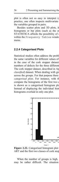
- Page 156: 58 2 Presenting and Summarising the
- Page 160: 60 2 Presenting and Summarising the
- Page 164: 62 2 Presenting and Summarising the
- Page 168: 64 2 Presenting and Summarising the
- Page 172: 66 2 Presenting and Summarising the
- Page 176: 68 2 Presenting and Summarising the
- Page 180: 70 2 Presenting and Summarising the
- Page 184: 72 2 Presenting and Summarising the
- Page 188: 74 2 Presenting and Summarising the
- Page 192: 76 2 Presenting and Summarising the
- Page 196: 78 2 Presenting and Summarising the
- Page 200: 80 2 Presenting and Summarising the
- Page 204:
82 3 Estimating Data Parameters los
- Page 208:
84 3 Estimating Data Parameters w
- Page 212:
86 3 Estimating Data Parameters int
- Page 216:
88 3 Estimating Data Parameters app
- Page 220:
90 3 Estimating Data Parameters m =
- Page 224:
92 3 Estimating Data Parameters In
- Page 228:
94 3 Estimating Data Parameters The
- Page 232:
96 3 Estimating Data Parameters est
- Page 236:
98 3 Estimating Data Parameters Exa
- Page 240:
100 3 Estimating Data Parameters Th
- Page 244:
102 3 Estimating Data Parameters A:
- Page 248:
104 3 Estimating Data Parameters A:
- Page 252:
106 3 Estimating Data Parameters We
- Page 256:
108 3 Estimating Data Parameters 3.
- Page 260:
4 Parametric Tests of Hypotheses In
- Page 264:
4.1 Hypothesis Test Procedure 113 V
- Page 268:
p B X 4.2 Test Errors and Test Powe
- Page 272:
xα = µ B −1 . 64× σ = 1300
- Page 276:
4.2 Test Errors and Test Power 119
- Page 280:
4.3 Inference on One Population 121
- Page 284:
Example 4.1 4.3 Inference on One Po
- Page 288:
4.3 Inference on One Population 125
- Page 292:
4.4 Inference on Two Populations 12
- Page 296:
4.4 Inference on Two Populations 12
- Page 300:
4.4 Inference on Two Populations 13
- Page 304:
4.4 Inference on Two Populations 13
- Page 308:
Then, the following test statistic:
- Page 312:
4.4 Inference on Two Populations 13
- Page 316:
4.4 Inference on Two Populations 13
- Page 320:
4.5 Inference on More than Two Popu
- Page 324:
4.5.2 One-Way ANOVA 4.5.2.1 Test Pr
- Page 328:
145 The ANOVA test uses precisely t
- Page 332:
4.5 Inference on More than Two Popu
- Page 336:
149 transformation. Notice how the
- Page 340:
4.5.2.2 Post Hoc Comparisons 151 Fr
- Page 344:
{CON, ADI, FAD, GLA}; {ADI, FAD, GL
- Page 348:
155 in the values of the sample mea
- Page 352:
SST = c i= 1 j= 1 = r ∑∑ c ∑
- Page 356:
159 Sum of the squares representing
- Page 360:
161 Notice that in Table 4.21 the t
- Page 364:
163 c. The comparison between hospi
- Page 368:
Power 1.00 .95 .90 .85 2-Way (2 X 3
- Page 372:
Exercises 167 4.5 Consider the Prog
- Page 376:
Exercises 169 freshmen in a program
- Page 380:
172 5 Non-Parametric Tests of Hypot
- Page 384:
174 5 Non-Parametric Tests of Hypot
- Page 388:
176 5 Non-Parametric Tests of Hypot
- Page 392:
178 5 Non-Parametric Tests of Hypot
- Page 396:
180 5 Non-Parametric Tests of Hypot
- Page 400:
182 5 Non-Parametric Tests of Hypot
- Page 404:
184 5 Non-Parametric Tests of Hypot
- Page 408:
186 5 Non-Parametric Tests of Hypot
- Page 412:
188 5 Non-Parametric Tests of Hypot
- Page 416:
190 5 Non-Parametric Tests of Hypot
- Page 420:
192 5 Non-Parametric Tests of Hypot
- Page 424:
194 5 Non-Parametric Tests of Hypot
- Page 428:
196 5 Non-Parametric Tests of Hypot
- Page 432:
198 5 Non-Parametric Tests of Hypot
- Page 436:
200 5 Non-Parametric Tests of Hypot
- Page 440:
202 5 Non-Parametric Tests of Hypot
- Page 444:
204 5 Non-Parametric Tests of Hypot
- Page 448:
206 5 Non-Parametric Tests of Hypot
- Page 452:
208 5 Non-Parametric Tests of Hypot
- Page 456:
210 5 Non-Parametric Tests of Hypot
- Page 460:
212 5 Non-Parametric Tests of Hypot
- Page 464:
214 5 Non-Parametric Tests of Hypot
- Page 468:
216 5 Non-Parametric Tests of Hypot
- Page 472:
218 5 Non-Parametric Tests of Hypot
- Page 476:
220 5 Non-Parametric Tests of Hypot
- Page 480:
222 5 Non-Parametric Tests of Hypot
- Page 484:
224 6 Statistical Classification (c
- Page 488:
226 6 Statistical Classification Eq
- Page 492:
228 6 Statistical Classification
- Page 496:
230 6 Statistical Classification li
- Page 500:
232 6 Statistical Classification It
- Page 504:
234 6 Statistical Classification ve
- Page 508:
236 6 Statistical Classification Fi
- Page 512:
238 6 Statistical Classification ω
- Page 516:
240 6 Statistical Classification ω
- Page 520:
242 6 Statistical Classification th
- Page 524:
244 6 Statistical Classification Fi
- Page 528:
246 6 Statistical Classification Bo
- Page 532:
248 6 Statistical Classification We
- Page 536:
250 6 Statistical Classification Th
- Page 540:
252 6 Statistical Classification si
- Page 544:
254 6 Statistical Classification In
- Page 548:
256 6 Statistical Classification St
- Page 552:
258 6 Statistical Classification St
- Page 556:
260 6 Statistical Classification At
- Page 560:
262 6 Statistical Classification pe
- Page 564:
264 6 Statistical Classification i(
- Page 568:
266 6 Statistical Classification ap
- Page 572:
268 6 Statistical Classification Co
- Page 576:
270 6 Statistical Classification 6.
- Page 580:
272 7 Data Regression Correlation d
- Page 584:
274 7 Data Regression These propert
- Page 588:
276 7 Data Regression The total var
- Page 592:
278 7 Data Regression Next, we crea
- Page 596:
280 7 Data Regression b 1 = ∑ ( x
- Page 600:
282 7 Data Regression Example 7.5 Q
- Page 604:
284 7 Data Regression The sampling
- Page 608:
286 7 Data Regression From the defi
- Page 612:
288 7 Data Regression * SSLF SSPE M
- Page 616:
290 7 Data Regression where: - y is
- Page 620:
292 7 Data Regression 1.0000 0.9692
- Page 624:
294 7 Data Regression The first lin
- Page 628:
296 7 Data Regression 7.2.5 ANOVA a
- Page 632:
298 7 Data Regression must ask whic
- Page 636:
300 7 Data Regression model. Simila
- Page 640:
302 7 Data Regression The MATLAB po
- Page 644:
304 7 Data Regression the same way
- Page 648:
306 7 Data Regression 7.3.2 Evaluat
- Page 652:
308 7 Data Regression The MATLAB re
- Page 656:
310 7 Data Regression with s 2 =
- Page 660:
312 7 Data Regression the threshold
- Page 664:
314 7 Data Regression 7.11, the lar
- Page 668:
316 7 Data Regression determination
- Page 672:
318 7 Data Regression smaller discr
- Page 676:
320 7 Data Regression Besides its u
- Page 680:
322 7 Data Regression VIF and Mean
- Page 684:
324 7 Data Regression Taking the na
- Page 688:
326 7 Data Regression Example 7.22
- Page 692:
328 7 Data Regression possible to p
- Page 696:
330 8 Data Structure Analysis In Fi
- Page 700:
332 8 Data Structure Analysis of th
- Page 704:
334 8 Data Structure Analysis 2 −
- Page 708:
336 8 Data Structure Analysis using
- Page 712:
338 8 Data Structure Analysis ∑
- Page 716:
340 8 Data Structure Analysis We se
- Page 720:
342 8 Data Structure Analysis p = 0
- Page 724:
344 8 Data Structure Analysis In or
- Page 728:
346 8 Data Structure Analysis A: On
- Page 732:
348 8 Data Structure Analysis ⎡0.
- Page 736:
350 8 Data Structure Analysis 1 0 -
- Page 740:
352 8 Data Structure Analysis 8.9 C
- Page 744:
354 9 Survival Analysis P( t ≤ T
- Page 748:
356 9 Survival Analysis Example 9.2
- Page 752:
358 9 Survival Analysis the Fatigue
- Page 756:
360 9 Survival Analysis “death”
- Page 760:
362 9 Survival Analysis A: The Hear
- Page 764:
364 9 Survival Analysis From Figure
- Page 768:
366 9 Survival Analysis denominator
- Page 772:
368 9 Survival Analysis The exponen
- Page 776:
370 9 Survival Analysis γ This is
- Page 780:
372 9 Survival Analysis the proport
- Page 784:
374 9 Survival Analysis 9.5 Compute
- Page 788:
376 10 Directional Data Example 10.
- Page 792:
378 10 Directional Data Example 10.
- Page 796:
380 10 Directional Data The MATLAB
- Page 800:
382 10 Directional Data A: We use t
- Page 804:
384 10 Directional Data For p = 2,
- Page 808:
386 10 Directional Data Thus, the r
- Page 812:
388 10 Directional Data from a unif
- Page 816:
390 10 Directional Data * 2 z = ( 1
- Page 820:
392 10 Directional Data 10.4.3 The
- Page 824:
394 10 Directional Data Example 10.
- Page 828:
396 10 Directional Data 10.5.2 Mean
- Page 832:
398 10 Directional Data Similar res
- Page 836:
400 10 Directional Data Exercises 1
- Page 840:
Appendix A - Short Survey on Probab
- Page 844:
A.1 Basic Notions 405 corresponding
- Page 848:
A.2 Conditional Probability and Ind
- Page 852:
A. 4 Bayes ’ Theorem 409 The firs
- Page 856:
A.5 Random Variables and Distributi
- Page 860:
a 0.5 0.4 0.3 0.2 0.1 0 f (x ) a a+
- Page 864:
Example A. 12 A.6 Expectation, Vari
- Page 868:
n [ X ] = ∑ i= 1 A.6 Expectation,
- Page 872:
A.7 The Binomial and Normal Distrib
- Page 876:
A.7 The Binomial and Normal Distrib
- Page 880:
The following results are worth men
- Page 884:
A.8.2 Moments A.8 Multivariate Dist
- Page 888:
For the d-variate case, this genera
- Page 892:
0.25 0.2 0.15 0.1 0.05 p(x) A.8 Mul
- Page 896:
432 Appendix B - Distributions A: T
- Page 900:
434 Appendix B - Distributions A: T
- Page 904:
436 Appendix B - Distributions For
- Page 908:
438 Appendix B - Distributions A: T
- Page 912:
440 Appendix B - Distributions Dist
- Page 916:
442 Appendix B - Distributions 0.45
- Page 920:
444 Appendix B - Distributions B.2.
- Page 924:
446 Appendix B - Distributions 1.2
- Page 928:
448 Appendix B - Distributions B.2.
- Page 932:
450 Appendix B - Distributions Dist
- Page 936:
452 Appendix B - Distributions 1 0.
- Page 940:
454 Appendix B - Distributions 0.6
- Page 944:
456 Appendix C - Point Estimation T
- Page 948:
458 Appendix C - Point Estimation
- Page 952:
460 Appendix D - Tables p n k 0.05
- Page 956:
462 Appendix D - Tables p n k 0.05
- Page 960:
464 Appendix D - Tables p n k 0.05
- Page 964:
466 Appendix D - Tables D.3 Student
- Page 968:
468 Appendix D - Tables D.5 Critica
- Page 972:
470 Appendix E - Datasets The varia
- Page 976:
472 Appendix E - Datasets E.6 CTG T
- Page 980:
474 Appendix E - Datasets E.9 FHR T
- Page 984:
476 Appendix E - Datasets E.14 Fore
- Page 988:
478 Appendix E - Datasets DATE_REOP
- Page 992:
480 Appendix E - Datasets CG: Conic
- Page 996:
482 Appendix E - Datasets E.26 Soil
- Page 1000:
484 Appendix E - Datasets E.29 VCG
- Page 1004:
Appendix F - Tools F.1 MATLAB Funct
- Page 1008:
Appendix F - Tools 489 r
- Page 1012:
References Chapters 1 and 2 Anderso
- Page 1016:
References 493 Gardner MJ, Altman D
- Page 1020:
References 495 Raudys S, Pikelis V
- Page 1024:
References 497 Mardia KV, Jupp PE (
- Page 1028:
500 Index 5.9 (two paired samples t
- Page 1032:
502 Index H hazard function, 353 ha
- Page 1036:
504 Index S sample, 5 mean, 416 siz