Brand standards manual - Memorial University of Newfoundland
Brand standards manual - Memorial University of Newfoundland
Brand standards manual - Memorial University of Newfoundland

Create successful ePaper yourself
Turn your PDF publications into a flip-book with our unique Google optimized e-Paper software.
12<br />
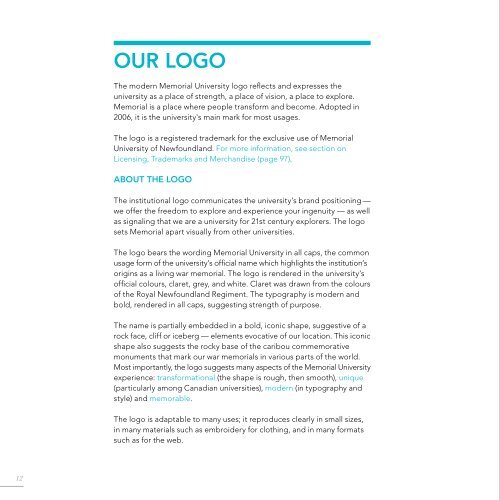
oUr loGo<br />
The modern <strong>Memorial</strong> <strong>University</strong> logo reflects and expresses the<br />
university as a place <strong>of</strong> strength, a place <strong>of</strong> vision, a place to explore.<br />
<strong>Memorial</strong> is a place where people transform and become. adopted in<br />
2006, it is the university's main mark for most usages.<br />
The logo is a registered trademark for the exclusive use <strong>of</strong> <strong>Memorial</strong><br />
<strong>University</strong> <strong>of</strong> <strong>Newfoundland</strong>. For more information, see section on<br />
Licensing, Trademarks and Merchandise (page 97).<br />
aBoUt tHe loGo<br />
The institutional logo communicates the university’s brand positioning —<br />
we <strong>of</strong>fer the freedom to explore and experience your ingenuity — as well<br />
as signaling that we are a university for 21st century explorers. The logo<br />
sets <strong>Memorial</strong> apart visually from other universities.<br />
The logo bears the wording <strong>Memorial</strong> <strong>University</strong> in all caps, the common<br />
usage form <strong>of</strong> the university’s <strong>of</strong>ficial name which highlights the institution’s<br />
origins as a living war memorial. The logo is rendered in the university’s<br />
<strong>of</strong>ficial colours, claret, grey, and white. Claret was drawn from the colours<br />
<strong>of</strong> the Royal <strong>Newfoundland</strong> Regiment. The typography is modern and<br />
bold, rendered in all caps, suggesting strength <strong>of</strong> purpose.<br />
The name is partially embedded in a bold, iconic shape, suggestive <strong>of</strong> a<br />
rock face, cliff or iceberg — elements evocative <strong>of</strong> our location. This iconic<br />
shape also suggests the rocky base <strong>of</strong> the caribou commemorative<br />
monuments that mark our war memorials in various parts <strong>of</strong> the world.<br />
Most importantly, the logo suggests many aspects <strong>of</strong> the <strong>Memorial</strong> <strong>University</strong><br />
experience: transformational (the shape is rough, then smooth), unique<br />
(particularly among Canadian universities), modern (in typography and<br />
style) and memorable.<br />
The logo is adaptable to many uses; it reproduces clearly in small sizes,<br />
in many materials such as embroidery for clothing, and in many formats<br />
such as for the web.<br />
<strong>University</strong> logo<br />
13