Brand standards manual - Memorial University of Newfoundland
Brand standards manual - Memorial University of Newfoundland
Brand standards manual - Memorial University of Newfoundland

You also want an ePaper? Increase the reach of your titles
YUMPU automatically turns print PDFs into web optimized ePapers that Google loves.
28<br />
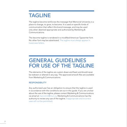
taGlIne<br />
The tagline become reinforces the message that <strong>Memorial</strong> <strong>University</strong> is a<br />
place to change, to grow, to become. It is used on specific kinds <strong>of</strong><br />
communication that reflect this brand message, and may be used<br />
only when deemed appropriate and authorized by Marketing &<br />
Communications.<br />
The become tagline is rendered in a modified american Typewriter font.<br />
No other font may be substituted. The tagline must always appear in<br />
lowercase letters.<br />
General GUIdelInes<br />
for Use <strong>of</strong> tHe taGlIne<br />
The elements <strong>of</strong> the tagline are custom drawn and fixed, and should never<br />
be redrawn or altered in any way. The approved artwork files are available<br />
from Marketing & Communications.<br />
resPonsIBIlItY<br />
any authorized user has an obligation to ensure that the tagline is used<br />
in accordance with the conditions set out in this guide. If you are unclear<br />
about the use <strong>of</strong> the tagline, please contact Marketing & Communications<br />
via email at marcomm@mun.ca. Marketing & Communications has the<br />
authority to review any use <strong>of</strong> the tagline. Inappropriate and incorrect<br />
uses will not be permitted.<br />
MInIMUM<br />
sPaCe<br />
The distance from the logo to the<br />
tagline is the height <strong>of</strong> the letter M<br />
in <strong>Memorial</strong>.<br />
taGlIne<br />
ColoUrs<br />
The tagline always prints as solid<br />
black except in cases where the<br />
<strong>Memorial</strong> logo is reversed out <strong>of</strong><br />
a solid. In this case, the tagline will<br />
also be white.<br />
MInIMUM<br />
sIZe<br />
Where the tagline is used with<br />
the logo, the minimum size <strong>of</strong> the<br />
logo and tagline is 15 millimetres<br />
(0.59 inches) wide. The minimum<br />
size for the tagline is 7.3 millimetres<br />
(0.287 inches) wide. In instances<br />
where the tagline and logo are<br />
separate, use discretion on the<br />
size <strong>of</strong> the tagline.<br />
Minimum space<br />
Minimum size<br />
Nothing should appear within this safety zone.<br />
The safety zone is equal to the height <strong>of</strong> the left side <strong>of</strong><br />
the claret block. When logo and tagline are used together,<br />
the safety zone should extend below the lowest point<br />
<strong>of</strong> the combined unit.<br />
Minimum size <strong>of</strong> the logo is 15mm (0.59in)<br />
measured horizontally – slightly smaller than<br />
the Canadian penny.<br />
Minimum size <strong>of</strong> the become tagline is<br />
7.3mm (0.287 in) measured horizontally.<br />
you could fit two <strong>of</strong> the become taglines<br />
horizontally inside the Canadian penny.<br />
29