pdf 1 - exhibitions international
pdf 1 - exhibitions international
pdf 1 - exhibitions international

Create successful ePaper yourself
Turn your PDF publications into a flip-book with our unique Google optimized e-Paper software.
16 competing for attention • directing the reading<br />
Reading and seeing 17<br />
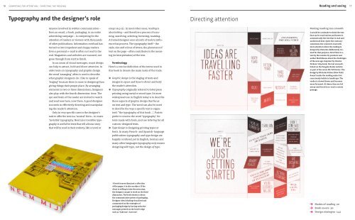
Typography and the designer’s role Directing attention<br />
Anyone involved in written communication –<br />
from an email, a book, packaging, to an entire<br />
advertising campaign – is competing for the<br />
attention of readers or viewers with thousands<br />
of other publications. Information overload has<br />
turned us into impatient and sloppy readers.<br />
Even a personal e-mail is often not read to the<br />
end. Magazines and websites are scanned, not<br />
gone through from start to finish.<br />
In an ocean of visual messages, smart design<br />
can help to attract, hold and direct attention. In<br />
older texts on typography and graphic design<br />
the word ‘arranging’ often is used to describe<br />
what graphic designers do. I like to speak of<br />
‘staging’ because there is more to designing than<br />
giving things their proper place. By arranging<br />
elements in two or three dimensions, designers<br />
also play with the fourth dimension: time. The<br />
eye and brain of the reader are invited to watch<br />
and read now here, now there. A good designer<br />
succeeds in effectively directing and manipulat-<br />
ing the reader’s attention.<br />
Only in very specific cases is the designer’s<br />
task to offer the text in a ‘neutral’ form – to create<br />
‘invisible’ typography. Neutral or invisible typo-<br />
graphy is useful for texts that tell a linear story<br />
that will be read in their entirety, like a novel or<br />
essay (→ p 22) . In most other cases, reading is<br />
also looking – and therefore a process of scan-<br />
ning, searching, selecting, browsing, roaming.<br />
A trained designer uses all sorts of tools to influ-<br />
ence that process. The typography itself – the<br />
style, size and colour of letters, the placement of<br />
text on the page – often contributes to the mean-<br />
ing (or interpretation) of the text.<br />
Terminology<br />
Here’s a concise definition of the terms used in<br />
this book to denote the main tasks of the trade:<br />
● Graphic design is the staging of texts and<br />
images in space and time to direct and hold<br />
the reader’s attention.<br />
● Typography originally referred to letterpress<br />
printing using metal or wood type. Its most<br />
widespread use in English today is to describe<br />
those aspects of graphic design that focus<br />
on text and type. The word can also be used<br />
to describe the way a specific text is organ-<br />
ised: “the typography of this book ...’. Purists<br />
prefer to reserve the word ‘typography’ for<br />
texts made with fonts, and use lettering for all<br />
custom-designed texts.<br />
● Type design is designing printing types or<br />
fonts. In many French- and Spanish-language<br />
publications typography and type design are<br />
happily confused; yet in English, German and<br />
many other languages typo graphy only means<br />
designing with type, not the design of type.<br />
A book is more than just a collection<br />
of flat pages: it is also an object. If the<br />
client is willing to take the extra step,<br />
the designer can get to work on the third<br />
dimension. The book shown is about<br />
the communicative power of packaging.<br />
Designer Alex Scholing visualised and<br />
commented on the strategies of<br />
pack ag ing design by having seductive<br />
messages printed on the book’s edge<br />
such as ‘Take me’, ‘Love me’.<br />
Making reading less smooth<br />
It would be a mistake to think the text<br />
that can be read easiest and fastest is<br />
automatically the text that is read and<br />
understood best. Quite the contrary:<br />
sometimes the content is read with<br />
more attention when the reading is<br />
delayed by obstacles deliberately cre-<br />
ated for that purpose. Hard Times is a<br />
text by the London DJ, producer and<br />
author Matt Mason about the challenges<br />
of the new age. Inspired by Charles<br />
Dickens’ 1854 book, the text was pub-<br />
lished on the Penguin Books website<br />
as part of the series We Tell Stories. The<br />
design by Nicholas Felton (New York)<br />
doesn’t make the reading easier but<br />
consciously builds in handicaps. The<br />
reader is slowed down and becomes<br />
more focussed. At times, they are led<br />
astray and forced to re-read a certain<br />
passage.<br />
→<br />
→<br />
→<br />
Modes of reading 20<br />
Book covers 30<br />
Design strategies 142

![01 -[BE/INT-2] 2 KOL +UITGEV+ - exhibitions international](https://img.yumpu.com/19621858/1/184x260/01-be-int-2-2-kol-uitgev-exhibitions-international.jpg?quality=85)