pdf 1 - exhibitions international
pdf 1 - exhibitions international
pdf 1 - exhibitions international

Create successful ePaper yourself
Turn your PDF publications into a flip-book with our unique Google optimized e-Paper software.
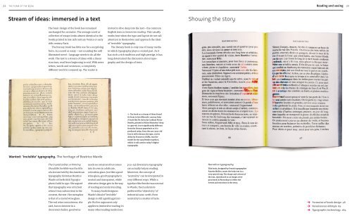
22 the form of the book<br />
Reading and seeing<br />
23<br />
Stream of ideas: immersed in a text<br />
The basic design of the book has remained<br />
unchanged for centuries. The average novel or<br />
collection of essays looks almost identical to the<br />
books printed in late 15th century Venice or early<br />
16th century Paris.<br />
The literary book has little use for a surprising<br />
form. In a novel or essay – not counting the odd<br />
illustrated novel – language needs to do all the<br />
work. The text is a stream of ideas with a linear<br />
structure, read from beginning to end. With mere<br />
letters, words and sentences, a completely<br />
different world is conjured up. The reader is<br />
Wanted: ‘invisible’ typography. The heritage of Beatrice Warde<br />
The Crystal Goblet, or Printing<br />
Should Be Invisible was the title<br />
of a lecture held by the American<br />
typography historian Beatrice<br />
Warde at the British Typogra-<br />
phers Guild in 1930. She argued<br />
that typography was at its best<br />
when it was subservient to the<br />
content, the text. Her metaphor<br />
is that of a crystal wine glass.<br />
The real wine connoisseur, she<br />
said, has no interest in a<br />
decorated chalice: good wine<br />
needs no ornament but comes<br />
into its own in a delicate,<br />
colourless glass. Just like a good<br />
wine glass, good typography is<br />
neutral and transparent, while<br />
obtrusive design gets in the way<br />
of reading and understanding.<br />
To many book designers<br />
Warde’s ideal of ‘invisible’<br />
design is still a guiding princi-<br />
ple. But her argument only<br />
applies to immersive reading. In<br />
many other reading modes (see<br />
invited to dive deep into the text – the common<br />
English term is immersive reading. This usually<br />
works best when the type and layout do not call<br />
attention to themselves and approach the ideal<br />
of ‘invisible’ typography.<br />
The literary book is only one of many media<br />
in which typography plays a central part. As it<br />
has such a rich tradition and high prestige, it has<br />
long determined the discussion about typo-<br />
graphy and the design of texts.<br />
← The book as a stream of ideas found<br />
its form in late fifteenth-century Italy.<br />
A book like De Aetna by Cardinal Pietro<br />
Bembo, printed at Aldus Manutius’ shop<br />
in 1495–96, is not significantly different<br />
from the literary paperback as it is<br />
produced today. Even the 500-year-old<br />
font is still relevant: the type, cut for<br />
Aldus by Francesco Griffo, was the<br />
model for the 1929 Bembo typeface,<br />
which is still used in today’s digital<br />
typography.<br />
p 22–23) diversity in typography<br />
can actually help in reading.<br />
Moreover, the concept of<br />
‘neutrality’ can be interpreted in<br />
very different ways. While a<br />
typeface like Bembo was neutral<br />
to Warde, the modernists<br />
preferred the ‘objectivity’ of<br />
industrial sans-serifs. Even<br />
neutrality is a matter of taste.<br />
Showing the story<br />
Narrative typography<br />
This book, designed by French typographer<br />
Fanette Mellier, treats the body text in a<br />
very special way. The shape and colours of<br />
the text, reproduced as an image, were<br />
processed in Photoshop to reflect the<br />
events and emotions in the story.<br />
→<br />
→<br />
→<br />
Formulae of book design 48<br />
Renaissance oldstyle 84<br />
Typographic technology 164


![01 -[BE/INT-2] 2 KOL +UITGEV+ - exhibitions international](https://img.yumpu.com/19621858/1/184x260/01-be-int-2-2-kol-uitgev-exhibitions-international.jpg?quality=85)