pdf 1 - exhibitions international
pdf 1 - exhibitions international
pdf 1 - exhibitions international

You also want an ePaper? Increase the reach of your titles
YUMPU automatically turns print PDFs into web optimized ePapers that Google loves.
20 different strategies for different uses<br />
Reading and seeing 21<br />
Modes of reading<br />
Immersive reading<br />
Informative reading<br />
Selective reading<br />
Consultative reading<br />
We read all day. Newspapers, websites, advertis-<br />
ing, business cards, text messages, logos, street<br />
names, wayfinding, fines. Occasionally we even<br />
read a book. A text can be huge or tiny, nearby or<br />
far away, it can be a single word or a series of<br />
densely printed pages. There is not one single<br />
way of shaping text, but many different ones.<br />
What works well or looks good is not the same for<br />
all types of text. How about trying to classify our<br />
various ways of reading into categories – a<br />
classification of reading modes? This could help<br />
us to understand why one text is designed in a<br />
certain way, and another very differently. It can<br />
also help the designer in making choices. The<br />
German typographer and teacher Hans Peter<br />
Willberg has tried to invent such a classification.<br />
What, where?<br />
Immersive reading could also be called linear<br />
reading: the text is read in a concentrated way<br />
from the beginning to the end and each<br />
subsequent section, page or chapter builds on<br />
what went before. Typical examples of this are<br />
novels, essays and lengthy magazine articles.<br />
When reading informatively and selectively,<br />
one usually does not start at the beginning, but<br />
first skims the text to pick out the interesting<br />
snippets. Newspapers and magazines are good<br />
examples, but illustrated books and text books<br />
are often designed for navigating from one<br />
useful bit to another. The reader’s goal is to<br />
quickly and efficiently record information.<br />
Dictionaries are a typical example of consulta-<br />
tive or referential reading. It is a very specific<br />
way of reading: a quest for that one item that<br />
you want to know more about. In timetables ,<br />
cultural listings and various other reference<br />
books something similar happens. Of course,<br />
the classic use of reference books is now<br />
gradually being replaced by online search<br />
functions.<br />
He deliberately limited himself to book design,<br />
leaving aside many forms of text that are not<br />
available in libraries or printed on paper – from<br />
advertising and signage to subtitles, forms and<br />
information leaflets for medicines. Nevertheless<br />
his typology of reading modes provides a good<br />
start for a more diversified view of why a certain<br />
kind of work is better designed in this way and<br />
another in that way. This personally coloured<br />
representation of the Willberg scheme may<br />
provide some insight into the diversity of the<br />
challenges both the reader and the designer face<br />
on a daily basis.<br />
How?<br />
On the subsequent pages we take a closer<br />
look at ways of shaping text to address different<br />
modes of reading.<br />
To be able to be immersed in a text, its design<br />
should not be distracting. A reader-friendly<br />
typeface that does not draw attention to itself is a<br />
prerequisite. Line length and line distance<br />
(leading) are just as crucial. For instance, if the<br />
reader’s eye has trouble finding the beginning<br />
of the next line, this is a design flaw.<br />
Informative reading requires a clear division of<br />
the text and a clear hierarchy – a design that<br />
distinguishes the various levels in the text.<br />
Navigation is a common term to designate the<br />
typographic elements (choice of type, lines,<br />
colours, icons, subheads, boxes) that help do<br />
this. In design for informative reading, the<br />
rhythm of texts and images can build an<br />
interesting visual dramaturgy.<br />
Again, lucid navigation is crucial. In dictionaries,<br />
timetables and similar things, convention plays<br />
a crucial role, and breaking expectations makes<br />
little sense here. For example, clear contrasts<br />
between keywords and explanatory text, and a<br />
considered compromise between space savings<br />
(economy) and readability are part of the<br />
challenges the designer has to get to grips with.<br />
Activating typography<br />
Staged typography<br />
Informative typography<br />
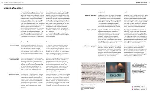
↑ Typography for consultative reading:<br />
Mark Thomson’s design for Collins’<br />
Dictionaries. Maximum clarity with<br />
sparse (but not all-too-minimalist)<br />
means.<br />
What, where?<br />
A strategy for drawing the readers’ attention and<br />
stimulating them to read. The first aim of activat-<br />
ing typography is looking; the reading happens<br />
a in the second instance. Magazines – especially<br />
their headlines, subheads, intros and pull quotes<br />
– are typical cases of activating typography.<br />
Adver tising, book covers and packaging could<br />
also count as typography that incites to action.<br />
As pointed out before, any work of typography<br />
exists to give a text the stage from which to<br />
address its audience. But we reserve the term<br />
‘staged typography’ for those cases in which<br />
typography attains its goals with theatrical<br />
means, visual tricks and special effects. It is<br />
outside the world of books that the most impres-<br />
sive stagings take place: in advertising, movie title<br />
sequences, lettering in public spaces, etc.<br />
There are situations in which a poorly designed<br />
warning or indication can be fatal, or can be the<br />
cause of a missed connection or administrative<br />
problems. In a complex society full of risks and<br />
regulations, providing good information design<br />
should be a matter of common decency for<br />
governments and service companies.<br />
How?<br />
Readability is not of primary concern here, rather<br />
the viewer needs to be seduced with all visual<br />
means available. There are hardly any rules or<br />
recipes, and designers may be able to claim much<br />
freedom. Therefore, more ingenuity is expected<br />
from them. Activating typography is often done<br />
in teams in which designers collaborate with<br />
writers, editors and/or marketing specialists.<br />
Staged typography hardly knows any rules or<br />
restrictions. The sky is the limit. This does not<br />
necessarily imply that this kind of typographic<br />
design is always outrageous or highly decorative<br />
– see Gerard Unger’s work below. It also does not<br />
mean that functionality is not relevant. Striking<br />
and distinctive typography is sometimes better<br />
placed to perform certain functions than more<br />
predictable and cautious solutions.<br />
More than any other branch of typographic<br />
design, information design is the task of a<br />
specialist. Given the number of incomprehensi-<br />
ble and confusing forms, signage, orientation<br />
systems, timetables and medicine leaflets,<br />
designers who are interested in specializing in it<br />
will have years of work ahead of them<br />
← Staged typography: type designer<br />
Gerard Unger created an alphabet called<br />
Delftse Poort (Delft Gate) for the<br />
Rotterdam building of the same name,<br />
in collaboration with the architect Abe<br />
Bonnema. The lettering combines a<br />
certain theatricality with seriousness<br />
and matter-of-factness, which is<br />
appropriate for a prestigious office<br />
building.<br />
←<br />
→<br />
→<br />
The designer’s role 16<br />
Typographic modes 21–39<br />
Organising & planning 40


![01 -[BE/INT-2] 2 KOL +UITGEV+ - exhibitions international](https://img.yumpu.com/19621858/1/184x260/01-be-int-2-2-kol-uitgev-exhibitions-international.jpg?quality=85)