pdf 1 - exhibitions international
pdf 1 - exhibitions international
pdf 1 - exhibitions international

You also want an ePaper? Increase the reach of your titles
YUMPU automatically turns print PDFs into web optimized ePapers that Google loves.
6 Introduction 7<br />
Culture, communication, typography<br />
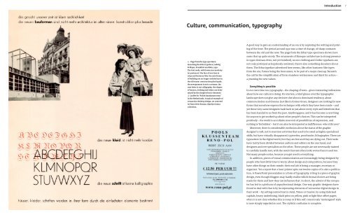
← Page from the type specimen<br />
launching the Erbar typeface, Ludwig<br />
& Mayer, Frankfurt am Main, 1930.<br />
The text reads, with lowercase modesty<br />
(or pretence): ‘the face of our time is<br />
crisp and business-like. the new forms<br />
of building are no longer architecture in<br />
the old sense: construction plus façade.<br />
the new garment is not a costume. the<br />
new letter is not calligraphy. the shapes<br />
of houses, clothing and letters are deter-<br />
mined by the simplest basic elements.’<br />
↓ Leaflet for ‘Polish handyman team’<br />
in the Netherlands. A typical example of<br />
vernacular desktop design, set centered<br />
in Times New Roman. Martijn Oostra<br />
collection.<br />
A good way to gain an understanding of an era is by exploring the writing and print-<br />
ing of the time. The period around 1930 was a time of change, of sharp contrasts<br />
between the old and the new. The page from the Erbar type specimen shown here<br />
sums that up quite nicely. The ornaments of Baroque architecture (a strong presence<br />
in 1930s German cities, not yet bombed), rococo clothing and Gothic typefaces are<br />
not only portrayed as hopelessly outdated, there’s also something decadent about<br />
them. The Erbar typeface advertised here seems, like other business-like types<br />
from the era, Futura being the forerunner, to be part of a major cleanup. Beneath<br />
the call for the simplification of form slumbers restlessness and thirst for action –<br />
a yearning for new values .<br />
Everything is possible<br />
In our own time too, typography – the shaping of texts – gives interesting indications<br />
about how our culture is doing. For starters, a brief glance over the typographic<br />
landscape does not give any decisive clue about a dominant tendency, about<br />
common desires and dreams. Just like in former times, designers are looking for new<br />
forms that somehow express the technique with which they have been made – and<br />
yet these very same designers hark back to just about every style and letterform that<br />
has been handed to us from the past. Anything goes, and it has become a rare thing<br />
for anyone to get worked up about other people’s choices. This can be interpreted<br />
positively – the world is an infinite reservoir of possibilities of expression, and<br />
nothing is ‘forbidden’ – but it can also be interpreted as indifference: who still cares?<br />
Moreover, there is considerable confusion about the status of the graphic<br />
designer’s craft, not to mention activities that used to be rated as highly specialised<br />
skills, but have virtually disappeared: typesetter, proofreader, lithographer. There are<br />
typesetters in the digital world, but they are few and they are dying out. Their tasks<br />
have tacitly been divided between authors and editors on the one hand, and<br />
designers and DTP specialists on the other. These people are not necessarily trained<br />
to carefully handle text, with the result that text often looks worse than it used too.<br />
Not many people notice, because you get used to everything.<br />
In addition, pieces of visual communication are increasingly being designed by<br />
people who have little time to worry about design and composition, because they<br />
have other things on their minds: their real job is being a manager, secretary or<br />
organiser. Yet a report that a laser printer spits out twelve copies of is also a publica-<br />
tion. A PowerPoint presentation is a form of typography. A blog is a piece of graphic<br />
design, even though bloggers may hardly realise which formal choices are being<br />
made for them and how they can influence that. In short, the advent of the compu-<br />
ter has led to a plethora of unprofessional design. One way graphic designers have<br />
found to deal with that is by incorporating elements of vernacular digital design in<br />
their work – by setting centred text in Arial, Times or Courier, by using italicised<br />
capitals, heavy underlining, black print on yellow, pink or light blue offset paper;<br />
often it is not clear whether this is irony or if this self-consciously ‘undesigned’ style<br />
is now simply regarded as cool. The stylistic confusion is complete.


![01 -[BE/INT-2] 2 KOL +UITGEV+ - exhibitions international](https://img.yumpu.com/19621858/1/184x260/01-be-int-2-2-kol-uitgev-exhibitions-international.jpg?quality=85)