pdf 1 - exhibitions international
pdf 1 - exhibitions international
pdf 1 - exhibitions international
Create successful ePaper yourself
Turn your PDF publications into a flip-book with our unique Google optimized e-Paper software.
Marian Bantjes critiques the alphabet<br />
(From her book I wonder, 2010).<br />
BIS Publishers<br />
Het Sieraad<br />
Postjesweg 1<br />
1057 DT Amsterdam<br />
The Netherlands<br />
T +31 (0)20 515 0230<br />
F +31 (0)20 515 0239<br />
bis@bispublishers.nl<br />
www.bispublishers.nl<br />
ISBN 978 90 6369 133 2<br />
Copyright © 2011 BIS Publishers<br />
and Jan Middendorp<br />
Image research and design<br />
Jan Middendorp<br />
Editorial and production assistance<br />
Catherine Dal, Christine Gertsch, Florian<br />
Hardwig, Anthony Noel<br />
Drawings<br />
Christine Gertsch, Christin Huber, Edgar<br />
Walthert<br />
Photography<br />
Eva Czaya, Christine Gertsch, JM<br />
Typefaces<br />
Rooney (Jan Fromm), Agile (Edgar Walthert,<br />
Village), the Shire Types (Jeremy Tankard)<br />
All rights reserved. No part of this publication<br />
may be reproduced or transmitted in any form<br />
or by any means, without permission in writing<br />
from the copyright owners.<br />
Every reasonable attempt has been made to<br />
identify owners of copyright. Any errors or<br />
omissions brought to the publisher’s attention<br />
will be corrected in subsequent editions.<br />
7<br />
11<br />
Reading and<br />
seeing<br />
Making text look right 118<br />
Formatting the paragraph 120<br />
Alignment 122<br />
Hyphenation & Justification 123<br />
Distinguishing sections, paragraphs 124<br />
Initials 125<br />
Letter and word, black and white 126<br />
Fine-tuning headlines 127<br />
Tracking: spacing and kerning 128<br />
Adjusting optical alignment 129<br />
OpenType functions and features 130<br />
Small capitals 132<br />
Ligatures &c. 134<br />
Swashes, flourishes, beginnings and endings 135<br />
Punctuation at home and abroad 136<br />
Hyphens, dashes, spaces – ¡and more! 137<br />
Numerals, figures, digits, numbers 138<br />
Adjusting to circumstances 140<br />
Small and narrow type 141<br />
These words don’t mean a thing... 12<br />
Legibility: design versus the academics 14<br />
Typography and the designer’s role 16<br />
Visual rhetoric 18<br />
Modes of reading 20<br />
Stream of ideas: immersed in a text 22<br />
Navigation: guiding the reader 24<br />
Staging the reader’s experience 26<br />
Seducing with type: packaging 28<br />
Seducing with type: book covers 30<br />
Corporate design 32<br />
Information design, at your service 34<br />
Designing for the web 36<br />
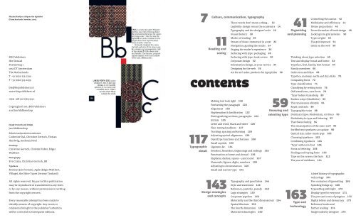
CONTENtS<br />
117<br />
Typographic<br />
detail<br />
Culture, communication, typography<br />
143<br />
Design strategies<br />
and concepts<br />
Art for art’s sake: products for typophiles 38<br />
Typography and good ideas 144<br />
Style and statement 146<br />
Reference, pastiche, parody 148<br />
Logo strategies 150<br />
Corporate typeface 152<br />
59<br />
Knowing and<br />
selecting type<br />
Materiality and the third dimensional 154<br />
Spatial illusions 156<br />
The fourth dimension 158<br />
Material technologies 160<br />
41<br />
Organising<br />
and planning<br />
Controlling the canvas 42<br />
Modularity and efficiency 44<br />
Divine proportions 46<br />
Secret formulae of book design 48<br />
Looking into grid systems 50<br />
Types of grid 52<br />
The grid exposed 54<br />
Grids on the web 56<br />
Thinking about type selection 60<br />
Text and display: bread and butter 62<br />
Typeface, font, family, font format 64<br />
Family members 66<br />
Italics true and false 68<br />
Typeface anatomy: serifs and dry sticks 70<br />
Comparing fonts 72<br />
Type classification 74<br />
Classifying by writing tools 76<br />
Old letterforms, new fonts 78<br />
‘Type’ before Gutenberg 80<br />
Broken script (blackletter) 82<br />
The renaissance oldstyle 84<br />
Royal contrasts 86<br />
Typographic noise 88<br />
Dominant type: Modernism, Art Deco 90<br />
Modularity in type and lettering 92<br />
That Swiss feeling 94<br />
The emancipation of the sans-serif 96<br />
Seriffed text typefaces: an update 98<br />
Optical size: tailor-made type 100<br />
Choosing typefaces 102<br />
Combining typefaces 104<br />
‘Type’ without a font 106<br />
Fonts or lettering 108<br />
Finding and buying fonts 110<br />
Type on the screen: the facts 112<br />
The year of webfonts 114<br />
163<br />
Type and<br />
technology<br />
A brief history of typographic<br />
technology 164<br />
Five centuries of typesetting 166<br />
Speeding things up 168<br />
Typesetting with light 170<br />
Display type for everyone 171<br />
The pros and cons of progress 172<br />
Digital letters and democracy 173<br />
Reference books and<br />
further reading 174<br />
Image index by designer 176





![01 -[BE/INT-2] 2 KOL +UITGEV+ - exhibitions international](https://img.yumpu.com/19621858/1/184x260/01-be-int-2-2-kol-uitgev-exhibitions-international.jpg?quality=85)
